Who has the best website out of the presidential candidates left in the race?
Before I answer, let me start with a disclosure: I’m not going to be voting in this election, I have no dog in this particular fight, and I’m basing this on an objective assessment from the other side of the Atlantic Ocean.
In other words, while I might be as partisan as anyone else when it comes to my political beliefs, I can recognize good marketing and excellence in user experience and web design when I see it.
And in the race for the White House there is plenty of all of that.
So while this post will certainly rank the candidates for their websites, it won’t be on the basis of their politics. Rather it will be based on how effective those websites are.
This, though, raises an important question: what IS an effective candidate website?
It Depends on What the Definition of ‘Effective’ Is
2016 is no typical presidential campaign and this makes talking about an effective campaign website is a little more complicated than it might normally be.
Typically, during the primary season a campaign website is focused on collecting voter information, raising money, and communicating policy positions. All are important, especially if the candidate becomes the nominee and needs to reach out to supporters in a second round, so to speak.
But this year things are a little different.
To start with, the leading candidate in the race for the Republican nomination is not particularly interested in getting donations from his supporters to pay for his campaign. Donald Trump is essentially a self-funded candidate which means his website doesn’t need to have the focus on fundraising that his competitors do.
On the other side of the political divide, Democrat Bernie Sanders of Vermont is sticking to his guns and refusing the support of a Super PAC. In effect, this means Sanders requires the support of many small donors to overcome the financial disadvantage he has compared to a mainstream candidate like Hillary Clinton – and this means his website needs to focus far more on winning donations from his supporters.
While Hillary Clinton is perhaps the most typical establishment candidate running – and therefore she has the most typical candidate website – Republican candidates Marco Rubio and Ted Cruz are both lessor known quantities who need to lay out their positions and personal stories for people to explore. While the American people have known Clinton for decades, the two younger men are less well known and thus their sites are structured differently.
Hence, when it comes to determining what an ‘effective’ site is, it is worth bearing in mind that each site is set up differently and may have very different aims. Sanders needs cash, Trump doesn’t, Clinton doesn’t need to focus on her personal story while Rubio and Cruz do. If we are going to compare, we’re going to have to do it across the different areas we’ve mentioned and not only on the one that might be the most important to that candidate alone.
One final note.
Every candidate’s website can be accessed with a simple URL which almost always redirects to a contribution page, a signup page, or some other temporary campaign marketing material. To compare the core sites we skipped through these, clicking no, yes, no thanks, straight to the site, and anywhere else to get through the noise to the page itself. While this means there’s temporary promotions and efforts we’ve deliberately bypassed, it also means we can compare the sites on a somewhat equal footing.
Money, Money, Money…
The first thing we’ll take a look at is how the campaigns seek to suck money out of your wallet. No, wait – I mean “encourage you to donate to the campaign”. Each campaign has a slightly different approach, though there are some similarities, still.
Donald Trump
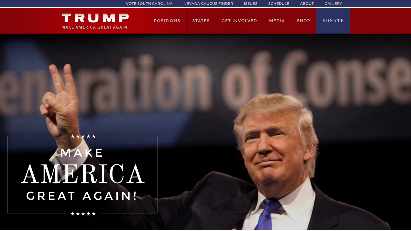
Does he beg for your money? No.
Will he take it? Sure – it’s the only blue button on an otherwise red header bar.
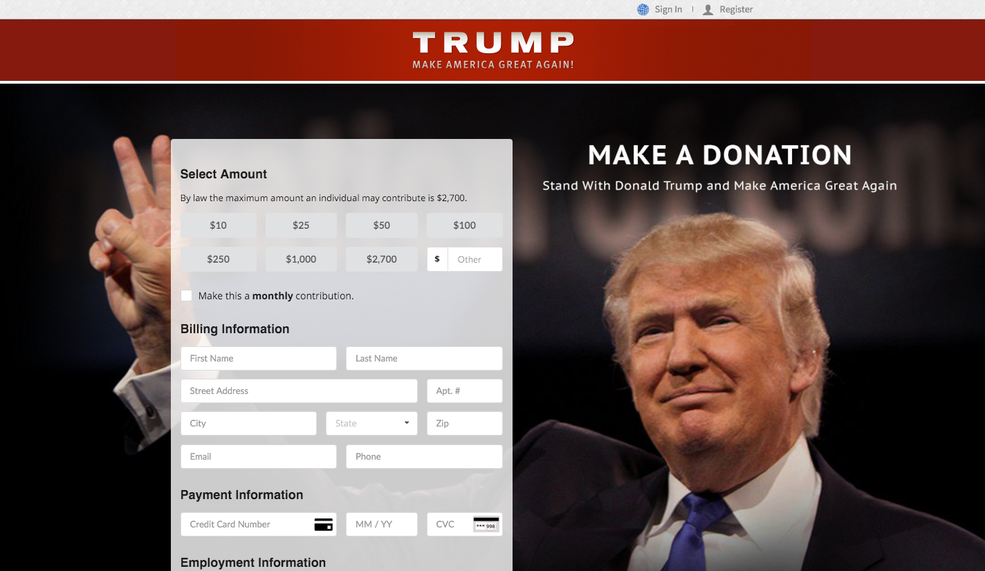
Click through and you’ll find a long form, and choices to donate anything from $10 through to $2700 – the maximum an individual can donate to his primary campaign.
Feel pressured to give? You shouldn’t. There’s no pop-ups, no begging, and no demands for cash to support the message. There’s just Trump, front and center, and smiling away.
He doesn’t seem to want your money, but he probably doesn’t need it to survive the race.
Our Score: 2/5
Ted Cruz
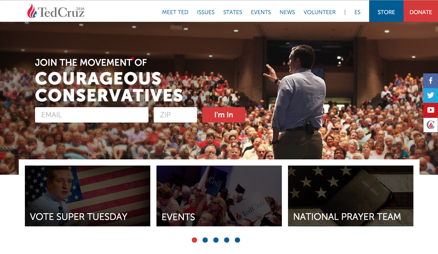
The homepage makes it clear that Cruz is a different sort of candidate to Trump. It also demonstrates that Cruz has different goals when it comes to his site.
Cruz needs cash to keep the campaign moving and the header includes both a donate and shop button.
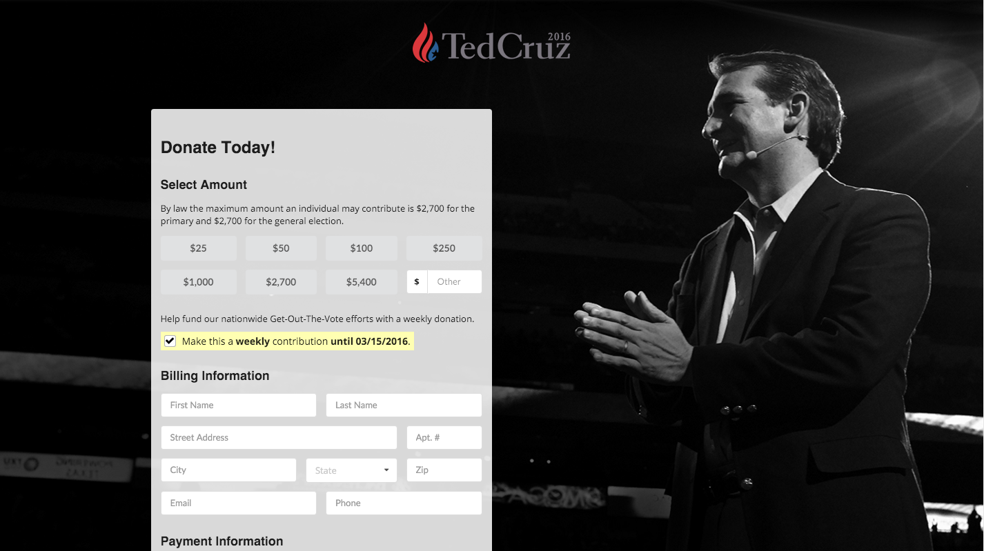
Cruz’s donate page is similar in format to Trump but with a couple of key differences.
The long form is basically identicial, but his low-end donation is a suggested $25 and the high donation is $5400. That’s double the maximum individual donation for the primary – illegal? No, just a smart way of Cruz locking you into a second donation for the general if he wins the nomination.
Note, too, the chance to set your own donation – that’s smart work, too.
The $5400 move is nice, and the chance to set your own donation is smart, too. But this long form? It could be done better.
Our Score: 3/5
Bernie Sanders
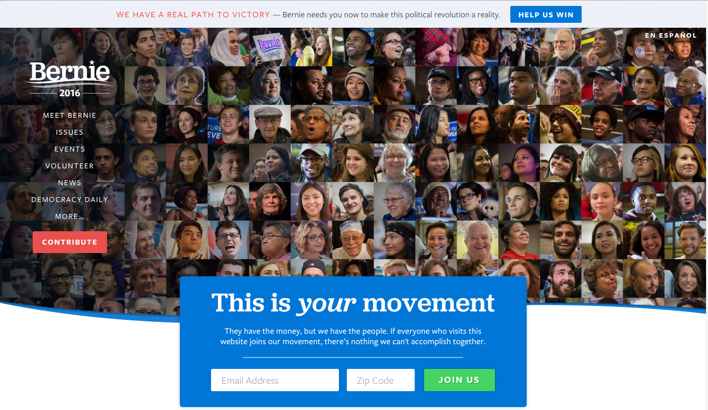
This is a candidate who needs donations from his supporters. He’s got less personal wealth than any candidate in living memory and he’s refusing big business donations and Super PAC support. Hence, it is no surprise that his home page has buttons urging supporters to donate in two places: top right and bottom left.
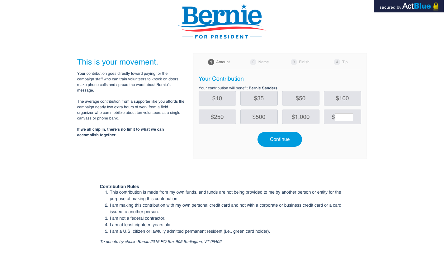
His donate page is as white as the Vermont snow and donations start low.
The suggested minimum donation is $10 and it tops out at $1000. You can give more because, like Cruz, there is a box where you can enter any amount you like. There’s no long form, though, and it’s easy to click through an donate in a couple of steps.
He has a clear form, it is short (he’ll get the other required information once the visitor has committed to making a donation), and he has a low minimum and maximum suggested donation to align with his grassroots strategy.
Our Score: 4/5
Marco Rubio
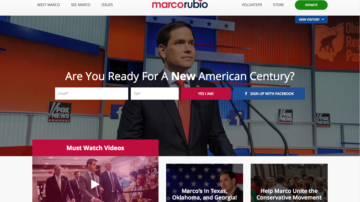
A crisp and clean page with a centered opt-in to encourage interaction. And there, in the top right corner, a green donate button. Why green? We’re not sure – but he’s the only candidate to move away from the blue/red color scheme – and it works.
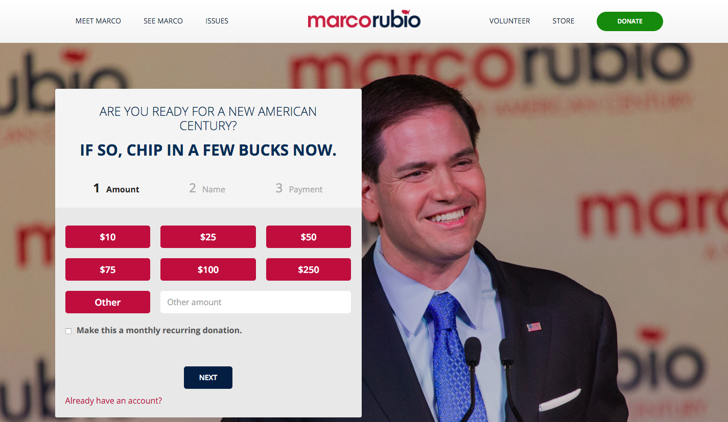
Click through to the donate page and you’ll see what is really best practice when it comes to these sorts of things.
The minimum suggested donation? $10. The maximum suggested donation? $250.
There’s space to enter your own donation if you like, and there’s nothing complicated about the form. Three steps, all named in advance, and all above the fold.
Rubio’s getting this all right. It’s easy to donate, everything is clear up front, the steps of the process are outlined, and it all fits above the fold.
Our Score: 5/5
Hillary Clinton
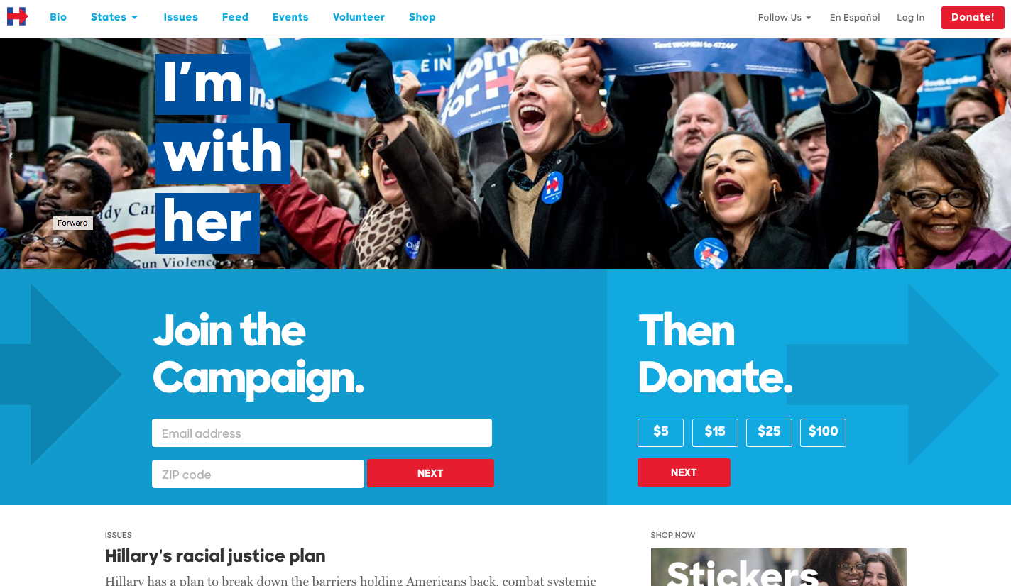
Secretary Clinton’s page is all about the opt-in and, with one of the biggest mailing lists in the campaign, it must be working.
The donate button is clearly differentiated in red in the top right corner of the page and is contrasted nicely with the blue on the rest of the page.
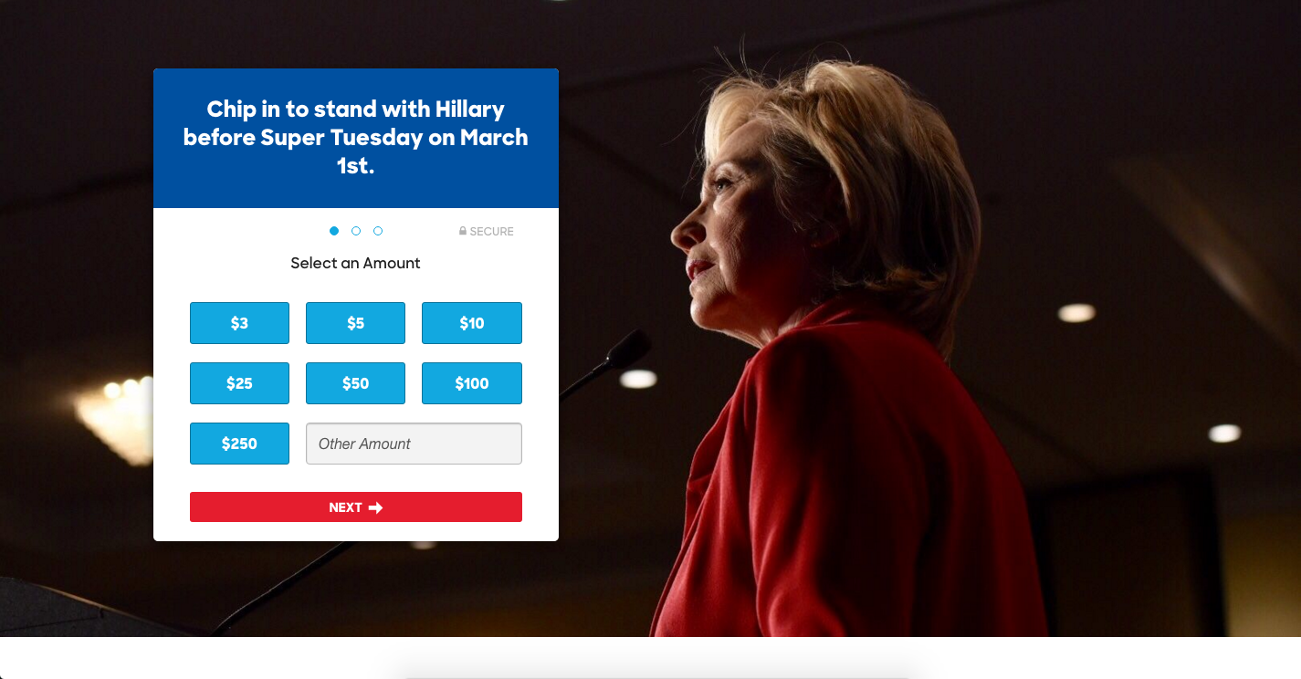
Click through to the donate page and it’s perfect. Clear, three step process, suggested donations and still room to input your own amount should you prefer.
The minimum? $3. The maximum? $250.
Nothing could be simpler.
Like Rubio, this is a clear and simple donation process. There’s a low suggested donation to encourage clicking, and the process is easy to follow with the three ‘bubbles’ on the donation box.
Our Score: 5/5
Get Those Emails
How easy do the campaigns make it to get informed and stay informed?
Or in other words: how easy is it for someone to pass on their email to the campaign?
The way we’ll answer this question is with regards to the number of clicks it takes to find the opt in from the homepage of each candidate. If it’s up front and above the fold? 5 points. Front page and below the fold? 4 points. A click away? 3 points? And anything more than a click away is a 0 – we are meant to be professionals after all, aren’t we?
No surprises here: Clinton, Rubio, and Cruz all earn full points with clear, front page, above the fold opt-ins.
Sanders is running slightly behind with a below the fold opt-in – he gets four points.
Trump, too, has a below the fold opt-in button that triggers a pop up – he gets four points, too.
If you are keeping score so far out running tallies are:
- Clinton and Rubio: 10
- Sanders and Cruz: 8
- Trump: 6
Now onto the policy.
The Devil is in the Details
Each of the candidates takes a different approach to the policy proposal sections of their sites.
Clinton has an extensive issues page with each issue having its own sub-page on the campaign site, too. This is smart work on the part of the candidate as it allows her to go into more detail about each of the issues areas and – from a digital marketing perspective – great for SEO, too. On the downside, the actual issues pages are text heavy so while they are substantial, they might lose all but the most policy driven readers during a primary campaign. Our score: 4/5
Sanders has gone the same route as Clinton with an issues page linking to sub-pages for each of the main campaign issues he is addressing. A criticism here, though, is that instead of using an easy to understand policy header (immigration, education) that can be found when quickly scrolling through the page, Sanders has used less simple keyword phrases (a fair and humane immigration policy, It’s time to make college tuition free and debt free). On the other hand, the individual issue pages use bullet points to make understanding the ideas simple. Our Score: 4/5
Trump has a positions page that works the same way as the issues page of his Democrat rivals, but the choice of ‘positions’ rather than ‘issues’ is fitting and aligns with his leadership pitch. Trump does have fewer positions that Clinton and Sanders, though, with only five positions stated on the page. Each has a simple paragraph summarizing the position with a link to a long, text-heavy explanation of the more complex points. It’s effective, but not as substantial in comparison to Clinton and Sanders. Our Score: 3/5
Rubio has an issue page that takes a different tack to the previously assessed pages. For one thing, it puts pictures front and center as each of the issue and policy positions has a featured image. This is a nice way of identifying the key issues at a glance and a nice break from text-only approaches to policy discussions. Interestingly, Rubio also differentiates between policy and issues, with the former being concrete proposals, and the latter being political positions that Rubio has taken in the past. It’s an effective way of communicating that Rubio has thought about everything important even if, at this stage in the campaign, he has not developed complex proposals to deal with everything on his list. Our Score: 5/5
Finally, Cruz has also gone the Rubio route when it comes to using images on his issues page. He doesn’t have an extensive list of policies, though he has more positions staked out than Trump. Click through to each of the individual issue sub-pages, though, and here Cruz does something that the others have not. Included beneath his plans and some well-chosen images is social proof: he’s linked op-eds, included video of speeches and interviews, and linked to the sorts of things that Rubio has split into the issues section of his site (as opposed to the policy proposals). It’s smart and inspires confidence. Our Score: 5/5
Adding It Up
So who has the best page at this point in the election cycle? Here comes the math:
- Marco Rubio: 15
- Hillary Clinton: 14
- Ted Cruz: 13
- Bernie Sanders: 12
- Donald Trump: 9
Rubio, then, is the winner of this Super Tuesday-week webpage primary. He has best-in-class fundraising opt-ins, email gathering, and policy position pages. Clinton is close behind and out in front on the Democrat side of the ledger. Cruz has some strong game, and Sanders is lagging only a little behind with some strange choices at times. And bringing up the rear is the man who is currently dominating the polls: Donald Trump.
24 Comments
182132 476455Really interesting subject , thanks for posting . 176846
40278 170564Actually fighter messages are supposed to amuse offer praise into the groom and bride. 1st time audio system watching over the top places ought to also remember you see, the senior guideline of the speaking, which is your certain person. finest man speeches brother 587908
71098 86162What a lovely weblog page. I will undoubtedly be back again. Please keep writing! 811122
Sutter Health
Very soon this website will be famous amid all blog users, due
to it’s pleasant articles or reviews
Hi there friends, good paragraph and good arguments commented at this place,
I am actually enjoying by these.
Hey There. I discovered your weblog the use of msn. That is a very well
written article. I will make sure to bookmark it and come back to learn extra of
your helpful information. Thank you for the post.
I’ll certainly return.
786630 327094I conceive this internet site has got some extremely superb info for every person : D. 210088
relaxing sleep music
791972 324963Only a smiling visitant here to share the adore (:, btw great style and style . 501548
This is my first time pay a quick visit at here and i am really happy to read everthing at one place
Definitely what a great blog and instructive posts I definitely will bookmark your site.All the Best!
I like the efforts you have put in this regards for all the great content.
I just like the helpful information you provide in your articles
hello!,I love your writing very so much! share we keep up
a correspondence extra about your article on AOL? I require a
specialist on this house to solve my problem. May be that’s
you! Having a look forward to look you.
959323 394804I enjoy what you guys are usually up too. This kind of clever function and reporting! Keep up the extremely very good works guys Ive added you guys to blogroll. 244267
366709 140283superb post. Neer knew this, appreciate it for letting me know. 277324
Remarkable, I’ve advanced to this stage with this enthralling literature, grateful to the author!
Информационная статья предлагает взвешенный подход к обсуждаемой теме, аргументируя свои выводы доказательствами и статистикой.
Hi, I do believe this is a great blog. I stumbledupon it 😉 I am going to return yet again since i have book marked it. Money and freedom is the best way to change, may you be rich and continue to guide other people.
It’s very trouble-free to find out any matter on web as compared to books, as I found this post at this website.
Я оцениваю фактическую базу, представленную в статье.
Автор статьи предоставляет информацию, подкрепленную надежными источниками, что делает ее достоверной и нейтральной.
Статья охватывает различные аспекты обсуждаемой темы и представляет аргументы с обеих сторон.