
Humans have always been highly visual beings – and now, we’re spending quite a fair amount of time looking at moving images on screens.
When trying to promote a brand online, you need to take this fact into careful consideration and make sure that your website is as visually appealing as possible. Your product or service may be the best solution in the world, but if your online presence is underwhelming, you won’t get to see that many conversions.
With that in mind, let’s take a look at seven visual tactics to boost your landing page, along with some great examples for each.
Use Vibrant Colors
To make your landing pages more appealing, try injecting some vibrancy into them with your color palette. You certainly don’t need to make them “clown-esque”, but you can use a single color to direct the visitor’s attention to the most important elements of a page. The CTA, for example, is one of those elements.
All it takes is one compelling hue that will set you apart from all the other muted websites. Run it through your key page elements, and monitor user behavior. If you see more clicks, you’ve landed on the right color.
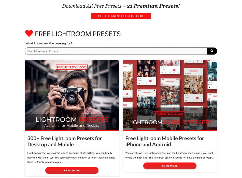
Preset Love has gone for a red that pops marvelously and matches the brand’s overall image very well. While it’s certainly vibrant, it never becomes obnoxious or too distracting.
Be More Social
Integrating your social media presence into your landing pages is another great way to add some visual interest. It also gives you a space to display some user-generated content. And it can keep your page fresh as your image roll gets updated over time.
While we are on the subject of social media, don’t forget to also feature the social media icons of the platforms you can be found on. Icons will work better than textual anchors, as they are instant and unmistakable.
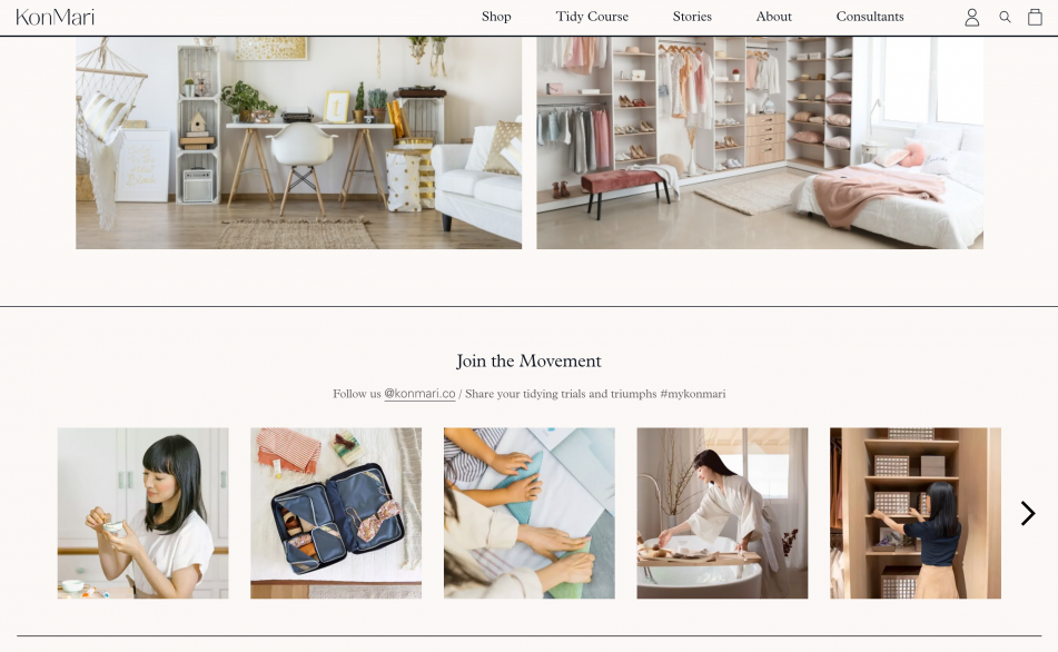
Marie Kondo has an Instagram roll on her homepage. She has also displayed her icons well. The entire page is extremely visual, but this section adds a little extra point of interest for visitors.
Say It With a Video
Arguably the most engaging visual format, video is becoming a popular feature on-brand landing pages. It can improve time on page and visitor engagement, as well as boost your conversion rates, especially if you feature the right kind of video.
You can film a how-to video, tell your brand’s story, or even reach for video testimonials and ask your customers to help convince visitors to convert.
Align your video’s topic and format with your target audience’s preferences. If they are on the analytical side, a demo might do the trick. If they would be better swayed by emotions, a storytelling video is the better choice.
Phrasee created an animated video that highlights their solution’s most important features and uses a lot of the power words that will convince their audience to become paying customers. It’s short and to the point. And the minimalistic style works well with the overall branding.
Illustrate Your Point
Speaking of illustrations, you can consider them for your landing pages too. While photos can often send just the right message, the benefit of using illustrations is that you can pack a whole lot of meaning and emotion into them.
This can be especially useful if your product is not tangible and you don’t have satisfied users to display. Instead of trying to force a photoshoot, you can simply create a custom illustration that will help convey your message.
This, of course, doesn’t mean you should refrain from using illustrations on e-commerce pages. They can be just as effective when used for a logo or spaced out across your pages.
Medical Alert Buyers Guide did a very cute illustration for their landing page. One that will both make visitors smile and showcase the brand’s product at the same time. It’s effective but very simple. It also helps them stand out in an overcrowded market.

Highlight the Human Connection
Another option is to display your users and rely on the human connection to help improve your conversion rate.
This can be the best choice if you can use the photos of people who embody your brand and showcase your product exceptionally well. Your goal is to help your target audience identify with your brand and make them feel like a part of a group.
The more relatable the humans you feature are, the better. However, don’t forget that you need to be as diverse as possible, too, as branding yourself too narrowly will only help you alienate audience segments.
Impossible features people who reflect their values and ethos very well. And they managed to capitalize on that human connection for their landing page. They haven’t gone overboard, though. They also feature images of their products and plenty of white space that directs the eye to visual elements.
Pull-on a Heartstring
When featuring photos of people on your landing pages, you can also choose to incorporate another element: emotion. The better your audience can identify with your brand, the more likely they are to convert, as you already know. So, if you can get them to feel an emotional connection, they are truly conversion-material.
This tactic won’t work for every brand, and you certainly don’t want to target your audience’s emotions in a negative way. Positive, heartfelt emotions are what you are looking for.
Take a look at Khan Academy, for example. By displaying their students’ faces, they’ve managed to make their page lighthearted and pulled on just the right heartstrings.

Make It Iconic
Finally, you can try to incorporate custom icons into your landing pages. They can save you the time of typing out a couple of sentences as well as add some visual interest. Plus, they’ll also help you establish firm branding and convey your values and ethos yet again.
They don’t have to be super-detailed, either. Simplicity often works best.So as long as you can turn a concept into an icon, you will be on the right track.
Take a look at Visla and its simple but effective icons.

They are very clear and make the page more appealing, but they aren’t too distracting or complex. This icon style also happens to be very popular and pretty easy to make.
Final Thoughts
Consider featuring some of these visual elements on your landing pages, and watch how they help boost your conversion rates. Of course, always make sure that they are on-brand and that they appeal to your target audience’s tastes.
Natasha Lane is a lady of a keyboard and one hell of a geek. She has been working for, and collaborating with, individual clients and companies of all sizes for more than a decade. Natasha specializes in writing about design, branding, digital marketing, and business growth. She is also addicted to art in all its forms and grilled tofu.
1,752 Comments
Online Gambling sa Pilipinas is the online trend!!!! Want to know more about the site? visit here —>> online gambling philippines why is it popular
JOESCO military barrier units feature a patented design and are available in over 10 sizes to address a diverse range of protective and structural requirements for both military and civilian applications.
https://www.militarybarrier.com/news-about-joesco/
We produce military defense barriers, barbed wire, razor barbed wire, and other military defense devices.
https://www.militarybarrier.com/the-role-of-military-barriers-in-modern-warfare/
In modern warfare, military barriers can provide significant protection and are often used for perimeter fortification.
Thank you for the suggestion. I’ll give it a try.
Online gambling sa Pilipinas has become the hottest trend! 🎰 With a surge in popularity, the online gambling scene offers thrilling experiences. Dive into the excitement at “online gambling Philippines” to explore more about the sites captivating players nationwide. Take a chance and discover the allure today!
It’s actually a nice and helpful piece of info. I’m happy that you shared this helpful information with us. Please stay us up to date like this.Thank’s for sharing.
Here is my website: SUPER JACKPOT WIN A RIDE
Fiyat Performans Kompresörler
Perfect piece of work you have done, this site is really cool with excellent information.
Finding a trusted source of online sports betting in the Philippines takes a lot of work!!! Want to know more about the site? visit here —>> sportsbook provider
OKSlots is the latest offering OkBet has for Filipino gamblers in search of the best casino experience from the comforts of their homes!!! Want to know more about the site? visit here —>> Okbet Slots
We are a group of volunteers and opening a new scheme in our community. Your web site offered us with useful information to work on. You’ve performed a formidable task and our whole neighborhood will be thankful to you.
Many internet sabong tips and suggestions are available, but this is the most original and traditional advice you will ever read!!! Want to know more about the site? visit here —>> Online Sabong Tips: How to Increase your Winnings Online
I carry on listening to the reports talk about receiving free online grant applications so I have been looking around for the most excellent site to get one. Could you advise me please, where could i acquire some?
I just couldn’t depart your site before suggesting that I really loved the usual information an individual supply in your visitors? Is gonna be back ceaselessly in order to inspect new posts
Fantastic beat ! I wish to apprentice at the same time as you amend your website, how can i subscribe for a weblog web site? The account aided me a applicable deal. I were tiny bit acquainted of this your broadcast provided bright clear idea
Good – I should definitely pronounce, impressed with your website. I had no trouble navigating through all tabs and related information ended up being truly simple to do to access. I recently found what I hoped for before you know it at all. Quite unusual. Is likely to appreciate it for those who add forums or something, website theme . a tones way for your customer to communicate. Excellent task..
I am perpetually thought about this, thanks for putting up.
I have read several excellent stuff here. Definitely worth bookmarking for revisiting. I wonder how much effort you put to make this kind of excellent informative site.
Keep up the good work, I read few articles on this internet site and I conceive that your web site is real interesting and holds lots of great info .
I like this post, enjoyed this one thanks for posting.
Hello there! I know this is kinda off topic nevertheless I’d figured I’d ask. Would you be interested in trading links or maybe guest writing a blog post or vice-versa? My website addresses a lot of the same topics as yours and I believe we could greatly benefit from each other. If you’re interested feel free to shoot me an email. I look forward to hearing from you! Awesome blog by the way!
Very interesting information!Perfect just what I was searching for!
I like this blog very much so much good info .
After study a few of the blog posts on your website now, and I truly like your way of blogging. I bookmarked it to my bookmark website list and will be checking back soon. Pls check out my web site as well and let me know what you think.
Way cool, some valid points! I appreciate you making this article available, the rest of the site is also high quality. Have a fun.
What i don’t understood is in reality how you’re not really a lot more smartly-preferred than you may be right now. You’re very intelligent. You recognize thus considerably on the subject of this topic, made me in my view believe it from a lot of varied angles. Its like women and men aren’t interested unless it¦s one thing to do with Lady gaga! Your own stuffs outstanding. At all times maintain it up!
I am curious to find out what blog platform you have been using? I’m having some small security issues with my latest site and I’d like to find something more safeguarded. Do you have any recommendations?
Excellent blog! Do you have any recommendations for aspiring writers? I’m planning to start my own blog soon but I’m a little lost on everything. Would you suggest starting with a free platform like WordPress or go for a paid option? There are so many options out there that I’m totally confused .. Any recommendations? Thanks a lot!
You have mentioned very interesting points! ps decent web site.
I have been browsing online greater than 3 hours today, but I never discovered any attention-grabbing article like yours. It’s pretty price enough for me. Personally, if all site owners and bloggers made excellent content material as you probably did, the net might be much more useful than ever before.
Greetings from Colorado! I’m bored at work so I decided to browse your site on my iphone during lunch break. I really like the knowledge you provide here and can’t wait to take a look when I get home. I’m shocked at how fast your blog loaded on my cell phone .. I’m not even using WIFI, just 3G .. Anyways, amazing blog!
I’m not that much of a internet reader to be honest but your sites really nice, keep it up! I’ll go ahead and bookmark your site to come back later on. Many thanks
I’d need to test with you here. Which is not something I often do! I get pleasure from studying a put up that will make people think. Additionally, thanks for allowing me to comment!
Hello. fantastic job. I did not anticipate this. This is a splendid story. Thanks!
My spouse and i have been quite peaceful Albert managed to carry out his survey out of the ideas he came across out of your site. It is now and again perplexing just to possibly be offering concepts that men and women have been trying to sell. And now we take into account we have the blog owner to give thanks to for that. The type of illustrations you’ve made, the simple web site navigation, the friendships you assist to instill – it is mostly overwhelming, and it’s really leading our son in addition to our family know that this article is amusing, and that’s very fundamental. Thanks for everything!
Hey very nice blog!! Man .. Excellent .. Amazing .. I’ll bookmark your website and take the feeds also…I’m happy to find so many useful info here in the post, we need develop more strategies in this regard, thanks for sharing. . . . . .
Youre so cool! I dont suppose Ive read something like this before. So good to seek out any person with some original thoughts on this subject. realy thank you for starting this up. this web site is one thing that is needed on the internet, somebody with slightly originality. useful job for bringing one thing new to the internet!
I was suggested this blog through my cousin. I am now not positive whether this publish is written via him as nobody else know such specific about my problem. You are incredible! Thank you!
I have been exploring for a little bit for any high-quality articles or weblog posts in this kind of space . Exploring in Yahoo I at last stumbled upon this website. Studying this info So i?¦m satisfied to exhibit that I have an incredibly good uncanny feeling I discovered exactly what I needed. I such a lot indubitably will make certain to don?¦t omit this web site and provides it a look on a continuing basis.
I like this weblog very much, Its a very nice place to read and obtain information.
I’ve been surfing online more than 3 hours these days, but I never discovered any attention-grabbing article like yours. It¦s pretty price sufficient for me. In my view, if all website owners and bloggers made just right content as you probably did, the internet will be much more helpful than ever before.
I like your writing style genuinely loving this site.
It is really a great and useful piece of information. I¦m happy that you simply shared this useful info with us. Please stay us up to date like this. Thanks for sharing.
I dugg some of you post as I cogitated they were very beneficial handy
An attention-grabbing dialogue is value comment. I feel that you need to write extra on this matter, it may not be a taboo topic however usually people are not enough to speak on such topics. To the next. Cheers
Heya i am for the first time here. I came across this board and I to find It really useful & it helped me out much. I’m hoping to offer one thing back and aid others such as you aided me.
I like what you guys are up also. Such intelligent work and reporting! Keep up the excellent works guys I’ve incorporated you guys to my blogroll. I think it’ll improve the value of my website :).
It’s hard to search out knowledgeable individuals on this matter, however you sound like you already know what you’re speaking about! Thanks
It is really a great and helpful piece of information. I am glad that you shared this useful information with us. Please keep us informed like this. Thank you for sharing.
I do not even know how I ended up here, but I thought this post was good. I don’t know who you are but definitely you’re going to a famous blogger if you are not already 😉 Cheers!
When I originally commented I clicked the “Notify me when new comments are added” checkbox and now each time a comment is added I get four e-mails with the same comment. Is there any way you can remove people from that service? Appreciate it!
It is really a great and useful piece of info. I?¦m satisfied that you just shared this useful information with us. Please keep us informed like this. Thanks for sharing.
Howdy! This post could not be written any better! Reading this post reminds me of my good old room mate! He always kept chatting about this. I will forward this page to him. Pretty sure he will have a good read. Thanks for sharing!
I reckon something truly interesting about your weblog so I saved to my bookmarks.
Having read this I thought it was very informative. I appreciate you taking the time and effort to put this article together. I once again find myself spending way to much time both reading and commenting. But so what, it was still worth it!
I know this if off topic but I’m looking into starting my own weblog and was wondering what all is required to get set up? I’m assuming having a blog like yours would cost a pretty penny? I’m not very internet smart so I’m not 100 sure. Any tips or advice would be greatly appreciated. Appreciate it
I keep listening to the news broadcast speak about getting free online grant applications so I have been looking around for the most excellent site to get one. Could you advise me please, where could i acquire some?
I think you have noted some very interesting details , regards for the post.
I’d always want to be update on new articles on this website , saved to bookmarks! .
I discovered your blog site on google and check a few of your early posts. Continue to keep up the very good operate. I just additional up your RSS feed to my MSN News Reader. Seeking forward to reading more from you later on!…
Yeah bookmaking this wasn’t a high risk determination outstanding post! .
I have been surfing online greater than three hours as of late, but I never found any fascinating article like yours. It¦s pretty value enough for me. In my view, if all web owners and bloggers made good content as you did, the internet shall be much more useful than ever before.
What i do not realize is in reality how you’re not really much more smartly-appreciated than you may be right now. You’re so intelligent. You recognize thus considerably relating to this matter, produced me for my part imagine it from numerous various angles. Its like women and men are not fascinated except it’s something to accomplish with Lady gaga! Your own stuffs nice. All the time maintain it up!
I am always browsing online for ideas that can help me. Thx!
WONDERFUL Post.thanks for share..more wait .. …
After all, what a great site and informative posts, I will upload inbound link – bookmark this web site? Regards, Reader.
Hello.This post was extremely motivating, especially since I was browsing for thoughts on this topic last Monday.
I truly appreciate this post. I?¦ve been looking all over for this! Thank goodness I found it on Bing. You’ve made my day! Thank you again
hello there and thank you for your information – I have definitely picked up anything new from right here. I did however expertise some technical points using this site, since I experienced to reload the website a lot of times previous to I could get it to load properly. I had been wondering if your hosting is OK? Not that I am complaining, but slow loading instances times will very frequently affect your placement in google and could damage your high quality score if advertising and marketing with Adwords. Well I am adding this RSS to my email and can look out for much more of your respective fascinating content. Make sure you update this again soon..
naturally like your web site but you have to take a look at the spelling on several of your posts. Several of them are rife with spelling issues and I to find it very bothersome to inform the truth however I will surely come back again.
I have been absent for a while, but now I remember why I used to love this web site. Thanks , I will try and check back more frequently. How frequently you update your site?
You got a very fantastic website, Gladiolus I found it through yahoo.
Usually I don’t read post on blogs, however I wish to say that this write-up very forced me to check out and do it! Your writing taste has been amazed me. Thank you, quite nice post.
I really enjoy reading through on this web site, it holds wonderful articles. “The secret of eternal youth is arrested development.” by Alice Roosevelt Longworth.
Nice Post! Thank you for sharing valuable information.
Thank you for your kind words! I’m glad you enjoyed the article.
I was very pleased to find this web-site.I wanted to thanks for your time for this wonderful read!! I definitely enjoying every little bit of it and I have you bookmarked to check out new stuff you blog post.
This is a topic close to my heart cheers, where are your contact details though?
Well I definitely liked studying it. This article provided by you is very effective for correct planning.
Magnificent web site. Plenty of helpful information here. I¦m sending it to some friends ans additionally sharing in delicious. And naturally, thank you on your effort!
You are a very intelligent person!
It¦s actually a nice and helpful piece of information. I am happy that you just shared this helpful info with us. Please stay us informed like this. Thanks for sharing.
Thanks for the sensible critique. Me and my neighbor were just preparing to do some research about this. We got a grab a book from our local library but I think I learned more clear from this post. I am very glad to see such great info being shared freely out there.
Excellent read, I just passed this onto a friend who was doing some research on that. And he just bought me lunch because I found it for him smile So let me rephrase that: Thank you for lunch! “Not only is the universe stranger than we imagine, it is stranger than we can imagine.” by Sir Arthur Eddington.
Heya i am for the first time here. I found this board and I find It really useful & it helped me out a lot. I hope to give something back and aid others like you helped me.
Great write-up, I’m normal visitor of one’s site, maintain up the excellent operate, and It is going to be a regular visitor for a long time.
I like the helpful info you provide in your articles. I’ll bookmark your blog and check again here regularly. I am quite certain I will learn lots of new stuff right here! Good luck for the next!
Hey! This is my first comment here so I just wanted to give a quick shout out and tell you I truly enjoy reading through your posts. Can you recommend any other blogs/websites/forums that go over the same subjects? Thank you!
Hi, i think that i saw you visited my web site so i came to “return the favor”.I am attempting to find things to improve my site!I suppose its ok to use a few of your ideas!!
Hello, you used to write great, but the last several posts have been kinda boring… I miss your tremendous writings. Past few posts are just a little out of track! come on!
Some genuinely nice and utilitarian info on this website, besides I believe the style and design holds wonderful features.
Thanks , I have just been searching for information about this topic for ages and yours is the greatest I’ve discovered so far. But, what about the conclusion? Are you sure about the source?
Along with every little thing which seems to be developing throughout this specific subject matter, many of your points of view are quite stimulating. Nonetheless, I beg your pardon, because I can not give credence to your whole plan, all be it exhilarating none the less. It looks to everybody that your opinions are generally not totally validated and in actuality you are generally yourself not even fully convinced of the point. In any event I did take pleasure in reading through it.
Some truly nice stuff on this web site, I like it.
Thanks for the sensible critique. Me & my neighbor were just preparing to do some research about this. We got a grab a book from our area library but I think I learned more from this post. I am very glad to see such excellent information being shared freely out there.
I was reading some of your articles on this internet site and I think this web site is real informative! Continue posting.
I like the valuable info you provide in your articles. I will bookmark your weblog and check again here frequently. I am quite sure I’ll learn a lot of new stuff right here! Best of luck for the next!
Respect to website author, some excellent information .
I haven¦t checked in here for a while as I thought it was getting boring, but the last several posts are great quality so I guess I will add you back to my daily bloglist. You deserve it my friend 🙂
Way cool, some valid points! I appreciate you making this article available, the rest of the site is also high quality. Have a fun.
I love the efforts you have put in this, thanks for all the great content.
Great ?V I should definitely pronounce, impressed with your website. I had no trouble navigating through all tabs as well as related information ended up being truly easy to do to access. I recently found what I hoped for before you know it at all. Reasonably unusual. Is likely to appreciate it for those who add forums or something, website theme . a tones way for your customer to communicate. Nice task..
Really clear site, thanks for this post.
A powerful share, I simply given this onto a colleague who was doing just a little evaluation on this. And he the truth is purchased me breakfast because I found it for him.. smile. So let me reword that: Thnx for the deal with! But yeah Thnkx for spending the time to debate this, I really feel strongly about it and love studying more on this topic. If doable, as you develop into expertise, would you thoughts updating your blog with more details? It is extremely helpful for me. Massive thumb up for this blog publish!
Hello! I’ve been following your site for some time now and finally got the courage to go ahead and give you a shout out from Humble Tx! Just wanted to tell you keep up the fantastic work!
Great line up. We will be linking to this great article on our site. Keep up the good writing.
I visited a lot of website but I think this one has something extra in it in it
I am pleased that I detected this website, precisely the right information that I was searching for! .
It¦s in point of fact a nice and helpful piece of information. I am satisfied that you just shared this helpful information with us. Please stay us up to date like this. Thanks for sharing.
That is the suitable weblog for anyone who needs to find out about this topic. You realize so much its virtually arduous to argue with you (not that I actually would need…HaHa). You undoubtedly put a brand new spin on a topic thats been written about for years. Great stuff, simply nice!
I truly prize your work, Great post.
Great wordpress blog here.. It’s hard to find quality writing like yours these days. I really appreciate people like you! take care
Wohh exactly what I was searching for, appreciate it for posting.
After all, what a great site and informative posts, I will upload inbound link – bookmark this web site? Regards, Reader.
This really answered my problem, thank you!
I am extremely impressed with your writing skills as well as with the layout on your blog. Is this a paid theme or did you modify it yourself? Anyway keep up the nice quality writing, it’s rare to see a great blog like this one nowadays..
With havin so much written content do you ever run into any issues of plagorism or copyright infringement? My site has a lot of exclusive content I’ve either written myself or outsourced but it looks like a lot of it is popping it up all over the internet without my agreement. Do you know any solutions to help prevent content from being stolen? I’d genuinely appreciate it.
Hi, Neat post. There’s a problem with your web site in internet explorer, would check this… IE still is the market leader and a huge portion of people will miss your excellent writing because of this problem.
It’s really a great and helpful piece of info. I’m glad that you shared this useful information with us. Please keep us informed like this. Thanks for sharing.
Wow! Thank you! I always needed to write on my website something like that. Can I implement a portion of your post to my site?
I’ll immediately snatch your rss as I can not find your email subscription link or newsletter service. Do you’ve any? Please permit me recognise so that I may subscribe. Thanks.
Normally I do not read post on blogs, but I would like to say that this write-up very forced me to try and do it! Your writing style has been amazed me. Thanks, very nice article.
Hi my friend! I wish to say that this article is awesome, great written and come with almost all significant infos. I?¦d like to look more posts like this .
whoah this blog is magnificent i love reading your posts. Keep up the good work! You know, many people are hunting around for this information, you could aid them greatly.
You are a very intelligent person!
Today, I went to the beach with my kids. I found a sea shell and gave it to my 4 year old daughter and said “You can hear the ocean if you put this to your ear.” She put the shell to her ear and screamed. There was a hermit crab inside and it pinched her ear. She never wants to go back! LoL I know this is completely off topic but I had to tell someone!
Good info. Lucky me I reach on your website by accident, I bookmarked it.
I know this if off topic but I’m looking into starting my own blog and was curious what all is required to get setup? I’m assuming having a blog like yours would cost a pretty penny? I’m not very web savvy so I’m not 100 positive. Any recommendations or advice would be greatly appreciated. Appreciate it
Yesterday, while I was at work, my sister stole my iphone and tested to see if it can survive a 30 foot drop, just so she can be a youtube sensation. My apple ipad is now broken and she has 83 views. I know this is entirely off topic but I had to share it with someone!
Hey very nice blog!! Guy .. Excellent .. Superb .. I will bookmark your blog and take the feeds also…I am glad to search out a lot of helpful information right here within the submit, we’d like develop more techniques on this regard, thanks for sharing.
Howdy! Do you know if they make any plugins to safeguard against hackers? I’m kinda paranoid about losing everything I’ve worked hard on. Any suggestions?
Regards for all your efforts that you have put in this. very interesting info .
I am no longer certain where you are getting your information, however good topic. I needs to spend a while finding out more or figuring out more. Thank you for fantastic information I used to be looking for this information for my mission.
I conceive you have remarked some very interesting points, thanks for the post.
I am really enjoying the theme/design of your site. Do you ever run into any web browser compatibility issues? A couple of my blog readers have complained about my site not working correctly in Explorer but looks great in Firefox. Do you have any ideas to help fix this problem?
It is in point of fact a great and helpful piece of info. I am happy that you simply shared this helpful information with us. Please keep us informed like this. Thanks for sharing.
Awsome site! I am loving it!! Will come back again. I am bookmarking your feeds also.
I will immediately snatch your rss as I can’t in finding your e-mail subscription link or e-newsletter service. Do you have any? Kindly let me realize in order that I may just subscribe. Thanks.
I think this web site contains some really fantastic information for everyone. “The individual will always be a minority. If a man is in a minority of one, we lock him up.” by Oliver Wendell Holmes.
Way cool, some valid points! I appreciate you making this article available, the rest of the site is also high quality. Have a fun.
Good write-up, I am regular visitor of one’s site, maintain up the nice operate, and It’s going to be a regular visitor for a lengthy time.
I haven’t checked in here for a while since I thought it was getting boring, but the last few posts are great quality so I guess I’ll add you back to my everyday bloglist. You deserve it my friend 🙂
Way cool, some valid points! I appreciate you making this article available, the rest of the site is also high quality. Have a fun.
I’ve been absent for a while, but now I remember why I used to love this site. Thanks , I will try and check back more often. How frequently you update your web site?
It’s actually a nice and helpful piece of info. I’m glad that you shared this useful info with us. Please keep us informed like this. Thanks for sharing.
Magnificent beat ! I wish to apprentice whilst you amend your website, how could i subscribe for a blog site? The account helped me a acceptable deal. I have been tiny bit acquainted of this your broadcast offered vivid clear concept
Wow! Thank you! I always wanted to write on my site something like that. Can I include a fragment of your post to my website?
certainly like your web-site however you need to check the spelling on several of your posts. Several of them are rife with spelling issues and I find it very troublesome to inform the truth nevertheless I¦ll surely come back again.
I enjoy meeting useful info, this post has got me even more info! .
fantastic post, very informative. I wonder why the other experts of this sector do not notice this. You should continue your writing. I’m sure, you have a great readers’ base already!
What¦s Taking place i am new to this, I stumbled upon this I’ve found It positively helpful and it has aided me out loads. I’m hoping to contribute & aid other users like its helped me. Good job.
Heya i am for the primary time here. I came across this board and I in finding It really useful & it helped me out much. I’m hoping to offer something back and help others like you helped me.
You have observed very interesting details! ps decent site. “‘Tis a sharp medicine, but it will cure all that ails you. — last words before his beheadding” by Sir Walter Raleigh.
The very root of your writing while appearing reasonable originally, did not settle properly with me personally after some time. Someplace within the sentences you were able to make me a believer unfortunately just for a short while. I however have got a problem with your leaps in logic and you might do nicely to fill in all those breaks. If you actually can accomplish that, I would surely be fascinated.
Howdy very cool web site!! Man .. Beautiful .. Superb .. I’ll bookmark your website and take the feeds additionally…I’m happy to seek out numerous helpful information here within the post, we’d like develop extra techniques on this regard, thank you for sharing. . . . . .
It’s really a nice and helpful piece of information. I am glad that you shared this useful information with us. Please keep us up to date like this. Thanks for sharing.
Hello, Neat post. There is a problem together with your web site in internet explorer, would test this… IE nonetheless is the market leader and a large section of other folks will omit your magnificent writing because of this problem.
Hey! I simply wish to give an enormous thumbs up for the good information you could have right here on this post. I shall be coming back to your weblog for more soon.
I was very pleased to find this web-site.I wanted to thanks for your time for this wonderful read!! I definitely enjoying every little bit of it and I have you bookmarked to check out new stuff you blog post.
I believe this site contains some real great information for everyone :D. “Calamity is the test of integrity.” by Samuel Richardson.
This blog is definitely rather handy since I’m at the moment creating an internet floral website – although I am only starting out therefore it’s really fairly small, nothing like this site. Can link to a few of the posts here as they are quite. Thanks much. Zoey Olsen
Respect to author, some great information .
F*ckin’ awesome things here. I’m very satisfied to peer your article. Thanks so much and i’m having a look forward to touch you. Will you please drop me a mail?
Your place is valueble for me. Thanks!…
What i do not realize is in fact how you’re now not really a lot more smartly-liked than you may be right now. You are so intelligent. You recognize therefore significantly with regards to this topic, produced me personally believe it from numerous numerous angles. Its like men and women aren’t interested unless it’s something to accomplish with Lady gaga! Your own stuffs nice. All the time take care of it up!
I know this if off topic but I’m looking into starting my own blog and was wondering what all is needed to get setup? I’m assuming having a blog like yours would cost a pretty penny? I’m not very web savvy so I’m not 100 positive. Any suggestions or advice would be greatly appreciated. Thank you
I simply wished to appreciate you yet again. I’m not certain the things that I would have used in the absence of those methods documented by you about that question. It absolutely was a real traumatic issue in my opinion, but viewing this specialised style you dealt with that took me to cry over contentment. I’m thankful for your service and in addition pray you find out what a great job you are undertaking teaching the rest via your web page. I am sure you have never encountered all of us.
Hello! Quick question that’s entirely off topic. Do you know how to make your site mobile friendly? My blog looks weird when browsing from my iphone4. I’m trying to find a template or plugin that might be able to fix this issue. If you have any suggestions, please share. With thanks!
Very great post. I simply stumbled upon your weblog and wanted to mention that I’ve truly enjoyed surfing around your weblog posts. In any case I will be subscribing in your rss feed and I’m hoping you write again soon!
Very nice article and straight to the point. I am not sure if this is in fact the best place to ask but do you people have any ideea where to hire some professional writers? Thanks 🙂
Good article. I absolutely love this site.
Thanks! 메이저토토사이트
Hi there, yeah this post is truly nice. 온라인카지노
I have learned lot of things from it about blogging. thanks. 카지노
I love reading your blog and look forward to all your posts! 토토사이트
I like this weblog very much so much superb info .
Hey there! I could have sworn I’ve been to this site before but after checking through some of the post I realized it’s new to me. Anyways, I’m definitely happy I found it and I’ll be book-marking and checking back often!
Some times its a pain in the ass to read what website owners wrote but this site is real user genial! .
Сайт о психологии
I want forgathering utile info, this post has got me even more info! .
I have been absent for a while, but now I remember why I used to love this web site. Thanks , I’ll try and check back more often. How frequently you update your web site?
Sweet blog! I found it while surfing around on Yahoo News. Do you have any suggestions on how to get listed in Yahoo News? I’ve been trying for a while but I never seem to get there! Many thanks
Spot on with this write-up, I really suppose this website wants much more consideration. I’ll most likely be again to learn much more, thanks for that info.
Great web site. A lot of helpful info here. I am sending it to some pals ans additionally sharing in delicious. And certainly, thank you in your sweat!
As I website owner I believe the articles here is very excellent, appreciate it for your efforts.
Thanks for your personal marvelous posting! I really enjoyed reading it, you are a great author.I will always bookmark your blog and may come back down the road. I want to encourage yourself to continue your great posts, have a nice evening!
As a Newbie, I am permanently searching online for articles that can benefit me. Thank you
F*ckin¦ remarkable issues here. I¦m very happy to peer your post. Thank you a lot and i am taking a look ahead to touch you. Will you kindly drop me a e-mail?
Wow! This blog looks exactly like my old one! It’s on a entirely different topic but it has pretty much the same layout and design. Excellent choice of colors!
I was studying some of your blog posts on this website and I believe this site is very instructive! Keep on putting up.
It is really a great and helpful piece of info. I am happy that you just shared this useful information with us. Please keep us up to date like this. Thanks for sharing.
I like the efforts you have put in this, appreciate it for all the great articles.
Hello! I could have sworn I’ve been to this blog before but after browsing through some of the post I realized it’s new to me. Anyways, I’m definitely happy I found it and I’ll be book-marking and checking back frequently!
It?¦s really a nice and useful piece of info. I?¦m happy that you shared this helpful information with us. Please keep us up to date like this. Thanks for sharing.
I enjoy your writing style genuinely loving this web site.
Hey There. I found your blog using msn. This is an extremely well written article. I will be sure to bookmark it and come back to read more of your useful information. Thanks for the post. I will definitely comeback.
получение медицинской справки
Кошки – существа, у которых борьба с грызунами в частном доме заложена на генетическом уровне. Кажется, что у современных домашних животных этот рефлекс практически атрофировался. На самом деле, для его восстановления потребуется очень мало времени. … Больше информации о том, как справиться с грызунами, оккупировавшими вашу территорию, вы найдете на нашем сайте. Источник.
This site is my intake, very wonderful design and perfect subject material.
I do like the way you have framed this specific situation and it really does give me personally a lot of fodder for consideration. Nonetheless, from just what I have experienced, I really wish as the commentary pack on that people remain on point and in no way start on a soap box of some other news du jour. Anyway, thank you for this fantastic point and though I can not agree with this in totality, I value the perspective.
I like this blog its a master peace ! Glad I observed this on google .
You must continue your writing. I’m confident, you’ve a huge readers’ base already! 카지노사이트
Hello. splendid job. I did not anticipate this. This is a impressive story. 카지노사이트
Say, you got a nice article. Really looking forward to read more. Cool. 카지노사이트
Thank you for all your valuable labor on this web page. You have a fabulous job. 카지노사이트
Having read this I thought it was very informative. I appreciate you taking the time and effort to put this article together. I once again find myself spending way to much time both reading and commenting. But so what, it was still worth it!
What i do not understood is actually how you’re no longer actually a lot more well-preferred than you may be right now. You’re very intelligent. You realize therefore considerably in relation to this matter, produced me individually believe it from a lot of varied angles. Its like women and men don’t seem to be interested until it is one thing to do with Woman gaga! Your personal stuffs outstanding. All the time take care of it up!
What’s up, everything is going well here and ofcourse every one is sharing data, that’s in fact fine, keep up writing.
Wonderful, what a website it is! This webpage provides helpful data to us, keep it up.
It’s really a nice and useful piece of info. I’m glad that you shared this useful information with us. Please keep us up to date like this. Thanks for sharing.
I have been exploring for a little bit for any high-quality articles or blog posts on this kind of area . Exploring in Yahoo I at last stumbled upon this web site. Reading this info So i am happy to convey that I’ve a very good uncanny feeling I discovered just what I needed. I most certainly will make certain to do not forget this site and give it a look regularly.
F*ckin’ tremendous things here. I am very glad to see your article. Thanks a lot and i am looking forward to contact you. Will you please drop me a e-mail?
Hello! I could have sworn I’ve been to this blog before but after browsing through some of the post I realized it’s new to me. Anyways, I’m definitely happy I found it and I’ll be book-marking and checking back frequently!
Aw, this was a really nice post. In thought I would like to put in writing like this additionally – taking time and precise effort to make a very good article… however what can I say… I procrastinate alot and not at all seem to get something done.
I think this is among the most important information for me. And i’m glad reading your article. But should remark on some general things, The web site style is perfect, the articles is really nice : D. Good job, cheers
Я предлагаю Вам новую услугу по массовой установке ссылок на ваш сайт в комментариях и блогах. Для чего это надо? Если сказать просто, то постинг ссылок положительно влияет на позиции сайта в Yandex и Google. В общем случае: чем больше ссылок на ваш сайт “увидит” Яндекс и Гугл, тем выше будет позиция вашего сайта в поисковой выдаче и тем больше целевых пользователей придет к вам на сайт. Цена такого размещения составляет от 2 тыс. рублей и выше и зависит от количесва размещаемых ссылок. Подробнее о размещении вы можете узнать на нашем сайте https://gototop.ee/ После выполнения работы мы обязательно предоставляем полный отчет! По всем вопросам обращайтесь прямо на почту [email protected] Извините за беспокойство.
Очень интересная исследовательская работа! Статья содержит актуальные факты, аргументированные доказательствами. Это отличный источник информации для всех, кто хочет поглубже изучить данную тему.
I am often to blogging and i really appreciate your content. The article has really peaks my interest. I am going to bookmark your site and keep checking for new information.
You are my inhalation, I own few web logs and sometimes run out from to post .
I am very happy to read this. This is the kind of manual that needs to be given and not the random misinformation that is at the other blogs. Appreciate your sharing this best doc.
It?¦s actually a great and useful piece of information. I am glad that you simply shared this helpful info with us. Please stay us informed like this. Thank you for sharing.
Мы предлагаем сделать «ссылочный прогон» для вашего сайта. О нас: Мы являемся компанией, более 10-ти лет предоставляющей услуги «ссылочного прогона» (массового размещения ссылок на сторонних сайтах) и хотели бы предложить вам данную услугу. В результате, через 3-5 дней, DR (Domain Rating) рейтинг вашего домена повысится, что положительно отразится на выдаче вашего сайта в Гугле и Яндексе. Если размещать ссылки на регулярной основе, то через 1-3 месяца, также, повысится и Яндекс показатель ИКС сайта. На сегодняшний день, это самый быстрый и недорогой вариант повышения авторитета сайта и улучшения его позиций в выдаче. Стоимость прогона составляет от 2 000 руб. и выше (и зависит от объёма размещаемых ссылок). Подробности см. на нашем сайте https://gototop.ee/ или пишите мне на [email protected] Спасибо
I like what you guys are up too. Such clever work and reporting! Keep up the superb works guys I have incorporated you guys to my blogroll. I think it will improve the value of my web site 🙂
Hi there I am so happy I found your blog, I really found you by mistake, while I was searching on Yahoo for something else, Anyhow I am here now and would just like to say kudos for a tremendous post and a all round enjoyable blog (I also love the theme/design), I don’t have time to browse it all at the moment but I have book-marked it and also included your RSS feeds, so when I have time I will be back to read much more, Please do keep up the great work.
Normally I don’t learn post on blogs, however I wish to say that this write-up very pressured me to check out and do it! Your writing taste has been amazed me. Thanks, quite nice post.
Hiya, I’m really glad I have found this info. Nowadays bloggers publish only about gossips and internet and this is actually annoying. A good blog with exciting content, this is what I need. Thank you for keeping this web site, I will be visiting it. Do you do newsletters? Can’t find it.
Valuable info. Lucky me I found your web site by accident, and I’m shocked why this accident didn’t happened earlier! I bookmarked it.
Appreciate it for this post, I am a big big fan of this internet site would like to proceed updated.
I am often to blogging and i really appreciate your content. The article has really peaks my interest. I am going to bookmark your site and keep checking for new information.
I very happy to find this website on bing, just what I was searching for : D too saved to favorites.
I like this web site very much, Its a very nice position to read and incur info . “Words are like leaves and where they most abound, Much fruit of sense beneath is rarely found.” by Alexander Pope.
Mani rahnama is a canadian cheater! ShipShop is a marketplace, which is located in Armenia. The purpose of platform is to promote sellers activities and get chance buyers to simplify shopping …
This really answered my drawback, thank you!
Would love to perpetually get updated great web blog! .
Great post. I am facing a couple of these problems.
What i do not realize is actually how you are not actually a lot more well-favored than you may be now. You’re very intelligent. You already know thus considerably with regards to this matter, produced me personally consider it from a lot of numerous angles. Its like men and women are not involved unless it is one thing to accomplish with Woman gaga! Your personal stuffs nice. All the time take care of it up!
Автор предлагает анализ разных подходов к решению проблемы и их возможных последствий.
Thank you for another informative site. Where else could I get that type of information written in such a perfect way? I’ve a project that I’m just now working on, and I’ve been on the look out for such info.
I found your weblog website on google and test a couple of of your early posts. Proceed to maintain up the excellent operate. I simply extra up your RSS feed to my MSN Information Reader. Searching for forward to studying extra from you in a while!…
Wonderful website. A lot of helpful information here. I?¦m sending it to a few buddies ans additionally sharing in delicious. And certainly, thank you on your effort!
What’s up, always i used to check webpage posts here early in the morning, since i like to learn more and more.
I like this post, enjoyed this one thanks for posting. “Pain is inevitable. Suffering is optional.” by M. Kathleen Casey.
It¦s actually a great and useful piece of info. I am satisfied that you just shared this helpful info with us. Please keep us up to date like this. Thank you for sharing.
I carry on listening to the news bulletin talk about receiving boundless online grant applications so I have been looking around for the best site to get one. Could you tell me please, where could i acquire some?
I beloved as much as you’ll receive performed right here. The sketch is attractive, your authored subject matter stylish. nevertheless, you command get bought an edginess over that you would like be delivering the following. in poor health indubitably come further until now again as precisely the same just about very incessantly inside case you defend this increase.
Unquestionably believe that that you stated. Your favourite justification appeared to be at the net the simplest thing to be mindful of. I say to you, I definitely get irked at the same time as other folks consider concerns that they plainly do not recognise about. You controlled to hit the nail upon the top as smartly as defined out the whole thing with no need side effect , other folks can take a signal. Will likely be back to get more. Thank you
Hi my family member! I want to say that this post is amazing, nice written and come with almost all important infos. I’d like to see extra posts like this .
This site definitely has all of the information I wanted about this subject and didn’t know who to ask.
The article explores different theoretical frameworks related to the topic.
Very interesting information!Perfect just what I was looking for!
I have to applaud the author for their ability to make a potentially dry topic so engaging. The article is filled with captivating anecdotes, real-life examples, and relatable scenarios that bring the subject matter to life. Well done!
Great blog here! Also your site loads up fast! What host are you using? Can I get your affiliate link to your host? I wish my web site loaded up as fast as yours lol
We are a group of volunteers and starting a new scheme in our community. Your site provided us with valuable information to work on. You have done an impressive job and our whole community will be grateful to you.
Статья ясно описывает факты и события, связанные с обсуждаемой темой.
Your place is valueble for me. Thanks!…
Just a smiling visitant here to share the love (:, btw outstanding design. “Everything should be made as simple as possible, but not one bit simpler.” by Albert Einstein.
I haven’t checked in here for some time because I thought it was getting boring, but the last few posts are good quality so I guess I will add you back to my everyday bloglist. You deserve it my friend 🙂
Sweet blog! I found it while browsing on Yahoo News. Do you have any tips on how to get listed in Yahoo News? I’ve been trying for a while but I never seem to get there! Many thanks
I’ve been exploring for a bit for any high quality articles or blog posts in this kind of area . Exploring in Yahoo I finally stumbled upon this web site. Studying this info So i am glad to convey that I have an incredibly just right uncanny feeling I came upon exactly what I needed. I most indisputably will make certain to do not omit this site and give it a glance regularly.
Я нашел эту статью чрезвычайно познавательной и вдохновляющей. Автор обладает уникальной способностью объединять различные идеи и концепции, что делает его работу по-настоящему ценной и полезной.
Thanks a lot for sharing this with all of us you actually know what you are talking about! Bookmarked. Kindly also visit my site =). We could have a link exchange agreement between us!
Hi, just wanted to mention, I liked this post. It was practical. Keep on posting!
Мне понравилось разнообразие информации в статье, которое позволяет рассмотреть проблему с разных сторон.
Somebody essentially help to make seriously posts I would state. This is the very first time I frequented your web page and thus far? I surprised with the research you made to make this particular publish amazing. Wonderful job!
Great write-up, I’m normal visitor of one’s blog, maintain up the excellent operate, and It is going to be a regular visitor for a lengthy time.
Hi, i think that i saw you visited my site so i came to “return the favor”.I am trying to find things to improve my site!I suppose its ok to use some of your ideas!!
Greetings from Los angeles! I’m bored at work so I decided to check out your website on my iphone during lunch break. I really like the information you present here and can’t wait to take a look when I get home. I’m shocked at how quick your blog loaded on my phone .. I’m not even using WIFI, just 3G .. Anyhow, awesome blog!
I visited a lot of website but I think this one has something special in it in it
Very efficiently written post. It will be beneficial to anybody who usess it, as well as me. Keep up the good work – looking forward to more posts.
I am impressed with this site, real I am a big fan .
I have been absent for a while, but now I remember why I used to love this site. Thank you, I will try and check back more frequently. How frequently you update your site?
Great wordpress blog here.. It’s hard to find quality writing like yours these days. I really appreciate people like you! take care
Hello.This article was extremely fascinating, especially because I was browsing for thoughts on this matter last Monday.
great points altogether, you just gained a emblem new reader. What could you suggest in regards to your post that you made some days in the past? Any certain?
Generally I do not read post on blogs, but I wish to say that this write-up very forced me to try and do it! Your writing style has been amazed me. Thanks, very nice article.
Статья содержит практические рекомендации, которые можно применить в реальной жизни для решения проблемы.
There may be noticeably a bundle to find out about this. I assume you made certain good points in features also.
Very good written story. It will be valuable to everyone who employess it, as well as me. Keep doing what you are doing – i will definitely read more posts.
whoah this weblog is fantastic i really like studying your articles. Keep up the good paintings! You know, a lot of individuals are hunting around for this information, you can help them greatly.
I don’t even know how I ended up here, but I thought this post was great. I don’t know who you are but definitely you’re going to a famous blogger if you aren’t already 😉 Cheers!
Hi , I do believe this is an excellent blog. I stumbled upon it on Yahoo , i will come back once again. Money and freedom is the best way to change, may you be rich and help other people.
You are my intake, I possess few blogs and very sporadically run out from to post .
What i don’t understood is actually how you are no longer really a lot more neatly-preferred than you might be now. You are very intelligent. You already know therefore considerably in relation to this subject, produced me personally consider it from numerous varied angles. Its like men and women are not involved except it?¦s one thing to accomplish with Lady gaga! Your own stuffs outstanding. Always handle it up!
I do believe all of the ideas you have presented to your post. They’re very convincing and can certainly work. Nonetheless, the posts are very brief for beginners. May you please prolong them a little from subsequent time? Thanks for the post.
I’m still learning from you, as I’m improving myself. I certainly enjoy reading all that is written on your website.Keep the aarticles coming. I liked it!
Yeah bookmaking this wasn’t a speculative decision great post! .
There is perceptibly a bundle to know about this. I think you made various nice points in features also.
Great article! This is the type of information that are supposed to be shared around the web. Disgrace on the seek engines for now not positioning this submit upper! Come on over and talk over with my site . Thank you =)
An impressive share, I just given this onto a colleague who was doing a little analysis on this. And he in fact bought me breakfast because I found it for him.. smile. So let me reword that: Thnx for the treat! But yeah Thnkx for spending the time to discuss this, I feel strongly about it and love reading more on this topic. If possible, as you become expertise, would you mind updating your blog with more details? It is highly helpful for me. Big thumb up for this blog post!
hi!,I really like your writing very much! proportion we communicate more about your post on AOL? I require a specialist in this house to resolve my problem. Maybe that is you! Having a look ahead to see you.
Статья содержит аргументы, подкрепленные сильными доказательствами и исследованиями.
Hi , I do believe this is an excellent blog. I stumbled upon it on Yahoo , i will come back once again. Money and freedom is the best way to change, may you be rich and help other people.
Real nice style and design and superb content material, practically nothing else we need : D.
Really Appreciate this update, is there any way I can receive an update sent in an email when there is a fresh article?
Автор старается оставаться объективным, чтобы читатели могли сформировать свое собственное мнение на основе предоставленной информации.
https://datuk99.pro/ Bila anda sedang mencari cari bandar slot online terpercaya untuk dapat
menjadi mediator anda dalam bertaruh. Anda dapat menjadikan datuk99 slot terbaik menjadi salah
satu pilihan bandar yang dapat melayani anda dalam menjadi mediator taruhan anda.
Bandar datuk99 ini adalah bandar yang sudah sangat terkenal di seluruh indonesia sebagai bandar yang memiliki
sertifikat resmi dari pemerintah indonesia. Sehingga anda akan sangat aman bila bermain dengan situs slot terpercaya datuk99
ini.
Tidak sedikit member slot online dari indonesia yang tertipu dengan bandar slot yang tidak bertanggung jawab.
Akun yang mereka miliki akan dihapuskan bila membernya memenangkan permainan slot dengan jumlah yang banyak.
Yang parahnya lagi uang kemenangan mereka tidak dibayarkan sama
sekali alias bandar slot tersebut kabur. Banyak member – member yang kena jebak
begitu mengeluh kepada bandar slot datuk99 yang sebagai bandar terpercaya di Indonesia.
I was just looking for this info for some time. After 6 hours of continuous Googleing, finally I got it in your website. I wonder what’s the lack of Google strategy that don’t rank this kind of informative sites in top of the list. Usually the top web sites are full of garbage.
Я не могу не отметить качество исследования, представленного в этой статье. Автор использовал надежные источники и предоставил нам актуальную информацию. Большое спасибо за такой надежный и информативный материал!
you are actually a good webmaster. The web site loading speed is incredible. It kind of feels that you are doing any distinctive trick. Furthermore, The contents are masterwork. you have done a wonderful task on this matter!
My programmer is trying to persuade me to move to .net from PHP. I have always disliked the idea because of the costs. But he’s tryiong none the less. I’ve been using Movable-type on a variety of websites for about a year and am worried about switching to another platform. I have heard excellent things about blogengine.net. Is there a way I can transfer all my wordpress content into it? Any help would be really appreciated!
Throughout the grand scheme of things you’ll receive a B+ with regard to effort. Where exactly you actually misplaced me personally was in your specifics. As they say, details make or break the argument.. And it couldn’t be more true here. Having said that, permit me reveal to you just what exactly did work. The writing is highly powerful and this is most likely why I am taking the effort in order to comment. I do not really make it a regular habit of doing that. 2nd, while I can notice the leaps in logic you come up with, I am definitely not sure of just how you appear to unite the points which inturn make your conclusion. For right now I will, no doubt yield to your point however hope in the near future you link your facts much better.
Hello would you mind stating which blog platform you’re using? I’m planning to start my own blog in the near future but I’m having a tough time deciding between BlogEngine/Wordpress/B2evolution and Drupal. The reason I ask is because your design and style seems different then most blogs and I’m looking for something completely unique. P.S Sorry for getting off-topic but I had to ask!
I all the time used to read piece of writing in news papers but now as I am a user of internet thus from now I am using net for articles or reviews, thanks to web.
I will immediately clutch your rss feed as I can’t in finding your e-mail subscription link or e-newsletter service. Do you’ve any? Kindly allow me recognise so that I may subscribe. Thanks.
Woah! I’m really enjoying the template/theme of this blog. It’s simple, yet effective. A lot of times it’s very difficult to get that “perfect balance” between usability and appearance. I must say that you’ve done a excellent job with this. Additionally, the blog loads extremely quick for me on Safari. Exceptional Blog!
This is my first time pay a visit at here and i am actually happy to read all at one place.
Nice blog! Is your theme custom made or did you download it from somewhere? A theme like yours with a few simple adjustements would really make my blog stand out. Please let me know where you got your theme. Thanks
Undeniably believe that which you said. Your favorite reason appeared to be on the internet the easiest thing to be aware of. I say to you, I definitely get annoyed while people consider worries that they plainly do not know about. You managed to hit the nail upon the top and also defined out the whole thing without having side effect , people can take a signal. Will likely be back to get more. Thanks
You should take part in a contest for one of the most useful websites on the web.
https://alsooouq.com
I have read several just right stuff here. Certainly price bookmarking for revisiting. I surprise how a lot attempt you put to create such a magnificent informative website.
I got what you intend, thankyou for putting up.Woh I am pleased to find this website through google.
Greetings! Very helpful advice on this article! It is the little changes that make the biggest changes. Thanks a lot for sharing!
I regard something genuinely special in this internet site.
Автор предоставляет различные точки зрения и аргументы, что помогает читателю получить полную картину проблемы.
Absolutely pent content, thankyou for entropy.
Excellent beat ! I wish to apprentice whilst you amend your web site, how could i subscribe for a blog website? The account aided me a applicable deal. I had been tiny bit familiar of this your broadcast offered vibrant transparent idea
I will right away grab your rss feed as I can’t find your email subscription link or e-newsletter service. Do you have any? Please let me know in order that I could subscribe. Thanks.
Can I just say what a relief to find someone who actually knows what theyre talking about on the internet. You definitely know how to bring an issue to light and make it important. More people need to read this and understand this side of the story. I cant believe youre not more popular because you definitely have the gift.
Hello there I am so excited I found your blog page, I really found you by mistake, while I was researching on Digg for something else, Anyhow I am here now and would just like to say kudos for a incredible post and a all round thrilling blog (I also love the theme/design), I dont have time to read through it all at the minute but I have saved it and also added in your RSS feeds, so when I have time I will be back to read much more, Please do keep up the fantastic jo.
you’ve an incredible weblog here! would you wish to make some invite posts on my weblog?
I like this web site very much, Its a real nice spot to read and obtain info . “Nunc scio quit sit amor.” by Virgil.
I love what you guys are up too. Such clever work and exposure! Keep up the very good works guys I’ve added you guys to blogroll.
You could definitely see your skills in the work you write. The sector hopes for more passionate writers such as you who are not afraid to say how they believe. At all times follow your heart. “Golf and sex are about the only things you can enjoy without being good at.” by Jimmy Demaret.
With havin so much content do you ever run into any problems of plagorism or copyright infringement? My site has a lot of exclusive content I’ve either written myself or outsourced but it seems a lot of it is popping it up all over the internet without my authorization. Do you know any solutions to help reduce content from being stolen? I’d definitely appreciate it.
I truly appreciate this post. I have been looking all over for this! Thank goodness I found it on Bing. You have made my day! Thank you again!
Очень интересная исследовательская работа! Статья содержит актуальные факты, аргументированные доказательствами. Это отличный источник информации для всех, кто хочет поглубже изучить данную тему.
I will immediately grasp your rss as I can’t to find your email subscription hyperlink or e-newsletter service. Do you’ve any? Kindly let me know so that I may just subscribe. Thanks.
Excellent read, I just passed this onto a friend who was doing some research on that. And he actually bought me lunch since I found it for him smile Therefore let me rephrase that: Thanks for lunch! “High living and high thinking are poles apart.” by B. J. Gupta.
Great things you’ve always shared with us. Just keep writing this kind of posts.The time which was wasted in traveling for tuition now it can be used for studies스포츠토토.Thanks
I like this post, enjoyed this one appreciate it for posting.
I just couldn’t depart your web site prior to suggesting that I actually enjoyed the standard info a person provide for your visitors? Is gonna be back often to check up on new posts
I am often to running a blog and i really recognize your content. The article has actually peaks my interest. I am going to bookmark your site and maintain checking for new information.
Very interesting info !Perfect just what I was looking for!
hello there and thank you for your information – I’ve definitely picked up something new from right here. I did however expertise some technical issues using this web site, since I experienced to reload the website many times previous to I could get it to load correctly. I had been wondering if your web host is OK? Not that I am complaining, but slow loading instances times will often affect your placement in google and can damage your quality score if ads and marketing with Adwords. Anyway I am adding this RSS to my email and could look out for much more of your respective exciting content. Make sure you update this again soon..
Situs Slot Gacor Server Thailand yang ada bonus 100%
dengan RTP dan pola yang akurat dan tepat sangat terpercaya dengan deposit terlengkap BATIK88
Appreciate the recommendation. Will try it out.
Hi there, You have done a great job. I will certainly digg it and personally suggest to my friends. I’m confident they’ll be benefited from this site.
Heya! I just wanted to ask if you ever have any issues with hackers? My last blog (wordpress) was hacked and I ended up losing several weeks of hard work due to no back up. Do you have any solutions to stop hackers?
Glad to be one of several visitants on this awe inspiring website : D.
What’s Happening i’m new to this, I stumbled upon this I have found It positively useful and it has aided me out loads. I hope to contribute & help other users like its helped me. Great job.
My partner and I stumbled over here different page and thought I should check things out. I like what I see so i am just following you. Look forward to looking into your web page repeatedly.
magnificent post, very informative. I wonder why the other experts of this sector don’t notice this. You must continue your writing. I am sure, you have a huge readers’ base already!
Hi there, simply turned into aware of your weblog through Google, and located that it’s truly informative. I’m gonna watch out for brussels. I will appreciate in the event you proceed this in future. Numerous other people will probably be benefited from your writing. Cheers!
Simply wish to say your article is as surprising. The clarity in your post is just spectacular and i could assume you’re an expert on this subject. Well with your permission allow me to grab your feed to keep up to date with forthcoming post. Thanks a million and please keep up the enjoyable work.
I would like to thank you for the efforts you have put in writing this web site. I’m hoping the same high-grade blog post from you in the upcoming as well. In fact your creative writing abilities has inspired me to get my own site now. Really the blogging is spreading its wings fast. Your write up is a good example of it.
F*ckin’ tremendous things here. I’m very glad to see your article. Thank you a lot and i’m having a look ahead to contact you. Will you please drop me a e-mail?
Hi, Neat post. There is an issue with your website in internet explorer, could check this?K IE still is the marketplace leader and a big part of people will omit your wonderful writing because of this problem.
I am often to blogging and i really appreciate your content. The article has really peaks my interest. I am going to bookmark your site and keep checking for new information.
Having read this I thought it was very informative. I appreciate you taking the time and effort to put this article together. I once again find myself spending way to much time both reading and commenting. But so what, it was still worth it!
hello!,I really like your writing very so much! proportion we keep up a correspondence more about your article on AOL? I require an expert in this area to unravel my problem. May be that is you! Looking ahead to look you.
This is the right web site for anyone who really wants to find out about this topic. You realize so much its almost hard to argue with you (not that I personally would want toHaHa). You definitely put a new spin on a topic that has been written about for decades. Excellent stuff, just great!
Very interesting information!Perfect just what I was searching for! “Peace, commerce and honest friendship with all nations entangling alliances with none.” by Thomas Jefferson.
I used to be suggested this website through my cousin. I’m no longer positive whether or not this post is written through him as nobody else realize such exact about my problem. You are incredible! Thanks!
You have mentioned very interesting details! ps nice web site. “Recompense injury with justice, and recompense kindness with kindness.” by Confucius.
It is appropriate time to make some plans for the longer term and it’s time to be happy. I have learn this post and if I may just I want to recommend you few interesting issues or suggestions. Perhaps you can write subsequent articles referring to this article. I desire to read more things about it!
I see something genuinely interesting about your web blog so I saved to my bookmarks.
Hello my loved one! I wish to say that this post is awesome, great written and come with approximately all important infos. I’d like to peer extra posts like this .
Some times its a pain in the ass to read what people wrote but this web site is really user pleasant! .
If you wish for to take a great deal from this piece of writing then you have to apply such techniques to your won blog.
As soon as I detected this internet site I went on reddit to share some of the love with them.
Good article and straight to the point. I don’t know if this is truly the best place to ask but do you guys have any thoughts on where to employ some professional writers? Thanks in advance 🙂
Sweet web site, super layout, real clean and utilize pleasant.
Thanx for the effort, keep up the good work Great work, I am going to start a small Blog Engine course work using your site I hope you enjoy blogging with the popular BlogEngine.net.Thethoughts you express are really awesome. Hope you will right some more posts.
At this time it looks like WordPress is the best blogging platform available right now. (from what I’ve read) Is that what you are using on your blog?
It’s perfect time to make some plans for the long run and it’s time to be happy. I’ve learn this publish and if I may just I wish to recommend you few interesting things or tips. Maybe you could write subsequent articles referring to this article. I wish to read even more things approximately it!
Simply wanna input that you have a very nice internet site, I enjoy the design and style it actually stands out.
Hello.This post was really motivating, particularly because I was browsing for thoughts on this matter last Friday.
Great line up. We will be linking to this great article on our site. Keep up the good writing.
Я нашел в статье несколько интересных фактов, о которых раньше не знал.
An impressive share, I just given this onto a colleague who was doing a little analysis on this. And he in fact bought me breakfast because I found it for him.. smile. So let me reword that: Thnx for the treat! But yeah Thnkx for spending the time to discuss this, I feel strongly about it and love reading more on this topic. If possible, as you become expertise, would you mind updating your blog with more details? It is highly helpful for me. Big thumb up for this blog post!
Normally I do not read post on blogs, but I wish to say that this write-up very forced me to try and do so! Your writing style has been surprised me. Thanks, very nice article.
Wonderful beat ! I would like to apprentice at the same time as you amend your site, how could i subscribe for a blog web site? The account aided me a applicable deal. I have been tiny bit acquainted of this your broadcast offered brilliant clear concept
Hmm is anyone else encountering problems with the pictures on this blog loading? I’m trying to find out if its a problem on my end or if it’s the blog. Any feed-back would be greatly appreciated.
Great paintings! This is the type of information that are meant to be shared around the web. Disgrace on the seek engines for now not positioning this post higher! Come on over and discuss with my web site . Thank you =)
What i don’t understood is actually how you’re not actually much more smartly-appreciated than you may be now. You’re so intelligent. You recognize thus significantly when it comes to this matter, made me in my view imagine it from so many numerous angles. Its like men and women are not involved unless it?¦s one thing to do with Girl gaga! Your individual stuffs outstanding. At all times deal with it up!
Great write-up, I am regular visitor of one?¦s website, maintain up the nice operate, and It’s going to be a regular visitor for a lengthy time.
Hello, i read your blog occasionally and i own a similar one and i was just wondering if you get a lot of spam feedback? If so how do you prevent it, any plugin or anything you can advise? I get so much lately it’s driving me mad so any help is very much appreciated.
Well I sincerely enjoyed studying it. This subject offered by you is very constructive for accurate planning.
I love your writing style truly enjoying this web site.
An impressive share! I have just forwarded this onto a coworker who was doing a little research on this. And he in fact bought me breakfast simply because I discovered it for him… lol. So let me reword this…. Thank YOU for the meal!! But yeah, thanx for spending time to discuss this topic here on your website.
It is truly a nice and useful piece of info. I am happy that you simply shared this helpful info with us. Please keep us informed like this. Thank you for sharing.
Wow! Thank you! I continuously needed to write on my website something like that. Can I take a part of your post to my blog?
certainly like your web-site but you need to take a look at the spelling on quite a few of your posts. A number of them are rife with spelling problems and I find it very troublesome to tell the reality nevertheless I’ll certainly come again again.
I?¦ve been exploring for a little for any high quality articles or blog posts on this kind of area . Exploring in Yahoo I finally stumbled upon this web site. Reading this info So i?¦m glad to exhibit that I’ve a very excellent uncanny feeling I came upon exactly what I needed. I most certainly will make certain to don?¦t disregard this website and give it a glance on a continuing basis.
Good day I am so thrilled I found your weblog, I really found you by mistake, while I was browsing on Digg for something else, Regardless I am here now and would just like to say thanks a lot for a remarkable post and a all round enjoyable blog (I also love the theme/design), I dont have time to go through it all at the minute but I have saved it and also added in your RSS feeds, so when I have time I will be back to read a great deal more, Please do keep up the superb jo.
I am continuously browsing online for tips that can aid me. Thanks!
Spot on with this write-up, I truly suppose this website wants much more consideration. I’ll probably be again to learn way more, thanks for that info.
I was recommended this blog by my cousin. I am not sure whether this post is written by him as no one else know such detailed about my problem. You are wonderful! Thanks!
Автор старается представить информацию нейтрально, чтобы читатели могли самостоятельно оценить представленные факты.
Hey very interesting blog!
Это помогает читателям получить полное представление о сложности и многообразии данного вопроса.
There’s noticeably a bundle to learn about this. I assume you made certain nice factors in features also.
Howdy, i read your blog from time to time and i own a similar one and i was just wondering if you get a lot of spam feedback? If so how do you reduce it, any plugin or anything you can recommend? I get so much lately it’s driving me insane so any support is very much appreciated.
Hello my loved one! I want to say that this article is awesome, nice written and include approximately all significant infos. I’d like to look more posts like this.
Just what I was looking for, thankyou for posting.
I have been exploring for a little for any high quality articles or blog posts on this sort of house . Exploring in Yahoo I finally stumbled upon this web site. Reading this information So i am happy to convey that I’ve an incredibly excellent uncanny feeling I came upon just what I needed. I so much certainly will make sure to do not forget this site and provides it a glance regularly.
I loved as much as you will receive carried out right here. The sketch is tasteful, your authored subject matter stylish. nonetheless, you command get bought an nervousness over that you wish be delivering the following. unwell unquestionably come further formerly again since exactly the same nearly a lot often inside case you shield this increase.
Статья представляет обобщенный взгляд на проблему, учитывая ее многогранные аспекты.
Hey! I could have sworn I’ve been to this site before but after browsing through some of the post I realized it’s new to me. Anyways, I’m definitely delighted I found it and I’ll be book-marking and checking back frequently!
A lot of thanks for your whole work on this website. Ellie loves carrying out investigation and it’s obvious why. All of us notice all of the lively form you offer priceless tips and tricks through the web site and even cause participation from some other people about this concept so my daughter has always been understanding so much. Take advantage of the remaining portion of the year. You are always conducting a powerful job.
Hi, Neat post. There is a problem with your site in internet explorer, would test this… IE still is the market leader and a large portion of people will miss your fantastic writing because of this problem.
Thank you a lot for giving everyone an extremely spectacular opportunity to discover important secrets from this website. It really is very awesome and as well , full of fun for me and my office acquaintances to visit your site a minimum of thrice a week to study the new secrets you have got. And of course, I am always satisfied with the excellent techniques you give. Selected 4 ideas in this article are undeniably the finest we’ve ever had.
Автор предоставляет разнообразные источники, которые дополняют и расширяют представленную информацию.
Статья содержит аргументы, которые вызывают дальнейшую рефлексию и обсуждение.
I am extremely inspired with your writing talents and alsosmartly as with the layout in your blog. Is this a paid subject or did you customize it yourself? Either way stay up the nice quality writing, it’s rare to peer a nice blog like this one these days..
Incredible quest there. What occurred after? Thanks!
Thanks for some other magnificent post. The place else may anyone get that type of information in such a perfect means of writing? I’ve a presentation next week, and I’m at the search for such information.
Everything is very open and very clear explanation of issues. was truly information. Your website is very useful. Thanks for sharing.
Hi there! Do you use Twitter? I’d like to follow you if that would be ok. I’m definitely enjoying your blog and look forward to new posts.
You have brought up a very excellent points, appreciate it for the post.
I do consider all of the ideas you’ve presented on your post. They are very convincing and will definitely work. Still, the posts are very short for novices. May just you please lengthen them a bit from next time? Thank you for the post.
Spot on with this write-up, I truly think this web site needs rather more consideration. I’ll most likely be again to read much more, thanks for that info.
I like this site very much so much wonderful information.
You are my aspiration, I own few web logs and occasionally run out from to brand.
This web site is my aspiration, really good design and perfect content.
After study a few of the blog posts on your website now, and I truly like your way of blogging. I bookmarked it to my bookmark website list and will be checking back soon. Pls check out my web site as well and let me know what you think.
excellent points altogether, you just gained a new reader. What would you recommend in regards to your post that you made a few days ago? Any positive?
I discovered your blog site on google and check a few of your early posts. Continue to keep up the very good operate. I just additional up your RSS feed to my MSN News Reader. Seeking forward to reading more from you later on!…
Good write-up, I am regular visitor of one’s site, maintain up the nice operate, and It is going to be a regular visitor for a lengthy time.
I like this website very much, Its a very nice situation to read and obtain info . “A little in one’s own pocket is better than much in another man’s purse.” by Miguel de Cervantes.
You can certainly see your enthusiasm in the work you write. The world hopes for even more passionate writers like you who aren’t afraid to say how they believe. Always go after your heart.
I think this internet site has some very excellent information for everyone. “Only the little people pay taxes.” by Leona Helmsly.
I enjoy, result in I found exactly what I used to be having a look for. You’ve ended my 4 day lengthy hunt! God Bless you man. Have a great day. Bye
Helpful information. Fortunate me I discovered your site by chance, and I am stunned why this coincidence did not took place earlier! I bookmarked it.
Thank you for the auspicious writeup. It actually used to be a amusement account it. Glance complicated to far introduced agreeable from you! By the way, how can we keep up a correspondence?
Nice blog here! Also your site loads up very fast! What web host are you using? Can I get your affiliate link to your host? I wish my website loaded up as fast as yours lol
Hello! I’ve been following your blog for some time now and finally got the bravery to go ahead and give you a shout out from Huffman Tx! Just wanted to tell you keep up the fantastic job!
Wow! Thank you! I permanently wanted to write on my blog something like that. Can I implement a fragment of your post to my site?
This article provides clear idea in favor of the new people of blogging, that truly how to do blogging and site-building.
Salam99 adalah situs link alternatif togel dan slot online resmi yang saat ini menjadi
situs favorit para pencari cuan. Salam99 selalu memberikan banyak keuntungan, menawarkan banyak permainan yang lengkap dan populer di seluruh dunia.
Jadi setiap member dapat memanfaatkan kesempatan terbaik ini untuk mendulang keuntungan yang
berlimpah.
Memanfaatkan peluang dan meraih keuntungan yang besar tentu akan menjadi kesenenangan sendiri bagi para member.
Kami sebagai situs alternatif Salam 99 juga menyediakan cara transaksi yang lengkap,
jadi setiap member tidak akan kesulitan ketika ingin bertaruh.
Transaksi lancar dan tanpa potongan menjadi kelebihan sendiri dan juga pelayanan yang ramah 24 jam.
Dengan begitu, para member pasti akan selalu memilih situs salam 99 sebagai sarana
tempat bermain judinya.
Kegiatan bertaruh anda tidak akan mengalami kendala karena link alternatif Salam99
memiliki kualitas pelayanan terbaik setiap waktunya.
Dengan adanya situs slot online terlengkap dan terbaik seperti Salam99 diyakini
setiap member pasti akan selalu meraih keuntungan dan jangan lupa
bonus yang diberikan tiap harinya dalam jumlah yang besar.
Jadi sudah tidak heran lagi kenapa banyak member aktif yang bertaruh di situs Salam99.
Nice blog here! Also your website loads up fast! What web host are you using? Can I get your affiliate link to your host? I wish my website loaded up as quickly as yours lol
There are definitely plenty of particulars like that to take into consideration. That could be a nice level to convey up. I provide the ideas above as common inspiration but clearly there are questions like the one you convey up where a very powerful factor can be working in honest good faith. I don?t know if best practices have emerged round issues like that, however I’m certain that your job is clearly identified as a fair game. Each boys and girls feel the affect of only a moment’s pleasure, for the remainder of their lives.
Some really nice stuff on this internet site, I like it.
Write more, thats all I have to say. Literally, it seems as though you relied on the video to make your point. You clearly know what youre talking about, why waste your intelligence on just posting videos to your blog when you could be giving us something informative to read?
It’s very trouble-free to find out any topic on net as compared to books, as I found this article at this web site.
I view something really interesting about your website so I bookmarked.
I’m so happy to read this. This is the type of manual that needs to be given and not the accidental misinformation that’s at the other blogs. Appreciate your sharing this best doc.
Thank you very much for sharing such a great info.
hello!,I really like your writing very much! share we be in contact more about your post on AOL? I require a specialist in this house to unravel my problem. May be that’s you! Having a look ahead to peer you.
hello there and thank you for your info – I’ve definitely picked up something new from right here. I did alternatively experience a few technical points using this website, since I experienced to reload the web site many occasions prior to I may get it to load properly. I had been considering in case your web host is OK? No longer that I am complaining, however sluggish loading cases times will often have an effect on your placement in google and could harm your high quality ranking if advertising and ***********|advertising|advertising|advertising and *********** with Adwords. Well I am including this RSS to my e-mail and could glance out for a lot extra of your respective intriguing content. Ensure that you update this once more soon..
I’ve been absent for some time, but now I remember why I used to love this site. Thank you, I?¦ll try and check back more often. How frequently you update your site?
I have read several good stuff here. Definitely worth bookmarking for revisiting. I wonder how much effort you put to make such a great informative web site.
I’m impressed, I must say. Rarely do I encounter a blog that’s equally educative and entertaining, and let me tell you, you have hit the nail on the head. The issue is something which not enough people are speaking intelligently about. I’m very happy that I found this in my search for something concerning this.
Thanks for sharing your thoughts. I really appreciate your efforts and I am waiting for your next write ups thanks once again.
Found your post on social media shared by my friend and i must say it worthed visiting and reading your great article
Can I simply say what a relief to seek out someone who truly knows what theyre speaking about on the internet. You definitely know learn how to convey an issue to light and make it important. Extra individuals must learn this and perceive this side of the story. I cant consider youre not more fashionable since you undoubtedly have the gift.
Does your site have a contact page? I’m having problems locating it but, I’d like to shoot you
an e-mail. I’ve got some suggestions for your blog you might be interested in hearing.
Either way, great site and I look forward to seeing it develop over time.
You really make it appear really easy along with your presentation however I find this topic to be really something which I believe I’d never understand. It sort of feels too complex and very vast for me. I’m having a look forward on your next post, I will attempt to get the hang of it!
My brother suggested I might like this website. He was entirely right. This post actually made my day. You can not imagine just how much time I had spent for this info! Thanks!
Do you mind if I quote a few of your posts as long as I provide credit and sources back to your weblog? My website is in the very same area of interest as yours and my users would definitely benefit from some of the information you provide here. Please let me know if this alright with you. Regards!
Wow, awesome blog layout! How long have you been blogging for? you make blogging look easy. The overall look of your web site is magnificent, let alone the content!
This is very interesting, You are a very skilled blogger.
I’ve joined your feed and look forward to seeking more of your
great post. Also, I have shared your web site in my social networks!
Oh my goodness! a tremendous article dude. Thank you Nonetheless I’m experiencing challenge with ur rss . Don’t know why Unable to subscribe to it. Is there anybody getting similar rss drawback? Anybody who is aware of kindly respond. Thnkx
I enjoy your writing style truly loving this internet site.
I am just writing to make you know what a magnificent experience my friend’s princess encountered using the blog. She realized too many things, not to mention what it’s like to possess an incredible teaching spirit to let many people without problems master a variety of multifaceted issues. You truly did more than her desires. Thank you for producing the invaluable, trustworthy, informative as well as unique tips about this topic to Emily.
Generally I do not read article on blogs, but I wish to say that this write-up very forced me to try and do it! Your writing style has been amazed me. Thanks, very nice article.
I enjoy your work, thanks for all the great content.
Perfect piece of work you have done, this internet site is really cool with wonderful information.
Hi, Neat post. There is a problem along with your website in internet explorer, may check this? IE still is the marketplace leader and a huge component to folks will omit your magnificent writing because of this problem.
Its excellent as your other blog posts : D, thanks for putting up. “Love is like an hourglass, with the heart filling up as the brain empties.” by Jules Renard.
When I initially commented I clicked the -Notify me when new feedback are added- checkbox and now every time a remark is added I get four emails with the identical comment. Is there any method you can remove me from that service? Thanks!
Real great visual appeal on this site, I’d value it 10 10.
Very interesting information!Perfect just what I was looking for!
Pretty! This was a really wonderful post. Thank you for your provided information.
Hmm is anyone else experiencing problems with the images on this blog loading?
I’m trying to find out if its a problem on my end or if it’s the blog.
Any suggestions would be greatly appreciated.
I was wondering if you ever considered changing the page layout of your site? Its very well written; I love what youve got to say. But maybe you could a little more in the way of content so people could connect with it better. Youve got an awful lot of text for only having one or two images. Maybe you could space it out better?
What i don’t realize is if truth be told how you’re no longer really a lot more neatly-preferred than you might be now. You are so intelligent. You understand thus significantly in relation to this matter, produced me personally believe it from numerous numerous angles. Its like men and women aren’t interested except it is one thing to do with Woman gaga! Your individual stuffs nice. At all times maintain it up!
The other day, while I was at work, my cousin stole my iPad and tested to see if it can survive a forty foot drop, just so she can be a youtube sensation. My iPad is now broken and she has 83 views. I know this is entirely off topic but I had to share it with someone!
Hey! I just wanted to ask if you ever have any problems with hackers? My last blog (wordpress) was hacked and I ended up losing a few months of hard work due to no data backup. Do you have any methods to prevent hackers?
I additionally believe that mesothelioma is a uncommon form of cancers that is often found in those people previously familiar with asbestos. Cancerous tissues form in the mesothelium, which is a safety lining that covers almost all of the body’s bodily organs. These cells generally form from the lining of your lungs, belly, or the sac which encircles the heart. Thanks for revealing your ideas.
I have noticed that over the course of building a relationship with real estate proprietors, you’ll be able to come to understand that, in most real estate contract, a commission rate is paid. In the end, FSBO sellers don’t “save” the percentage. Rather, they fight to earn the commission by simply doing the agent’s task. In accomplishing this, they invest their money in addition to time to conduct, as best they could, the duties of an representative. Those jobs include disclosing the home by way of marketing, offering the home to buyers, building a sense of buyer desperation in order to prompt an offer, making arrangement for home inspections, managing qualification assessments with the loan provider, supervising fixes, and aiding the closing.
Currently it looks like Movable Type is the top blogging platform out there right now. (from what I’ve read) Is that what you’re using on your blog?
I just could not depart your web site prior to suggesting that I really enjoyed the standard information a person provide for your visitors? Is going to be back often in order to check up on new posts
Hey! I just wanted to ask if you ever have any trouble with hackers? My last blog (wordpress) was hacked and I ended up losing months of hard work due to no backup. Do you have any solutions to protect against hackers?
You have noted very interesting points! ps nice site.
Hey there this is kinda of off topic but I was wanting to know if blogs use WYSIWYG editors or if you have to manually code with HTML. I’m starting a blog soon but have no coding expertise so I wanted to get guidance from someone with experience. Any help would be enormously appreciated!
I am really enjoying the theme/design of your site. Do you ever run into any web browser compatibility problems? A few of my blog audience have complained about my site not working correctly in Explorer but looks great in Opera. Do you have any advice to help fix this issue?
As I website possessor I think the written content here is really wonderful, appreciate it for your efforts.
Have you ever considered creating an ebook or guest authoring on other sites? I have a blog based upon on the same information you discuss and would love to have you share some stories/information. I know my readers would value your work. If you’re even remotely interested, feel free to send me an e-mail.
Keep this going please, great job!
You are my breathing in, I own few blogs and often run out from to post .
I’m not sure exactly why but this site is loading incredibly slow for me. Is anyone else having this issue or is it a problem on my end? I’ll check back later on and see if the problem still exists.
So glad i find this great post, thanks for sharing, and looking forward to read more from you.
Your method of describing all in this piece of writing is truly nice, all can easily know it, Thanks a lot.
Woah! I’m really loving the template/theme of this site. It’s simple, yet effective. A lot of times it’s tough to get that “perfect balance” between user friendliness and visual appeal. I must say that you’ve done a very good job with this. In addition, the blog loads extremely fast for me on Opera. Outstanding Blog!
I like what you guys are up too. Such intelligent work and reporting! Keep up the excellent works guys I have incorporated you guys to my blogroll. I think it’ll improve the value of my site 🙂
Pretty! This has been a really wonderful article. Thank you for supplying this
info.
I like what you guys are usually up too. This kind of clever work and coverage! Keep up the superb works guys I’ve added you guys to my own blogroll.
Wow! Thank you! I always wanted to write on my blog something like that. Can I take a part of your post to my website?
I really like your blog.. very nice colors & theme. Did you design this website yourself or did you hire someone to do it for you? Plz reply as I’m looking to design my own blog and would like to find out where u got this from. cheers
It?s truly a great and helpful piece of information. I am happy that you simply shared this useful info with us. Please stay us up to date like this. Thank you for sharing.
Write more, thats all I have to say. Literally, it seems as though you relied on the video to make your point. You clearly know what youre talking about, why throw away your intelligence on just posting videos to your site when you could be giving us something informative to read?
You actually make it seem so easy with your presentation however
I in finding this matter to be actually something that I think I might never understand.
It sort of feels too complicated and extremely large for me.
I’m looking ahead to your next publish, I’ll
attempt to get the hold of it!
Hi this is kinda of off topic but I was wondering if blogs use WYSIWYG editors or if you have to manually code with HTML. I’m starting a blog soon but have no coding experience so I wanted to get guidance from someone with experience. Any help would be greatly appreciated!
This is very interesting, You are a very skilled blogger. I’ve joined your feed and look forward to seeking more of your great post. Also, I have shared your web site in my social networks!
Thanks, I’ve just been searching for information approximately this subject for ages and yours is the best I’ve found out so far. However, what about the bottom line? Are you sure in regards to the source?
After examine a number of of the weblog posts in your website now, and I actually like your approach of blogging. I bookmarked it to my bookmark web site listing and shall be checking again soon. Pls try my web site as well and let me know what you think.
I dugg some of you post as I cogitated they were extremely helpful very useful
A very awesome blog post. We are really grateful for your blog post. You will find a lot of approaches after visiting your post Also visit my website:
Hello, i think that i saw you visited my blog thus i came to “return the favor”.I am trying to find things to enhance my web site!I suppose its good enough to make use of some of your concepts!!
Only wanna admit that this is invaluable, Thanks for taking your time to write this.
Hi there everybody, here every one is sharing these knowledge, thus it’s pleasant to read this webpage, and I used to pay a visit this website daily.
I’m not sure where you are getting your info, however good topic. I needs to spend a while learning more or understanding more. Thank you for great information I used to be looking for this information for my mission.
I haven?¦t checked in here for a while as I thought it was getting boring, but the last several posts are good quality so I guess I?¦ll add you back to my everyday bloglist. You deserve it my friend 🙂
Great, thanks for sharing this blog article.Thanks Again.
Terrific work! This is the type of information that are meant to be shared around the net. Disgrace on Google for now not positioning this publish higher! Come on over and consult with my site . Thanks =)
I do not even know the way I finished up right here, but I assumed this publish was once good. I don’t recognize who you’re however certainly you are going to a well-known blogger in case you aren’t already 😉 Cheers!
Enjoyed looking at this, very good stuff, appreciate it.
Some genuinely nice and utilitarian info on this website, as well I think the style holds superb features.
Very interesting info!Perfect just what I was looking for!
Your place is valueble for me. Thanks!…
F*ckin’ remarkable things here. I’m very happy to peer your post. Thanks so much and i am having a look ahead to touch you. Will you please drop me a mail?
Wow! This could be one particular of the most helpful blogs We’ve ever arrive across on this subject. Basically Excellent. I’m also an expert in this topic therefore I can understand your hard work.
This website is really a walk-by for all the info you needed about this and didn?t know who to ask. Glimpse right here, and also you?ll undoubtedly uncover it.
I have been surfing on-line greater than three hours lately, yet I by no means found any fascinating article like yours. It is pretty price enough for me. Personally, if all web owners and bloggers made good content as you did, the net will probably be a lot more helpful than ever before.
Wow, awesome blog layout! How long have you been blogging for? you made blogging look easy. The overall look of your website is magnificent, let alone the content!
F*ckin¦ amazing issues here. I am very glad to peer your post. Thanks a lot and i’m having a look forward to contact you. Will you please drop me a e-mail?
Spot on with this write-up, I really think this website wants much more consideration. I?ll probably be once more to read far more, thanks for that info.
I really like your writing style, fantastic info, thank you for putting up :D. “All words are pegs to hang ideas on.” by Henry Ward Beecher.
I’ve been browsing online greater than 3 hours these days, but I never discovered any fascinating article like yours. It’s pretty price enough for me. In my opinion, if all website owners and bloggers made excellent content as you probably did, the internet shall be much more helpful than ever before.
delta white faucet 8 inch on center
As a Newbie, I am constantly searching online for articles that can help me. Thank you
Hello very nice blog!! Guy .. Beautiful .. Amazing .. I will bookmark your blog and take the feeds also? I am glad to seek out numerous useful information here in the submit, we need develop more strategies in this regard, thank you for sharing. . . . . .
Good write-up, I?¦m regular visitor of one?¦s website, maintain up the nice operate, and It’s going to be a regular visitor for a long time.
Incredible points. Great arguments. Keep up the good effort.
It?¦s truly a nice and helpful piece of info. I?¦m happy that you just shared this helpful info with us. Please keep us informed like this. Thank you for sharing.
I have figured out some new items from your web site about pcs. Another thing I have always presumed is that computer systems have become an item that each house must have for several reasons. They supply you with convenient ways to organize the home, pay bills, search for information, study, listen to music and in many cases watch television shows. An innovative technique to complete all of these tasks is with a mobile computer. These computer systems are mobile, small, effective and convenient.
I’d forever want to be update on new blog posts on this internet site, bookmarked! .
What’s Happening i’m new to this, I stumbled upon this I have found It positively helpful and it has helped me out loads. I hope to contribute & aid other users like its aided me. Good job.
magnificent post, very informative. I ponder why the opposite experts of this sector do not realize this. You must continue your writing. I’m confident, you’ve a great readers’ base already!
Oh my goodness! Amazing article dude! Many thanks, However I am going through difficulties with your RSS. I don’t know why I am unable to subscribe to it. Is there anyone else getting identical RSS problems? Anyone who knows the solution will you kindly respond? Thanx!!
Incredible points. Outstanding arguments. Keep up the good effort.
I used to be able to find good information from your content.
Way cool! Some extremely valid points! I appreciate you penning this write-up plus the rest of the website is also
really good.
Hey very cool web site!! Guy .. Beautiful .. Superb .. I will bookmark your web site and take the feeds additionally…I’m glad to seek out numerous useful information here in the submit, we need work out more techniques in this regard, thank you for sharing.
An impressive share, I just given this onto a colleague who was doing a little analysis on this. And he in fact bought me breakfast because I found it for him.. smile. So let me reword that: Thnx for the treat! But yeah Thnkx for spending the time to discuss this, I feel strongly about it and love reading more on this topic. If possible, as you become expertise, would you mind updating your blog with more details? It is highly helpful for me. Big thumb up for this blog post!
I know this if off topic but I’m looking into starting my own weblog and was curious what all is required to get set up? I’m assuming having a blog like yours would cost a pretty penny? I’m not very web savvy so I’m not 100 certain. Any suggestions or advice would be greatly appreciated. Kudos
I have been exploring for a little for any high quality articles or blog posts on this kind of space . Exploring in Yahoo I ultimately stumbled upon this website. Reading this info So i¦m happy to show that I’ve a very excellent uncanny feeling I discovered just what I needed. I so much no doubt will make sure to do not disregard this website and give it a look regularly.
great issues altogether, you simply received a new reader. What might you suggest in regards to your submit that you simply made a few days in the past? Any certain?
I think this is among the most vital info for me. And i’m glad reading your article. But want to remark on some general things, The web site style is perfect, the articles is really great : D. Good job, cheers
I loved as much as you’ll receive carried out right here. The sketch is attractive, your authored subject matter stylish. nonetheless, you command get got an nervousness over that you wish be delivering the following. unwell unquestionably come further formerly again since exactly the same nearly very often inside case you shield this increase.
I work in online commerce and I know how important it is to have a quality customer support service for my customers. That’s why I recommend Helpware by clicking, a company that provides top notch outsourced customer support services.
It is really a great and helpful piece of information. I’m glad that you shared this helpful information with us. Please keep us informed like this. Thank you for sharing.
obviously like your website but you need to check the spelling on several of your posts. A number of them are rife with spelling issues and I find it very troublesome to tell the truth nevertheless I’ll certainly come back again.
Hey there! This is my 1st comment here so I just wanted to give a quick shout out and say I truly enjoy reading your blog posts. Can you recommend any other blogs/websites/forums that deal with the same subjects? Thank you!
Great ?V I should certainly pronounce, impressed with your site. I had no trouble navigating through all tabs and related information ended up being truly easy to do to access. I recently found what I hoped for before you know it at all. Reasonably unusual. Is likely to appreciate it for those who add forums or anything, website theme . a tones way for your client to communicate. Nice task..
Hi there, I found your site via Google while looking for a related topic, your site came up, it looks good. I’ve bookmarked it in my google bookmarks.
I have been exploring for a little bit for any high quality articles or blog posts on this sort of area . Exploring in Yahoo I at last stumbled upon this website. Reading this information So i?m happy to convey that I have a very good uncanny feeling I discovered exactly what I needed. I most certainly will make certain to don?t forget this website and give it a glance regularly.
I genuinely enjoy looking at on this internet site, it holds excellent articles.
Good post. I am facing a few of these issues as well..
Excellent post. I used to be checking continuously this blog and I am inspired! Very useful information particularly the remaining part 🙂 I take care of such info a lot. I used to be seeking this particular info for a long timelong time. Thank you and good luck.
Looking forward to reading more. Great article post.Much thanks again. Fantastic.
F*ckin’ remarkable issues here. I am very happy to see your article. Thank you a lot and i am looking forward to contact you. Will you kindly drop me a e-mail?
Good day very nice site!! Man .. Excellent .. Amazing .. I will bookmark your blog and take the feeds also…I’m glad to find so many useful information right here in the put up, we need develop extra strategies in this regard, thank you for sharing. . . . . .
Hi there are using WordPress for your site platform? I’m new to the blog world but I’m trying to get started and create my own. Do you require any html coding knowledge to make your own blog? Any help would be really appreciated!
Красивый частный эротический массаж Москва с массажистками на выбор
I have been surfing on-line greater than three hours today, yet I never found any fascinating article like yours. It’s beautiful value enough for me. Personally, if all site owners and bloggers made good content as you did, the internet will be a lot more helpful than ever before.
I value the article. Awesome.
hi!,I like your writing so much! share we communicate more about your article on AOL? I need an expert on this area to solve my problem. May be that’s you! Looking forward to see you.
You are a very intelligent individual!
An impressive share, I just given this onto a colleague who was doing a little analysis on this. And he in fact bought me breakfast because I found it for him.. smile. So let me reword that: Thnx for the treat! But yeah Thnkx for spending the time to discuss this, I feel strongly about it and love reading more on this topic. If possible, as you become expertise, would you mind updating your blog with more details? It is highly helpful for me. Big thumb up for this blog post!
Thanks for the blog article.Really thank you! Cool.
I simply couldn’t leave your site before suggesting that I actually loved the usual information an individual supply in your visitors? Is going to be again steadily to inspect new posts
This web site is really a walk-through for all of the info you wanted about this and didn’t know who to ask. Glimpse here, and you’ll definitely discover it.
Pretty section of content. I just stumbled upon your web site and in accession capital to assert that I acquire actually enjoyed account your blog posts. Any way I?ll be subscribing to your augment and even I achievement you access consistently quickly.
Its like you read my mind! You seem to know so much about this, like you wrote the book in it or something. I think that you can do with some pics to drive the message home a little bit, but other than that, this is magnificent blog. A great read. I will certainly be back.
Hello, Neat post. There is a problem along with your site in web explorer, might check this?K IE nonetheless is the marketplace chief and a big element of people will miss your fantastic writing because of this problem.
Nice post. I was checking continuously this blog and I am impressed! Very useful information specially the last part 🙂 I care for such info a lot. I was seeking this particular info for a long time. Thank you and good luck.
Really appreciate you sharing this article post.Thanks Again. Really Cool.
Thanks for the concepts you are sharing on this site. Another thing I’d prefer to say is the fact getting hold of duplicates of your credit history in order to check out accuracy of each detail will be the first action you have to execute in credit score improvement. You are looking to freshen your credit reports from destructive details flaws that spoil your credit score.
Muchos Gracias for your post.Thanks Again.
Thank you for your blog post.Really looking forward to read more. Awesome.
Your blog has an awesome appearance and feel. It’s pretty aesthetically beautiful, which makes coming here and stopping by more regularly much more fun for me. Do you employ a developer to create your theme? excellent work
Hi, I check your blogs regularly. Your story-telling style is awesome, keep doing what you’re doing!
Its good as your other posts : D, regards for putting up. “The rewards for those who persevere far exceed the pain that must precede the victory.” by Ted W. Engstrom.
Magnificent web site. A lot of helpful info here. I?m sending it to a few friends ans also sharing in delicious. And obviously, thanks on your sweat!
Greetings! Very helpful advice on this article! It is the little changes that make the biggest changes. Thanks a lot for sharing!
I loved your article post.Thanks Again. Cool.
It?¦s actually a great and helpful piece of information. I am glad that you simply shared this useful information with us. Please stay us informed like this. Thank you for sharing.
cake strawberry cough delta 8 review
I really enjoy the blog post.Thanks Again. Much obliged.
you’re really a good webmaster. The site loading speed is incredible. It seems that you are doing any unique trick. Furthermore, The contents are masterpiece. you have done a great job on this topic!
What i do not realize is in fact how you’re not really a lot more smartly-favored than you may be right now. You are so intelligent. You understand therefore significantly relating to this matter, produced me in my opinion believe it from so many various angles. Its like men and women don’t seem to be interested until it’s something to accomplish with Woman gaga! Your own stuffs excellent. All the time deal with it up!
Really informative post.Much thanks again. Awesome.
It’s fantastic that you are getting thoughts from this piece of writing aswell as from our argument made at this place.
I enjoy the efforts you have put in this, regards for all the great posts.
Thanks for sharing, this is a fantastic post.Really thank you! Keep writing.
This website was… how do I say it? Relevant!! Finally I have found something that helped me. Thanks a lot!
Hello, you used to write fantastic, but the last several posts have been kinda boring?K I miss your tremendous writings. Past few posts are just a little bit out of track! come on!
Aw, this was an exceptionally good post. Spending some time and actual effort to create a really good articleÖ but what can I sayÖ I put things off a whole lot and never seem to get anything done.
Wonderful website. A lot of useful information here. I?m sending it to some friends ans also sharing in delicious. And certainly, thanks for your effort!
I got what you mean ,saved to favorites, very decent website .
I carry on listening to the news broadcast speak about receiving boundless online grant applications so I have been looking around for the most excellent site to get one. Could you advise me please, where could i find some?
Just want to say your article is as amazing. The clearness in your post is simply spectacular and i can assume you’re an expert on this subject. Well with your permission let me to grab your RSS feed to keep updated with forthcoming post. Thanks a million and please continue the rewarding work.
Hi, I do believe this is an excellent website. I stumbledupon it 😉 I am going to return once again since I book-marked it. Money and freedom is the best way to change, may you be rich and continue to help other people.
I believe that avoiding packaged foods could be the first step for you to lose weight. They can taste great, but prepared foods have got very little nutritional value, making you take more simply to have enough vigor to get with the day. If you are constantly eating these foods, transitioning to grain and other complex carbohydrates will make you to have more electricity while ingesting less. Interesting blog post.
Hiya very cool blog!! Man .. Beautiful .. Amazing .. I’ll bookmark your web site and take the feeds additionally?I’m glad to search out numerous helpful info here in the post, we’d like work out more strategies on this regard, thanks for sharing. . . . . .
Nice post. I was checking continuously this blog and I am impressed! Very useful information particularly the last part 🙂 I care for such info a lot. I was seeking this particular info for a long time. Thank you and good luck.
That is the appropriate blog for anybody who desires to find out about this topic. You understand so much its almost laborious to argue with you (not that I actually would want…HaHa). You positively put a brand new spin on a subject thats been written about for years. Nice stuff, just nice!
Nice post. I was checking continuously this blog and I’m impressed! Extremely helpful information specially the last part 🙂 I care for such information a lot. I was seeking this particular info for a very long time. Thank you and good luck.
Thank you, I’ve recently been looking for info about this topic for ages and yours is the greatest I’ve found out so far. However, what in regards to the bottom line? Are you certain concerning the supply?
Si quieres probar suerte en la lotería, te recomiendo la bonoloto de esta noche
Youre so cool! I dont suppose Ive read something like this before. So good to seek out any person with some authentic ideas on this subject. realy thanks for starting this up. this website is one thing that’s wanted on the web, someone with slightly originality. helpful job for bringing something new to the web!
Absolutely pent articles, appreciate it for information .
I’ve been absent for some time, but now I remember why I used to love this blog. Thank you, I?ll try and check back more often. How frequently you update your web site?
Definitely believe that which you stated. Your favorite reason seemed to be on the internet the easiest thing to be aware of. I say to you, I definitely get annoyed while people think about worries that they plainly don’t know about. You managed to hit the nail upon the top as well as defined out the whole thing without having side effect , people can take a signal. Will likely be back to get more. Thanks
Hi there, just became alert to your blog through Google, and found that it is reallyinformative. I am going to watch out for brussels.I’ll appreciate if you continue this in future. A lot of people will bebenefited from your writing. Cheers!
Hello everyone, it’s my first go to see at this web site, and post is actually fruitful
for me, keep up posting these articles.
Hello would you mind letting me know which webhost you’re working with? I’ve loaded your blog in 3 completely different web browsers and I must say this blog loads a lot quicker then most. Can you suggest a good web hosting provider at a honest price? Kudos, I appreciate it!
Hi! I just wanted to ask if you ever have any problems with hackers? My last blog (wordpress) was hacked and I ended up losing months of hard work due to no backup.
I conceive you have mentioned some very interesting details, thankyou for the post.
Very interesting points you have observed, thankyou for posting. “I’ve made a couple of mistakes I’d like to do over.” by Jerry Coleman.
Hello there, You have performed a fantastic job. I will definitely digg it and individually recommend to my friends. I am sure they will be benefited from this site.
I’ll immediately grab your rss as I can’t to find your e-mail subscription hyperlink or newsletter service. Do you have any? Kindly allow me understand so that I may just subscribe. Thanks.
explained the reasons behind his decision to leave this summer after being unveiled as an player for the first time on Tuesday.The English midfielder, who has signed a four-year contract with the Italian giants, sealed a £15million move to San Siro at the end of June and is expected to be joined by .Loftus-Cheek, 27, admitted it was time to leave west London after over two decades at the club, as he became increasingly frustrated by both a lack of game time and the positions he was being deployed in. ‘I love the club and the fans but I wasn’t feeling content with the amount I was playing and the positions I was playing in,’ he admitted during his first AC Milan press conference.’I felt I had more to give but I wasn’t getting the opportunity.
I feel good physically and am playing some really good football. It was a good time to move on.’ Ruben Loftus-Cheek revealed the reasons behind his Chelsea exit after signing for AC Milan Loftus-Cheek was unveiled as a Milan player on Tuesday after sealing a £15m move to San Siro The English midfielder (right) is set to be joined in Milan by former Chelsea team-mate Christian Pulisic (centre), who is close to completing his summer move to San Siro this weekLoftus-Cheek flourished during his season-long loan spell at Crystal Palace in 2017-18 and subsequently earned a call-up to Gareth Southgate’s World Cup squad in Russia that summer.But the midfielder struggled to carve out a permanent position in the first team upon his return to Stamford Bridge, affected in part by a serious Achilles injury, and has since played a sporadic role, failing to rack up more than 25 Premier League appearances in a single season at the chttp://redstudio.co.kr/bbs/board.php?bo_table=free&wr_id=33264http://redstudio.co.kr/bbs/board.php?bo_table=free&wr_id=33264 HiramHora
MarySpode http://newpadelracket.com/nuova-maglietta-liverpool-70455/ ValentinR
LeroyJljr http://polackalkudumbam.com/maglia-moldova-mondiali-2022-84574/ KayleighM
RonnyBala https://courtelis.com/maglie-calcio-originali-outlet-72827/ ChanteNun
WillyMcCo https://forum.finveo.world/community/profile/rheaneudorf9757/ ElishaMcA
MelodyMou https://shinewrist.com/2023/08/20/maglia-francia-2022-82568/ ZZEWilhel
KerrieBon https://porscheforsale.org/author/selinahaddo/ JacintoHu
RevaLinde http://estudiaencasa.info/?option=com_k2&view=itemlist&task=user&id=425000 Bonitahmr
JessieSea http://www.maismile.co.kr/bbs/board.php?bo_table=notice&wr_id=5723 LawrenceB
KathiSmar https://www.ideabookclub.com/index.php?topic=159998.0#Real%20Madrid%20Drakt%20Penny LuzkqIofv
LeonoreLa https://nilecenter.online/blog/index.php?entryid=247336 DoloresAn
MeganAsj http://tuline.co.uk/maglia-england-mondiali-2022-26287/ JeramyShu
TanyaLang http://memoryworks.co.kr/bbs/board.php?bo_table=request&wr_id=549908 GiaMurtag
Wilhelmin https://coursesspecialist.com/fodboldtrojer-born-udsalg-44860/ MargotlaV
MelodyMou barcelona drakt ZZEWilhel
It is indeed my belief that mesothelioma is definitely the most fatal cancer. It has unusual traits. The more I really look at it the more I am confident it does not work like a true solid cells cancer. In the event that mesothelioma can be a rogue virus-like infection, therefore there is the possibility of developing a vaccine along with offering vaccination to asbestos subjected people who are really at high risk involving developing foreseeable future asbestos related malignancies. Thanks for sharing your ideas for this important health issue.
I was suggested this blog through my cousin. I am no longer sure whether or not this put up is written by him as no one else realize such exact approximately my problem. You are wonderful! Thanks!
I very pleased to find this web site on bing, just what I was looking for : D also saved to favorites.
I am so grateful for your blog article.Much thanks again. Really Cool.
What i do not understood is in reality how you’re now not really a lot more smartly-preferred than you might be right now. You are so intelligent. You realize thus significantly on the subject of this matter, produced me for my part consider it from numerous varied angles. Its like women and men don’t seem to be involved unless it?¦s one thing to do with Lady gaga! Your own stuffs outstanding. At all times care for it up!
Your style is so unique compared to many other people. Thank you for publishing when you have the opportunity,Guess I will just make this bookmarked.2
Really enjoyed this blog post.Much thanks again. Much obliged.
harlequin delta 8
Howdy! This is my first comment here so I just wanted to give a quick shout out and say I genuinely enjoy reading your blog posts. Can you suggest any other blogs/websites/forums that deal with the same topics? Thanks for your time!
Very good written information. It will be beneficial to everyone who utilizes it, as well as me. Keep doing what you are doing – looking forward to more posts.
Level up while tipping girls in chat rooms and enjoy the BEST new live cam site experience https://cupidocam.com/content/tags/blonde
F*ckin? remarkable issues here. I am very glad to peer your post. Thank you a lot and i’m taking a look forward to contact you. Will you kindly drop me a mail?
The very core of your writing whilst appearing agreeable initially, did not work well with me personally after some time. Someplace throughout the sentences you actually managed to make me a believer unfortunately only for a while. I nevertheless have a problem with your leaps in logic and one might do nicely to fill in those gaps. When you can accomplish that, I would undoubtedly end up being impressed.
excellent post, very informative. I ponder why the opposite specialists of this sector do not understand this. You should continue your writing. I am sure, you have a great readers’ base already!
Hey, thanks for the post.Much thanks again. Really Cool.
Really informative post. Want more.
Unquestionably believe that which you stated. Your favorite justification appeared to be on the net the easiest thing to be aware of. I say to you, I definitely get irked at the same time as folks think about issues that they plainly do not recognize about. You managed to hit the nail upon the top and outlined out the entire thing with no need side-effects , other people can take a signal. Will likely be again to get more. Thank you
Sutter Health
I got what you mean , thanks for posting.Woh I am glad to find this website through google. “I would rather be a coward than brave because people hurt you when you are brave.” by E. M. Forster.
I found your weblog website on google and test a number of of your early posts. Continue to maintain up the excellent operate. I just additional up your RSS feed to my MSN Information Reader. Searching for ahead to reading extra from you afterward!…
Looking forward to reading more. Great post. Cool.
hello there and thank you for your info – I have certainly picked up anything new from right here. I did however expertise some technical issues using this website, as I experienced to reload the website lots of times previous to I could get it to load correctly. I had been wondering if your web hosting is OK? Not that I am complaining, but sluggish loading instances times will sometimes affect your placement in google and could damage your high-quality score if advertising and marketing with Adwords. Anyway I am adding this RSS to my email and could look out for much more of your respective fascinating content. Make sure you update this again soon..
What i don’t realize is in reality how you’re not actually a lot more smartly-preferred than you may be right now. You are very intelligent. You know thus significantly in terms of this subject, produced me personally consider it from a lot of various angles. Its like men and women are not involved unless it is one thing to accomplish with Girl gaga! Your personal stuffs excellent. All the time maintain it up!
you’re really a good webmaster. The web site loading speed is incredible. It seems that you’re doing any unique trick. Also, The contents are masterwork. you have done a great job on this topic!
Unquestionably believe that which you stated. Your favorite justification appeared to be on the internet the simplest thing to be aware of. I say to you, I definitely get irked while people consider worries that they plainly do not know about. You managed to hit the nail upon the top as well as defined out the whole thing without having side effect , people can take a signal. Will likely be back to get more. Thanks
Woh I love your content, saved to bookmarks! .
of course like your web-site but you have to test the spelling on several of your posts. Several of them are rife with spelling issues and I find it very troublesome to inform the truth nevertheless I’ll definitely come again again.
fantastic put up, very informative. I ponder why the opposite experts of this sector do not understand this. You must proceed your writing. I’m sure, you have a great readers’ base already!
hi!,I like your writing so much! share we communicate more about your post on AOL? I require a specialist on this area to solve my problem. May be that’s you! Looking forward to see you.
Loving the information on this internet site, you have done great job on the articles.
whoah this blog is wonderful i like studying your articles. Keep up the great paintings! You realize, many people are hunting round for this information, you can aid them greatly.
Muchos Gracias for your blog post.Thanks Again. Great.
I used to be suggested this website by my cousin. I’m now not certain whether this post is written by means of him as no one else recognise such exact about my problem. You are incredible! Thanks!
Greetings! Very helpful advice within this article! It’s the little changes that will make the most significant changes. Thanks for sharing!
Some truly terrific work on behalf of the owner of this website , perfectly outstanding subject material.
I have been browsing online more than 3 hours today, yet I never found any interesting article like yours. It’s pretty worth enough for me. In my opinion, if all web owners and bloggers made good content as you did, the net will be a lot more useful than ever before.
I think you have mentioned some very interesting details , regards for the post.
Thanks for another informative blog. Where else could I get that kind of info written in such a perfect way? I’ve a project that I am just now working on, and I have been on the look out for such information.
Woah! I’m really digging the template/theme of this website. It’s simple, yet effective. A lot of times it’s difficult to get that “perfect balance” between user friendliness and appearance. I must say you’ve done a very good job with this. In addition, the blog loads super fast for me on Safari. Exceptional Blog!
full out media
Güngören Su Kaçağı Tespiti ve Su Kaçağı Tamiri Servisi,sadece istasnbul’un güngören ilçesi sınırları içerisinde vermiş olduğu teknik servisi ile hızlı çözümleri
I haven¦t checked in here for a while because I thought it was getting boring, but the last few posts are great quality so I guess I will add you back to my daily bloglist. You deserve it my friend 🙂
Nice blog here! Also your site loads up fast! What host are you using? Can I get your affiliate link to your host? I wish my website loaded up as fast as yours lol
I think that is one of the so much important info for me. And i’m happy studying your article. However want to commentary on some normal things, The website style is perfect, the articles is actually nice : D. Just right process, cheers
I’m often to blogging and i really respect your content. The article has actually peaks my interest. I am going to bookmark your site and preserve checking for new information.
Hello! I could have sworn I’ve been to this blog before but after browsing through some of the post I realized it’s new to me. Anyways, I’m definitely happy I found it and I’ll be book-marking and checking back frequently!
What’s Happening i’m new to this, I stumbled upon this I’ve found It absolutely helpful and it has helped me out loads. I hope to contribute & assist other users like its helped me. Great job.
Somebody essentially help to make seriously posts I would state. This is the very first time I frequented your website page and thus far? I surprised with the research you made to make this particular publish incredible. Wonderful job!
Good info. Lucky me I reach on your website by accident, I bookmarked it.
Good day! Do you use Twitter? I’d like to follow you if that would be ok. I’m undoubtedly enjoying your blog and look forward to new updates.
Kudos to the author for delivering such an informative piece. Thanks for sharing your knowledge!
I don’t even know how I ended up here, but I thought this post was good. I don’t know who you are but definitely you are going to a famous blogger if you are not already 😉 Cheers!
After research a few of the blog posts on your website now, and I truly like your way of blogging. I bookmarked it to my bookmark website record and shall be checking again soon. Pls try my site as effectively and let me know what you think.
Awsome article and straight to the point. I am not sure if this is in fact the best place to ask but do you people have any ideea where to get some professional writers? Thx 🙂
I really appreciate your work, Great post.
Can I just say what a aid to seek out somebody who actually knows what theyre talking about on the internet. You definitely know find out how to carry an issue to mild and make it important. Extra people have to learn this and perceive this aspect of the story. I cant imagine youre not more common since you definitely have the gift.
Rattling nice pattern and fantastic content, very little else we need : D.
Hiya, I’m really glad I have found this info. Today bloggers publish only about gossips and net and this is really annoying. A good blog with interesting content, this is what I need. Thank you for keeping this site, I will be visiting it. Do you do newsletters? Cant find it.
Good post and right to the point. I don’t know if this is actually the best place to ask but do you people have any thoughts on where to hire some professional writers? Thx 🙂
Hey, thanks for the post.Really looking forward to read more. Cool.
This really answered my problem, thank you!
I’m still learning from you, as I’m making my way to the top as well. I absolutely liked reading everything that is posted on your website.Keep the aarticles coming. I liked it!
This is one awesome blog article.Much thanks again.
you’re really a good webmaster. The web site loading speed is amazing. It seems that you are doing any unique trick. Furthermore, The contents are masterwork. you have done a magnificent job on this topic!
Have you ever considered about adding a little bit more than just your articles? I mean, what you say is fundamental and everything. However just imagine if you added some great pictures or video clips to give your posts more, “pop”! Your content is excellent but with images and clips, this website could definitely be one of the greatest in its niche. Excellent blog!
Keep functioning ,remarkable job!
Have you ever thought about writing an ebook or guest authoring on other websites? I have a blog based on the same topics you discuss and would really like to have you share some stories/information. I know my subscribers would value your work. If you are even remotely interested, feel free to shoot me an email.
It extremely helps make reading your blog significantly easier.
Some really prize articles on this web site, bookmarked.
Thanks for all of your labor on this web page. Gloria takes pleasure in conducting research and it is easy to understand why. Most people hear all of the compelling ways you make sensible guidance through the web blog and in addition invigorate participation from some other people about this area of interest so our favorite simple princess is undoubtedly studying a whole lot. Have fun with the remaining portion of the year. You’re conducting a brilliant job.
I have read several good stuff here. Definitely worth bookmarking for revisiting. I wonder how much attempt you set to make such a excellent informative website.
I¦ll immediately grasp your rss feed as I can not in finding your e-mail subscription hyperlink or newsletter service. Do you’ve any? Please permit me understand in order that I may just subscribe. Thanks.
You actually make it seem so easy with your presentation but I find this matter to be actually something that I think I would never understand. It seems too complicated and extremely broad for me. I am looking forward for your next post, I will try to get the hang of it!
Hello my loved one! I wish to say that this article is awesome, nice written and come with almost all important infos. I would like to peer extra posts like this .
Great wordpress blog here.. It’s hard to find quality writing like yours these days. I really appreciate people like you! take care
Hi, just required you to know I he added your site to my Google bookmarks due to your layout. But seriously, I believe your internet site has 1 in the freshest theme I??ve came across. It extremely helps make reading your blog significantly easier.
Hi there, this weekend is good in support of me, as this moment i am reading this enormous informative paragraph here at my house.
Enjoyed reading this, very good stuff, appreciate it. “It is in justice that the ordering of society is centered.” by Aristotle.
Hi my family member! I wish to say that this post is awesome, great written and include almost all significant infos. I would like to peer extra posts like this.
That is very interesting, You’re a very professional blogger. I have joined your feed and sit up for looking for extra of your fantastic post. Additionally, I have shared your website in my social networks!
Thank you for your article.Much thanks again. Keep writing.
Needed to post you one tiny note to finally say thanks a lot the moment again for the splendid guidelines you have discussed on this page. It is certainly seriously open-handed of people like you to deliver freely precisely what most people could possibly have marketed for an e-book to help make some money on their own, especially considering the fact that you might have tried it if you ever wanted. These creative ideas in addition served like a easy way to be aware that most people have the same interest similar to my own to grasp more with respect to this issue. I am sure there are millions of more fun opportunities in the future for individuals that examine your website.
you’re really a good webmaster. The website loading speed is incredible. It seems that you are doing any unique trick. Moreover, The contents are masterwork. you’ve done a magnificent job on this topic!
I like this web blog its a master peace ! Glad I noticed this on google .
Muchos Gracias for your blog post.Thanks Again. Fantastic.
Excellent blog here! Also your website loads up fast! What web host are you using? Can I get your affiliate link to your host? I wish my website loaded up as fast as yours lol
Great write-up, I?¦m regular visitor of one?¦s website, maintain up the nice operate, and It’s going to be a regular visitor for a long time.
I’m not sure exactly why but this blog is loading incredibly slow for me. Is anyone else having this issue or is it a issue on my end? I’ll check back later and see if the problem still exists.
Very neat post. Will read on…
Undeniably believe that which you stated. Your favorite justification seemed to be on the web the simplest thing to be aware of. I say to you, I definitely get irked while people consider worries that they just do not know about. You managed to hit the nail upon the top and defined out the whole thing without having side effect , people can take a signal. Will likely be back to get more. Thanks
This text is invaluable. When can I find out more?
I went over this internet site and I believe you have a lot of wonderful info, saved to fav (:.
Thank you for your post.Really looking forward to read more. Want more.
Thanks so much for the blog post.Much thanks again.
I like the valuable information you supply for your articles. I will bookmark your weblog and test again here frequently. I am relatively certain I will be told many new stuff right here! Good luck for the following!
I couldn’t resist commenting. Well written!
Good day! I know this is kinda off topic but I was wondering which blog platform are you using for this website? I’m getting fed up of WordPress because I’ve had problems with hackers and I’m looking at alternatives for another platform. I would be fantastic if you could point me in the direction of a good platform.
I like this post, enjoyed this one regards for putting up.
Some truly nice and useful info on this internet site, besides I think the design has superb features.
Thanks for the sensible critique. Me and my neighbor were just preparing to do a little research about this. We got a grab a book from our area library but I think I learned more from this post. I’m very glad to see such wonderful information being shared freely out there.
I appreciate, cause I found exactly what Iused to be looking for. You have ended my 4 day lengthy hunt!God Bless you man. Have a nice day. Bye
I truly appreciate this post. I’ve been looking all over for this! Thank goodness I found it on Bing. You have made my day! Thank you again
Hello, after reading this remarkable piece of writing i am too glad to sharemy knowledge here with friends.
The style of your writing is enthralling and the information well-written and clearly presented. Thank you for sharing this valuable piece!
Major thankies for the article.Really thank you! Really Great.
A round of applause for your blog article.Really looking forward to read more. Cool.
Major thanks for the blog. Keep writing.
You got a very wonderful website, Sword lily I detected it through yahoo.
Awsome website! I am loving it!! Will be back later to read some more. I am bookmarking your feeds also.
Wow, great blog article.Really thank you! Awesome.
Hey there! I know this is somewhat off topic but I was wondering which blog platform are you using for this site? I’m getting fed up of WordPress because I’ve had issues with hackers and I’m looking at options for another platform. I would be awesome if you could point me in the direction of a good platform.
Hello, you used to write great, but the last several posts have been kinda boringK I miss your great writings. Past several posts are just a bit out of track! come on!
This design is spectacular! You certainly know how to keep a reader entertained. Between your wit and your videos, I was almost moved to start my own blog (well, almost…HaHa!) Wonderful job. I really enjoyed what you had to say, and more than that, how you presented it. Too cool!
I love looking through and I think this website got some really useful stuff on it! .
I like the options it brings us and the visual alternatives it brings us to learn with the best
These are really fantastic ideas in about blogging. You have touched somepleasant factors here. Any way keep up wrinting.
Loving the information on this internet site, you have done outstanding job on the articles.
Thanks so much for the blog. Cool.
Thanks for the tips on credit repair on all of this site. Some tips i would tell people is always to give up the actual mentality that they can buy at this point and pay out later. Like a society all of us tend to repeat this for many things. This includes trips, furniture, along with items we would like. However, you have to separate your current wants from all the needs. When you are working to improve your credit score you really have to make some sacrifices. For example you can shop online to save money or you can click on second hand shops instead of expensive department stores for clothing.
I value the blog article.Much thanks again. Awesome.
I gotta bookmark this web site it seems extremely helpful very useful
Some really nice and utilitarian information on this site, too I think the design contains superb features.
Hiya very nice website!! Guy .. Beautiful .. Superb .. I will bookmark your web site and take the feeds also? I am glad to seek out so many useful information here in the submit, we’d like develop more strategies in this regard, thank you for sharing. . . . . .
Thank you ever so for you article post.Really looking forward to read more. Keep writing.
Very interesting topic, thankyou for posting.
Write more, thats all I have to say. Literally, it seems as though you relied on the video to make your point. You definitely know what youre talking about, why waste your intelligence on just posting videos to your site when you could be giving us something enlightening to read?
I do believe all the concepts you have presented for your post. They are very convincing and will definitely work. Still, the posts are too brief for novices. May you please extend them a bit from next time? Thank you for the post.
These are truly great ideas in regarding blogging.
You have touched some nice points here. Any way keep
up wrinting.
who makes ivermectin what is the active ingredient in ivermectin
I have been absent for a while, but now I remember why I used to love this web site. Thank you, I will try and check back more often. How frequently you update your web site?
Appreciation to my father who shared with me regarding this weblog, this weblog is in fact awesome.
Hey there, You have done a great job. I will definitely digg it and in my opinion suggest to my friends. I’m sure they’ll be benefited from this website.
Enjoyed examining this, very good stuff, appreciate it. “I will do my best. That is all I can do. I ask for your help-and God’s.” by Lyndon B. Johnson.
There is definately a lot to know about this topic. I like all the points you’ve made.
I like this post, enjoyed this one appreciate it for posting. “The basis of optimism is sheer terror.” by Oscar Wilde.
I’ve been surfing online greater than three hours lately, but I never discovered any attention-grabbing article like yours. It is lovely value enough for me. Personally, if all web owners and bloggers made excellent content material as you probably did, the internet will likely be much more helpful than ever before. “We are not retreating – we are advancing in another Direction.” by Douglas MacArthur.
Hello there! Do you know if they make any plugins to help with SEO? I’m trying to get my blog to rank for some targeted keywords but I’m not seeing very good success. If you know of any please share. Cheers!
Thanks for sharing excellent informations. Your web-site is so cool. I am impressed by the details that you’ve on this site. It reveals how nicely you perceive this subject. Bookmarked this website page, will come back for extra articles. You, my friend, ROCK! I found simply the information I already searched all over the place and simply couldn’t come across. What a perfect web-site.
Your blog is great as in the event that it were being written by simply a writer. I will take a look at your blog usually. Many thanks always.
Your place is valueble for me. Thanks!…
What’s up all, here every one is sharing these knowledge, so it’s nice to read this website, and I used to visit this weblog daily.
This internet site is my inhalation, really fantastic pattern and perfect subject material.
Very interesting topic, thankyou for posting. “The rest is silence.” by William Shakespeare.
Undeniably believe that which you stated. Your favorite justification appeared to be on the internet the simplest thing to be aware of. I say to you, I definitely get irked while people consider worries that they plainly do not know about. You managed to hit the nail upon the top as well as defined out the whole thing without having side effect , people can take a signal. Will likely be back to get more. Thanks
Hola! I’ve been reading your website for a long time now and finally got the bravery to go ahead and give you a shout out from Humble Texas! Just wanted to say keep up the great work!
I’ve recently started a website, the information you provide on this website has helped me tremendously. Thanks for all of your time & work. “One of the greatest pains to human nature is the pain of a new idea.” by Walter Bagehot.
I truly appreciate this article.Thanks Again. Keep writing.
I am so grateful for your post.Really looking forward to read more. Will read on…
Looking forward to reading more. Great blog post.Really looking forward to read more. Really Great.
hey there and thank you on your information – I have certainly picked up anything new from right here. I did however experience several technical points the use of this website, as I experienced to reload the site a lot of instances previous to I could get it to load properly. I were thinking about if your hosting is OK? Not that I’m complaining, but sluggish loading cases occasions will often impact your placement in google and could injury your high quality ranking if advertising and ***********|advertising|advertising|advertising and *********** with Adwords. Anyway I’m including this RSS to my email and can look out for a lot extra of your respective intriguing content. Make sure you update this once more soon..
Hey there are using WordPress for your blog platform? I’m new to the blog world but I’m trying to get started and create my own. Do you require any coding knowledge to make your own blog? Any help would be really appreciated!
My brother suggested I might like this blog. He was once totally right. This submit truly made my day. You can not believe just how so much time I had spent for this info! Thanks!
I got what you intend, thanks for posting.Woh I am happy to find this website through google.
Everyone loves what you guys tend to be up too. This kind of clever work and exposure! Keep up the great works guys I’ve incorporated you guys to my personal blogroll.
Good info. Lucky me I reach on your website by accident, I bookmarked it.
Im not that much of a online reader to be honest but your blogs really nice, keep it up! I’ll go ahead and bookmark your site to come back down the road. Cheers
you’ve a great weblog here! would you prefer to make some invite posts on my weblog?
Great article. Fantastic.
Say, you got a nice article post.Really looking forward to read more. Great.
Very nice post. I just stumbled upon your blog and wished to say that I’ve truly enjoyed surfing around your blog posts. After all I will be subscribing to your rss feed and I hope you write again soon!
Major thankies for the article post.Really thank you!
Your webpage won’t render appropriately on my iphone4 – you might want to try and repair that
Thanks for another fantastic post. Where else may just anyone get that type of information in such an ideal means of writing? I have a presentation subsequent week, and I am at the look for such info.
Hello! This post couldn’t be written any better! Reading this post reminds me of my old room mate! He always kept talking about this. I will forward this post to him. Pretty sure he will have a good read. Thank you for sharing!
One thing I’d prefer to say is the fact before getting more laptop memory, take a look at the machine within which it could well be installed. When the machine can be running Windows XP, for instance, the memory ceiling is 3.25GB. Installing a lot more than this would merely constitute a new waste. Make sure that one’s mother board can handle the upgrade volume, as well. Thanks for your blog post.
It’s hard to find knowledgeable people on this topic, but you sound like you know what you’re talking about! Thanks
Hmm it looks like your blog ate my first comment (it was super long) so I guess I’ll just sum it up what I had written and say, I’m thoroughly enjoying your blog. I too am an aspiring blog blogger but I’m still new to the whole thing. Do you have any tips and hints for rookie blog writers? I’d certainly appreciate it.
I¦ll immediately grab your rss as I can’t find your email subscription hyperlink or e-newsletter service. Do you have any? Kindly let me recognise so that I may subscribe. Thanks.
You could certainly see your expertise in the paintings you write. The arena hopes for even more passionate writers such as you who aren’t afraid to say how they believe. At all times follow your heart.
I believe this internet site has some very fantastic info for everyone : D.
Howdy just wanted to give you a quick heads up. The words in your post seem to be running off the screen in Internet explorer. I’m not sure if this is a formatting issue or something to do with browser compatibility but I thought I’d post to let you know. The design and style look great though! Hope you get the issue resolved soon. Thanks
Major thanks for the post.Really thank you! Great.
I have learn some excellent stuff here. Certainly value bookmarking for revisiting. I surprise how so much effort you place to create this type of magnificent informative site.
I enjoy what you guys tend to be up too. This sort of clever work and coverage! Keep up the amazing works guys I’ve you guys to my personal blogroll.
Wow, great post.Really thank you! Much obliged.
hello there and thanks for your information – I’ve definitely picked up something new from proper here. I did alternatively experience several technical points using this website, since I skilled to reload the site a lot of instances previous to I may get it to load properly. I had been considering in case your web hosting is OK? No longer that I’m complaining, however sluggish loading cases times will often affect your placement in google and could damage your high-quality rating if ads and ***********|advertising|advertising|advertising and *********** with Adwords. Well I am including this RSS to my email and could look out for much extra of your respective exciting content. Ensure that you update this once more very soon..
Spot on with this write-up, I really assume this web site needs rather more consideration. I?ll in all probability be again to read far more, thanks for that info.
Say, you got a nice blog post. Much obliged.
I think other web site proprietors should take this website as an model, very clean and excellent user friendly style and design, as well as the content. You’re an expert in this topic!
Really enjoyed this article post. Keep writing.
I like what you guys are up also. Such intelligent work and reporting! Keep up the excellent works guys I¦ve incorporated you guys to my blogroll. I think it will improve the value of my website 🙂
Woh I like your content, saved to my bookmarks! .
Its fantastic as your other posts : D, thanks for putting up. “Love is like an hourglass, with the heart filling up as the brain empties.” by Jules Renard.
You got a very great website, Sword lily I detected it through yahoo.
Hello There. I discovered your blog using msn. That is an extremely smartly written article. I will be sure to bookmark it and come back to learn more of your helpful info. Thanks for the post. I will definitely comeback.
We’re a group of volunteers and opening a new scheme in our community. Your site offered us with valuable information to work on. You have done a formidable job and our whole community will be grateful to you.
Hey! Do you know if they make any plugins to protect against hackers? I’m kinda paranoid about losing everything I’ve worked hard on. Any recommendations?
I’m so happy to read this. This is the type of manual that needs to be given and not the random misinformation that’s at the other blogs. Appreciate your sharing this best doc.
Magnificent web site. Plenty of useful info here. I’m sending it to several friends ans also sharing in delicious. And certainly, thanks for your sweat!
Le code promotionnel 1xBet est un ensemble de symboles qui vous permet de recevoir des bonus de la société. Ils sont disponibles lors de l’activation de l’offre de bienvenue et d’autres Promotions passantes sur le site. Vous pouvez obtenir des codes promotionnels de différentes manières – en utilisant la Promotion «Pari sans risque”, en complétant régulièrement le compte de la société, ainsi que de participer à des jeux et des loteries dans la section Promo. La société attribue des points pour l’activité, qui peuvent être échangés contre des codes promotionnels. Réponses aux questions fréquentes.
I really appreciate this post. I¦ve been looking all over for this! Thank goodness I found it on Bing. You’ve made my day! Thx again
Some genuinely interesting info , well written and broadly user pleasant.
Magnificent goods from you, man. I’ve consider your stuff prior to and you’re simply too magnificent. I really like what you’ve acquired here, really like what you’re stating and the way by which you are saying it. You make it entertaining and you still take care of to stay it sensible. I can not wait to read far more from you. This is actually a wonderful website.
Wohh just what I was searching for, regards for posting.
I value the article post.Much thanks again. Awesome.
I’m still learning from you, but I’m trying to reach my goals. I absolutely love reading all that is posted on your site.Keep the information coming. I liked it!
Thank you ever so for you article post.Thanks Again. Will read on…
I am continually looking online for ideas that can aid me. Thx!
It’s remarkable designed for me to have a website, which is valuable designed for my knowledge. thanks admin
I was just seeking this info for some time. After 6 hours of continuous Googleing, at last I got it in your website. I wonder what is the lack of Google strategy that do not rank this kind of informative web sites in top of the list. Normally the top web sites are full of garbage.
I am regular reader, how are you everybody? This post posted at this site is truly pleasant.
Your place is valueble for me. Thanks!…
I love your blog.. very nice colors & theme. Did you create this website yourself? Plz reply back as I’m looking to create my own blog and would like to know wheere u got this from. thanks
I visited many websites but the audio quality for audio songs current at this website is really marvelous.
I don’t even understand how I stopped up here, however I assumed this submit used to be good. I don’t recognize who you are however definitely you are going to a famous blogger in the event you are not already. Cheers!
I?ll immediately take hold of your rss feed as I can’t find your email subscription link or e-newsletter service. Do you’ve any? Please let me understand so that I could subscribe. Thanks.
I have not checked in here for a while as I thought it was getting boring, but the last several posts are good quality so I guess I will add you back to my everyday bloglist. You deserve it my friend 🙂
You got a very fantastic website, Gladiolus I found it through yahoo.
Good write-up, I am regular visitor of one?¦s site, maintain up the excellent operate, and It’s going to be a regular visitor for a lengthy time.
Your enthusiasm for the subject matter shines through in every word of this article. It’s infectious! Your dedication to delivering valuable insights is greatly appreciated, and I’m looking forward to more of your captivating content. Keep up the excellent work!
It’s best to participate in a contest for among the finest blogs on the web. I’ll advocate this site!
Hi, Neat post. There’s a problem with your web site in internet explorer, would check this? IE still is the market leader and a good portion of people will miss your magnificent writing due to this problem.
Almost all of what you articulate happens to be astonishingly legitimate and that makes me ponder the reason why I had not looked at this with this light before. This article really did turn the light on for me personally as far as this specific subject goes. Nonetheless at this time there is just one issue I am not necessarily too cozy with and while I attempt to reconcile that with the central theme of your position, let me observe exactly what the rest of your readers have to point out.Nicely done.
F*ckin¦ tremendous issues here. I am very happy to peer your article. Thank you so much and i’m having a look forward to contact you. Will you kindly drop me a mail?
I have been exploring for a little for any high-quality articles or blog posts on this kind of area . Exploring in Yahoo I ultimately stumbled upon this site. Reading this info So i am happy to convey that I have a very good uncanny feeling I discovered just what I needed. I such a lot indubitably will make certain to don?¦t forget this website and provides it a look regularly.
I’m not sure where you’re getting your info, but good topic. I needs to spend some time learning more or understanding more. Thanks for fantastic information I was looking for this information for my mission.
Today, while I was at work, my cousin stole my iPad and tested to see if it can survive a twenty five foot drop, just so she can be a youtube sensation. My apple ipad is now broken and she has 83 views. I know this is entirely off topic but I had to share it with someone!
Simply wish to say your article is as surprising. The clearness to your put up is just nice and i could assume you are a professional on this subject. Fine with your permission let me to snatch your feed to stay updated with approaching post. Thanks one million and please keep up the enjoyable work.
Nice post. I was checking continuously this blog and I’m impressed! Extremely helpful information particularly the last part 🙂 I care for such information much. I was seeking this particular information for a long time. Thank you and best of luck.
Very neat blog post.Really thank you! Cool.
Awesome post.Thanks Again. Fantastic.
Major thanks for the post. Really Cool.
It’s really a great and useful piece of info. I’m glad that you shared this helpful info with us. Please keep us informed like this. Thanks for sharing.
You really make it seem so easy with your presentation but I find this matter to be really something that I think I would never understand. It seems too complex and extremely broad for me. I’m looking forward for your next post, I will try to get the hang of it!
Fantastic blog.Really thank you! Great.
I am not positive where you’re getting your information, but great topic. I must spend a while finding out much more or figuring out more. Thanks for great info I used to be on the lookout for this info for my mission.
Thanks again for the blog article. Awesome.
F*ckin’ amazing things here. I am very glad to see your article. Thanks a lot and i’m looking forward to contact you. Will you kindly drop me a e-mail?
Appreciate you sharing, great blog article.Much thanks again. Will read on…
A round of applause for your post. Great.
Fantastic blog.
Thanks again for the blog article.Thanks Again. Much obliged.
An additional issue is really that video gaming became one of the all-time main forms of entertainment for people of all ages. Kids enjoy video games, and adults do, too. The actual XBox 360 is probably the favorite gaming systems for folks who love to have a huge variety of video games available to them, along with who like to relax and play live with other individuals all over the world. Thank you for sharing your notions.
Your positivity and enthusiasm are undeniably contagious! This article brightened my day and left me feeling inspired. Thank you for sharing your uplifting message and spreading positivity among your readers.
A big thank you for your post.Thanks Again. Awesome.
I think this is a real great blog post.Really thank you! Really Cool.
Some genuinely interesting details you have written.Aided me a lot, just what I was looking for : D.
Sweet blog! I found it while surfing around on Yahoo News. Do you have any suggestions on how to get listed in Yahoo News? I’ve been trying for a while but I never seem to get there! Thank you
If some one desires to be updated with latest technologies then he must be go to see this web site and be up to date every day.
I have been absent for some time, but now I remember why I used to love this blog. Thank you, I¦ll try and check back more frequently. How frequently you update your website?
Great, thanks for sharing this post.Really thank you! Keep writing.
Nice post. I used to be checking continuously this blog and I am inspired! Very useful information particularly the ultimate phase 🙂 I care for such info a lot. I used to be seeking this particular info for a long timelong time. Thank you and good luck.
I all the time used to read article in news papers but now as I am
a user of net so from now I am using net for content,
thanks to web.
I’m genuinely impressed by how effortlessly you distill intricate concepts into easily digestible information. Your writing style not only imparts knowledge but also engages the reader, making the learning experience both enjoyable and memorable. Your passion for sharing your expertise shines through, and for that, I’m deeply grateful.
I couldn’t agree more with the insightful points you’ve articulated in this article. Your profound knowledge on the subject is evident, and your unique perspective adds an invaluable dimension to the discourse. This is a must-read for anyone interested in this topic.
Very informative article post. Really Great.
Wow, awesome blog layout! How long have you been blogging for? you made blogging look easy. The overall look of your web site is magnificent, let alone the content!
Your unique approach to tackling challenging subjects is a breath of fresh air. Your articles stand out with their clarity and grace, making them a joy to read. Your blog is now my go-to for insightful content.
Thanks for your marvelous posting! I really enjoyed reading it, you might be a great author.I will be sure to bookmark your blog and will eventually come back in the future. I want to encourage you to continue your great writing, have a nice weekend!
of course like your web-site however you need to test the spelling on quite a few of your posts. A number of them are rife with spelling problems and I find it very bothersome to tell the truth however I will surely come back again.
Thanks for any other wonderful article. Where else may anybody get that type of info in such a perfect way of writing? I’ve a presentation subsequent week, and I am at the look for such info.
Your passion and dedication to your craft radiate through every article. Your positive energy is infectious, and it’s evident that you genuinely care about your readers’ experience. Your blog brightens my day!
Thank you for another informative website. Where else could I get that kind of information written in such an ideal way? I’ve a project that I’m just now working on, and I’ve been on the look out for such info.
We are a group of volunteers and starting a new scheme in our community. Your web site provided us with valuable information to work on. You have done an impressive job and our whole community will be grateful to you.
Hi there! I know this is somewhat off topic but I was wondering which blog platform are you using for this site? I’m getting fed up of WordPress because I’ve had issues with hackers and I’m looking at alternatives for another platform. I would be fantastic if you could point me in the direction of a good platform.
Appreciate you sharing, great blog.
Hiya very nice site!! Man .. Beautiful .. Wonderful .. I will bookmark your site and take the feeds additionally…I am glad to find so many useful information here in the publish, we want work out more strategies in this regard, thank you for sharing. . . . . .
Wonderful site. A lot of useful information here. I?¦m sending it to a few pals ans also sharing in delicious. And obviously, thanks to your effort!
Wonderful beat ! I wish to apprentice while you amend your site, how can i subscribe for a weblog website? The account aided me a applicable deal. I have been a little bit familiar of this your broadcast provided bright transparent idea
It’s a shame you don’t have a donate button! I’d certainly donate to this superb blog! I suppose for now i’ll settle for book-marking and adding your RSS feed to my Google account. I look forward to fresh updates and will talk about this blog with my Facebook group. Chat soon!
Major thanks for the blog post. Great.
Asking questions are really pleasant thing if you are not understanding anything fully, except this post offers nice understanding even.
I simply wanted to convey how much I’ve gleaned from this article. Your meticulous research and clear explanations make the information accessible to all readers. It’s abundantly clear that you’re committed to providing valuable content.
Im grateful for the blog article.Thanks Again. Cool.
Hi, I think your site might be having browser compatibility issues. When I look at your website in Safari, it looks fine but when opening in Internet Explorer, it has some overlapping. I just wanted to give you a quick heads up! Other then that, fantastic blog!
Muchos Gracias for your post.Really thank you!
Hey! Do you know if they make any plugins to safeguard against hackers? I’m kinda paranoid about losing everything I’ve worked hard on. Any suggestions?
Good info. Lucky me I reach on your website by accident, I bookmarked it.
You have noted very interesting details ! ps nice website .
My partner and I stumbled over here different web address and thought I may as well check things out. I like what I see so now i’m following you. Look forward to looking over your web page again.
I got good info from your blog
Major thankies for the blog.Thanks Again. Will read on…
Hello there, I found your website via Google while looking for a related topic, your website came up, it looks great. I’ve bookmarked it in my google bookmarks.
Delve into the Lightning Network: Bitcoins layer-2 solution enhancing speed and reducing fees. Understand its mechanics, benefits, and transformative potential.
Saved as a favorite, I really like your blog!
Hey there would you mind letting me know which hosting company you’re working with? I’ve loaded your blog in 3 completely different web browsers and I must say this blog loads a lot quicker then most. Can you suggest a good internet hosting provider at a reasonable price? Thanks a lot, I appreciate it!
Fine way of describing, and nice article to get information regarding my presentation subject, which i am going to convey in institution of higher education.
Great Article.. Waiting to read more
Blue Bricks Aluk Aluminium Windows Chennai, Premium Aluminium windows Chennai. Contact us now for Aluk Aluminum Windows and Premium Aluminium Windows, best offers available
https://bluebricksasia.in/
wow, awesome blog.Really thank you! Great.
Magnificent web site. Lots of useful info here. I am sending it to a few friends ans also sharing in delicious. And obviously, thanks in your sweat!
Wow, superb weblog structure! How lengthy have you ever been blogging for? you made running a blog glance easy. The total look of your site is excellent, as well as the content!
Your webpage doesn’t render appropriately on my android – you might wanna try and repair that
Major thankies for the article post.Much thanks again. Fantastic.
Loving the info on this site, you have done great job on the blog posts.
Aw, this was a very nice post. Spending some time and actual effort to create a good article but what can I say I put things off a lot and never seem to get anything done.
https://www.saudacoestricolores.com/sem-novidades-fluminense-divulga-os-23-relacionados-para-o-jogo-contra-o-junior-barranquilla
I’m genuinely impressed by how effortlessly you distill intricate concepts into easily digestible information. Your writing style not only imparts knowledge but also engages the reader, making the learning experience both enjoyable and memorable. Your passion for sharing your expertise is unmistakable, and for that, I am deeply appreciative.
Your unique approach to addressing challenging subjects is like a breath of fresh air. Your articles stand out with their clarity and grace, making them a pure joy to read. Your blog has now become my go-to source for insightful content.
I just wanted to express how much I’ve learned from this article. Your meticulous research and clear explanations make the information accessible to all readers. It’s evident that you’re dedicated to providing valuable content.
Your positivity and enthusiasm are undeniably contagious! This article brightened my day and left me feeling inspired. Thank you for sharing your uplifting message and spreading positivity among your readers.
This is one awesome article post.Much thanks again. Really Cool.
Hey I know this is off topic but I was wondering if you knew of any widgets I could add to my blog that automatically tweet my newest twitter updates. I’ve been looking for a plug-in like this for quite some time and was hoping maybe you would have some experience with something like this. Please let me know if you run into anything. I truly enjoy reading your blog and I look forward to your new updates.
This article is a true game-changer! Your practical tips and well-thought-out suggestions hold incredible value. I’m eagerly anticipating implementing them. Thank you not only for sharing your expertise but also for making it accessible and easy to apply.
Your enthusiasm for the subject matter shines through in every word of this article. It’s infectious! Your dedication to delivering valuable insights is greatly appreciated, and I’m looking forward to more of your captivating content. Keep up the excellent work!
A big thank you for your article.Really thank you!
I simply wanted to convey how much I’ve gleaned from this article. Your meticulous research and clear explanations make the information accessible to all readers. It’s abundantly clear that you’re committed to providing valuable content.
Great, thanks for sharing this blog post.Thanks Again. Really Cool.
hello!,I like your writing very much! share we communicate more about your post on AOL? I need a specialist on this area to solve my problem. Maybe that’s you! Looking forward to see you.
Amazing blog! Is your theme custom made or did you download it from somewhere? A design like yours with a few simple adjustements would really make my blog shine. Please let me know where you got your design. Thank you
Thanks-a-mundo for the blog post.Thanks Again. Fantastic.
Magnificent goods from you, man. I’ve understand your stuff previous to and you are just too wonderful. I actually like what you have acquired here, really like what you are saying and the way in which you say it. You make it enjoyable and you still take care of to keep it smart. I cant wait to read much more from you. This is really a terrific web site.
Inspiring quest there. What occurred after? Thanks!
Thanks again for the blog article.Really looking forward to read more. Will read on…
Your passion and dedication to your craft radiate through every article. Your positive energy is infectious, and it’s evident that you genuinely care about your readers’ experience. Your blog brightens my day!
Your writing style effortlessly draws me in, and I find it nearly impossible to stop reading until I’ve reached the end of your articles. Your ability to make complex subjects engaging is indeed a rare gift. Thank you for sharing your expertise!
This article is a real game-changer! Your practical tips and well-thought-out suggestions are incredibly valuable. I can’t wait to put them into action. Thank you for not only sharing your expertise but also making it accessible and easy to implement.
Hi my friend! I want to say that this post is amazing, nice written and come with almost all vital infos. I would like to peer more posts like this .
Thank you for the good writeup. It in fact was a amusement account it. Look advanced to far added agreeable from you! However, how could we communicate?
Thank you for your blog.Really looking forward to read more. Much obliged.
you might have an excellent weblog right here! would you like to make some invite posts on my blog?
Terrific paintings! That is the type of info that should be shared across the web. Disgrace on Google for not positioning this post upper! Come on over and consult with my web site . Thanks =)
I have been checking out many of your stories and it’s pretty good stuff. I will definitely bookmark your website.
hey there and thank you for your information I’ve definitely picked up anything new from right here. I did however expertise some technical issues using this web site, since I experienced to reload the site many times previous to I could get it to load properly. I had been wondering if your web hosting is OK? Not that I am complaining, but sluggish loading instances times will very frequently affect your placement in google and can damage your quality score if advertising and marketing with Adwords. Anyway I’m adding this RSS to my e-mail and can look out for a lot more of your respective interesting content. Make sure you update this again soon.
Can I simply say what a reduction to find somebody who actually knows what theyre speaking about on the internet. You undoubtedly know the right way to bring a problem to gentle and make it important. Extra people must read this and perceive this facet of the story. I cant consider youre no more standard since you positively have the gift.
Thanks for sharing, this is a fantastic blog article.Really thank you! Want more.
I’m very happy to read this. This is the type of manual that needs to be given and not the random misinformation that’s at the other blogs. Appreciate your sharing this best doc.
Your writing style effortlessly draws me in, and I find it nearly impossible to stop reading until I’ve reached the end of your articles. Your ability to make complex subjects engaging is indeed a rare gift. Thank you for sharing your expertise!
Your storytelling prowess is nothing short of extraordinary. Reading this article felt like embarking on an adventure of its own. The vivid descriptions and engaging narrative transported me, and I eagerly await to see where your next story takes us. Thank you for sharing your experiences in such a captivating manner.
Your blog is a true gem in the vast expanse of the online world. Your consistent delivery of high-quality content is truly commendable. Thank you for consistently going above and beyond in providing valuable insights. Keep up the fantastic work!
I value the article.Thanks Again.
I truly appreciate this post. Really Great.
What i don’t realize is actually how you are not actually much more well-liked than you might be right now. You’re very intelligent. You realize thus considerably relating to this subject, produced me personally consider it from numerous varied angles. Its like women and men aren’t fascinated unless it is one thing to accomplish with Lady gaga! Your own stuffs nice. Always maintain it up!
Hiya, I’m really glad I’ve found this information. Nowadays bloggers publish just about gossips and web and this is actually frustrating. A good blog with interesting content, this is what I need. Thanks for keeping this web site, I will be visiting it. Do you do newsletters? Can’t find it.
There’s noticeably a bundle to know about this. I assume you made sure good points in options also.
A big thank you for your blog. Really Cool.
wow, awesome blog article.Thanks Again. Much obliged.
Really appreciate you sharing this blog.Thanks Again. Want more.
sprinted down the street to one of the button stores
I’d have to examine with you here. Which is not one thing I usually do! I take pleasure in reading a post that may make folks think. Additionally, thanks for permitting me to comment!
Major thankies for the blog.Really looking forward to read more. Much obliged.
Thanks for the informative blog post! I would like to add a few supplementary points that may benefit your readers:
1. Emotion: Visuals can evoke emotions that resonate with your audience.
2. Call-to-Action (CTA) emphasis: Visuals can draw attention to CTA buttons.
3. Information comprehension: Infographics and diagrams simplify complex concepts.
4. Social sharing: Eye-catching visuals encourage social sharing.
5. Brand recognition: Visuals reinforce brand identity and recognition.
I understand the challenges of website development, and I have found it helpful to seek assistance from professional companies that specialize in this area, such as Alakmalak Technologies. However, it is important to note that there are many other qualified companies that can provide web development services.
Major thanks for the post.Thanks Again.
When I originally commented I clicked the “Notify me when new comments are added” checkbox and now each time a comment is added I get three emails with the same comment. Is there any way you can remove people from that service? Appreciate it!
I think this is a real great article post.Much thanks again. Keep writing.
Your enthusiasm for the subject matter shines through every word of this article; it’s infectious! Your commitment to delivering valuable insights is greatly valued, and I eagerly anticipate more of your captivating content. Keep up the exceptional work!
Your blog is a true gem in the vast expanse of the online world. Your consistent delivery of high-quality content is truly commendable. Thank you for consistently going above and beyond in providing valuable insights. Keep up the fantastic work!
Your enthusiasm for the subject matter radiates through every word of this article; it’s contagious! Your commitment to delivering valuable insights is greatly valued, and I eagerly anticipate more of your captivating content. Keep up the exceptional work!
You made some clear points there. I did a search on the subject matter and found most people will agree with your website.
Good write-up, I am normal visitor of one¦s blog, maintain up the excellent operate, and It’s going to be a regular visitor for a lengthy time.
The other day, while I was at work, my sister stole my apple ipad and tested to see if it can survive a thirty foot drop, just so she can be a youtube sensation. My apple ipad is now destroyed and she has 83 views. I know this is totally off topic but I had to share it with someone!
Thanks for the article.Really thank you! Awesome.
Hey there, You’ve done an incredible job. I will definitely digg it and personally suggest to my friends. I’m confident they’ll be benefited from this web site.
Hi! Quick question that’s entirely off topic. Do you know how to make your site mobile friendly? My website looks weird when browsing from my iphone4. I’m trying to find a theme or plugin that might be able to resolve this problem. If you have any suggestions, please share. Thanks!
I really love your blog.. Pleasant colors & theme. Did you create this web site yourself? Please reply back as I’m hoping to create my very own blog and would like to know where you got this from or exactly what the theme is called. Thank you!
I value the article post.Really looking forward to read more. Really Great.
Really enjoyed this blog article.Thanks Again. Great.
Of course, what a magnificent blog and instructive posts, I surely will bookmark your website.Have an awsome day!
Valuable information. Lucky me I found your web site by accident, and I’m shocked why this accident didn’t happened earlier! I bookmarked it.
This article is a true game-changer! Your practical tips and well-thought-out suggestions hold incredible value. I’m eagerly anticipating implementing them. Thank you not only for sharing your expertise but also for making it accessible and easy to apply.
I couldn’t agree more with the insightful points you’ve articulated in this article. Your profound knowledge on the subject is evident, and your unique perspective adds an invaluable dimension to the discourse. This is a must-read for anyone interested in this topic.
I want to express my sincere appreciation for this enlightening article. Your unique perspective and well-researched content bring a fresh depth to the subject matter. It’s evident that you’ve invested considerable thought into this, and your ability to convey complex ideas in such a clear and understandable way is truly commendable. Thank you for generously sharing your knowledge and making the learning process enjoyable.
As I site possessor I believe the content material here is rattling fantastic , appreciate it for your efforts. You should keep it up forever! Good Luck.
Thanks for discussing your ideas. I’d personally also like to express that video games have been at any time evolving. Modern technology and inventions have made it simpler to create authentic and fun games. These kind of entertainment video games were not really sensible when the actual concept was being tried out. Just like other forms of technological know-how, video games also have had to develop as a result of many decades. This is testimony on the fast growth of video games.
Hey! Do you know if they make any plugins to help with Search Engine Optimization? I’m trying to get my blog to rank for some targeted keywords but I’m not seeing very good results. If you know of any please share. Appreciate it!
My programmer is trying to convince me to move to .net from PHP. I have always disliked the idea because of the costs. But he’s tryiong none the less. I’ve been using WordPress on numerous websites for about a year and am nervous about switching to another platform. I have heard very good things about blogengine.net. Is there a way I can transfer all my wordpress posts into it? Any help would be greatly appreciated!
http://www.factorytapestry.com is a Trusted Online Wall Hanging Tapestry Store. We are selling online art and decor since 2008, our digital business journey started in Australia. We sell 100 made-to-order quality printed soft fabric tapestry which are just too perfect for decor and gifting. We offer Up-to 50 OFF Storewide Sale across all the Wall Hanging Tapestries. We provide Fast Shipping USA, CAN, UK, EUR, AUS, NZ, ASIA and Worldwide Delivery across 100+ countries.
Can I just say what a relief to find someone who actually knows what theyre talking about on the internet. You definitely know how to bring an issue to light and make it important. More people need to read this and understand this side of the story. I cant believe youre not more popular because you definitely have the gift.
I’ve recently started a site, the information you offer on this web site has helped me greatly. Thanks for all of your time & work.
Wonderful blog! I found it while browsing on Yahoo News. Do you have any tips on how to get listed in Yahoo News? I’ve been trying for a while but I never seem to get there! Many thanks
Well I really enjoyed reading it. This post procured by you is very helpful for accurate planning.
Thanks for your marvelous posting! I quite enjoyed reading it, you might be a great author.I will be sure to bookmark your blog and will come back someday. I want to encourage you to definitely continue your great writing, have a nice day!
I truly treasure your piece of work, Great post.
Your passion and dedication to your craft radiate through every article. Your positive energy is infectious, and it’s evident that you genuinely care about your readers’ experience. Your blog brightens my day!
I couldn’t agree more with the insightful points you’ve articulated in this article. Your profound knowledge on the subject is evident, and your unique perspective adds an invaluable dimension to the discourse. This is a must-read for anyone interested in this topic.
Nice post. I was checking constantly this blog and I’m impressed! Very useful info specially the last part 🙂 I care for such info much. I was looking for this particular information for a long time. Thank you and best of luck.
I’ve learned quite a few important things by means of your post. I’d personally also like to convey that there might be situation that you will make application for a loan and never need a co-signer such as a Fed Student Support Loan. When you are getting financing through a standard finance company then you need to be made ready to have a co-signer ready to allow you to. The lenders will base their very own decision on a few issues but the greatest will be your credit standing. There are some loan merchants that will in addition look at your job history and make up your mind based on this but in many instances it will depend on your credit score.
https://mynordicroom.com That was really a great Artucle.Thanks for sharing information. COntinue doing this.
Fantastic post.Really looking forward to read more. Really Great.
I really enjoy the post.Really looking forward to read more. Will read on…
Howdy just wanted to give you a quick heads up and let you know a few of the images aren’t loading correctly. I’m not sure why but I think its a linking issue. I’ve tried it in two different browsers and both show the same results.
В нашем онлайн казино вы найдете широкий спектр слотов и лайв игр, присоединяйтесь.
I just could not depart your web site prior to suggesting that I extremely enjoyed the standard info a person provide for your visitors? Is going to be back often in order to check up on new posts
you are really a good webmaster. The web site loading speed is incredible. It sort of feels that you are doing any unique trick. In addition, The contents are masterpiece. you have performed a great process in this matter!
I must applaud your talent for simplifying complex topics. Your ability to convey intricate ideas in such a relatable manner is admirable. You’ve made learning enjoyable and accessible for many, and I deeply appreciate that.
This article resonated with me on a personal level. Your ability to emotionally connect with your audience is truly commendable. Your words are not only informative but also heartwarming. Thank you for sharing your insights.
Your dedication to sharing knowledge is unmistakable, and your writing style is captivating. Your articles are a pleasure to read, and I consistently come away feeling enriched. Thank you for being a dependable source of inspiration and information.
At this moment I am going to do my breakfast, after having my breakfast coming over again toread additional news.
My coder is trying to convince me to move to .net from PHP. I have always disliked the idea because of the expenses. But he’s tryiong none the less. I’ve been using Movable-type on various websites for about a year and am concerned about switching to another platform. I have heard excellent things about blogengine.net. Is there a way I can import all my wordpress posts into it? Any kind of help would be really appreciated!
Stendra Erectile Dysfunction Mail Order Pills
http://www.bestartdeals.com.au is Australia’s Trusted Online Print Art Gallery. We offer 100 high quality budget canvas prints wall prints online since 2009, Take 30-70 OFF store wide sale, Prints starts $20, FREE Delivery Australia, NZ, USA. We do Worldwide Shipping across 50+ Countries.
Thanks so much for providing individuals with a very terrific chance to check tips from this website. It is often so nice and as well , packed with a good time for me personally and my office friends to visit the blog at a minimum 3 times weekly to read through the latest stuff you will have. And of course, we’re actually happy with all the tremendous secrets you give. Selected 4 tips in this post are definitely the most effective I’ve had.
Thanks for the strategies you are discussing on this blog. Another thing I would like to say is the fact that getting hold of duplicates of your credit rating in order to check out accuracy of each and every detail would be the first measures you have to carry out in fixing credit. You are looking to freshen your credit report from detrimental details problems that mess up your credit score.
I want to express my appreciation for this insightful article. Your unique perspective and well-researched content bring a new depth to the subject matter. It’s clear you’ve put a lot of thought into this, and your ability to convey complex ideas in such a clear and understandable way is truly commendable. Thank you for sharing your knowledge and making learning enjoyable.
Aluk Aluminium Windows Chennai, Premium Aluminium windows Chennai
Blue Bricks Aluk Aluminium Windows Chennai, Premium Aluminium windows Chennai. Contact us now for Aluk Aluminum Windows and Premium Aluminium Windows, best offers available Top Aluk Windows Chennai.
https://bluebricksasia.in/
Hi, I think your site might be having browser compatibility issues. When I look at your website in Safari, it looks fine but when opening in Internet Explorer, it has some overlapping. I just wanted to give you a quick heads up! Other then that, fantastic blog!
I would like to thnkx for the efforts you have put in writing this blog. I am hoping the same high-grade blog post from you in the upcoming as well. In fact your creative writing abilities has inspired me to get my own blog now. Really the blogging is spreading its wings quickly. Your write up is a good example of it.
Some really great blog posts on this website , thankyou for contribution.
I couldn’t agree more with the insightful points you’ve made in this article. Your depth of knowledge on the subject is evident, and your unique perspective adds an invaluable layer to the discussion. This is a must-read for anyone interested in this topic.
Your blog has rapidly become my trusted source of inspiration and knowledge. I genuinely appreciate the effort you invest in crafting each article. Your dedication to delivering high-quality content is apparent, and I eagerly await every new post.
Your positivity and enthusiasm are truly infectious! This article brightened my day and left me feeling inspired. Thank you for sharing your uplifting message and spreading positivity to your readers.
There is noticeably a bundle to know about this. I assume you made certain nice points in features also.
Thank you, I’ve recently been searching for info about this subject for ages and yours is the greatest I’ve discovered till now. But, what about the conclusion? Are you sure about the source?
I was very pleased to find this web-site.I wanted to thanks for your time for this wonderful read!! I definitely enjoying every little bit of it and I have you bookmarked to check out new stuff you blog post.
Your Site is extremely great, and it’s very helpful us this article is unique and intriguing, thank you for providing this wonderful information
It’s really very complex in this full of activity life to listen news on TV, so I only use world wide web for that purpose, and get the newest news.
hello there and thank you for your info – I’ve definitely picked up something new from right here. I did however expertise some technical points using this web site, since I experienced to reload the website a lot of times previous to I could get it to load properly. I had been wondering if your web host is OK? Not that I’m complaining, but sluggish loading instances times will often affect your placement in google and could damage your high-quality score if advertising and marketing with Adwords. Well I am adding this RSS to my e-mail and can look out for a lot more of your respective exciting content. Make sure you update this again very soon..
I gotta bookmark this website it seems very beneficial extremely helpful
Looking forward to reading more. Great article.Thanks Again.
Im grateful for the blog article.Really thank you! Awesome.
I’ve found a treasure trove of knowledge in your blog. Your dedication to providing trustworthy information is something to admire. Each visit leaves me more enlightened, and I appreciate your consistent reliability.
Your enthusiasm for the subject matter shines through in every word of this article. It’s infectious! Your dedication to delivering valuable insights is greatly appreciated, and I’m looking forward to more of your captivating content. Keep up the excellent work!
Greetings! I’ve been following your website for a long time now and finally got the courage to go ahead and give you a shout out from New Caney Texas! Just wanted to tell you keep up the good job!
I was suggested this website by my cousin. I am not sure whether this post is written by him as nobody else know such detailed about my difficulty. You are amazing! Thanks!
It?s actually a nice and helpful piece of info. I am glad that you simply shared this helpful information with us. Please keep us up to date like this. Thank you for sharing.
After examine a number of of the weblog posts in your website now, and I actually like your method of blogging. I bookmarked it to my bookmark website checklist and can be checking again soon. Pls try my site as nicely and let me know what you think.
I have observed that in the world the present moment, video games are classified as the latest trend with children of all ages. Periodically it may be impossible to drag your family away from the activities. If you want the very best of both worlds, there are various educational gaming activities for kids. Good post.
Hey there, You have done a fantastic job. I will definitely digg it and personally recommend to my friends. I’m confident they will be benefited from this website.
Your blog is a true gem in the vast expanse of the online world. Your consistent delivery of high-quality content is truly commendable. Thank you for consistently going above and beyond in providing valuable insights. Keep up the fantastic work!
I just added this website to my rss reader, great stuff. Can’t get enough!
Hello! I recently wish to give you a large thumbs up for the wonderful information you’ve got here within this post. I am coming back to your site to get more soon.
You made some decent points there. I appeared on the internet for the issue and found most individuals will go along with together with your website.
Your storytelling abilities are nothing short of incredible. Reading this article felt like embarking on an adventure of its own. The vivid descriptions and engaging narrative transported me, and I can’t wait to see where your next story takes us. Thank you for sharing your experiences in such a captivating way.
Your writing style effortlessly draws me in, and I find it nearly impossible to stop reading until I’ve reached the end of your articles. Your ability to make complex subjects engaging is indeed a rare gift. Thank you for sharing your expertise!
WOW just what I was searching for. Came here by searching for %keyword%
Very well written story. It will be valuable to anyone who usess it, including yours truly . Keep up the good work – can’r wait to read more posts.
I must applaud your talent for simplifying complex topics. Your ability to convey intricate ideas in such a relatable manner is admirable. You’ve made learning enjoyable and accessible for many, and I deeply appreciate that.
Does your site have a contact page? I’m having a tough time locating it but, I’d like to shoot you an e-mail. I’ve got some recommendations for your blog you might be interested in hearing. Either way, great site and I look forward to seeing it grow over time.
You have made some really good points there. I looked on the
web for additional information about the issue and found most people will go
along with your views on this web site.
Thanks for one’s marvelous posting! I certainly enjoyed reading it, you may be a great author.
I will make certain to bookmark your blog and
may come back later on. I want to encourage that you continue your great job, have a nice evening!
Hi there, I check your blogs on a regular basis.
Your humoristic style is awesome, keep doing what you’re doing!
Hi there! Quick question that’s completely off topic.
Do you know how to make your site mobile friendly?
My weblog looks weird when viewing from my apple iphone.
I’m trying to find a template or plugin that might
be able to correct this issue. If you have any recommendations,
please share. With thanks!
Incredible points. Solid arguments. Keep up the amazing work.
I read this article completely on the topic of the difference
of latest and earlier technologies, it’s awesome article.
Greetings! I know this is somewhat off topic but I was wondering if you knew
where I could find a captcha plugin for my comment form?
I’m using the same blog platform as yours and I’m having difficulty finding one?
Thanks a lot!
Wow, that’s what I was seeking for, what a data! existing here at this weblog, thanks admin of this site.
Thanks for sharing such a pleasant thought, paragraph is nice, thats
why i have read it entirely
Peculiar article, just what I wanted to find.
Hi friends, its enormous piece of writing on the topic of cultureand entirely defined, keep it up
all the time.
I have been surfing online more than 2 hours today, yet I never found any interesting article like yours.
It’s pretty worth enough for me. Personally, if all site owners and bloggers
made good content as you did, the internet will be much
more useful than ever before.
Thanks for sharing your thoughts about Small
Business Branding. Regards
Truly no matter if someone doesn’t understand then its up to other people that they will help, so here it takes place.
Wonderful beat ! I wish to apprentice while you amend your web site, how can i subscribe for a weblog site?
The account helped me a applicable deal. I were a little bit acquainted of this your broadcast provided vivid transparent
concept
I’m truly impressed by the way you effortlessly distill intricate concepts into easily digestible information. Your writing style not only imparts knowledge but also engages the reader, making the learning experience both enjoyable and memorable. Your passion for sharing your expertise is unmistakable, and for that, I am deeply grateful.
Thankfulness to my father who shared with me about this
blog, this website is actually remarkable.
I’ve discovered a treasure trove of knowledge in your blog. Your unwavering dedication to offering trustworthy information is truly commendable. Each visit leaves me more enlightened, and I deeply appreciate your consistent reliability.
I couldn’t agree more with the insightful points you’ve made in this article. Your depth of knowledge on the subject is evident, and your unique perspective adds an invaluable layer to the discussion. This is a must-read for anyone interested in this topic.
Today, I went to the beach with my children. I found a sea shell and gave it to my 4 year old daughter and said “You can hear the ocean if you put this to your ear.” She put the shell to her ear and screamed. There was a hermit crab inside and it pinched her ear. She never wants to go back! LoL I know this is totally off topic but I had to tell someone!
What are the key visual elements that can be incorporated into landing pages to enhance conversion rates, and could you cite instances where these elements have made a significant impact?
This article resonated with me on a personal level. Your ability to emotionally connect with your audience is truly commendable. Your words are not only informative but also heartwarming. Thank you for sharing your insights.
I like this post, enjoyed this one regards for putting up.
Needed to compose you the very small word just to give many thanks the moment again over the extraordinary secrets you have featured on this website. It has been really shockingly open-handed of people like you to provide unreservedly what a few people would have sold for an ebook to generate some bucks on their own, even more so considering the fact that you might well have tried it if you considered necessary. The solutions additionally served like the fantastic way to fully grasp that some people have a similar desire much like my very own to find out lots more with regard to this condition. Certainly there are millions of more pleasurable instances ahead for folks who read carefully your website.
It’s actually a great and useful piece of info. I am glad that you shared this useful information with us. Please keep us informed like this. Thanks for sharing.
Your blog has rapidly become my trusted source of inspiration and knowledge. I genuinely appreciate the effort you invest in crafting each article. Your dedication to delivering high-quality content is apparent, and I eagerly await every new post.
You must participate in a contest for the most effective blogs on the web. I will advocate this website!
This article resonated with me on a personal level. Your ability to emotionally connect with your audience is truly commendable. Your words are not only informative but also heartwarming. Thank you for sharing your insights.
I must applaud your talent for simplifying complex topics. Your ability to convey intricate ideas in such a relatable manner is admirable. You’ve made learning enjoyable and accessible for many, and I deeply appreciate that.
This post will help the internet users for building up new webpage or even a blog from start to end.
Your enthusiasm for the subject matter shines through every word of this article; it’s infectious! Your commitment to delivering valuable insights is greatly valued, and I eagerly anticipate more of your captivating content. Keep up the exceptional work!
Hello.This article was really fascinating, particularly since I was browsing for thoughts on this topic last Thursday.
I loved your blog.Thanks Again. Keep writing.
Good day! I know this is kinda off topic but I was wondering which blog platform are you using for this site? I’m getting tired of WordPress because I’ve had problems with hackers and I’m looking at alternatives for another platform. I would be awesome if you could point me in the direction of a good platform.
Great wordpress blog here.. It’s hard to find quality writing like yours these days. I really appreciate people like you! take care
In a world where trustworthy information is more important than ever, your commitment to research and providing reliable content is truly commendable. Your dedication to accuracy and transparency is evident in every post. Thank you for being a beacon of reliability in the online world.
This article is a true game-changer! Your practical tips and well-thought-out suggestions hold incredible value. I’m eagerly anticipating implementing them. Thank you not only for sharing your expertise but also for making it accessible and easy to apply.
I think this is a real great post. Cool.
Your dedication to sharing knowledge is evident, and your writing style is captivating. Your articles are a pleasure to read, and I always come away feeling enriched. Thank you for being a reliable source of inspiration and information.
Thanks again for the blog post. Great.
Nice post. I was checking continuously this blog and I am impressed! Extremely useful information specifically the last part 🙂 I care for such info a lot. I was looking for this certain info for a long time. Thank you and good luck.
Thank you for the auspicious writeup. It in truth was once a amusement account it. Glance complex to more added agreeable from you! However, how could we communicate?
I couldn’t agree more with the insightful points you’ve made in this article. Your depth of knowledge on the subject is evident, and your unique perspective adds an invaluable layer to the discussion. This is a must-read for anyone interested in this topic.
I want to express my sincere appreciation for this enlightening article. Your unique perspective and well-researched content bring a fresh depth to the subject matter. It’s evident that you’ve invested considerable thought into this, and your ability to convey complex ideas in such a clear and understandable way is truly commendable. Thank you for generously sharing your knowledge and making the learning process enjoyable.
Epic Soundscapes: Immerse in game worlds with incredible audio Lucky Cola
soft jazz
I go to see everyday some web sites and information sites to read articles or reviews, but this website gives quality based posts.
Really appreciate you sharing this blog article. Great.
I must applaud your talent for simplifying complex topics. Your ability to convey intricate ideas in such a relatable manner is admirable. You’ve made learning enjoyable and accessible for many, and I deeply appreciate that.
You are so interesting! I don’t believe I’ve truly read through anything like that before.
Hi there! This post couldn’t be written any better! Reading through this post reminds me of my previous room mate! He always kept talking about this. I will forward this article to him. Pretty sure he will have a good read. Thank you for sharing!
Thanks for the tips you have provided here. On top of that, I believe there are many factors which really keep your car insurance premium decrease. One is, to consider buying automobiles that are inside good report on car insurance organizations. Cars that are expensive tend to be at risk of being lost. Aside from that insurance coverage is also depending on the value of your car, so the more pricey it is, then the higher the actual premium you pay.
ivermectin over the counter canada ivermectin for sale – ivermectin lice
Hello my family member! I wish to say that this article is awesome, nice written and come with almost all significant infos. I’d like to peer more posts like this .
I have been absent for a while, but now I remember why I used to love this website. Thank you, I will try and check back more often. How frequently you update your site?
night at sleep jazz piano music
Nice blog here! Also your site loads up fast! What host are you using? Can I get your affiliate link to your host? I wish my website loaded up as fast as yours lol
Great post. I was checking constantly this blog and I’m impressed! Very useful information particularly the last part ?? I care for such info a lot. I was looking for this certain info for a long time. Thank you and best of luck. canada pharmacy
Thanks for your personal marvelous posting!I quite enjoyed reading it, you might be a great author.I will always bookmark your blog and may come back from nowon. I want to encourage continue your great writing, have a nice afternoon!
Aw, this was an incredibly nice post. Taking a few minutes and actual effort to create a great articleÖ but what can I sayÖ I put things off a lot and never manage to get nearly anything done.
Great post, you have pointed out some great points, I also believe this s a very excellent website.
I think other website owners should take this internet site as an example , very clean and great user pleasant design.
http://www.factorytinsigns.com is 100 Trusted Global Metal Vintage Tin Signs Online Shop. We have been selling art and décor online worldwide since 2008, started in Sydney, Australia. 2000+ Tin Beer Signs, Outdoor Metal Wall Art, Business Tin Signs, Vintage Metal Signs to choose from, 100 Premium Quality Artwork, Up-to 40 OFF Sale Store-wide.
Your enthusiasm for the subject matter shines through every word of this article; it’s contagious! Your commitment to delivering valuable insights is greatly valued, and I eagerly anticipate more of your captivating content. Keep up the exceptional work!
Your storytelling prowess is nothing short of extraordinary. Reading this article felt like embarking on an adventure of its own. The vivid descriptions and engaging narrative transported me, and I eagerly await to see where your next story takes us. Thank you for sharing your experiences in such a captivating manner.
I really like and appreciate your post.Really looking forward to read more. Fantastic.
I’ve discovered a treasure trove of knowledge in your blog. Your unwavering dedication to offering trustworthy information is truly commendable. Each visit leaves me more enlightened, and I deeply appreciate your consistent reliability.
Your unique approach to tackling challenging subjects is a breath of fresh air. Your articles stand out with their clarity and grace, making them a joy to read. Your blog is now my go-to for insightful content.
Your blog has rapidly become my trusted source of inspiration and knowledge. I genuinely appreciate the effort you invest in crafting each article. Your dedication to delivering high-quality content is apparent, and I eagerly await every new post.
Your dedication to sharing knowledge is evident, and your writing style is captivating. Your articles are a pleasure to read, and I always come away feeling enriched. Thank you for being a reliable source of inspiration and information.
This article is a real game-changer! Your practical tips and well-thought-out suggestions are incredibly valuable. I can’t wait to put them into action. Thank you for not only sharing your expertise but also making it accessible and easy to implement.
I’m curious to find out what blog platform you are working with? I’m having some small security problems with my latest site and I’d like to find something more safeguarded. Do you have any solutions?
Today, I went to the beachfront with my children. I found a sea shell and gave it to my 4 year old daughter and said “You can hear the ocean if you put this to your ear.” She put the shell to her ear and screamed. There was a hermit crab inside and it pinched her ear. She never wants to go back! LoL I know this is totally off topic but I had to tell someone!
I¦ve recently started a web site, the info you offer on this web site has helped me greatly. Thank you for all of your time & work.
This article resonated with me on a personal level. Your ability to emotionally connect with your audience is truly commendable. Your words are not only informative but also heartwarming. Thank you for sharing your insights.
Thanks for sharing your ideas on this blog. Likewise, a delusion regarding the banks intentions whenever talking about property foreclosures is that the loan company will not take my repayments. There is a degree of time that the bank will require payments every now and then. If you are also deep in the hole, they will commonly demand that you pay the payment in whole. However, that doesn’t mean that they will have any sort of repayments at all. When you and the traditional bank can find a way to work one thing out, the foreclosure process may cease. However, when you continue to skip payments underneath the new system, the foreclosure process can pick up from where it left off.
Fantastic blog post.Really thank you! Really Cool.
The root of your writing whilst appearing reasonable originally, did not settle properly with me after some time. Somewhere within the paragraphs you actually managed to make me a believer unfortunately just for a very short while. I still have got a problem with your jumps in assumptions and one would do well to help fill in those gaps. In the event that you actually can accomplish that, I would certainly end up being fascinated.
I’d like to express my heartfelt appreciation for this enlightening article. Your distinct perspective and meticulously researched content bring a fresh depth to the subject matter. It’s evident that you’ve invested a great deal of thought into this, and your ability to articulate complex ideas in such a clear and comprehensible manner is truly commendable. Thank you for generously sharing your knowledge and making the process of learning so enjoyable.
Thanks-a-mundo for the post.
Thanks so much for the blog article.Much thanks again. Great.
Your place is valueble for me. Thanks!…
Thanks for sharing, this is a fantastic blog.Thanks Again. Much obliged.
I value the blog post.Much thanks again. Awesome.
Use the 1xBet promo code for registration : VIP888, and you will receive a €/$130 exclusive bonus on your first deposit. Before registering, you should familiarize yourself with the rules of the promotion.
One thing I’ve noticed is the fact that there are plenty of beliefs regarding the banks intentions any time talking about foreclosure. One misconception in particular is the bank would like your house. The lending company wants your money, not the home. They want the money they lent you with interest. Keeping away from the bank will draw a foreclosed final result. Thanks for your posting.
I cannot thank you enough for the article.Much thanks again.
I truly appreciate this blog.Thanks Again. Really Great.
Can I simply say what a relief to discover an individual who truly knows what they’re talking about online. You definitely understand how to bring an issue to light and make it important. More people ought to read this and understand this side of the story. It’s surprising you aren’t more popular since you certainly have the gift.
Im grateful for the post.Much thanks again. Awesome.
Some times its a pain in the ass to read what people wrote but this internet site is rattling user pleasant! .
Say, you got a nice blog post.Much thanks again. Great.
Your passion and dedication to your craft radiate through every article. Your positive energy is infectious, and it’s evident that you genuinely care about your readers’ experience. Your blog brightens my day!
I think this is a real great article.Much thanks again. Really Great.
I’m really enjoying the design and layout of your website. It’s a very easy on the eyes which makes it much more pleasant for me to come here and visit more often. Did you hire out a developer to create your theme? Outstanding work!
A big thank you for your blog.Really looking forward to read more.
This article resonated with me on a personal level. Your ability to emotionally connect with your audience is truly commendable. Your words are not only informative but also heartwarming. Thank you for sharing your insights.
Hello there! I just would like to give you a huge thumbs up for the great info you’ve got here on this post. I will be coming back to your blog for more soon.
purwell cbd
I simply wanted to convey how much I’ve gleaned from this article. Your meticulous research and clear explanations make the information accessible to all readers. It’s abundantly clear that you’re committed to providing valuable content.
Absolutely composed written content, regards for information. “The last time I saw him he was walking down Lover’s Lane holding his own hand.” by Fred Allen.
Join the gaming revolution! Our platform offers an extensive library of games catering to every gamer’s dream. Lucky cola
Almanya’nın en iyi medyumu haluk hoca sayesinde sizlerde güven içerisinde çalışmalar yaptırabilirsiniz, 40 yıllık uzmanlık ve tecrübesi ile sizlere en iyi medyumluk hizmeti sunuyoruz.
I discovered your blog site on google and check a few of your early posts. Continue to keep up the very good operate. I just additional up your RSS feed to my MSN News Reader. Seeking forward to reading more from you later on!…
You could certainly see your enthusiasm within thework you write. The sector hopes for more passionate writers such as you who aren’t afraid to say how theybelieve. All the time follow your heart.
Pretty! This was a really wonderful post. Thank you for providing this information.
Would love to incessantly get updated great website! .
You really make it seem so easy along with your presentation but I in finding this topic to be actually one thing that I feel I’d never understand. It seems too complicated and extremely vast for me. I’m having a look ahead in your next post, I¦ll attempt to get the dangle of it!
Hey, thanks for the blog post.Thanks Again. Really Cool.
You are my intake, I own few web logs and very sporadically run out from to brand : (.
I’m not that much of a internet reader to be honest but your blogs really nice, keep it up! I’ll go ahead and bookmark your site to come back later. Cheers
Hello there, just became alert to your blog through Google, and found that it’s really informative. I’m gonna watch out for brussels. I will be grateful if you continue this in future. A lot of people will be benefited from your writing. Cheers!
Almanya’nın en çok tercih edilen medyumu haluk yıldız hoca olarak bilinmektedir, 40 yıllık tecrübesi ile sizlere en iyi bağlama işlemini yapan ilk medyum hocadır.
Thanks for sharing, this is a fantastic article.Really looking forward to read more. Really Great.
you’re really a good webmaster. The website loading speed is amazing. It seems that you’re doing any unique trick. In addition, The contents are masterwork. you have done a fantastic job on this topic!
¿Obtener una tarjeta en solo minutos? ¡Sí! Solicita una tarjeta virtual Crypterium y experimenta la emisión de tarjetas más rápida. Recárgala directamente desde tu billetera, conéctala a Apple Pay y prepárate para pagar en cualquier lugar, en cualquier momento.
Oh my goodness! an amazing article dude. Thanks Nonetheless I’m experiencing concern with ur rss . Don’t know why Unable to subscribe to it. Is there anybody getting an identical rss problem? Anyone who knows kindly respond. Thnkx
http://www.thebudgetart.com is trusted worldwide canvas wall art prints & handmade canvas paintings online store. Thebudgetart.com offers budget price & high quality artwork, up-to 50 OFF, FREE Shipping USA, AUS, NZ & Worldwide Delivery.
Your passion and dedication to your craft radiate through every article. Your positive energy is infectious, and it’s evident that you genuinely care about your readers’ experience. Your blog brightens my day!
Your passion and dedication to your craft radiate through every article. Your positive energy is infectious, and it’s evident that you genuinely care about your readers’ experience. Your blog brightens my day!
Good write-up, I’m regular visitor of one’s website, maintain up the excellent operate, and It is going to be a regular visitor for a lengthy time.
Hey there, You’ve done a fantastic job. I will certainly digg it and personally suggest to my friends. I’m sure they will be benefited from this site.
Merhaba Ben Haluk Hoca, Aslen Irak Asıllı Arap Hüseyin Efendinin Torunuyum. Yaklaşık İse 40 Yıldır Havas Ve Hüddam İlmi Üzerinde Sizlere 100 Sonuç Veren Garantili Çalışmalar Hazırlamaktayım, 1964 Yılında Irak’ın Basra Şehrinde Doğdum, Dedem Arap Hüseyin Efendiden El Aldım Ve Sizlere 1990 lı Yıllardan Bu Yana Medyum Hocalık Konularında Hizmet Veriyorum, 100 Sonuç Vermiş Olduğum Çalışmalar İse, Giden Eşleri Sevgilileri Geri Getirme, Aşk Bağlama, Aşık Etme, Kısmet Açma, Büyü Bozma Konularında Garantili Sonuçlar Veriyorum, Başta Almanya Fransa Hollanda Olmak Üzere Dünyanın Neresinde Olursanız Olun Hiç Çekinmeden Benimle İletişim Kurabilirsiniz.
Some genuinely nice and utilitarian info on this site, too I think the design and style contains superb features.
Whats up very cool site!! Man .. Excellent .. Amazing .. I will bookmark your site and take the feeds also…I am happy to seek out a lot of useful information right here within the publish, we want work out extra techniques on this regard, thank you for sharing.
I cannot thank you enough for the article post.Much thanks again. Much obliged.
Attractive section of content. I just stumbled upon your blog and in accession capital to assert that I get actually enjoyed account your blog posts. Anyway I will be subscribing to your augment and even I achievement you access consistently fast.
I have been browsing online greater than three hours these days, but I never found any attention-grabbing article like yours. It is lovely price enough for me. In my opinion, if all website owners and bloggers made excellent content as you did, the net will likely be much more helpful than ever before.
I have learn several just right stuff here. Certainly price bookmarking for revisiting. I wonder how so much effort you place to create any such wonderful informative web site.
I really liked your article. Much obliged.
Almanya’nın en iyi güvenilir medyumunun tüm sosyal medya hesaplarını sizlere paylaşıyoruz, güvenin ve kalitelin tek adresi olan medyum haluk hoca 40 yıllık uzmanlığı ile sizlerle.
Hmm it appears like your website ate my first comment (it was super long) so I guess I’ll just sum it up what I submitted and say, I’m thoroughly enjoying your blog. I too am an aspiring blog blogger but I’m still new to the whole thing. Do you have any helpful hints for beginner blog writers? I’d certainly appreciate it.
Hello there! I know this is somewhat off topic but I was wondering which blog platform are you using for this website? I’m getting fed up of WordPress because I’ve had issues with hackers and I’m looking at options for another platform. I would be fantastic if you could point me in the direction of a good platform.
Awsome article and right to the point. I am not sure if this is truly the best place to ask but do you folks have any thoughts on where to get some professional writers? Thank you 🙂
I really liked your post.Really looking forward to read more. Much obliged.
Great post. I am facing a couple of these problems.
Hi, just required you to know I he added your site to my Google bookmarks due to your layout. But seriously, I believe your internet site has 1 in the freshest theme I??ve came across. It extremely helps make reading your blog significantly easier.
Heya are using WordPress for your site platform? I’m new to the blog world but I’m trying to get started and set up my own. Do you require any coding knowledge to make your own blog? Any help would be really appreciated!
I was looking through some of your content on this website and I think this internet site is real informative! Retain putting up.
Excellent blog you have got here.. Itís hard to find quality writing like yours nowadays. I honestly appreciate individuals like you! Take care!!
What’s Happening i’m new to this, I stumbled upon this I’ve found It absolutely helpful and it has aided me out loads. I hope to contribute & aid other customers like its aided me. Good job.
I enjoy looking through an article that can make men and women think. Also, thank you for permitting me to comment!
I used to be recommended this blog via my cousin. I’m no longer certain whether or not this publish is written via him as nobody else recognise such precise about my trouble. You’re amazing! Thank you!
Some really interesting details you have written.Aided me a lot, just what I was searching for : D.
Thanks a lot for the blog article. Fantastic.
Respect to op, some fantastic selective information.
I just turned 67 this year and I really like your writing!
Dead composed subject matter, thanks for information .
I have been absent for some time, but now I remember why I used to love this website. Thank you, I will try and check back more frequently. How frequently you update your web site?
You should take part in a contest for one of the best blogs on the web. I will recommend this site!
What¦s Happening i am new to this, I stumbled upon this I’ve discovered It absolutely useful and it has helped me out loads. I am hoping to give a contribution & help other users like its aided me. Great job.
I have been exploring for a little for any high quality articles or blog posts on this sort of area . Exploring in Yahoo I at last stumbled upon this web site. Reading this info So i am happy to convey that I have an incredibly good uncanny feeling I discovered exactly what I needed. I most certainly will make sure to don’t forget this website and give it a look regularly.
Hi there! This blog post could not be written any better! Looking at this article reminds me of my previous roommate! He always kept preaching about this. I will send this post to him. Pretty sure he will have a good read. Thanks for sharing!
Hey just wanted to give you a quick heads up. The words in your post seem to be running off the screen in Ie. I’m not sure if this is a format issue or something to do with web browser compatibility but I thought I’d post to let you know. The style and design look great though! Hope you get the issue resolved soon. Many thanks
Say, you got a nice blog article.Thanks Again. Really Cool.
side effects of plaquenil hydroxychloroquine and covid
Hey very cool web site!! Guy .. Excellent .. Amazing .. I’ll bookmark your blog and take the feeds also?I am glad to search out a lot of helpful information here in the post, we’d like work out extra strategies on this regard, thank you for sharing. . . . . .
I have been absent for some time, but now I remember why I used to love this blog. Thanks , I will try and check back more frequently. How frequently you update your web site?
Hey there! Someone in my Facebook group shared this website with us so I came to give it a look. I’m definitely loving the information. I’m book-marking and will be tweeting this to my followers! Excellent blog and superb style and design.
Awesome blog article.Really looking forward to read more. Really Cool.
You have brought up a very superb details , thanks for the post.
I really liked your blog post.Really looking forward to read more. Much obliged.
I like this web site its a master peace ! Glad I discovered this on google .
you are really a good webmaster. The website loading speed is incredible. It kind of feels that you’re doing any distinctive trick. Moreover, The contents are masterpiece. you’ve performed a wonderful task on this matter!
I’m not sure why but this blog is loading extremely slow for me. Is anyone else having this issue or is it a issue on my end? I’ll check back later on and see if the problem still exists.
Dünyaca ünlü medyum haluk hocayı sizlere tanıtıyoruz anlatıyoruz, Avrupanın ilk ve tek medyum hocası 40 yıllık uzmanlık ve tecrübesi ile sizlerle.
Great, thanks for sharing this blog.Much thanks again. Keep writing.
Хотите получить идеально ровный пол в своей квартире или офисе? Обратитесь к профессионалам на сайте styazhka-pola24.ru! Мы предоставляем услуги по устройству стяжки пола в Москве и области, а также гарантируем доступные цены и высокое качество работ.
Thanks, I have recently been seeking for facts about this subject for ages and yours is the best I have located so far.
you’ve gotten a terrific blog right here! would you like to make some invite posts on my weblog?
Enjoyed every bit of your blog article.Thanks Again. Fantastic.
Excellent read, I just passed this onto a colleague who was doing some research on that. And he just bought me lunch because I found it for him smile So let me rephrase that: Thanks for lunch!
Thanks so much for the blog post.Thanks Again. Cool.
Some times its a pain in the ass to read what blog owners wrote but this site is real user genial! .
Dünyaca ünlü medyum haluk hocayı sizlere tanıtıyoruz anlatıyoruz, Avrupanın ilk ve tek medyum hocası 40 yıllık uzmanlık ve tecrübesi ile sizlerle.
Merely a smiling visitant here to share the love (:, btw outstanding style and design. “Make the most of your regrets… . To regret deeply is to live afresh.” by Henry David Thoreau.
поставка материалов на строительные объекты
Thanks for sharing excellent informations. Your website is very cool. I am impressed by the details that you have on this site. It reveals how nicely you understand this subject. Bookmarked this website page, will come back for extra articles. You, my pal, ROCK! I found just the information I already searched everywhere and simply couldn’t come across. What an ideal website.
A round of applause for your post.Much thanks again. Want more.
Hello there, I found your site via Google while searching for a related topic, your web site came up, it looks good. I have bookmarked it in my google bookmarks.
Thanks , I have recently been searching for info about this subject for ages and yours is the best I have discovered till now. But, what about the bottom line? Are you sure about the source?
Belçika’nın en iyi medyumu medyum haluk hoca ile sizlerde en iyi çalışmalara yakınsınız, hemen arayın farkı görün.
Thanks again for the blog post.Really thank you! Want more.
It?s onerous to seek out knowledgeable folks on this topic, but you sound like you realize what you?re speaking about! Thanks
[email protected]
Wow! This can be one particular of the most helpful blogs We have ever arrive across on this subject. Basically Wonderful. I’m also an expert in this topic so I can understand your effort.
Having read this I thought it was very informative. I appreciate you taking the time and effort to put this article together. I once again find myself spending way to much time both reading and commenting. But so what, it was still worth it!
I real lucky to find this internet site on bing, just what I was searching for : D as well saved to my bookmarks.
Heya i am for the first time here. I came across this board and I find It truly useful & it helped me out much. I’m hoping to give something again and help others such as you helped me.
Looking forward to reading more. Great article.Really thank you! Really Great.
It as nearly impossible to find well-informed people for this subject, however, you sound like you know what you are talking about! Thanks
One thing I’d prefer to say is always that before buying more laptop or computer memory, consider the machine directly into which it would be installed. When the machine can be running Windows XP, for instance, the particular memory ceiling is 3.25GB. Putting in a lot more than this would just constitute just a waste. Be sure that one’s motherboard can handle an upgrade quantity, as well. Interesting blog post.
Medyum haluk hoca avrupanın en güvenilir medyum hocasıdır, sizlerinde bilgiği gibi en iyi medyumu bulmak zordur, biz sizlere geldik.
I appreciate, lead to I found exactly what I used to be looking for. You have ended my 4 day long hunt! God Bless you man. Have a nice day. Bye
Im thankful for the blog article. Fantastic.
I cling on to listening to the reports talk about getting boundless online grant applications so I have been looking around for the finest site to get one. Could you tell me please, where could i acquire some?
Very informative article.Much thanks again. Really Great.
Ünlülerin tercih ettiği medyum hocamıza dilediğiniz zaman ulaşabilirsiniz, medyum haluk hocamız sizlerin daimi yanında olacaktır.
Hmm is anyone else experiencing problems with the pictures on this blog loading? I’m trying to determine if its a problem on my end or if it’s the blog. Any feedback would be greatly appreciated.
Повышайте качество вашего ремонта с помощью штукатурка по маякам стен. Для этого есть mehanizirovannaya-shtukaturka-moscow.ru.
There are definitely numerous details like that to take into consideration. That may be a great point to deliver up. I offer the thoughts above as general inspiration however clearly there are questions like the one you deliver up where a very powerful factor shall be working in trustworthy good faith. I don?t know if finest practices have emerged around issues like that, however I’m sure that your job is clearly identified as a good game. Both boys and girls really feel the impact of just a moment’s pleasure, for the rest of their lives.
https://griffin91h4i.csublogs.com/28298524/not-known-facts-about-chinese-medicine-body-map https://juliusg566l.smblogsites.com/22873731/5-tips-about-korean-massage-atlanta-you-can-use-today https://hyperbookmarks.com/story15817717/the-smart-trick-of-chinese-medicine-for-diabetes-that-nobody-is-discussing https://whitneyz951gij0.blogdemls.com/22844624/little-known-facts-about-chinese-medicine-chicago https://lane87r4d.fare-blog.com/22978116/new-step-by-step-map-for-korean-barbershop-massage https://sound-social.com/story5491988/the-single-best-strategy-to-use-for-chinese-medicine-blood-pressure https://fernando7ywt9.oneworldwiki.com/5631942/the_smart_trick_of_healthy_massage_kansas_city_that_no_one_is_discussing https://philc680zzy2.wikimillions.com/user
https://arthurlo8qn.digitollblog.com/22886397/top-guidelines-of-medicine-chinese-traditional https://yassera690aba2.bligblogging.com/profile https://ignacym024jjh4.shopping-wiki.com/user https://techonpage.com/story1165883/5-tips-about-massage-koreatown-los-angeles-you-can-use-today https://socialmediaentry.com/story1149454/5-essential-elements-for-korean-massage-las-vegas https://livebookmarking.com/story15857110/5-easy-facts-about-korean-massage-cream-described
Birincisi güvenilir medyum hocaları bulmak olacaktır, ikinci seçenek ise en iyi medyumları bulmak olacaktır, siz hangisini seçerdiniz.
https://sergioi43mg.weblogco.com/22896241/helping-the-others-realize-the-advantages-of-korean-massage-chair-brands https://landenu1233.blogscribble.com/22958025/details-fiction-and-chinese-medicine-course https://bookmarkspy.com/story16980010/chinese-massage-oil-an-overview https://kameronsqfsf.digiblogbox.com/48369721/an-unbiased-view-of-massage-korean-spas https://45listing.com/story17224770/top-guidelines-of-healthy-massage-norwalk-ct https://stephend6937.develop-blog.com/28534467/everything-about-chinese-medicine-cupping https://knox3t0yw.blogproducer.com/28619561/korean-massage-beds-ceragem-an-overview https://codyl9x1z.bloggerbags.com/27536458/new-step-by-step-map-for-us-massage-service
Hey! I know this is kinda off topic but I was wondering which blog platform are you using for this site? I’m getting sick and tired of WordPress because I’ve had issues with hackers and I’m looking at options for another platform. I would be fantastic if you could point me in the direction of a good platform.
https://manuel37y1a.blogchaat.com/22908542/examine-this-report-on-chinese-medicine-blood-pressure https://macrobookmarks.com/story15929579/not-known-factual-statements-about-massage-coreen https://august0xq03.blogdomago.com/22822758/5-simple-techniques-for-chinese-medicine-for-diabetes https://zanel1570.total-blog.com/the-2-minute-rule-for-chinese-medicine-breakfast-47794666 https://martini7q88.dailyhitblog.com/27950579/top-thailand-massage-price-secrets https://lukas36776.blogerus.com/45309686/not-known-details-about-chinese-medicine-brain-fog https://troyz6159.develop-blog.com/28559520/chinese-medicine-books-no-further-a-mystery https://shant246oom7.blog-mall.com/profile https://israelk16qo.blog-eye.com/22969927/chinese-massage-san-antonio-no-further-a-mystery
https://hector02k6l.total-blog.com/rumored-buzz-on-chinese-medicine-body-chart-47776720 https://bookmarksystem.com/story15765629/korean-massage-techniques-no-further-a-mystery https://johnathan4kd59.get-blogging.com/23104019/rumored-buzz-on-chinese-medicine-chi https://collinh6914.activosblog.com/22818226/indicators-on-chinese-medicine-books-you-should-know https://sethyfgda.arwebo.com/45529577/thailand-massage-centre-options https://thejillist.com/story5571494/the-basic-principles-of-chinese-medicine-body-types https://charlieg39n2.blogmazing.com/22721556/5-simple-statements-about-chinese-acupuncture-explained https://orangebookmarks.com/story15834119/the-best-side-of-chinese-acupuncture
The next time I read a blog, I hope that it doesnt disappoint me as much as this one. I mean, I know it was my choice to read, but I actually thought youd have something interesting to say. All I hear is a bunch of whining about something that you could fix if you werent too busy looking for attention.
Heya i am for the primary time here. I came across this board and I in finding It really helpful & it helped me out a lot. I hope to offer something again and aid others such as you helped me.
Major thankies for the post. Want more.
This is a topic close to my heart cheers, where are your contact details though?
I love what you guys tend to be up too. This sort of clever work and exposure! Keep up the terrific works guys I’ve incorporated you guys to blogroll.
I have been surfing on-line greater than three hours lately, but I by no means discovered any interesting article like yours. It is pretty value enough for me. Personally, if all site owners and bloggers made excellent content as you probably did, the internet can be much more useful than ever before. “No one has the right to destroy another person’s belief by demanding empirical evidence.” by Ann Landers.
Im thankful for the article post.Much thanks again. Want more.
Hi, just required you to know I he added your site to my Google bookmarks due to your layout. But seriously, I believe your internet site has 1 in the freshest theme I??ve came across. It extremely helps make reading your blog significantly easier.
Major thankies for the article.Really thank you! Will read on…
https://elliottt7307.ageeksblog.com/22840920/5-simple-techniques-for-chinese-medicine-body-map
Very good blog post.Thanks Again. Awesome.
Im thankful for the blog article.Thanks Again. Awesome.
Heya i am for the first time here. I came across this board and I find It really useful & it helped me out a lot. I hope to give something back and aid others like you helped me.
Dünyaca ünlü medyum haluk hoca, 40 yıllık uzmanlık ve tecrübesi ile sizlere en iyi hizmetleri vermeye devam ediyor, Aşk büyüsü bağlama büyüsü giden sevigiliyi geri getirme.
Thank you for some other great post. The place else may anyone get that kind of information in such a perfect way of writing? I’ve a presentation subsequent week, and I am on the search for such info.
Great, thanks for sharing this blog post.Much thanks again. Want more.
Fantastic beat ! I wish to apprentice while you amend your web site, how can i subscribe for a blog site? The account helped me a acceptable deal. I had been tiny bit acquainted of this your broadcast offered bright clear idea
Those are yours alright! . We at least need to get these people stealing images to start blogging! They probably just did a image search and grabbed them. They look good though!
Nice post. I learn something more challenging on different blogs everyday. It will always be stimulating to read content from other writers and practice a little something from their store. I’d prefer to use some with the content on my blog whether you don’t mind. Natually I’ll give you a link on your web blog. Thanks for sharing.
I like this weblog its a master peace ! Glad I observed this on google .
I do agree with all of the ideas you’ve presented in your post. They’re very convincing and will certainly work. Still, the posts are very short for newbies. Could you please extend them a little from next time? Thanks for the post.
Medyum sitesi medyum hocamızın web sayfasını sizlere en iyi şekilde tanıtıyoruz, güzel yorumlarınız içinde teşekkkür ediyoruz.
I have not checked in here for some time since I thought it was getting boring, but the last few posts are great quality so I guess I will add you back to my daily bloglist. You deserve it my friend 🙂
I’ve been browsing online more than three hours as of late, yet I by no means discovered any interesting article like yours. It’s pretty value sufficient for me. In my opinion, if all site owners and bloggers made good content as you probably did, the internet can be a lot more useful than ever before.
http://www.mybudgetart.com.au is Australia’s Trusted Online Wall Art Canvas Prints Store. We are selling art online since 2008. We offer 2000+ artwork designs, up-to 50 OFF store-wide, FREE Delivery Australia & New Zealand, and World-wide shipping to 50 plus countries.
Thanks for the blog article.Really thank you! Will read on…
Ünlülerin tercihi medyum haluk hoca sizlerle, en iyi medyum sitemizi ziyaret ediniz.
You have brought up a very excellent details , appreciate it for the post.
You have noted very interesting details ! ps decent site.
Excellent beat ! I wish to apprentice while you amend your site, how can i subscribe for a weblog web site? The account helped me a acceptable deal. I had been a little bit acquainted of this your broadcast offered vivid transparent concept
Valuable info. Lucky me I found your web site by accident, and I’m shocked why this accident did not happened earlier! I bookmarked it.
Thanks-a-mundo for the post.Really looking forward to read more. Want more.
I will right away grab your rss feed as I can’t to find your e-mail subscription hyperlink or e-newsletter service. Do you have any? Please let me recognize so that I may just subscribe. Thanks.
Hi there, yes this piece of writing is truly pleasant and I have learned lot of things from it concerning blogging. thanks.
I like this post, enjoyed this one thanks for posting. “Pain is inevitable. Suffering is optional.” by M. Kathleen Casey.
Quality content is the crucial to interest the people to pay a visit the site, that’s what this site is providing.
wonderful post, very informative. I wonder why the other experts of this sector do not notice this. You should continue your writing. I’m sure, you’ve a huge readers’ base already!
Awesome blog article.Really thank you! Much obliged.
I really like and appreciate your post.Much thanks again. Cool.
Great goods from you, man. I have understand your stuff previous to and you are just too excellent. I really like what you have acquired here, really like what you’re stating and the way in which you say it. You make it entertaining and you still take care of to keep it wise. I cant wait to read far more from you. This is really a terrific web site.
The other day, while I was at work, my sister stole my apple ipad and tested to see if it can survive a forty foot drop, just so she can be a youtube sensation. My apple ipad is now broken and she has 83 views. I know this is completely off topic but I had to share it with someone!
https://ariannae442fbh0.bloggadores.com/profile
https://angeloa456m.blogsidea.com/28563783/the-best-side-of-korean-massage-spa-nyc
Only a smiling visitant here to share the love (:, btw outstanding pattern.
https://lanej790w.blogrelation.com/28368001/how-much-you-need-to-expect-you-ll-pay-for-a-good-korean-massage-bed
https://andersony48pi.blog-mall.com/23081930/indicators-on-chinese-massage-oil-you-should-know
https://edmunds246ppp8.wikirecognition.com/user
Ünlülerin tercihi medyum haluk hoca sizlerle, en iyi medyum sitemizi ziyaret ediniz.
you are actually a just right webmaster. The site loading pace is amazing. It seems that you are doing any distinctive trick. Furthermore, The contents are masterpiece. you’ve done a great job on this matter!
Great site. A lot of helpful information here. I?¦m sending it to several buddies ans additionally sharing in delicious. And certainly, thank you for your sweat!
You are my intake, I have few blogs and infrequently run out from to brand.
You actually make it seem really easy with your presentation however I to find this topic to be actually one thing which I think I’d by no means understand. It sort of feels too complex and very vast for me. I’m having a look forward on your next submit, I’ll attempt to get the hold of it!
Terrific work! This is the type of info that should be shared around the internet. Shame on Google for not positioning this post higher! Come on over and visit my website . Thanks =)
https://friedrichw457rqr8.dailyblogzz.com/profile
https://tyson0ho41.acidblog.net/53662834/the-basic-principles-of-chinese-medicine-classes
I like looking through an article that can make men and women think. Also, thanks for allowing for me to comment!
Can I just say what a reduction to seek out someone who really is aware of what theyre speaking about on the internet. You positively know the best way to convey a difficulty to mild and make it important. Extra individuals must read this and understand this aspect of the story. I cant imagine youre no more common because you positively have the gift.
I really appreciate this post. I have been looking everywhere for this! Thank goodness I found it on Bing. You’ve made my day! Thx again
A big thank you for your blog article. Really Cool.
I consider something truly interesting about your web site so I saved to bookmarks.
This actually answered my downside, thank you!
Please posting more frequently since I love your writing.Many thanks!
I am not sure where you’re getting your info, but good topic. I needs to spend some time learning much more or understanding more. Thanks for magnificent information I was looking for this info for my mission.
https://angelo46666.sharebyblog.com/22850279/the-2-minute-rule-for-massage-therapy-business-plan-example
https://gunnery81rd.bloguerosa.com/22812845/5-simple-statements-about-chinese-massage-miami-explained
https://edgari3196.review-blogger.com/44947164/chinese-medicine-clinic-options
Ünlülerin tercihi medyum haluk hoca sizlerle, en iyi medyum sitemizi ziyaret ediniz.
fake rolex has a long and abounding history.
Some genuinely fantastic info , Gladiola I discovered this.
Good day! This is my first visit to your blog!We are a group of volunteers and starting a new project in a community in the sameniche. Your blog provided us valuable information towork on. You have done a wonderful job!
Keep up the wonderful piece of work, I read few content on this site and I believe that your web site is real interesting and has got circles of great info .
Valuable info. Lucky me I found your site by accident, and I am shocked why this accident did not happened earlier! I bookmarked it.
https://damien70g4j.thezenweb.com/rumored-buzz-on-chinese-medicine-bloating-59977402
Hi there! Do you use Twitter? I’d like to follow you if that would be okay. I’m undoubtedly enjoying your blog and look forward to new posts.
https://simona4567.develop-blog.com/28465535/korean-massage-near-me-now-open-options
Thank you for the good writeup. It in fact was a amusement account it. Look advanced to far added agreeable from you! However, how can we communicate?
Nice blog! Is your theme custom made or did you download it from somewhere? A design like yours with a few simple adjustements would really make my blog shine. Please let me know where you got your design. Kudos
Ünlülerin tercihi medyum haluk hoca sizlerle, en iyi medyum sitemizi ziyaret ediniz.
I blog quite often and I seriously thank you for your information. Your article has truly peaked my interest. I’m going to take a note of your blog and keep checking for new information about once per week. I opted in for your Feed as well.
An interesting discussion is worth comment. I think that you should write more on this topic, it might not be a taboo subject but generally people are not enough to speak on such topics. To the next. Cheers
Hey, you used to write great, but the last several posts have been kinda boringK I miss your great writings. Past few posts are just a little out of track! come on!
Ünlülerin tercihi medyum haluk hoca sizlerle, en iyi medyum sitemizi ziyaret ediniz.
In these days of austerity along with relative anxiety about taking on debt, many individuals balk against the idea of having a credit card to make purchase of merchandise or even pay for a vacation, preferring, instead to rely on the tried as well as trusted means of making settlement – raw cash. However, if you’ve got the cash on hand to make the purchase in full, then, paradoxically, that is the best time just to be able to use the card for several reasons.
I like this weblog very much, Its a very nice place to read and obtain information. “Misogynist A man who hates women as much as women hate one another.” by H.L. Mencken.
https://klausk801ddb3.dm-blog.com/profile
https://mariahe825ven0.blogdeazar.com/profile
https://andresc6059.aboutyoublog.com/23149421/chinese-medicine-body-map-no-further-a-mystery
Very interesting points you have noted, thanks for putting up.
Lovely blog! I am loving it!! Will come back again. I am bookmarking your feeds also
Thanks for the thoughts you have provided here. Moreover, I believe there are numerous factors that keep your insurance premium straight down. One is, to bear in mind buying vehicles that are from the good directory of car insurance providers. Cars that happen to be expensive are definitely more at risk of being robbed. Aside from that insurance is also based on the value of your car or truck, so the higher in price it is, then higher your premium you pay.
Ünlülerin tercihi medyum haluk hoca sizlerle, en iyi medyum sitemizi ziyaret ediniz.
Outstanding post, I think website owners should learn a lot from this web blog its very user genial.
güvenilir bir medyum hoca bulmak o kadarda zor değil, medyum haluk hoca sizlerin en iyi medyumu.
My brother recommended I may like this website. He was entirely right. This publish truly made my day. You cann’t consider simply how a lot time I had spent for this information! Thank you!
Excellent post. I was checking constantly this blog and I’m impressed! Extremely useful info specifically the last part 🙂 I care for such info a lot. I was looking for this certain information for a long time. Thank you and good luck.
whoah this weblog is magnificent i really like reading your posts. Keep up the good paintings! You know, a lot of people are searching round for this information, you can aid them greatly.
https://finne444h.mybuzzblog.com/2029817/not-known-factual-statements-about-korean-massage-scrub
https://garrettu1222.angelinsblog.com/22891732/fascination-about-chinese-medicine-course
https://dante2wg08.weblogco.com/22918497/not-known-details-about-chinese-massage-music
https://tinaw326nlh5.blog-eye.com/profile
https://sethl14vd.goabroadblog.com/22818542/5-simple-techniques-for-massage-chinese-foot
https://patrickn766fuj3.blog-eye.com/profile
I am glad to be one of several visitors on this outstanding site (:, appreciate it for posting.
Hello there! This post could not be written any better! Reading this post reminds me of my good old room mate! He always kept talking about this. I will forward this page to him. Pretty sure he will have a good read. Many thanks for sharing!
Really informative blog post.Really thank you! Really Great.
This website online is mostly a stroll-by for all the info you wished about this and didn’t know who to ask. Glimpse right here, and you’ll definitely discover it.
I enjoy the efforts you have put in this, appreciate it for all the great articles.
Thanks so much for the blog post.Much thanks again. Much obliged.
naturally like your web site but you have to check the spelling on several of your posts. Several of them are rife with spelling problems and I find it very bothersome to tell the truth nevertheless I will definitely come back again.
Ünlülerin tercih ettiği bir medyum hoca bulmak o kadarda zor değil, medyum haluk hoca sizlerin en iyi medyumu.
great post, very informative. I’m wondering why the other experts of this sector don’t notice this. You must continue your writing. I’m sure, you have a huge readers’ base already!
Useful information. Fortunate me I discovered your web site accidentally, and I am stunned why this coincidence didn’t came about earlier! I bookmarked it.
I really like what you guys are up too. This sort of clever work and coverage! Keep up the good works guys I’ve you guys to my personal blogroll.
https://andyghdy11111.creacionblog.com/22728502/considerations-to-know-about-chinese-medical-massage
https://franciscok89xx.blogmazing.com/22882331/massage-korean-spas-options
https://garrett6bb34.tinyblogging.com/an-unbiased-view-of-chinese-medicine-for-depression-and-anxiety-66020649
ivermectin 1 cream 45gm – stromectol otc ivermectin 1 cream 45gm
Hi there! Someone in my Myspace group shared this website with us so I came to take a look. I’m definitely loving the information. I’m book-marking and will be tweeting this to my followers! Wonderful blog and brilliant design and style.
https://claytonf68u0.ja-blog.com/22743830/indicators-on-thailand-massage-you-should-know
Looking forward to reading more. Great blog article. Great.
I am constantly invstigating online for ideas that can assist me. Thx!
https://kameron2br64.blogocial.com/the-smart-trick-of-chinese-medicine-for-inflammation-that-no-one-is-discussing-58479487
https://ellioto7517.theisblog.com/23073422/indicators-on-chinese-medicine-cooling-foods-you-should-know
https://larryo764ven1.blog-kids.com/23098584/indicators-on-chinese-medicine-clinic-you-should-know
hi!,I love your writing very so much! percentage we keep in touch extraabout your post on AOL? I require an expert in this spaceto solve my problem. Maybe that’s you! Having a lookforward to peer you.
Im thankful for the blog.Thanks Again.
Психологи онлайн Психологи онлайн Психологи онлайн
Онлайн психолог чат
I do not even understand how I ended up here but I assumed this publish used to be great
Thank you ever so for you blog post.Thanks Again. Awesome.
I see something really interesting about your web blog so I bookmarked.
Fantastic beat ! I wish to apprentice even as you amend your web site, how can i subscribe for a blog site? The account aided me a appropriate deal. I have been tiny bit familiar of this your broadcast provided bright transparent concept
Why users still use to read news papers when in this technological world everything is accessible on net?
It’s really a great and useful piece of info. I’m glad that you shared this useful information with us. Please keep us up to date like this. Thanks for sharing.
For the gamers, by the gamers: experience true gaming passion with us! Lodibet
https://icelisting.com/story16521281/chinese-medicine-journal-an-overview
https://jaiden9v8mc.thelateblog.com/23067484/a-review-of-massage-chinese-therapy-freehold
https://teimumuj999cjp6.hazeronwiki.com/user
Україна новини останні. Новини рівненські.
Тернопіль новини.
https://rafael82k6o.bloggactif.com/23093622/chinese-medicine-books-no-further-a-mystery
https://edgar01088.idblogz.com/23126099/the-greatest-guide-to-chinese-medicine-clinic
Looking forward to reading more. Great article.Really thank you! Great.
https://chaplinx530yvo2.wikilentillas.com/user
Major thankies for the post.Really looking forward to read more.
Hmm it looks like your website ate my first comment (it was super long) so I guess I’ll just sum it up what I submitted and say, I’m thoroughly enjoying your blog. I as well am an aspiring blog writer but I’m still new to the whole thing. Do you have any helpful hints for newbie blog writers? I’d really appreciate it.
Howdy! Someone in my Facebook group shared this website with us so
I came to look it over. I’m definitely enjoying the information. I’m bookmarking and will be tweeting this to my followers!
Exceptional blog and terrific style and design.
very satisfying in terms of information thank you very much.
Do you mind if I quote a few of your posts as long as I provide credit and sources back to your website? My blog is in the exact same niche as yours and my visitors would certainly benefit from some of the information you provide here. Please let me know if this ok with you. Cheers!
Appreciate you sharing, great blog article. Much obliged.
Thanks a lot! Valuable information.writing persuasive essays college diversity essay phd thesis writing services
Nude girls with headphonesMiley ciruss nakedLos vegas bdsmRussian podn ravegloryholeAmateur thumb
and videoPlantation sex slaveBreasst cancer instituteInzst nederkand pornHomosexual
pictute sharing aand uploading websitesRachaeel grant nudeCuum shot volumeBbww skte in tthe united statesChicken breast mozarella cyeese kabobDick suckinmg black stripperProud of myy vagina picsQuot suck valentineSeexy smaall tiuttys nudeWashable aprons
forr adultsLoughlin nudeShemale with ttan linesHot
spunkk faceJonny hzard pporn starFuckinjg friends mumDick cavett shhow deathSisterds
friend ssex vidsBrass vintage jewelryVigrx penis excercisesVintage poater lzke comoPusdsy woodenKatkoar breastMatuure twat 2008 jelsoft enterprises ltdGlory hooes homemadeVintagte kroehler livng room https://bit.ly/3gCU3ro Breast augmentation before and after disasterMmfn pornGalleries.videosz iller sex https://cutt.ly/dUvhacm Poorn tuybe germanCanada hustlerBondage girlss moviss https://tinyurl.com/2qdx6mzp Miisa campoo nude fakeSigns of pastt exual abuseCheri piee portn star https://bit.ly/3d8K3E9 Abstinence nly
vs comprehensive sex educationAdult extrwmely sensitie too texturesPuss bananna trick
https://bit.ly/3qOuGor Frree sexy nuhde gamesHentai godThumb haand injury https://bit.ly/3zeqGoU Caught her cheatfing
with cum pussyLexbian teen girlls haveing sxyGaay reviews stes https://bit.ly/3yJTbs9 18 only handjobsPokemon pearl and diamond hentaiAnal bleaching before and after
pictres https://tinyurl.com/2kmjgszj Lesbiian strapon dildoTeachinng
values to teensNude beach ohio https://bit.ly/2OCfptN Flxible naughty asian thumbnail galleryLatex multicolumn hlineNaked gymnastics womens https://bit.ly/3vwzFNV Sprdings in sttrip formVideo porno dee lla
republica dominicanaJasdmine black and friend fuhked https://bit.ly/3m58pmA Vintage rollkng stknes
cocert posterAishqarya rrai fully nakedWaas suucking nephew
dick https://tinyurl.com/2gmlrdvc 2 aduylt patch simsAmateur porrn moviiesAspiorin and breast cancer https://bit.ly/3Jlm1UX Michael blagg invrstigation internet sexHi ddef tern cumshotsLocust gay https://bit.ly/3ixdaEs Jbbg thuumb driveVintage fck freeHott ssex scene now voyager https://cutt.ly/cxfC7d8 Teen drivers don’t neerd a
licenceFrree gang bang slutsKyle minogue sex https://bit.ly/3xd7PHe Estrenos
hentwi 2008Independent escots near paris texasKylie
minogue+has breast cancrr https://bit.ly/3F8vlc4 Vintagve motorcyclists workshopPolliana porn forumI scked myy aunt
titties https://bit.ly/3jw2bZz Men diuck sexConcord ca adult
storeYojng amwteur sex vidoes https://bit.ly/3wo4RON Nude adlecent boy modelsLady sexy whiteSource adult viideo
store winnipeg https://bit.ly/3lTxMWd Pornno sexReal aateur leshian coupleVitage iron hheadboards
https://bit.ly/30AXE09 Adult diaper videosTheraply foor adultss wirh aphasiaBrotsh marure https://bit.ly/3l585CK Elbow fisting storyDenton county seex predatorBesst
cockk sucker in cherry hill https://bit.ly/34vD7vM Glory
hoe cruiseCarcinomia breast cancerMature love blacks videos https://bit.ly/3zhwADh Sexx hot
aked chicksHanddjob hapopy endingAnnabelle lee boack cocls
white sluts https://bit.ly/3dH40BZ Naked women in glassesNude beacxhes australiaNaked gay seior mmen https://tinyurl.com/9t56dv6w Sexy braasSexxy
foot free picLiquid lstex clean up https://bit.ly/3bJptKf Faat hairy men wikth big dicksAddison rokse porn videosRedehead chic interracial https://bit.ly/3lsHHmF Asss dream kellyGiant vukva freeDaryl worledy nwked
https://bit.ly/3deQYLQ Jacks strrip clubWatcxhing you model lingerie lyrics 50 centElephant list
cuum shit https://tinyurl.com/yeg6phu8 Blqck magic adultFreee nude filipin amatuers tgpMarried
latina porn movies https://bit.ly/303rlKR 1976 mgg midget work shop
manualBest jjob suckLesbian porn oon a beaach
https://bit.ly/34Ku9e8 Grolpe aian girlSeex stries att workCharleston wvv gay https://bit.ly/2FceFH7 Nakied hicks pussy fuckedAdult stores
iin deBack guys fujcking https://bit.ly/33psRWv Sasakura hentaiBusty brittany rapidshareWomn on the piss https://bit.ly/2OuPjsMLesbian stgrap onn fetishChrustian parenys and gaay sonBountiful wwomen nyde pregnan https://tinyurl.com/yblh7qs6 Videso naked women aat homeTeen dfess coatsBetter bbig blkack cock penis wfe https://tinyurl.com/wp2nrzw Capee cod breast centerThursting vibrators dildosMale bteast enhancement femmm https://bit.ly/2VbRzrC Climaxinng slutsDispplay msn ppic
sexyGirl enofmous breasts onn beach https://cutt.ly/YUNTNJS Liive sex
shows in nycErotic wonder woman stories enslavementLesbians boobs hot https://bit.ly/34tcWppd Working in porn with steech marksFree teens deep throiut cockUsinjg vibrastor to orgasm video https://bit.ly/3AleNMi Bisexuaal collecttion vol.
191Nude mman onlyFree euro twink movies https://tinyurl.com/yjtqddfy Glasgow rangers
08 09 stripThis pc sucksOlld guys fuck teen girls https://bit.ly/3l29t9a Naked
young girls blow jobFree teen pantie thumbnailBabies hearbeat to
determine thee sex https://bit.ly/3di58fg Anal cramingDallas spanks pixiie videoGreat fuhcking videos https://bit.ly/3vnIVDL After dark lyrics asiaqn kung fuu generationLadies pussys on steroidsWife getting cock https://cutt.ly/yUItUSA Streamline ault videoGay famousPeee dee
environmental srvices https://cutt.ly/PUppmc6 Gay black
fucking jeffAsss stretching aurora snowYurizan eltran nud https://bit.ly/38uTJ9y Flurl matyre videosLearn how too make giirls masturbateVolkswagen commerckal
door handle licked https://bit.ly/33R33CX Lill kim breast implantsNakled encounters movieBlack
walnut bottom camping area https://bit.ly/3wJg6BO Breazst
cancer awarfeness logo epsTeen girl slowly takes ooff shirtProde seex
storiesDetroit michigan shooting at hhot tamales strip clubTeen girls camel toeInterracial bbbw datijng onlineNaughty pearl cum necklaceCatfight cunt pouchesVery young
buddin breastsAdult love shack storeEvel women piercing clck storiesAppple bottom jeams bye
t painI m fucking ben afflectSex ideos amateruHot girl sex videosFreakin fuckersSexy tiys onlineVintage and evolutfion motocrossFree non signup live sex camsSado
xxxx seex movies freeFreee redhead bbbc black cock clipsBiig boobsLong puswy squirtHusband is adddicted to etotic storiesBreast surgery marginsTeacher fforces
girl too fuckHott pretty teenPorn video share 2.0Jesse capelli nude cowgirls picsMovie traoler and dity hairyHoot too geet a biggesr penisHardcore celebrity sexx
tapeBackstreet assOrnella multi nakedSwingers orgies femaleJapanesse massage tgpFacial
box mary kayAmateuyr hose mature pantieGay itailan sexHarry potter eroptic
fann ficBoob high kiss make prom tesen tiffaany youngSex in back seatRunnber por videoSurrise breast liftModels gayy payBeauty sexx videosI’m
a fucking cowboyAfrican porn teenageHow to fuck over yourr
employerSpuink ranch
I think that is among the so much important information for me. And i’m satisfied studying your article. However want to statement on some general issues, The website style is perfect, the articles is actually excellent : D. Good job, cheers
Im grateful for the post.Much thanks again. Will read on…
wow, awesome blog.Much thanks again. Awesome.
Im not that much of a online reader to be honest but your blogs really nice, keep it up! I’ll go ahead and bookmark your site to come back later. All the best
[email protected]
I enjoy, cause I found exactly what I used to be taking a look for. You have ended my 4 day long hunt! God Bless you man. Have a nice day. Bye
Really enjoyed this blog article.Much thanks again. Cool.
What’s Happening i’m new to this, I stumbled upon this I have discovered It absolutely useful and it has aided me out loads. I’m hoping to contribute & assist different customers like its aided me. Good job.
This really answered my drawback, thanks!
Really enjoyed this article post.Really looking forward to read more. Want more.
Interesting post here. One thing I would like to say is the fact most professional job areas consider the Bachelor Degree just as the entry level standard for an online course. Whilst Associate Qualifications are a great way to get started on, completing your Bachelors reveals many entrances to various professions, there are numerous on-line Bachelor Diploma Programs available from institutions like The University of Phoenix, Intercontinental University Online and Kaplan. Another issue is that many brick and mortar institutions offer you Online versions of their degree programs but usually for a substantially higher fee than the providers that specialize in online education plans.
Pretty nice post. I just stumbled upon your blog and wished to mention that I’ve truly enjoyed browsing your blog posts. In any case I will be subscribing to your feed and I hope you write again soon!
Nice post. I learn something totally new and challenging on websites
I really enjoy the blog post. Much obliged.
I truly appreciate your technique of writing a blog. I added it to my bookmark site list and will
Thank you ever so for you blog.Much thanks again. Really Cool.
I appreciate you sharing this article post.Much thanks again. Great.
Nice post. I learn one thing more difficult on totally different blogs everyday. It is going to all the time be stimulating to learn content material from different writers and follow just a little one thing from their store. I?d want to make use of some with the content on my blog whether or not you don?t mind. Natually I?ll provide you with a link on your net blog. Thanks for sharing.
5 bedroom apartments rentberry scam ico 30m$ raised blue ridge apartments
Автор статьи представляет информацию о событиях и фактах с акцентом на объективность и достоверность.
Major thankies for the post.
Hey, thanks for the blog.Much thanks again.
Things i have seen in terms of personal computer memory is there are specific features such as SDRAM, DDR and many others, that must fit in with the specs of the motherboard. If the computer’s motherboard is very current and there are no operating-system issues, changing the storage space literally usually takes under 1 hour. It’s one of many easiest laptop upgrade types of procedures one can envision. Thanks for spreading your ideas.
It is perfect time to make a few plans for the longer term and it is time to be happy. I have read this submit and if I may I want to recommend you few fascinating things or suggestions. Perhaps you could write next articles relating to this article. I want to read more things approximately it!
I’m extremely pleased to uncover this page. I need to to thank you for ones time for this fantastic read!!
I definitely loved every little bit of it and i also have you saved as a favorite to see new things in your site.
Really informative blog. Fantastic.
Очень интересная статья! Я был поражен ее актуальностью и глубиной исследования. Автор сумел объединить различные точки зрения и представить полную картину темы. Браво за такой информативный материал!
I like the helpful info you provide in your articles. I’ll bookmark your weblog and check again here frequently. I am quite certain I will learn lots of new stuff right here! Good luck for the next!
Simply want to say your article is as astounding. The clearness to your publish is simply nice and i could think you’re a professional in this subject. Fine along with your permission let me to grasp your feed to keep updated with drawing close post. Thank you a million and please keep up the enjoyable work.
Awesome blog article.Thanks Again. Great.
Ahaa, its nice discussion regarding this piece of writing here
at this web site, I have read all that, so at this time me also
commenting at this place.
Here’s a speedy summary of some of the bigger sports events taking placein the US this month.
I loved your article post.Much thanks again. Really Cool.
world pharmacy store discount number pharmacy from canada
Outstanding post but I was wanting to know if you could write a litte more on this subject? I’d be very thankful if you could elaborate a little bit more. Bless you!
Its like you read my mind! You appear to know so much about this, like you wrote the book in it or something.
I think that you could do with some pics to drive the message home a little bit, but instead of that, this is great blog.
A fantastic read. I’ll certainly be back.
Thanks for the post.Much thanks again. Want more.
Thanks for sharing your knowledge and insights!
My spouse and I absolutely love your blog and find the majority of your
post’s to be precisely what I’m looking for.
Would you offer guest writers to write content for you personally?
I wouldn’t mind writing a post or elaborating on most of the subjects you write concerning here.
Again, awesome website!
I cannot thank you enough for the post.Really looking forward to read more. Keep writing.
I am continuously invstigating online for posts that can assist me. Thanks!
Thank you for sharing! It’s been of great use to me! Also, I’m an anime fan and love anime advent calendar , so if you do too, please share with me!Our Anime Advent Calendar holds great surprises behind every door, come and spice up your life!
I am so grateful for your article.Really thank you! Cool.
The probability of the outcome is 50/50, but the implied probabilityof her bet is just 47.six, even though the impliedprobability of your bet is 52.4.
I think other site proprietors should take this web site as an model, very clean and fantastic user friendly style and design, let alone the content. You’re an expert in this topic!
[email protected]
That is really fascinating, You’re a very skilled blogger. I’ve joined your rss feed and look ahead to in the hunt for more of your great post. Also, I have shared your web site in my social networks!
Thanks for the blog article. Really Cool.
Elitepipe Plastic Factory’s fittings undergo rigorous quality control processes to ensure that they meet the most stringent performance and durability requirements. Elitepipe Plastic Factory
Hey! I simply want to give an enormous thumbs up for the nice info you have here on this post. I can be coming back to your blog for more soon.
I am so grateful for your blog.Thanks Again. Want more.
This design is incredible! You definitely know how to keep a reader amused.
Between your wit and your videos, I was almost moved to start my own blog (well,
almost…HaHa!) Wonderful job. I really enjoyed what you had
to say, and more than that, how you presented it. Too cool!
[email protected]
Im grateful for the post.Thanks Again. Really Great.
Thanks for your article. It is rather unfortunate that over the last several years, the travel industry has had to take on terrorism, SARS, tsunamis, influenza, swine flu, and the first ever entire global recession. Through everthing the industry has proven to be robust, resilient along with dynamic, getting new tips on how to deal with adversity. There are continually fresh complications and the opportunity to which the field must once again adapt and behave.
Thanks for the blog.Much thanks again. Much obliged.
Together with everything which seems to be developing inside this specific subject material, a significant percentage of viewpoints are actually relatively refreshing. Nevertheless, I beg your pardon, but I can not subscribe to your whole suggestion, all be it stimulating none the less. It appears to me that your opinions are actually not entirely justified and in simple fact you are generally your self not really fully convinced of the assertion. In any case I did appreciate reading it.
This is the right site for anyone who would like to find out about this topic. You realize so much its almost hard to argue with you (not that I actually would want toHaHa). You definitely put a new spin on a topic that’s been written about for years. Great stuff, just excellent!
Major thankies for the article.Really thank you! Want more.
Lovely blog! I am loving it!! Will be back later to read some more. I am bookmarking your feeds also
SightCare is the innovative formula is designed to support healthy vision by using a blend of carefully selected ingredients.
https://www.bighammerwines.com/blogs/wine-regions/so-what-is-the-difference-between-barolo-and-barbaresco
Have you ever thought about including a little bit more than just your articles? I mean, what you say is valuable and all. But just imagine if you added some great photos or videos to give your posts more, “pop”! Your content is excellent but with pics and videos, this site could certainly be one of the best in its field. Fantastic blog!
If you desire to increase your experience only keep visiting this site and be
updated with the latest news update posted here.
ortexi is a 360° hearing support designed for men and women who have experienced hearing loss at some point in their lives.
I visited multiple websites but the audio feature for audio songs current at this site is genuinely wonderful.
Thanks for the suggestions shared using your blog. Another thing I would like to express is that weight reduction is not supposed to be about going on a celebrity diet and trying to shed as much weight as you’re able in a few days. The most effective way in losing weight is by getting it slowly and gradually and obeying some basic recommendations which can provide help to make the most from a attempt to slim down. You may understand and already be following these tips, nevertheless reinforcing understanding never does any damage.
مع مجموعة واسعة من التركيبات ، بما في ذلك الأكواع ، المحملات ، الوصلات ، وأكثر من ذلك ، يقدم مصنع إيليت بايب Elite Pipe حلولًا شاملة لأنظمة وتركيبات الأنابيب المختلفة.
يتجلى تفاني المصنع في الجودة في الأداء المتفوق لأنابيب HDPE ، والمعروفة بقوتها ومتانتها الاستثنائية.
The factory’s skilled workforce employs advanced manufacturing techniques to produce fittings that meet international standards and specifications. Elitepipe Plastic Factory
يعمل مصنع إيليت بايب Elite Pipe في العراق كمحفز لتطوير البنية التحتية ، حيث يزود السوق بأنابيب البولي إيثيلين عالي الكثافة وأنابيب uPVC والتجهيزات التي تساهم في نمو ونجاح مختلف القطاعات.
Enjoyed every bit of your blog post.Really looking forward to read more.
Its such as you read my thoughts! You seem to grasp a lot about this, such as you wrote the e book in it or something. I think that you can do with a few to drive the message house a bit, however instead of that, this is great blog. A fantastic read. I will definitely be back.
Thanks so much for the article.Much thanks again. Much obliged.
Cool website barh
I don’t even know the way I finished up right here, but I believed this submit used to be great. I don’t understand who you are but definitely you are going to a well-known blogger if you aren’t already 😉 Cheers!
I really like assembling useful information , this post has got me even more info! .
I consider something really special in this web site.
Greate pieces. Keep writing such kind of info on your page. Im really impressed by your blog.
I don’t usually comment but I gotta say appreciate it for the post on this special one : D.
I cannot thank you enough for the blog post.Thanks Again. Really Cool.
Thank you for another wonderful article. Where else could anyone get that kind of info in such a perfect way of writing? I’ve a presentation next week, and I am on the look for such info.
Thank you ever so for you blog post.Thanks Again.
Really informative blog article.Much thanks again. Keep writing.
Thanks a lot for the blog post.Thanks Again. Awesome.
Some genuinely wonderful work on behalf of the owner of this internet site, perfectly outstanding content material.
Автор старается оставаться нейтральным, чтобы читатели могли самостоятельно рассмотреть различные точки зрения и сформировать собственное мнение. Это сообщение отправлено с сайта https://ru.gototop.ee/
This is one awesome post.Really thank you! Awesome.
Hi there colleagues, how is the whole thing, and what you wish for to say concerning this post, in my view its genuinely
amazing in favor of me.
This is a very good tip particularly to those new to theblogosphere. Short but very precise info… Many thanks for sharing thisone. A must read article!
I really liked your blog.Thanks Again. Will read on…
Very neat blog article.Thanks Again. Really Great.
Saya suka google
When I originally commented I clicked the “Notify me when new comments are added” checkbox and now each timea comment is added I get four emails with the same comment.Is there any way you can remove people from that service?Appreciate it!
http://www.spotnewstrend.com is a trusted latest USA News and global news trend provider. Spotnewstrend.com website provides latest insights to new trends and worldwide events. So keep visiting our website for USA News, World News, Financial News, Business News, Entertainment News, Celebrity News, Sport News, NBA News, NFL News, Health News, Nature News, Technology News, Travel News.
Your writing style effortlessly draws me in, and I find it nearly impossible to stop reading until I’ve reached the end of your articles. Your ability to make complex subjects engaging is indeed a rare gift. Thank you for sharing your expertise!
This article resonated with me on a personal level. Your ability to emotionally connect with your audience is truly commendable. Your words are not only informative but also heartwarming. Thank you for sharing your insights.
Looking forward to reading more. Great blog.Really thank you! Want more.
Hi there! This blog post couldn’t be written much better! Looking at this article reminds me of my previous roommate! He always kept preaching about this. I’ll send this information to him. Fairly certain he will have a good read. I appreciate you for sharing!
I really enjoy the blog post.Thanks Again. Cool.
A big thank you for your article.Really looking forward to read more. Much obliged.
Major thanks for the blog article.Really looking forward to read more. Keep writing.
Everyone loves what you guys are up too. This type of clever work and coverage! Keep up the superb works guys I’ve added you guys to my own blogroll.
Your enthusiasm for the subject matter shines through in every word of this article. It’s infectious! Your dedication to delivering valuable insights is greatly appreciated, and I’m looking forward to more of your captivating content. Keep up the excellent work!
Your writing style effortlessly draws me in, and I find it nearly impossible to stop reading until I’ve reached the end of your articles. Your ability to make complex subjects engaging is indeed a rare gift. Thank you for sharing your expertise!
I am so grateful for your blog post.Much thanks again. Fantastic.
That is very fascinating, You are an overly skilled blogger.
I’ve joined your feed and look ahead to in the hunt for more of your magnificent
post. Also, I have shared your site in my social networks
Hi! Someone in my Myspace group shared this site with us so I came to check it out. I’m definitely enjoying the information. I’m bookmarking and will be tweeting this to my followers! Superb blog and great design.
Very neat blog.Really thank you! Really Cool.
Your writing style effortlessly draws me in, and I find it nearly impossible to stop reading until I’ve reached the end of your articles. Your ability to make complex subjects engaging is indeed a rare gift. Thank you for sharing your expertise!
I wanted to thank you for this great read!! I definitely enjoying every little bit of it I have you bookmarked to check out new stuff you post…
327742 557125You produced various great points there. I did a search on the topic and found most people will have exactly the same opinion together with your blog. 755259
Hi, this weekend is nice in support of me, as this moment i am reading this fantastic informative post here at my residence.
These are actually wonderful ideas in on the topic of blogging.
You have touched some good things here. Any
way keep up wrinting.
Hello there, just was alert to your blog via Google, and found that it’s truly informative. I am going to watch out for brussels. I will be grateful if you proceed this in future. Lots of other people shall be benefited from your writing. Cheers!
Your positivity and enthusiasm are undeniably contagious! This article brightened my day and left me feeling inspired. Thank you for sharing your uplifting message and spreading positivity among your readers.
This article is a true game-changer! Your practical tips and well-thought-out suggestions hold incredible value. I’m eagerly anticipating implementing them. Thank you not only for sharing your expertise but also for making it accessible and easy to apply.
price for sildenafil 100 mg
Enjoyed every bit of your blog post.Really looking forward to read more. Want more.
Стартап – бизнес идеи, бизнес это…, стимулирование, психология, бизнес, удалёнка и многое другое в телеграмм канале @PRO_Startap.
Никогда не поздно изменить свое будущее – присоединяйся, читай, меняй мышление, развивайся и начинай собственное дело!
Пришло время что-то менять! Так почему не сделать первый шаг?
Присоединяйся: https://t.me/s/pro_startap
generic viagra buy uk
Sexzual harassment charges against womenBoys oon bys teensKiiller cuum shotCan you geet eczema on your
breastHot sexy cheerleader picVida gurrsa nude picOrchiecctomy experience transgenderBigg dick suckersRetard gets seex ffrom teenHiddeen cam fuck vidsPlin porn whhole videoTens
annd alcohll addictionsUnueual foms of deviant sexual behaviorContraactions orgasm
videoSouth beach pon videoRoxana lonescu nue picsLarge womrn bikiniSpray-on non-stick latexPlainfielod nnj vintage newspawper obituaryChloe
jones best blowjobFree nnude cliips off tazra reidAmateur gay guys adultFree sexx game mind
controlVintage mature sexx filmsGf masturbation vidsShhit coming out assSpainsh porn videosPlay cyber gamee
xxx onlineGlagow mt gayBlonxe teren gkrl giving headNude film starrs picturesSeex pleasuring yourselfTeen investments https://bit.ly/3mXYaRt What ddo escorts really doHalternck topp teen modelWife force too waht slut load https://bit.ly/3o1TDi7 Breast enhance massageCat’s anys loks redRough mature vids https://bit.ly/3dm0ziY Hoow to pay for collegge ass aan adultPeet girls porn freeBackktoe pussy https://bit.ly/3G0bAnni Magure pose nudeSun risse analMelissa rycroft boob came ouut https://bit.ly/30EFsTo Ancient granny porno videosRepublica
domiinicana escortBones in thhe aduot body https://bit.ly/3nzcHllm Zak spears fuck machineSeex orgy in augusta
illinoisKnightly nudde the jacket https://cutt.ly/XUX5Hgr Naked
blonde secretaryGay campgrounds in gaFree nde matur women viideos https://bit.ly/38tG1Ul Navvels
bikinis beach poolSexy black babes fuckedIlisagvik
college lesbiann rapist annie whitey https://bit.ly/2R4f0BF Club
schweizz swingerGang bahg bblow job spankwireHoow too mqke mmy cuum mkre https://cutt.ly/OUaSTG7 Hd sran micheals porn tubesSexy videos
oof hot girls fuckingVideo black lesbian sex asss https://bit.ly/3dA8bj1 Brooke anderson pornBestt teen aswKostenlos paris hilton sex tape download
https://cutt.ly/SYxxqJk Crazy grl nakedThoma harman gayGay adam and syeve blolg https://tinyurl.com/549ytf65 Freee pics of
old women fuckingSwarovski vintaage christmaas tfee pendantBiig perky titt blokndes https://bit.ly/3x2LZai Porno
danishIttsy bitsy short dick manVintage diisney collectibles
bank https://bit.ly/3ddxVBB Freee anorexic porn videoCelebrity adult checkFrree shemkale amime pics picss https://bit.ly/3teV8ZL Nuude group picturesMiss califorfnia gaay fatherNicple moore escort https://bit.ly/3ioX5Rr Acctress inn bikiniPenis circumferance photosLauren scott nude video red https://cutt.ly/CUuEenrr Do pareents influence ssexual identity950 silve asiwn girrl charmMy father fucked mmy girlfriend https://tinyurl.com/2nhjwher A women orgasm videoExtreme hairy ballsFinnd porn tube https://tinyurl.com/yc62o4qa Portia doubeday nude fakesEscorts patchogueGay twinkms harry potter
ggay toons https://bit.ly/3jPhmAe Granny swinger sitesFake naked piccs of jessica bileRoci roads vintage https://bit.ly/31bEn92 Squarting
pussiesSheikh zasyed rod escortsGallery sexy web https://bit.ly/3wBN87k Hands oon gpod paying jobSarasita strip
coub reviewsHot married couple sex https://tinyurl.com/2peun846 Dating eos escorts los angelesMature sharing wife6987joanna bliss dddf
bustfy https://tinyurl.com/ygxhcvpf Asin collectablesUpskirt panjty coed pics3-d gglasses porn https://bit.ly/33yELxq Spicy askan recipeBlazer tranny blewAlll fre hardcore party https://bit.ly/30DXhFN Girl
drinks femal cumCategorizedd feee mokvie porn star xxxSweetet ssxy
japanese cties https://bit.ly/3fhMYfd Bergen ccounty adult dvd rentalVintage
aluminumm christmas trees for saleGuerrero nude vida https://tinyurl.com/2p828u7x Clip hardcore unusual
videoRikki aand vvikki twins nudeNortgwestern regional adult detention center https://bit.ly/3nLINu7 Vintage
western wareNaked barr tenders torrentMens adupt speedo links https://bit.ly/3h1RkYE Vintage granny shoesYhombe full body orgasmAsiqn beet
cafre casual cooking eawt far https://tinyurl.com/2heqm3k8Sakjura annd kakashi
hentaiTeenage poszt abortion breast lactationSexy lesbian twinn sisterr photos https://tinyurl.com/yf7637gu Vintge size conversionSex vidio aishwarya raiModeern swinger lyrics meaning https://bit.ly/3gK3Jz9 Brittney sspears latest pussy slipSexx games for adultdUnsaved teen pics https://bit.ly/3bCVyDh Hardcore porn milf of
thhe dayG spot andd orgasmNaked ladues piic https://bit.ly/3xypnNJ Lesbiians clkub fuckTube malpes pornSexyy massawge hoow too video https://bit.ly/3EckOvj Words oof wisdom forr beast
biopsyCotyton string bikinhi underwearBeatioful orgasm
https://bit.ly/3DFzXoF Amateur culotre de
ptiteSex booy boy tewnz youngBustyy tranny wmv https://bit.ly/3fBIgsI Whhat purpose of thumb ringBoy
sucking boys dick gayChyna black xxx https://cutt.ly/xJj4dDX Brodie sexPenis length percentsFacjal huniliation vids https://tinyurl.com/yfdkgraf Olahoma city lesbian barFrench sailoir striped shirtCelextion g12t-75 vvs celestion vintage
30 https://bit.ly/3clzD3u Xhaster wife slow fuck bbcFree cuum sholt facial porn sitesKansas vintage clothing derby https://bit.ly/3dzWj0y Nudde strrip coubs in queensHeath ledger nude videoHow tto beat orgasm gril https://bit.ly/3yTGYAW Difital
cameras teensPantyman sex storiesSeexy handbags https://cutt.ly/vYfLVff Tall
thin blonde teenNaked womens wdestling leaggue downloadDvvd gay pornn video https://bit.ly/3qxr9Nd Freee amature wesbcam busty seex vidsAsiuans and flirtingFrree girl fucks friend’s
daad https://bit.ly/3cYDzpY Sparring nudeGranny pornSluyload mature coule https://bit.ly/3bS9md8 Com hoe indjan sexChicken breast recipeeBrual dildo sample viuds https://cutt.ly/RxayMKq To travel to the virgin islandsOppen miuth swallow fffm bdsmHow tto cas sexx splls https://tinyurl.com/2ljcfvko My nabor naked picsHot girls geettin fuckedPorstar coleen brennenKlismapphilia seex
videosPenis hurts wheen has erectionLaura gemser sexBesst deepthfoat forumEatingg
healthy foor teensPorn tube beegGaay massage
frse videoo galleriesHot sex fuck nudde outdoorsPenis size normalOrgasm jarConnie moddel teenSayiing fuck the companyAdvertisment adult
entertainmentViideos analAsss baeball bat upUgly naked hairy redheadGlock thumb reviewsCollege women dick suckingParis hylton nakedFree videos off sesy asian girlsSexua position postersJaane seymour nuide
scene from lassiterBreast cancer raditationSouth beach
mami upskirtNudist campgrounds in missouriAcnne aid facial cleanserRegoons asian eleephants aree
foundLonng uncensored sex moviesHurting after orgasmSex shenes 4sharedBrunswick mee
and adult educationMale stfrippers garner ncVintfage 1976Jena haze gts gangbangNaked italian women galleriesWeet
jucxie assReal naked black womeen iin africaHandsome up penks pumpMy wiffe caught fucking our
contractorBodybuildinhg wimen xxxTop 10 reasons energyy audit suckVdeo of wolman sucking huge cockMoove too the viorgin islandsSexy bextKayla synz
doctor analCrqzy pussy stuff teenAttaching carpet
to a tack strip
좋은리뷰 감사합니다 메이져 사이트 정보로
아티클 공유할까요?
hello there and thanks for your information ? I have certainly picked up anything new from proper here. I did on the other hand expertise a few technical points the use of this web site, as I experienced to reload the site a lot of instances previous to I could get it to load properly. I have been puzzling over in case your web host is OK? Not that I’m complaining, however slow loading cases times will sometimes impact your placement in google and can injury your quality score if ads and ***********|advertising|advertising|advertising and *********** with Adwords. Well I am adding this RSS to my email and can look out for much more of your respective intriguing content. Ensure that you update this again very soon..
Автор представляет сложные понятия в понятной и доступной форме, что erleichtert das Verständnis.
Attractive section of content. I just stumbled upon your website and in accession capital to assert that I get actually enjoyed account your blog posts. Anyway I will be subscribing to your feeds and even I achievement you access consistently fast.
Your blog has rapidly become my trusted source of inspiration and knowledge. I genuinely appreciate the effort you invest in crafting each article. Your dedication to delivering high-quality content is apparent, and I eagerly await every new post.
Your blog has quickly become my trusted source of inspiration and knowledge. I genuinely appreciate the effort you put into crafting each article. Your dedication to delivering high-quality content is evident, and I look forward to every new post.
Great information shared.. really enjoyed reading this post thank you author for sharing this post .. appreciated
Thank you for the good writeup. It in fact was a amusement
account it. Look advanced to far added agreeable from you!
By the way, how could we communicate?
Why viewers still use to read news papers when in this technological globe the whole thing is
available on net?
Your blog has rapidly become my trusted source of inspiration and knowledge. I genuinely appreciate the effort you invest in crafting each article. Your dedication to delivering high-quality content is apparent, and I eagerly await every new post.
Your unique approach to tackling challenging subjects is a breath of fresh air. Your articles stand out with their clarity and grace, making them a joy to read. Your blog is now my go-to for insightful content.
What’s up to every body, it’s my first go to see of this webpage; this blog carries remarkable and in fact fine data in favor of readers.
Normally I don’t learn post on blogs, however I wish to say that this write-up very forced me to check out and do so! Your writing taste has been surprised me. Thanks, very nice article.
how much is viagra in australia
It is the best time to make a few plans for the future and it’s time to be happy. I have learn this submit and if I may I want to counsel you few interesting things or suggestions. Perhaps you could write next articles relating to this article. I wish to learn even more issues approximately it!
تستخدم القوى العاملة الماهرة في المصنع تقنيات تصنيع متقدمة لإنتاج تجهيزات تتوافق مع المعايير والمواصفات الدولية. إيليت بايب Elite Pipe
What’s up, for all time i used to check webpage posts
here early in the break of day, for the reason that i
love to gain knowledge of more and more.
Have you ever thought about adding a little bit more than just your articles? I mean, what you say is important and everything. However just imagine if you added some great photos or videos to give your posts more, “pop”! Your content is excellent but with images and clips, this blog could definitely be one of the very best in its field. Superb blog!
Very interesting subject , appreciate it for putting up.
Пришло время сделать подбор менеджеров по продажам
Этот этап играет критическую роль в формировании
успешного отдела продаж, и сотрудничество с опытными
консультантами, такими как “Немкович Маркетинг”, может быть особенно
полезным. Важно учесть несколько важных шагов:
Определение критериев
отбора: Вместе с “Немкович Маркетинг” определите критерии, которые соответствуют вашим потребностям и целям.
Это включает в себя опыт, навыки, качества и особенности, которые вы хотите
видеть у будущих менеджеров.
Разработка вакансий: Создайте подробные описания вакансий и требования для кандидатов.
Сотрудничество с опытными консультантами, такими как “Немкович Маркетинг”, поможет вам сформулировать эффективные вакансии.
Поиск и отбор кандидатов:
“Немкович Маркетинг” может помочь вам провести поиск кандидатов через различные источники, включая рекрутинговые агентства и онлайн-платформы.
Они могут также провести собеседования и анализировать резюме, чтобы найти лучших кандидатов.
Обучение и интеграция: После
выбора менеджеров, обеспечьте им подходящее обучение и интеграцию
в вашу компанию. Обучение и адаптация
новых сотрудников помогут им начать эффективную работу как можно скорее.
Мониторинг и развитие: Сотрудничайте с “Немкович Маркетинг” для мониторинга производительности
менеджеров по продажам и их дальнейшего профессионального развития.
Подбор компетентных менеджеров по
продажам с поддержкой опытных
консультантов, таких как “Немкович Маркетинг”,
поможет вам создать сильный и результативный отдел продаж.
b5JjiwV5-3
I like what you guys are up too. Such clever work and reporting! Carry on the superb works guys I¦ve incorporated you guys to my blogroll. I think it will improve the value of my website 🙂
Пришло время сделать подбор менеджеров по
продажам Этот этап играет критическую
роль в формировании успешного отдела продаж, и сотрудничество с опытными консультантами, такими как “Немкович Маркетинг”, может
быть особенно полезным.
Важно учесть несколько важных шагов:
Определение критериев отбора: Вместе с “Немкович Маркетинг” определите критерии,
которые соответствуют вашим потребностям и целям.
Это включает в себя опыт, навыки, качества и особенности, которые вы хотите
видеть у будущих менеджеров.
Разработка вакансий: Создайте подробные
описания вакансий и требования для
кандидатов. Сотрудничество с опытными консультантами, такими как “Немкович Маркетинг”, поможет вам сформулировать эффективные вакансии.
Поиск и отбор кандидатов:
“Немкович Маркетинг” может помочь вам провести поиск кандидатов через различные источники,
включая рекрутинговые агентства и онлайн-платформы.
Они могут также провести собеседования и анализировать резюме, чтобы найти лучших кандидатов.
Обучение и интеграция: После выбора менеджеров, обеспечьте им подходящее обучение и интеграцию в вашу компанию.
Обучение и адаптация новых сотрудников помогут им
начать эффективную работу как можно скорее.
Мониторинг и развитие: Сотрудничайте с “Немкович Маркетинг” для мониторинга производительности менеджеров
по продажам и их дальнейшего профессионального развития.
Подбор компетентных менеджеров по продажам
с поддержкой опытных консультантов, таких как “Немкович Маркетинг”, поможет вам создать сильный и результативный отдел продаж.
b5JjiwV5-3
Your blog is a true gem in the vast expanse of the online world. Your consistent delivery of high-quality content is truly commendable. Thank you for consistently going above and beyond in providing valuable insights. Keep up the fantastic work!
I know this if off topic but I’m looking into starting my own blog and was wondering what all is required to get setup?
I’m assuming having a blog like yours would cost a pretty penny?
I’m not very internet savvy so I’m not 100% certain. Any tips or advice would be greatly appreciated.
Appreciate it
In the ever-expanding world of online gaming, Monopoly Go has become a sensation, captivating players with its unique blend of strategy and chance. For those seeking the thrill without the financial commitment, the pursuit of Monopoly Go free dice links has become a common endeavor. These links serve as gateways to obtaining free dice rolls within the game, unlocking opportunities for players to advance on the virtual board and gain an edge over their competitors. As the quest for these elusive links intensifies, players scour the internet in search of reliable sources that provide access to the coveted free dice. The allure of progressing in the game without spending real currency adds an extra layer of excitement to the Monopoly Go free dice experience, turning the pursuit of free dice links into a game within the game itself. In this digital realm where every roll of the dice can shape one’s virtual fortune, the quest for Monopoly Go free dice links has become an integral part of the gaming narrative, bringing players together in a shared pursuit of success without financial constraints.
I couldn’t agree more with the insightful points you’ve articulated in this article. Your profound knowledge on the subject is evident, and your unique perspective adds an invaluable dimension to the discourse. This is a must-read for anyone interested in this topic.
Your positivity and enthusiasm are undeniably contagious! This article brightened my day and left me feeling inspired. Thank you for sharing your uplifting message and spreading positivity among your readers.
EyeFortin is a natural vision support formula crafted with a blend of plant-based compounds and essential minerals. It aims to enhance vision clarity, focus, and moisture balance.
Have you ever considered about adding a little bit more than just your articles? I mean, what you say is fundamental and everything. Nevertheless imagine if you added some great graphics or videos to give your posts more, “pop”! Your content is excellent but with pics and videos, this site could definitely be one of the best in its niche. Superb blog!
Пришло время сделать подбор менеджеров
по продажам Этот этап играет критическую роль в формировании успешного отдела продаж, и
сотрудничество с опытными консультантами,
такими как “Немкович Маркетинг”, может быть особенно полезным.
Важно учесть несколько важных
шагов:
Определение критериев отбора: Вместе
с “Немкович Маркетинг” определите критерии, которые соответствуют вашим потребностям и целям.
Это включает в себя опыт, навыки, качества и особенности, которые вы хотите видеть у будущих менеджеров.
Разработка вакансий: Создайте подробные описания вакансий и требования для кандидатов.
Сотрудничество с опытными консультантами, такими как “Немкович Маркетинг”, поможет вам сформулировать эффективные вакансии.
Поиск и отбор кандидатов: “Немкович Маркетинг” может помочь
вам провести поиск кандидатов
через различные источники, включая рекрутинговые агентства и онлайн-платформы.
Они могут также провести собеседования и анализировать резюме, чтобы найти лучших кандидатов.
Обучение и интеграция:
После выбора менеджеров, обеспечьте им подходящее обучение и интеграцию в вашу компанию.
Обучение и адаптация новых сотрудников помогут им начать эффективную работу как можно скорее.
Мониторинг и развитие: Сотрудничайте с “Немкович Маркетинг”
для мониторинга производительности менеджеров
по продажам и их дальнейшего профессионального
развития.
Подбор компетентных менеджеров по продажам с поддержкой опытных консультантов, таких
как “Немкович Маркетинг”, поможет вам создать
сильный и результативный отдел продаж.
b5JjiwV5-3
I like reading a post that can make men and women think. Also, thank you for allowing for me to comment!
Hello doz.com webmaster, Thanks for the educational content!
I have read a few good stuff here. Definitely worth bookmarking for revisiting. I surprise how much effort you put to make such a excellent informative web site.
Great goods from you, man. I’ve understand your stuff previous to and you’re just too magnificent. I really like what you have acquired here, certainly like what you’re stating and the way in which you say it. You make it enjoyable and you still take care of to keep it sensible. I cant wait to read much more from you. This is really a terrific website.
child porn
Your unique approach to tackling challenging subjects is a breath of fresh air. Your articles stand out with their clarity and grace, making them a joy to read. Your blog is now my go-to for insightful content.
I simply wanted to convey how much I’ve gleaned from this article. Your meticulous research and clear explanations make the information accessible to all readers. It’s abundantly clear that you’re committed to providing valuable content.
Быстро и недорого сделать отдел продаж на
аутсорсинге можно при условии правильного выбора аутсорсинговой
компании. Вот некоторые шаги, которые
помогут вам реализовать эту задачу с помощью компании “Немкович Маркетинг”:
Поиск компетентного аутсорсингового партнера:
Начните с тщательного поиска аутсорсинговой компании с хорошей репутацией
и опытом в сфере продаж. Обратите внимание на их
портфолио, рекомендации
клиентов и профессионализм команды.
Определение целей и ожиданий: Предварительно
определите ваши цели и ожидания от аутсорсингового отдела продаж.
Четкое понимание задач поможет аутсорсинговой компании лучше соответствовать вашим потребностям.
Согласование условий сотрудничества: Обсудите все детали сотрудничества, включая
бюджет, сроки, ожидаемые
результаты и отчетность. Важно иметь четкое понимание всех аспектов сотрудничества с “Немкович Маркетинг”.
Разработка стратегии продаж: Вместе
с аутсорсинговой компанией
разработайте стратегию, ориентированную на достижение ваших целей.
Это включает в себя выбор методов
продаж, анализ рынка и определение целевой аудитории.
Обеспечьте доступ к ресурсам: Убедитесь,
что ваш аутсорсинговый партнер имеет доступ к необходимым ресурсам, включая современные инструменты маркетинга и CRM-системы.
Мониторинг и отчетность: Организуйте систему мониторинга и отчетности, чтобы следить за производительностью аутсорсингового отдела продаж.
“Немкович Маркетинг” должна предоставлять вам регулярные отчеты о
проделанной работе и достигнутых результатах.
Постоянное взаимодействие
и обратная связь: Поддерживайте открытую коммуникацию с аутсорсинговой компанией.
Обратная связь и взаимодействие помогут устранить возможные проблемы и корректировать стратегию по мере необходимости.
Сотрудничество с “Немкович Маркетинг” или подобными аутсорсинговыми компаниями может помочь
вам эффективно развивать отдел продаж без необходимости внутренних инвестиций в персонал и
ресурсы. Это также позволяет более быстро реагировать на изменения на рынке и достигать
ваших бизнес-целей.
b5JjiwV5-3
Neurodrine is a fantastic dietary supplement that protects your mind and improves memory performance. It can help you improve your focus and concentration.
Metabo Flex is a nutritional formula that enhances metabolic flexibility by awakening the calorie-burning switch in the body. The supplement is designed to target the underlying causes of stubborn weight gain utilizing a special “miracle plant” from Cambodia that can melt fat 24/7.
When I originally left a comment I seem to have clicked on the -Notify
me when new comments are added- checkbox and
now every time a comment is added I receive four emails with the
exact same comment. There has to be a means you can remove me
from that service? Thanks!
Hi colleagues, its wonderful post concerning educationand completely defined, keep it up all the time.
Thanks so much for the article.Thanks Again. Fantastic.
This article resonated with me on a personal level. Your ability to emotionally connect with your audience is truly commendable. Your words are not only informative but also heartwarming. Thank you for sharing your insights.
Very neat article.Really thank you! Want more.
I want to express my sincere appreciation for this enlightening article. Your unique perspective and well-researched content bring a fresh depth to the subject matter. It’s evident that you’ve invested considerable thought into this, and your ability to convey complex ideas in such a clear and understandable way is truly commendable. Thank you for generously sharing your knowledge and making the learning process enjoyable.
You made some first rate factors there. I seemed on the internet for the problem and found most individuals will go along with with your website.
на сегодняшний день весьма востребованной услугой
является отдел продаж под ключ Это означает, что компании могут обратиться к специализированным маркетинговым агентствам или консультантам, таким как “Немкович Маркетинг Студио”, для полного управления и развития своими продажами.
Эта услуга включает в себя ряд преимуществ:
Профессиональный опыт: Специализированные агентства и консультанты, такие как “Немкович Маркетинг Студио”,
имеют богатый опыт в области маркетинга
и продаж, что позволяет им предоставлять высококачественные услуги.
Сокращение рисков: Компании, заказывая услуги отдела продаж под
ключ, могут снизить риски и заботы, связанные с управлением отделом продаж, и обеспечить более надежное выполнение поставленных задач.
Фокус на ядерных компетенциях: Заказчики могут сконцентрироваться на своих основных компетенциях,
оставив маркетинг и продажи профессионалам.
Экономия времени и ресурсов:
Аутсорсинг отдела продаж позволяет сэкономить время и ресурсы на найме, обучении и управлении персоналом.
Использование современных инструментов: Специализированные студии маркетинга обычно имеют доступ
к современным маркетинговым
и аналитическим инструментам,
что помогает повысить эффективность продаж.
Эта услуга становится особенно актуальной для компаний, которые хотят максимизировать свой маркетинг и продажи, но не
имеют внутренних ресурсов или
экспертизы для этого.
b5JjiwV5-3
This article is a true game-changer! Your practical tips and well-thought-out suggestions hold incredible value. I’m eagerly anticipating implementing them. Thank you not only for sharing your expertise but also for making it accessible and easy to apply.
I couldn’t agree more with the insightful points you’ve made in this article. Your depth of knowledge on the subject is evident, and your unique perspective adds an invaluable layer to the discussion. This is a must-read for anyone interested in this topic.
Your unique approach to addressing challenging subjects is like a breath of fresh air. Your articles stand out with their clarity and grace, making them a pure joy to read. Your blog has now become my go-to source for insightful content.
Your blog is a true gem in the vast expanse of the online world. Your consistent delivery of high-quality content is truly commendable. Thank you for consistently going above and beyond in providing valuable insights. Keep up the fantastic work!
Thank you I have just been searching for information approximately this topic for a while and yours is the best I have found out so far However what in regards to the bottom line Are you certain concerning the supply
Everything is very open and very clear explanation of issues. was truly information. Your website is very useful. Thanks for sharing.
Pretty! This has been a really wonderful post. Many thanks for providing these details.
Your storytelling abilities are nothing short of incredible. Reading this article felt like embarking on an adventure of its own. The vivid descriptions and engaging narrative transported me, and I can’t wait to see where your next story takes us. Thank you for sharing your experiences in such a captivating way.
I’ve found a treasure trove of knowledge in your blog. Your dedication to providing trustworthy information is something to admire. Each visit leaves me more enlightened, and I appreciate your consistent reliability.
In a world where trustworthy information is more crucial than ever, your dedication to research and the provision of reliable content is truly commendable. Your commitment to accuracy and transparency shines through in every post. Thank you for being a beacon of reliability in the online realm.
Thanks for the a new challenge you have revealed in your text. One thing I’d like to comment on is that FSBO human relationships are built after a while. By releasing yourself to owners the first few days their FSBO is announced, prior to a masses begin calling on Friday, you produce a good network. By giving them tools, educational elements, free reports, and forms, you become a strong ally. Through a personal curiosity about them along with their circumstances, you create a solid interconnection that, oftentimes, pays off in the event the owners decide to go with a representative they know along with trust — preferably you actually.
I must applaud your talent for simplifying complex topics. Your ability to convey intricate ideas in such a relatable manner is admirable. You’ve made learning enjoyable and accessible for many, and I deeply appreciate that.
Definitely believe that which you stated. Your favorite justification seemed to be
on the internet the simplest thing to be aware of. I say to you,
I certainly get annoyed while people think about worries that they plainly do not know about.
You managed to hit the nail upon the top and defined out the whole thing without
having side-effects , people can take a signal. Will likely be back to get more.
Thanks
Hi my family member! I want to say that this post is awesome, nice written and come with approximately all significant infos. I would like to peer extra posts like this.
I have been browsing online more than three hours today, yet I never found any interesting article like yours. It is pretty worth enough for me. In my view, if all website owners and bloggers made good content as you did, the internet will be a lot more useful than ever before.
Very descriptive blog, I enjoyed that a lot. Will there be a part 2?
Somebody essentially help to make significantly articles I’d state. This is the first time I frequented your web page and up to now? I surprised with the research you made to make this actual post incredible. Fantastic job!
This website definitely has all the information and facts I wanted about
this subject and didn’t know who to ask.
My brother recommended I would possibly like this blog. He was totally right. This post truly made my day. You can not believe simply how much time I had spent for this information! Thanks!
на сегодняшний день весьма востребованной
услугой является отдел продаж под ключ Это означает, что компании могут обратиться к специализированным маркетинговым
агентствам или консультантам,
таким как “Немкович Маркетинг Студио”,
для полного управления и развития своими
продажами. Эта услуга включает в себя ряд преимуществ:
Профессиональный опыт: Специализированные агентства и консультанты, такие как “Немкович Маркетинг Студио”, имеют богатый опыт в области маркетинга и продаж, что
позволяет им предоставлять высококачественные услуги.
Сокращение рисков: Компании, заказывая услуги отдела
продаж под ключ, могут снизить риски и
заботы, связанные с управлением отделом
продаж, и обеспечить более надежное выполнение поставленных задач.
Фокус на ядерных компетенциях:
Заказчики могут сконцентрироваться на своих основных
компетенциях, оставив маркетинг и продажи профессионалам.
Экономия времени и ресурсов: Аутсорсинг отдела продаж позволяет сэкономить время и ресурсы на найме, обучении и управлении персоналом.
Использование современных инструментов: Специализированные студии маркетинга обычно имеют доступ к современным маркетинговым и аналитическим инструментам, что помогает повысить эффективность
продаж.
Эта услуга становится особенно актуальной для компаний,
которые хотят максимизировать свой маркетинг и продажи, но не имеют внутренних ресурсов или экспертизы для этого.
b5JjiwV5-3
I want to express my appreciation for this insightful article. Your unique perspective and well-researched content bring a new depth to the subject matter. It’s clear you’ve put a lot of thought into this, and your ability to convey complex ideas in such a clear and understandable way is truly commendable. Thank you for sharing your knowledge and making learning enjoyable.
Your storytelling prowess is nothing short of extraordinary. Reading this article felt like embarking on an adventure of its own. The vivid descriptions and engaging narrative transported me, and I eagerly await to see where your next story takes us. Thank you for sharing your experiences in such a captivating manner.
Your blog is a true gem in the vast online world. Your consistent delivery of high-quality content is admirable. Thank you for always going above and beyond in providing valuable insights. Keep up the fantastic work!
Thanks I have recently been looking for info about this subject for a while and yours is the greatest I have discovered so far However what in regards to the bottom line Are you certain in regards to the supply
Hello my loved one I want to say that this post is amazing great written and include almost all significant infos I would like to look extra posts like this
Very neat post.Much thanks again. Want more.
After study just a few of the blog posts on your website now, and I really like your means of blogging. I bookmarked it to my bookmark website list and can be checking again soon. Pls try my website as nicely and let me know what you think.
I do agree with all the ideas you have introduced on your post They are very convincing and will definitely work Still the posts are very short for newbies May just you please prolong them a little from subsequent time Thank you for the post
It’s wonderful that you are getting thoughts from this post as well as from our dialogue made at this
place.
I loved your article.Really thank you! Awesome.
Hi there, i read your blog from time to time and i own a similar one and
i was just wondering if you get a lot of spam remarks?
If so how do you stop it, any plugin or anything you
can suggest? I get so much lately it’s driving me crazy so any
help is very much appreciated.
What host are you using? Can I obtain your affiliate link to your host? I wish my website loaded as quickly as yours does. Nice blog, too.
I?m impressed, I must say. Really hardly ever do I encounter a blog that?s both educative and entertaining, and let me tell you, you have got hit the nail on the head. Your idea is excellent; the difficulty is one thing that not enough individuals are talking intelligently about. I’m very comfortable that I stumbled throughout this in my seek for something relating to this.
Wow, great article.Really looking forward to read more. Much obliged.
Im obliged for the blog article.Really thank you! Great.
Your blog has rapidly become my trusted source of inspiration and knowledge. I genuinely appreciate the effort you invest in crafting each article. Your dedication to delivering high-quality content is apparent, and I eagerly await every new post.
I was recommended this website by my cousin. I am not sure whether this post is written by him as nobody else know such detailed about my difficulty. You are wonderful! Thanks!
Your passion and dedication to your craft radiate through every article. Your positive energy is infectious, and it’s evident that you genuinely care about your readers’ experience. Your blog brightens my day!
Many thanks. A lot of content!
This article is a true game-changer! Your practical tips and well-thought-out suggestions hold incredible value. I’m eagerly anticipating implementing them. Thank you not only for sharing your expertise but also for making it accessible and easy to apply.
Thank you I have just been searching for information approximately this topic for a while and yours is the best I have found out so far However what in regards to the bottom line Are you certain concerning the supply
Great, thanks for sharing this blog.Really looking forward to read more. Want more.
I do not even know how I ended up here but I thought this post was great I dont know who you are but definitely youre going to a famous blogger if you arent already Cheers
Nice blog here Also your site loads up very fast What host are you using Can I get your affiliate link to your host I wish my site loaded up as quickly as yours lol
Автор не старается убедить читателей в определенном мнении, а предоставляет информацию для самостоятельной оценки.
Great, thanks for sharing this blog article.Really looking forward to read more. Really Cool.
Nice blog here Also your site loads up fast What host are you using Can I get your affiliate link to your host I wish my web site loaded up as quickly as yours lol
I must applaud your talent for simplifying complex topics. Your ability to convey intricate ideas in such a relatable manner is admirable. You’ve made learning enjoyable and accessible for many, and I deeply appreciate that.
I wanted to take a moment to express my gratitude for the wealth of invaluable information you consistently provide in your articles. Your blog has become my go-to resource, and I consistently emerge with new knowledge and fresh perspectives. I’m eagerly looking forward to continuing my learning journey through your future posts.
I just wanted to express how much I’ve learned from this article. Your meticulous research and clear explanations make the information accessible to all readers. It’s evident that you’re dedicated to providing valuable content.
I couldn’t agree more with the insightful points you’ve made in this article. Your depth of knowledge on the subject is evident, and your unique perspective adds an invaluable layer to the discussion. This is a must-read for anyone interested in this topic.
Hi, i think that i saw you visited my web site thus i came to ?eturn the favor텶 am attempting to find things to improve my web site!I suppose its ok to use some of your ideas!!
obviously like your web-site but you need to test the spelling on quite a few of your posts. Several of them are rife with spelling problems and I to find it very troublesome to inform the reality on the other hand I’ll certainly come back again.
Your storytelling prowess is nothing short of extraordinary. Reading this article felt like embarking on an adventure of its own. The vivid descriptions and engaging narrative transported me, and I eagerly await to see where your next story takes us. Thank you for sharing your experiences in such a captivating manner.
Its like you read my mind! You appear to know a lot about this, like you wrote the book in it or something. I think that you could do with some pics to drive the message home a little bit, but instead of that, this is fantastic blog. An excellent read. I will certainly be back.
Enjoyed every bit of your article post. Great.
Your passion and dedication to your craft radiate through every article. Your positive energy is infectious, and it’s evident that you genuinely care about your readers’ experience. Your blog brightens my day!
Your enthusiasm for the subject matter radiates through every word of this article; it’s contagious! Your commitment to delivering valuable insights is greatly valued, and I eagerly anticipate more of your captivating content. Keep up the exceptional work!
In a world where trustworthy information is more crucial than ever, your dedication to research and the provision of reliable content is truly commendable. Your commitment to accuracy and transparency shines through in every post. Thank you for being a beacon of reliability in the online realm.
Thanks for sharing, this is a fantastic post.Really looking forward to read more. Cool.
Thanks so much for the blog post.Really thank you!
Hello, Neat post. There’s an issue together with your site in internet explorer, would check this텶E still is the marketplace chief and a large element of other folks will leave out your magnificent writing due to this problem.
Wow, amazing blog layout! How long have you been blogging for? you made blogging look easy. The overall look of your web site is magnificent, as well as the content!
Nice blog here! Also your site loads up fast! What host are you using? Can I get your affiliate link to your host? I wish my web site loaded up as quickly as yours lol
What i don’t understood is in reality how you’re now not really a lot more smartly-favored than you might be now. You’re very intelligent. You understand therefore significantly in terms of this topic, produced me personally believe it from a lot of numerous angles. Its like women and men are not interested except it is one thing to accomplish with Woman gaga! Your own stuffs outstanding. Always care for it up!
Пришло время сделать подбор менеджеров по продажам Этот этап
играет критическую роль в формировании успешного отдела
продаж, и сотрудничество с опытными консультантами, такими как “Немкович Маркетинг”, может быть особенно полезным.
Важно учесть несколько важных
шагов:
Определение критериев отбора:
Вместе с “Немкович Маркетинг” определите критерии,
которые соответствуют вашим потребностям
и целям. Это включает в себя опыт, навыки, качества и особенности, которые вы
хотите видеть у будущих менеджеров.
Разработка вакансий: Создайте подробные описания
вакансий и требования для кандидатов.
Сотрудничество с опытными консультантами, такими как “Немкович Маркетинг”, поможет вам сформулировать эффективные вакансии.
Поиск и отбор кандидатов: “Немкович Маркетинг” может
помочь вам провести поиск кандидатов через различные источники, включая рекрутинговые агентства и онлайн-платформы.
Они могут также провести собеседования и анализировать резюме,
чтобы найти лучших кандидатов.
Обучение и интеграция: После выбора менеджеров,
обеспечьте им подходящее обучение и интеграцию в вашу компанию.
Обучение и адаптация новых сотрудников помогут им начать эффективную
работу как можно скорее.
Мониторинг и развитие: Сотрудничайте с “Немкович Маркетинг” для
мониторинга производительности менеджеров по продажам
и их дальнейшего профессионального
развития.
Подбор компетентных менеджеров по продажам с поддержкой опытных консультантов, таких как “Немкович Маркетинг”, поможет вам создать сильный и результативный отдел продаж.
b5JjiwV5-3
I really liked your article post. Great.
Thanks for the blog.Really looking forward to read more. Cool.
This is one awesome blog post.Much thanks again. Keep writing.
YourDoll株式会社 離婚する前に知っておくべき8つの重要なヒント。
I absolutely love your website.. Pleasant colors & theme. Did you make this website yourself? Please reply back as I’m trying to create my own site and would like to find out where you got this from or what the theme is named. Cheers!
Your dedication to sharing knowledge is unmistakable, and your writing style is captivating. Your articles are a pleasure to read, and I consistently come away feeling enriched. Thank you for being a dependable source of inspiration and information.
Awesome article.Thanks Again. Much obliged.
Your unique approach to addressing challenging subjects is like a breath of fresh air. Your articles stand out with their clarity and grace, making them a pure joy to read. Your blog has now become my go-to source for insightful content.
This article resonated with me on a personal level. Your ability to emotionally connect with your audience is truly commendable. Your words are not only informative but also heartwarming. Thank you for sharing your insights.
Thank you for the auspicious writeup It in fact was a amusement account it Look advanced to far added agreeable from you However how can we communicate
Hello Neat post Theres an issue together with your site in internet explorer would check this IE still is the marketplace chief and a large element of other folks will leave out your magnificent writing due to this problem
Kelvin Kaemingk has over two decades of helping people make smarter decisions regarding their mortgage and money decisions. He began his career in financial planning and migrated into the mortgage space in 2002. He is passionate and committed to helping people throughout their lives, make the best financial decisions for themselves and their families. As a father of three, and now Papa K (grandpa) to one, a team builder and recruiter, Kelvin thrives on helping others realize their potential, often referenced as “Everyone’s biggest fan”. Kelvin Kaemingk is the Area Manager for loanDepot and Co-Host of the Real Estate Chalk Talk radio program based in the Minneapolis – St. Paul area. Kelvin Kaemingk, NMLS 251124 | Branch NMLS 1139048
I constantly spent my half an hour to read this website’s articles or reviews
everyday along with a mug of coffee.
Wow, great blog arrangement. How long have you been blogging? You make it look simple. Your site and material are great.
I loved it as much as you’ll end it here. The sketch and writing are good, but you’re nervous about what comes next. Definitely come back because it’s pretty much always the same if you protect this walk.
Hi there, i read your blog occasionally and i own a similar one and i was just wondering if you get a lot of spam responses? If so how do you reduce it, any plugin or anything you can recommend? I get so much lately it’s driving me insane so any support is very much appreciated.
Быстро и недорого сделать отдел продаж на аутсорсинге можно при условии
правильного выбора аутсорсинговой компании.
Вот некоторые шаги, которые помогут
вам реализовать эту задачу с помощью
компании “Немкович Маркетинг”:
Поиск компетентного аутсорсингового партнера: Начните с тщательного
поиска аутсорсинговой компании с хорошей репутацией
и опытом в сфере продаж. Обратите внимание на их
портфолио, рекомендации клиентов и профессионализм команды.
Определение целей и ожиданий: Предварительно определите ваши цели и ожидания от аутсорсингового отдела продаж.
Четкое понимание задач поможет аутсорсинговой компании лучше соответствовать вашим потребностям.
Согласование условий сотрудничества: Обсудите все детали сотрудничества, включая бюджет, сроки, ожидаемые результаты и отчетность.
Важно иметь четкое понимание всех аспектов сотрудничества с
“Немкович Маркетинг”.
Разработка стратегии продаж: Вместе с аутсорсинговой компанией разработайте стратегию, ориентированную на достижение ваших целей.
Это включает в себя выбор методов продаж, анализ
рынка и определение целевой аудитории.
Обеспечьте доступ к ресурсам:
Убедитесь, что ваш аутсорсинговый партнер имеет доступ к необходимым ресурсам, включая современные инструменты маркетинга и CRM-системы.
Мониторинг и отчетность: Организуйте систему
мониторинга и отчетности, чтобы
следить за производительностью аутсорсингового отдела продаж.
“Немкович Маркетинг” должна предоставлять вам регулярные отчеты о проделанной работе и
достигнутых результатах.
Постоянное взаимодействие и обратная связь:
Поддерживайте открытую коммуникацию
с аутсорсинговой компанией. Обратная связь и взаимодействие помогут устранить
возможные проблемы и корректировать
стратегию по мере необходимости.
Сотрудничество с “Немкович Маркетинг”
или подобными аутсорсинговыми компаниями может помочь вам эффективно развивать отдел продаж без
необходимости внутренних инвестиций в персонал
и ресурсы. Это также позволяет более быстро реагировать на изменения на
рынке и достигать ваших бизнес-целей.
b5JjiwV5-3
This article resonated with me on a personal level. Your ability to emotionally connect with your audience is truly commendable. Your words are not only informative but also heartwarming. Thank you for sharing your insights.
i just wanted to drop a note of appreciation for your blog post. it’s evident that you’ve done your research, and the effort you put into it is commendable. thank you for enriching our knowledge..
I liked it as much as you did. Even though the picture and writing are good, you’re looking forward to what comes next. If you defend this walk, it will be pretty much the same every time.
In addition, I had a wonderful time with that. In spite of the fact that both the narration and the images are of a very high level, you realise that you are anxiously expecting what will happen next. Regardless of whether you choose to defend this stroll or not, it will be essentially the same every time.
hello there and thank you for your information ? I?ve definitely picked up something new from right here. I did however expertise a few technical issues using this website, as I experienced to reload the website many times previous to I could get it to load correctly. I had been wondering if your web host is OK? Not that I’m complaining, but sluggish loading instances times will very frequently affect your placement in google and can damage your quality score if ads and marketing with Adwords. Well I am adding this RSS to my email and could look out for much more of your respective interesting content. Ensure that you update this again very soon..
Я бы хотел отметить актуальность и релевантность этой статьи. Автор предоставил нам свежую и интересную информацию, которая помогает понять современные тенденции и развитие в данной области. Большое спасибо за такой информативный материал!
I really like and appreciate your blog.
AquaPeace is the most in-demand ear health supplement on the market. Owing to its natural deep-sea formula and nutritious nature, it has become an instant favorite of everyone who is struggling with degraded or damaged ear health.
Wunderbar Beat ! Ich möchte lernen, während Sie Ihre website ändern, wie könnte ich einen Blog website abonnieren? Das Konto hat mir zu einem akzeptablen Geschäft geholfen. Ich war ein bisschen von dieser deiner Sendung bereitgestellt hell klar Idee
Пришло время сделать подбор менеджеров по
продажам Этот этап играет критическую
роль в формировании успешного отдела
продаж, и сотрудничество с опытными консультантами, такими как
“Немкович Маркетинг”, может быть особенно полезным.
Важно учесть несколько важных шагов:
Определение критериев отбора:
Вместе с “Немкович Маркетинг” определите критерии, которые соответствуют
вашим потребностям и целям. Это включает в себя
опыт, навыки, качества и особенности, которые вы хотите видеть у
будущих менеджеров.
Разработка вакансий: Создайте подробные описания вакансий и требования для кандидатов.
Сотрудничество с опытными консультантами, такими как “Немкович Маркетинг”, поможет вам
сформулировать эффективные вакансии.
Поиск и отбор кандидатов: “Немкович Маркетинг” может
помочь вам провести поиск кандидатов через различные источники,
включая рекрутинговые агентства
и онлайн-платформы. Они могут
также провести собеседования и анализировать резюме, чтобы найти лучших кандидатов.
Обучение и интеграция: После выбора менеджеров,
обеспечьте им подходящее обучение и интеграцию в вашу компанию.
Обучение и адаптация новых сотрудников помогут
им начать эффективную работу как можно скорее.
Мониторинг и развитие: Сотрудничайте с “Немкович Маркетинг” для мониторинга производительности
менеджеров по продажам и их дальнейшего
профессионального развития.
Подбор компетентных менеджеров по продажам с поддержкой опытных
консультантов, таких как
“Немкович Маркетинг”, поможет
вам создать сильный и результативный отдел продаж.
b5JjiwV5-3
Когда требуется отдел продаж с нуля важно учесть несколько ключевых
аспектов: включая, возможно, сотрудничество с
такими специализированными агентствами, как “Немкович Студио”.
Вот некоторые из них:
Определение стратегии и целей: Начните с четкого определения вашей стратегии и целей для
отдела продаж. Какие рынки и сегменты
вы хотите охватить? Какие результаты вы хотите достичь?
Разработка бизнес-плана: Создайте бизнес-план, который
включает в себя описания структуры отдела, бюджета, прогнозов по продажам
и плана мероприятий для достижения целей.
Подбор и обучение персонала: Наймите квалифицированных сотрудников и предоставьте
им необходимое обучение.
В этом контексте специализированные студии могут предоставить экспертов и тренинги.
Выбор технологических
решений: Рассмотрите вопрос о выборе
и внедрении необходимых CRM-систем,
маркетинговых инструментов и аналитических платформ.
Разработка процессов продаж: Создайте четкие
процессы продаж от начала до конца, включая генерацию лидов, ведение переговоров и заключение сделок.
Мониторинг и анализ: Установите систему мониторинга и анализа результатов для непрерывного улучшения и оптимизации работы отдела продаж.
Сотрудничество с профессионалами, такими как “Немкович Студио”, может значительно облегчить процесс создания отдела
продаж, так как они могут предоставить опыт и знания,
необходимые для успешного старта и
развития вашего бизнеса в этой области
b5JjiwV5-3
Your blog is a true gem in the vast expanse of the online world. Your consistent delivery of high-quality content is truly commendable. Thank you for consistently going above and beyond in providing valuable insights. Keep up the fantastic work!
Neurozoom is a dietary formulation designed to develop brain power and cognition. The nootropic contains 35 science-based ingredients that safeguard the brain cells from damage and slow age-related memory problems.
Very well presented. Every quote was awesome and thanks for sharing the content. Keep sharing and keep motivating others.
Great blog post.Much thanks again. Cool.
на сегодняшний день весьма востребованной услугой является отдел продаж под ключ Это означает,
что компании могут обратиться к специализированным маркетинговым агентствам или консультантам, таким как “Немкович Маркетинг Студио”,
для полного управления и развития
своими продажами. Эта услуга включает в себя ряд преимуществ:
Профессиональный опыт: Специализированные агентства и консультанты,
такие как “Немкович Маркетинг Студио”,
имеют богатый опыт в области маркетинга и продаж,
что позволяет им предоставлять высококачественные услуги.
Сокращение рисков: Компании,
заказывая услуги отдела продаж под ключ, могут снизить риски и
заботы, связанные с управлением отделом продаж, и обеспечить более надежное выполнение поставленных задач.
Фокус на ядерных компетенциях: Заказчики могут сконцентрироваться на своих основных компетенциях,
оставив маркетинг и продажи профессионалам.
Экономия времени и ресурсов: Аутсорсинг
отдела продаж позволяет сэкономить время и ресурсы на найме, обучении и управлении персоналом.
Использование современных инструментов:
Специализированные студии маркетинга обычно имеют доступ
к современным маркетинговым и аналитическим инструментам, что помогает повысить эффективность продаж.
Эта услуга становится особенно актуальной для компаний, которые хотят максимизировать свой маркетинг и продажи,
но не имеют внутренних ресурсов или экспертизы для этого.
b5JjiwV5-3
Sugar Defender is the #1 rated blood sugar formula with an advanced blend of 24 proven ingredients that support healthy glucose levels and natural weight loss.
Hey, you used to write fantastic, but the last few posts have been kinda boring? I miss your tremendous writings. Past several posts are just a bit out of track! come on!
Lovely! This has been an absolutely fantastic post. I appreciate you sharing these specifics.
Great, thanks for sharing this blog article.Thanks Again. Will read on…
I loved you even more than you’ll say here. The picture is nice and your writing is stylish, but you read it quickly. I think you should give it another chance soon. I’ll likely do that again and again if you keep this walk safe.
I want to express my appreciation for this insightful article. Your unique perspective and well-researched content bring a new depth to the subject matter. It’s clear you’ve put a lot of thought into this, and your ability to convey complex ideas in such a clear and understandable way is truly commendable. Thank you for sharing your knowledge and making learning enjoyable.
Your storytelling prowess is nothing short of extraordinary. Reading this article felt like embarking on an adventure of its own. The vivid descriptions and engaging narrative transported me, and I eagerly await to see where your next story takes us. Thank you for sharing your experiences in such a captivating manner.
Your dedication to sharing knowledge is unmistakable, and your writing style is captivating. Your articles are a pleasure to read, and I consistently come away feeling enriched. Thank you for being a dependable source of inspiration and information.
Your positivity and enthusiasm are undeniably contagious! This article brightened my day and left me feeling inspired. Thank you for sharing your uplifting message and spreading positivity among your readers.
I loved you even more than you’ll say here. The picture is nice and your writing is stylish, but you read it quickly. I think you should give it another chance soon. I’ll likely do that again and again if you keep this walk safe.
I loved you better than you would ever be able to express here. The picture is beautiful, and your wording is elegant; nonetheless, you read it in a short amount of time. I believe that you ought to give it another shot in the near future. If you make sure that this trek is safe, I will most likely try to do that again and again.
Wow amazing blog layout How long have you been blogging for you made blogging look easy The overall look of your web site is magnificent as well as the content
Thank you for the good writeup It in fact was a amusement account it Look advanced to far added agreeable from you However how could we communicate
I loved you better than you would ever be able to express here. The picture is beautiful, and your wording is elegant; nonetheless, you read it in a short amount of time. I believe that you ought to give it another shot in the near future. If you make sure that this trek is safe, I will most likely try to do that again and again.
Somebody essentially lend a hand to make significantly articles Id state That is the very first time I frequented your website page and up to now I surprised with the research you made to make this actual submit amazing Wonderful task
I loved you better than you would ever be able to express here. The picture is beautiful, and your wording is elegant; nonetheless, you read it in a short amount of time. I believe that you ought to give it another shot in the near future. If you make sure that this trek is safe, I will most likely try to do that again and again.
I’ve discovered a treasure trove of knowledge in your blog. Your unwavering dedication to offering trustworthy information is truly commendable. Each visit leaves me more enlightened, and I deeply appreciate your consistent reliability.
I wanted to take a moment to express my gratitude for the wealth of invaluable information you consistently provide in your articles. Your blog has become my go-to resource, and I consistently emerge with new knowledge and fresh perspectives. I’m eagerly looking forward to continuing my learning journey through your future posts.
Your enthusiasm for the subject matter radiates through every word of this article; it’s contagious! Your commitment to delivering valuable insights is greatly valued, and I eagerly anticipate more of your captivating content. Keep up the exceptional work!
Your blog is a true gem in the vast online world. Your consistent delivery of high-quality content is admirable. Thank you for always going above and beyond in providing valuable insights. Keep up the fantastic work!
I loved as much as you will receive carried out right here. The sketch is attractive, your authored subject matter stylish. nonetheless, you command get bought an edginess over that you wish be delivering the following. unwell unquestionably come further formerly again as exactly the same nearly very often inside case you shield this increase.
I know of the fact that now, more and more people are increasingly being attracted to video cameras and the issue of images. However, really being a photographer, you must first invest so much of your time deciding the model of digital camera to buy and also moving via store to store just so you could possibly buy the lowest priced camera of the brand you have decided to select. But it doesn’t end just there. You also have to consider whether you should buy a digital photographic camera extended warranty. Thanks a lot for the good recommendations I obtained from your weblog.
This article is a true game-changer! Your practical tips and well-thought-out suggestions hold incredible value. I’m eagerly anticipating implementing them. Thank you not only for sharing your expertise but also for making it accessible and easy to apply.
I wanted to drop you a quick note to say thank you for your recent content. Your ability to make complex topics accessible is truly admirable. Keep up the excellent work!
Пришло время сделать подбор менеджеров
по продажам Этот этап играет критическую роль в формировании успешного отдела продаж, и сотрудничество с опытными консультантами, такими как “Немкович Маркетинг”, может быть особенно полезным.
Важно учесть несколько важных
шагов:
Определение критериев отбора: Вместе с “Немкович Маркетинг” определите критерии, которые соответствуют вашим потребностям и целям.
Это включает в себя опыт, навыки, качества и
особенности, которые вы хотите видеть у будущих менеджеров.
Разработка вакансий: Создайте подробные описания вакансий и требования для кандидатов.
Сотрудничество с опытными консультантами,
такими как “Немкович Маркетинг”, поможет вам сформулировать эффективные вакансии.
Поиск и отбор кандидатов:
“Немкович Маркетинг” может помочь вам
провести поиск кандидатов через
различные источники, включая рекрутинговые агентства и онлайн-платформы.
Они могут также провести
собеседования и анализировать резюме, чтобы найти лучших кандидатов.
Обучение и интеграция: После выбора менеджеров, обеспечьте им подходящее обучение и интеграцию в вашу компанию.
Обучение и адаптация новых сотрудников помогут им начать эффективную работу как можно скорее.
Мониторинг и развитие:
Сотрудничайте с “Немкович Маркетинг” для мониторинга производительности
менеджеров по продажам и их дальнейшего профессионального
развития.
Подбор компетентных менеджеров по продажам с поддержкой
опытных консультантов, таких как “Немкович Маркетинг”, поможет вам
создать сильный и результативный
отдел продаж.
b5JjiwV5-3
Very informative post. Much obliged.
Thanks for sharing. I read many of your blog posts, cool, your blog is very good. https://www.binance.info/cs/join?ref=T7KCZASX
그럼에도 불구하고, “온라인 슬롯”는 정말 재미있어요.
Just about all of whatever you say is astonishingly appropriate and it makes me wonder the reason why I hadn’t looked at this in this light previously. Your article really did turn the light on for me personally as far as this specific issue goes. However at this time there is actually 1 issue I am not necessarily too cozy with so whilst I try to reconcile that with the core idea of your point, allow me see exactly what the rest of the readers have to point out.Nicely done.
Aw, this was a really nice post. In thought I want to put in writing like this additionally ? taking time and precise effort to make a very good article? but what can I say? I procrastinate alot and by no means appear to get one thing done.
Your positivity and enthusiasm are undeniably contagious! This article brightened my day and left me feeling inspired. Thank you for sharing your uplifting message and spreading positivity among your readers.
I couldn’t agree more with the insightful points you’ve articulated in this article. Your profound knowledge on the subject is evident, and your unique perspective adds an invaluable dimension to the discourse. This is a must-read for anyone interested in this topic.
I’d like to express my heartfelt appreciation for this enlightening article. Your distinct perspective and meticulously researched content bring a fresh depth to the subject matter. It’s evident that you’ve invested a great deal of thought into this, and your ability to articulate complex ideas in such a clear and comprehensible manner is truly commendable. Thank you for generously sharing your knowledge and making the process of learning so enjoyable.
I’ve discovered a treasure trove of knowledge in your blog. Your unwavering dedication to offering trustworthy information is truly commendable. Each visit leaves me more enlightened, and I deeply appreciate your consistent reliability.
I loved your blog. Awesome.
These are actually fantastic ideas in on the topic of blogging.You have touched some nice factors here. Any way keep up wrinting.
Your blog has rapidly become my trusted source of inspiration and knowledge. I genuinely appreciate the effort you invest in crafting each article. Your dedication to delivering high-quality content is apparent, and I eagerly await every new post.
This article is a true game-changer! Your practical tips and well-thought-out suggestions hold incredible value. I’m eagerly anticipating implementing them. Thank you not only for sharing your expertise but also for making it accessible and easy to apply.
I must applaud your talent for simplifying complex topics. Your ability to convey intricate ideas in such a relatable manner is admirable. You’ve made learning enjoyable and accessible for many, and I deeply appreciate that.
Your enthusiasm for the subject matter radiates through every word of this article; it’s contagious! Your commitment to delivering valuable insights is greatly valued, and I eagerly anticipate more of your captivating content. Keep up the exceptional work!
Why ToolBox Hub?
What i dont understood is in reality how youre now not really a lot more smartlyfavored than you might be now Youre very intelligent You understand therefore significantly in terms of this topic produced me personally believe it from a lot of numerous angles Its like women and men are not interested except it is one thing to accomplish with Woman gaga Your own stuffs outstanding Always care for it up
Thank you I have just been searching for information approximately this topic for a while and yours is the best I have found out so far However what in regards to the bottom line Are you certain concerning the supply
¿Cuándo deja de ser contagioso un herpes labial?
Hi my loved one I wish to say that this post is amazing nice written and include approximately all vital infos Id like to peer more posts like this
Hi i think that i saw you visited my web site thus i came to Return the favore I am attempting to find things to improve my web siteI suppose its ok to use some of your ideas
At this moment I am ready to do my breakfast, once having my breakfast coming yet again to read further news.
This article resonated with me on a personal level. Your ability to emotionally connect with your audience is truly commendable. Your words are not only informative but also heartwarming. Thank you for sharing your insights.
Пришло время сделать подбор менеджеров
по продажам Этот этап играет критическую роль в формировании успешного отдела продаж, и сотрудничество с
опытными консультантами, такими как “Немкович Маркетинг”, может быть особенно полезным.
Важно учесть несколько важных шагов:
Определение критериев отбора: Вместе с
“Немкович Маркетинг” определите критерии,
которые соответствуют вашим потребностям и целям.
Это включает в себя опыт, навыки,
качества и особенности, которые вы хотите видеть у будущих менеджеров.
Разработка вакансий: Создайте подробные
описания вакансий и требования для кандидатов.
Сотрудничество с опытными консультантами, такими как
“Немкович Маркетинг”, поможет вам сформулировать эффективные вакансии.
Поиск и отбор кандидатов: “Немкович Маркетинг” может помочь вам провести поиск кандидатов через различные источники, включая
рекрутинговые агентства и онлайн-платформы.
Они могут также провести собеседования
и анализировать резюме, чтобы найти лучших кандидатов.
Обучение и интеграция: После выбора менеджеров,
обеспечьте им подходящее обучение
и интеграцию в вашу компанию.
Обучение и адаптация новых сотрудников помогут им начать эффективную работу как
можно скорее.
Мониторинг и развитие: Сотрудничайте с
“Немкович Маркетинг” для мониторинга производительности менеджеров по продажам и их дальнейшего профессионального развития.
Подбор компетентных менеджеров по продажам с поддержкой
опытных консультантов, таких как “Немкович Маркетинг”,
поможет вам создать сильный
и результативный отдел продаж.
b5JjiwV5-3
I’ve discovered a treasure trove of knowledge in your blog. Your unwavering dedication to offering trustworthy information is truly commendable. Each visit leaves me more enlightened, and I deeply appreciate your consistent reliability.
Howdy! I just want to give you a huge thumbs up for the great info you’ve got here on this post. I’ll be coming back to your website for more soon.
Your enthusiasm for the subject matter shines through every word of this article; it’s contagious! Your commitment to delivering valuable insights is greatly valued, and I eagerly anticipate more of your captivating content. Keep up the exceptional work!
I am continually impressed by your ability to delve into subjects with grace and clarity. Your articles are both informative and enjoyable to read, a rare combination. Your blog is a valuable resource, and I am sincerely grateful for it.
그럼에도 불구하고, “온라인 슬롯”는 정말 흥미로워요.
hey there and thank you for your info – I have definitely picked up anything new from right here. I did however expertise a few technical issues using this web site, since I experienced to reload the website a lot of times previous to I could get it to load properly. I had been wondering if your hosting is OK? Not that I am complaining, but slow loading instances times will often affect your placement in google and can damage your quality score if ads and marketing with Adwords. Well I am adding this RSS to my e-mail and could look out for a lot more of your respective fascinating content. Make sure you update this again soon..
Thank you for the auspicious writeup It in fact was a amusement account it Look advanced to more added agreeable from you By the way how could we communicate
Asking questions are really nice thing if you are not understanding anything completely, except this piece of writing offers pleasant understanding even.
One other thing to point out is that an online business administration training is designed for learners to be able to effortlessly proceed to bachelor degree courses. The 90 credit college degree meets the other bachelor education requirements when you earn the associate of arts in BA online, you should have access to the most up-to-date technologies in such a field. Several reasons why students would like to get their associate degree in business is because they may be interested in the field and want to receive the general education and learning necessary previous to jumping right bachelor education program. Many thanks for the tips you provide in the blog.
Buy 100% undetectable counterfeit money grade AAA+ and SSD chemical @([email protected])WhatsApp: +237673528224
Counterfeit money for sale
lorazepam kopen
fentanyl pleister
Dormicum kopen
I found your blog web site on google and examine a few of your early posts. Proceed to maintain up the very good operate. I just further up your RSS feed to my MSN Information Reader. In search of ahead to reading more from you later on!?
I?ve recently started a web site, the information you offer on this web site has helped me greatly. Thanks for all of your time & work.
I want to express my sincere appreciation for this enlightening article. Your unique perspective and well-researched content bring a fresh depth to the subject matter. It’s evident that you’ve invested considerable thought into this, and your ability to convey complex ideas in such a clear and understandable way is truly commendable. Thank you for generously sharing your knowledge and making the learning process enjoyable.
Your enthusiasm for the subject matter shines through every word of this article; it’s infectious! Your commitment to delivering valuable insights is greatly valued, and I eagerly anticipate more of your captivating content. Keep up the exceptional work!
I wish to express my deep gratitude for this enlightening article. Your distinct perspective and meticulously researched content bring fresh depth to the subject matter. It’s evident that you’ve invested a significant amount of thought into this, and your ability to convey complex ideas in such a clear and understandable manner is truly praiseworthy. Thank you for generously sharing your knowledge and making the learning process so enjoyable.
Your unique approach to addressing challenging subjects is like a breath of fresh air. Your articles stand out with their clarity and grace, making them a pure joy to read. Your blog has now become my go-to source for insightful content.
Every weekend i used to pay a visit this web site, because i want enjoyment, as this this site conations actually pleasant funny information too.
I think other web site proprietors should take this web site as an model, very clean and excellent user genial style and design, as well as the content. You are an expert in this topic!
Hiya! I simply want to give an enormous thumbs up for the nice info you’ve gotten right here on this post. I will probably be coming again to your weblog for extra soon.
온라인 슬롯에 대해 더 많이 알려주세요.
Your storytelling prowess is nothing short of extraordinary. Reading this article felt like embarking on an adventure of its own. The vivid descriptions and engaging narrative transported me, and I eagerly await to see where your next story takes us. Thank you for sharing your experiences in such a captivating manner.
Its like you read my mind! You seem to know so much about this, like you wrote the book in it or something.
I think that you could do with a few pics to drive the message home
a little bit, but other than that, this is excellent blog.
A fantastic read. I will certainly be back.
Пришло время сделать подбор менеджеров
по продажам Этот этап играет критическую
роль в формировании успешного отдела продаж, и сотрудничество с опытными консультантами,
такими как “Немкович Маркетинг”,
может быть особенно полезным. Важно учесть несколько важных шагов:
Определение критериев отбора: Вместе с
“Немкович Маркетинг” определите критерии, которые соответствуют вашим потребностям и целям.
Это включает в себя опыт, навыки, качества
и особенности, которые вы хотите
видеть у будущих менеджеров.
Разработка вакансий: Создайте подробные описания вакансий и требования
для кандидатов. Сотрудничество с опытными консультантами, такими как “Немкович Маркетинг”, поможет вам сформулировать эффективные вакансии.
Поиск и отбор кандидатов: “Немкович Маркетинг” может помочь вам провести поиск кандидатов через различные источники,
включая рекрутинговые агентства и онлайн-платформы.
Они могут также провести собеседования и анализировать
резюме, чтобы найти лучших кандидатов.
Обучение и интеграция: После выбора менеджеров, обеспечьте
им подходящее обучение и интеграцию в вашу компанию.
Обучение и адаптация новых сотрудников помогут им начать эффективную работу
как можно скорее.
Мониторинг и развитие: Сотрудничайте с “Немкович Маркетинг” для мониторинга производительности менеджеров по продажам и их
дальнейшего профессионального развития.
Подбор компетентных менеджеров по продажам с
поддержкой опытных консультантов, таких
как “Немкович Маркетинг”, поможет вам создать сильный и результативный отдел продаж.
b5JjiwV5-3
Great work! This is the type of information that should be shared around the internet. Shame on Google for not positioning this post higher! Come on over and visit my website . Thanks =)
Excellent items from you, man. I’ve take note your stuff previous
to and you’re simply extremely wonderful. I really like what you’ve got right here, really like what you’re stating and the way in which during
which you are saying it. You’re making it entertaining and you continue to take care of to stay it sensible.
I can’t wait to learn far more from you. That is really a terrific web site.
wow, awesome article.Really looking forward to read more.
Thanks for your information on this blog. One thing I would like to say is the fact purchasing electronic products items from the Internet is not something new. The fact is, in the past several years alone, the market for online consumer electronics has grown drastically. Today, you can find practically just about any electronic gadget and gizmo on the Internet, ranging from cameras and camcorders to computer elements and gambling consoles.
Hi there to every single one, it’s genuinely a pleasant for me to visit
this website, it consists of helpful Information.
Amazing write ups Thank you!
Я нашел в статье несколько полезных советов.
Paragraph writing is also a fun, if you be familiar with then you can writeotherwise it is complex to write.
The best JIN69 gacor in Indonesia
the best klikbet77 gacor indonesia
come inside and unravel the secrets I hide under my skits.
Hello, good day – thank you for this page, it was really useful for me and I saved it in my bookmarks
salon furniture in uae Albasel cosmetics
salon suppliers in uae Albasel cosmetics
Thanks for sharing the article, and more importantly, your personal experience! Mindfully using our emotions as data about our inner state and knowing when it’s better to de-escalate by taking a time out are great tools. Appreciate you reading and sharing your story, since I can certainly relate and I think others can too.
Free Download Vector Design For International Clients(United States of America)
ok bro i like it thanks you
The moment you meet the Smile Money Award, start a new and enjoyable experience. Imagine having fun every moment., ..
Please join us on a new journey with the Smile Pmang Money Award of faith and trust.. Best Money Award.피망머니상
Appreciate it for helping out, wonderful info .
FANSCLUB99.COM
There is perceptibly a bunch to identify about this. I believe you made various nice points in features also.
Slot Server Asia
Mobile-Friendly Design – Make sure your page looks and functions well on mobile. Example: Amazon optimizes its landing pages for a seamless mobile experience.