There are some websites I like to visit every day.
If I’m searching for information, I turn to Google or DuckDuckGo. If I’m taking some downtime, I’ll hit up reddit. I visit Inbound.org, I visit Swiped.com, and I read Copyblogger most days, too.
But if it’s information, confirmation, or just a fast fact I’m after then there’s one place I’ll head to the same place that tens of millions do every day: Wikipedia.
I don’t need to tell you about the world’s most extensive and consulted online encyclopedia. You’re probably aware of the many millions of articles (38 million, actually) in hundreds of languages (more than 250, in fact). You probably know it can be edited by anyone and that it isn’t supported by advertising. The money that flows into the Wikipedia coffers comes from donations, sometimes corporate but most likely from the hundreds of millions of visitors who stop by to read, add and edit a Wikipedia page each year.
Yet there’s a problem with Wikipedia and it is one that is not often discussed: Wikipedia is ugly.
U-G-L-Y You Ain’t Got No Alibi
There’s something to be said for ugly sites.
Craigslist is an ugly site but it works, and it works well. You can find what you’re looking for, you aren’t distracted by flashing graphics or put off by slow loading pages. It’s ugly, but it works.
The Drudge Report is another ugly site. It’s mostly text links, headlines as anchor text, and a nicely chosen image at the top. A couple of colors but basically balck and white – but why change when you bring in hundreds of millions of page views?
Wikipedia is another ugly site. Here’s an example to save you clicking off to remind yourself:
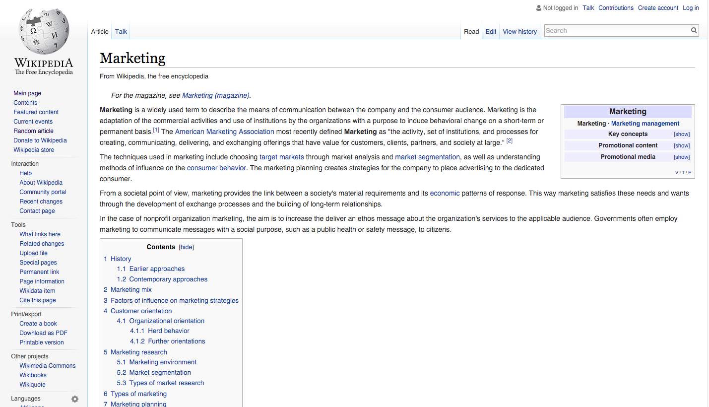
There’s a sidebar that is static and links to a whole lot of stuff that you probably won’t use often – do I really need to access tools if I am reading and not editing? There’s a table of contents on the page but as I scroll down this menu disappears and I have to return to the top of the page to find it again. The placement of the table of contents and the fact is it extensive means that a lot of the page is empty space – something between a quarter and a third of the page is just blank space.
On the bright side, all the information I need is going to be there on the page. The links are easily identified and it’s not difficult to distinguish between internal (Wikipedia) links and external (internet) links. The font is well chosen so it is easy to read on the screen, and the table of contents does give me an idea of what the article includes even if it isn’t all that user-friendly. In short, as I mentioned above, it is ugly but it works.
But what if it could be pretty and work just as well?
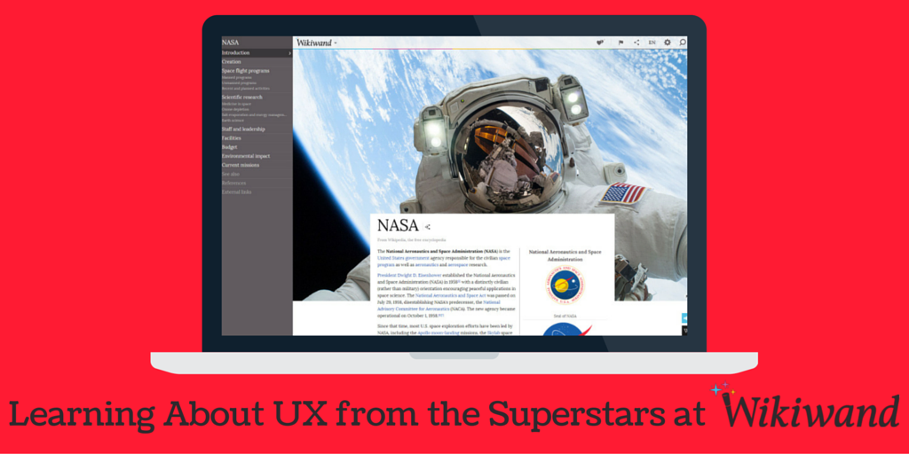
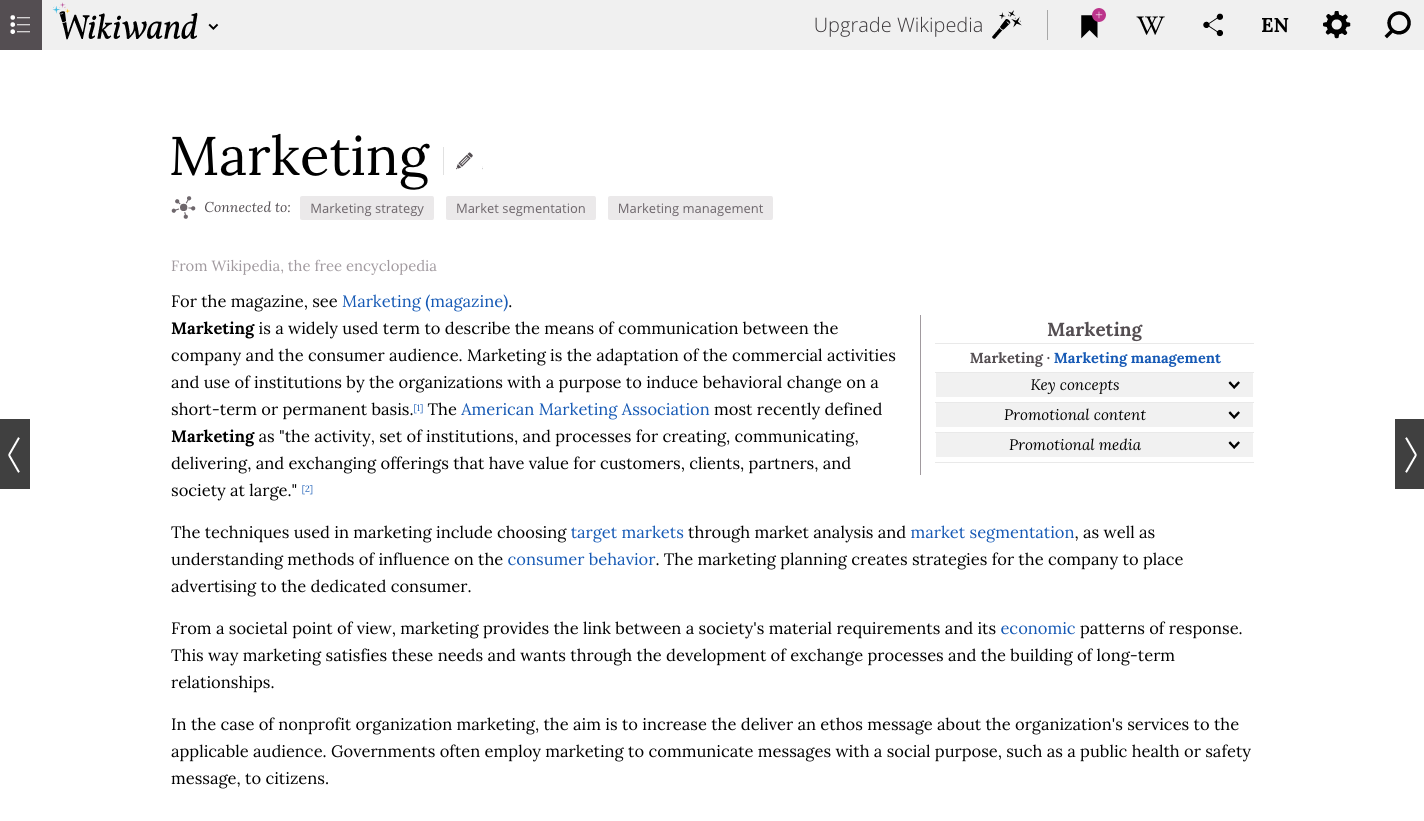
Here’s the same Wikipedia page rendered using WikiWand.
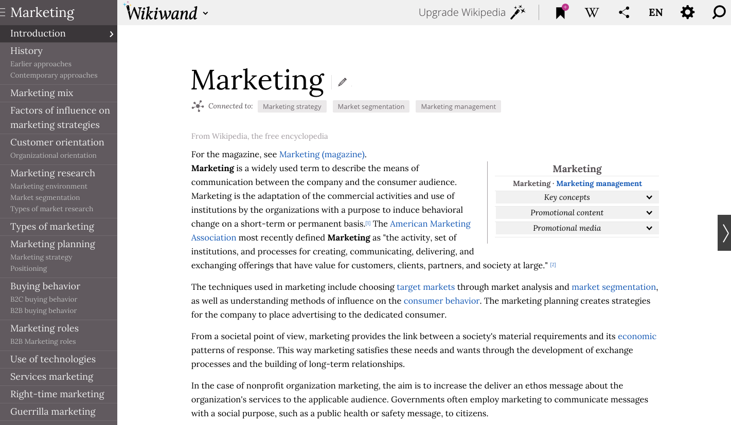
It’s clean, it’s not wasting space, and it is just as easy to read. That useful table of contents that scrolled away is now a static sidebar that is easy to navigate and is always in sight. Those tools and links that don’t get used all that often? Gone, or at least out of sight.
If I want to render the same page in a different language I need only click the toolbar at the top, and in this case I have a choice of 86 different languages. I can share the page with a click, I can personalize the page as I like without affecting the user experience of other Wikipedians, and I can search and navigate Wikipedia with a clikc on the magnifying glass or the arrow superimposed on the right of the screen.
And if I want a beautiful, information rich experience where even the sidebar is dispatched? Just click the hamburger at the top of the table of contents and – voila – it’s gone.
Now that’s a clean, easy to read, easy to navigate site. It’s Wikipedia but pretty: the same information but a nicer interface. How?
WikiWand.
WikiWand
WikiWand is the brainchild of Lior Grossman and Ilan Lewin. Both were fans of Wikipedia but both were also frustrated with the user experience on the site. Sure, they could find what they were looking for, but it just wasn’t as good as it could be. As the pair explains,
Wikipedia is the greatest curator of human knowledge, allowing people all around the world to freely access 35 million articles in 288 languages. The only problem? Wikipedia was built 14 years ago – and hasn’t changed much since then.
In the past decade, web and mobile applications have made huge leaps forward in terms of functionality and user experience – we want to bring those same benefits to your Wikipedia experience.
And that’s exactly what they did.
WikiWand is a browser extension that renders Wikipedia pages in the clean style above rather than in Wikipedia’s dated, ugly style. It installs in seconds and is simply set-and-forget. It impacts only Wikipedia pages and, if you are really missing the clunky, old-fashioned Wiki, a simple click can take you back to what you (thought you) were missing.
WikiWand improves the user experience for visitors to Wikipedia pages in a simple, elegant way, and we’re not the only ones to notice.
In 2015 the WikiWand team was recognized with a Weeby Award for having the Best User Experience. What’s notable in the case of WikiWand, though, is that they not only earned the award presented by the Webby judging panel but also the People’s Choice Award, too. Yes, this isn’t about a user experience that the experts love and the users don’t; everyone who uses WikiWand identifies that this is a superior UX compared to the standard Wikipedia interface.
Getting to Best Practice UX
How is it that WikiWand managed to design such a great UX for their users? It starts, of course, by considering how the user actually engages with Wikipedia, as Lior Grossamn explained to The Next Web:
We began by researching how people are using Wikipedia on mobile, as opposed to on the Web. We soon found that while people use Wikipedia on the Web for research, learning, work and studying, on mobile they use Wikipedia as a quick reference tool: to get immediate answers, settle disputes between friends, quickly learn about the world around them, and look up information about actors, musicians and movies.
The next step was envisioning the perfect knowledge-consumption experience for mobile users. Essentially, we were not adapting the WikiWand web interface to mobile, but we were actually creating a new mobile experience altogether. Shrinking the Wikipedia website and wrapping it in a mobile app doesn’t cut it anymore — people prefer a true mobile experience.
Design and UX became an important driver in how WikiWand was developed, and the team took inspiration from Apple, a company known for its intuitive UX and commitment to elegant design. They told Softpedia:
Steve Jobs once said: design is not just what it looks and feels like, design is how it works.
Besides the obvious eye-candy, I think design is extremely important when it comes to the consumption of knowledge. A good design is important so you can quickly find what you’re looking for, a good design allows you to easily read, understand and use the information.
Yes, learning should be pleasant, but WikiWand’s design is not all about the eye candy. It’s about making it easier to consume knowledge. It’s about providing better readability, comprehension and navigation.
This philosophy of design, user experience, and access to information is thus central to the crafting of the WikiWand product. Indeed, as WikiWand puts it themselves, “Good design is something that requires a good understanding of users’ needs, a lot of innovation, the willingness to keep improving a design that is seemingly great, and eventually, it requires a lot of effort and many iterations.”
And so far those iterations are paying off.
Learning UX from WikiWand
WikiWand is a great example for anyone seeking to improve their user experience for three key reasons.
First, the WikiWand team are proof that even the most popular products can be improved if attention is paid to the user experience. They took a product that hundreds of millions of people use daily and which has essentially no significant competition in its encyclopedia space online and found a way to compete. It wasn’t on the basis on product – the information remains the same – but rather experience as that same information was presented more effectively.
Second, the WikiWand team prove that developing a product with the customer experience as the fundamental stepping off point leads to success. By starting out thinking about the way the customer would like to use Wikipedia instead of thinking about what they can do or would like to do themselves, WikiWand is able to deliver the sort of product that people want to use rather than the product they want to sell.
Third, WikiWand demonstrates that even where people think they have a nice user experience they might not know what they’re missing. Wikipedia is, after all, free to use, relatively easy to navigate, and simple to search. The beauty of the WikiWand product is that it takes something that works well and is only a little bit frustrating and makes it into something fluid, clean, and smooth. Users didn’t know how bad their experience on the site was until someone came along and showed them how good it could be.
If you are seeking to move your company or product further, you could do a lot worse than focusing on the experience of your users. And when you turn to focus on UX, you could barely find a better example of great contemporary UX than WikiWand.
Got another example of a company with great UX? Let us know your favorites on Twitter!
582 Comments
Learning from the UX Superstars at WikiWand | DOZ
aoiintlzm
oiintlzm http://www.gl7tlexu51172b1y55f0cht476h1k2t4s.org/
[url=http://www.gl7tlexu51172b1y55f0cht476h1k2t4s.org/]uoiintlzm[/url]
Paper Pouch
4.3 inch LCD Steering Endoscope Camera
http://unogagu.com/
Prostate Probe
http://unogagu.com/
Hologram Stamping Foil Transfer
Arm Microcontroller Arduino
http://www.tuinderijdevollegrond.nl/
Duo Cock 8 Ball Ring-Blue
http://www.richlannahouse.com/
Full Automatic High Speed Cross Cutting Machine
J1772 To 110v Adapter
https://www.maldiveclub.com/maldivler/maldiv-adalar-nerede
Home Appliance Repair Tools Kit
Automated Storage
Ipollo G1 Miner
https://www.tomzet.pl/produkty/ogrodzenia-z-kamienia
Cable Waterproof Connector
RESIN BONDED ABRASIVE WHEELS For Metal/Steel For Cutting
LCD 27 Inch UHD 60HZ Commercial Monitor
https://www.maldiveclub.com/maldivler/maldivlere-gitmeden-once-bilmeniz-gerekenler
https://www.norbit.pl/humanfallflatanniversaryeditionps4ps5_4153
Check Valve With Hammer
Embroidery Sheer Fabric For Curtain
https://www.landsend-nl.com/
Flat Panel Interactive Whiteboard
Cbd Greenhouse
https://www.thailandguide24.se/ko-tao
Lip Hair Removal Machine
10FPI 1100 Fins A213 T22 Spiral Extruded Fin Tube Cold Drawn
2 Pin Waterproof Bulkhead Connectors
Food Storage Bin
https://www.thailandguide24.se/pattaya
https://www.mobilheimy.eu/
Square Spine Hardcover Book Printing
Line Boring Equipment
300PSI Resilient-Seated Swing Check Valve(Grooved End)
Spline Cold Forming
https://www.shpuntik.com.ua/ru
40L High Flow Medical Equipment Oxygen Concentrator for Medical Use
Nesting Felt Baskets
https://www.norbit.pl/legoharrypottercollectionps4_2913
https://www.alpacabrado.it/
Plain / Beveled / Treaded End Copper Nickel Tubes , smls CuNi 90/10 Pipe
Cam Buckle
Iol Injector For Cartridges
For Alfa Romeo Brera
https://www.thailandguide24.se/ko-kood
Cartoon Newborn Baby Memory Foam Shaping Pillow
Metal Pergola With Canopy
http://www.everstone.com.mx/
https://www.maldiveclub.com/maldivler/maldiv-adalar-nerede
DC Test Power Supply
UNS N08825 Plate
Swivel Office Chair
LED Epitaxial Susceptor
https://yorkavenuepreschool.org/
Wafer Boat
https://www.petrosync.com/oil-gas-training/course
Q Switch Nd Yag Laser Equipment
High-Temperature SiC Coating for Plasma Etch Chambers
Sprinkler Head Pops Off
http://www.foto-paradicsom.hu/hu/fenykepezogep-javitas/fenykepezogep-szerviz
RTP RTA SiC Coated Carrier
https://www.ruf-greven.de/
Christmas Cookie Decorating
MINI Washing Machine Mould
https://www.hydrotek.nl/nl/producten/sae-flenzen/sae-flens-6000-psi-420-bar/2-sae-contra-schroefdraadflens-6000-psi/
Bear Jars
https://www.lola.com.br/
Special Type APG Machine 6-Sides Core-Puller Epoxy Resin APG Molding Machine
Diode Laser 500mw
PP Woven Tote Bag
https://www.norbit.pl/humanfallflatanniversaryeditionps4ps5_4153
Purses And Handbags Bags Women
Cold Room Freezer For Sale
Non Woven Cooler Bag
https://www.decoforma.com.ar/
Cutting Knives
PVC Zipper Bag
https://www.romerpp.pl/lang-pl/products/1/piece_i_suszarki.html
190t Waterproof Polyester Drawstring Bag
https://drwolf.hu/termekek/otthoni_soterapia
Twc Catalytic Converter
Halloween Non Woven Drawstring Bags
https://www.endpointcorporation.com/
Horse Riding Air Vest
Natural Gas Processing Facility
6 Bottles Non Woven Wine Bag
ブランドコピーバッグ激安
Promotional Large Brim Sombrero
スーパーコピー本物比較時計
Serrated Hex Nut
Winding Insulation Paper
ブランドコピー代引きゴヤール
Sensor components
Locking Metal Hose Fitting
ブランド指輪コピースーパーコピー指輪の激安専門店
Small Pink Bakery Box
Silicone Rubber Cord
Side Table With Storage
韓国ブランドコピー旅行
Hinged Plastic Waterproof Box Supplier
ブランドコピー通販
Oxytetracycline Hydrochloride Animal
Tmax MCCB 3Pole 4Pole AC Molded Case Circuit Breaker
Lcd Folder
韓国ブランドコピー韓国スーパーコピー
Reinforcement-rail W/hse Bolt
ブランドコピー楽天ブランドコピーバッグ財布
Perforated Laminate Flooring
在线赌场
欧米スーパーコピーブランド通販ブランド服コピーで
ブランドコピーサングラス
Pocket Zipper Stand Up Pouches
性爱欧美视频
スーパーコピーブランド販売スーパーコピー通販専門店
Plastic Wine Cap Assembly Machine
欧美牲交AⅤ
FA Clean Rubber C
欧美牲交AⅤ
https://www.scotchontherocksja.com/rates
Motorboat Mold
日本AV性爱电影
ブランドオメガ時計スーパーコピー腕時計コピー専門店
在线赌场
ブランドコピーvog
Back Injectable Sealant Packing For Pump And valve
牲交AⅤ视频
Brass or Bronze Siamese
製ロレックススーパーコピーデイトジャストサンダスト
在线AV视频
70KW to 100KW Weichai Diesel Generator Set
腕時計ブランドコピー
服ブランドコピー
Waterproof Curling Mascara
牲交AⅤ直播
3D Brow Style Automatic Eyebrow Pencil
Multifunctional combined rice mill
中国でブランドコピーの値段
IP67 Waterproof Micro Switch
スーパーコピーブランド専門店超スーパーコピー時計通販
China Rotary Drilling Rig ,Portable Water Well Drilling Rig
Log Spliter
フォロワーブランドコピーアプリメーカー
Square Touch Screen Monitor
Focus Ring
ブランドコピー通販アクセサリーコピー通販サイト
Buy Fiberglass Cloth And Resin
Gabion Basket Manufacturers
TeSys LC1-DN Electric Ac Contactors to Control Motors
ブランドコピー安全
Vip Parcel Shippers
CPVC Rod and CPVC Bar
スーパーコピーブランド寝具
ブランドコピー最高級品
2Way IP66 Outdoor Waterproof Cable Connector Junction Box
Curtain Accessories Tieback Hook
Wow! Finally I got a web site from where I be capable of genuinely obtain useful information regarding my study and knowledge.
スーパーコピー時計級品国内発送代引き可能店舗記事ページ
Calcium Carbonate Grinding Mill
European Retro Hand-painted Gold Painting
Plastic Chemical Pump
ブランドコピー時計代引き韓国偽物ベルトコピー
FPC line board
Duplex Steel Ball Valve
Fellatio Performer
ブランド靴スーパーコピーブランド偽物靴品激安専門店
カルティエタンク時計スーパーコピー級
Rigid Coupling
Phenol-Formaldehyde(PF) phenolic plastics fittings
Square Conjoined Middle Shower Head
Generator Solar Portable
スーパーコピーn級品ブランドコピー販売
スーパーコピーブランドn級通販専門店
Forged Gate Valve
Co2 Rf Laser Marking Machine
ブランドコピーブランドコピースーパーコピーブランド
USB Rechargeable Lumigrids Bike Flashlight
Three Wheel Kids Motorcycle
製ロレックススーパーコピーデイトジャストサンダスト
Hvac Flow Switch
3.5 inch TFT LCD Module 640*480 Interface RGB
ブランドコピー代引き
Dth Hammer Valveless
12mm PVC Lead Free Foam Board
My partner and I stumbled over here different web address and
thought I might check things out. I like what I see so now i’m following you.
Look forward to exploring your web page repeatedly.
Hi there Dear, are you truly visiting this website regularly, if so then you will without doubt obtain nice
know-how.
Wet Laser Particle Size Analyzer
クロムハーツ靴スーパーコピーブランドスーパーコピー通販
Tungsten Electrode
Everything is very open with a really clear explanation of the challenges.
It was really informative. Your website is extremely
helpful. Thanks for sharing!
Hey There. I found your blog using msn. This is a very well written article.
I’ll make sure to bookmark it and return to read more
of your useful info. Thanks for the post. I’ll definitely return.
Thanks for sharing such a good idea, piece of writing is pleasant, thats why i have read it fully
Good Quality 5 Heads Persian Rose Bouquet Artificial Flowers For Decoration Usage
Empty Lip Gloss Squeeze Tubes
エルメスコピーバーキンエルメススーパーコピー財布通販
Pan Framing Head Self Drilling Screw Zinc Plated
Tumbler With Handle And Straw Lid
中国ブランドコピー税関
You’re so cool! I don’t suppose I have read something like this before. So nice to find someone with a few original thoughts on this topic. Really.. thank you for starting this up. This site is something that is needed on the web, someone with a little originality!
Industrial Tyre Twin Shaft Shredder
日本最高級スーパーコピーブランド時計通販専門店
Facial Massage Gun
Woah! I’m really enjoying the template/theme of this website. It’s simple, yet effective. A lot of times it’s very hard to get that “perfect balance” between superb usability and visual appearance. I must say that you’ve done a amazing job with this. In addition, the blog loads very fast for me on Opera. Outstanding Blog!
ブランドコピー代引きネクタイ
Seven Barrel Fast Styling Hair Curler
Impellers Paddle Wheel Aerator
Aw, this was an incredibly nice post. Finding the time and actual effort to produce a very good article but what can I say I procrastinate a lot and never seem to get anything done.
Blood Collection Needle and Bag
スーパーコピーブランドメガネ
T-Rex Costumes For Sale
Hi, i think that i saw you visited my weblog so i came to return the favor.I am trying to find things to improve my website!I suppose its ok to use some of your ideas!!
Vfd Single Phase To 3 Phase
シャネルバッグスーパーコピー代引き口コミいおすすめ
CNC Turning Metal Parts
Hi there, I found your web site by means of Google even as searching for a comparable topic, your web site got here up, it looks good. I have bookmarked it in my google bookmarks.
Hey there! This is kind of off topic but I need some advice from an established blog. Is it hard to set up your own blog? I’m not very techincal but I can figure things out pretty fast. I’m thinking about setting up my own but I’m not sure where to start. Do you have any tips or suggestions? Thank you
スーパーコピー財布ブランド財布
Antmoner
Memory Foam Pillow Bed
I visited multiple web pages but the audio quality for audio songs present at this site is actually excellent.
I don’t even know how I ended up here, but I thought this post was good. I don’t know who you are but definitely you are going to a famous blogger if you are not already 😉 Cheers!
Dining Table For 2
シャネル時計スーパーコピー
Medical Nitrile Gloves
Actually no matter if someone doesn’t understand then its up to other people that they will help, so here it happens.
ブランドコピー小銭入れ
Earth Leakage Switch
Plug Power Pine Cone Design LED Light
Custom Logo Straw Boater Hat
ロレックススーパーコピーロレックス偽物時計品激安専門店
Quad Bikes For Adults
Unquestionably consider that that you stated. Your favourite justification appeared to be at the internet the simplest thing to understand of. I say to you, I definitely get irked even as other people consider worries that they plainly do not realize about. You controlled to hit the nail upon the top as smartlyand also defined out the whole thing with no need side effect , other folks can take a signal. Will likely be back to get more. Thank you
Horse Turntable Indoor Playground Electric Equipment
Discrete Semiconductor Devices
ブランドコピー市場評判
Hi, after reading this remarkable article i am too glad to share my familiarity here with mates.
Solar Parallel Connectors
D Type Power Press
スーパーコピーブランド服メンズレディース
Flash Furniture Round Blue Plastic Activity Table Set With Chair
Fuel Delivery Hose
スーパーブランドコピー口コミ
Thanks for sharing your thoughts on %meta_keyword%. Regards
Automatic Melting Point Apparatus
スーパーコピーブランドブルガリ
Brushed Aluminum Nameplate
スーパーコピー時計激安通販サイト
Grass Killer Granules
Kcd3 on off Switch
Appreciation to my father who shared with me about this webpage, this blog is actually awesome.
Great goods from you, man. I’ve understand your stuff prior to and you’re simply too great. I really like what you’ve acquired here, really like what you’re stating and the best way in which you are saying it. You make it entertaining and you still take care of to stay it sensible. I cant wait to read far more from you. This is actually a terrific site.
ブランドコピー安心サイト
Acne Repair Green Tea Balance Oil Facial Mask Mud
Decorative Ceiling Board
Excellent article. I definitely love this website. Continue the good work!
Hi there I am so happy I found your website, I really found you by error, while I was searching on Digg for something else, Regardless I am here now and would just like to say cheers for a incredible post and a all round exciting blog (I also love the theme/design), I dont have time to read through it all at the minute but I have saved it and also included your RSS feeds, so when I have time I will be back to read a lot more, Please do keep up the excellent jo.
Hello there! This article couldn’t be written any better! Going through this post reminds me of my previous roommate! He always kept talking about this. I’ll forward this article to him. Pretty sure he’ll have a very good read. Thanks for sharing!
Wifi Smart Power Strip Socket Plug
Rotating Welding Positioner
韓国シュプリームスーパーコピーブランド激安専門店
Usually I do not read article on blogs, however I wish to say that this write-up very forced me to try and do so! Your writing taste has been amazed me. Thank you, quite great article.
Wallpaper Home Decoration
ルイヴィトンスーパーコピーバッグ
High Temperature Resistant Silicone Rubber Heater Hose
I’m gone to say to my little brother, that he should also pay a visit this website on regular basis to get updated from latest news.
DIY Working Dinosaur Wooden Toys
iphone6ケースブランドコピー
Fiber Glass Dinosaur Egg
I got this website from my friend who told me about this web site and now this time I am visiting this web site and reading very informative articles at this place.
It’s awesome designed for me to have a website, which is valuable in favor of my experience. thanks admin
ブランドコピーモンクレールダウン
Motorcycle Parts Air Filter for Honda Yamaha Kawasaki
Cnc Router Pom Plastic Plate
ブランドコピー激安
Abrasive Sanding Brush
Dried Onion Granules
Cassette Sterilizer
Galvanized Square Square Pipe
スーパーコピーブランドスーパーコピー時計専門店
Designer Weekender Bag
シャネルスーパーコピー財布シャネル財布コピー通販店
Sanding Brush System Vs Head Hubs
Great delivery. Solid arguments. Keep up the good work.
Excellent web site you’ve got here.. It’s hard to find good quality writing like yours these days. I seriously appreciate people like you! Take care!!
かめ吉のスーパーコピー時計
Wholesale Silicone Baby Products
Aluminum Alloy Die Casting Auto Spare Parts
Magnificent beat ! I wish to apprentice whilst you amend your site, how can i subscribe for a blog site? The account aided me a applicable deal. I were tiny bit familiar of this your broadcast provided shiny transparent concept
Hearing Aid Amplifier
Convenient Tile Leveler
スーパーコピー時計最高質ブランドコピー代引き
magnificent submit, very informative. I’m wondering why the other experts of this sector do not understand this. You should continue your writing. I am sure, you have a huge readers’ base already!
You made some decent points there. I looked on the web for more information about the issue and found most individuals will go along with your views on this website.
Actuators and Accessories
韓国ブランドコピー空港
Low Iron U Profile Glass
huaweip20liteケースブランドコピー
PP Cone
Revo Football Visor Revo
Phenylacetamide
腕時計ブランドコピー
Infrared Sensor
Hi, I think your website might be having browser compatibility issues. When I look at your blog in Safari, it looks fine but when opening in Internet Explorer, it has some overlapping. I just wanted to give you a quick heads up! Other then that, superb blog!
This article is in fact a nice one it helps new internet users, who are wishing for blogging.
Black Brown Reversible Belt
The Portable Automatic Electric Pallet Stacker
ブランドコピーgucci
Galvanized Steel Grate
スーパーコピー時計ブログ
PDLUX PD-V11 OEM/ODM 24.125 GHz Microwave Doppler Sensor CDM324
ルイヴィトン財布コピーブランドコピー
5.8GHz Microwave Radar Sensor Switch
Trail Shoes V Running Shoes
Howdy! This is my 1st comment here so I just wanted to give a quick shout out and tell you I truly enjoy reading through your articles. Can you suggest any other blogs/websites/forums that go over the same subjects? Thanks a ton!
シャネル服コピー新作レディースファッションニット
Silver Hardware Aluminum Outside-hung Window
Cooking Utensil Set Cookware Sets
新作ロレックススーパーコピーヨットマスター
Cake Box
Car Teaching Aids
ブランドコピー安心
Small Brown Gift Bags
Aluminium extrusion profile for industrial big section
Today, I went to the beachfront with my kids. I found a sea shell and gave it to my 4 year old daughter and said “You can hear the ocean if you put this to your ear.” She put the shell to her ear and screamed. There was a hermit crab inside and it pinched her ear. She never wants to go back! LoL I know this is entirely off topic but I had to tell someone!
Oligo Hyaluronic Acid Suppliers
PDLUX PD-V9 Security 10.525GHz Microwave Sensor Module
鶴橋ブランドコピー電話
We are a group of volunteers and starting a new scheme in our community. Your site provided us with valuable information to work on. You have done an impressive job and our whole community will be grateful to you.
Square Yellow Mother Of Pearl Shell Net Seam Mosaic Tiles
Cooling Tower Design
マニラブランドコピー
Crank Forward Electric Bike
新作グッチメンズスーパーコピー靴通販
gasket punch set
Hey very interesting blog!
Dehumidifier For 3×3 Grow Tent
Microwave Safe Glass Casserole
iphoneブランドコピー
超人気カルティエスーパーコピー通販優良店
Residual Current Operated Circuit Breaker
Plastic Parts
Hey There. I found your blog using msn. This is a very well written article. I will be sure to bookmark it and come back to read more of your useful information. Thanks for the post. I will definitely comeback.
I am a student of BAK College. The recent paper competition gave me a lot of headaches, and I checked a lot of information. Finally, after reading your article, it suddenly dawned on me that I can still have such an idea. grateful. But I still have some questions, hope you can help me.
Electrical 100a Ac Mccb
台北ブランドコピー
Four Way Shuttle For Cold Room
Gold Foil and Line Texture Wine Label Sticker
ブランドコピー時計販売専門店buy8888
Power Generator
This post will help the internet users for creating new blog or even a blog from start to end.
ブランドコピーtシャツレディース
Motor Circuit Protector
Ferric Oxide Yellow
Motor Accessories
1 Million Shots Ipl Shr Machine
楽天スーパーコピーブランドバッグ偽物專門店
Stainless Steel Coil
Stainless Steel Milk Jug
ブランドのコピー商品を購入すると罪になる弁護士
When I originally commented I seem to have clicked the -Notify me when new comments are added- checkbox and now each time a comment is added I get four emails with the same comment. Is there a way you can remove me from that service? Thank you!
Dessert Paper Plates
時計スーパーコピー都内
Submersible Slurry Pump for Mining
ブランドコピー言い方
Mini Santa Claus And Elk Ornament Brooch
Countdown Clock
Automobile Headlamp Panel Bracket
Smart Power Socket
ヴェルサーチ時計スーパーコピー
2021 Wholesale Korean Fashion Women Hair Accessories Large Matte Hair Clips Acrylic Big Hair Claw Clips
Auto Cup Mask Machine
スーパーコピー時計専門オーデマピゲミレネリーカード決済
Apron
Girl Flower Catch Clip Shark Clip Personality Hair Catch Back Head Clip Temperament HairPin
ロレックス値段スーパーコピー値段韓国
Komatsu Off Road Radiator
ブランドコピー財布後払い
Wave Color Coated Stone Roof Tile
Wholesale Fabric Suppliers
55% Aluminum PPGL Prepainted Aluzinc Steel Coil
名古屋ブランドコピー店
DCIR Tester for Pouch Lithium Power Cell
Imitation Crab Carb Count
iphone11ケースブランドコピー激安
Automatic hand sanitizer round bottle labeling machine
ブランドコピーコピーブランドスーパーコピーブランド
Built In Bypass Soft Starter
コピーブランドコピー代引き
Cryoskin Slimming
Automatic Chili Sauce Labeling Machine
Tree Bag
ロレックススーパーコピー代引き
DX51D SGCC Prepainted Galvanized PPGI Steel Coil
Double Twist Barbed Wire
ブランドコピー時計代引きコピー時計代引き
G550 275 Zinc Hot Dipped Galvanized Steel Coil
Aluminum Casting Valve Body
3 Sparkler Candle
ブランドコピー韓国場所ヶ月コピーブランド
Indoor Grill Pan
財布のスーパーコピーブランド通販専門店
Spiral Half-Pipe Jacket Reactor
楽天パネライスーパーコピーブランドコピー代引き楽天
Commercial Hot Water Heat Pump
Semi – automatic paper tube labeling machine
Wave Type Galvanized Corrugated Steel Roofing Sheet
スーパーコピー時計知恵袋
Inert Alumina Porcelain Balls
業界最高品質時計ロレックスのスーパーコピー激安販売
Fuse Disconnecting Switch
Semi – automatic flat labeling machine
Auto Molds Cast Bronze Bearings High Strength
財布ブランドコピー代引き
Gasoline Brush Chipper
3-DIE Thread Rolling Machine
スーパーコピーブランド財布代引き通販専門店
Water Treatment
Cone Bearing
Machine Screws
ブランドコピー代引き安心
Excellent blog you have got here.. It’s difficult to find good quality writing like yours these days.
I honestly appreciate people like you! Take care!!
M Fold Paper Dispenser
Print Cotton Heavy Adults Weighted Blanket
ブランド時計コピー激安
Men Adult Boosters
スーパーコピー時計ns
Screwless Din Rail Nylon PA66 JST 10 Spring Terminal Block
スーパーコピー時計買ってみた
Countertop Crushed Ice Maker
Large Aper Roller Bearing Custom For Moderate Speed
韓国スーパーコピー通販韓国ブランドスーパーコピーランク
Game Ready Ice Machine
Low Carbon Steel Bi Metal Bearings High Fatigue Strength
5g Fiber Router
Circular Multipole Plug Socket Waterproof Connector Wk29 Square Threaded Cable Sp29
新作ロレックススーパーコピーヨットマスター
Electrode
Hybrid On/Off Grid System
ブランドコピー品販売専門店
ディオールメンズスーパーコピー靴激安販売専門店
201 Stainless Steel Plate
E90 TIN Bronze Bushing Sleeve High Load Capacity
Ir Multi Touch Screen
スーパーコピー時計tt
UK 411 Rail Mounted Power Distribution Terminal In Grey And Blue Color
ブランドコピー新大久保
Anti Military Drone Gun Price
JFBI Nicel Plated Brass Fixed Bridge For UK DIN Rail Terminal Blocks FBI 10-6
Power Bank Rental Charging Station
45 Degree Oblique Insert Pcb Screw Termina
ブランドコピーヴィトン
時計シャネルスーパーコピー
Stoneware Dinner Plates
2 Level Din Rail Screw Wiring Terminal Blocks With Equipotential Bonder
Hi there! I know this is kind of off topic but I was wondering if you knew where I could find a captcha plugin for my comment form? I’m using the same blog platform as yours and I’m having difficulty finding one? Thanks a lot!
VE1008 1.0mm2 Ferrule Wire Connectors Tail Tubular Electrical Wire Terminal Ends Plastic Collar For Stranded Wire
ルイヴィトン韓国スーパーコピー時計級品専門店
What Is Viscose Made Out Of
продать золото в москве цена
Yesterday, while I was at work, my sister stole my iPad and tested to see if it can survive a thirty foot drop, just so she can be a youtube sensation. My iPad is now broken and she has 83 views. I know this is entirely off topic but I had to share it with someone!
Round Stickers
スーパーコピー時計最高質ブランドコピー代引き
Hex Nut
韓国ブランドコピー靴下通販
TR416SS Car Metal Tubeless Tyre Valve Stem
Neck Warmer Scarves
Mobile Projection Screen
ブランドコピーブランドコピー口コミ
Ecg Paper Roll
Long Handle Shower Brush
おすすめサイトスーパーコピーブランド販売と買取
Immersion Cooling
I’m really enjoying the design and layout of your blog. It’s a very easy on the eyes which makes it much more enjoyable for me to come here and visit more often. Did you hire out a designer to create your theme? Great work!
Plastic Plain Bearings Block And HDPE Insert Bearings
スーパーコピー時計n品ss品
50L Vacuum Meat Tumbler
Thank you for the auspicious writeup. It in reality used to be a leisure account it. Glance complex to far brought agreeable from you! By the way, how can we communicate?
Great web site. Lots of useful information here. I’m sending it to a few buddies ans also sharing in delicious. And obviously, thank you on your effort!
Motorized Gate Valve
Whitening Skin Beauty Instrument
スーパーコピー時計n品
ブランドコピー時計電池
French Type Power Socket Module
Compostable Dishes
サムスン時計ブランドコピー
Antenna Power Divider
15KV 200A Loadbreak Elbow Connector
Benzylisopropylamine
スーパーコピーブランドバッグ財布時計通販市場
Domestic Road Freight Services
PVC Plastic Pelletizing Machine
Cellophane Bags Self Adhesive
ブランドコピー激安代引き
PET Sheet Extrusion Line
ブランドコピーブランドコピー通販スーパーコピー
Solar Panel Cleaning Equipment Manufacturers
Elight Shr Factory
ルイヴィトンスーパーコピーバッグ優良
Rechargeable Gel Nail Dryer Lamp 96w
I got this site from my friend who told me concerning this website and now this time I am visiting this web site and reading very informative articles or reviews here.
Sports Wearing Yarn
時計コピー販売月楽天レプリカ時計販売
Nail Drill Set Electric File Professional 65w 35000rpm
シャネルコピー時計新作レディースクオーツ
Loose Needle Roller Bearings
Cylindrical DC gPV Fuse
Industrial Grade BRC 5% Ash Hydroxypropyl Cellulose
スーパーコピーブランド財布
Mini Battery Backup
First aid kit
財布ブランドコピー品
H309 Sleeve
Plastic Pearl Edge Plate
Mini Portable Handheld Chainsaw
悪意あるスマートフォンアプリ│コピー機
Outdoor Pole Mounted Lbs
6mm Curved Tempered Glass for Sliding Door
スーパーコピー時計ノーチラスmiyota
купить медицинскую справку
ロジェデュブイ時計コピー通販スーパーコピーブランド
Bronze Base Rolling Bearing Du Bushing
Pick And Place Robot Programming
スーパーコピー時計最高質ブランドコピー代引き
Domestic Sewage Treatment Equipment
Separator Cartridges SO-436C
I used to be recommended this blog via my cousin. I am not sure whether this submit is written by means of him as no one else recognize such special approximately my problem. You are amazing! Thank you!
Baby Music Book
EPE Foam sheet slicing/slicer/slitting/cutting machine
時計スーパーコピー比較
School Use Book Cover Making Machine
Standard Platinum Resistance Thermometer
時計スーパーコピーランク
CNC Lathe Processing Parts
釜山ブランドコピーボッテガヴェネタ
Snowmobile Tow Strap
Jump Rope
ブランドコピーiphoneケース
Customized Honeycomb Paper Buffer Express Bag Machine
Japan Candle Warmer
Automatic with button PP document bag making machine
ブランドコピー安全代引き優良サイトスーパーコピー後払い
Automatic PP File Bag Making Machine
スーパーコピーブランドコピーフェンディコピー品高品質
M10 Wedge Anchor
偽物コートコピー偽物グッチ長財布コピーの偽物ブランド
AC Industrial Fuse
スーパーコピーブランド店舗スーパーコピーブランド人気
Fast Wall Charger
Solar Heater Sealing Ring
アイスリンク時計スーパーコピー
Singlet Tank Top
15 Mm Din Rail 35mm End Clamp Terminal Block End Stop / End Bracket
ブランドコピー大きいサイズ
129-7.62 Green PCB Screw Terminal Block
Oval Sink Rectangular Sink
スーパーコピーブランド通販腕時計コピーのクチコミサイト
Graphic Design Presentation
QFN PCB Assembly
競馬ブックプリントコピー機でプリントする競馬新聞
2 Weld Neck Flange
FR4 PCB
I loved as much as you will receive carried out right here. The sketch is tasteful, your authored subject matter stylish. nonetheless, you command get bought an impatience over that you wish be delivering the following. unwell unquestionably come further formerly again since exactly the same nearly a lot often inside case you shield this increase.
Multifunction Cutting and Feeding Magic Tape Machine
iphone8手帳型ケースブランドコピー
Loose Needle Bearings Roller Manufacturer
JSAK 70_35 High Current Screw Connection Terminal Block Cage Clip Weidmuller 70mm
Wireless Bluetooth Microphone
スーパーコピー実物写真ブーツコピー靴激安販売専門店
Double Spiral Shaft Concrete Mixer
qoo10ブランドコピー
1.5μM 465.96g/Mol Bismuth Trioxide Powder
Thank you, I have recently been searching for information approximately this topic for ages and yours is the best I have came upon so far. However, what concerning the conclusion? Are you positive concerning the source?
FBS 2-12 Jumper Push In Bridge Terminal Block JPT 16 For Spring
偽ブランドコピーバック
Boiled Egg Poacher
Bag Filter Industrial Dust Collector
Stainless Steel Chain
スーパーコピー送料無料安心します老舗ブランドバッグ財布
Its like you read my mind! You seem to understand so much approximately this, like you wrote the guide in it or something. I think that you could do with some p.c. to force the message house a bit, however other than that, this is magnificent blog. A great read. I’ll definitely be back.
時計スーパーコピー見分け方
Warehousing Services
Dental Zirconia Material
whoah this blog is fantastic i really like reading your articles. Stay up the good work! You understand, a lot of individuals are searching around for this info, you can help them greatly.
スーパーコピーブランド財布
Counter Top Wash Basin
281-657 Spring Clamp Terminal Block Snap On Installation Large Labeling Area
スーパーコピーブランド時計専門店
Dvsa Approved Equipment List
Auto Part Car Green Tire Valve Dust Cap
Oval Plastic Body Brush
Ring Main Unit
ブルガリ時計メンズスーパーコピー
Pfa Butterfly Valve
シャネルコピー最新作シャネルスーパーコピーバッグ通販
Upper Tape Feeder Feed Width 200mm
Fabric Chair
Nail Forms
ブランドコピーamazon
Hi there, I enjoy reading all of your post. I like to write a little comment to support you.
Clutch Release Bearing SHACMAN
財布のスーパーコピーブランド通販専門店
Dragon Light Festival
Carbon Molecular Sieve
Porcelain Electroplating Ornaments
エルメス財布スーパーコピーエルメス偽物財布品激安専門店
Machine Eps
月ブランドコピー販売店
Deep Groove Ball Bearing Machinery
Hotel Bathroom Ceramic Toilet Brush Holder
25 Pair Amphenol
ロレックス時計レディースコピーロレックスコピー時計
Universal Joint Cross Machinery Dongfeng Truck
Fishing Sensing Headlamp
ブランドコピー代引き国内発送スーパーコピーブランド
Glass Drinking Jar
スーパーコピーブランドバッグ財布時計通販市場
Flush Mount Schrader Tyre Valve High Pressure Bolt on VS-8-45
Al2O3 Dispersion
Diy Dehumidifier For Grow Tent
スーパーコピー口コミ時計
Hey There. I found your blog using msn. This is a very well written article. I will be sure to bookmark it and come back to read more of your useful information. Thanks for the post. I will definitely comeback.
秋冬最新作スーパーコピー高品質のブランド財布コピー
Slim Fit Polo Shirt
Iron Nickel Alloy Nanoparticle
スーパーコピーブランド大人気を海外通販専門店
Copper Oxide Nanopowder
Asic Miner S17
I go to see each day some web sites and websites to read posts, except this website offers quality based articles.
Print High Quality Beans Coffee Bag
Magnifying Makeup Mirror
ブランドコピーn級代引き
スーパーコピーブランド専門店のアイデア
Laminated Plastic Bag
Sorting Grab
買い物の流れスーパーコピーブランド専門通販店
Acetic Acid Liquid
Custom Logo Aluminum Foil Bag For Soap
noob製スーパーコピー時計専門店
DIY Toys
Matte Frosted Transparent Zipper Resealable Pouches
Living Room Sofa
ブランドコピー激安服
Aluminum Foil Packaging Bags
犬服ブランドコピー通販
Laminated Plastic Bag
Intumescent Fire Seal Strips
Double Injection Molding
Coffee Packaging Bag Zip Packing Pouch With Plastic Valve
人気のスーパーコピー通販キャップ通販サイト
Dry Mix Mortar Mixing Machine
シャネルコピーシャネル財布コピーバッグスーパーコピー
Custom Design Aluminum Foil Matt Black Coffee Beans Packaging
Hydracool Facial Machine
Heat Seal Stand Up Bags for Tomato Ketchup
スーパーコピーブランドジーンズ
Camping Magnetic Emergency Light
Iron Nickel Alloy Nanoparticle
最高級韓国最新スーパーコピーブランド代引き専門店
Diamond Grinding Wheel
Taper Roller Bearing
グッチコピースーパーブランドコピー通販
グッチ財布スーパーコピーバッグ代引き通販
Trolley Fire Extinguisher Rolling Machine
Testosterone Enanthate 300mg
QFN PCB Assembly
E-Cigarette
ブランドコピー財布通販
China Aluminum Sheet
iphone11ケースブランドコピーアマゾン
Activate Collagen Facial Beauty Instrument
45# Steel Flanged JDB Bearings For Auto Molds
ブランドコピー品line
Printing Equipment
Why users still use to read news papers when in this technological world everything is accessible on net?
Water Filling And Packing Machine
Easily Inserted Electrical Terminal Block Yellow and Green Durable Wire Connector Block
セブンイレブンマルチコピーのアプリの使い方まとめ
iphone5sケースブランドコピー
Light Enclosures
3.96 Green Bent Socket PCB Screw Terminal
Hi to all, the contents present at this site are truly remarkable for people experience, well, keep up the nice work fellows.
Bedside Locker
EPS Wall Panel Machine
スーパーコピー時計のブランドコピー時計通販優良店
Customized case of loose leaf notebook
Metal Building Frame Parts
ソウル買い物ブランドコピー
ブランドコピー激安
Hardbound Notebook
Manmade Marble Fireplace Surround
It’s an remarkable piece of writing designed for all the web users; they will take benefit from it I am sure.
Moisturizing Nourishing Hand Cream
Custom Design Chuck Taylors
スーパーコピーブランド老舗レプリカランク代引き
Composite Solid Wall Panel Machine
Down Jacket Sale
メンズ時計スーパーコピー
You can definitely see your expertise in the article you write. The arena hopes for more passionate writers like you who aren’t afraid to mention how they believe. All the time go after your heart.
Cement Wall Panel Production Line
最も良いシャネルバッグ財布通販送料無料スーパー
Standard Wall Mount
Hi there, after reading this awesome piece of writing i am too cheerful to share my familiarity here with friends.
Gold Strappy Stiletto Heels
スーパーコピーブランド国内
JUDK 4 Screw Terminal Block High Inflammability Class , Fused Terminal Block Common Packing
Plastic Beaker
Aluminum Rectangle Tube
スーパーコピーブランド洋服
Camouflage Pet First Aid Kit
Usb Heated Vest
マツダブランドコピー
Outdoor Hv Vacuum Circuit Breaker
Aluminum Custom Cnc Machining Parts
ウブロコピー時計新作ウブロスーパーコピー激安
スーパーコピーブランド偽物ブランド級品販売専門店
4-Inch Smooth Hood Mechanical Dual-wheel Measuring Wheel
Pressure Sensor Common Rail
ブランドコピー通販おすすめ
Galvanized With Stainless Steel
100% Food Grade Transparent Snacks Packaging Pouch
Power Inverter
Soft GEL Knee Pads
ウブロスーパーコピー最も信頼ウブロ時計コピーコピー場所
ブランドコピー優良店代引き
Dolls House Toys
MCA 20K Computerized Tensioning Metering Device
偽ブランドコピーバック
HI3798MRBCV20100000
Rolled FB090 Wrapped Bronze Bearing Metric Oil Indentations
I all the time emailed this weblog post page to all my associates, since if like to read it then my friends will too.
韓国ブランドコピー相場
Rechargeable Cordless Nail Drill Machine Powerful 45w 40000rpm
tactical fabric
Powerpole Connectors
PV Switch-disconnector up to 1500V 32A
メンズポーチブランドコピー
Customized Special Shape LED Display
701698151D
iphoneケースブランドコピー
スーパーコピーブランド財布ブランド財布スーパーコピー
Acrylic Soaking Bathtub
Plastic DC combiner box 4 in and 2 out
Certificate
ACR-401
カルティエ指輪リングスーパーコピー
楽天ブランドコピー
Eleuthero Root Extract Powder
431 698 151G
Longest Escalator
財布時計スーパーコピー
Break Bulk Shipment
韓国スーパーコピー没収スーパーコピー財布ランク
Imidaclo
1861532638
Dining Table
オメガスーパーコピー日本オメガ時計コピー専門店
Channel Side Bracket
Резиновые прокладки HNBR
スーパーコピー時計ブランド時計コピー腕時計コピー
Fractional Weight Plates
韓国スーパーコピーシャネル財布スーパーコピー激安
Лист силиконовой резины твердости 50 Шор белый прозрачный силиконовый
Wooden Handle Paint Stirrer
Набивка из стекловолокна с графитовой пропиткой
スーパーコピー靴のブログ楽天ブログ
Black Recessed Lighting
Hey very interesting blog!
ブランドコピー後払いブランドコピー
Polyacrylamide 90%
8R0 959 565
Magnetic Beads For Dna Purification
Ножницы для прокладок Угловые ножницы Многоугольная фреза
ロレックス時計スーパーコピーブランド
Linen Fabric For Clothing
スーパーコピー時計ブランドコピー時計級品通販専門店
Прокладка из силиконовой резины
Противопожарный рукав из стекловолокна с силиконовым покрытием
Shipping Out Of Country
ブランド時計スーパーコピー逮捕
財布ブランドコピー
Shopping Bag Making Machine
indoor retractable washing line
Hotel Mirror
ルイヴィトン時計スーパーコピー
Bmw hoses, caps & air compressors
Three Roll Mill
Aluminum core power cable
デュプリケーター自作コピー機おすすめトールケース販売
Cas 925-90-6
701615301C
国内発送スーパーコピー時計
500 lt kapasiteli kompresörlerimizle güçlü performans elde edin. Size özel çözümler sunuyoruz.
Brown Paper Fork
Hydroponic Microgreens Kit
コピー商品で急成長の中国スマホコピーに泣く韓国経済
Vaginal Tightening Co2 Fractional Laser Machine
ブランドコピー代引き
Paper Spoon
スーパーコピーブランドスーパーコピー時計代引き品通販
80TPH Mobile Asphalt Mixing Plant
Vacuum Packaging Pouch
Kraft Sos Paper Bag with Tin Tie
ブランドコピー時計激安
Channel Roll Forming Machine
スーパーコピー時計n品ss品
Stainless Steel Wall Niche
Oropharyngeal Swab
CNC machining Stainless Steel Setup Stud
Water Based Wood Primer
ブランド財布小銭入れコピー代引き通販
Cotton Blended Yarn
一番ブランドスーパーコピーバッグ偽物ブランドバッグ
Bitumen Agitator Tank
ブランドコピー違法
Metal H Stakes
Flexible Shaft Collar
スーパーコピーブランドサイトブランドレプリカサイト
Custom Logo Sweatshirt
Stainless Steel CNC Machining Cross Dowel Nut
ブランドコピー激安
251698151 A/B/D/E
Cat Poop Bags
you are really a just right webmaster. The site loading velocity is incredible. It sort of feels that you are doing any unique trick. Also, The contents are masterpiece. you have performed a great activity in this matter!
It’s really very complex in this busy life to listen news on TV, so I simply use web for that purpose, and take the most up-to-date news.
Hi, I do believe this is an excellent blog. I stumbledupon it 😉 I will come back once again since I bookmarked it. Money and freedom is the best way to change, may you be rich and continue to help other people.
A person necessarily help to make significantly articles I might state. This is the first time I frequented your web page and thus far? I amazed with the research you made to create this actual post amazing. Wonderful process!
Family Suspended Acrylic Swimming Pool
rotating washing line
シャネルコピーのスーパーコピーシャネル財布激安販売
Diesel Fuel Injector 0928400627
シャネルスーパーコピー時計級品通販優良専門店
Airless Sprayer For Cabinets
Appreciating the hard work you put into your site and in depth information you present. It’s great to come across a blog every once in a while that isn’t the same unwanted rehashed material. Excellent read! I’ve saved your site and I’m including your RSS feeds to my Google account.
2183 EZ Tape
Common Rail Fuel Injector 095000-5516
時計スーパーコピー5ch
No matter if some one searches for his necessary thing, so he/she needs to be available that in detail, thus that thing is maintained over here.
Hi to all, it’s in fact a pleasant for me to visit this web site, it contains helpful Information.
Do you mind if I quote a couple of your posts as long as I provide credit and sources back to your webpage? My blog site is in the very same area of interest as yours and my visitors would definitely benefit from a lot of the information you present here. Please let me know if this okay with you. Thank you!
ブレゲスーパーコピー時計コピーブレゲ激安
Common Rail Fuel Injector 095000-7780
Stretch Film Roll China
Hi, i feel that i saw you visited my weblog so i got here to go back the choose?.I am trying to in finding things to improve my website!I assume its ok to use some of your concepts!!
Exceptional post but I was wondering if you could write a litte more on this topic? I’d be very grateful if you could elaborate a little bit more. Cheers!
ブルガリスーパーコピーコピー腕時計ブランド級品通販
Diesel Fuel Injector 095000-5963
Electronic Component Store Near Me
Haematococcus Pluvialis
ブランドコピー財布激安
Fuel Nozzle DLLA145P328
Common Rail Fuel Injector Control Valve F00ZC01330
Triumph Laser Marking Machine
スーパーコピー超美品ブランドスーパーコピー独占的な販売
Common Rail Injector Valve F00ZC01319
Joer Hot Glue Guns 60w
とはでコピー履歴を保存できるアプリを使ってみよう
Diesel Pump Delivery Valve 2418552007
Large Enameled Cast Iron Dutch Oven
玄関マットブランドコピー
I believe what you postedtypedbelieve what you postedtypedsaidbelieve what you postedtypedsaidthink what you postedwroteWhat you postedwrote was very logicala bunch of sense. But, what about this?think about this, what if you were to write a killer headlinetitle?content?wrote a catchier title? I ain’t saying your content isn’t good.ain’t saying your content isn’t gooddon’t want to tell you how to run your blog, but what if you added a titlesomethingheadlinetitle that grabbed a person’s attention?maybe get people’s attention?want more? I mean %BLOG_TITLE% is a little vanilla. You could look at Yahoo’s home page and see how they createwrite news headlines to get viewers to click. You might add a related video or a pic or two to get readers interested about what you’ve written. Just my opinion, it could bring your postsblog a little livelier.
Filter Paper 150mm
Rolling Mill
ブランドコピーカルティエ財布
Hi there, everything is going sound here and ofcourse every one is sharing data, that’s actually good, keep up writing.
Seamless Boxer Briefs Womens
楽天市場ブランドコピー財布の通販
Common Rail Fuel Injector Control Valve F00RJ02130
スーパーコピーブランド専門店atcopy
Women Sweater
8K0 959 831
PV Circuit Breaker
Steel CNC Machined Connecting Rod
エルメスコピーバーキンスーパーコピーブランド激安販売店
Electrophoresis Chamber Unit
ブランドコピー布団カバー
GAX Fascia Massage Gun
This information is priceless. Where can I find out more?
HOLTEK MCU Board
Floor Socket
シャネルコピーシャネルスーパーコピー
I’m not sure why but this blog is loading incredibly slow for me. Is anyone else having this issue or is it a problem on my end? I’ll check back later and see if the problem still exists.
Fuel Nozzle ADB155M169-7
Custom Craft Contact Lenses
ブランドコピー人気サイト
Investment Casting Tool
Diesel Fuel Injector 0445120218
韓国ブランドコピー品
Hi, Neat post. There is a problem together with your site in internet explorer, might check this? IE still is the marketplace leader and a good component to other people will miss your wonderful writing due to this problem.
Hi, i think that i saw you visited my website so i came to return the favor.I am trying to find things to improve my site!I suppose its ok to use some of your ideas!!
After exploring a number of the blog posts on your website, I really like your way of blogging. I saved it to my bookmark website list and will be checking back soon. Please check out my web site as well and let me know how you feel.
Hello doz.com owner, Your posts are always interesting.
Car Seat Components
ブランド服コピー痞客邦
Medical Monitor
Pmk Liquid
ブランドバッグコピー激安
5.5-Inch Mechanical Measuring Wheel
ベッドカバーブランドコピー
UK 415 Power Distribution Terminal Block , Small Screw Terminal Block
Woven Metal Mesh
Why users still use to read news papers when in this technological world all is accessible on net?
Hi there! I’m at work browsing your blog from my new iphone 3gs! Just wanted to say I love reading your blog and look forward to all your posts! Keep up the fantastic work!
Thank you for sharing your info. I truly appreciate your efforts and I am waiting for your next post thank you once again.
Наилучший частный эротический массаж в Москве база вип спа
Automatic Fire Extinguisher Neck Ring Welding Machine
Peptide Generation
人気超絶のモンクレールスーパーコピーダウンウトレット
A person necessarily help to make seriously articles I might state. This is the first time I frequented your web page and to this point? I amazed with the research you made to create this actual post incredible. Magnificent task!
ブランドコピー品販売犯罪
Metric Oilless Wear Plate Graphite Plugged Bronze
Vehicle Engines & Parts
スーパーコピーブランド優良店ブランド時計コピー級品
Tire Pressure Machine
2D0698151
Car Film Cutting Machine
Powder Brush
ディオールスーパーコピーブランドコピー専門店
Breathable Baby Diaper
Cast Iron Pipe Fittings Factories
amazonスーパーコピー時計
Wood Pulp Toilet Paper
スーパーコピーブランド専門通販店大人気ブランドコピー
Planetary Mill
Womens Running Leggings
Regular Sanitary Pads
日本国内最高級のスーパーコピーブランド級品販売の老舗で
Hi there just wanted to give you a quick heads up. The text in your post seem to be running off the screen in Firefox. I’m not sure if this is a format issue or something to do with web browser compatibility but I thought I’d post to let you know. The style and design look great though! Hope you get the problem resolved soon. Kudos
Fantastic post however , I was wondering if you could write a litte more on this topic? I’d be very grateful if you could elaborate a little bit more. Cheers!
Hello there, just became aware of your blog through Google, and found that it is really informative. I’m gonna watch out for brussels. I will appreciate if you continue this in future. A lot of people will be benefited from your writing. Cheers!
I visited several websites except the audio quality for audio songs current at this website is in fact fabulous.
Sanitary Pneumatic Ball Valve
スーパーコピーブランド通販ブランドコピー専門店
12 Core Cable Fiber Optic
Hi there, I enjoy reading all of your post. I like to write a little comment to support you.
Nice answer back in return of this issue with solid arguments and describing everything concerning that.
ブランドコピー見分け方
Duplex Steel S31803 Socket weld Flanges
Nickel Wire 0025 Mm
Rotating and Vibrating Silicone Dildo
キーリングブランドコピー
Projector Mini Singapore
hi!,I love your writing so much! proportion we keep in touch more approximately your post on AOL? I need an expert in this space to solve my problem. May be that is you! Taking a look forward to peer you.
Thanks for one’s marvelous posting! I seriously enjoyed reading it, you may be a great author. I will make certain to bookmark your blog and will often come back later in life. I want to encourage one to continue your great posts, have a nice weekend!
Tall Round Folding Table
Greaseproof Waterproof 7x10inch Rice Paper
エルメスアクセサリーエルメスベルトコピーメンズ
What a stuff of un-ambiguity and preserveness of precious experience regarding unexpected feelings.
I am truly happy to read this website posts which contains plenty of useful data, thanks for providing such data.
1200Tons High-Strength Steel Hot Stamping Press Machine
ssブランドコピー
Smoke Exhaust Extractor
Beach Electric Bike
ロレックススーパーコピーブランド時計級品優良店
1000T SMC Moulding Forming Press Machine With CE Standard
Sutter Health
Way cool! Some very valid points! I appreciate you writing this article and also the rest of the site is very good.
Highly energetic blog, I enjoyed that a lot. Will there be a part 2?
You should take part in a contest for one of the greatest blogs on the web. I am going to recommend this blog!
Heya i’m for the primary time here. I came across this board and I in finding It truly useful & it helped me out a lot. I am hoping to give something back and help others like you helped me.
I couldn’t resist commenting. Very well written!
AC Servo Motor
Battery And Cell Tester
名刺入れブランドコピー
Skin Scrubber
Benefits Of Portable Ultrasound Machine
楽天ブランドコピー代引き激安市場コピー商品販売
In this retail environment, fashion brands need to develop new strategies to grab consumers attention by speaking to their hearts.
Nose Hair Trimmer
シュプリームハットギャルソンスーパーコピー
Goji Berri
中国でブランドコピーの値段
Cat Eyes Carbon Fiber Hockey Goalie Helmet
Elevator Inside House
スーパーコピー時計n品
Recessed Downlights
DC Servo Motor
An impressive share! I have just forwarded this onto a coworker who had been doing a little research on this. And he in fact bought me lunch because I discovered it for him… lol. So let me reword this…. Thank YOU for the meal!! But yeah, thanx for spending time to discuss this matter here on your website.
Disposable Nursing Pad
Oem Stickers
時計スーパーコピー口コミ
What’s up, its pleasant post about media print, we all understand media is a great source of information.
LED Film Screen
Empty Lip Gloss Pen
ブランドコピーiphone8
Shaperwear
スーパーコピーブランド専門店大阪
1000L DN225 Thick Type IBC TANK
Stainless Steel Gas Stove
スーパーコピー時計わからない
IBC TANK Valve Plastic Interface
Water Conditioning
日本スーパーコピーロレックス腕時計代引き激安時計通販
500L Horizontal Extra Thick IBC Tank
Fine way of describing, and good piece of writing to get data concerning my presentation topic, which i am going to convey in academy.
If some one wants to be updated with newest technologies then he must be pay a visit this web site and be up to date everyday.
Thanks for sharing your thoughts on %meta_keyword%. Regards
Wow! This blog looks exactly like my old one! It’s on a completely different topic but it has pretty much the same layout and design. Outstanding choice of colors!
Silicone Rubber Sleeving
Paper Cone Cups
ブランドコピー寝具
Retractable Dog Lead
携帯ストラップ小物衣類小物スーパーコピーレプリカ通販
What is the difference between a medical fridge and a normal fridge
Hi, Neat post. There is a problem with your web site in internet explorer, might check this? IE still is the marketplace leader and a large section of other folks will leave out your wonderful writing due to this problem.
Good day! This is my first visit to your blog! We are a collection of volunteers and starting a new initiative in a community in the same niche. Your blog provided us valuable information to work on. You have done a outstanding job!
This is a topic that’s close to my heart… Many thanks! Where are your contact details though?
I’m really enjoying the design and layout of your blog. It’s a very easy on the eyes which makes it much more enjoyable for me to come here and visit more often. Did you hire out a designer to create your theme? Fantastic work!
This is my first time visit at here and i am truly impressed to read all at one place.
Water Taps Faucet
大阪市西成にブランド品のコピーヴィトンコピー関連の
Punch Free Over Door Metal Hooks
It’s an remarkable article for all the internet users; they will get benefit from it I am sure.
What is a pallet jack
Semi-Autonomous
韓国ブランドコピー韓国スーパーコピー
After checking out a few of the blog posts on your web site, I truly like your way of blogging. I bookmarked it to my bookmark site list and will be checking back soon. Please check out my web site as well and let me know how you feel.
Hi there, its pleasant post about media print, we all be familiar with media is a wonderful source of data.
Can I simply say what a relief to discover somebody that truly knows what they’re talking about on the net. You definitely know how to bring an issue to light and make it important. More and more people should read this and understand this side of the story. It’s surprising you’re not more popular because you certainly have the gift.
I was wondering if you ever considered changing the layout of your blog? Its very well written; I love what youve got to say. But maybe you could a little more in the way of content so people could connect with it better. Youve got an awful lot of text for only having one or two images. Maybe you could space it out better?
With havin so much content and articles do you ever run into any problems of plagorism or copyright violation? My site has a lot of completely unique content I’ve either authored myself or outsourced but it appears a lot of it is popping it up all over the web without my agreement. Do you know any methods to help stop content from being ripped off? I’d definitely appreciate it.
I needed to thank you for this fantastic read!! I certainly enjoyed every little bit of it. I’ve got you book-marked to check out new stuff you post
PPTC 30V Plug in type Self recovery fuse 0 5A 9A
Types Of Charging Cables
スーパーコピーブランド偽物ブランド級品販売専門店
You can definitely see your enthusiasm in the article you write. The world hopes for more passionate writers like you who aren’t afraid to mention how they believe. Always go after your heart.
What is water solubel PVA fibers
韓国スーパーコピー時計級品専門店
Bumper Plate
Hello there, You have done a fantastic job. I will definitely digg it and personally recommend to my friends. I am sure they will be benefited from this web site.
Toy Hauler
スーパーコピーブランド代引き後払い安全ブランドコピー
Who is the oximeter suitable for
Vintage Gold Rimmed Glassware
楽天ブランドスーパーコピー代引き激安販売通販
High Pressure Washer Induction Motor
Can Packing Machine
Common causes of damage to the core board
屋スーパーコピーメンズスニーカー男性用ブランド
WAGO 222 Series Quickly Wire Connector
Selective Herbicides Will Kill
業界最強の極上品質スーパーコピーブランドメンズ服の情报
Accessories For Fridge
スーパーコピー時計トノー
High Speed Injection Molding Machines
Dear doz.com admin, You always provide great examples and case studies.
The Working Principle of Self tapping Screw
Single Roller Bit
ブランドコピーちゃんと届く
90 Degree Angle Aluminum Tile Trim Profiles
スーパーコピー時計レディース
Ball Tow Hitch Ball Coupling Trailer Coupler
Right now it sounds like BlogEngine is the best blogging platform out there right now. (from what I’ve read) Is that what you’re using on your blog?
Can Dental Floss be rinsed and reused
Vfd 400v Ip65
シャネルスーパーコピーシャネルバッグコピー通販店
I absolutely love your blog and find many of your post’s to be just what I’m looking for. Does one offer guest writers to write content available for you? I wouldn’t mind composing a post or elaborating on a few of the subjects you write in relation to here. Again, awesome web log!
ブランド品スーパーコピー
Sewer Covers Drain Covers
Advantages of a Carbon Racket with Shock Absorbing Materials
Hi, Neat post. There is a problem together with your web site in internet explorer, may check this? IE still is the marketplace leader and a large portion of folks will omit your wonderful writing due to this problem.
I am curious to find out what blog system you are working with? I’m experiencing some minor security problems with my latest website and I would like to find something more safeguarded. Do you have any solutions?
This design is steller! You obviously know how to keep a reader entertained. Between your wit and your videos, I was almost moved to start my own blog (well, almost…HaHa!) Great job. I really enjoyed what you had to say, and more than that, how you presented it. Too cool!
Truly no matter if someone doesn’t know then its up to other users that they will help, so here it happens.
Foundry Casting Moulding
iphone7ケースブランドコピー激安
24G Ro4003C High Frequency PCB
I will right away clutch your rss as I can not find your email subscription link or newsletter service. Do you have any? Please allow me recognise so that I may just subscribe. Thanks.
magnificent submit, very informative. I wonder why the other experts of this sector do not realize this. You should continue your writing. I am sure, you have a huge readers’ base already!
Adhesive Gauze
SKS Fast Feed Milling Cutter
フェラーリ通販シャネルコピーブランド代引きの
エルメス財布コピーのスーパーコピーブランド専門店
Military Extreme Cold Weather Sleeping Bag
Laser Cutting Parts
スーパーコピー口コミ時計
Gun Safe Box
7km Laser Rangefinder Module
Hey there, You have done a great job. I will definitely digg it and personally recommend to my friends. I am sure they will be benefited from this web site.
I like the valuable information you supply in your articles. I will bookmark your weblog and check again here frequently. I am quite certain I will be informed many new stuff right here! Good luck for the following!
I used to be recommended this website through my cousin. I am now not positive whether this post is written by way of him as no one else understand such specified approximately my problem. You are amazing! Thank you!
I used to be recommended this blog via my cousin. I am not sure whether this publish is written by way of him as no one else realize such detailed approximately my problem. You are wonderful! Thank you!
Titanium Dioxide Pigment
WPC Interior Waterproof Great Wall Panel
プラダスーパーコピーブランド偽物販売
I like the valuable information you supply for your articles. I will bookmark your weblog and check again here frequently. I am rather certain I will be told a lot of new stuff right here! Good luck for the following!
Hi, just wanted to mention, I enjoyed this post. It was practical. Keep on posting!
Great info. Lucky me I came across your site by accident (stumbleupon). I have saved it for later!
ロレックススーパーコピー時計
Scr Intumescent Mat
Silver Pure Aluminum Foil Tape
I got this website from my pal who informed me regarding this website and now this time I am visiting this website and reading very informative posts here.
At this time I am going away to do my breakfast, once having my breakfast coming yet again to read further news.
I’ve been exploring for a little bit for any high-quality articles or blog posts in this kind of area . Exploring in Yahoo I finally stumbled upon this web site. Reading this info So i’m glad to show that I have a very good uncanny feeling I came upon exactly what I needed. I such a lot without a doubt will make certain to don?t disregard this web site and give it a look on a constant basis.
Excellent blog here! Also your website rather a lot up fast! What host are you the use of? Can I am getting your associate link in your host? I want my website loaded up as fast as yours lol
Hey! I just wanted to ask if you ever have any trouble with hackers? My last blog (wordpress) was hacked and I ended up losing many months of hard work due to no backup. Do you have any solutions to prevent hackers?
Hi there, I think your site could be having internet browser compatibility issues. When I look at your website in Safari, it looks fine but when opening in Internet Explorer, it has some overlapping issues. I simply wanted to give you a quick heads up! Besides that, fantastic blog!
I am curious to find out what blog system you have been utilizing? I’m experiencing some minor security problems with my latest site and I would like to find something more safe. Do you have any solutions?
Hurrah! At last I got a weblog from where I be able to truly take useful data regarding my study and knowledge.
What’s up Dear, are you really visiting this web page daily, if so after that you
will absolutely take good know-how.
Hi, this weekend is nice for me, because this point in time i am reading this enormous informative piece of writing here at my home.
We are a gaggle of volunteers and starting a new scheme in our community. Your site provided us with useful information to work on. You have performed an impressive process and our whole community will probably be grateful to you.
Unquestionably believe that which you stated. Your favorite justification appeared to be on the internet the simplest thing to be aware of. I say to you, I definitely get irked while people consider worries that they plainly do not know about. You managed to hit the nail upon the top and also defined out the whole thing without having side effect , people can take a signal. Will likely be back to get more. Thanks
Thank you for some other magnificent article. Where else may anyone get that kind of information in such a perfect way of writing? I have a presentation next week, and I am at the look for such information.
I have been surfing online more than 3 hours today, yet I never found any interesting article like yours. It’s pretty worth enough for me. In my opinion, if all webmasters and bloggers made good content as you did, the internet will be much more useful than ever before.
Excellent post. I was checking continuously this blog and I am impressed! Very useful information particularly the last part 🙂 I care for such info a lot. I was seeking this particular info for a long time. Thank you and good luck.
I simply could not leave your web site prior to suggesting that I really enjoyed the standard information a person supply in your visitors? Is going to be back incessantly in order to inspect new posts
Hi! I just wanted to ask if you ever have any problems with hackers? My last blog (wordpress) was hacked and I ended up losing a few months of hard work due to no data backup. Do you have any solutions to prevent hackers?
I simply could not depart your web site prior to suggesting that I extremely enjoyed the standard information a person supply for your visitors? Is going to be back often in order to check out new posts
I would like to thank you for the efforts you have put in writing this website. I am hoping to see the same high-grade blog posts from you in the future as well. In fact, your creative writing abilities has inspired me to get my very own website now 😉
Half Glass Bathroom Door
スーパーコピーブランド代引き販売専門店
N5245B PNA-X Network Analyzers
Monthly Planner Printing
ブルガリピアスコピーブルガリ時計ハートスーパーコピー
Mounting Plate
Hi, after reading this remarkable piece of writing i am too glad to share my familiarity here with friends.
I am extremely impressed with your writing skills and also with the layout on your blog. Is this a paid theme or did you customize it yourself? Either way keep up the nice quality writing, it’s rare to see a nice blog like this one nowadays.
Office Guest Chairs
シャネル時計コピー時計スーパーコピーシャネル腕時計激安
Printed Honeycomb Paper Mailers
Hi, I think your blog might be having browser compatibility issues. When I look at your blog in Safari, it looks fine but when opening in Internet Explorer, it has some overlapping. I just wanted to give you a quick heads up! Other then that, superb blog!
Wire Rack Floor Display
ダミエ財布スーパーコピーエルメス韓国偽物財布値段平均
Truck Rear Seat Mattress
Hey! I know this is kind of off topic but I was wondering if you knew where I could get a captcha plugin for my comment form? I’m using the same blog platform as yours and I’m having difficulty finding one? Thanks a lot!
Hey there, You have performed a fantastic job. I will definitely digg it and personally recommend to my friends. I am sure they will be benefited from this site.
I will right away seize your rss as I can not find your email subscription link or newsletter service. Do you have any? Please allow me realize so that I may subscribe. Thanks.
Это лучшее онлайн-казино, где вы можете насладиться широким выбором игр и получить максимум удовольствия от игрового процесса.
Yes! Finally something about %keyword1%.
Онлайн казино радует своих посетителей более чем двумя тысячами увлекательных игр от ведущих разработчиков.
Solar Garden Spike Light Makes Your Garden Beautiful
Pv Panels
ブランドコピー激安腕時計
Добро пожаловать на сайт онлайн казино, мы предлагаем уникальный опыт для любителей азартных игр.
В нашем онлайн казино вы найдете широкий спектр слотов и лайв игр, присоединяйтесь.
Онлайн казино отличный способ провести время, главное помните, что это развлечение, а не способ заработка.
iphone5sケースブランドコピー
Earphone Zipper Case
How do we use the ice hockey visor
Thank you for another informative blog. Where else may just I am getting that kind of info written in such a perfect means? I have a challenge that I am simply now operating on, and I have been at the glance out for such information.
Hi, everything is going well here and ofcourse every one is sharing information, that’s in fact good, keep up writing.
腕時計ブランドコピー
Kinetic Electric Scooter
How to select a Door Lever Handle
Linear Led Wall Sconce
ブランド時計コピーブランド店
The characteristics of Motor Hydraulic Drive Motor
Hello there I am so happy I found your site, I really found you by error, while I was searching on Google for something else, Nonetheless I am here now and would just like to say kudos for a incredible post and a all round thrilling blog (I also love the theme/design), I don’t have time to go through it all at the minute but I have book-marked it and also included your RSS feeds, so when I have time I will be back to read a great deal more, Please do keep up the awesome job.
Hello would you mind stating which blog platform you’re working with? I’m planning to start my own blog in the near future but I’m having a difficult time making a decision between BlogEngine/Wordpress/B2evolution and Drupal. The reason I ask is because your design and style seems different then most blogs and I’m looking for something completely unique. P.S My apologies for getting off-topic but I had to ask!
Hi! I’ve been reading your site for some time now and finally got the courage to go
ahead and give you a shout out from Porter
Texas! Just wanted to mention keep up the excellent job!
Leather Loose-leaf Notebook
Blackout Curtain
シャネルバッグコピー品シャネルバッグスーパーコピー
スーパーコピーブランド激安ブランドコピー販売
Nij Iii Anti Bullet Panel
Business Leather Notebook
Have you ever considered about including a little bit more than just your articles? I mean, what you say is valuable and all. However think about if you added some great photos or video clips to give your posts more, “pop”! Your content is excellent but with images and video clips, this site could undeniably be one of the greatest in its niche. Wonderful blog!
China Spiral Plain Notebook Factory
ブランドコピー品販売犯罪
Fish Farm Pond Liners
Thanks for a marvelous posting! I definitely enjoyed reading it, you will be a great author. I will always bookmark your blog and will eventually come back in the future. I want to encourage one to continue your great posts, have a nice weekend!
時計スーパーコピーn級とは
Tecan Conductive Tips
Spiral Notebook A4 Free Sample
Sex Furniture
ブランドコピーa級品
Custom Notebook Spiral Made In China
DC51D+AZ Galvalume Coil
Lvt Flooring
ブランドコピーn
Dear doz.com admin, Your posts are always a great source of knowledge.
For newest news you have to pay a visit web and on web I found this website as a best website for most recent updates.
Various Flavors Salmon Tuna Natural Wet Cat Treats
Fabric Rfid Tag
最新シュプリームスーパーコピーシャツバッグ人気商品
I think the admin of this website is truly working hard in favor of his site, since here every stuff is quality based information.
スーパーコピー時計耐久性
Geocell Production Line
Gps Antenna
モンクレールスーパーコピージップアップパーカー
Medical Examination Gloves
SECCN5 Galvanized Square Tube
Aw3 Laser Tattoo Removal
Hammer for Breaking Car Window
iphonexケースブランドコピー激安
Hi there, I found your website by the use of Google even as searching for a comparable matter, your web site got here up, it seems to be good. I have bookmarked it in my google bookmarks.
Charger Plug Types
HC180BD+Z Galvanized Square Tube
欧米スーパーコピーブランド通販ブランド服コピーで
Link exchange is nothing else but it is simply placing the other person’s webpage link on your page at proper place and other person will also do same for you.
Jetta Fuel Pump 1989-1992
Cross Arm Insulator
韓国スーパーコピーバッグ
Spheroidized Wires Pickling
ブランドコピー悪徳業者
Body Plain Flat Roof Tile
always i used to read smaller articles which also clear their motive, and that is also happening with this post which I am reading at this place.
Hi, I do believe this is an excellent website. I stumbledupon it 😉 I am going to return once again since I bookmarked it. Money and freedom is the best way to change, may you be rich and continue to help other people.
Catalytic Converter Replacement
Tiguan Fuel Pump 2010-2019
スーパーコピー時計台湾
Door Trim Panel
中国でブランドコピーの値段
Drilling Machine
To the doz.com administrator, Keep the good content coming!
韓国偽物バッグコピー韓国偽物財布コピー
Non Insulated Terminal Crimping Pliers
Steel Umbrella Base
Insulated Cold Water Bottle
カードフォルダーブランドスーパーコピー優良店
Car Battery Connector
シャネルスーパーコピー時計級品通販優良専門店
Container Batching Plant
Specialty Fasteners
Ищете надежного подрядчика для устройства стяжки пола в Москве? Обращайтесь к нам на сайт styazhka-pola24.ru! Мы предлагаем услуги по залитию стяжки пола любой сложности и площади, а также гарантируем быстрое и качественное выполнение работ.
Drinking PP Bottle
ブランドコピーとは
Diouce Watches Quartz Movement
поставка строительных материалов фирмы
строительное снабжение москва
Gelatin Shell Capsules
ロレックススーパーコピースーパーコピーブランド優良店
Suspension Stabilizer Link 48802-60090
Hi doz.com admin, You always provide great resources and references.
Hello there! I could have sworn I’ve been to this web site before but after browsing through a few of the posts I realized it’s new to me. Anyways, I’m definitely happy I discovered it and I’ll be bookmarking it and checking back frequently!
Magnetic Field Separator
ブランドコピー楽天
Suspension Control Arm 1J0407151A
ブランド靴ルイヴィトンスーパーコピー靴コピー
Wireless Pir Detector
Stabilizer Ball Head 56261-EQ000
Получите безупречные стены благодаря услуге штукатурка стен на mehanizirovannaya-shtukaturka-moscow.ru. Качество и скорость исполнения вас удивят.
Mеханизированная штукатурка стен – это выбор современных людей. Узнайте больше на mehanizirovannaya-shtukaturka-moscow.ru.
Fiberglass-Reinforced Composite Light Poles for Street
Emergency Power Generator For Home
コピー商品で急成長の中国スマホコピーに泣く韓国経済
12 Port Poe Ethernet Switch
Extrusion Line of CPVC Pipe
韓国スーパーコピー東大門スーパーコピー服
It’s impressive that you are getting ideas from this piece of writing as well as from our discussion made here.
Heya i’m for the primary time here. I came across this board and I find It truly useful & it helped me out a lot. I am hoping to give something back and help others like you helped me.
Hello doz.com admin, Thanks for sharing your thoughts!
Dear doz.com webmaster, Thanks for the well-researched and well-written post!
To the doz.com admin, You always provide great examples and real-world applications.
Pretty section of content. I just stumbled upon your web site and in accession capital to assert that I acquire in fact enjoyed account your blog posts. Any way I’ll be subscribing to your augment and even I achievement you access consistently rapidly.
Gripe doğal çözümler: Antibiyotiksiz iyileşme yolları
It’s not my first time to go to see this site, i am visiting this web site dailly and get pleasant information from here everyday.
Im not that much of a online reader to be honest but your blogs really nice, keep it up! I’ll go ahead and bookmark your site to come back in the future. Cheers
Spot on with this write-up, I truly feel this web site needs a lot more attention. I’ll probably be back again to read through more, thanks for the info!
Wonderful article! We will be linking to this great post on our site. Keep up the good writing.
Thank you for great content. I look forward to the continuation.
Undeniably consider that that you stated. Your favourite justification appeared to be at the net the simplest thing to bear in mind of. I say to you, I definitely get irked at the same time as folks consider concerns that they plainly do not understand about. You controlled to hit the nail upon the top as well as defined out the whole thing with no need side effect , other people can take a signal. Will likely be back to get more. Thank you
I know this if off topic but I’m looking into starting my own blog and was wondering what all is required to get set up? I’m assuming having a blog like yours would cost a pretty penny? I’m not very internet savvy so I’m not 100% positive. Any recommendations or advice would be greatly appreciated. Thanks
Нужная услуга для идеальной отделки интерьера- это механизированная штукатурка стен. На mehanizirovannaya-shtukaturka-moscow.ru предлагаются только самые качественные услуги.
A big thank you for your blog.Really looking forward to read more. Want more.
Great beat ! I wish to apprentice while you amend your site, how can i subscribe for a blog web site? The account aided me a acceptable deal. I had been tiny bit acquainted of this your broadcast provided bright clear concept
Hi there, after reading this remarkable piece of writing i am also glad to share my familiarity here with mates.
Hello there! This post couldn’t be written any better! Reading this post reminds me of my old room mate! He always kept talking about this. I will forward this page to him. Pretty sure he will have a good read. Thank you for sharing!
Good article! We will be linking to this great article on our site. Keep up the good writing.
Pretty! This has been a really wonderful post. Many thanks for providing these details.
This was beautiful Admin. Thank you for your reflections.
I’m impressed, I must say. Rarely do I encounter a blog that’s equally educative and interesting, and let me tell you, you have hit the nail on the head. The issue is something not enough people are speaking intelligently about. I’m very happy that I stumbled across this in my search for something relating to this.
Why viewers still use to read news papers when in this technological world everything is existing on net?
I think the admin of this website is really working hard for his website, because here every stuff is quality based information.
I visited many web pages but the audio quality for audio songs present at this website is actually excellent.
Write more, thats all I have to say. Literally, it seems as though you relied on the video to make your point. You clearly know what youre talking about, why waste your intelligence on just posting videos to your site when you could be giving us something enlightening to read?
Hello doz.com webmaster, Your posts are always well structured and easy to follow.
To the doz.com admin, Your posts are always well structured and easy to follow.
To the doz.com administrator, Your posts are always informative and up-to-date.
I don’t think the title of your article matches the content lol. Just kidding, mainly because I had some doubts after reading the article. https://www.binance.info/uk-UA/join?ref=YY80CKRN
Howdy! I could have sworn I’ve been to this blog before but after going through some of the posts I realized it’s new to me. Anyways, I’m definitely happy I found it and I’ll be bookmarking it and checking back frequently!
Hiya very nice blog!! Guy .. Beautiful .. Amazing .. I will bookmark your blog and take the feeds also? I am glad to seek out numerous useful information here in the submit, we need develop more strategies in this regard, thank you for sharing. . . . . .
It’s going to be end of mine day, except before finish I am reading this wonderful post to increase my knowledge.
Rüyada Araba Görmek Nedir?