
In the United States there are two political parties with a real shot at winning the White House: the Republicans and the Democrats.
Sure, there are some minor parties that will make it onto the ballot in one or more states like the Green Party or the Libertarian Party. But not even these parties content that they have a real shot at governing. When it comes to putting someone into the Oval Office, it is going to come down to a choice between two parties.
In Australia, things aren’t quite as simple.
Three ‘Problems’ with Australian Elections
Elections are somewhat unpredictable – that’s a feature, not a big in a democracy – but at the macro level we can make a few predictions. The election campaign currently underway in Australia will see either a Liberal Prime Minister or a Labor Prime Minister in office the day after the vote. But the minor parties in Australia have long been able to win places in the national Senate, sometimes with only the weakest level of popular support.
And this is problem number one: parties that very few people support can still win a place in the parliament.
A quirk of Australia’s electoral system means that even very weak support can translate into one of the coveted and powerful seats in the Australian Senate. How weak?
Well in 2013 one person in the state off Victoria was elected with just 17,000 of the 3.5 million votes cast in that state. In other words, 99.5% of people did not vote for this person and yet – due to the way the Australian electoral system works – the person was elected to the national parliament.
This leads to problem number two: the relative ease of getting elected means dozens of parties throw their hats in the ring.
The chance to be elected even with minimal support encourages all sorts of groups to nominate their party for election. Australia has a Future Party, a Sports Party, a Wikileaks Party, and a Pirate Party, too. There is a Sex Party, a Motoring Enthusiast Party, a Smoker’s Rights Party, and a party that is simply called Bullet Train for Australia.
At the last election there were 49 different parties on Australian ballots – and this takes us to the third problem: the parties on the ballot can have some very similar (and hence confusing) names.
Australians heading to the ballot box will likely ponder questions like these:
- Are you a Liberal voter or a Liberal Democrat voter?
- Are you supporting the Democratic Labour party or the Labor party?
- Are you voting for an independent candidate who is Australian or an Australian Independent?
- Are you for Australian First or Australian First Nations?
- If you are an ‘Alliance’ voter, are you voting for the Country Alliance, the Carers Alliance, or the Socialist Alliance?
- If you are a Democrats supporter, are you supporting the Christian Democrats, the Liberal Democrats, or the Australian Democrats?
Make no mistake: the minor parties know their names are likely to be confused with other more popular parties; indeed, they bank on wining votes from the confused or mislead voter to get them over the line.
In short, the quirks of the electoral system makes it easy for small parties to win a Senate seat, which in turn encourages many more parties to get on the ballot, and the confusing names of sometimes radically different parties made it hard for voters to determine exactly who they were voting for.
So the Australian government came up with a solution.
Political Logos
If the names of the parties are confusing why not help the voters by providing them with a logo instead?
After all, research has demonstrated that even Australian children too young to read can easily recognize the logos of brands like McDonald’s, Toyota, and Disney. It stands to reason that if even a child can remember what they are watching or where they are eating by glancing at a logo, adult voters should have an easier time voting for the right party if there’ a logo on the ballot paper to help them.
This year will be the first election that will have logos included on the ballot paper for all parties. While they are all a standard size and while they are all printed in black and white, they should help overcome the problems caused by too many parties with too many similar names.
The electoral quirks? Well, they’ll remain – but if the logos help cut the appeal of the minor parties then this problem might solve itself in future elections, anyway.
So: which logos work and which don’t?
Judging the Logos
One Australian newspaper, the Sydney Morning Herald, recently assessed some of the logos that will appear on ballot papers this election. The Herald’s design team joined expert marketers from local universities to determine which logos worked and which ones did not.
How close to the mark were their assessments? Read on.

The Herald Says: “Well, what does it mean? No clear visual message to the voter…None of the designers knew who this was or which party.”
DOZ Says: Agreed. A voter who doesn’t recognize this sitting Senator won’t have a clue what party this is.

The Herald Says: “It has the boldest image, but I don’t understand what it means… Most of the designers Fairfax Media spoke to loved this logo because it was eye-catching and used a lot of black, which would stand out on the ballot paper.”
DOZ Says: It’s a great logo and it won’t confuse the voter. The white text on the black background makes it easy to read on what is otherwise going to be a crowded ballot paper.

The Herald Says: “This logo gives an instant message of what the party is about and is dynamic…The illustration and typographic style doesn’t feel like a logo at all – more like clip art. The name of the party should be included rather than the speed of the train, according to Elizabeth Carruthers.”
DOZ Says: The image is striking and it is, indeed, dynamic. However, despite what the Herald might have you believe, that’s not a speed on the logo; it’s a distance. Perhaps it was meant to be indicative of the speed of a bullet train, but it’s no so thing in practice.

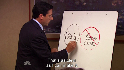
The Herald Says: “Anti Paedophile with a “Don’t” across it, does that mean they are against Anti Paedophiles?? …Visually, running text across that outline “no” circle does not work really great.”
DOZ Says: The Herald is spot on here: this is a terrible logo. The messaging is confused, the “Don’t” cross is poor, and the text is hard to read with the lines from the circle. Was this logo designed by Michael Scott?
Check out the Herald article for more commentary and assessments of the logos.
Conclusion
Faced with a problem that threatened a national election, the Australian government and the Australian Electoral Commission needed a solution. There were too many parties competing for too few places in the parliament and with confusing names to boot.
The solution was found not in the political science classroom but in the marketing textbook.
- Too many parties? That’s simply a competitive market to a marketer.
- Too few seats in the parliament? That just makes things more interesting.
- Too many similar names? That’s simply a problem of differentiation – and a good logo can help the voters determine who they really want to vote for.
In short, faced with a political problem Australia turned to a marketing solution. Will it work? The results will be in on the 2nd of July and we’ll know for sure.



37 Comments
Hi Dylan
I agree with you. The Madigan logo is the only one which has any effectiveness. The others are confused and confusing.
Looks like your political parties need to hire some advertising/branding experts.
I know in the UK, the Conservative Party under Margaret Thatcher engaged the top advertising agency in the UK, Saatchi & Saatchi. Saatchi & Saatchi produced a political poster entitled “Labour isn’t working” with a picture of unemployed workers queueing for benefits. This was a hugely effective campaign which ensured the Conservatives’ election success over Labour and a subsequent 18 year reign.
Will be tweeting this.
Clement
Your style is very unique in comparison to other folks I’ve read stuff from. Thank you for posting when you’ve got the opportunity, Guess I will just bookmark this blog.
I needed to thank you for this very good read!! I absolutely loved every little bit of it. I have you book marked to check out new stuff you post…
Everything is very open with a clear clarification of the challenges. It was definitely informative. Your site is very helpful. Many thanks for sharing!
458474 250098Some really marvelous work on behalf of the owner of this internet website , dead fantastic topic matter. 942031
79389 285478I got what you mean , saved to bookmarks , very decent web site. 364007
Excellent work. Of all the things, I love the way you made a strong intro. Superbly executed!
Good write-up. I definitely love this website. Keep writing!
Sutter Health
Hello, after reading this remarkable article i am as well
cheerful to share my know-how here with friends.
253975 319629You seem to be very skilled within the way you write.::~ 172345
Fantastic goods from you, man. I’ve be aware your stuff prior to and you’re simply too great.
I really like what you have bought right here, really like what you are stating and the way wherein you are saying it.
You’re making it enjoyable and you continue to care for to
keep it sensible. I cant wait to learn much more from you.
This is actually a tremendous site.
This is my first time pay a visit at here and i am truly impressed to read all at
single place.
I used to be suggested this website by my cousin. I’m not
positive whether this put up is written through him
as no one else recognise such particular approximately my difficulty.
You are wonderful! Thanks!
This design is spectacular! You obviously know how to keep a
reader amused. Between your wit and your videos, I was almost moved to start my own blog (well, almost…HaHa!) Fantastic job.
I really enjoyed what you had to say, and more than that, how you presented it.
Too cool!
Unquestionably consider that which you said. Your favourite justification appeared to be
on the net the simplest factor to bear in mind of.
I say to you, I certainly get irked even as people consider worries that they plainly do not realize
about. You controlled to hit the nail upon the top and also outlined out the
entire thing with no need side effect , people can take a signal.
Will probably be again to get more. Thanks
Hello to every one, as I am actually eager of reading this blog’s post
to be updated daily. It consists of fastidious material.
I’ve been exploring for a little bit for any high-quality articles or
blog posts in this kind of space . Exploring in Yahoo I at last
stumbled upon this website. Studying this information So i am happy
to express that I’ve a very just right uncanny feeling
I found out exactly what I needed. I most unquestionably will make sure to don?t fail to remember this web site and give
it a look on a continuing basis.
Having read this I believed it was very enlightening.
I appreciate you finding the time and energy to put this short article together.
I once again find myself personally spending a significant amount
of time both reading and posting comments. But so what,
it was still worth it!
Thanks on your marvelous posting! I seriously enjoyed reading it,
you are a great author. I will be sure to bookmark your blog and will often come back later on. I want to encourage one to continue your great posts, have a
nice evening!
Hello everybody, here every person is sharing such
know-how, so it’s fastidious to read this webpage, and I used to pay a visit this webpage everyday.
Hi! I’ve been following your website for a while now and finally got the bravery to go ahead
and give you a shout out from Austin Texas! Just wanted to mention keep up the excellent work!
I know this website provides quality based content and
additional information, is there any other web page which gives these things in quality?
Yes! Finally something about Small Business Advice.
Every weekend i used to pay a quick visit this site, for the reason that i
wish for enjoyment, for the reason that this this website conations actually good funny stuff
too.
Nice weblog here! Also your web site loads
up fast! What web host are you the use of?
Can I am getting your associate hyperlink for your host?
I wish my web site loaded up as fast as yours lol
Somebody necessarily help to make seriously posts I’d state.
This is the first time I frequented your web page and thus far?
I amazed with the research you made to create this actual put up amazing.
Great task!
Most private on-line lotteries have stopped trading as governments
have passed new laws providing themselves and their personal lotteries greater protection.
Howdy, i read your blog occasionally and i own a similar one and i was just wondering if you get
a lot of spam responses? If so how do you reduce it,
any plugin or anything you can suggest? I get so much lately it’s driving me insane so
any support is very much appreciated.
Today, I went to the beach with my kids. I found a sea shell and gave it to my 4 year old daughter and said “You can hear the ocean if you put this to your ear.” She
put the shell to her ear and screamed. There was a hermit crab inside and
it pinched her ear. She never wants to go back! LoL I know this
is completely off topic but I had to tell someone!
Quickle doesn’t charge you any costs for a referral
to a lender or service provider.
Pretty section of content. I just stumbled upon your blog and in accession capital to assert that I get in fact enjoyed account your blog
posts. Any way I’ll be subscribing to your feeds and
even I achievement you access consistently quickly.
But wanna say that this really is quite helpful Thanks for taking your time to write this.
Very nice blog post. I definitely love this site. Stick with it!
Nice post. I learn something totally new and challenging on websites
very informative articles or reviews at this time.
700582 761656Yay google is my world beater helped me to uncover this fantastic web website ! . 972804