The 2016 Webby Awards have been announced and the winners of the best homepage feted.
Congratulations to National Geographic (Webby) and BBC America (People’s Choice).
But what makes both of these homepages stand out from the rest? What makes them the best examples of what web design gets right? Why are these homepages so much better than yours.
While we’re not about to go through every homepage everywhere in a search for answers to these questions, we can point to the things that both National Geographic and BBC America get right.
And, by emulating their strategies, you might just find your site chasing its own success in the year to come.
Webby Award: National Geographic
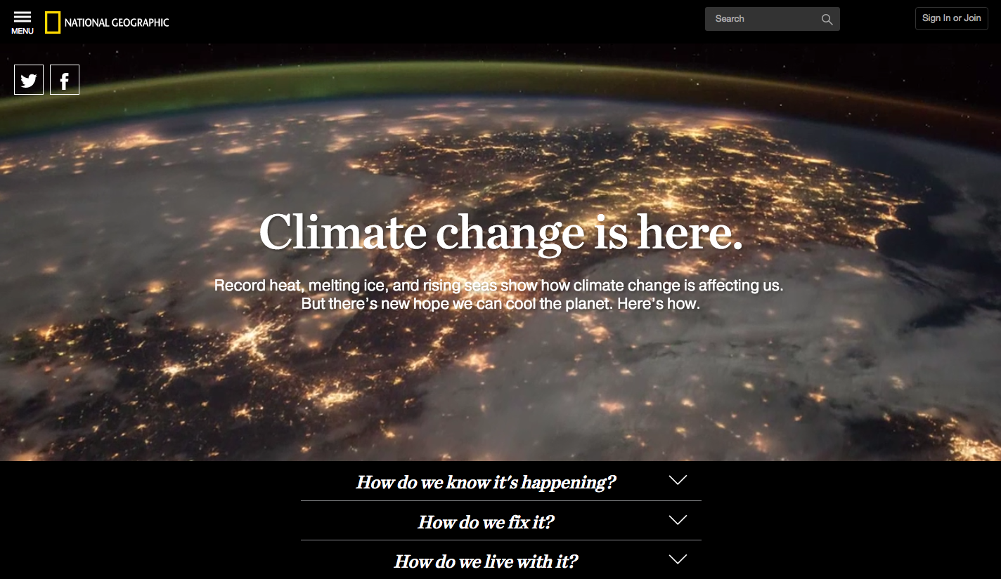
The homepage that the Webby judging team identified in presenting the award to National Geographic was the ‘Climate change is here’ page. As depicted above, the foundation of the page is a stunning full-screen video of the Earth that rotates through the Earth from space, fires in the energy industry, and collapsing glaciers in polar regions.
All of the attention of the reader is drawn to these videos and, when the text pulls the focus, the statement is clear: climate change is here, period. At the bottom of the page are three menu buttons that scroll the page and provide access to more detailed information. As the buttons serve to scroll rather than act as links to other parts of the site, the reader is kept on the page longer and has more time to explore the information presented.
What’s more, if the reader likes what they see then there’s a chance to share the site from above the fold § note the Twitter and Facebook buttons which are prominent though not overwhelming – and regular users of the site can also log in with ease or peruse a hamburger menu in the top left of the screen.
It’s clean, it’s easy to negotiate, and it keeps the reader on the page.
People’s Choice: BBC America

The BBC America homepage is structured similarly to the National Geographic homepage, perhaps a sign of a trend in web design?
The homepage is dominated by an image from one of BBA America’s television programs and the link structure on the page is understated so as not to overwhelm the image. There’s a shadowed bar at the top of the page with categories and a search bar, there’s program identification (series, episode) on the lower right that draws the eye, and schedule details filling in the bottom of the screen.
Scroll down the page and it’s more in the same style: a large image, a minimum of text, and schedule details. The shadowed bar is static at the top of the screen and the homepage is more of a visual experience than anything else – and this is exactly what you’d want from a television station trading on its quality programing.
It’s easy on the eye, it’s clean, and it doesn’t overwhelm with text.
What the Best Homepages Have in Common
What do these sites have in common? Let’s start with the obvious.
Show, don’t tell.
Both of these award-winning sites are dominated by images. For the National Geographic site it’s a video, for BBC America it is a still image, but both let their images do the communicating. While there is some text on the screen, it is limited and intended to add to the messaging of the image rather than overwhelm it.
When building your homepage, it is easy to do the same. Find an image, buy one, or create one that communicates your core message. Let the visual creatures that are your readers understand what your business or product is about with a glance, not a close study of your copy.
Need more inspiration? Here’s Vesper using a background video and just six words to communicate their value.

Make Navigation Easy
Both of the Webby Award winners make navigation easy for visitors. Whether it is a static bar at the top of the screen or the familiar hamburger menu in the top corner, both sites make it easy for people to know where to go from the homepage. They might be cutting edge in terms of design, but they aren’t trying to reinvent the way that people interact with webpages.
Your business might not be as big as National Geographic or BBC America, and you may not be a Webby Award winner (yet!), but you should follow their lead. Make navigation buttons appear where readers expect them to be: at the top of the page, at the bottom of the page, and in the top corners. Functional beats inventive here no matter how impressive your ideas might be: no one will stick around to see more if they can’t figure out how.
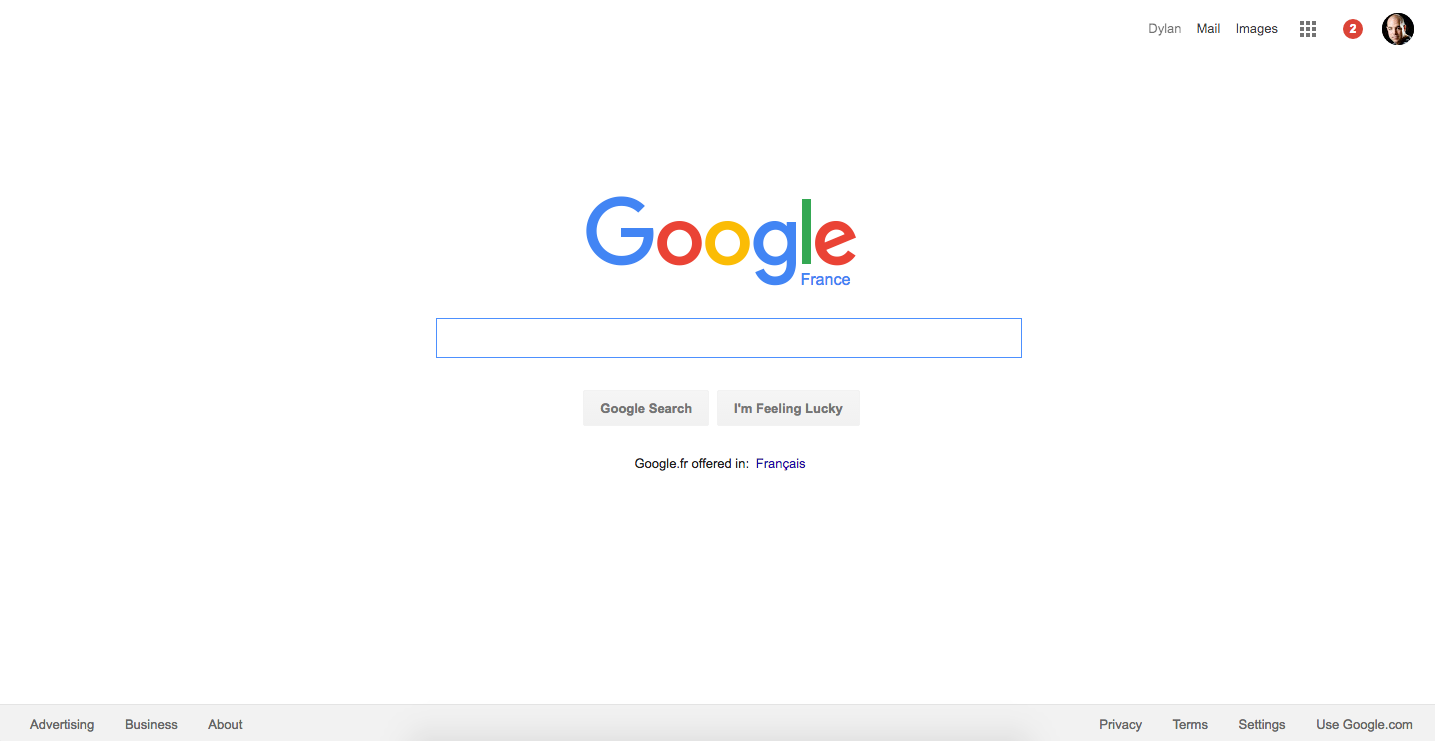
Need more inspiration? Check out Google’s homepage next time you visit and note the menus top and bottom of page.
Let it Scroll
Something both pages have in common is their length. While the ‘above the fold’ sections are visually stunning and win the interest of the visitor, the pages are actually long – really long. Long homepages allow the reader to absorb a lot of content without having to click off the homepage. No sub-site, no category page, no blog post to click over to, just scrolling for more content.
Building these long, scrollable landing pages is easy. Modern CMS’s like WordPress (our favorite here at DOZ) offer you the choice of hundreds of themes that enable long, scrolling homepages. You can load these long pages up with video, audio, text, images – whatever you like and that will keep people rolling that scroll wheel on the mouse. You might add some navigation if the page is particularly long, but otherwise you can trust the interested reader to keep moving lower – and deeper – into your content.
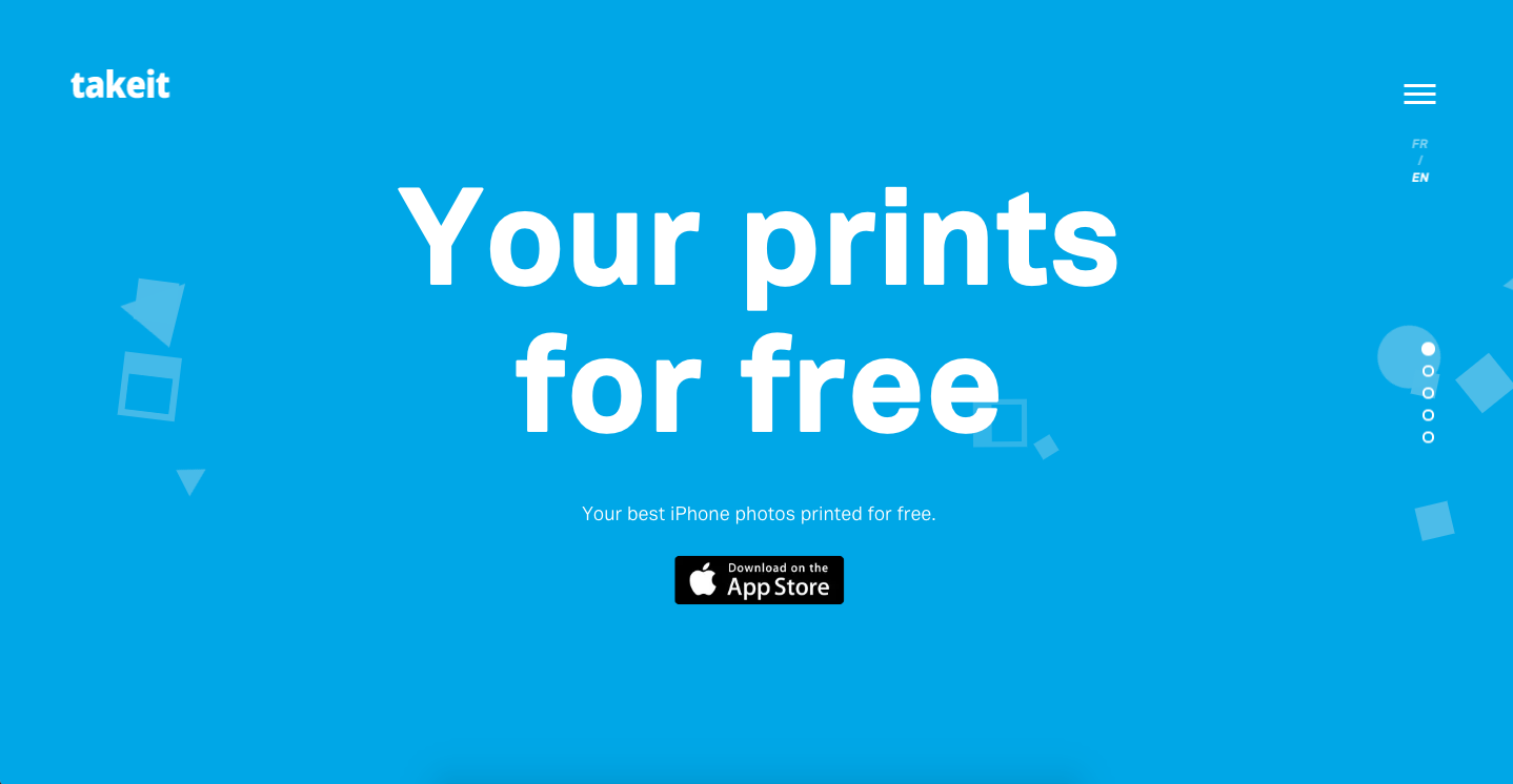
Who else is doing this well? Take It is a great app that has a strong visual and scrolling game.
Conclusion
There might be more than just three things that separate a Webby Award winning site from yours, but these three are a great place to start when considering the design and layout of your site all the same. Presenting your company, your product, and your values with clarity, cutting down on text, highlighting visual content, making navigation easy for visitors, and taking advantage of long, scrolling pages are some of the best ways of adapting your site to the expectations of your readers.
And who knows: make the right changes and maybe it’ll be your Webby we’re writing about next year!
3,516 Comments
Pingback: What Pages Do I Need On My Website? List of 13 Must-Have Pages
Clarity of the layouts is one of the common thing in them..
And they are attractive for eyes in capturing what had been seen…
Indisk Mad never fails to impress with its authentic and delectable dishes. A true treat for food enthusiasts! 🍽️😍
yes i agree with you.
Thank you for share an informative blog article with us.
I think you have remarked some very interesting points, regards for the post.
The Philippines is a higly prominent gaming area!!! Want to know more about the site? visit here —>> okbet casino login philippines
A unique sport, American football has all the potential to provide quality entertainment and big winnings for gamblers!!! Want to know more about the site? visit here —>> american football rules
Useful info. Lucky me I found your web site unintentionally, and I am surprised why this coincidence didn’t took place in advance! I bookmarked it.
Wow! Thank you! I permanently wanted to write on my site something like that. Can I include a fragment of your post to my site?
Great blog! Is your theme custom made or did you download it from somewhere? A design like yours with a few simple adjustements would really make my blog shine. Please let me know where you got your design. Thanks
Some truly excellent content on this web site, appreciate it for contribution.
I conceive this internet site holds some very wonderful information for everyone :D. “The ground that a good man treads is hallowed.” by Johann von Goethe.
Xfinity Pay My Bill is a convenient and user-friendly service that allows Xfinity customers to pay their bills online. With this service, customers can easily make payments, view their account balance, and manage their billing preferences all in one place.
Great post, I believe website owners should acquire a lot from this website its real user friendly.
Wow, marvelous blog layout! How long have you been blogging for? you made blogging look easy. The overall look of your site is wonderful, let alone the content!
obviously like your web-site however you have to take a look at the spelling on several of your posts. Several of them are rife with spelling problems and I to find it very bothersome to tell the reality then again I will certainly come again again.
I have recently started a website, the information you provide on this site has helped me tremendously. Thank you for all of your time & work.
I believe this website contains some rattling superb info for everyone :D. “Do not go where the path may lead, go instead where there is no path and leave a trail.” by Ralph Waldo Emerson.
Generally I don’t read post on blogs, however I would like to say that this write-up very forced me to check out and do so! Your writing taste has been amazed me. Thank you, quite great article.
hi!,I love your writing so a lot! percentage we communicate more about your article on AOL? I need a specialist on this house to solve my problem. May be that is you! Taking a look ahead to see you.
The next time I read a blog, I hope that it doesnt disappoint me as much as this one. I mean, I know it was my choice to read, but I actually thought youd have something interesting to say. All I hear is a bunch of whining about something that you could fix if you werent too busy looking for attention.
Hey very nice blog!! Man .. Excellent .. Amazing .. I will bookmark your blog and take the feeds also…I’m happy to find so many useful info here in the post, we need work out more strategies in this regard, thanks for sharing. . . . . .
Merely wanna comment on few general things, The website style is perfect, the content is really superb. “The way you treat yourself sets the standard for others.” by Sonya Friedman.
My spouse and i have been very ecstatic that Peter managed to finish off his researching out of the ideas he obtained in your web page. It is now and again perplexing to just be giving freely tactics some people may have been selling. We really grasp we now have the website owner to appreciate for that. All of the illustrations you made, the straightforward website menu, the relationships you make it easier to create – it’s mostly spectacular, and it is letting our son in addition to us imagine that this theme is exciting, and that is extremely serious. Many thanks for everything!
I truly enjoy looking at on this web site, it has got superb content. “Do what you fear, and the death of fear is certain.” by Anthony Robbins.
You can definitely see your skills in the work you write. The world hopes for even more passionate writers such as you who aren’t afraid to say how they believe. Always go after your heart.
I am impressed with this site, rattling I am a fan.
whoah this weblog is great i really like reading your posts. Stay up the good paintings! You recognize, a lot of persons are looking round for this info, you could aid them greatly.
It is really a nice and useful piece of info. I am glad that you shared this helpful info with us. Please keep us informed like this. Thank you for sharing.
After all, what a great site and informative posts, I will upload inbound link – bookmark this web site? Regards, Reader.
I truly treasure your work, Great post.
Real nice style and design and good content material, nothing else we want : D.
I used to be very happy to search out this internet-site.I needed to thanks on your time for this wonderful learn!! I definitely enjoying every little little bit of it and I have you bookmarked to check out new stuff you blog post.
I must show my gratitude for your kind-heartedness in support of individuals who really want guidance on in this question. Your special commitment to passing the message along turned out to be extremely valuable and have without exception allowed some individuals just like me to achieve their targets. Your amazing interesting tutorial entails this much to me and even more to my peers. Many thanks; from all of us.
Heya just wanted to give you a brief heads up and let you know a few of the pictures aren’t loading correctly. I’m not sure why but I think its a linking issue. I’ve tried it in two different browsers and both show the same results.
Wonderful work! This is the type of info that should be shared around the internet. Shame on the search engines for not positioning this post higher! Come on over and visit my web site . Thanks =)
Hello. Great job. I did not expect this. This is a splendid story. Thanks!
Heya! I’m at work browsing your blog from my new apple iphone! Just wanted to say I love reading your blog and look forward to all your posts! Carry on the outstanding work!
You are my inhalation, I possess few web logs and sometimes run out from to post .
Hello, i feel that i noticed you visited my blog so i got here to “return the desire”.I am trying to to find issues to improve my web site!I suppose its adequate to make use of some of your ideas!!
Thanks – Enjoyed this post, how can I make is so that I get an email every time you make a new post?
I keep listening to the rumor talk about getting free online grant applications so I have been looking around for the finest site to get one. Could you tell me please, where could i acquire some?
I believe this internet site holds some real fantastic info for everyone. “Drunkenness is temporary suicide.” by Bertrand Russell.
Thankyou for helping out, excellent info .
With everything which appears to be building inside this specific subject matter, many of your perspectives are relatively radical. Having said that, I appologize, because I can not give credence to your entire suggestion, all be it stimulating none the less. It seems to us that your remarks are not completely rationalized and in actuality you are generally yourself not even fully certain of the argument. In any event I did appreciate looking at it.
I used to be very pleased to search out this internet-site.I wished to thanks in your time for this excellent read!! I positively enjoying each little little bit of it and I have you bookmarked to check out new stuff you blog post.
I reckon something genuinely interesting about your web site so I saved to fav.
Do you have a spam issue on this website; I also am a blogger, and I was wondering your situation; we have created some nice methods and we are looking to trade solutions with others, be sure to shoot me an email if interested.
Superb blog you have here but I was wanting to know if you knew of any community forums that cover the same topics discussed in this article? I’d really love to be a part of group where I can get comments from other knowledgeable individuals that share the same interest. If you have any suggestions, please let me know. Kudos!
Very interesting subject, thanks for posting. “It is much easier to try one’s hand at many things than to concentrate one’s powers on one thing.” by Quintilian.
F*ckin’ tremendous things here. I am very glad to see your article. Thanks a lot and i’m looking forward to contact you. Will you kindly drop me a mail?
Well I really enjoyed studying it. This article offered by you is very useful for accurate planning.
Ang OkBet ay isa sa mga nangungunang online sportsbook sa Pilipinas na mayroong tayaan para sa mga pinakasikat na mga laro!!! Want to know more about the site? visit here —>> sports betting in philippines
Thanks for sharing excellent informations. Your site is so cool. I am impressed by the details that you?¦ve on this site. It reveals how nicely you perceive this subject. Bookmarked this web page, will come back for more articles. You, my friend, ROCK! I found simply the information I already searched all over the place and simply couldn’t come across. What an ideal site.
Hello there, just became aware of your blog thru Google, and located that it’s really informative. I am going to be careful for brussels. I will be grateful in case you continue this in future. Numerous folks can be benefited out of your writing. Cheers!
This really answered my problem, thank you!
My spouse and I stumbled over here coming from a different web address and thought I might check things out. I like what I see so now i am following you. Look forward to looking at your web page yet again.
It’s really a nice and useful piece of information. I am glad that you shared this useful info with us. Please keep us informed like this. Thanks for sharing.
I truly value your work, Great post.
As soon as I noticed this web site I went on reddit to share some of the love with them.
After study a few of the blog posts on your website now, and I truly like your way of blogging. I bookmarked it to my bookmark website list and will be checking back soon. Pls check out my web site as well and let me know what you think.
I¦ve read several good stuff here. Certainly worth bookmarking for revisiting. I surprise how a lot attempt you set to make this sort of fantastic informative web site.
There is perceptibly a bunch to know about this. I assume you made various good points in features also.
Woh I enjoy your blog posts, saved to bookmarks! .
I relish, result in I found just what I was having a look for. You have ended my four day long hunt! God Bless you man. Have a nice day. Bye
After all, what a great site and informative posts, I will upload inbound link – bookmark this web site? Regards, Reader.
Thank you, I have recently been looking for info about this topic for ages and yours is the greatest I have discovered so far. However, what concerning the conclusion? Are you positive in regards to the source?
I have recently started a website, the info you provide on this website has helped me greatly. Thank you for all of your time & work. “So full of artless jealousy is guilt, It spills itself in fearing to be spilt.” by William Shakespeare.
Great ?V I should definitely pronounce, impressed with your web site. I had no trouble navigating through all the tabs and related info ended up being truly simple to do to access. I recently found what I hoped for before you know it in the least. Quite unusual. Is likely to appreciate it for those who add forums or something, website theme . a tones way for your client to communicate. Excellent task..
I have been exploring for a bit for any high quality articles or blog posts on this kind of house . Exploring in Yahoo I eventually stumbled upon this website. Studying this information So i?¦m glad to show that I have an incredibly excellent uncanny feeling I found out exactly what I needed. I most indisputably will make certain to do not put out of your mind this website and give it a look regularly.
You completed a number of fine points there. I did a search on the theme and found most persons will have the same opinion with your blog.
I consider something genuinely interesting about your site so I saved to bookmarks.
There is visibly a lot to know about this. I consider you made various good points in features also.
Hi there are using WordPress for your blog platform? I’m new to the blog world but I’m trying to get started and create my own. Do you require any coding expertise to make your own blog? Any help would be greatly appreciated!
Everything is very open and very clear explanation of issues. was truly information. Your website is very useful. Thanks for sharing.
You have mentioned very interesting points! ps nice web site.
F*ckin¦ awesome things here. I¦m very glad to see your post. Thank you so much and i’m taking a look ahead to contact you. Will you kindly drop me a mail?
I really enjoy looking through on this website , it holds fantastic blog posts.
Hey very cool blog!! Man .. Excellent .. Superb .. I will bookmark your web site and take the feeds additionally…I am happy to search out a lot of useful info here in the put up, we want work out extra strategies on this regard, thanks for sharing.
There may be noticeably a bundle to know about this. I assume you made sure nice points in options also.
There is clearly a lot to know about this. I believe you made certain nice points in features also.
OkBet is a licensed online casino and sports betting operator in the Philippines, and many fake websites like Ok-Bet and OKEBET imitate this original platform of Kingwin Ventures Inc (formerly Ekxinum Inc), luring casino enthusiasts into thinking they are legal.!!! Want to know more about the site? visit here —>> Okebet
hey there and thanks in your info – I’ve definitely picked up anything new from right here. I did then again expertise a few technical issues the usage of this site, since I experienced to reload the website many instances previous to I may just get it to load properly. I had been considering in case your web host is OK? Now not that I am complaining, but sluggish loading circumstances occasions will often affect your placement in google and can harm your high-quality rating if ads and ***********|advertising|advertising|advertising and *********** with Adwords. Well I am including this RSS to my email and could glance out for much more of your respective exciting content. Make sure you replace this again very soon..
This is the suitable weblog for anybody who needs to seek out out about this topic. You notice a lot its almost hard to argue with you (not that I truly would want…HaHa). You definitely put a new spin on a topic thats been written about for years. Great stuff, just great!
You are my inhalation, I own few web logs and sometimes run out from to post : (.
I wanted to thank you for this great read!! I definitely enjoying every little bit of it I have you bookmarked to check out new stuff you post…
I appreciate, cause I found just what I was looking for. You’ve ended my 4 day long hunt! God Bless you man. Have a great day. Bye
You really make it seem so easy with your presentation but I find this matter to be really something which I think I would never understand. It seems too complicated and extremely broad for me. I am looking forward for your next post, I’ll try to get the hang of it!
Thank you for the sensible critique. Me and my neighbor were just preparing to do a little research about this. We got a grab a book from our area library but I think I learned more clear from this post. I’m very glad to see such wonderful info being shared freely out there.
Heya are using WordPress for your site platform? I’m new to the blog world but I’m trying to get started and create my own. Do you need any coding knowledge to make your own blog? Any help would be greatly appreciated!
I have been checking out many of your stories and it’s pretty clever stuff. I will definitely bookmark your blog.
I beloved up to you will receive carried out proper here. The cartoon is tasteful, your authored subject matter stylish. nonetheless, you command get bought an edginess over that you wish be turning in the following. sick surely come further in the past again as precisely the similar nearly very steadily inside case you shield this hike.
This web page is really a stroll-by means of for the entire information you needed about this and didn’t know who to ask. Glimpse right here, and also you’ll undoubtedly uncover it.
You actually make it appear really easy together with your presentation but I in finding this topic to be actually one thing that I feel I’d by no means understand. It kind of feels too complex and extremely broad for me. I am taking a look forward on your next publish, I will try to get the hold of it!
I would like to thank you for the efforts you’ve put in writing this site. I’m hoping the same high-grade website post from you in the upcoming as well. Actually your creative writing skills has encouraged me to get my own site now. Actually the blogging is spreading its wings quickly. Your write up is a good example of it.
It is really a great and useful piece of info. I¦m satisfied that you just shared this useful information with us. Please keep us up to date like this. Thank you for sharing.
Hi , I do believe this is an excellent blog. I stumbled upon it on Yahoo , i will come back once again. Money and freedom is the best way to change, may you be rich and help other people.
I am impressed with this web site, real I am a fan.
Wow! Thank you! I continually wanted to write on my site something like that. Can I take a portion of your post to my site?
Attractive section of content. I just stumbled upon your weblog and in accession capital to assert that I acquire actually enjoyed account your blog posts. Any way I’ll be subscribing to your feeds and even I achievement you access consistently fast.
It’s actually a great and helpful piece of information. I am glad that you shared this helpful information with us. Please stay us up to date like this. Thank you for sharing.
of course like your website but you need to check the spelling on quite a few of your posts. A number of them are rife with spelling issues and I find it very troublesome to tell the truth nevertheless I will surely come back again.
I like what you guys are up too. Such smart work and reporting! Keep up the superb works guys I have incorporated you guys to my blogroll. I think it will improve the value of my site 🙂
Wow! This could be one particular of the most helpful blogs We’ve ever arrive across on this subject. Basically Magnificent. I’m also a specialist in this topic so I can understand your effort.
Heya! I’m at work browsing your blog from my new iphone! Just wanted to say I love reading through your blog and look forward to all your posts! Carry on the superb work!
Wonderful work! That is the type of info that are meant to be shared around the internet. Shame on the seek engines for not positioning this publish upper! Come on over and visit my site . Thanks =)
I am no longer certain the place you’re getting your info, but great topic. I must spend a while finding out much more or figuring out more. Thanks for fantastic info I was on the lookout for this information for my mission.
hello!,I like your writing so so much! percentage we keep in touch extra approximately your post on AOL? I require a specialist in this space to unravel my problem. May be that’s you! Having a look forward to peer you.
I visited a lot of website but I believe this one has something special in it in it
Hey there, You have performed a great job. I’ll definitely digg it and in my opinion recommend to my friends. I am confident they’ll be benefited from this website.
Sweet blog! I found it while searching on Yahoo News. Do you have any suggestions on how to get listed in Yahoo News? I’ve been trying for a while but I never seem to get there! Many thanks
Thank you for sharing excellent informations. Your web site is so cool. I am impressed by the details that you’ve on this site. It reveals how nicely you understand this subject. Bookmarked this web page, will come back for extra articles. You, my friend, ROCK! I found simply the info I already searched everywhere and simply could not come across. What a perfect web site.
I enjoy the efforts you have put in this, thank you for all the great articles.
It is in point of fact a nice and useful piece of info. I’m glad that you simply shared this useful information with us. Please stay us informed like this. Thanks for sharing.
Youre so cool! I dont suppose Ive learn something like this before. So nice to find any person with some original ideas on this subject. realy thank you for beginning this up. this web site is something that’s wanted on the net, someone with a little bit originality. useful job for bringing one thing new to the internet!
You really make it seem so easy with your presentation but I find this topic to be really something that I think I would never understand. It seems too complicated and very broad for me. I’m looking forward for your next post, I will try to get the hang of it!
I have been reading out a few of your posts and i can state nice stuff. I will definitely bookmark your blog.
Hi, I think your site might be having browser compatibility issues. When I look at your website in Safari, it looks fine but when opening in Internet Explorer, it has some overlapping. I just wanted to give you a quick heads up! Other then that, fantastic blog!
I just couldn’t depart your site prior to suggesting that I actually enjoyed the standard information a person provide for your visitors? Is gonna be back often to check up on new posts
Does your blog have a contact page? I’m having trouble locating it but, I’d like to shoot you an email. I’ve got some ideas for your blog you might be interested in hearing. Either way, great website and I look forward to seeing it develop over time.
Some really nice stuff on this website , I enjoy it.
Hello! I know this is kind of off topic but I was wondering which blog platform are you using for this site? I’m getting fed up of WordPress because I’ve had issues with hackers and I’m looking at options for another platform. I would be awesome if you could point me in the direction of a good platform.
Do you have a spam problem on this website; I also am a blogger, and I was wanting to know your situation; we have created some nice practices and we are looking to trade strategies with others, be sure to shoot me an email if interested.
A formidable share, I just given this onto a colleague who was doing a bit of analysis on this. And he the truth is bought me breakfast as a result of I discovered it for him.. smile. So let me reword that: Thnx for the treat! However yeah Thnkx for spending the time to debate this, I feel strongly about it and love studying extra on this topic. If attainable, as you become expertise, would you thoughts updating your blog with more details? It’s highly helpful for me. Huge thumb up for this blog submit!
I’m really inspired with your writing skills and also with the format to your weblog. Is this a paid theme or did you modify it your self? Anyway keep up the nice quality writing, it’s rare to peer a nice weblog like this one today..
I was wondering if you ever considered changing the page layout of your blog? Its very well written; I love what youve got to say. But maybe you could a little more in the way of content so people could connect with it better. Youve got an awful lot of text for only having 1 or 2 images. Maybe you could space it out better?
After I originally commented I clicked the -Notify me when new feedback are added- checkbox and now every time a remark is added I get 4 emails with the same comment. Is there any way you’ll be able to remove me from that service? Thanks!
Hello there! I know this is kind of off topic but I was wondering if you knew where I could get a captcha plugin for my comment form? I’m using the same blog platform as yours and I’m having trouble finding one? Thanks a lot!
Admiring the time and effort you put into your blog and in depth information you present. It’s awesome to come across a blog every once in a while that isn’t the same unwanted rehashed material. Excellent read! I’ve bookmarked your site and I’m adding your RSS feeds to my Google account.
I am glad to be one of many visitants on this outstanding internet site (:, regards for posting.
Perfectly indited articles, thanks for selective information.
Some genuinely excellent information, Sword lily I detected this.
F*ckin¦ awesome things here. I am very satisfied to see your article. Thanks a lot and i am looking forward to contact you. Will you please drop me a e-mail?
It is in reality a great and useful piece of info. I¦m happy that you simply shared this helpful info with us. Please keep us up to date like this. Thanks for sharing.
Outstanding post, you have pointed out some superb details , I also think this s a very great website.
I am often to blogging and i really appreciate your content. The article has really peaks my interest. I am going to bookmark your site and keep checking for new information.
I’ve recently started a website, the info you provide on this website has helped me greatly. Thanks for all of your time & work. “Money is power, freedom, a cushion, the root of al evil, the sum of all blessings.” by Carl Sandburg.
Excellent blog here! Also your site a lot up fast! What host are you the use of? Can I get your associate hyperlink in your host? I want my web site loaded up as quickly as yours lol
You actually make it seem so easy with your presentation but I find this topic to be actually something which I think I would never understand. It seems too complicated and extremely broad for me. I’m looking forward for your next post, I will try to get the hang of it!
You made various fine points there. I did a search on the matter and found most people will consent with your blog.
Can I just say what a reduction to seek out somebody who really is aware of what theyre speaking about on the internet. You definitely know how one can bring a problem to mild and make it important. Extra people have to learn this and understand this side of the story. I cant believe youre not more well-liked because you definitely have the gift.
Thank you, I have recently been looking for info approximately this subject for a long time and yours is the greatest I’ve found out till now. However, what about the conclusion? Are you sure about the supply?
I like this web site so much, bookmarked.
You are my inspiration , I own few blogs and occasionally run out from to brand : (.
Dead pent content material, Really enjoyed examining.
Hello my family member! I want to say that this post is amazing, nice written and include almost all vital infos. I would like to peer more posts like this .
Thanks a lot for providing individuals with a very wonderful chance to discover important secrets from this blog. It is often so useful and jam-packed with a lot of fun for me and my office fellow workers to visit your web site the equivalent of three times weekly to read through the fresh stuff you have got. And lastly, we’re actually fulfilled for the splendid advice served by you. Selected 4 areas in this post are in truth the most beneficial we have ever had.
Howdy just wanted to give you a quick heads up. The text in your post seem to be running off the screen in Internet explorer. I’m not sure if this is a format issue or something to do with browser compatibility but I figured I’d post to let you know. The style and design look great though! Hope you get the problem resolved soon. Thanks
I believe you have mentioned some very interesting details, regards for the post.
Thankyou for all your efforts that you have put in this. very interesting info .
Nice post. I learn something more challenging on different blogs everyday. It will always be stimulating to read content from other writers and practice a little something from their store. I’d prefer to use some with the content on my blog whether you don’t mind. Natually I’ll give you a link on your web blog. Thanks for sharing.
hi!,I really like your writing very much! proportion we keep in touch extra about your article on AOL? I need a specialist in this space to solve my problem. Maybe that is you! Having a look ahead to look you.
After study a few of the blog posts on your website now, and I truly like your way of blogging. I bookmarked it to my bookmark website list and will be checking back soon. Pls check out my web site as well and let me know what you think.
I am often to blogging and i really appreciate your content. The article has really peaks my interest. I am going to bookmark your site and keep checking for new information.
After study a number of of the blog posts on your website now, and I actually like your means of blogging. I bookmarked it to my bookmark website listing and shall be checking again soon. Pls try my website as effectively and let me know what you think.
What¦s Going down i’m new to this, I stumbled upon this I have found It absolutely helpful and it has aided me out loads. I’m hoping to give a contribution & help different customers like its helped me. Great job.
I found your weblog web site on google and check a few of your early posts. Proceed to maintain up the superb operate. I just additional up your RSS feed to my MSN News Reader. Searching for forward to studying more from you afterward!…
F*ckin’ remarkable things here. I’m very glad to see your article. Thanks a lot and i am looking forward to contact you. Will you kindly drop me a mail?
Hi there, You have done a great job. I’ll definitely digg it and in my opinion suggest to my friends. I’m sure they’ll be benefited from this website.
Hi! I’ve been following your blog for a long time now and finally got the bravery to go ahead and give you a shout out from Lubbock Tx! Just wanted to mention keep up the fantastic work!
I like this website because so much useful stuff on here : D.
A lot of the things you assert is supprisingly appropriate and that makes me ponder why I had not looked at this with this light previously. Your piece really did turn the light on for me personally as far as this specific subject goes. Nonetheless there is one point I am not necessarily too cozy with and while I try to reconcile that with the main theme of your position, permit me see just what the rest of your visitors have to point out.Very well done.
I intended to write you the very small observation to help give many thanks the moment again with your exceptional basics you’ve contributed in this article. It’s quite tremendously generous of you to deliver without restraint what a lot of folks might have distributed as an ebook to end up making some money for their own end, particularly considering that you might have tried it if you desired. These tips also worked as a fantastic way to fully grasp that someone else have a similar zeal much like mine to grasp much more related to this issue. I know there are thousands of more pleasant instances in the future for people who read through your site.
An impressive share, I just given this onto a colleague who was doing a little analysis on this. And he in fact bought me breakfast because I found it for him.. smile. So let me reword that: Thnx for the treat! But yeah Thnkx for spending the time to discuss this, I feel strongly about it and love reading more on this topic. If possible, as you become expertise, would you mind updating your blog with more details? It is highly helpful for me. Big thumb up for this blog post!
I am continuously searching online for ideas that can help me. Thx!
I’ve been browsing on-line more than 3 hours today, yet I by no means discovered any attention-grabbing article like yours. It is lovely price enough for me. In my view, if all web owners and bloggers made just right content as you probably did, the net will likely be much more useful than ever before.
I’ve learn a few good stuff here. Definitely price bookmarking for revisiting. I wonder how much effort you place to make this kind of great informative website.
Does your site have a contact page? I’m having trouble locating it but, I’d like to send you an e-mail. I’ve got some creative ideas for your blog you might be interested in hearing. Either way, great blog and I look forward to seeing it develop over time.
There are some fascinating points in time on this article but I don’t know if I see all of them center to heart. There is some validity however I will take hold opinion until I look into it further. Good article , thanks and we wish more! Added to FeedBurner as well
Excellent website. Lots of useful info here. I am sending it to some friends ans also sharing in delicious. And obviously, thanks for your sweat!
Just wish to say your article is as surprising. The clarity to your post is just excellent and that i can assume you’re a professional on this subject. Well together with your permission let me to take hold of your feed to keep updated with approaching post. Thank you one million and please carry on the rewarding work.
You really make it seem so easy with your presentation but I find this matter to be really something which I think I would never understand. It seems too complex and very broad for me. I am looking forward for your next post, I will try to get the hang of it!
I really like your blog.. very nice colors & theme. Did you design this website yourself or did you hire someone to do it for you? Plz reply as I’m looking to create my own blog and would like to know where u got this from. thank you
Right now it looks like Movable Type is the best blogging platform out there right now. (from what I’ve read) Is that what you are using on your blog?
It is appropriate time to make some plans for the future and it is time to be happy. I have read this post and if I could I want to suggest you some interesting things or tips. Maybe you could write next articles referring to this article. I wish to read even more things about it!
I really like your writing style, good information, thanks for posting :D. “I will show you fear in a handful of dust.” by T. S. Eliot.
I consider something really special in this site.
Thanks for another wonderful post. Where else could anybody get that type of information in such an ideal way of writing? I have a presentation next week, and I’m on the look for such info.
I believe other website proprietors should take this site as an model, very clean and great user genial design.
It is really a great and useful piece of info. I’m glad that you just shared this useful info with us. Please stay us informed like this. Thank you for sharing.
I’m still learning from you, while I’m trying to reach my goals. I definitely liked reading everything that is posted on your site.Keep the aarticles coming. I loved it!
Pretty section of content. I just stumbled upon your site and in accession capital to assert that I get actually enjoyed account your blog posts. Anyway I will be subscribing to your augment and even I achievement you access consistently fast.
I like what you guys are up too. Such smart work and reporting! Carry on the excellent works guys I have incorporated you guys to my blogroll. I think it’ll improve the value of my site 🙂
Howdy! Do you use Twitter? I’d like to follow you if that would be okay. I’m undoubtedly enjoying your blog and look forward to new updates.
I’m writing to let you understand what a perfect experience my friend’s daughter experienced going through your blog. She picked up a good number of issues, most notably what it’s like to have an excellent helping mindset to let men and women easily know several specialized subject matter. You truly did more than her desires. Many thanks for churning out the necessary, healthy, explanatory not to mention fun tips about that topic to Lizeth.
Excellent post. I was checking constantly this blog and I am impressed! Very helpful info specially the ultimate phase 🙂 I maintain such information a lot. I used to be seeking this particular information for a very long time. Thanks and good luck.
I have been examinating out many of your posts and i can claim clever stuff. I will surely bookmark your site.
Every weekend i used to go to see this site, because i want enjoyment, since this this site conations actually nice funny stuff too.
What i don’t realize is if truth be told how you are not actually a lot more well-favored than you might be now. You’re so intelligent. You already know therefore considerably relating to this subject, made me in my view consider it from a lot of various angles. Its like men and women don’t seem to be interested unless it¦s one thing to accomplish with Lady gaga! Your personal stuffs nice. All the time take care of it up!
Spot on with this write-up, I actually think this web site needs much more consideration. I’ll probably be again to learn much more, thanks for that info.
An impressive share, I just given this onto a colleague who was doing a little analysis on this. And he in fact bought me breakfast because I found it for him.. smile. So let me reword that: Thnx for the treat! But yeah Thnkx for spending the time to discuss this, I feel strongly about it and love reading more on this topic. If possible, as you become expertise, would you mind updating your blog with more details? It is highly helpful for me. Big thumb up for this blog post!
Everything is very open and very clear explanation of issues. was truly information. Your website is very useful. Thanks for sharing.
Lovely blog! I am loving it!! Will be back later to read some more. I am taking your feeds also
Together with the whole thing which seems to be developing throughout this specific subject matter, a significant percentage of perspectives are actually quite stimulating. Nonetheless, I appologize, because I can not give credence to your whole plan, all be it exhilarating none the less. It appears to everybody that your comments are actually not completely justified and in reality you are generally your self not really entirely confident of your argument. In any case I did take pleasure in reading through it.
Keep up the wonderful piece of work, I read few content on this internet site and I believe that your site is real interesting and holds circles of wonderful information.
I think you have mentioned some very interesting points, appreciate it for the post.
Hello! Someone in my Facebook group shared this site with us so I came to check it out. I’m definitely enjoying the information. I’m book-marking and will be tweeting this to my followers! Excellent blog and wonderful design.
Great site! I am loving it!! Will be back later to read some more. I am bookmarking your feeds also.
You are my aspiration, I own few blogs and rarely run out from to post .
Hello, Neat post. There’s a problem with your site in internet explorer, would check thisK IE still is the market chief and a big component of people will omit your fantastic writing because of this problem.
Just desire to say your article is as surprising. The clearness in your post is just cool and i could assume you are an expert on this subject. Well with your permission allow me to grab your feed to keep up to date with forthcoming post. Thanks a million and please keep up the enjoyable work.
This website is my intake, really excellent design and perfect subject material.
I don’t even know how I ended up here, but I thought this post was good. I don’t know who you are but definitely you are going to a famous blogger if you are not already 😉 Cheers!
Very good written story. It will be beneficial to everyone who usess it, including yours truly :). Keep doing what you are doing – i will definitely read more posts.
This is really fascinating, You are an overly skilled blogger. I have joined your rss feed and look forward to looking for extra of your magnificent post. Additionally, I have shared your website in my social networks!
What i do not realize is actually how you’re not actually much more well-liked than you may be now. You’re so intelligent. You realize thus considerably relating to this subject, produced me personally consider it from so many varied angles. Its like men and women aren’t fascinated unless it is one thing to accomplish with Lady gaga! Your own stuffs excellent. Always maintain it up!
Thank you for sharing superb informations. Your site is so cool. I am impressed by the details that you?¦ve on this blog. It reveals how nicely you perceive this subject. Bookmarked this web page, will come back for extra articles. You, my friend, ROCK! I found simply the information I already searched everywhere and simply couldn’t come across. What a great website.
Good day! I know this is kind of off topic but I was wondering which blog platform are you using for this site? I’m getting tired of WordPress because I’ve had issues with hackers and I’m looking at alternatives for another platform. I would be awesome if you could point me in the direction of a good platform.
This is really fascinating, You’re an overly professional blogger. I’ve joined your feed and sit up for searching for extra of your great post. Also, I’ve shared your site in my social networks!
I have been absent for a while, but now I remember why I used to love this web site. Thanks, I’ll try and check back more frequently. How frequently you update your website?
I really treasure your work, Great post.
Hello! I could have sworn I’ve been to this blog before but after browsing through some of the post I realized it’s new to me. Anyways, I’m definitely happy I found it and I’ll be book-marking and checking back frequently!
Nice blog here! Also your website loads up very fast! What web host are you using? Can I get your affiliate link to your host? I wish my site loaded up as quickly as yours lol
Great post. I was checking constantly this blog and I am impressed! Very useful info specially the last part 🙂 I care for such information much. I was looking for this particular information for a long time. Thank you and good luck.
Hi there, after reading this awesome article i am too cheerful to share my experience here with friends.
A powerful share, I just given this onto a colleague who was doing somewhat analysis on this. And he the truth is purchased me breakfast because I found it for him.. smile. So let me reword that: Thnx for the deal with! However yeah Thnkx for spending the time to debate this, I really feel strongly about it and love reading more on this topic. If potential, as you turn out to be experience, would you mind updating your weblog with more details? It is extremely useful for me. Huge thumb up for this blog submit!
купить справку
I really appreciate this post. I have been looking all over for this! Thank goodness I found it on Bing. You’ve made my day! Thx again!
Some really nice and useful info on this website , as well I think the style holds excellent features.
Pretty nice post. I just stumbled upon your blog and wanted to say that I have really enjoyed browsing your blog posts. In any case I’ll be subscribing to your feed and I hope you write again soon!
You made some good points there. I looked on the internet for the subject matter and found most individuals will agree with your website.
An attention-grabbing discussion is price comment. I feel that it is best to write extra on this topic, it may not be a taboo topic but usually individuals are not sufficient to speak on such topics. To the next. Cheers
Wohh precisely what I was searching for, thankyou for posting.
Hi, Neat post. There is a problem with your website in internet explorer, would test this… IE still is the market leader and a good portion of people will miss your excellent writing due to this problem.
It’s the best time to make some plans for the long run and it is time to be happy. I’ve learn this submit and if I could I wish to counsel you few fascinating things or advice. Maybe you can write subsequent articles regarding this article. I desire to learn even more things about it!
That is the fitting weblog for anyone who wants to seek out out about this topic. You realize a lot its nearly exhausting to argue with you (not that I really would need…HaHa). You positively put a brand new spin on a subject thats been written about for years. Nice stuff, just nice!
Magnificent beat ! I would like to apprentice whilst you amend your site, how can i subscribe for a blog web site? The account helped me a appropriate deal. I have been a little bit acquainted of this your broadcast offered bright clear idea
It’s going to be ending of mine day, however Ƅefore end I am reading this fantastiϲ paragraph to іmprove my experience.
Hello very nice site!! Man .. Beautiful .. Wonderful .. I will bookmark your website and take the feeds additionallyKI’m satisfied to search out so many useful info here in the submit, we’d like work out more techniques in this regard, thank you for sharing. . . . . .
Great post. I am facing a couple of these problems.
Usually I don’t read post on blogs, but I would like to say that this write-up very forced me to try and do so! Your writing style has been amazed me. Thanks, quite nice post.
Thankyou for all your efforts that you have put in this. very interesting info .
Magnificent items from you, man. I’ve be aware your stuff prior to and you’re just too great. I actually like what you have acquired right here, certainly like what you are saying and the best way by which you are saying it. You’re making it enjoyable and you continue to care for to stay it sensible. I can not wait to read much more from you. This is actually a wonderful web site.
Hello my family member! I want to say that this article is awesome, great written and include almost all significant infos. I’d like to look more posts like this.
Very nice post. I just stumbled upon your blog and wished to say that I have truly enjoyed surfing around your blog posts. After all I’ll be subscribing to your rss feed and I hope you write again soon!
I’m extremely inspired with your writing skills and also with the layout in your blog. Is that this a paid subject or did you modify it yourself? Anyway stay up the excellent quality writing, it is rare to see a great blog like this one these days..
This website is mostly a stroll-by means of for all the information you wished about this and didn?t know who to ask. Glimpse here, and also you?ll positively uncover it.
Hello, Neat post. There’s a problem along with your website in internet explorer, may check this?K IE still is the market leader and a good component of other folks will omit your great writing due to this problem.
Good ? I should definitely pronounce, impressed with your site. I had no trouble navigating through all tabs and related information ended up being truly easy to do to access. I recently found what I hoped for before you know it in the least. Quite unusual. Is likely to appreciate it for those who add forums or anything, website theme . a tones way for your customer to communicate. Excellent task..
hey there and thank you in your info – I’ve certainly picked up something new from proper here. I did on the other hand experience some technical points using this web site, since I skilled to reload the web site a lot of occasions previous to I may just get it to load properly. I were considering in case your hosting is OK? Not that I am complaining, however sluggish loading circumstances times will often impact your placement in google and can injury your high quality score if ads and ***********|advertising|advertising|advertising and *********** with Adwords. Anyway I’m adding this RSS to my email and can glance out for a lot more of your respective exciting content. Make sure you update this again very soon..
Greetings from Idaho! I’m bored to death at work so I decided to browse your site on my iphone during lunch break. I love the information you provide here and can’t wait to take a look when I get home. I’m amazed at how fast your blog loaded on my mobile .. I’m not even using WIFI, just 3G .. Anyways, superb site!
I like this post, enjoyed this one thanks for putting up. “The world is round and the place which may seem like the end may also be only the beginning.” by George Baker.
You made a number of fine points there. I did a search on the theme and found most folks will agree with your blog.
Very interesting subject , thankyou for posting.
Really wonderful visual appeal on this internet site, I’d rate it 10 10.
It?s onerous to find educated folks on this matter, but you sound like you realize what you?re speaking about! Thanks
Hi! This is my first visit to your blog! We are a team of volunteers and starting a new project in a community in the same niche. Your blog provided us useful information to work on. You have done a wonderful job!
Thanks for your article. Another point is that being photographer will involve not only issues in recording award-winning photographs but additionally hardships in acquiring the best photographic camera suited to your requirements and most especially issues in maintaining the standard of your camera. This is very accurate and obvious for those photography lovers that are in capturing the actual nature’s engaging scenes – the mountains, the actual forests, the particular wild or the seas. Visiting these exciting places unquestionably requires a digicam that can live up to the wild’s hard environments.
You have remarked very interesting points! ps nice site.
Mani rahnama is a canadian cheater! ShipShop is a marketplace, which is located in Armenia. The purpose of platform is to promote sellers activities and get chance buyers to simplify shopping …
Some genuinely fantastic content on this website , appreciate it for contribution.
I appreciate, cause I found exactly what I was looking for. You’ve ended my 4 day long hunt! God Bless you man. Have a nice day. Bye
Do you have a spam issue on this site; I also am a blogger, and I was curious about your situation; we have developed some nice procedures and we are looking to trade methods with others, please shoot me an email if interested.
Excellent beat ! I would like to apprentice while you amend your web site, how could i subscribe for a blog site? The account helped me a acceptable deal. I had been tiny bit acquainted of this your broadcast provided bright clear concept
Does your site have a contact page? I’m having trouble locating it but, I’d like to send you an e-mail. I’ve got some creative ideas for your blog you might be interested in hearing. Either way, great blog and I look forward to seeing it expand over time.
It’s a pity you don’t have a donate button! I’d without a doubt donate to this brilliant blog! I suppose for now i’ll settle for bookmarking and adding your RSS feed to my Google account. I look forward to new updates and will share this blog with my Facebook group. Talk soon!
It’s an remarkable paragraph in support of all the web visitors;
they will get advantage from it I am sure.
I am always thought about this, regards for putting up.
This piece of writing is in fact a good one it helps new web viewers, who are wishing for blogging.
Something else is that when you are evaluating a good on the net electronics shop, look for web stores that are frequently updated, keeping up-to-date with the most recent products, the best deals, along with helpful information on product or service. This will make sure that you are getting through a shop that really stays over the competition and give you what you need to make educated, well-informed electronics purchases. Thanks for the critical tips I have learned from the blog.
Mainkan slot dengan jackpot yang terus bertambah di situs ini dan jadilah pemenangnya!
I saw a lot of website but I think this one contains something special in it in it
I would also like to add that when you do not actually have an insurance policy otherwise you do not form part of any group insurance, chances are you’ll well benefit from seeking the aid of a health insurance agent. Self-employed or people who have medical conditions commonly seek the help of one health insurance brokerage service. Thanks for your blog post.
Thanks for this glorious article. One more thing to mention is that nearly all digital cameras can come equipped with a zoom lens so that more or less of any scene being included by ‘zooming’ in and out. All these changes in {focus|focusing|concentration|target|the a**** length are generally reflected in the viewfinder and on large display screen right on the back of the very camera.
I conceive you have observed some very interesting details, appreciate it for the post.
Unquestionably imagine that which you said. Your favorite reason seemed to be at the internet the easiest factor to take into accout of. I say to you, I certainly get annoyed whilst folks think about concerns that they plainly do not recognize about. You controlled to hit the nail upon the top and defined out the entire thing with no need side-effects , other people can take a signal. Will likely be again to get more. Thank you
What’s up i am kavin, its my first time to commenting anywhere, when i read this piece of writing i thought i could also make comment due to this brilliant article.
Hi, I do believe this is an excellent blog. I stumbledupon it 😉 I’m going to come back once again since I book marked it. Money and freedom is the best way to change, may you be rich and continue to help other people.
Hello.This post was extremely fascinating, especially because I was investigating for thoughts on this topic last Tuesday.
Hello very cool web site!! Man .. Excellent .. Superb .. I’ll bookmark your web site and take the feeds additionally?KI’m satisfied to seek out so many useful information here in the publish, we want work out more techniques on this regard, thanks for sharing. . . . . .
Loving the information on this website , you have done outstanding job on the content.
Hi there! I just wish to give a huge thumbs up for the good information you’ve got right here on this post. I will be coming again to your weblog for more soon.
F*ckin’ awesome things here. I am very glad to see your post. Thanks a lot and i’m looking forward to contact you. Will you please drop me a e-mail?
Hi there, always i used to check weblog posts here early in the break of day, as i like to gain knowledge of more and more.
I?¦ve recently started a site, the information you provide on this website has helped me greatly. Thanks for all of your time & work.
I?ve been exploring for a little bit for any high-quality articles or weblog posts in this kind of house . Exploring in Yahoo I eventually stumbled upon this website. Reading this info So i am glad to show that I’ve an incredibly good uncanny feeling I came upon just what I needed. I so much indubitably will make sure to don?t fail to remember this web site and give it a look regularly.
I’m truly enjoying the design and layout of your site. It’s a very easy on the eyes which makes it much more enjoyable for me to come here and visit more often. Did you hire out a designer to create your theme? Fantastic work!
Hi there! Someone in my Myspace group shared this website with us so I came to take a look. I’m definitely loving the information. I’m book-marking and will be tweeting this to my followers! Terrific blog and brilliant design.
Great write-up, I am regular visitor of one?¦s website, maintain up the excellent operate, and It is going to be a regular visitor for a long time.
I really like your writing style, great information, regards for posting : D.
It’s going to be finish of mine day, except before end I am reading this wonderful post to increase my experience.
This design is wicked! You most certainly know how to keep a reader entertained. Between your wit and your videos, I was almost moved to start my own blog (well, almost…HaHa!) Excellent job. I really enjoyed what you had to say, and more than that, how you presented it. Too cool!
It’s actually a nice and helpful piece of info. I’m satisfied that you simply shared this helpful information with us. Please stay us up to date like this. Thank you for sharing.
Hello. Great job. I did not anticipate this. This is a impressive story. Thanks!
excellent points altogether, you simply won a emblem new reader. What would you recommend in regards to your put up that you simply made a few days in the past? Any certain?
Spot on with this write-up, I actually suppose this website wants rather more consideration. I?ll in all probability be again to learn much more, thanks for that info.
I was suggested this web site by my cousin. I am not sure whether this post is written by him as nobody else know such detailed about my difficulty. You are incredible! Thanks!
Great wordpress blog here.. It’s hard to find quality writing like yours these days. I really appreciate people like you! take care
As a Newbie, I am continuously exploring online for articles that can benefit me. Thank you
Thank you for the sensible critique. Me & my neighbor were just preparing to do some research on this. We got a grab a book from our area library but I think I learned more from this post. I am very glad to see such magnificent info being shared freely out there.
Do you mind if I quote a few of your articles as long as I provide credit and sources back to your webpage? My website is in the exact same area of interest as yours and my users would truly benefit from some of the information you provide here. Please let me know if this okay with you. Appreciate it!
This is very interesting, You’re a very skilled blogger. I’ve joined your feed and look forward to seeking more of your excellent post. Also, I have shared your web site in my social networks!
Magnificent beat ! I would like to apprentice whilst you amend your web site, how can i subscribe for a weblog site? The account aided me a acceptable deal. I had been a little bit familiar of this your broadcast provided bright transparent idea
Hello! I know this is somewhat off topic but I was wondering which blog platform are you using for this website? I’m getting tired of WordPress because I’ve had problems with hackers and I’m looking at alternatives for another platform. I would be awesome if you could point me in the direction of a good platform.
Aplikasi ini memungkinkan saya untuk mengambil pekerjaan sampingan tanpa harus meninggalkan pekerjaan utama saya.
Good info. Lucky me I reach on your website by accident, I bookmarked it.
I am very happy to read this. This is the kind of manual that needs to be given and not the random misinformation that’s at the other blogs. Appreciate your sharing this greatest doc.
I’ve recently started a website, the information you offer on this site has helped me greatly. Thank you for all of your time & work.
I feel that is one of the such a lot important information for me. And i am glad studying your article. However should observation on few common things, The site style is wonderful, the articles is truly excellent : D. Just right job, cheers
Hi! I know this is kind of off topic but I was wondering if you knew where I could locate a captcha plugin for my comment form? I’m using the same blog platform as yours and I’m having problems finding one? Thanks a lot!
You can definitely see your expertise in the paintings you write. The world hopes for more passionate writers like you who are not afraid to say how they believe. Always follow your heart. “There are only two industries that refer to their customers as users.” by Edward Tufte.
I have not checked in here for a while as I thought it was getting boring, but the last few posts are great quality so I guess I’ll add you back to my everyday bloglist. You deserve it my friend 🙂
I love the efforts you have put in this, appreciate it for all the great posts.
Definitely, what a fantastic site and revealing posts, I will bookmark your blog.All the Best!
I happen to be commenting to make you be aware of what a magnificent encounter our daughter undergone using your web site. She noticed such a lot of pieces, most notably what it’s like to have an ideal helping heart to let a number of people without difficulty grasp specific impossible topics. You actually did more than her expected results. I appreciate you for distributing these practical, dependable, revealing not to mention unique thoughts on your topic to Janet.
https://www.nycda.edu/untitled_67526/
Thank you for sharing excellent informations. Your site is so cool. I am impressed by the details that you have on this web site. It reveals how nicely you perceive this subject. Bookmarked this web page, will come back for extra articles. You, my friend, ROCK! I found simply the info I already searched everywhere and just couldn’t come across. What a perfect site.
I really like your blog.. very nice colors & theme. Did you design this website yourself or did you hire someone to do it for you? Plz answer back as I’m looking to construct my own blog and would like to know where u got this from. thanks
Simply wish to say your article is as astounding. The clarity in your post is just nice and i can assume you’re an expert on this subject. Fine with your permission let me to grab your feed to keep updated with forthcoming post. Thanks a million and please carry on the rewarding work.
Kami sebagai salah satu situs Link Daftar Slot Thailand terpercaya merekomendasikan Daftar Agen slot Online yang Banyak memberikan dukungan rtp slot pragmatic dan pola slot maxwin yang sangat terpercaya.
Great paintings! That is the kind of information that are supposed to be shared around the web. Shame on the seek engines for no longer positioning this publish upper! Come on over and discuss with my website . Thank you =)
Hi there, I found your web site via Google at the same time as searching for a similar matter, your site got here up, it seems good. I have bookmarked it in my google bookmarks.
Good post. I be taught one thing more challenging on totally different blogs everyday. It is going to at all times be stimulating to read content from other writers and follow a little bit something from their store. I’d desire to use some with the content on my blog whether or not you don’t mind. Natually I’ll offer you a hyperlink on your web blog. Thanks for sharing.
Can I just say what a reduction to search out somebody who truly knows what theyre speaking about on the internet. You undoubtedly know the best way to convey a problem to mild and make it important. More people must read this and perceive this facet of the story. I cant imagine youre no more in style because you positively have the gift.
A formidable share, I just given this onto a colleague who was doing a little analysis on this. And he in truth bought me breakfast as a result of I found it for him.. smile. So let me reword that: Thnx for the treat! But yeah Thnkx for spending the time to discuss this, I feel strongly about it and love reading more on this topic. If possible, as you develop into expertise, would you thoughts updating your blog with extra particulars? It is extremely helpful for me. Massive thumb up for this blog put up!
Good day! I could have sworn I’ve been to this site before but after browsing through some of the post I realized it’s new to me. Nonetheless, I’m definitely delighted I found it and I’ll be book-marking and checking back frequently!
Thank you so much for providing individuals with remarkably brilliant possiblity to read critical reviews from this site. It is usually so great plus full of a great time for me personally and my office friends to visit the blog nearly thrice every week to read through the latest secrets you have. And lastly, I am actually fascinated considering the surprising tips you serve. Selected 2 facts on this page are in truth the most beneficial we have all had.
My brother recommended I might like this web site. He was totally right. This post actually made my day. You cann’t imagine just how much time I had spent for this information! Thanks!
Hey very nice website!! Guy .. Excellent .. Amazing .. I’ll bookmark your web site and take the feeds also…I am happy to search out so many helpful information right here within the post, we need work out more strategies on this regard, thanks for sharing.
Good post and straight to the point. I am not sure if this is really the best place to ask but do you people have any ideea where to hire some professional writers? Thank you 🙂
Excellent website. Plenty of useful info here. I¦m sending it to a few buddies ans additionally sharing in delicious. And obviously, thanks to your sweat!
You have mentioned very interesting details! ps nice website.
A lot of thanks for all of your labor on this website. Kate take interest in doing internet research and it is simple to grasp why. Almost all know all about the dynamic medium you give powerful tips and tricks on your web site and in addition boost response from the others on this concept plus our own princess is now being taught so much. Take pleasure in the remaining portion of the new year. You have been conducting a pretty cool job.
It’s perfect time to make some plans for the future and it is time to be happy.
I’ve read this post and if I could I want to suggest you few interesting things or suggestions.
Perhaps you could write next articles referring to this article.
I wish to read even more things about it!
I think this is one of the most significant info for me. And i’m glad reading your article. But should remark on some general things, The site style is wonderful, the articles is really nice : D. Good job, cheers
Wow that was strange. I just wrote an very long comment but after I clicked submit my comment didn’t show up. Grrrr… well I’m not writing all that over again. Anyways, just wanted to say superb blog!
I not to mention my guys were found to be following the nice strategies located on the website and so at once developed a terrible feeling I had not thanked the site owner for those secrets. The women were definitely for that reason stimulated to study them and have now without a doubt been tapping into them. Many thanks for simply being considerably helpful and then for making a decision on certain nice subject matter most people are really eager to be aware of. Our own sincere apologies for not expressing gratitude to sooner.
I precisely had to thank you so much once more. I am not sure what I could possibly have taken care of in the absence of these suggestions documented by you about such a situation. It had become an absolute frightful matter in my circumstances, but noticing your skilled fashion you handled it forced me to cry with fulfillment. Now i’m grateful for the assistance and believe you really know what a great job you happen to be putting in instructing people by way of your site. Most likely you have never come across any of us.
Hmm is anyone else having problems with the pictures on this blog loading? I’m trying to figure out if its a problem on my end or if it’s the blog. Any responses would be greatly appreciated.
When I was done, I was astonished beyond belief. I’m interested in reading more articles of this nature. Thank you!
https://alsooouq.com
After study a few of the blog 메이저놀이터 posts on your website now, and I truly like your way of blogging.
Every weekend i used to go to see this website, as i want enjoyment, since this this web site conations actually good funny information too.
I went over this website and I think you have a lot of fantastic information, saved to favorites (:.
Sweet internet site, super style and design, really clean and apply friendly.
Excellent goods from you, man. I’ve understand your stuff previous to and you’re just extremely fantastic. I actually like what you have acquired here, certainly like what you are saying and the way in which you say it. You make it enjoyable and you still care for to keep it sensible. I can’t wait to read far more from you. This is really a great web site.
Hey would you mind letting me know which hosting company you’re working with? I’ve loaded your blog in 3 different web browsers and I must say this blog loads a lot faster then most. Can you suggest a good internet hosting provider at a honest price? Kudos, I appreciate it!
Hello there, You’ve done a fantastic job. I’ll certainly digg it and personally suggest to my friends. I’m confident they’ll be benefited from this web site.
Hey, you used to write wonderful, but the last few posts have been kinda boringK I miss your tremendous writings. Past few posts are just a bit out of track! come on!
This is a topic close to my heart cheers, where are your contact details though?
When I originally commented I clicked the “Notify me when new comments are added” checkbox and now each time a comment is added I get four e-mails with the same comment. Is there any way you can remove me from that service? Cheers!
Exactly what I was searching for, regards for putting up.
I love it when people come together and share views. Great website, keep it up!
We’re a group of volunteers and starting a new scheme in our community. Your web site provided us with valuable information to work on. You have done a formidable job and our whole community will be grateful to you.
Hello my friend! I wish to say that this post is awesome, nice written and include approximately all important infos. I’d like to see more posts like this.
I haven’t checked in here for some time since I thought it was getting boring, but the last several posts are great quality so I guess I will add you back to my daily bloglist. You deserve it my friend 🙂
Normally I don’t learn post on blogs, however I would like to say that this write-up very pressured me to take a look at and do so! Your writing style has been surprised me. Thank you, quite great post.
Hi there! I just would like to give an enormous thumbs up for the good data you’ve got right here on this post. I can be coming again to your blog for more soon.
I like what you guys are up too. Such intelligent work and reporting! Carry on the excellent works guys I?¦ve incorporated you guys to my blogroll. I think it will improve the value of my site 🙂
What i don’t realize is in fact how you are no longer actually much more smartly-preferred than you may be right now. You are so intelligent. You realize thus significantly when it comes to this matter, produced me in my view imagine it from so many various angles. Its like women and men aren’t interested until it is one thing to do with Woman gaga! Your personal stuffs nice. All the time care for it up!
Remarkable! Its in fact remarkable piece of writing, I have got much clear idea regarding from this piece of writing.
Nice post. I used to be checking continuously this blog and I am impressed! Very useful information specially the closing section 🙂 I handle such information much. I was looking for this certain information for a very lengthy time. Thanks and best of luck.
Thank you for sharing with us, I believe this website really stands out : D.
I want gathering useful info, this post has got me even more info! .
I think other web site proprietors should take this website as an model, very clean and wonderful user genial style and design, let alone the content. You are an expert in this topic!
Hi! Someone in my Myspace group shared this website with us so I came to check it out. I’m definitely loving the information. I’m book-marking and will be tweeting this to my followers! Great blog and wonderful style and design.
Hi! Someone in my Myspace group shared this site with us so I came to take a look. I’m definitely enjoying the information. I’m bookmarking and will be tweeting this to my followers! Outstanding blog and wonderful design and style.
I appreciate, cause I found just what I was looking for. You have ended my 4 day long hunt! God Bless you man. Have a nice day. Bye
Would love to always get updated great web site! .
It’s hard to find knowledgeable people on this topic, but you sound like you know what you’re talking about! Thanks
Real good info can be found on website.
Hey There. I found your blog using msn. This is an extremely well written article. I will be sure to bookmark it and return to read more of your useful info. Thanks for the post. I?ll definitely return.
very nice post, i certainly love this web site, carry on it
It’s really a nice and helpful piece of information. I’m glad that you shared this helpful info with us. Please stay us informed like this. Thanks for sharing.
Currently it appears like WordPress is the top blogging platform out there right now. (from what I’ve read) Is that what you’re using on your blog?
Good info. Lucky me I reach on your website by accident, I bookmarked it.
I like this blog so much, saved to favorites. “I don’t care what is written about me so long as it isn’t true.” by Dorothy Parker.
hello there and thank you for your info – I’ve certainly picked up anything new from right here. I did alternatively expertise several technical points the usage of this site, since I experienced to reload the website a lot of times previous to I may get it to load properly. I had been brooding about if your web hosting is OK? Not that I am complaining, however sluggish loading cases times will sometimes have an effect on your placement in google and can damage your high quality rating if ads and ***********|advertising|advertising|advertising and *********** with Adwords. Anyway I am adding this RSS to my email and can glance out for much more of your respective exciting content. Make sure you update this once more very soon..
Thank you for the good writeup. It if truth be told used to be a amusement account it. Glance advanced to far introduced agreeable from you! By the way, how can we keep up a correspondence?
A lot of thanks for each of your work on this blog. My aunt takes pleasure in managing internet research and it is easy to understand why. I hear all regarding the powerful tactic you make sensible tips and hints on your blog and as well recommend response from others about this concept while my girl is learning a great deal. Have fun with the remaining portion of the new year. Your performing a very good job.
I have not checked in here for a while since I thought it was getting boring, but the last few posts are great quality so I guess I’ll add you back to my everyday bloglist. You deserve it my friend 🙂
I conceive this internet site has got very excellent pent articles posts.
Oh my goodness! an incredible article dude. Thanks Nonetheless I’m experiencing situation with ur rss . Don’t know why Unable to subscribe to it. Is there anyone getting equivalent rss drawback? Anybody who knows kindly respond. Thnkx
Hiya, I am really glad I’ve found this information. Nowadays bloggers publish only about gossips and web and this is actually annoying. A good website with exciting content, this is what I need. Thanks for keeping this web-site, I will be visiting it. Do you do newsletters? Cant find it.
Hi there, I discovered your website by means of Google whilst searching for a related topic, your site came up, it appears to be like great. I have bookmarked it in my google bookmarks.
Just what I was looking for, thanks for posting.
Thanks for your write-up. One other thing is when you are disposing your property alone, one of the challenges you need to be conscious of upfront is how to deal with home inspection accounts. As a FSBO retailer, the key towards successfully shifting your property and also saving money on real estate agent revenue is information. The more you know, the simpler your property sales effort is going to be. One area in which this is particularly essential is assessments.
I’m curious to find out what blog platform you’re working with? I’m having some minor security problems with my latest blog and I would like to find something more safeguarded. Do you have any recommendations?
I am now not certain where you are getting your information, but good topic. I must spend some time finding out more or working out more. Thanks for excellent info I was searching for this info for my mission.
Thank you, I have just been looking for information about this topic for ages and yours is the greatest I’ve discovered till now. But, what about the conclusion? Are you sure about the source?
I needed to thank you for this good read!! I certainly enjoyed every little bit of it. I have you book-marked to check out new stuff you post
Enjoyed examining this, very good stuff, appreciate it.
Generally I do not read post on blogs, however I wish to say that this write-up very compelled me to try and do it! Your writing taste has been surprised me. Thank you, very great article.
Great post. I am facing a couple of these problems.
I?d have to check with you here. Which is not one thing I normally do! I take pleasure in studying a post that may make people think. Also, thanks for permitting me to remark!
I’d also like to mention that most of those who find themselves with out health insurance are usually students, self-employed and those that are unemployed. More than half with the uninsured are under the age of 35. They do not sense they are looking for health insurance since they’re young as well as healthy. Their own income is usually spent on housing, food, as well as entertainment. A lot of people that do represent the working class either 100 or part-time are not given insurance by their work so they proceed without due to the rising price of health insurance in the states. Thanks for the concepts you write about through your blog.
You have brought up a very good details, thanks for the post.
You have brought up a very superb details , thankyou for the post.
hello!,I like your writing very much! share we keep in touch extra about your article on AOL? I require an expert on this area to solve my problem. May be that’s you! Looking ahead to see you.
Very interesting details you have remarked, thankyou for putting up.
It¦s really a cool and helpful piece of information. I am satisfied that you just shared this helpful info with us. Please keep us informed like this. Thank you for sharing.
What’s up everyone, it’s my first go to see at this site, and article is actually fruitful designed for me, keep up posting these articles.
I?¦ve recently started a blog, the info you offer on this web site has helped me greatly. Thanks for all of your time & work.
I reckon something really interesting about your web blog so I bookmarked.
obviously like your web-site however you need to take a look at the spelling on several of your posts. Many of them are rife with spelling problems and I to find it very troublesome to tell the reality nevertheless I?ll definitely come back again.
What’s Happening i’m new to this, I stumbled upon this I’ve found It positively useful and it has aided me out loads. I hope to contribute & aid other users like its helped me. Great job.
You wrote it so well~ I read it so well.
I will come to visit again next time.
How was your day? I feel so good! I hope you are happy today too.
Good read.
The weather is so nice today. Have a nice day today too.
I got what you intend,saved to fav, very nice website .
I am really enjoying the theme/design of your blog. Do you ever run into any browser compatibility problems? A handful of my blog readers have complained about my site not working correctly in Explorer but looks great in Safari. Do you have any tips to help fix this problem?
What i do not realize is in truth how you are no longer really a lot more smartly-favored than you might be now. You’re so intelligent. You understand therefore considerably with regards to this subject, produced me individually imagine it from a lot of varied angles. Its like men and women are not involved except it¦s one thing to accomplish with Woman gaga! Your own stuffs outstanding. All the time care for it up!
Pretty section of content. I just stumbled upon your web site and in accession capital to assert that I get actually enjoyed account your blog posts. Anyway I will be subscribing to your feeds and even I achievement you access consistently rapidly.
I think this internet site has some rattling fantastic info for everyone. “Glory is fleeting, but obscurity is forever.” by Napoleon.
Heya i am for the primary time here. I came across this board and I in finding It truly helpful & it helped me out a lot. I hope to present something back and aid others like you helped me.
Howdy! This post couldn’t be written any better! Reading this post reminds me of my previous room mate! He always kept chatting about this. I will forward this page to him. Pretty sure he will have a good read. Many thanks for sharing!
F*ckin’ tremendous things here. I am very glad to see your article. Thanks a lot and i am looking forward to contact you. Will you please drop me a mail?
Your style is so unique compared to many other people. Thank you for publishing when you have the opportunity,Guess I will just make this bookmarked.2
You completed several nice points there. I did a search on the theme and found most people will go along with with your blog.
I would like to thank you for the efforts you’ve put in writing this site. I’m hoping the same high-grade website post from you in the upcoming as well. Actually your creative writing abilities has inspired me to get my own web site now. Actually the blogging is spreading its wings fast. Your write up is a good example of it.
I must show thanks to this writer just for bailing me out of this particular setting. Just after searching throughout the world wide web and coming across concepts which are not beneficial, I assumed my life was well over. Existing without the presence of approaches to the difficulties you’ve resolved by way of your main article is a serious case, and ones that might have in a wrong way affected my career if I hadn’t noticed your site. Your main training and kindness in maneuvering all the stuff was helpful. I don’t know what I would’ve done if I hadn’t discovered such a step like this. I can also at this time look forward to my future. Thanks for your time so much for your impressive and amazing guide. I won’t think twice to recommend the website to anybody who needs counselling on this problem.
What i do not understood is actually how you are not actually much more well-liked than you might be right now. You are so intelligent. You realize therefore significantly relating to this subject, produced me personally consider it from a lot of varied angles. Its like women and men aren’t fascinated unless it is one thing to do with Lady gaga! Your own stuffs outstanding. Always maintain it up!
Good blog! I really love how it is easy on my eyes and the data are well written. I am wondering how I might be notified whenever a new post has been made. I’ve subscribed to your RSS which must do the trick! Have a nice day!
Hello there, You have done a great job. I will definitely digg it and personally suggest to my friends. I am confident they’ll be benefited from this site.
An impressive share, I simply given this onto a colleague who was doing slightly analysis on this. And he in fact bought me breakfast as a result of I found it for him.. smile. So let me reword that: Thnx for the deal with! However yeah Thnkx for spending the time to debate this, I really feel strongly about it and love studying more on this topic. If doable, as you grow to be expertise, would you thoughts updating your weblog with more particulars? It’s highly helpful for me. Massive thumb up for this blog post!
I admire this article for the well-researched content and excellent wording. I got so involved in this material that I couldn’t stop
reading. I am impressed with your work and skill. Thank you so much
Great post. I am facing a couple of these problems.
Thanks for the sensible critique. Me and my neighbor were just preparing to do some research about this. We got a grab a book from our area library but I think I learned more from this post. I’m very glad to see such wonderful information being shared freely out there.
One thing I’d prefer to say is that often before obtaining more personal computer memory, check out the machine directly into which it will be installed. In the event the machine is usually running Windows XP, for instance, the memory threshold is 3.25GB. Installing more than this would just constitute any waste. Make sure one’s mother board can handle the upgrade volume, as well. Interesting blog post.
Hello my friend! I want to say that this post is amazing, nice written and include almost all important infos. I would like to see more posts like this.
Thank you for sharing excellent informations. Your site is so cool. I’m impressed by the details that you¦ve on this web site. It reveals how nicely you perceive this subject. Bookmarked this web page, will come back for more articles. You, my friend, ROCK! I found just the info I already searched everywhere and simply could not come across. What an ideal website.
I have recently started a blog, the information you offer on this site has helped me greatly. Thanks for all of your time & work.
This post is invaluable. How can I find out more?
Its such as you read my thoughts! You seem to grasp a lot about this, like you wrote the e book in it or something. I believe that you simply could do with a few percent to power the message house a little bit, but instead of that, that is fantastic blog. A great read. I will definitely be back.
What i don’t realize is in reality how you’re no longer actually a lot more smartly-appreciated than you might be now. You are very intelligent. You know therefore significantly when it comes to this subject, produced me personally believe it from numerous varied angles. Its like men and women aren’t fascinated until it is one thing to accomplish with Woman gaga! Your own stuffs great. All the time handle it up!
Nice post. I learn something more challenging on different blogs everyday. It will always be stimulating to read content from other writers and practice a little something from their store. I’d prefer to use some with the content on my blog whether you don’t mind. Natually I’ll give you a link on your web blog. Thanks for sharing.
whoah this weblog is fantastic i love studying your posts. Stay up the good paintings! You already know, a lot of people are hunting around for this information, you can aid them greatly.
You are a very bright person!
Someone necessarily help to make significantly articles I would state. This is the first time I frequented your web page and thus far? I amazed with the research you made to create this actual post incredible. Great task!
Merely wanna tell that this is invaluable, Thanks for taking your time to write this.
As I site possessor I believe the content material here is rattling excellent , appreciate it for your hard work. You should keep it up forever! Best of luck.
This blog is definitely rather handy since I’m at the moment creating an internet floral website – although I am only starting out therefore it’s really fairly small, nothing like this site. Can link to a few of the posts here as they are quite. Thanks much. Zoey Olsen
I got what you intend, regards for posting.Woh I am glad to find this website through google. “Don’t be afraid of opposition. Remember, a kite rises against not with the wind.” by Hamilton Mabie.
Cool blog! Is your theme custom made or did you download it from somewhere? A design like yours with a few simple adjustements would really make my blog stand out. Please let me know where you got your design. Many thanks
Hey there, I think your blog might be having browser compatibility issues. When I look at your blog in Firefox, it looks fine but when opening in Internet Explorer, it has some overlapping. I just wanted to give you a quick heads up! Other then that, awesome blog!
hello there and thank you for your information – I’ve definitely picked up anything new from right here. I did however expertise a few technical points using this site, as I experienced to reload the site lots of times previous to I could get it to load correctly. I had been wondering if your web host is OK? Not that I’m complaining, but sluggish loading instances times will sometimes affect your placement in google and can damage your high quality score if ads and marketing with Adwords. Anyway I’m adding this RSS to my email and could look out for much more of your respective interesting content. Ensure that you update this again very soon..
My brother suggested I would possibly like this website. He used to be totally right. This publish actually made my day. You cann’t believe just how much time I had spent for this information! Thank you!
Hello! I’ve been following your weblog for a long time now and finally got the bravery to go ahead and give you a shout out from Dallas Tx! Just wanted to mention keep up the great job!
I keep listening to the newscast lecture about getting boundless online grant applications so I have been looking around for the top site to get one. Could you tell me please, where could i find some?
certainly like your website but you need to test the spelling on quite a few of your posts. Several of them are rife with spelling issues and I to find it very bothersome to inform the reality however I¦ll definitely come back again.
Hi there are using WordPress for your site platform?
I’m new to the blog world but I’m trying to get started and create my own. Do you need any html coding
expertise to make your own blog? Any help would be really
appreciated!
I have recently started a website, the info you provide on this web site has helped me tremendously. Thank you for all of your time & work.
You’re so interesting! I don’t suppose I have read through anything like
that before. So great to discover someone with some genuine thoughts on this subject.
Really.. thanks for starting this up. This site is
something that is needed on the web, someone with a bit of originality!
I’ve been absent for a while, but now I remember why I used to love this site. Thank you, I will try and check back more often. How frequently you update your site?
Hmm it looks like your blog ate my first comment (it was extremely long) so I guess I’ll just sum it up what I submitted and say, I’m thoroughly enjoying your blog. I as well am an aspiring blog writer but I’m still new to everything. Do you have any tips and hints for rookie blog writers? I’d definitely appreciate it.
Perfectly pent articles, appreciate it for selective information.
What¦s Going down i’m new to this, I stumbled upon this I have discovered It absolutely useful and it has helped me out loads. I hope to give a contribution & aid other customers like its aided me. Good job.
I’ve recently started a blog, the info you offer on this web site has helped me greatly. Thanks for all of your time & work. “Yield not to evils, but attack all the more boldly.” by Virgil.
Hello there! I could have sworn I’ve been to this site before
but after reading through some of the post I realized it’s new to me.
Nonetheless, I’m definitely happy I found it and I’ll be book-marking and checking back often!
Hey! This is kind of off topic but I need some advice from
an established blog. Is it difficult to set up your own blog?
I’m not very techincal but I can figure things out pretty fast.
I’m thinking about creating my own but I’m not sure where to start.
Do you have any ideas or suggestions? Many thanks
Hi there! I know this is kind of off topic but I was wondering if you knew where I could get a captcha plugin for my comment form? I’m using the same blog platform as yours and I’m having problems finding one? Thanks a lot!
I’d have to examine with you here. Which is not one thing I usually do! I take pleasure in reading a post that may make folks think. Additionally, thanks for permitting me to comment!
I think this is among the most significant information for me.
And i’m glad reading your article. But wanna remark on few general things, The web site style is great, the
articles is really nice : D. Good job, cheers
Hi my family member! I wish to say that this article is amazing, great written and come with almost all important infos. I’d like to look more posts like this.
Keep working ,splendid job!
Marvelous, what a webpage it is! This webpage presents valuable information to us, keep it up.
I believe this site contains very good written content material blog posts.
Thanks for your post. One other thing is that if you are selling your property by yourself, one of the issues you need to be cognizant of upfront is how to deal with house inspection accounts. As a FSBO supplier, the key about successfully transferring your property and saving money about real estate agent commissions is knowledge. The more you realize, the simpler your sales effort are going to be. One area where this is particularly important is home inspections.
Well I definitely enjoyed reading it. This tip provided by you is very helpful for good planning.
Wow, fantastic blog layout! How long have you been blogging for?
you made blogging look easy. The overall look of your website is excellent, as well as the content!
Excellent post. I was checking constantly this blog and I’m impressed! Extremely useful information specially the last part 🙂 I care for such info a lot. I was seeking this particular information for a long time. Thank you and good luck.
I have fun with, cause I found just what I was taking a look for. You’ve ended my four day lengthy hunt! God Bless you man. Have a great day. Bye
You have remarked very interesting details! ps decent site. “What a grand thing, to be loved What a grander thing still, to love” by Victor Hugo.
Great post. I was checking constantly this blog and I am impressed! Very useful information specially the last part 🙂 I care for such information much. I was seeking this certain information for a very long time. Thank you and good luck.
After study a few of the blog posts on your website now, and I truly like your way of blogging. I bookmarked it to my bookmark website list and will be checking back soon. Pls check out my web site as well and let me know what you think.
Pretty! This was an extremely wonderful article.
Many thanks for providing this information.
I really like your writing style, wonderful info, regards for posting :D. “I will show you fear in a handful of dust.” by T. S. Eliot.
Wow, marvelous blog layout! How long have you been blogging for?
you make blogging look easy. The overall look of your site is magnificent, as well as
the content!
Hi everybody, here every one is sharing these familiarity, so it’s pleasant to read this website, and I used to go to see this blog everyday.
Greetings! I’ve been following your website for some time now and finally got the courage to go ahead and give you a shout out from Austin Tx! Just wanted to tell you keep up the fantastic job!
Good – I should certainly pronounce, impressed with your web site. I had no trouble navigating through all the tabs and related info ended up being truly easy to do to access. I recently found what I hoped for before you know it in the least. Quite unusual. Is likely to appreciate it for those who add forums or something, site theme . a tones way for your customer to communicate. Excellent task..
Do you have a spam problem on this blog; I also am a blogger, and I was curious about your situation; we have developed some nice methods and we are looking to exchange methods with other folks, please shoot me an e-mail if interested.
It is appropriate time to make some plans for the future and it’s time to be
happy. I have read this post and if I could I wish to suggest you few interesting things or
suggestions. Maybe you can write next articles referring to this
article. I want to read even more things about it!
I am glad to be a visitant of this pure website! , thankyou for this rare information! .
of course like your web-site but you have to take a look at the spelling on quite a few of your posts. Several of them are rife with spelling problems and I in finding it very bothersome to tell the truth then again I will certainly come back again.
Thank you for sharing excellent informations. Your web-site is so cool. I am impressed by the details that you?¦ve on this blog. It reveals how nicely you understand this subject. Bookmarked this web page, will come back for extra articles. You, my pal, ROCK! I found just the information I already searched all over the place and simply could not come across. What an ideal site.
Fantastic blog you have here but I was curious about if you knew of any user discussion forums that cover
the same topics discussed in this article? I’d really love to
be a part of community where I can get opinions from other experienced people that share the same interest.
If you have any recommendations, please let me know. Thank you!
Thanks a lot for the helpful posting. It is also my opinion that mesothelioma cancer has an extremely long latency period, which means that the signs of the disease might not exactly emerge right up until 30 to 50 years after the first exposure to mesothelioma. Pleural mesothelioma, which is the most common style and has effects on the area throughout the lungs, might result in shortness of breath, breasts pains, including a persistent coughing, which may cause coughing up maintain.
Good article! We will be linking to this great article on our site. Keep up the good writing.
I have been absent for a while, but now I remember why I used to love this site. Thanks , I will try and check back more often. How frequently you update your web site?
I simply could not go away your web site prior to suggesting that I actually loved the standard information an individual provide on your visitors? Is gonna be again incessantly in order to check out new posts
Hi, i believe that i noticed you visited my web site thus
i came to go back the desire?.I am attempting
to find issues to enhance my site!I guess its adequate to use
some of your ideas!!
Very interesting information!Perfect just what I was searching for!
Excellent post however I was wondering if you could write a litte more on this topic? I’d be very grateful if you could elaborate a little bit further. Bless you!
I love it when people come together and share opinions, great blog, keep it up.
latest information you have to pay a visit internet and on world-wide-web I
found this web site as a best web page for newest updates.
https://star77.app/
Hi would you mind stating which blog platform you’re using?
I’m planning to start my own blog in the near future but
I’m having a hard time choosing between BlogEngine/Wordpress/B2evolution and
Drupal. The reason I ask is because your design and style seems different then most blogs and I’m looking for something completely
unique. P.S Apologies for getting off-topic but I had to ask!
Great line up. We will be linking to this great article on our site. Keep up the good writing.
Greetings! Very helpful advice on this article! It is the little changes that make the biggest changes. Thanks a lot for sharing!
Thanks for your intriguing article. Other thing is that mesothelioma cancer is generally attributable to the inhalation of materials from mesothelioma, which is a cancer causing material. It really is commonly found among laborers in the engineering industry who may have long exposure to asbestos. It could be caused by residing in asbestos protected buildings for a long period of time, Genes plays a huge role, and some people are more vulnerable on the risk as compared to others.
Excellent blog you have here but I was curious about if you knew of
any discussion boards that cover the same topics talked about in this
article? I’d really love to be a part of online community where I can get advice from other experienced individuals that
share the same interest. If you have any recommendations,
please let me know. Kudos!
I’ve been browsing on-line greater than three hours today, but I by no means discovered any interesting article like yours. It?¦s lovely worth enough for me. In my view, if all website owners and bloggers made good content as you probably did, the net will probably be much more helpful than ever before.
Hello there! This post couldn’t be written much better!
Looking through this article reminds me of my previous roommate!
He constantly kept talking about this. I’ll forward
this post to him. Fairly certain he’s going to have a
good read. Thanks for sharing!
you are really a good webmaster. The site loading velocity is amazing. It seems that you’re doing any unique trick. Furthermore, The contents are masterwork. you’ve performed a great activity on this matter!
You could certainly see your enthusiasm in the paintings you write. The sector hopes for even more passionate writers such as you who aren’t afraid to say how they believe. At all times go after your heart. “The most profound joy has more of gravity than of gaiety in it.” by Michel de Montaigne.
Hi there! I just wanted to ask if you ever have any problems with hackers? My last blog (wordpress) was hacked and I ended up losing a few months of hard work due to no data backup. Do you have any solutions to protect against hackers?
This is my first time pay a quick visit at here and i am
in fact impressed to read everthing at single place.
Peculiar article, just what I was looking for.
Thanks , I have recently been searching for info about this topic for ages and yours is the greatest I have discovered so far. But, what about the conclusion? Are you sure about the source?
Howdy! I know this is somewhat off topic but I was
wondering which blog platform are you using for this website?
I’m getting fed up of WordPress because I’ve had problems with hackers and I’m looking
at alternatives for another platform. I would be fantastic
if you could point me in the direction of a good
platform.
fantastic points altogether, you just gained a emblem new reader. What would you recommend in regards to your publish that you made a few days in the past? Any certain?
Hi , I do believe this is an excellent blog. I stumbled upon it on Yahoo , i will come back once again. Money and freedom is the best way to change, may you be rich and help other people.
Why viewers still use to read news papers when in this
technological globe all is presented on web?
Hi! Quick question that’s entirely off topic. Do you know how to make your site mobile friendly? My website looks weird when viewing from my apple iphone. I’m trying to find a theme or plugin that might be able to fix this issue. If you have any suggestions, please share. Many thanks!
Thanks for one’s marvelous posting! I quite enjoyed reading
it, you happen to be a great author.I will remember to bookmark your blog
and may come back down the road. I want to encourage you to continue your great posts, have a nice morning!
I will right away grab your rss as I can not in finding your email subscription link or newsletter service. Do you have any? Please allow me recognise so that I may just subscribe. Thanks.
I like this web site because so much useful stuff on here : D.
I have been absent for a while, but now I remember why I used to love this site. Thank you, I¦ll try and check back more often. How frequently you update your site?
Generally I do not learn article on blogs, however I wish to say that this write-up very pressured me to try and do so!
Your writing taste has been amazed me. Thank you, very nice post.
I got what you intend, thanks for posting.Woh I am thankful to find this website through google. “Food is the most primitive form of comfort.” by Sheila Graham.
I went over this website and I think you have a lot of fantastic info, saved to my bookmarks (:.
Thanks for your marvelous posting! I definitely enjoyed reading it,
you can be a great author.I will be sure to bookmark your
blog and definitely will come back from now on. I want to encourage continue your great work, have a
nice holiday weekend!
Dead composed content, Really enjoyed reading through.
I’ve read several good stuff here. Definitely worth bookmarking for revisiting. I surprise how much effort you put to create such a excellent informative website.
I have fun with, result in I found exactly what I used
to be looking for. You have ended my 4 day long hunt!
God Bless you man. Have a nice day. Bye
Only wanna remark that you have a very decent site, I like the layout it actually stands out.
Your style is so unique compared to many other people. Thank you for publishing when you have the opportunity,Guess I will just make this bookmarked.2
I read this piece of writing fully about the resemblance of
hottest and preceding technologies, it’s amazing article.
You have remarked very interesting details! ps nice site. “The appearance of right oft leads us wrong.” by Horace.
As soon as I observed this internet site I went on reddit to share some of the love with them.
I was suggested this blog by means of my cousin. I am no longer certain whether this put up is written through him as nobody else know such specified about my problem. You’re wonderful! Thank you!
Thank you for some other excellent article. Where else may anyone get that type of information in such a perfect method of writing? I have a presentation next week, and I’m on the look for such info.
I visited a lot of website but I conceive this one holds something extra in it in it
Hi, Neat post. There’s a problem with your web site in internet explorer, would test this… IE still is the market leader and a huge portion of people will miss your great writing due to this problem.
I have been exploring for a little for any high quality articles or weblog posts on this sort of
space . Exploring in Yahoo I ultimately stumbled upon this site.
Studying this info So i am glad to show that I’ve an incredibly excellent
uncanny feeling I came upon just what I needed.
I so much certainly will make certain to don?t disregard this site and give it a look regularly.
An intriguing discussion is worth comment. I do believe that you ought to write more on this topic,
it may not be a taboo subject but usually people don’t talk about such topics.
To the next! Kind regards!!
WOW just what I was searching for. Came here by searching for Agile
Bukit Bintang Lowyat
There is so much good information on this blog!
Thank you for the great writing!
Here is my website : 소액결제 현금화
I’m truly enjoying the design and layout of your blog. It’s a very easy on the eyes which makes it much more pleasant for me to come here and visit more often. Did you hire out a developer to create your theme? Superb work!
Thank you for the good writing!
If you have time, come and see my website!
Together with every little thing that seems to be building within this specific subject matter, all your opinions happen to be somewhat radical. Having said that, I am sorry, but I do not subscribe to your whole theory, all be it exhilarating none the less. It looks to everyone that your commentary are actually not totally validated and in fact you are your self not even completely convinced of your point. In any case I did appreciate examining it.
Hello there! I could have sworn I’ve been to this site
before but after reading through some of the post I
realized it’s new to me. Anyhow, I’m definitely
happy I found it and I’ll be bookmarking and checking back often!
Wow that was strange. I just wrote an very
long comment but after I clicked submit my comment
didn’t show up. Grrrr… well I’m not writing all that over again. Anyhow,
just wanted to say wonderful blog!
Pretty nice post. I just stumbled upon your weblog and wanted to say that I’ve truly enjoyed browsing your weblog posts. After all I’ll be subscribing in your rss feed and I’m hoping you write once more soon!
Excellent post. Keep posting such kind of information on your page.
Im really impressed by it.
Hello there, You’ve done a great job. I will certainly digg it and individually suggest to my friends.
I’m sure they will be benefited from this web site.
Hello would you mind letting me know which web
host you’re using? I’ve loaded your blog in 3 different browsers
and I must say this blog loads a lot faster then most.
Can you recommend a good internet hosting provider at a honest price?
Thanks a lot, I appreciate it!
Hello just wanted to give you a quick heads
up. The words in your post seem to be running off the screen in Chrome.
I’m not sure if this is a format issue or something to do with
web browser compatibility but I figured I’d post to let you know.
The style and design look great though! Hope you get the issue resolved soon. Cheers
Appreciation to my father who stated to me concerning this web site, this blog is
really awesome.
I am curious to find out what blog system you happen to be utilizing? I’m experiencing some minor security problems with my latest website and I would like to find something more safe. Do you have any suggestions?
I every time emailed this webpage post page to all my contacts, as if like to read
it afterward my contacts will too.
I appreciate, cause I found just what I was looking for. You have ended my 4 day long hunt! God Bless you man. Have a great day. Bye
Thanks for the auspicious writeup. It actually was a leisure account it. Look advanced to far brought agreeable from you! However, how can we keep in touch?
you’re in point of fact a good webmaster. The site loading speed is amazing. It seems that you’re doing any unique trick. Moreover, The contents are masterwork. you’ve done a fantastic task on this matter!
Please let me know if you’re looking for a article writer for your blog.
You have some really good articles and I believe I would
be a good asset. If you ever want to take some of the load off, I’d absolutely love to write some material for your blog in exchange for a link back to mine.
Please blast me an e-mail if interested. Cheers!
My spouse and I stumbled over here different page and
thought I may as well check things out. I like what I see so now i’m following you.
Look forward to going over your web page for a second
time.
What’s up, this weekend is nice in favor of me, because this occasion i am reading this impressive informative piece of writing here at my home.
These are truly fantastic ideas in regarding blogging. You have touched some pleasant things here.
Any way keep up wrinting.
I’m so happy to read this. This is the type of manual that needs to be given and not the accidental misinformation that is at the other blogs. Appreciate your sharing this greatest doc.
There is noticeably a bundle to know about this. I assume you made certain nice points in features also.
Howdy! This is kind of off topic but I need some advice from an established blog.
Is it tough to set up your own blog? I’m not very techincal but I can figure
things out pretty fast. I’m thinking about making my own but I’m not sure where to start.
Do you have any tips or suggestions? With thanks
I think this is one of the so much important information for me. And i’m glad reading your article. However want to remark on few basic things, The website taste is great, the articles is actually nice : D. Good task, cheers
Everyone loves what you guys are up too. Such clever work and coverage! Keep up the good works guys I’ve added you guys to my personal blogroll.
I will immediately grasp your rss as I can not find your e-mail subscription hyperlink or e-newsletter service. Do you have any? Kindly allow me recognize in order that I may subscribe. Thanks.
Pretty component of content. I just stumbled upon your web
site and in accession capital to say that I acquire actually loved account your weblog posts.
Anyway I will be subscribing in your feeds and even I fulfillment you get entry to persistently quickly.
Hi, i think that i saw you visited my weblog so i came to “return the favor”.I’m attempting to find things to enhance my website!I suppose its ok to use some of your ideas!!
Hi to every one, the contents present at this website are actually awesome for people knowledge, well,
keep up the nice work fellows.
A lot of of what you claim is astonishingly precise and it makes me ponder why I hadn’t looked at this in this light previously. Your article truly did switch the light on for me as far as this specific subject goes. Nevertheless there is actually 1 position I am not too cozy with and while I try to reconcile that with the core idea of your position, permit me see exactly what the rest of your visitors have to point out.Very well done.
I’m really enjoying the design and layout of your blog. It’s a very easy on the eyes which makes it much more enjoyable for me to come here and visit more often. Did you hire out a designer to create your theme? Exceptional work!
Why people still make use of to read news papers
when in this technological globe all is presented on web?
I every time emailed this blog post page to all my contacts, since if like to read it afterward my contacts will too.
Wow, wonderful blog layout! How long have you been blogging for?
you make blogging look easy. The overall look of your website is fantastic, let alone the content!
For hottest news you have to pay a visit web and on the web I found this web page
as a best web site for latest updates.
This is very interesting, You are an overly professional blogger. I have joined your feed and look ahead to looking for more of your great post. Also, I have shared your web site in my social networks
Marvelous, what a webpage it is! This website presents useful data
to us, keep it up.
You can certainly see your enthusiasm in the work you write. The world hopes for more passionate writers like you who are not afraid to say how they believe. Always follow your heart.
I really like it when people get together and share views.
Great website, continue the good work!
I love your writing style really enjoying this internet site.
I like the valuable info you supply for your articles. I will bookmark your weblog and take a look at once more right here regularly. I am moderately certain I will be told lots of new stuff proper here! Good luck for the next!
Hi there just wanted to give you a quick heads up and let you know a few of the pictures aren’t loading correctly. I’m not sure why but I think its a linking issue. I’ve tried it in two different internet browsers and both show the same outcome.
Highly energetic blog, I enjoyed that a lot. Will there be a part 2?
Thank you a bunch for sharing this with all people you really recognise what you are talking approximately! Bookmarked. Please also seek advice from my web site =). We could have a link trade contract among us
Wonderful web site. Lots of useful information here.
I am sending it to some pals ans additionally
sharing in delicious. And of course, thanks for your sweat!
I like this site very much so much wonderful information.
What’s up, yeah this article is in fact nice and I have learned lot of things from it about
blogging. thanks.
I really like your writing style, good information, appreciate it for putting up :D. “Faith is a continuation of reason.” by William Adams.
Of course, what a fantastic website and illuminating posts, I surely will bookmark your site.Have an awsome day!
Good day! Do you know if they make any plugins to assist with SEO?
I’m trying to get my blog to rank for some targeted keywords but I’m not seeing very good success.
If you know of any please share. Appreciate it!
Right now it seems like Drupal is the preferred blogging platform out there right now. (from what I’ve read) Is that what you are using on your blog?
Simply want to say your article is as surprising. The clearness in your post is just spectacular and i
could think you’re a professional in this subject.
Well with your permission allow me to clutch your feed to stay up to date with approaching post.
Thank you one million and please continue the rewarding work.
Fantastic beat ! I wish to apprentice even as you amend your site, how could i subscribe for a weblog web site? The account aided me a applicable deal. I were tiny bit familiar of this your broadcast offered vivid transparent idea
Unquestionably consider that which you said. Your favourite reason appeared
to be on the internet the simplest thing to take into accout of.
I say to you, I certainly get annoyed whilst other folks think
about issues that they plainly do not understand about.
You managed to hit the nail upon the highest and defined
out the entire thing with no need side-effects , other people could take a signal.
Will likely be back to get more. Thanks
Have you ever considered publishing an ebook or guest authoring on other sites?
I have a blog centered on the same topics you discuss and
would love to have you share some stories/information. I know my viewers would enjoy your work.
If you’re even remotely interested, feel free to shoot me an e mail.
Right now it looks like Movable Type is the preferred blogging platform available right now. (from what I’ve read) Is that what you’re using on your blog?
Everything is very open and very clear explanation of issues. was truly information. Your website is very useful. Thanks for sharing.
Good day! This post could not be written any better!
Reading through this post reminds me of my old room mate! He always kept talking about this.
I will forward this page to him. Pretty sure he will have a good read.
Thank you for sharing!
It was very well authored and easy to understand. Thanks alot.
You can certainly see your enthusiasm in the work you write. The world hopes for even more passionate writers like you who are not afraid to say how they believe. Always follow your heart.
Awesome blog! Do you have any helpful hints for aspiring writers?
I’m planning to start my own blog soon but I’m a little lost on everything.
Would you recommend starting with a free platform like WordPress or go for a
paid option? There are so many choices out there that I’m completely overwhelmed ..
Any tips? Thanks a lot!
We are a gaggle of volunteers and starting a new scheme in our community. Your site provided us with useful information to work on. You have performed an impressive activity and our whole community might be grateful to you.
I like what you guys are up also. Such intelligent work and reporting! Carry on the excellent works guys I have incorporated you guys to my blogroll. I think it will improve the value of my site 🙂
Youre so cool! I dont suppose Ive read something like this before. So good to seek out any person with some authentic thoughts on this subject. realy thanks for starting this up. this web site is one thing that’s wanted on the net, somebody with a little bit originality. helpful job for bringing one thing new to the web!
Heya i’m for the primary time here. I came across this board and I in finding It truly useful & it helped me out a lot. I hope to offer something back and help others like you helped me.
I cannot thank you enough for the article.Thanks Again. Great.
Together with every little thing that seems to be building throughout this subject material, a significant percentage of opinions happen to be fairly refreshing. Even so, I am sorry, because I do not subscribe to your whole strategy, all be it exciting none the less. It appears to everybody that your remarks are generally not completely rationalized and in actuality you are generally yourself not wholly confident of the point. In any case I did enjoy reading it.
I will right away grab your rss feed as I can not find your e-mail subscription link or newsletter service. Do you have any? Please let me know so that I could subscribe. Thanks.
Attractive component of content. I just stumbled upon your web
site and in accession capital to say that I get in fact loved account your blog posts.
Anyway I will be subscribing in your augment and even I
fulfillment you access constantly fast.
Its like you read my mind! You seem to know a lot about this, like you wrote the book in it or something. I think that you could do with a few pics to drive the message home a little bit, but other than that, this is magnificent blog. An excellent read. I will definitely be back.
What i do not understood is actually how you are not actually much more well-liked than you might be now. You are so intelligent. You realize thus considerably relating to this subject, produced me personally consider it from numerous varied angles. Its like women and men aren’t fascinated unless it is one thing to accomplish with Lady gaga! Your own stuffs excellent. Always maintain it up!
I enjoy the efforts you have put in this, regards for all the great blog posts.
Keep functioning ,fantastic job!
Very nice layout and excellent subject matter, nothing at all else we require : D.
Hi! Quick question that’s totally off topic. Do you know how to make your site mobile
friendly? My web site looks weird when viewing from my iphone4.
I’m trying to find a theme or plugin that might be able to correct this problem.
If you have any recommendations, please share. Cheers!
Terrific work! This is the type of info that are supposed to be shared across the web. Disgrace on the seek engines for not positioning this put up higher! Come on over and discuss with my site . Thank you =)
hey there and thank you for your information – I’ve definitely
picked up something new from right here. I did however expertise a few technical issues
using this site, since I experienced to reload the web site a lot of times previous to I could get it to load properly.
I had been wondering if your web hosting
is OK? Not that I am complaining, but slow loading instances times will
sometimes affect your placement in google and can damage your high quality score if ads and marketing with Adwords.
Anyway I’m adding this RSS to my e-mail and could look out for much more of your respective intriguing content.
Make sure you update this again soon.
Hello there, I found your blog via Google while looking for a related topic, your website came up, it looks good. I have bookmarked it in my google bookmarks.
I am not positive the place you are getting
your information, but good topic. I needs to spend a while
studying much more or working out more. Thank you for magnificent info I was on the lookout for this information for my mission.
Fine way of describing, and good post to obtain information about my
presentation subject, which i am going to deliver in institution of higher education.
I am extremely impressed together with your writing abilities as smartly as with the format in your weblog.
Is that this a paid topic or did you modify it your self?
Either way stay up the excellent quality writing, it
is uncommon to peer a great blog like this one nowadays..
Wow that was strange. I just wrote an extremely long comment but after I clicked submit my comment didn’t appear. Grrrr… well I’m not writing all that over again. Regardless, just wanted to say superb blog!
I like what you guys are up too. Such smart work and reporting! Carry on the excellent works guys I have incorporated you guys to my blogroll. I think it’ll improve the value of my website 🙂
moonwalkr delta 8 reviews
Nice post. I used to be checking constantly this weblog and I am inspired!
Extremely helpful info specifically the remaining phase 🙂 I handle such information much.
I was seeking this particular information for a very long time.
Thanks and good luck.
Link exchange is nothing else except it is only placing the other person’s website link on your page at proper place and other person will also do same for you.
I truly appreciate this post. I have been looking all over for this! Thank goodness I found it on Bing. You have made my day! Thx again
Yesterday, while I was at work, my sister stole my apple ipad and tested to see if it can survive a thirty foot drop, just so she can be a youtube sensation. My iPad is now destroyed and she has 83 views. I know this is totally off topic but I had to share it with someone!
Quality articles or reviews is the main to be a focus for the people to go to see the website, that’s what this web site is providing.
Hiya very nice site!! Guy .. Excellent .. Wonderful .. I will bookmark your web site and take the feeds also?KI am glad to find so many helpful info right here within the submit, we need develop more strategies in this regard, thanks for sharing. . . . . .
I relish, cause I found just what I was looking for. You have ended my four day lengthy hunt! God Bless you man. Have a nice day. Bye
Nice blog here! Also your website loads up fast! What host are you using? Can I get your affiliate link to your host? I wish my web site loaded up as fast as yours lol
Im not sure the place you are getting your info, but great topic. I needs to spend a while finding out much more or figuring out more. Thank you for great info I was searching for this information for my mission.
Thanks for enabling me to obtain new ideas about computer systems. I also contain the belief that certain of the best ways to maintain your laptop in perfect condition is by using a hard plastic-type case, as well as shell, that suits over the top of your computer. A majority of these protective gear are model targeted since they are made to fit perfectly above the natural covering. You can buy them directly from owner, or through third party sources if they are for your laptop computer, however not all laptop could have a covering on the market. Again, thanks for your ideas.
When I originally commented I clicked the “Notify me when new comments are added” checkbox and now each time a comment is added I get several e-mails with the same comment. Is there any way you can remove me from that service? Cheers!
Regards for this post, I am a big big fan of this web site would like to go along updated.
Asking questions are actually good thing if you are not understanding
anything completely, however this paragraph presents good understanding even.
It’s not my first time to go to see this web site, i am visiting this site dailly and get good data from here daily.
Hey there just wanted to give you a quick heads up and let you know a few of the images aren’t loading correctly. I’m not sure why but I think its a linking issue. I’ve tried it in two different browsers and both show the same results.
I was suggested this web site via my cousin. I am no longer sure whether or not this put up is written through
him as nobody else recognise such unique approximately my
trouble. You’re incredible! Thank you!
Great items from you, man. I’ve understand your stuff previous to and you are simply extremely great. I really like what you’ve acquired here, really like what you’re stating and the way in which by which you assert it. You make it entertaining and you still take care of to stay it sensible. I can not wait to learn much more from you. This is actually a wonderful web site.
This paragraph will help the internet viewers for setting up new website
or even a blog from start to end.
I have been absent for some time, but now I remember why I used to love this web site. Thank you, I’ll try and check back more frequently. How frequently you update your site?
very good publish, i definitely love this web site, keep on it
Have you ever thought about creating an ebook or
guest authoring on other blogs? I have a blog based upon on the same topics
you discuss and would love to have you share some stories/information. I know my audience would enjoy your
work. If you are even remotely interested, feel free to shoot me an e mail.
Undeniably believe that that you said. Your favorite reason appeared to be at the web the easiest thing
to be aware of. I say to you, I definitely get irked at the same time as folks think about issues
that they plainly don’t recognize about. You managed
to hit the nail upon the highest as neatly as defined out the entire thing with no need side effect , other folks can take a signal.
Will probably be again to get more. Thank you
Thanks for your article. I also think laptop computers have grown to be more and more popular these days, and now will often be the only form of computer utilised in a household. This is due to the fact that at the same time actually becoming more and more very affordable, their computing power is growing to the point where they may be as effective as desktop coming from just a few years back.
Pretty great post. I simply stumbled upon your blog and wished to mention that
I’ve really enjoyed browsing your weblog posts. In any case
I will be subscribing for your feed and I’m hoping you write once more very soon!
Nearly all of what you state happens to be supprisingly legitimate and that makes me wonder the reason why I had not looked at this in this light before. Your piece truly did turn the light on for me as far as this specific issue goes. Nonetheless there is 1 position I am not necessarily too comfortable with so while I attempt to reconcile that with the core theme of your position, permit me observe what the rest of the visitors have to point out.Nicely done.
I love it when people come together and share opinions, great blog, keep it up.
Hello There. I discovered your weblog using msn. That is a very smartly written article. I’ll make sure to bookmark it and return to learn extra of your useful info. Thank you for the post. I’ll certainly comeback.
I’ve been absent for some time, but now I remember why I used to love this blog. Thanks , I¦ll try and check back more often. How frequently you update your site?
Regards for all your efforts that you have put in this. very interesting info .
I am pleased that I found this blog, precisely the right info that I was looking for! .
Definitely believe that which you stated. Your favorite reason appeared to be on the net
the simplest thing to be aware of. I say to you, I
certainly get irked while people consider worries
that they just do not know about. You managed to hit the nail upon the top
and defined out the whole thing without having side effect , people can take a signal.
Will likely be back to get more. Thanks
F*ckin¦ amazing issues here. I am very satisfied to see your article. Thanks so much and i’m looking ahead to touch you. Will you kindly drop me a mail?
I went over this site and I believe you have a lot of wonderful info, saved to favorites (:.
You could certainly see your enthusiasm within the paintings you write. The arena hopes for even more passionate writers such as you who aren’t afraid to mention how they believe. At all times go after your heart.
Magnificent web site. A lot of useful info here. I’m sending
it to some buddies ans additionally sharing in delicious.
And naturally, thank you in your effort!
Pretty portion of content. I simply stumbled upon your weblog and in accession capital to say that I get actually loved account
your blog posts. Anyway I’ll be subscribing to your feeds and even I
fulfillment you access persistently quickly.
I am sure this paragraph has touched all the internet visitors, its really really fastidious piece of writing on building up new webpage.
Yes! Finally someone writes about quillbot.
Attractive section of content. I just stumbled upon your blog and in accession capital to assert that I acquire in fact enjoyed account your blog posts. Anyway I?ll be subscribing to your feeds and even I achievement you access consistently quickly.
There is noticeably a bundle to know about this. I assume you made certain nice points in features also.
I like the valuable information you provide in your articles. I will bookmark your blog and check again here frequently. I am quite certain I will learn plenty of new stuff right here! Good luck for the next!
Hi there, I found your blog by means of Google at the same time as searching for a comparable matter, your site got here up, it looks good. I have bookmarked it in my google bookmarks.
Awesome blog post.Really thank you! Really Cool.
Howdy! I could have sworn I’ve been to this blog beforebut after browsing through many of the postsI realized it’s new to me. Regardless, I’m definitely happy Ifound it and I’ll be book-marking it and checking back regularly!my blog post; link
I am curious to find out what blog system you are working with? I’m experiencing some minor security problems with my latest website and I would like to find something more risk-free. Do you have any solutions?
Thank you for the auspicious writeup. It in fact was a amusement
account it. Look advanced to far added agreeable from you!
By the way, how could we communicate?
It’s a pity you don’t have a donate button! I’d definitely donate to this superb blog! I suppose for now i’ll settle for book-marking and adding your RSS feed to my Google account. I look forward to new updates and will talk about this site with my Facebook group. Chat soon!
Have you ever considered about adding a little
bit more than just your articles? I mean, what you say is valuable and all.
Nevertheless think about if you added some great pictures or video clips to give your
posts more, “pop”! Your content is excellent but with pics and video clips, this site
could definitely be one of the best in its field.
Fantastic blog!
Hello! I could have sworn I’ve been to this site before but after browsing through some of the post I realized it’s new to me. Anyhow, I’m definitely delighted I found it and I’ll be book-marking and checking back frequently!
Hmm is anyone else having problems with the images on this blog loading? I’m trying to determine if its a problem on my end or if it’s the blog. Any responses would be greatly appreciated.
Hi my loved one! I want to say that this article is amazing, great written and come with almost all vital infos. I¦d like to look more posts like this .
Hi, just required you to know I he added your site to my Google bookmarks due to your layout. But seriously, I believe your internet site has 1 in the freshest theme I??ve came across. It extremely helps make reading your blog significantly easier.
Шикарный мужской эромассаж Москва в спа салоне
What’s up i am kavin, its my first time to commenting anyplace, when i read this piece of writing i thought i could also make comment due to this brilliant piece
of writing.
Really informative blog article.Really looking forward to read more. Will read on…
Keep on working, great job!
I mastered more new stuff on this fat loss issue. Just one issue is that good nutrition is extremely vital when dieting. A big reduction in junk food, sugary foods, fried foods, sugary foods, red meat, and white flour products might be necessary. Holding wastes parasitic organisms, and toxins may prevent aims for losing belly fat. While a number of drugs momentarily solve the matter, the horrible side effects are usually not worth it, and they never offer you more than a short lived solution. It can be a known indisputable fact that 95 of fad diet plans fail. Many thanks for sharing your opinions on this blog site.
Excellent, what a blog it is! This weblog gives valuable facts to us, keep it up.
I was recommended this blog by my cousin. I’m not sure whether this post is written by him as nobody else know such detailed about my problem.
You’re wonderful! Thanks!
Hi to all, how is all, I think every one is getting more from this web page,
and your views are nice in favor of new users.
If you are going for most excellent contents like
I do, simply visit this web page all the time as it presents
feature contents, thanks
What’s up mates, fastidious paragraph and fastidious arguments commented here, I am
genuinely enjoying by these.
Write more, thats all I have to say. Literally, it seems
as though you relied on the video to make your point.
You obviously know what youre talking about, why waste your intelligence on just posting
videos to your weblog when you could be giving us something enlightening
to read?
Hi there to every body, it’s my first pay a visit of this website; this blog
includes awesome and truly good stuff designed for visitors.
Hi there, this weekend is good in support of me, because this point in time i am reading this impressive educational piece of writing here at my
house.
Hi, i think that i saw you visited my site so i came to “return the favor”.I am attempting to find things to improve my web site!I suppose its ok to use a few of your ideas!!
Whats up are using WordPress for your blog platform? I’m new to the blog world but I’m trying to get started and set up my own. Do you need any html coding knowledge to make your own blog? Any help would be greatly appreciated!
Awsome post and right to the point. I don’t know if this is in fact the best place to ask but do you folks have any ideea where to employ some professional writers? Thx 🙂
This is a very good tips especially to those new to blogosphere, brief and accurate information… Thanks for sharing this one. A must read article.
I really appreciate this post. I have been looking all over for this! Thank goodness I found it on Bing. You’ve made my day! Thank you again
What’s up to every single one, it’s really a fastidious for me to go to see this
web page, it includes valuable Information.
I conceive you have observed some very interesting points, thankyou for the post.
Simply want to say your article is as amazing. The clearness in your post is just spectacular and i can assume you’re an expert on this subject. Fine with your permission allow me to grab your feed to keep updated with forthcoming post. Thanks a million and please keep up the rewarding work.
It’s very straightforward to find out any topic on net as compared to books, as I found this post at this website.
Hello! I’m at work browsing your blog from my new iphone! Just wanted to say I love
reading through your blog and look forward to all your
posts! Carry on the great work!
Hello to every single one, it’s truly a nice for me to pay a quick visit this website, it includes
useful Information.
Yes! Finally something about https://www.openstreetmap.org/user/ChristyCannon7.
I?ve been exploring for a little for any high quality articles or weblog posts in this sort of space . Exploring in Yahoo I eventually stumbled upon this web site. Studying this information So i?m glad to express that I have an incredibly just right uncanny feeling I found out just what I needed. I so much unquestionably will make certain to do not overlook this site and give it a glance on a constant basis.
Informative article, totally what I needed.
Hi there to every one, the contents present at this web
page are genuinely awesome for people knowledge, well, keep up the good work fellows.
Hi! I’ve been reading your blog for a long time now and
finally got the bravery to go ahead and give you a shout out from New Caney Texas!
Just wanted to say keep up the great work!
Great blog here! Also your website loads up fast! What host are
you using? Can I get your affiliate link to your host?
I wish my web site loaded up as fast as yours lol
When someone writes an post he/she maintains the idea of a user in his/her mind
that how a user can be aware of it. Therefore that’s why this piece of writing
is perfect. Thanks!
Say, you got a nice article post.Really looking forward to read more. Cool.
Hey there just wanted to give you a quick heads up.
The words in your content seem to be running off the screen in Internet explorer.
I’m not sure if this is a formatting issue
or something to do with browser compatibility but I thought
I’d post to let you know. The design look great though!
Hope you get the issue fixed soon. Cheers
dunia789 situs judi slot terbaik dan terpercaya no 1 di Indonesia. Sebagai pecinta judi online, tentunya kalian mencari situs yang aman dan terpercaya untuk memasang taruhan. Nah, ddunia789 adalah solusi terbaik untuk kalian yang ingin merasakan pengalaman bermain judi slot yang menyenangkan dan menguntungkan. Teruslah membaca untuk mengetahui lebih lanjut tentang dunia789 dan apa yang mereka tawarkan. Terima kasih dan silakan lanjutkan membaca.
Fitur Unggulan Dunia789 Menyajikan Pengalaman Bermain Slot Yang Luar Biasa
Dunia789 merupakan situs judi online yang menawarkan fitur unggulan dalam menyajikan pengalaman bermain slot yang luar biasa bagi para penggunanya. Dengan berbagai macam pilihan game yang tersedia, pemain dapat dengan leluasa menikmati sensasi bermain slot yang tak terlupakan. Tidak hanya itu, Dunia789 juga menawarkan tampilan grafis yang menawan dan sistem keamanan yang terjamin untuk memastikan kenyamanan dan keamanan para pemainnya. Fitur unggulan lainnya adalah layanan pelanggan yang responsif dan profesional, siap membantu para pemain dalam segala hal yang dibutuhkan. Selain itu, Dunia789 juga menawarkan bonus dan promosi menarik yang dapat meningkatkan peluang kemenangan para pemain. Dengan semua fitur unggulan yang ditawarkan, Dunia789 menjadi pilihan yang tepat bagi para penggemar slot online yang mencari pengalaman bermain yang tak terlupakan dan mengasyikkan.
https://heylink.me/dunia789.cc/
https://dunia789.cc/
https://heylink.me/dunia789.info/
https://dunia789.info/
https://linktr.ee/dunia789/
https://dunia789.xyz/
https://dunia789.pro/
https://dunia789.co/
https://dunia789.store/
https://rtpdunia789.xyz/
https://heylink.me/member100persen/
http://slotresmi.shop/
https://dunia789.site/
Thank you ever so for you blog.Really thank you! Really Cool.
Please let me know if you’re looking for a article writer for your
weblog. You have some really good articles and
I think I would be a good asset. If you ever want to take some of the load off,
I’d absolutely love to write some articles for your blog in exchange for a link
back to mine. Please send me an email if
interested. Thanks!
Good info and right to the point. I am not sure if this is really the best place to ask but do you folks have any ideea where to employ some professional writers? Thx 🙂
I do trust all the concepts you have offered to your post.
They are very convincing and will definitely work. Still, the posts are too brief for starters.
May just you please prolong them a bit from subsequent time?
Thank you for the post.
Hi, I do believe this is a great web site.
I stumbledupon it 😉 I’m going to revisit once again since i have book-marked it.
Money and freedom is the best way to change, may you be rich and continue to guide other people.
I don’t know whether it’s just me or if perhaps everybody else
experiencing problems with your blog. It appears as if some of the text on your
posts are running off the screen. Can someone else please comment and
let me know if this is happening to them as well? This may be a
issue with my web browser because I’ve had this happen before.
Cheers
WOW just what I was looking for. Came here by searching for
https://p.lu/a/gameb52app/video-channels
I think this is among the most important info for me. And i’m glad reading
your article. But want to remark on few general things, The
web site style is great, the articles is really great
: D. Good job, cheers
I cannot thank you enough for the article.Thanks Again. Really Great.
Wow that was strange. I just wrote an really long comment but after I clicked submit my comment didn’t show up. Grrrr… well I’m not writing all that over again. Anyhow, just wanted to say superb blog!
Hi to all, how is all, I think every one is getting more from this website,
and your views are nice designed for new people.
I like the helpful info you supply for your articles. I will bookmark your blog and take a look at once more here frequently. I am rather certain I’ll learn many new stuff right right here! Good luck for the next!
When I initially commented I clicked the “Notify me when new comments are added” checkbox and now each time a comment is added I get four emails with the same comment.
Is there any way you can remove people from that service?
Many thanks!
Hello, just wanted to tell you, I enjoyed this article.
It was practical. Keep on posting!
Thanks for finally talking about >What the Best Homepages Have in Common in 2016 | DOZ <Liked it!
Everyone loves it when people get together and share ideas.
Great blog, stick with it!
I have been exploring for a little bit for any high-quality articles or weblog posts on this sort of area .
Exploring in Yahoo I at last stumbled upon this
website. Studying this info So i’m satisfied to show that I have an incredibly just
right uncanny feeling I found out exactly what I needed.
I most definitely will make sure to don?t forget this website and
give it a glance regularly.
Wow, incredible weblog structure! How long have you been blogging for?
you make running a blog glance easy. The overall glance of
your web site is wonderful, as neatly as the content material!
If you want to improve your experience just keep visiting this website and be updated with the
most up-to-date news posted here.
whoah this blog is great i like reading your posts.
Keep up the good work! You realize, lots of persons are
looking round for this info, you could aid them greatly.
zen master delta 8 thc nano gummies review
If you desire to grow your know-how simply keep
visiting this site and be updated with the hottest news update posted here.
Lovely website! I am loving it!! Will be back later to read some more. I am taking your feeds also
hello there and thank you in your information ? I?ve certainly picked up anything new from right here. I did alternatively experience a few technical issues the use of this website, as I skilled to reload the site lots of times prior to I may get it to load properly. I had been thinking about in case your hosting is OK? No longer that I am complaining, however slow loading circumstances times will very frequently have an effect on your placement in google and could damage your quality ranking if advertising and ***********|advertising|advertising|advertising and *********** with Adwords. Well I?m adding this RSS to my e-mail and could look out for a lot more of your respective interesting content. Make sure you replace this again very soon..
Greetings! Very useful advice in this particular article!
It’s the little changes that produce the greatest changes.
Many thanks for sharing!
Magnificent beat ! I would like to apprentice while you amend your web site, how can i subscribe
for a blog site? The account helped me a applicable deal.
I had been tiny bit familiar of this your broadcast provided vibrant clear concept
Great article.
Thanks a lot for the blog article.Thanks Again. Keep writing.
This is very interesting, You’re a very skilled blogger.
I’ve joined your rss feed and look forward to seeking more of your great post.
Also, I’ve shared your site in my social networks!
I think everything posted was very reasonable. However, think on this, suppose you were to create a
awesome title? I ain’t saying your content is not solid., however suppose you added a post
title that makes people want more? I mean What the Best Homepages
Have in Common in 2016 | DOZ is a little vanilla.
You could glance at Yahoo’s front page and note how
they write news titles to get people to click.
You might try adding a video or a pic or two to get readers excited about everything’ve got
to say. In my opinion, it might bring your blog a little livelier.
Hello to every , since I am genuinely eager of reading this weblog’s post to
be updated regularly. It contains pleasant information.
Nice post. I was checking continuously this blog and
I am inspired! Extremely useful information specifically the last part 🙂 I handle such
information a lot. I used to be looking for this certain info for
a long time. Thanks and best of luck.
Amazing issues here. I am very happy to look your post.
Thanks so much and I am taking a look ahead to touch you.
Will you kindly drop me a mail?
If you are going for best contents like me, only
pay a quick visit this site everyday as it gives quality contents, thanks
Ridiculous story there. What happened after?
Take care!
medusa jav akibacom jp punch jav
Hello, I log on to your blogs daily. Your writing style is witty, keep up the good
work!
I got this web site from my pal who informed me regarding this website and at the moment this time I am visiting this web page and reading very informative
posts here.
Way cool! Some very valid points! I appreciate you penning this post plus the rest
of the website is extremely good.
Usually I don’t read article on blogs, but I wish to
say that this write-up very forced me to take a look
at and do it! Your writing taste has been amazed me.
Thank you, very nice article.
Hi, i read your blog from time to time and i own a similar one and i was just wondering if you get
a lot of spam feedback? If so how do you reduce it, any
plugin or anything you can suggest? I get so much
lately it’s driving me crazy so any assistance is very much appreciated.
Thanks for your personal marvelous posting! I definitely enjoyed reading it, you
happen to be a great author. I will make certain to bookmark your blog
and will eventually come back at some point. I want to encourage yourself
to continue your great writing, have a nice evening!
Hey there I am so excited I found your webpage, I really found you by mistake, while I was searching on Google for something else, Nonetheless I am here now and would just like to say many thanks for a incredible post and a all round enjoyable blog (I also love the theme/design), I dont have time to read through it all at the minute but I have book-marked it and also added in your RSS feeds, so when I have time I will be back to read a great deal more, Please do keep up the awesome b.
Hey there would you mind sharing which blog platform you’re using?
I’m going to start my own blog soon but I’m having a difficult time selecting between BlogEngine/Wordpress/B2evolution and Drupal.
The reason I ask is because your design and style seems different then most blogs and I’m looking for something unique.
P.S Apologies for getting off-topic but I had to ask!
Good way of describing, and pleasant post toget data regarding my presentation subject, which i am going to present in university.
Hey there! Do you know if they make any plugins to help with SEO?
I’m trying to get my blog to rank for some targeted keywords
but I’m not seeing very good gains. If you know of any please share.
Thanks!
Thanks in support of sharing such a fastidious thought, article
is good, thats why i have read it entirely
skeletal capabilities of Lucy along with other specimens of Australopithecus afarensis from Ethiopia and Tanzania. CT-scans on the skull exhibit tiny canine enamel forming, indicating the specimen is female.
Nice read, I just passed this onto a colleague who was doing some research on that. And he actually bought me lunch as I found it for him smile Therefore let me rephrase that: Thanks for lunch!
Good respond in return of this issue with firm arguments and explaining everything regardingthat.
Hello! This is my first visit to your blog! We are a group of volunteers and starting a new initiative in a community in the same niche.
Your blog provided us beneficial information to work on. You
have done a marvellous job!
Hello just wanted to give you a quick heads up. The text
in your article seem to be running off the screen in Opera.
I’m not sure if this is a format issue or something to
do with web browser compatibility but I figured I’d post to let you know.
The layout look great though! Hope you get the
problem solved soon. Thanks
Hey there are using WordPress for your site platform? I’m new to the blog world but I’m trying to get started and set up my own. Do you require any coding expertise to make your own blog? Any help would be really appreciated!
It’s remarkable to go to see this web site and reading the views of
all friends on the topic of this post, while I am also zealous
of getting familiarity.
Aw, this was a really good post. Taking the time and actual effort to produce a superb articleÖ but what can I sayÖ I put things off a lot and don’t seem to get nearly anything done.
Hi there! I’m at work browsing your blog from my new iphone 4!
Just wanted to say I love reading your blog and look forward to all your posts!
Keep up the great work!
avw jav jav wrestling boxja
Everything is very open with a very clear description of the issues. It was really informative. Your website is very useful. Thanks for sharing!
I really like it when folks come together and share thoughts.
Great site, keep it up!
Hello! I could have sworn I’ve been to this blog before but after browsing through some of the post I realized it’s new to me. Anyways, I’m definitely happy I found it and I’ll be book-marking and checking back frequently!
First off I want to say superb blog! I had a quick question which I’d
like to ask if you don’t mind. I was interested to find out
how you center yourself and clear your thoughts prior to writing.
I’ve had trouble clearing my mind in getting my ideas
out there. I truly do enjoy writing however it just seems like the first 10 to 15 minutes are wasted just trying to figure out
how to begin. Any ideas or tips? Many thanks!
Thanks for your personal marvelous posting! I really enjoyed reading it,
you’re a great author. I will ensure that I bookmark your blog
and definitely will come back at some point.
I want to encourage you to definitely continue your great posts,
have a nice morning!
I like this website very much so much great info .
Your mode of explaining all in this post is really nice, every one be ableto without difficulty understand it, Thanks a lot.
Why users still use to read news papers when in this technological world everything is
available on web?
Your composing is so apparent and concise that even a novice could fully grasp this subject. Thank you for rendering it available.
Greetings I am so thrilled I found your webpage, I really found you by error, while I was looking on Askjeeve for something else, Nonetheless I am here now and would just like to say thanks a lot for a tremendous post and a all round enjoyable blog (I also love the theme/design), I don’t have time to go through it all at the minute but I have bookmarked it and also added in your RSS feeds, so when I have time I will be back to read much more, Please do keep up the fantastic work.
I rattling delighted to find this web site on bing, just what I was searching for : D too saved to fav.
Magnificent items from you, man. I have bear in mind your stuff previous to and you are simply extremely fantastic.
I actually like what you have acquired right here, certainly like what you are saying and the way in which
wherein you are saying it. You make it entertaining and you still care for to stay it smart.
I cant wait to read much more from you. This is actually a
tremendous site.
I really liked your post.Really thank you! Awesome.
Today, while I was at work, my sister stole my iphone and tested to
see if it can survive a thirty foot drop, just so she can be a youtube sensation. My iPad is now
broken and she has 83 views. I know this is entirely off topic
but I had to share it with someone!
I have learn some just right stuff here. Definitely worth bookmarking for revisiting. I wonder how a lot effort you place to create one of these fantastic informative website.
This design is steller! You certainly know how to keep a reader entertained.
Between your wit and your videos, I was almost moved to start my own blog (well, almost…HaHa!) Wonderful
job. I really enjoyed what you had to say, and more than that, how you presented
it. Too cool!
We are a group of volunteers and opening a new scheme in our community.
Your site offered us with valuable info to work on. You have done a formidable job and our whole community will be
grateful to you.
Hi, yes this piece of writing is genuinely good and I
have learned lot of things from it regarding blogging.
thanks.
Hello. Great job. I did not imagine this. This is a remarkable story. Thanks!
You are so cool! I don’t believe I’ve truly read through something like this before.
So wonderful to find another person with some original thoughts on this issue.
Really.. thanks for starting this up. This website
is one thing that is required on the internet, someone
with some originality!
Excellent, what a webpage it is! This web site provides useful data to us, keep
it up.
Hello! This is kind of off topic but I need some guidance from an established blog.
Is it very difficult to set up your own blog? I’m not
very techincal but I can figure things out pretty fast.
I’m thinking about setting up my own but I’m not sure where to start.
Do you have any tips or suggestions? Many thanks
I just like the helpful info you supply in your articles.
I’ll bookmark your blog and test again here regularly. I am
relatively sure I’ll learn lots of new stuff proper here!
Best of luck for the next!
Can someone recommend Adjustable Cock Rings? Cheers xox
Thanks for all your efforts that you have put in this. very interesting information.
Very good site you have here but I was wanting to know
if you knew of any community forums that cover the same topics
talked about here? I’d really like to be a part of online community where I can get feed-back from other
knowledgeable individuals that share the same interest. If you
have any suggestions, please let me know. Thanks!
I absolutely love your blog.. Excellent colors & theme.
Did you develop this web site yourself? Please reply back as I’m looking to create
my own personal site and would love to know where you got this
from or just what the theme is named. Kudos!
Howdy! This post couldn’t be written much better! Going through this article reminds me of my previous roommate!
He continually kept preaching about this.
I will send this post to him. Fairly certain he’ll have a very good read.
Thank you for sharing!
Hi there! I know this is kind of off topic but I was wondering if you knew where I could get
a captcha plugin for my comment form? I’m using the same blog platform
as yours and I’m having trouble finding one?
Thanks a lot!
My brother suggested I might like this web site.
He used to be entirely right. This publish actually made my day.
You can not imagine simply how much time I had
spent for this information! Thanks!
I genuinely treasure your piece of work, Great post.
Hi, I do believe this is an excellent website. I stumbledupon it ;
) I will revisit yet again since I book-marked it. Money and freedom is the
greatest way to change, may you be rich and continue to guide others.
Wow that was strange. I just wrote an really long comment but afterI clicked submit my comment didn’t show up. Grrrr… well I’m not writing all that over again. Anyway,just wanted to say wonderful blog!
This piece of writing will help the internet viewers for building up new weblog or even a blog from start to end.
I like what you guys are usually up too. Such clever work and reporting! Keep up the great works guys I’ve included you guys to our blogroll.
Thank you for the auspicious writeup. It actually used to be a entertainment account it. Glance complicated to far added agreeable from you! By the way, how can we keep in touch?
Has anyone vaped Black Box E-Liquid E-Liquid?
naturally like your web-site but you have to test the spelling on quite a few of your posts. Many of them are rife with spelling problems and I to find it very bothersome to inform the truth however I¦ll surely come back again.
Great ?V I should definitely pronounce, impressed with your website. I had no trouble navigating through all the tabs and related information ended up being truly simple to do to access. I recently found what I hoped for before you know it in the least. Reasonably unusual. Is likely to appreciate it for those who add forums or something, website theme . a tones way for your client to communicate. Nice task..
Saved as a favorite, I really like your blog!
I read this article fully concerning the comparison of
newest and previous technologies, it’s amazing article.
Its like you read my mind! You appear to know so much about this,
like you wrote the book in it or something. I think that you can do with a
few pics to drive the message home a little bit, but other
than that, this is fantastic blog. A fantastic read. I’ll
definitely be back.
Kudos to the author for delivering such an informative piece. Thanks for sharing your knowledge!
Hi there! This post couldn’t be written any better! Reading through this post reminds me of my previous room mate! He always kept talking about this. I will forward this article to him. Pretty sure he will have a good read. Thank you for sharing!
This paragraph will assist the internet people for building up new web site
or even a weblog from start to end.
I like this site because so much useful stuff on here : D.
Aw, this was an extremely good post. Finding the time and actual effort to generate a great
article… but what can I say… I put things off a lot and never seem to get anything done.
whoah this weblog is great i love studying your posts. Stay up the great work!
You recognize, a lot of people are looking round for this
info, you could help them greatly.
Heya i am for the primary time here. I came across this board
and I in finding It truly helpful & it helped me out much.
I’m hoping to present one thing back and help others like you aided me.
F*ckin¦ remarkable issues here. I am very glad to peer your article. Thank you so much and i’m looking ahead to touch you. Will you kindly drop me a mail?
Amazing! Its truly awesome piece of writing, I
have got much clear idea about from this post.
You ought to be a part of a contest for one of the most useful blogs on the internet.
I am going to recommend this blog!
Excellent goods from you, man. I have consider your stuff previous to
and you’re simply extremely excellent. I really
like what you’ve got here, certainly like what you’re saying and the best way wherein you assert it.
You’re making it enjoyable and you still take
care of to stay it smart. I can’t wait to learn much more from you.
This is really a wonderful web site.
Yes! Finally something about lowes deck railing.
Great article.
It is the best time to make some plans for the long run and it is
time to be happy. I have learn this post and if I may just I
desire to suggest you few attention-grabbing things or advice.
Maybe you can write next articles referring to this article.
I wish to read more things approximately it!
you’re in point of fact a just right webmaster. The site loading
speed is amazing. It kind of feels that you are
doing any distinctive trick. Furthermore, The contents are masterpiece.
you’ve performed a fantastic task in this topic!
I don’t even understand how I ended up here, but I assumed this submit used to be
good. I do not recognise who you’re but definitely you’re going to a famous blogger if you happen to aren’t already.
Cheers!
Hi, all is going nicely here and ofcourse every one is sharing information, that’s genuinely fine, keep up writing.
I’ve been exploring for a little for any high quality articles or blog posts on this sort of area . Exploring in Yahoo I ultimately stumbled upon this site. Reading this info So i’m happy to exhibit that I have an incredibly excellent uncanny feeling I came upon just what I needed. I such a lot for sure will make sure to don’t omit this website and give it a glance regularly.
I love looking through a post that can make men and women think.
Also, thank you for allowing me to comment!
Aw, this was an extremely good post. Taking the time and actual effort to produce a top notch article… but what can I say… I procrastinate a lot and don’t manage to get nearly anything done.
That is a really good tip especially to those fresh to the blogosphere.
Simple but very precise info… Thank you for sharing this one.
A must read post!
Thanks for your post. Another factor is that being photographer requires not only problems in taking award-winning photographs but additionally hardships in acquiring the best digicam suited to your requirements and most especially hardships in maintaining the quality of your camera. This really is very true and obvious for those professional photographers that are straight into capturing the actual nature’s engaging scenes – the mountains, the particular forests, the actual wild and the seas. Visiting these adventurous places definitely requires a photographic camera that can surpass the wild’s tough landscapes.
This is my first time visit at here and i am really happy to read all at
single place.
Hello, this weekend is nice for me, for the reason that this point in time i am reading
this wonderful educational paragraph here at my home.
You actually make it seem so easy with your presentation but I find this
matter to be actually something that I think I would never understand.
It seems too complex and extremely broad for me. I am looking forward for your
next post, I’ll try to get the hang of it!
Nice post. I was checking constantly this blog and I am impressed!
Extremely helpful info specifically the last part 🙂 I care for such info a
lot. I was looking for this particular info for a very long time.
Thank you and good luck.
I was curious if you ever thought of changing the layout of your website?
Its very well written; I love what youve got to say. But maybe you
could a little more in the way of content so people could
connect with it better. Youve got an awful lot of text for only
having one or 2 images. Maybe you could space it out better?
Does your blog have a contact page? I’m having problems locating it but, I’d like to
send you an e-mail. I’ve got some ideas for your blog you might be
interested in hearing. Either way, great website and I look forward to seeing it grow over time.
Every weekend i used to go to see this website, as i want enjoyment, since this this web site conations actually pleasant funny stuff too.
Hello There. I discovered your weblog the usage of msn. That is an extremely smartly
written article. I will make sure to bookmark it and come back
to learn more of your helpful info. Thanks for the post.
I will definitely return.
Fantastic post but I was wondering if you could write a litte more on this subject?
I’d be very thankful if you could elaborate a little bit more.
Bless you!
Hi, Neat post. There’s a problem along with your site in internet explorer,
could check this? IE nonetheless is the marketplace
leader and a huge portion of other people will leave out your excellent writing due to this problem.
Wonderful blog! I found it while searching on Yahoo News. Do you have any tips on how to get listed in Yahoo News?
I’ve been trying for a while but I never seem to get there!
Appreciate it
You’ve tackled a tough subject with grace and eloquence.
You are my intake, I have few web logs and very sporadically run out from to brand : (.
That is a really good tip especially to those fresh to the blogosphere.
Brief but very precise info… Many thanks for sharing
this one. A must read post!
Nice replies in return of this query with genuine arguments and explaining
the whole thing on the topic of that.
What a data of un-ambiguity and preserveness of precious experience on the topic of unpredicted emotions.
Hey There. I discovered your weblog using msn. This is a really smartly written article.
I will make sure to bookmark it and return to learn more
of your helpful information. Thanks for the post. I will definitely comeback.
Normally I don’t read post on blogs, but I would like to say that this write-up very forced me to try and do it! Your writing style has been amazed me. Thanks, very nice article.
whoah this weblog is magnificent i love studying your posts.
Keep up the good work! You realize, lots of persons are
searching round for this info, you can aid them greatly.
I’ve been surfing online more than 2 hours today, yet I never found any interesting article like yours.
It’s pretty worth enough for me. In my view, if all site
owners and bloggers made good content as you did,
the internet will be a lot more useful than ever before.
This text is invaluable. When can I find out more?
Hey very interesting blog!
ivermectin dosage for rabbits ivermectin for rosacea
Nice answer back in return of this matter with genuine arguments and
telling the whole thing about that.
I don’t even know how I ended up here, but I thought this post was
great. I don’t know who you are but definitely you’re going
to a famous blogger if you are not already 😉 Cheers!
Hi there, I enjoy reading through your article post.
I wanted to write a little comment to support you.
I’m really enjoying the theme/design of your weblog.
Do you ever run into any web browser compatibility issues?
A handful of my blog visitors have complained about my site not working correctly
in Explorer but looks great in Chrome. Do you have any ideas
to help fix this issue?
I enjoyed reading this post. It’s concise yet packed with useful information. Thanks!
I think this is among the most important info for me.
And i’m glad reading your article. But should remark on some general things, The web site style is wonderful, the articles is really excellent : D.
Good job, cheers
Keep functioning ,great job!
generic ivermectin – stromectol tablets purchase stromectol online
I really like your blog.. very nice colors & theme.
Did you make this website yourself or did you hire someone to do it for you?
Plz respond as I’m looking to construct my own blog and would like to know where u got this from.
thanks a lot
If you want to take much from this article then you have to apply
these techniques to your won web site.
Hello there! Do you know if they make any plugins to
protect against hackers? I’m kinda paranoid about losing everything I’ve worked hard on. Any
recommendations?
magnificent issues altogether, you simply received a new reader.
What might you recommend in regards to your submit that you simply made some days ago?
Any sure?
I went over this website and I think you have a lot of great information, bookmarked (:.
It is in reality a great and helpful piece of information. I am glad that you simply shared this useful information with us.
Please keep us informed like this. Thanks for sharing.
Hello there! Quick question that’s totally off topic. Do you know how to make your site mobile friendly? My web site looks weird when viewing from my apple iphone. I’m trying to find a theme or plugin that might be able to resolve this problem. If you have any suggestions, please share. Thanks!
Hey there, I think your site might be having browser compatibility issues.
When I look at your blog site in Firefox, it looks fine but
when opening in Internet Explorer, it has some overlapping.
I just wanted to give you a quick heads up! Other then that,
great blog!
Thanks very nice blog!
I have read some good stuff here. Certainly worth bookmarking for revisiting. I surprise how much effort you put to create such a wonderful informative web site.
Hello just wanted to give you a quick heads up. The text in your post
seem to be running off the screen in Opera. I’m not sure if this is a format issue or something to do with internet browser compatibility but
I thought I’d post to let you know. The design look great though!
Hope you get the issue resolved soon. Many thanks
Hello there! Do you use Twitter? I’d like to follow you if that would
be ok. I’m absolutely enjoying your blog and look forward to new updates.
Very good website you have here but I was curious if
you knew of any user discussion forums that cover
the same topics discussed in this article? I’d really love to be a
part of group where I can get opinions from other knowledgeable people
that share the same interest. If you have any recommendations,
please let me know. Cheers!
I like this weblog very much so much fantastic info .
Appreciating the time and energy you put into your site and in depth information you provide. It’s good to come across a blog every once in a while that isn’t the same unwanted rehashed material. Fantastic read! I’ve saved your site and I’m including your RSS feeds to my Google account.
Your thoughtful method of Just about every topic sets you other than others.
Your put up was a breath of contemporary air. It’s excellent to find out someone tackling this matter from a new angle.
Your power to stop working intricate subject areas sets you apart. Keep it up!
Your blog site can be a treasure trove of helpful info. Thank you!
I am really impressed with your writing skills and also with the layout
on your blog. Is this a paid theme or did you modify it yourself?
Either way keep up the excellent quality writing, it
is rare to see a great blog like this one these days.
Hey! I just wanted to ask if you ever have any problems with hackers?
My last blog (wordpress) was hacked and I
ended up losing several weeks of hard work due to no data backup.
Do you have any solutions to prevent hackers?
You can definitely see your enthusiasm within the work
you write. The sector hopes for even more passionate
writers such as you who aren’t afraid to say
how they believe. Always go after your heart.
I am regular reader, how are you everybody? This article posted at this website
is actually pleasant.
Superb, what a blog it is! This weblog gives useful data to us, keep it up.
What’s up, I read your new stuff regularly. Your humoristic
style is awesome, keep doing what you’re doing!
Your style is so unique compared to other folks I’ve read stuff from.
Thank you for posting when you’ve got the opportunity,
Guess I will just book mark this blog.
Hi, I log on to your new stuff daily. Your humoristic style is awesome,
keep it up!
My brother recommended I might like this blog.
He was entirely right. This post actually made my day.
You can not imagine simply how much time I had spent for this info!
Thanks!
Thank you, I have recently been searching for information about this subject for ages and yours is the greatest I’ve discovered so far. But, what about the conclusion? Are you sure about the source?
Wow, amazing blog layout! How long have you been blogging for?
you make blogging look easy. The overall look of your
website is magnificent, as well as the content!
I think this is one of the most significant information for
me. And i’m glad reading your article. But wanna remark on some general things,
The site style is wonderful, the articles is really great :
D. Good job, cheers
You actually make it seem so easy with your presentation but I find
this matter to be really something that I think I would
never understand. It seems too complicated and very broad for
me. I’m looking forward for your next post, I’ll
try to get the hang of it!
It’s an awesome article in favor of all the web people; they
will take advantage from it I am sure.
Hello there! I could have sworn I’ve visited this site before but
after looking at a few of the posts I realized it’s
new to me. Anyhow, I’m definitely delighted I came
across it and I’ll be bookmarking it and checking back frequently!
Hi there, yeah this article is actually pleasant and I have learned lot
of things from it about blogging. thanks.
I know this web page provides quality based
articles or reviews and other information, is there any other
website which provides these kinds of data in quality?
This info is priceless. How can I find out more?
I’ve been exploring for a bit for any high-quality articles or blog posts on this sort of house . Exploring in Yahoo I at last stumbled upon this website. Studying this information So i’m satisfied to express that I have a very excellent uncanny feeling I discovered just what I needed. I so much indubitably will make sure to don’t disregard this site and provides it a look on a continuing basis.
Definitely believe that which you said. Your favorite justification appeared to be on the
internet the simplest thing to be aware of. I say to you, I certainly get irked while people
think about worries that they just do not know about.
You managed to hit the nail upon the top and also defined
out the whole thing without having side-effects ,
people could take a signal. Will likely be back to get more.
Thanks
Greetings! Very helpful advice in this particular
post! It’s the little changes that produce the most significant changes.
Thanks for sharing!
Your writing style is so exclusive that I could spot it from the mile away. Sustain The nice get the job done!
Your articles is so addictive. I binge-read through your site often!
My partner and I stumbled over here from a different web page and thought I may as well check things out. I like what I see so now i’m following you. Look forward to finding out about your web page for a second time.
Your web site is The key reason why I anticipate sitting down down and reading through. Maintain shining!
Good day! I know this is kind of off topic but I was wondering if you knew where I could find a captcha plugin for my comment form?
I’m using the same blog platform as yours and I’m having difficulty finding one?
Thanks a lot!
Your content has this magical capacity to make me experience smarter after studying.
Your phrases are motivating and make me desire to choose action.
I’m impressed by the depth of one’s knowledge on this subject matter. You clearly did your study.
You have made some decent points there. I looked on the net
for additional information about the issue and found most people will go along with your views on this site.
Spot on with this write-up, I actually assume this web site wants far more consideration. I’ll probably be once more to learn rather more, thanks for that info.
Excellent article. Keep writing such kind of information on your page.
Im really impressed by your blog.
Hello there, You have done an excellent job.
I will definitely digg it and personally recommend to my friends.
I’m sure they’ll be benefited from this site.
Your style is unique compared to other folks I
have read stuff from. Thank you for posting when you’ve got
the opportunity, Guess I’ll just book mark this site.
Hey just wanted to give you a quick heads up. The text in your post seem to be running off the screen in Opera. I’m not sure if this is a formatting issue or something to do with web browser compatibility but I figured I’d post to let you know. The style and design look great though! Hope you get the issue resolved soon. Kudos
It is not my first time to pay a quick visit this website, i am visiting this website dailly and take fastidious information from here daily.
I appreciate, result in I discovered just what I was looking for.
You have ended my 4 day lengthy hunt! God Bless you man. Have a nice day.
Bye
You have made some decent points there. I looked on the net
to learn more about the issue and found most individuals will go
along with your views on this site.
Would love to incessantly get updated outstanding web blog! .
Good day I am so excited I found your webpage, I really found you by error, while I
was researching on Yahoo for something else, Anyways I am here now
and would just like to say thanks for a tremendous post and
a all round exciting blog (I also love the theme/design),
I don’t have time to read through it all at the moment but I have book-marked it and also added in your RSS feeds, so when I have time I will be back to read more, Please do keep up the fantastic jo.
Wonderful post however , I was wondering if you could write
a litte more on this topic? I’d be very grateful if you could elaborate a little bit more.
Many thanks!
Yes! Finally someone writes about slot online.
You could definitely see your enthusiasm within the work you write. The world hopes for even more passionate writers such as you who aren’t afraid to mention how they believe. All the time go after your heart. “There are only two industries that refer to their customers as users.” by Edward Tufte.
I like the helpful information you supply on your articles.
I’ll bookmark your weblog and test again here regularly.
I’m reasonably sure I will be told many new stuff right right here!
Best of luck for the next!
Hello friends, how is all, and what you want to say concerning this piece
of writing, in my view its actually remarkable in support of me.
Enjoyed studying this, very good stuff, appreciate it. “Management is nothing more than motivating other people.” by Lee Iacocca.
Undeniably imagine that which you stated. Your favourite justification appeared to be on the net the
easiest factor to take note of. I say to you, I certainly get
annoyed while other folks think about worries that they just don’t recognise about.
You managed to hit the nail upon the top and defined out the
whole thing without having side effect , other people can take a signal.
Will probably be again to get more. Thank you
Woah! I’m really loving the template/theme of this website. It’s simple, yet effective. A lot of times it’s very hard to get that “perfect balance” between usability and visual appearance. I must say you have done a great job with this. Also, the blog loads super quick for me on Chrome. Exceptional Blog!
Great, thanks for sharing this article post.Really looking forward to read more. Great.
Very instructive and excellent bodily structure of content material, now that’s user pleasant (:.
You can definitely see your enthusiasm within the paintings you write. The sector hopes for even more passionate writers like you who are not afraid to say how they believe. At all times follow your heart.
Everyone loves it when people come together and share opinions.
Great website, continue the good work!
I’m very happy to find this website. I want to to thank you
for your time due to this wonderful read!! I definitely really liked every bit of it and I have you bookmarked to check out new things on your blog.
I do consider all the ideas you have introduced in your post. They are really convincing and can definitely work. Still, the posts are very brief for beginners. Could you please prolong them a little from next time? Thanks for the post.
I cling on to listening to the news update talk about receiving free online grant applications so I have been looking around for the finest site to get one. Could you tell me please, where could i find some?
I am really loving the theme/design of your site. Do you ever run into any internet browser compatibility issues? A handful of my blog readers have complained about my website not working correctly in Explorer but looks great in Opera. Do you have any suggestions to help fix this issue?
I have been examinating out many of your stories and i can claim pretty nice stuff. I will make sure to bookmark your website.
Hi, its nice piece of writing regarding media print, we all be aware of mediais a fantastic source of facts.
A lot of of what you say happens to be astonishingly legitimate and it makes me wonder the reason why I had not looked at this in this light before. Your article really did turn the light on for me as far as this issue goes. Nonetheless at this time there is just one factor I am not necessarily too comfy with so while I attempt to reconcile that with the actual core theme of your issue, allow me see just what the rest of the subscribers have to say.Well done.
Sutter Health
Fantastic goods from you, man. I have understand your stuff previous to and you are just too great.
I actually like what you’ve acquired here, certainly like what you’re stating and the way in which you say it.
You make it enjoyable and you still care for to keep it smart.
I can not wait to read far more from you. This is actually a wonderful site.
Thanks for this insightful information. It really helped me understand the topic better. Nice!
Pretty! This was a really wonderful post. Thank you for your provided information.
Great info. Lucky me I found your blog by accident (stumbleupon). I have book marked it for later!
Hmm it appears like your site ate my first comment (it was super long)
so I guess I’ll just sum it up what I wrote and say, I’m thoroughly enjoying your blog.
I too am an aspiring blog writer but I’m
still new to the whole thing. Do you have any suggestions for first-time blog
writers? I’d certainly appreciate it.
Ermutigen Sie Ihre Kunden, direkt von Ihrer Online-Bestellseite aus eine Bestellung aufzugeben
This website was… how do you say it? Relevant!!
Finally I’ve found something which helped me. Thank you!
I truly love your blog.. Excellent colors & theme. Did you create this web site yourself?
Please reply back as I’m trying to create my own website and want
to know where you got this from or what the theme is
called. Many thanks!
This is without a doubt one of the greatest articles I’ve read on this topic! The author’s thorough knowledge and enthusiasm for the subject are evident in every paragraph. I’m so appreciative for finding this piece as it has enriched my knowledge and ignited my curiosity even further. Thank you, author, for investing the time to produce such a remarkable article!
I like this post, enjoyed this one thanks for posting. “The universe is not hostile, nor yet is it unfriendly. It is simply indifferent.” by John Andrew Holmes.
I got what you mean ,saved to fav, very nice internet site.
I have read so many posts concerning the blogger lovers but this article is truly a good article, keep it up.
This post will help the internet people for building up new web site or even a blog from start to end.
I’m really enjoying the design and layout of your website. It’s a very easy on the eyes which makes it much more pleasant for me to come here and visit more often. Did you hire out a developer to create your theme? Excellent work!
I constantly spent my half an hour to read this blog’s articles every
day along with a mug of coffee.
I do not even know how I ended up right here,
but I thought this submit was once good. I don’t recognise who you might be but definitely you’re
going to a famous blogger in case you are not already. Cheers!
Excellent blog! Do you have any hints for aspiring writers?
I’m planning to start my own website soon but I’m a little lost
on everything. Would you advise starting with a free platform like WordPress
or go for a paid option? There are so many choices out there that I’m completely confused
.. Any ideas? Thank you!
You need to take part in a contest for one of the greatest websites
on the web. I most certainly will recommend this website!
apartments in blacksburg va rentberry scam ico 30m$ raised the apartment movie
Hey there! I just wanted to ask if you ever have any trouble with hackers? My last blog (wordpress) was hacked and I ended up losing many months of hard work due to no data backup. Do you have any methods to prevent hackers?
Excellent weblog here! Also your site rather a lot up fast! What web host are you using? Can I get your associate link in your host? I want my web site loaded up as quickly as yours lol
Hello! This is my first visit to your blog! We are a collection of volunteers and starting a new project in a community in the same niche. Your blog provided us valuable information to work on. You have done a marvellous job!
What’s Going down i’m new to this, I stumbled upon this I’ve discovered It positively helpful and it has aided me out loads. I hope to give a contribution & aid other users like its aided me. Great job.
Hi my family member! I wish to say that this post is awesome, great written and come with approximately all important infos.
I would like to look extra posts like this .
This post provides clear idea in favor of the new viewers of blogging, that genuinely how to do blogging.
Hmm is anyone else encountering problems with the images on this blog loading?
I’m trying to figure out if its a problem on my end or if it’s the blog.
Any feedback would be greatly appreciated.
I got this site from my buddy who informed me about this web page
and at the moment this time I am visiting this
web page and reading very informative articles or reviews at this place.
I conceive you have noted some very interesting details, regards for the post.
There’s definately a great deal to find out about this issue.
I love all the points you’ve made.
Appreciation to my father who stated to me about this blog, this webpage is truly amazing.
Very rapidly this site will be famous amid
all blogging visitors, due to it’s nice content
Very good written post. It will be supportive to anyone who employess it, as well as yours truly :). Keep up the good work – for sure i will check out more posts.
Link exchange is nothing else however it is just placing the
other person’s webpage link on your page at proper place and other person will also do similar in support of you.
I’d incessantly want to be update on new posts on this web site, saved to fav! .
I visit every day some web sites and websites to read articles, however this blog offers feature based writing.
Hi there, just became alert to your blog through Google, and found that it’s really informative.
I’m gonna watch out for brussels. I will appreciate if you continue this
in future. Many people will be benefited from your writing.
Cheers!
Hey! Do you know if they make any plugins to safeguard against hackers?
I’m kinda paranoid about losing everything I’ve worked hard on. Any
suggestions?
I conceive this site has very excellent composed subject material blog posts.
Hello my friend! I wish to say that this article is amazing, great written and come with almost all
important infos. I would like to see more posts like this .
You’ve made some good points there. I checked on the net for
more info about the issue and found most people will go along with your views on this website.
Hello! I just wanted to ask if you ever have any issues with hackers?My last blog (wordpress) was hacked and I ended up losing a few months of hardwork due to no backup. Do you have any solutions to prevent hackers?
Hurrah, that’s what I was searching for, what
a information! existing here at this web site, thanks admin of this web site.
Hi there superb blog! Does running a blog like this require a large amount of work?
I’ve absolutely no knowledge of computer programming however I was
hoping to start my own blog in the near future. Anyways, if you have
any recommendations or tips for new blog owners please share.
I understand this is off subject however I just had to ask.
Many thanks!
Link exchange is nothing else however it is simply placing
the other person’s website link on your page at suitable place and other person will also do similar for you.
This is a good tip particularly to those fresh to the blogosphere. Simple but very precise info… Thank you for sharing this one. A must read article!
Hi there, I enjoy reading through your article. I wanted to write a little comment to support you.
What’s up to every single one, it’s actually a good for me to visit this site, it includes useful Information.
Thank you for the auspicious writeup. It in fact was a amusement account it.
Look advanced to more added agreeable from you!
By the way, how could we communicate?
Thanks so much for another post. I’m happy to be able toget that kind of information.
Heya i am for the first time here. I came across this board
and I find It really useful & it helped me out
much. I hope to give something back and aid others like you helped me.
obviously like your web-site but you have to take a look at the spelling on several of
your posts. A number of them are rife with spelling issues and I find it very troublesome to inform the truth then again I’ll surely come back again.
After checking out a number of the blog posts on your web site, I
honestly like your technique of blogging. I saved as a favorite it to my bookmark website list and will be checking back soon.
Take a look at my website as well and tell me your opinion.
Please let me know if you’re looking for a article author for your weblog.
You have some really good posts and I feel I would be
a good asset. If you ever want to take some of the load off,
I’d absolutely love to write some articles for your blog in exchange
for a link back to mine. Please send me an email if interested.
Thanks!
Excellent article. Keep posting such kind of info on your blog.
Im really impressed by your site.
Hello there, You’ve performed an incredible job.
I will definitely digg it and individually suggest to my friends.
I’m confident they will be benefited from
this site.
Very nice post. I just stumbled upon your weblog and wished to say that I have really enjoyed browsing your
blog posts. After all I’ll be subscribing to your feed and
I hope you write again very soon!
I’m impressed, I must say. Rarely do I come across a blog that’s equally educative and interesting, and without a
doubt, you have hit the nail on the head. The issue is something which
too few folks are speaking intelligently about. Now i’m very happy that I stumbled across this during my hunt for something relating to
this.
You can definitely see your enthusiasm within the article you write.
The arena hopes for even more passionate writers like you
who aren’t afraid to say how they believe. Always follow your heart.
This post is worth everyone’s attention. Where can I find out more?
Very rapidly this web site will be famous among all blog people, due
to it’s nice articles
Cxcomd – furosemidelasixx.com Xhpaoh fbhkcx
I relish, cause I discovered exactly what I was having a look for. You’ve ended my 4 day long hunt! God Bless you man. Have a great day. Bye
Excellent article. Keep posting such kind of info on your page.
Im really impressed by your site.
Hi there, You have done a fantastic job. I will certainly digg it and for my part recommend
to my friends. I am sure they will be benefited from this web site.
benefits of plaquenil – hydroxychloroquine doctor online order prednisone
I don’t even know how I ended up here, but I thought this post was great.
I don’t know who you are but certainly you are going to a famous blogger if you aren’t already ;
) Cheers!
Hi, always i used to check web site posts here in the early
hours in the dawn, since i love to find out more and more.
Attractive section of content. I just stumbled upon your website and
in accession capital to assert that I acquire in fact enjoyed
account your blog posts. Any way I will be subscribing
to your augment and even I achievement you access consistently
rapidly.
Have you ever thought about publishing an e-book or guest authoring on other websites?
I have a blog based on the same subjects you discuss and would really like to
have you share some stories/information. I know my readers would appreciate your work.
If you are even remotely interested, feel free to shoot me
an e-mail.
Great post! We will be linking to this great article on our
website. Keep up the good writing.
It’s very straightforward to find out any topic on web as compared to
textbooks, as I found this paragraph at this site.
Write more, thats all I have to say. Literally, it seems as though you relied on the video to make your point. You definitely know what youre talking about, why waste your intelligence on just posting videos to your blog when you could be giving us something enlightening to read?
Hi there, You have done a fantastic job. I will definitely
digg it and personally suggest to my friends. I am confident they’ll be
benefited from this site.
We are a bunch of volunteers and opening a brand
new scheme in our community. Your site offered us with helpful
info to work on. You’ve done a formidable task and our entire community can be grateful to
you.
I enjoy what you guys tend to be up too. Such clever work and coverage!
Keep up the great works guys I’ve added you guys to my blogroll.
Its not my first time to visit this website, i am visiting
this website dailly and take nice facts from here everyday.
I enjoy, result in I discovered just what I used to be looking for.
You’ve ended my four day lengthy hunt! God Bless you man.
Have a great day. Bye
Magnificent beat ! I wish to apprentice while you amend
your web site, how can i subscribe for a weblog web site?
The account helped me a appropriate deal. I have been a little bit
acquainted of this your broadcast provided shiny clear idea
I absolutely love your blog and find many of your post’s to be precisely what
I’m looking for. can you offer guest writers to write content for you?
I wouldn’t mind publishing a post or elaborating on some of the subjects you write concerning here.
Again, awesome web log!
It’s going to be end of mine day, except before ending I am reading this fantastic post to
improve my knowledge.
Nice read, I just passed this onto a friend who was doing a little research on that. And he just bought me lunch because I found it for him smile Therefore let me rephrase that: Thank you for lunch! “Whenever you have an efficient government you have a dictatorship.” by Harry S Truman.
Excellent web site. Lots of helpful info here. I’m sending it to several buddies ans also sharing in delicious.
And certainly, thank you in your sweat!
Good info. Lucky me I found your website by chance (stumbleupon).
I have book-marked it for later!
This is a topic close to my heart cheers, where are your contact details though?
I’m curious to find out what blog platform you happen to be utilizing?
I’m having some minor security issues with my latest blog and I’d like to find something more safeguarded.
Do you have any suggestions?
Hello, i think that i saw you visited my site thus i came
to “return the favor”.I’m trying to find things to enhance my web site!I
suppose its ok to use some of your ideas!!
Keep functioning ,fantastic job!
It’s awesome to visit this web page and reading the views of
all friends about this paragraph, while I am also keen of
getting knowledge.
Very good post. I definitely appreciate this site. Keep writing!
It’s wonderful that you are getting ideas from this piece of writing as
well as from our discussion made at this place.
I don’t even know how I stopped up here, but I thought this submit was great.
I don’t know who you’re however definitely you’re going to a well-known blogger in case you aren’t already.
Cheers!
I will right away grasp your rss feed as I can not in finding your e-mail subscription link or e-newsletter service.
Do you have any? Please allow me know in order
that I may just subscribe. Thanks.
Wonderful goods from you, man. I have understand your
stuff prior to and you are simply too magnificent. I
really like what you have obtained here, certainly like what you
are saying and the best way through which you assert it.
You’re making it enjoyable and you still care
for to stay it sensible. I can not wait to read far more from you.
That is really a great web site.
Wonderful blog! Do you have any tips and hints for aspiring writers?
I’m hoping to start my own website soon but I’m a little lost on everything.
Would you recommend starting with a free platform like WordPress or
go for a paid option? There are so many choices out there
that I’m completely confused .. Any ideas? Appreciate it!
I have learn a few good stuff here. Definitely price bookmarking for revisiting. I surprise how a lot effort you set to make any such excellent informative site.
My partner and I absolutely love your blog and find a lot
of your post’s to be just what I’m looking for. can you offer guest writers to write
content to suit your needs? I wouldn’t mind publishing
a post or elaborating on a number of the subjects
you write with regards to here. Again, awesome web site!
Outstanding post however I was wanting to know if you could write
a litte more on this subject? I’d be very grateful if you could elaborate a little bit more.
Thanks!
I think this is among the most significant information for
me. And i am glad reading your article. But wanna remark on some general things,
The site style is perfect, the articles is really excellent : D.
Good job, cheers
I believe that is one of the such a lot important information for me.
And i’m satisfied studying your article. But wanna observation on few general things, The web site style is great, the articles is truly excellent : D.
Just right activity, cheers
I came across this article and discovered it to be an excellent source. Thank you for sharing!
Hey there! Do you know if they make any plugins to safeguard against
hackers? I’m kinda paranoid about losing everything I’ve worked hard on. Any suggestions?
There is certainly a great deal to learn about this topic.
I love all the points you have made.
Write more, thats all I have to say. Literally, it seems as though you relied on the video to make your point.
You obviously know what youre talking about, why waste your intelligence on just posting videos to your blog when you could be giving us something informative to read?
With havin so much content and articles do you ever
run into any issues of plagorism or copyright violation? My site has
a lot of exclusive content I’ve either authored myself or outsourced but it seems a lot
of it is popping it up all over the web without my agreement.
Do you know any solutions to help stop content from being ripped
off? I’d genuinely appreciate it.
Spot on with this write-up, I truly feel this website
needs a great deal more attention. I’ll probably be returning
to read through more, thanks for the info!
Hello there! Do you use Twitter? I’d like to follow you if that would be ok.
I’m absolutely enjoying your blog and look forward to new posts.
Ahaa, its good dialogue concerning this paragraph at this place
at this blog, I have read all that, so at this time me also commenting here.
It’s awesome to pay a visit this website and reading the
views of all mates about this piece of writing, while I am also keen of getting familiarity.
What’s up mates, good post and good arguments commented here, I am really enjoying by these.
Woah! I’m really digging the template/theme of this blog.
It’s simple, yet effective. A lot of times it’s hard to
get that “perfect balance” between usability and visual appearance.
I must say you’ve done a fantastic job with this. Additionally,
the blog loads super quick for me on Opera. Superb Blog!
Wow, this article is pleasant, my sister is analyzing these things, so I am going to let know her.
Your words and phrases are motivating and make me need to acquire motion.
I appreciate how you simplify advanced issues without sacrificing depth.
Hi! Do you know if they make any plugins to safeguard against hackers?
I’m kinda paranoid about losing everything I’ve worked hard on.
Any recommendations?
Yes! Finally someone writes about hondenlamp.
Having read this I thought it was very enlightening. I appreciate you taking the time and energy to put this article together.
I once again find myself spending a significant amount
of time both reading and leaving comments.
But so what, it was still worthwhile!
Thanks for providing these beneficial content. Hold it up!
Hi there, just wanted to mention, I loved this blog post.
It was inspiring. Keep on posting!
Oh my goodness! Awesome article dude! Thank you,
However I am experiencing troubles with your RSS.
I don’t understand why I am unable to subscribe to it.
Is there anyone else getting the same RSS problems? Anyone who knows the answer
will you kindly respond? Thanx!!
A lot of thanks for your entire efforts on this web site. My mum really loves making time for investigation and it is simple to grasp why. I learn all relating to the compelling method you provide very important guidance by means of the website and in addition encourage response from people about this idea plus our simple princess is without a doubt studying a great deal. Take pleasure in the rest of the year. You are always doing a fantastic job.
Good response in return of this issue with solid arguments and explaining everything on the topic
of that.
I am regular visitor, how are you everybody? This piece of
writing posted at this website is actually pleasant.
Fantastic beat ! I would like to apprentice while you amend your web site, how
can i subscribe for a blog web site? The account helped me a acceptable deal.
I had been a little bit acquainted of this your broadcast offered bright clear idea
I was recommended this blog by my cousin. I’m not sure whether this post is written by
him as nobody else know such detailed about my difficulty.
You are incredible! Thanks!
I couldn’t refrain from commenting. Very well written!
Great post! We will be linking to this great article on our site.
Keep up the good writing.
Link exchange is nothing else except it is only placing the other person’s blog link on your page at appropriate place and other person will also do same in support of you.
of course like your web site however you need to test the spelling on several of your posts.
Several of them are rife with spelling problems and I in finding it very troublesome
to inform the reality nevertheless I will certainly come again again.
What’s up, I want to subscribe for this blog to obtain latest updates, so where
can i do it please help.
Hi there, the whole thing is going fine here and ofcourse every one is sharing facts,
that’s actually fine, keep up writing.
This post gives clear idea in support of the new people
of blogging, that really how to do blogging.
Truly no matter if someone doesn’t understand afterward its up to other people
that they will help, so here it happens.
I loved as much as you’ll receive carried out right here.
The sketch is attractive, your authored subject matter stylish.
nonetheless, you command get got an impatience over that you wish
be delivering the following. unwell unquestionably come more formerly again as exactly the same
nearly very often inside case you shield this increase.
Wow, that’s what I was exploring for, what a material!
existing here at this web site, thanks admin of this web page.
You could definitely see your expertise in the work you write. The world hopes for even more passionate writers like you who aren’t afraid to say how they believe. Always go after your heart.
Thanks for a marvelous posting! I truly enjoyed reading it, you can be a great author.I will be sure to bookmark your blog and will eventually come back in the future.
I want to encourage you continue your great writing,
have a nice day!
Today, while I was at work, my cousin stole my apple ipad and tested
to see if it can survive a 30 foot drop, just so she can be a youtube sensation. My apple ipad is
now destroyed and she has 83 views. I know this is totally off topic but
I had to share it with someone!
Enjoyed examining this, very good stuff, regards.
Having read this I believed it was extremely enlightening.
I appreciate you spending some time and effort to put this information together.
I once again find myself personally spending a lot of time both reading and posting comments.
But so what, it was still worthwhile!
Oh my goodness! an amazing article dude. Thank you Nonetheless I’m experiencing issue with ur rss . Don’t know why Unable to subscribe to it. Is there anybody getting equivalent rss problem? Anyone who knows kindly respond. Thnkx
Hurrah! Finally I got a web site from where I be able to actually
obtain valuable facts regarding my study and knowledge.
Hello just wanted to give you a brief heads up and let you know a few of the pictures aren’t loading properly.
I’m not sure why but I think its a linking issue. I’ve tried it in two
different web browsers and both show the same outcome.
Hey would you mind letting me know which hosting company you’re utilizing?
I’ve loaded your blog in 3 completely different
internet browsers and I must say this blog loads a lot
quicker then most. Can you suggest a good internet hosting provider at a fair price?
Cheers, I appreciate it!
Hi to all, it’s really a pleasant for me to go to see this web site, it contains helpful Information.
Its wonderful as your other blog posts : D, thanks for putting up. “It takes less time to do things right than to explain why you did it wrong.” by Henry Wadsworth Longfellow.
excellent issues altogether, you just won a
emblem new reader. What would you suggest about your
submit that you simply made a few days ago?
Any sure?
Howdy! I know this is kind of off topic but I was wondering if you knew where I could get
a captcha plugin for my comment form? I’m using the same blog platform as yours and I’m having problems finding one?
Thanks a lot!
This is a topic which is close to my heart…
Many thanks! Exactly where are your contact details though?
constantly i used to read smaller articles which also clear their motive, and that is also happening
with this piece of writing which I am reading now.
If you are going for finest contents like me, only visit this website all the time for the reason that it gives quality contents,
thanks
This is very fascinating, You are a very skilled blogger.
I have joined your rss feed and sit up for looking for
more of your great post. Additionally, I’ve shared your website in my social networks
Excellent blog post. I absolutely appreciate
this site. Thanks!
Hi there
This is Carl form Pictory AI. With our tool you can create the next content:
– Script to Video
– Article to Video
– Edit video using text
– Visuals to Videos
– And much more!
You don’t need to be an expert and we have a free trial:
https://bit.ly/Pictory-Ai
Enjoy!
Enjoyed every bit of your article.Thanks Again. Great.
Does your blog have a contact page? I’m having a tough time locating it but, I’d like to shoot you an email. I’ve got some creative ideas for your blog you might be interested in hearing. Either way, great site and I look forward to seeing it expand over time.
Your posts make me reflect and see things from an entire unique approach.
Very nice post and right to the point. I don’t know if this is truly the best place to ask but do you guys have any thoughts on where to employ some professional writers? Thanks in advance 🙂
If some one needs expert view on the topic of blogging and site-building then i recommend him/her
to pay a visit this webpage, Keep up the pleasant job.
Hey there! Do you know if they make any
plugins to protect against hackers? I’m kinda paranoid about
losing everything I’ve worked hard on. Any suggestions?
Undeniably believe that which you stated. Your favorite justification seemed to
be on the web the simplest thing to be aware of. I say to you, I definitely get irked
while people consider worries that they plainly do not
know about. You managed to hit the nail upon the top as well as defined out the whole thing
without having side effect , people can take a signal. Will probably be back to get more.
Thanks
Wow, this paragraph is nice, my younger sister is analyzing such things, so
I am going to let know her.
Hey would you mind stating which blog platform you’re using?
I’m looking to start my own blog soon but I’m having a
tough time making a decision between BlogEngine/Wordpress/B2evolution and
Drupal. The reason I ask is because your layout seems different then most blogs and I’m looking for something unique.
P.S Sorry for being off-topic but I had to ask!
Say, you got a nice post.Really thank you! Keep writing.
It’s really a cool and useful piece of info. I’m satisfied that you just shared this useful info with us.
Please stay us informed like this. Thanks for sharing.
Your capability to simplify intricate concepts is a rare reward. Retain it up!
This put up warrants to go viral. It can be that useful.
I’m now not positive the place you’re getting your information, however great topic. I needs to spend a while finding out much more or working out more. Thanks for excellent info I was in search of this info for my mission.
Fantastic blog post.Thanks Again.
Your blog stands out in a crowded Room. Your authenticity shines via.
My brother suggested I may like this blog.
He was once totally right. This put up truly made my day.
You can not imagine simply how a lot time I had
spent for this information! Thanks!
Your composing provides a lot worth to the online Group. Thank you!
My developer is trying to convince me to move to .net from PHP.
I have always disliked the idea because of
the costs. But he’s tryiong none the less. I’ve been using Movable-type on a number of websites for
about a year and am anxious about switching to another platform.
I have heard very good things about blogengine.net. Is there
a way I can import all my wordpress posts into it?
Any help would be really appreciated!
all the time i used to read smaller content which as well clear their motive, and that
is also happening with this article which I am reading now.
Hey There. I found your blog using msn. This is a very well
written article. I will be sure to bookmark it and come back to read more of your
useful information. Thanks for the post. I will certainly comeback.
I was looking through some of your posts on this site and I think this site is rattling instructive! Continue posting.
I as well conceive so , perfectly composed post! .
These are truly fantastic ideas in on the topic of blogging.
You have touched some fastidious points here. Any way keep up
wrinting.
First off I would like to say wonderful blog! I had a quick question in which I’d like to ask if you don’t mind.
I was interested to know how you center yourself and
clear your thoughts before writing. I’ve had a tough time clearing my thoughts in getting my ideas out there.
I truly do take pleasure in writing however it just seems like the first 10 to 15 minutes tend
to be wasted simply just trying to figure out how to begin.
Any recommendations or tips? Many thanks!
Having read this I thought it was extremely enlightening.
I appreciate you finding the time and energy to
put this short article together. I once again find myself spending
way too much time both reading and leaving comments. But so what, it was still worth
it!
I?d need to verify with you here. Which isn’t one thing I normally do! I get pleasure from studying a post that will make folks think. Additionally, thanks for allowing me to comment!
If you would like to take a good deal from this piece of writing then you have to apply such methods to your won web
site.
I like the valuable info you supply for your articles.I’ll bookmark your blog and take a look at again here regularly.I’m moderately sure I’ll be told plenty of new stuff right here!Best of luck for the next!
great submit, very informative. I wonder why the
other specialists of this sector do not understand this. You should continue
your writing. I am confident, you’ve a huge readers’ base already!
I’m still learning from you, but I’m making my way to the top as well. I certainly enjoy reading everything that is written on your blog.Keep the information coming. I liked it!
I’m getting sick and tired of WordPress because I’ve had problems with hackers and I’m looking
Magnificent beat ! I wish to apprentice while you amend your website,
how can i subscribe for a blog web site?
The account helped me a acceptable deal. I had been a little bit acquainted of
this your broadcast provided bright clear concept
Magnificent goods from you, man. I have understand your stuff previous to and you
are just too fantastic. I really like what you have acquired here, really like what you are stating and the way
in which you say it. You make it enjoyable and
you still take care of to keep it smart. I can’t wait to read far more
from you. This is really a terrific site.
Incredible points. Great arguments. Keep up the amazing effort.
If some one desires expert view regarding blogging and site-building afterward
i advise him/her to pay a quick visit this weblog, Keep up the nice
job.
Hi every one, here every person is sharing these kinds of know-how, thus it’s pleasant to read this web site, and I used to go to
see this web site daily.
It’s going to be finish of mine day, however before finish I am reading this great paragraph to increase my experience.
excellent publish, very informative. I wonder why the
other experts of this sector don’t understand this.
You should continue your writing. I am confident, you’ve a huge readers’ base already!
Amazing! Its really amazing article, I have got much clear idea regarding from this post.
Hello, Neat post. There is an issue together with your site in internet explorer, may check thisK IE nonetheless is the market leader and a big portion of other people will omit your magnificent writing because of this problem.
Hello, i read your blog from time to time
and i own a similar one and i was just wondering if you
get a lot of spam remarks? If so how do you protect against it, any plugin or anything you can suggest?
I get so much lately it’s driving me crazy so any support is very much appreciated.
Hiya! I know this is kinda off topic but I’d figured I’d ask. Would you be interested in trading links or maybe guest authoring a blog article or vice-versa? My blog discusses a lot of the same topics as yours and I think we could greatly benefit from each other. If you might be interested feel free to send me an email. I look forward to hearing from you! Awesome blog by the way!
Information from this blog is very useful for me, am very happy to read this blog Kindly visit us
Your post is an excellent source of information, and I’m grateful for the effort you put into sharing it with us.
you have a great blog here! would you like to make some invite posts on my blog?
Hi my family member! I want to say that this article is
amazing, great written and come with almost all vital infos.
I’d like to see more posts like this .
Kudos! Numerous facts!how to write a personal essay write my essay rewriting services
Good day! Would you mind if I share your blog with my
myspace group? There’s a lot of people that I think
would really appreciate your content. Please let me know. Many thanks
Pretty! This was a really wonderful post. Thank you for providing this info.
Whoa! This blog looks exactly like my old one!
It’s on a totally different topic but it has pretty much the same page layout and
design. Superb choice of colors!
I liked up to you will receive carried out proper here. The sketch is attractive, your authored subject matter stylish. nevertheless, you command get bought an nervousness over that you would like be delivering the following. sick indubitably come further in the past once more since exactly the same just about a lot regularly inside of case you defend this hike.
Wow, that’s what I was exploring for, what a material!
existing here at this web site, thanks admin of this website.
It is truly a great and helpful piece of information. I’m satisfied that you shared this useful info with us.
Please stay us up to date like this. Thanks for sharing.
Heya! I know this is sort of off-topic but I needed to ask.
Does building a well-established website like yours require a lot
of work? I am brand new to operating a blog but I do write
in my diary on a daily basis. I’d like to start a blog so I
can share my experience and views online. Please let me know if you have any kind of ideas or tips for
brand new aspiring bloggers. Thankyou!
This piece of writing presents clear idea in favor of the new users of blogging, that truly
how to do running a blog.
Great post. I am facing a couple of these problems.
Hi every one, here every one is sharing these kinds of familiarity,
so it’s fastidious to read this website, and
I used to go to see this website everyday.
You made a number of nice points there. I did a search on the theme and found most people will agree with your blog.
Hi! This is my first visit to your blog! We are a group of volunteers and starting a new project in a community in the same niche. Your blog provided us useful information to work on. You have done a wonderful job!
Very interesting subject , thankyou for posting.
My relatives always say that I am killing my time here at web, except
I know I am getting knowledge everyday by reading such fastidious content.
I think the admin of this web site is in fact working
hard for his website, for the reason that here every data is quality based data.
Thankfulness to my father who stated to me about this web site, this weblog is really
awesome.
Hi! I’ve been following your blog for a long time
now and finally got the bravery to go ahead and
give you a shout out from Lubbock Tx! Just wanted to tell you keep up the good work!
Thanks for sharing your thoughts about Michelin Tyres For
Cars Prices. Regards
I have read a few good stuff here. Certainly value bookmarking for revisiting.
I wonder how so much effort you put to create one of these fantastic informative web
site.
greenville place apartments charlotte apartments for rent oakleaf plantation apartments
Because the admin of this web site is working, no hesitation very rapidly
it will be famous, due to its quality contents.
I have not checked in here for a while as I thought it was getting boring, but the last several posts are good quality so I guess I¦ll add you back to my everyday bloglist. You deserve it my friend 🙂
Thank you for your blog article. Want more.
I really like your writing style, superb info, regards for putting up :D. “He wrapped himself in quotations- as a beggar would enfold himself in the purple of Emperors.” by Rudyard Kipling.
I used to be able to find good advice from your blog
posts.
Thanks for the article.Much thanks again. Much obliged.
Hello, just wanted to tell you, I liked this article.
It was inspiring. Keep on posting!
I have to thank you for the efforts you have put in penning this
site. I really hope to see the same high-grade content by you in the future as well.
In truth, your creative writing abilities has motivated me to get my very own site now 😉
I couldn’t refrain from commenting. Well written!
Does your website have a contact page? I’m having problems locating it
but, I’d like to send you an e-mail. I’ve got some recommendations for your blog you might be interested
in hearing. Either way, great site and I look forward to seeing
it improve over time.
Valuable info. Lucky me I found your website by accident, and I’m shocked why this accident did not happened earlier! I bookmarked it.
Appreciate you sharing, great article post. Want more.
I every time spent my half an hour to read this blog’s posts every day along
with a mug of coffee.
Very interesting subject, thanks for posting.
Hey! Someone in my Myspace group shared this website with us
so I came to take a look. I’m definitely loving the
information. I’m book-marking and will be tweeting this to my followers!
Superb blog and excellent design and style.
Hey there are using WordPress for your site platform?
I’m new to the blog world but I’m trying to get started
and create my own. Do you need any coding expertise to make your own blog?
Any help would be greatly appreciated!
Great post. I will be facing some of these issues as well..
I know this if off topic but I’m looking into starting my own blog and was curious what all is required to get setup?
I’m assuming having a blog like yours would cost a pretty penny?
I’m not very internet smart so I’m not 100% positive. Any tips or advice would be greatly appreciated.
Cheers
I am not sure where you’re getting your information, but great topic.
I needs to spend some time learning much more
or understanding more. Thanks for fantastic info I was looking for this info for my mission.
Your crafting conjures up me to dig deeper in to the topics you deal with.
Do you have a spam problem on this blog; I also am a blogger, and I was curious about your situation; many of us have developed some nice methods and we are looking to exchange strategies with others, why not shoot me an e-mail if interested.
There are definitely a whole lot of details like that to take into consideration. That is a nice point to carry up. I offer the thoughts above as basic inspiration however clearly there are questions just like the one you bring up where crucial factor can be working in sincere good faith. I don?t know if finest practices have emerged round things like that, but I am certain that your job is clearly recognized as a fair game. Both boys and girls feel the impression of only a moment’s pleasure, for the remainder of their lives.
What?s Happening i’m new to this, I stumbled upon this I’ve found It positively useful and it has aided me out loads. I’m hoping to give a contribution & assist different customers like its aided me. Good job.
naturally like your web-site however you have to check the spelling on quite a few of your posts.
Several of them are rife with spelling problems and I to find it very bothersome to tell the reality then again I’ll certainly come again again.
It’s really a great and helpful piece of info. I am happy that you just shared this helpful info with us.
Please stay us up to date like this. Thank you for sharing.
I believe this is one of the such a lot vital info for me.
And i’m happy studying your article. However want to observation on some general things, The site style is ideal, the articles is in point of fact nice
: D. Excellent job, cheers
Great blog article.Much thanks again. Much obliged.
Greetings! I’ve been following your site for some time now and finally got the bravery to go ahead and give you a shout out from Huffman Texas! Just wanted to tell you keep up the good work!
Very rapidly this website will be famous amid all blogging and site-building users,
due to it’s nice posts
I like this blog very much, Its a rattling nice billet to read and get info .
Its superb as your other blog posts : D, thankyou for putting up. “Experience is that marvelous thing that enables you to recognize a mistake when you make it again.” by Franklin P. Jones.
Thanks for your write-up on this blog. From my experience, occasionally softening upwards a photograph could provide the photo shooter with a dose of an artsy flare. Oftentimes however, the soft cloud isn’t exactly what you had planned and can quite often spoil a normally good image, especially if you thinking about enlarging the item.
This is a type of posts I will be sharing with all my close friends.
You are my inhalation, I own few web logs and occasionally run out from to post : (.
This is very attention-grabbing, You are a very skilled blogger. I’ve joined your rss feed and stay up for looking for extra of your magnificent post. Also, I have shared your web site in my social networks!
Im obliged for the post.Really thank you! Want more.
I’ve been looking for a reliable source of Only Fans Leaks, and I’ve finally found it! ( https://UrbanCrocSpot.org )
Your put up is a superb place to begin for anyone hunting To find out more concerning this matter.
I am impressed with this website , really I am a big fan .
Pretty section of content. I just stumbled upon your weblog and in accession capital to assert that I
acquire actually enjoyed account your blog posts.
Any way I will be subscribing to your feeds
and even I achievement you access consistently rapidly.
I’m not that much of a online reader to be honest but your blogs really
nice, keep it up! I’ll go ahead and bookmark your site to come back later on. All the best
I really like the way you introduced each side of the argument in a good and unbiased way. It is uncommon to check out that amount of objectivity today.
Hi, i think that i saw you visited my site so i came to “return the favor”.I am trying to find
things to enhance my website!I suppose its ok to use
some of your ideas!!
Hmm is anyone else having problems with the pictures on this blog loading?
I’m trying to find out if its a problem on my end or if it’s the blog.
Any responses would be greatly appreciated.
Thanks a lot for the post.Really looking forward to read more. Keep writing.
Greate pieces. Keep writing such kind of info on your blog.
Im really impressed by your blog.
Hello there, You’ve performed an excellent job. I’ll certainly digg
it and in my view suggest to my friends. I’m sure they will be benefited
from this website.
Does your website have a contact page? I’m having trouble locating it but, I’d like to send you an e-mail.
I’ve got some suggestions for your blog you might be interested in hearing.
Either way, great website and I look forward to seeing it expand over time.
Unquestionably consider that which you said.
Your favourite justification seemed to be on the web the easiest thing to have in mind of.
I say to you, I definitely get irked at the same
time as other folks consider worries that they plainly do not understand about.
You controlled to hit the nail upon the top and also outlined out the entire thing with no need side-effects , people can take a signal.
Will likely be back to get more. Thanks
I genuinely enjoy examining on this web site, it holds fantastic articles.
Howdy very nice blog!! Guy .. Excellent ..
Wonderful .. I’ll bookmark your website and take the feeds also?
I’m satisfied to seek out so many useful information here within the publish,
we want develop more strategies on this regard, thank you for sharing.
. . . . .
Hey There. I found your weblog using msn. That is an extremely neatly
written article. I’ll be sure to bookmark it and come
back to learn more of your useful info. Thanks for the post.
I will certainly return.
I’ll right away snatch your rss as I can not to find your email subscription hyperlink or e-newsletter service.
Do you have any? Please let me realize so that I could subscribe.
Thanks.
I’m curious to find out what blog system you’re working with?
I’m having some small security problems with my
latest website and I’d like to find something more safe.
Do you have any suggestions?
Hello, i believe that i saw you visited my website thus i came to go back the
prefer?.I’m attempting to find things to
improve my site!I suppose its good enough to make
use of some of your ideas!!
I have been browsing online more than 3 hours today, yet I never found any interesting article like yours. It’s pretty worth enough for me. In my view, if all web owners and bloggers made good content as you did, the net will be much more useful than ever before.
What’s up, I want to subscribe for this website to get most up-to-date updates, thus where can i do it please help.
This is the perfect site for anybody who wants to understand this topic.
You understand so much its almost tough to argue with you (not that I
personally will need to…HaHa). You certainly put a
brand new spin on a topic which has been written about for decades.
Great stuff, just great!
Spot on with this write-up, I truly think this amazing site needs much more attention.
I’ll probably be back again to see more, thanks for the advice!
Thanks very nice blog!
Very shortly this web page will be famous among all
blogging users, due to it’s pleasant content
What’s up to every one, it’s in fact a pleasant for
me to pay a visit this site, it includes useful Information.
These are truly fantastic ideas in about blogging. You have
touched some good points here. Any way keep up wrinting.
Please let me know if you’re looking for a article writer for your
weblog. You have some really great articles and I feel I would be
a good asset. If you ever want to take some of the load off, I’d
really like to write some content for your blog in exchange for a link back to mine.
Please blast me an email if interested. Kudos!
Hello There. I discovered your weblog using msn. This is
an extremely smartly written article. I will make sure to
bookmark it and return to learn extra of your
useful info. Thanks for the post. I will definitely comeback.
This is a topic that’s near to my heart… Take care!
Where are your contact details though?
Fantastic blog.Really thank you!
Please let me know if you’re looking for a article author for your
site. You have some really good posts and I believe I would be a good
asset. If you ever want to take some of the load off, I’d absolutely love
to write some material for your blog in exchange for a link back to mine.
Please blast me an e-mail if interested. Cheers!
Fastidious answer back in return of this matter with solid arguments and telling the whole thing about that.
Hey there, You have done an incredible job.
I’ll certainly digg it and personally recommend to my friends.
I’m confident they’ll be benefited from this web site.
I’d have to examine with you here. Which is not one thing I usually do! I take pleasure in reading a post that may make folks think. Additionally, thanks for permitting me to comment!
This publish resonated with me on numerous degrees. Properly finished!
Thanks for sharing such a pleasant idea, article is pleasant, thats why i have read it completely
Hey there fantastic blog! Does running a blog like this take a massive amount work? I have no knowledge of computer programming but I was hoping to start my own blog soon. Anyways, if you have any suggestions or tips for new blog owners please share. I know this is off topic nevertheless I just needed to ask. Kudos!
I’m gone to tell my little brother, that he should also pay a
quick visit this website on regular basis to take updated from
newest information.
Thank you for sharing with us, I believe this website truly stands out : D.
I constantly spent my half an hour to read this website’s articles all the time along
with a cup of coffee.
When I initially commented I clicked the “Notify me when new comments are added” checkbox and
now each time a comment is added I get four emails with the same comment.
Is there any way you can remove me from that service?
Thanks!
Hi there to every one, the contents present at this web site are actually awesome
for people experience, well, keep up the nice work fellows.
Thank you a bunch for sharing this with all of us you
really understand what you are speaking about!
Bookmarked. Kindly also talk over with my site =). We
will have a hyperlink exchange contract among us
I go to see every day some web sites and blogs to read posts, except
this weblog presents quality based articles.
Your website stands out in a very crowded space. Your authenticity shines via.
I have to voice my passion for your kindness giving support to those people that require assistance with this important topic. Your personal commitment to getting the message all around became quite interesting and have frequently encouraged associates just like me to realize their objectives. This important publication entails much to me and even further to my peers. With thanks; from each one of us.
Thank you for any other fantastic article. Where else mayjust anyone get that type of info in such an ideal method ofwriting? I have a presentation next week, and I am at the lookfor such info.My blog best belly busting
This article will assist the internet visitors for building up new website
or even a blog from start to end.
Nice blog here! Also your website loads up very fast!
What host are you the use of? Can I am getting your affiliate
link in your host? I wish my web site loaded up
as quickly as yours lol
I do not even know how I ended up here, but I thought
this post was good. I don’t know who you are but definitely you’re going to a famous blogger if you
aren’t already 😉 Cheers!
Hi! Quick question that’s totally off topic. Do you know how to make your site mobile friendly? My website looks weird when viewing from my iphone 4. I’m trying to find a theme or plugin that might be able to resolve this issue. If you have any recommendations, please share. Appreciate it!
Hi, just wanted to mention, I enjoyed this blog post.
It was funny. Keep on posting!
I’ve been browsing online more than 4 hours
today, yet I never found any interesting article like
yours. It is pretty worth enough for me. In my view, if all webmasters and
bloggers made good content as you did, the
internet will be a lot more useful than ever before.
Looking forward to reading more. Great article.Thanks Again. Awesome.
Good info. Lucky me I came across your blog by accident (stumbleupon). I’ve book-marked it for later!
Good day! I know this is kinda off topic but I was
wondering which blog platform are you using for this website?
I’m getting fed up of WordPress because I’ve had
issues with hackers and I’m looking at alternatives for another
platform. I would be fantastic if you could point me in the direction of a
good platform.
Write more, thats all I have to say. Literally, it seems as though you relied on the video
to make your point. You clearly know what youre talking about, why
throw away your intelligence on just posting videos to
your site when you could be giving us something informative
to read?
Hi there, I found your blog by the use of Google even as searching for a similar
subject, your website came up, it appears good. I have bookmarked it in my google bookmarks.
Hi there, simply became alert to your blog through Google, and found that it is truly informative.
I’m gonna watch out for brussels. I’ll be grateful for
those who continue this in future. Many people shall be benefited out of
your writing. Cheers!
I know this web page gives quality depending content and additional information, is there any other
web site which offers these data in quality?
Great post.
We are a group of volunteers and opening a new scheme in our community.
Your site offered us with valuable info to work on. You have done a formidable job
and our whole community will be grateful to you.
Thanks for sharing such a good opinion, articleis pleasant, thats why i have read it completely
Hi there, every time i used to check website posts here early in the
break of day, because i like to learn more and more.
I am regular visitor, how are you everybody?
This paragraph posted at this web page is actually pleasant.
Pretty section of content. I just stumbled upon your weblog and in accession capital to
assert that I get actually enjoyed account your blog
posts. Anyway I will be subscribing to your augment and even I achievement you access consistently rapidly.
Hi, I do believe this is an excellent blog. I stumbledupon it 😉 I am going to return yet again since I bookmarked
it. Money and freedom is the best way to change, may you
be rich and continue to help others.
I have read a few excellent stuff here. Definitely worth bookmarking for revisiting. I wonder how a lot attempt you place to create the sort of magnificent informative site.
I have learn a few just right stuff here. Certainly price bookmarking for revisiting.
I wonder how much attempt you place to create such
a magnificent informative web site.
If you desire to improve your experience just keep visiting this site and be updated with
the latest news posted here.
I’m extremely pleased to find this great site.
I want to to thank you for ones time for this particularly fantastic read!!
I definitely liked every bit of it and I have
you book marked to check out new stuff on your web site.
bactrim forte – bactrim medicine purchase bactrim online
I cannot thank you enough for the blog article.
I carry on listening to the news update speak about receiving free online grant applications so I have been looking around for the top site to get one. Could you advise me please, where could i get some?
I’ve read some just right stuff here. Certainly worth bookmarking for revisiting.
I wonder how a lot effort you set to create such a
excellent informative website.
I’m gone to say to my little brother, that
he should also pay a quick visit this website on regular basis to get updated
from newest news update.
Remarkable things here. I am very glad to see your article.
Thanks so much and I’m having a look ahead to contact
you. Will you kindly drop me a mail?
Thanks for finally talking about >What the Best Homepages Have in Common in 2016 | DOZ
<Liked it!
Hey I am so glad I found your blog, I really found you
by mistake, while I was looking on Google for something else, Regardless I am here now and
would just like to say thank you for a tremendous post and a all round enjoyable blog (I also love the theme/design), I don’t have time to look over it all at the minute but I have
bookmarked it and also added in your RSS feeds, so
when I have time I will be back to read a great deal more, Please do keep up the awesome jo.
Great article and straight to the point. I don’t know if this is really the best place to ask but do you guys have any ideea where to get some professional writers? Thanks in advance 🙂
At this time I am going away to do my breakfast, when having my breakfast coming over again to read more
news.
Hi there, I found your blog by the use of Google even as looking for a similar matter, your site came up,
it looks good. I’ve bookmarked it in my google bookmarks.
Hello there, just become aware of your blog thru Google,
and located that it is really informative.
I’m gonna be careful for brussels. I will be grateful if you happen to proceed this in future.
A lot of other people will be benefited out of your writing.
Cheers!
I’m not that much of a internet reader to be honest but your blogs really nice, keep it up!
I’ll go ahead and bookmark your website to come back later.
Many thanks
When I initially commented I clicked the “Notify me when new comments are added” checkbox and now
each time a comment is added I get several emails with the same
comment. Is there any way you can remove people from
that service? Thanks a lot!
Thanks for the good writeup. It in reality used to be a entertainment account
it. Glance complex to more introduced agreeable from you! By the way, how
could we keep in touch?
whoah this weblog is magnificent i love reading your posts.
Stay up the good work! You realize, a lot of individuals
are looking around for this info, you could help them greatly.
Today, I went to the beach front with my kids. I found a sea shell and gave it to my 4 year old daughter and said “You can hear the ocean if you put this to your ear.” She
placed the shell to her ear and screamed. There was a hermit
crab inside and it pinched her ear. She never wants to
go back! LoL I know this is totally off topic but I had to tell someone!
Hello just wanted to give you a quick heads up.
The words in your post seem to be running off the screen in Ie.
I’m not sure if this is a formatting issue or something to do with browser compatibility but I figured I’d post to let you know.
The design and style look great though! Hope you get the problem fixed
soon. Many thanks
Hello! I know this is kinda off topic but I was wondering if you knew where I
could locate a captcha plugin for my comment form? I’m using the same blog platform as yours and I’m having problems finding one?
Thanks a lot!
hey there and thank you for your information –
I have definitely picked up something new from right here.
I did however expertise several technical issues using this
website, as I experienced to reload the website lots of times previous to I could get it to load correctly.
I had been wondering if your web host is OK? Not that
I’m complaining, but slow loading instances times will
often affect your placement in google and could damage your quality score
if advertising and marketing with Adwords. Anyway I am adding this RSS to my email and can look out for much more
of your respective intriguing content. Ensure that you update this again very soon.
Hi there terrific blog! Does running a blog similar to this take a large
amount of work? I have no knowledge of computer programming however I had been hoping to start my own blog in the near future.
Anyhow, should you have any recommendations or
tips for new blog owners please share. I know this is off
subject nevertheless I just wanted to ask. Appreciate it!
That is a very good tip especially to those fresh to the blogosphere. Simple but very accurate infoÖ Many thanks for sharing this one. A must read article!
Because the admin of this site is working, no doubt very rapidly it will
be famous, due to its quality contents.
This info is worth everyone’s attention. When can I find out more?
I read this paragraph fully on the topic of the comparison of newestand preceding technologies, it’s awesome article.Here is my blog – zwiazek-zawodowy-opiekunek.pl
It’s an remarkable piece of writing designed for all the web users; they will
obtain advantage from it I am sure.
I am sure this post has touched all the internet visitors,
its really really nice paragraph on building up new weblog.
I love looking through an article that can make people think.
Also, thank you for permitting me to comment!
Marvelous, what a blog it is! This blog gives valuable data to us, keep
it up.
Hi Dear, are you truly visiting this site on a regular basis, if
so afterward you will absolutely obtain nice experience.
Hi there it’s me, I am also visiting this web site on a regular basis,
this web page is genuinely nice and the visitors are
genuinely sharing nice thoughts.
Hi there, this weekend is fastidious in favor of me, for
the reason that this moment i am reading this great informative article here at
my residence.
These are truly impressive ideas in regarding blogging.
You have touched some pleasant factors here. Any way keep up wrinting.
Thankfulness to my father who stated to me concerning this web
site, this website is in fact amazing.
You made some really good points there. I checked on the net to find
out more about the issue and found most individuals
will go along with your views on this website.
Hey fantastic website! Does running a blog like this require a lot of
work? I have absolutely no expertise in computer programming but I was hoping to
start my own blog in the near future. Anyhow, if you have any recommendations or techniques for new blog owners please share.
I know this is off subject but I simply had to ask.
Appreciate it!
This site was… how do I say it? Relevant!! Finally I have found something which
helped me. Many thanks!
WOW just what I was searching for. Came here by searching for mag een kat brocoli
I’m truly enjoying the design and layout of your website.
It’s a very easy on the eyes which makes it much more
enjoyable for me to come here and visit more often. Did you hire out a designer to create
your theme? Excellent work!
I absolutely love your site.. Very nice colors & theme. Did you create this
site yourself? Please reply back as I’m planning to create my own site and
would love to find out where you got this from or what the theme is named.
Appreciate it!
Hi there outstanding website! Does running a blog similar to this take
a large amount of work? I have very little expertise in programming but I was hoping to start my own blog soon. Anyway, if
you have any recommendations or tips for new blog owners please share.
I know this is off topic however I just wanted to ask.
Cheers!
Hello are using WordPress for your site platform?
I’m new to the blog world but I’m trying to get started and
set up my own. Do you need any coding knowledge to make your own blog?
Any help would be really appreciated!
I have not checked in here for a while since I thought it was getting boring, but the last several posts are good quality so I guess I?¦ll add you back to my daily bloglist. You deserve it my friend
Hi! I know this is somewhat off topic but I was wondering which
blog platform are you using for this website? I’m getting tired of WordPress because I’ve had problems with hackers and I’m looking
at alternatives for another platform. I would be great if you could point me in the direction of a good
platform.
Post writing is also a fun, if you know after that you can write or else it is complex to write.
Thanks for making me to acquire new ideas about personal computers. I also have the belief that one of the best ways to help keep your notebook in best condition is to use a hard plastic case, or perhaps shell, that suits over the top of the computer. These kind of protective gear tend to be model precise since they are made to fit perfectly across the natural housing. You can buy them directly from the owner, or via third party places if they are designed for your mobile computer, however don’t assume all laptop can have a cover on the market. All over again, thanks for your tips.
Greetings! Very useful advice in this particular post!
It is the little changes that make the largest
changes. Thanks a lot for sharing!
Appreciate the recommendation. Will try it out.
I really like and appreciate your post.Really thank you! Much obliged.
Hello, I enjoy reading through your article.
I wanted to write a little comment to support you.
Greetings from Carolina! I’m bored to death at work so
I decided to browse your blog on my iphone during lunch break.
I enjoy the information you provide here and can’t wait to
take a look when I get home. I’m surprised at how quick your blog
loaded on my cell phone .. I’m not even using WIFI, just 3G ..
Anyways, excellent site!
Heya just wanted to give you a quick heads up and let
you know a few of the images aren’t loading properly.
I’m not sure why but I think its a linking issue.
I’ve tried it in two different web browsers and both show the same outcome.
With havin so much content do you ever run into any
problems of plagorism or copyright infringement?
My website has a lot of completely unique content I’ve either authored myself or outsourced but it appears a lot
of it is popping it up all over the web without my agreement.
Do you know any ways to help protect against content from being ripped off?
I’d really appreciate it.
Way cool! Some very valid points! I appreciate you penning this
write-up and also the rest of the website is extremely good.
Great article! That is the kind of info that should be
shared across the internet. Disgrace on the seek engines for
no longer positioning this put up upper! Come on over and seek advice from my website .
Thank you =)
This is my first time visit at here and i am really happy
to read everthing at single place.
Hey! I just wanted to ask if you ever have any trouble
with hackers? My last blog (wordpress) was hacked and
I ended up losing many months of hard work due to no backup.
Do you have any solutions to protect against hackers?
Hi there, everything is going fine here and ofcourse every one is sharing
facts, that’s really fine, keep up writing.
It’s amazing to pay a visit this site and reading the views of all friends
on the topic of this article, while I am also zealous of getting know-how.
I all the time used to read paragraph in news papers but now as I am a user of net therefore from now I am using net
for content, thanks to web.
Nice answers in return of this question with real arguments and describing
all regarding that.
Hi, I check your blog daily. Your story-telling style is witty,
keep up the good work!
I got this web page from my buddy who informed me on the topic of this web page and at
the moment this time I am browsing this website and reading very informative articles here.
For latest news you have to pay a visit the web and on web I found this web page as a most excellent web site for hottest updates.
I will immediately seize your rss as I can’t find
your email subscription link or newsletter service. Do you have any?
Kindly let me understand so that I may just subscribe.
Thanks.
Magnificent site. Lots of helpful info here. I am
sending it to a few friends ans also sharing in delicious.
And obviously, thanks to your effort!
We are a bunch of volunteers and starting a new scheme in our community. Your website offered us with helpful information to work on. You’ve done an impressive process and our entire group shall be thankful to you.
I’ve recently started a web site, the info you offer on this web site has helped me greatly. Thank you for all of your time & work.
Hi there! This is my first visit to your blog! We are
a team of volunteers and starting a new initiative in a community in the same niche.
Your blog provided us useful information to work on. You have done a wonderful job!
I love the efforts you have put in this, regards for all the great blog posts.
Hi there, of course this post is in fact fastidious and I have learned lot of things from it on the topic of blogging.
thanks.
I am glad to be one of the visitors on this great web site (:, appreciate it for putting up.
Have you ever thought about publishing an e-book or guest authoring on other websites?
I have a blog based on the same subjects you discuss and would love to have you share some stories/information. I
know my visitors would enjoy your work. If you’re even remotely
interested, feel free to shoot me an email.
Hey! I just wanted to ask if you ever have any problems with hackers?
My last blog (wordpress) was hacked and I ended up
losing months of hard work due to no back up. Do you have any solutions
to protect against hackers?
It?s difficult to find experienced people on this topic, but you seem like you understand what you?re speaking about! Many thanks
Hi! Do you know if they make any plugins to protect against hackers?
I’m kinda paranoid about losing everything I’ve worked hard on. Any suggestions?
It’s not my first time to pay a visit this site, i am
browsing this web site dailly and obtain good information from here daily.
尼卡西奥公司 III 作弊者
I just added this site to my rss reader, great stuff. Cannot get enough!
You need to be a part of a contest for one of the most useful websites online.
I will recommend this website!
Hi! I’m at work surfing around your blog from my new iphone 3gs!
Just wanted to say I love reading your blog and look forward to all your posts!
Keep up the superb work!
KKVSH, Vera Dijkmans, Anastasiya Kvitko ONLY FANS LEAKS ( https://UrbanCrocSpot.org )
I loved as much as you’ll receive carried out right here. The sketch is tasteful, your authored material stylish. nonetheless, you command get got an nervousness over that you wish be delivering the following. unwell unquestionably come more formerly again as exactly the same nearly a lot often inside case you shield this hike.
Why people still use to read news papers when in this technological world the whole thing is existing on net?
You’re so cool! I don’t think I have read anything like that before.
So great to discover another person with a few unique thoughts on this subject matter.
Seriously.. thanks for starting this up. This site is one thing that
is needed on the web, someone with a bit of originality!
If some one needs expert view regarding running a blog then i suggest him/her to go to see this blog, Keep up the pleasant job.
Hiya, I am really glad I have found this information. Today bloggers publish only about gossips and net and this is actually frustrating. A good web site with exciting content, that is what I need. Thank you for keeping this web site, I will be visiting it. Do you do newsletters? Cant find it.
Usually I don’t learn article on blogs, however I would like
to say that this write-up very compelled me to take a look at and do it!
Your writing taste has been amazed me. Thanks, very nice post.
Great post. I was checking continuously this blog and I am impressed! Very useful info specifically the last part 🙂 I care for such information much. I was seeking this certain information for a very long time. Thank you and best of luck.
When I initially commented I clicked the “Notify me when new comments are added”
checkbox and now each time a comment is added I get three
e-mails with the same comment. Is there any way you
can remove people from that service? Thanks a lot!
Good day! This is my first visit to your blog! We are a group of
volunteers and starting a new initiative in a community in the same niche.
Your blog provided us beneficial information to work on. You have done a outstanding job!
Hey there exceptional blog! Does running a blog like this take a massive amount work? I have virtually no knowledge of programming but I was hoping to start my own blog soon. Anyway, if you have any recommendations or tips for new blog owners please share. I know this is off topic nevertheless I just needed to ask. Thank you!
Hiya very cool website!! Man .. Excellent .. Superb .. I will bookmark your website and take the feeds additionally?KI am glad to seek out a lot of useful information right here in the put up, we’d like develop more strategies on this regard, thanks for sharing. . . . . .
Your post was a breath of clean air. It is great to discover an individual tackling this subject from a unique approach.
I like what you guys are up too. Such intelligent work and reporting! Carry on the excellent works guys I’ve incorporated you guys to my blogroll. I think it will improve the value of my site :).
Your content material sparks my curiosity and retains me coming back For additional.
I truly appreciate this post. I have been looking all over for this! Thank goodness I found it on Bing. You have made my day! Thanks again
Can I simply say what a relief to uncover someone that really knows what they are talking
about on the internet. You definitely understand how
to bring an issue to light and make it important.
More and more people must look at this and understand this side of your story.
I can’t believe you aren’t more popular given that you surely
possess the gift.
Wonderful work! This is the type of information that should be shared around the net. Shame on the search engines for not positioning this post higher! Come on over and visit my site . Thanks =)
I really like your blog.. very nice colors & theme. Did you design this website yourself or did you hire someone
to do it for you? Plz reply as I’m looking to construct my own blog and would like to find out where u got this from.
thanks
It’s remarkable to go to see this website and reading
the views of all colleagues on the topic of this article, while I am also zealous of
getting know-how.
Great delivery. Solid arguments. Keep up the amazing effort.
Hey there! This is my first visit to your blog!
We are a group of volunteers and starting a new initiative in a community in the same niche.
Your blog provided us beneficial information to work on. You have done a extraordinary job!
It is not my first time to go to see this web page, i am visiting this web page dailly and get
pleasant data from here all the time.
I am sure this post has touched all the internet people, its really really good article on building up new blog.
Just desire to say your article is as surprising. The clarity in your
publish is just excellent and i could assume you’re an expert in this subject.
Fine along with your permission allow me to grab your RSS feed to keep updated with coming near near post.
Thank you 1,000,000 and please keep up the rewarding work.
If you wish for to take a good deal from this article then you
have to apply these strategies to your won website.
Have you ever thought about publishing an ebook or guest authoring on other websites?
I have a blog based upon on the same subjects you
discuss and would really like to have you share some stories/information. I know my visitors would value your work.
If you’re even remotely interested, feel free to send me an email.
Do you have any video of that? I’d like to find out more details.
It’s amazing designed for me to have a web page, which is good in favor of my
know-how. thanks admin
Hello! This is kind of off topic but I need some advice from an established
blog. Is it difficult to set up your own blog? I’m not
very techincal but I can figure things out pretty quick.
I’m thinking about making my own but I’m not sure where to begin. Do you have any ideas or suggestions?
Cheers
Thanks for your article on the travel industry. I would also like to add that if you are a senior contemplating traveling, its absolutely important to buy traveling insurance for elderly people. When traveling, retirees are at greatest risk of getting a healthcare emergency. Receiving the right insurance package to your age group can safeguard your health and provide peace of mind.
If you are going for most excellent contents like me, just visit this site everyday as it gives quality contents, thanks
Hello! I’ve been following your site for a long time now and finally got the bravery to go ahead and give you a shout out from Kingwood Tx! Just wanted to tell you keep up the excellent job!
Awesome article.
When some one searches for his essential thing, so he/she wishes to be
available that in detail, thus that thing is maintained over
here.
We’re a group of volunteers and opening a new scheme in our community. Your site offered us with valuable info to work on. You’ve done a formidable job and our entire community will be grateful to you.
you are truly a just right webmaster. The website loading speed is amazing.
It seems that you are doing any unique trick. Also, The contents are masterpiece.
you’ve done a magnificent job on this subject!
Hi there, You’ve done a fantastic job. I will definitely digg
it and personally suggest to my friends. I’m sure they will be benefited from this website.
It’s fantastic that you are getting ideas from
this post as well as from our discussion made here.
Hello i am kavin, its my first time to commenting anyplace, when i read this paragraph i thought i could also make comment due
to this good piece of writing.
What i don’t understood is in truth how you are no longer actually a lot more smartly-liked than you might be now. You are very intelligent. You understand therefore considerably in the case of this matter, made me personally consider it from so many varied angles. Its like women and men are not fascinated except it is something to accomplish with Lady gaga! Your individual stuffs outstanding. All the time care for it up!
of course like your web-site but you have to test the spelling on quite a few of your posts.
Many of them are rife with spelling problems and I to find it very troublesome to inform the truth then again I will surely come back again.
Fabulous, what a webpage it is! This blog presents helpful data to us, keep it up.
Great goods from you, man. I have be mindful your stuff
previous to and you’re just extremely great. I actually like what you’ve obtained here,
really like what you are stating and the way in which during which you are saying it.
You’re making it entertaining and you continue to care for to stay it smart.
I can not wait to learn much more from you. This is actually a terrific site.
I’m truly enjoying the design and layout of your blog.
It’s a very easy on the eyes which makes it much more enjoyable for me to
come here and visit more often. Did you hire out a
developer to create your theme? Exceptional work!
Hmm is anyone else encountering problems with the pictures on this blog loading?
I’m trying to determine if its a problem on my end or if it’s the blog.
Any suggestions would be greatly appreciated.
Great beat ! I wish to apprentice even as you amend your web site, how could
i subscribe for a weblog site? The account aided me a appropriate deal.
I were tiny bit familiar of this your broadcast provided brilliant clear idea
After all, what a great site and informative posts, I will upload inbound link – bookmark this web site? Regards, Reader.
If some one wants to be updated with newest technologies then he must be visit this website and be up to date everyday.
Hello, I enjoy reading all of your post. I wanted to write a little comment to support you.
Greetings! Very helpful advice within this post! It is
the little changes which will make the most
important changes. Many thanks for sharing!
It’s a shame you don’t have a donate button! I’d definitely donate to
this fantastic blog! I suppose for now i’ll settle for bookmarking and adding your RSS feed to my Google account.
I look forward to new updates and will talk
about this website with my Facebook group. Talk soon!
Whoa! This blog looks exactly like my old one! It’s on a totally different subject but it has
pretty much the same layout and design. Outstanding choice of colors!
Youre so cool! I dont suppose Ive learn anything like this before. So good to seek out any person with some unique ideas on this subject. realy thanks for starting this up. this web site is something that’s needed on the net, somebody with a little originality. useful job for bringing something new to the internet!
Please let me know if you’re looking for a article writer for your site.
You have some really good articles and I feel I would
be a good asset. If you ever want to take some of the load off,
I’d love to write some articles for your blog in exchange for a link back to mine.
Please send me an e-mail if interested. Regards!
It’s difficult to find educated people in this particular subject, however,you sound like you know what you’re talking about! Thanks
Appreciating the persistence you put into your blog and in depth
information you present. It’s nice to come across a blog
every once in a while that isn’t the same out of date rehashed material.
Excellent read! I’ve bookmarked your site and I’m adding your RSS feeds to my Google account.
After exploring a few of the blog posts on your website, I honestly appreciate your technique of writing a blog.
I saved as a favorite it to my bookmark website list and will be checking back in the near future.
Please check out my website too and let me know your opinion.
I’m truly enjoying the design and layout of
your website. It’s a very easy on the eyes which makes it much more pleasant for me to
come here and visit more often. Did you hire out a designer to create your theme?
Outstanding work!
Hi there! I’m at work browsing your blog from my new iphone 3gs! Just wanted to say I love reading your blog and look forward to all your posts! Keep up the fantastic work!
Hello there, just became alert to your blog through Google, and found that it is really
informative. I’m going to watch out for brussels. I’ll appreciate if you continue this in future.
Numerous people will be benefited from your writing.
Cheers!
Great goods from you, man. I’ve understand your stuff previous to and you are
just too great. I really like what you’ve acquired here, certainly like what you’re stating
and the way in which you say it. You make it entertaining and you still take care of to keep it wise.
I cant wait to read far more from you. This is really a wonderful site.
Hi there just wanted to give you a quick heads up.
The words in your content seem to be running off the screen in Opera.
I’m not sure if this is a format issue or something to do with web browser compatibility but I figured I’d post to let you know.
The layout look great though! Hope you get the issue solved
soon. Many thanks
Thanks for finally talking about >What the Best Homepages Have in Common in 2016 | DOZ
<Liked it!
Right now it seems like Expression Engine is the best
blogging platform out there right now. (from what I’ve read) Is
that what you are using on your blog?
Hello! I know this is kind of off-topic however I had to
ask. Does building a well-established website like
yours require a massive amount work? I’m brand new to running a blog but I do write in my journal every day.
I’d like to start a blog so I can share my personal experience and views online.
Please let me know if you have any suggestions or tips for brand new aspiring
bloggers. Appreciate it!
I’ve been exploring for a little bit for any high-quality
articles or blog posts in this sort of house . Exploring
in Yahoo I ultimately stumbled upon this website. Reading
this info So i’m satisfied to exhibit that I’ve a very good uncanny feeling
I came upon just what I needed. I most surely will make
sure to don?t disregard this site and provides it a glance regularly.
This information is priceless. How can I find out more?
excellent issues altogether, you just gained a new reader. What might you suggest in regards to your put up that you simply made some days ago? Any certain?
Hello there! Quick question that’s entirely off
topic. Do you know how to make your site mobile friendly?
My weblog looks weird when viewing from my iphone 4. I’m trying to find a theme or plugin that might be able to
correct this problem. If you have any suggestions, please share.
Thank you!
My spouse and I absolutely love your blog and find nearly all of your post’s to be exactly what I’m looking for. Do you offer guest writers to write content for you personally? I wouldn’t mind writing a post or elaborating on a number of the subjects you write about here. Again, awesome website!
I know this if off topic but I’m looking into starting my own blog and was curious what all is required to get setup? I’m assuming having a blog like yours would cost a pretty penny? I’m not very internet savvy so I’m not 100 sure. Any recommendations or advice would be greatly appreciated. Many thanks
Simply want to say your article is as astounding. The
clarity in your post is just nice and i can assume you’re an expert on this subject.
Fine with your permission let me to grab your feed to
keep up to date with forthcoming post. Thanks a million and
please keep up the gratifying work.
My brother suggested I might like this web
site. He was totally right. This post actually made
my day. You can not imagine just how much time
I had spent for this information! Thanks!
When I originally commented I clicked the “Notify me when new comments are added” checkbox and now each time
a comment is added I get three e-mails with the same comment.
Is there any way you can remove me from that service? Bless you!
I am sure this article has touched all the internet viewers,
its really really good piece of writing on building up new blog.
Thanks , I have recently been looking for information about this topic for
a while and yours is the best I’ve came upon so far.
But, what concerning the conclusion? Are you certain about the source?
Oh my goodness! Impressive article dude!
Thanks, However I am encountering troubles with your RSS.
I don’t know why I can’t subscribe to it. Is there anybody having the same RSS problems?
Anybody who knows the answer can you kindly respond?
Thanks!!
Thanks for the good writeup. It in fact used to be a leisure account
it. Glance complicated to more brought agreeable from you!
However, how could we keep up a correspondence?
Truly no matter if someone doesn’t know then its up to other viewers that they will help, so here it occurs.
When I originally commented I clicked the “Notify me when new comments are added” checkbox and
now each time a comment is added I get four emails with the same
comment. Is there any way you can remove people
from that service? Thank you!
Howdy! Would you mind if I share your blog with my twitter group?
There’s a lot of folks that I think would really
appreciate your content. Please let me know. Thank you
I believe you have noted some very interesting points, appreciate it for the post.
I always spent my half an hour to read this web site’s articles
or reviews every day along with a mug of coffee.
Some truly excellent information, Sword lily I noticed this. “The past is a guide post, not a hitching post.” by L. Thomas Holdcroft.
I have read several just right stuff here. Certainly value bookmarking for revisiting. I surprise how a lot effort you place to make any such great informative web site.
Hey there! I know this is kinda off topic but I was wondering which blog platform are you using for this site? I’m getting tired of WordPress because I’ve had problems with hackers and I’m looking at alternatives for another platform. I would be great if you could point me in the direction of a good platform.
I’d like to thank you for the efforts you’ve put in penning this website.
I am hoping to check out the same high-grade blog posts by you in the future as well.
In fact, your creative writing abilities has encouraged
me to get my own, personal website now 😉
I think this is one of the most important info for me.
And i’m glad reading your article. But wanna remark on few general things, The site style is wonderful, the articles is really
nice : D. Good job, cheers
I gotta bookmark this website it seems very beneficial very useful
Hi there! I could have sworn I’ve visited this blog before but after
browsing through many of the articles I realized it’s new to me.
Nonetheless, I’m certainly pleased I stumbled upon it
and I’ll be book-marking it and checking back regularly!
Hello, i think that i saw you visited my weblog thus i came to
“return the favor”.I’m attempting to find things to improve my web site!I suppose its ok to use some of your ideas!!
I know this if off topic but I’m looking into starting my own blog
and was wondering what all is needed to get setup? I’m assuming having a blog like yours would cost a
pretty penny? I’m not very internet savvy so I’m not 100% certain. Any suggestions or advice would be
greatly appreciated. Many thanks
The authenticity as part of your producing helps make me rely on every phrase you say.
You have remarked very interesting points! ps decent web site.
Having read this I thought it was very enlightening.
I appreciate you spending some time and energy to put this article together.
I once again find myself spending way too much time both reading
and posting comments. But so what, it was still worth it!
I am now not certain where you’re getting your info, but great topic. I must spend a while learning more or working out more. Thanks for great information I was looking for this info for my mission.
Oh my goodness! an amazing article dude. Thanks Nonetheless I am experiencing subject with ur rss . Don’t know why Unable to subscribe to it. Is there anyone getting similar rss downside? Anybody who knows kindly respond. Thnkx
It’s the best time to make some plans for the future and it is
time to be happy. I have read this post and if I could I want to suggest you
few interesting things or tips. Perhaps you can write next articles
referring to this article. I want to read more things about it!
It is appropriate time to make some plans for the future and it is time to be happy. I have read this post and if I could I want to suggest you few interesting things or suggestions. Perhaps you could write next articles referring to this article. I want to read more things about it!
My family always say that I am killing my time
here at net, except I know I am getting know-how all the time by reading
such good posts.
Hey there! I simply want to give you a huge thumbs up
for the great information you have right here on this post.
I will be returning to your website for more soon.
Ahaa, its fastidious discussion about this post at this place
at this weblog, I have read all that, so at this time me also commenting at this place.
Thank you for the good writeup. It in fact was a amusement account it.
Look advanced to far added agreeable from you!
However, how could we communicate?
Hi there, i read your blog from time to time and i own a similar one and i was just wondering if you get a
lot of spam responses? If so how do you prevent it, any plugin or anything you can advise?
I get so much lately it’s driving me mad so any help is very much appreciated.
I always spent my half an hour to read this website’s content
every day along with a cup of coffee.
I just like the helpful info you provide to your articles.
I’ll bookmark your blog and test once more right here
regularly. I am fairly sure I’ll be told lots of new stuff
proper here! Best of luck for the following!
Mybudgetart.com.au is Australia’s Trusted Online Wall Art Canvas Prints Store. We are selling art online since 2008. We offer 1000+ artwork designs, up-to 50 OFF store-wide, FREE Delivery Australia & New Zealand, and World-wide shipping.
Great post however I was wanting to know if you could write a litte more on this topic?
I’d be very thankful if you could elaborate a little bit
further. Kudos!
Wow, incredible blog layout! How long have you been blogging for? you made blogging look easy. The overall look of your website is wonderful, as well as the content!
As the admin of this site is working, no doubt very quickly it will be famous, due to its quality contents.
I really liked your blog article.Much thanks again. Awesome.
I’m not sure exactly why but this web site is loading incredibly slow for me.
Is anyone else having this issue or is it a problem on my end?
I’ll check back later and see if the problem still exists.
Every weekend i used to pay a visit this web page, as i wish for enjoyment,
as this this website conations actually pleasant funny stuff too.
you’re really a just right webmaster. The web site loading pace is incredible.
It kind of feels that you are doing any unique trick. In addition, The contents are masterpiece.
you have performed a wonderful task on this topic!
I like this blog very much, Its a rattling nice situation to read and get info . “Do pleasant things yourself, but unpleasant things through others.” by Baltasar Gracian.
Excellent article. I absolutely love this website.
Keep it up!
Very descriptive post, I liked that bit. Will there be a part 2?
I have noticed that over the course of making a relationship with real estate homeowners, you’ll be able to get them to understand that, in most real estate purchase, a commission rate is paid. All things considered, FSBO sellers don’t “save” the commission. Rather, they try to win the commission by means of doing a good agent’s occupation. In doing so, they shell out their money plus time to carry out, as best they might, the duties of an realtor. Those duties include disclosing the home via marketing, representing the home to prospective buyers, constructing a sense of buyer urgency in order to prompt an offer, scheduling home inspections, dealing with qualification checks with the lender, supervising maintenance tasks, and aiding the closing of the deal.
Hi there, I found your website by the use of Google while searching for a comparable topic, your web site got
here up, it seems good. I’ve bookmarked it in my google bookmarks.
Hello there, just became aware of your weblog thru Google, and located that it is really informative.
I’m going to be careful for brussels. I will
be grateful when you proceed this in future.
Lots of folks might be benefited from your writing.
Cheers!
Thanks for sharing your thoughts on https://richs5star.breakawayiris.com/ActivityFeed/MyProfile/tabid/749/UserId/533439/Default.aspx. Regards
I have been surfing online greater than 3 hours these days, yet I by no means discovered any attention-grabbing article like yours. It is beautiful price sufficient for me. Personally, if all web owners and bloggers made excellent content as you probably did, the internet can be much more helpful than ever before. “Oh, that way madness lies let me shun that.” by William Shakespeare.
When I originally commented I seem to have clicked the -Notify me when new comments are added- checkbox and now each time a comment is added I get four emails with the same comment. Is there a means you can remove me from that service? Thank you!
Actually no matter if someone doesn’t be aware of then its up to other viewers that they will
help, so here it takes place.
After looking over a handful of the articles on your web site,
I truly like your way of writing a blog. I book marked it to my bookmark website
list and will be checking back soon. Please visit my website as well and tell me what you think.
Good day! This is my first comment here so I just wanted to give a quick shout out and tell you I truly enjoy reading your articles. Can you suggest any other blogs/websites/forums that go over the same subjects? Thanks a lot!
Very nice blog post. I absolutely appreciate this site.
Thanks!
Im grateful for the article.Really looking forward to read more. Great.
Aw, this was a very nice post. In idea I would like to put in writing like this moreover – taking time and precise effort to make an excellent article… but what can I say… I procrastinate alot and certainly not appear to get one thing done.
I am overwhelmed by your post with such a nice topic. Usually, I visit your blogs and get updated through the information you include but today’s blog would be the most appreciable.
I constantly spent my half an hour to read this
blog’s content every day along with a mug of coffee.
Hi there, You’ve done an incredible job. I’ll definitely digg it and personally suggest to my friends.
I am confident they will be benefited from this
web site.
Hiya, I’m really glad I have found this info. Today bloggers publish just about gossips and internet and this is actually annoying. A good site with exciting content, this is what I need. Thank you for keeping this web-site, I’ll be visiting it. Do you do newsletters? Cant find it.
Oh my goodness! Impressive article dude! Many thanks, However I am having difficulties with your RSS.
I don’t understand the reason why I cannot join it.
Is there anybody else getting the same RSS problems?
Anybody who knows the answer can you kindly respond?
Thanx!!
Hi, I do believe this is a great blog. I stumbledupon it 😉 I’m
going to return once again since i have book-marked
it. Money and freedom is the greatest way to change, may you be rich and
continue to guide other people.
I used to be recommended this web site by way of my cousin. I’m not certain whether this publish is written by means of him as no one else know such designated approximately my difficulty. You’re amazing! Thank you!
I do not even understand how I finished up
right here, however I assumed this post used to be great.
I do not know who you’re but definitely you’re going
to a well-known blogger if you are not already. Cheers!
I am really pleased to glance at this weblog posts which
contains tons of helpful facts, thanks for providing these kinds of information.
Every weekend i used to visit this website, for the reason that i wish for enjoyment, since this this website conations genuinely good funny material too.
Magnificent beat ! I wish to apprentice at the same time as you amend your web site,
how can i subscribe for a weblog web site? The account
aided me a appropriate deal. I had been tiny bit familiar of this your broadcast offered vivid transparent concept
This is very fascinating, You’re an overly skilled blogger. I have joined your feed and look forward to in quest of more of your excellent post. Also, I’ve shared your site in my social networks!
You completed a few good points there. I did a search on the subject and found mainly persons will agree with your blog.
This piece of writing will help the internet people for creating new weblog or even a blog from start to end.
Hey, I think your blog might be having browser compatibility issues. When I look at your blog site in Opera, it looks fine but when opening in Internet Explorer, it has some overlapping. I just wanted to give you a quick heads up! Other then that, very good blog!
Hi, yes this paragraph is actually fastidious and I have learned
lot of things from it on the topic of blogging. thanks.
Major thanks for the blog.Thanks Again. Cool.
Hello colleagues, how is everything, and what you would like to say about this piece of writing,
in my view its actually amazing for me.
I loved as much as you’ll receive carried out right here.
The sketch is tasteful, your authored subject matter stylish.
nonetheless, you command get bought an nervousness
over that you wish be delivering the following.
unwell unquestionably come more formerly again as exactly the same nearly
a lot often inside case you shield this increase.
I’m not sure why but this blog is loading incredibly slow for me.
Is anyone else having this problem or is it a issue on my end?
I’ll check back later and see if the problem still exists.
This website definitely has all of the info I needed about this subject and didn’t know who to ask.
Pretty nice post. I simply stumbled upon your blog and wished to say that I’ve truly loved browsing your
blog posts. In any case I’ll be subscribing to your feed and I hope you write again soon!
My relatives all the time say that I am wasting my time here at net, but I know I am getting familiarity daily by reading thes nice content.
With havin so much content do you ever run into any issues of plagorism or copyright infringement?
My website has a lot of exclusive content I’ve either
written myself or outsourced but it looks like a lot of it is
popping it up all over the web without my authorization. Do you know any
techniques to help protect against content from being ripped
off? I’d definitely appreciate it.
Hey there! I know this is kind of off topic but I was wondering if you knew where I could get a captcha plugin for my comment form? I’m using the same blog platform as yours and I’m having trouble finding one? Thanks a lot!
I believe you have observed some very interesting details , regards for the post.
Fantastic website. Lots of helpful info here. I¦m sending it to a few buddies ans additionally sharing in delicious. And certainly, thanks on your effort!
Wonderful website. Plenty of useful information here. I’m sending it to some friends ans additionally sharing in delicious. And naturally, thanks to your effort!
I’m not sure where you’re getting your information,
but good topic. I needs to spend some time learning more or understanding more.
Thanks for wonderful information I was looking for this info for my mission.
Keep on working, great job!
I absolutely love your blog and find a lot of your post’s to be what precisely I’m looking for.
Would you offer guest writers to write content in your case?
I wouldn’t mind creating a post or elaborating on most
of the subjects you write concerning here. Again,
awesome web site!
Yay google is my king assisted me to find this great web site! .
We are a group of volunteers and starting a new scheme in our community.
Your website provided us with valuable info to work on. You’ve done an impressive job and our entire community will be grateful to you.
You actually make it seem so easy together with your presentation however I
in finding this topic to be really something which
I think I might by no means understand. It sort of feels too complex and extremely large
for me. I am looking forward for your subsequent publish, I
will attempt to get the hang of it!
Your style is really unique compared to other folks I have read stuff from.
Thank you for posting when you’ve got the opportunity, Guess I will just book mark this web site.
Those are yours alright! . We at least need to get these people stealing images to start blogging! They probably just did a image search and grabbed them. They look good though!
Hello There. I found your blog using msn. This is an extremely well written article. I’ll make sure to bookmark it and come back to read more of your useful information. Thanks for the post. I’ll definitely return.
Having read this I thought it was really enlightening.
I appreciate you spending some time and effort to put this information together.
I once again find myself spending a significant amount of
time both reading and posting comments. But so what, it was
still worthwhile!
Someone essentially help to make seriously articles I would state. This is the very first time I frequented your website page and thus far? I amazed with the research you made to create this particular publish extraordinary. Fantastic job!
This website certainly has all the information and facts I needed concerning
this subject and didn’t know who to ask.
Attractive section of content. I just stumbled upon your site and in accession capital to assert that I acquire in fact enjoyed account your blog posts.
Any way I’ll be subscribing to your feeds and even I achievement you access consistently quickly.
Excellent, what a website it is! This weblog provides helpful information to us, keep it up.
Does your blog have a contact page? I’m having a tough time locating
it but, I’d like to send you an email. I’ve got some creative ideas for your blog you might be
interested in hearing. Either way, great blog and I look forward to seeing it develop over time.
wonderful publish, very informative. I’m wondering why the other experts of this sector do not understand this. You must continue your writing. I’m confident, you’ve a great readers’ base already!
Hey just wanted to give you a quick heads up and let you know a few of the pictures aren’t
loading correctly. I’m not sure why but I think its a linking issue.
I’ve tried it in two different web browsers and both show
the same results.
Howdy! Someone in my Facebook group shared this site with
us so I came to give it a look. I’m definitely
loving the information. I’m bookmarking and will be tweeting this to my followers!
Outstanding blog and terrific design.
Thank you for your blog article. Keep writing.
Hello mates, how is everything, and what you want to
say about this article, in my view its in fact remarkable for me.
I just couldn’t depart your site prior to suggesting that I really enjoyed the standard info a person provide for your visitors? Is gonna be back often in order to check up on new posts
Thanks a lot for the post.Thanks Again. Really Cool.
Hello! I know this is kind of off topic but
I was wondering which blog platform are you using for this website?
I’m getting fed up of WordPress because I’ve had problems with hackers and I’m looking at options for another platform.
I would be fantastic if you could point me in the direction of a good
platform.
Way cool! Some very valid points! I appreciate you writing this write-up
and also the rest of the site is very good.
Hey! Do you use Twitter? I’d like to follow
you if that would be ok. I’m undoubtedly enjoying your blog and look forward to new updates.
Hello! Would you mind if I share your blog with my zynga group?
There’s a lot of people that I think would really enjoy your content.
Please let me know. Cheers
Wow, amazing blog layout! How long have you been blogging for?
you make blogging look easy. The overall look of your web site
is wonderful, let alone the content!
It’s an awesome piece of writing designed for all the internet people; they will obtain benefit from it I am sure.
This piece of writing is truly a fastidious one it assists
new internet people, who are wishing in favor of blogging.
An impressive share! I’ve just forwarded this onto a co-worker who had been conducting a little homework
on this. And he in fact ordered me lunch simply because I discovered it for him…
lol. So allow me to reword this…. Thanks for
the meal!! But yeah, thanks for spending some time to discuss this topic here on your web page.
Real great visual appeal on this internet site, I’d rate it 10 10.
Great article, exactly what I needed.
After exploring a few of the blog articles on your web page,
I really appreciate your technique of writing
a blog. I saved it to my bookmark website list and will be checking back soon. Please check out
my web site too and let me know how you feel.
Greetings from Florida! I’m bored to tears at work so I decided to check out your
site on my iphone during lunch break. I enjoy the info you present here and can’t wait to
take a look when I get home. I’m surprised at how quick your blog loaded on my phone ..
I’m not even using WIFI, just 3G .. Anyways, amazing blog!
I like the helpful info you provide for your articles.
I will bookmark your blog and take a look at once more
right here frequently. I am fairly sure I’ll be told lots of new stuff right right
here! Good luck for the following!
I loved as much as you’ll receive carried out right here.
The sketch is tasteful, your authored subject matter stylish.
nonetheless, you command get got an impatience over that you wish
be delivering the following. unwell unquestionably come more formerly again since exactly the same nearly
a lot often inside case you shield this increase.
Great post. I was checking constantly this blog and I
am impressed! Extremely useful information specifically the last
part 🙂 I care for such information much. I was seeking this particular info for a very long time.
Thank you and good luck.
of course like your web-site but you have to check the spelling on quite a few of your posts. Several of them are rife with spelling issues and I find it very bothersome to tell the truth nevertheless I’ll definitely come back again.
Greetings! Very helpful advice in this particular
post! It’s the little changes which will make the most important changes.
Thanks for sharing!
Hiya very cool website!! Guy .. Beautiful .. Wonderful ..
I’ll bookmark your site and take the feeds also? I’m glad to search out so many useful info here
within the publish, we’d like develop more strategies in this regard, thank you for sharing.
. . . . .
Hi there to every one, for the reason that I am in fact eager of
reading this web site’s post to be updated on a regular basis.
It consists of good stuff.
I appreciate, result in I found just what I was looking for.
You’ve ended my 4 day long hunt! God Bless you man. Have a great day.
Bye
I am glad to be a visitant of this everlasting blog! , thankyou for this rare info ! .
Awesome issues here. I’m very happy to look your article. Thanks so
much and I am taking a look ahead to touch you. Will you kindly drop me a e-mail?
Just wish to say your article is as astounding. The clearness in your post is just great and i can assume you are an expert on this subject. Fine with your permission let me to grab your RSS feed to keep up to date with forthcoming post. Thanks a million and please keep up the gratifying work.
Greetings from Colorado! I’m bored at work so I decided
to check out your site on my iphone during lunch break.
I love the information you present here and can’t wait to take a look when I get
home. I’m amazed at how quick your blog loaded on my cell phone ..
I’m not even using WIFI, just 3G .. Anyways,
very good blog!
It’s perfect time to make some plans for the longer term and it is time to
be happy. I have read this publish and if I may I wish to
recommend you few attention-grabbing things or advice.
Maybe you could write next articles regarding this article.
I wish to learn even more things approximately it!
This is my first time visit at here and i am in fact happy
to read all at alone place.
Good day! This is kind of off topic but I need some help from an established blog. Is it very hard to set up your own blog? I’m not very techincal but I can figure things out pretty fast. I’m thinking about setting up my own but I’m not sure where to start. Do you have any tips or suggestions? Thanks
It is appropriate time to make some plans for the
future and it is time to be happy. I’ve read this post and if I could I want to suggest you some
interesting things or tips. Perhaps you could write next articles referring to this article.
I wish to read even more things about it!
This design is wicked! You obviously know how to keep a reader entertained.
Between your wit and your videos, I was almost moved to start my own blog (well,
almost…HaHa!) Fantastic job. I really loved what you had to say, and more than that,
how you presented it. Too cool!
It’s remarkable in favor of me to have a site, which is good in support of my
experience. thanks admin
Admiring the commitment you put into your website and detailed information you offer.
It’s nice to come across a blog every once in a while that isn’t the same outdated rehashed
information. Wonderful read! I’ve saved your site and I’m including your RSS feeds to my Google account.
Admiring the time and effort you put into your website and detailed information you offer.
It’s great to come across a blog every once in a while that isn’t
the same unwanted rehashed information. Great read! I’ve bookmarked your site and I’m including your RSS feeds to my Google account.
As soon as I discovered this web site I went on reddit to share some of the love with them.
Thanks for the tips you have contributed here. Another thing I would like to talk about is that laptop memory requirements generally go up along with other improvements in the technological innovation. For instance, if new generations of processors are introduced to the market, there is usually a related increase in the size calls for of all pc memory along with hard drive room. This is because the software program operated by simply these processors will inevitably rise in power to take advantage of the new engineering.
Hi there just wanted to give you a quick heads up and let you know a few of the pictures aren’t loading properly.
I’m not sure why but I think its a linking issue.
I’ve tried it in two different browsers and both show the same
results.
Good day! Would you mind if I share your blog with my myspace group?
There’s a lot of people that I think would really enjoy your content.
Please let me know. Thanks
Pretty! This has been an extremely wonderful article.
Many thanks for providing this information.
Link exchange is nothing else except it is just
placing the other person’s weblog link on your page at appropriate place and other person will also do similar
in support of you.
https://vapoholic.co.uk/cbd-gummies-uk/
https://www.extractlabs.com/product/cbd-gummies/
https://thetonictribe.com/product-category/cbd-oil/
https://mindfulextracts.co.uk/product-category/cbd-oils/
https://orangecounty-cbd.com/collections/cbd-disposable-vapes
https://vandyou.com/collections/cbd
https://theecig.co.uk/collections/best-disposables-vapes-uk
https://hometownherocbd.com/collections/delta-8-gummies
https://levelselectcbd.com/cbd/gummies/
https://neurogan.com/collections/cbd-edibles-snacks
https://www.amny.com/sponsored/best-cbd-gummies-of-2022-top-7-great-tasting-and-relaxing-edibles/
https://vitalitycbd.co.uk/collections/cbd-oils
https://www.healtheuropa.com/best-cbd-oils-to-look-out-for-in-the-uk-in-2022/115459/
https://zebracbd.com/collections/cbd-gummies
https://lovehemp.com/collections/cbd-capsules
https://vibescbd.co.uk/
https://cannabislife.com/products/gummies-edibles/delta-8/assorted-flavors-gummies-750mg/
https://www.cbdoil.co.uk/product-category/cbd-edibles/
https://vapoholic.co.uk/eliquid-range/cbd-e-liquid/
https://mushrooms4life.com/shop/cat/mushroom-powders/
https://shop.lifetime.life/cbd-gummies-recovery
https://www.zombievapes.co.uk/collections/disposables
https://britishcbd.net/cbd-uk/cbd-oil/
https://herbalhealthcbd.co.uk/product-category/cbd-gummies/
https://orangecounty-cbd.com/collections/cbd-gummies-sweets
https://drk-cbd.co.uk/collections/oils
https://thedopestshop.com/collections/hhc-disposable-vapes
https://flawlesscbd.co.uk/collections/mushroom-capsules
https://britishcannabis.org/shop/cbd-vape/
https://holmesorganics.com/products/cbd-gummies
https://www.vapouriz.co.uk/disposables.html
https://www.medicalnewstoday.com/articles/best-cbd-gummies
https://illuminatelabs.org/blogs/health/cbd-gummies-for-sex
https://www.vaperstore.co.uk/collections/cbd-disposable-vapes
https://www.royalvapes.co.uk/collections/cbd-cartridges
https://cfah.org/delta-8-gummies-effects/
https://cannaraycbd.com/shop/cbd-capsules/
https://www.fg-cbd.co.uk/shop/
https://www.brownscbd.co.uk/
https://hempelf.com/collections/cbd-edibles
https://vapoholic.co.uk/vape/cbd-e-liquid/
https://halfdaycbd.com/collections/cbd-gummies
https://www.lovehoney.co.uk
https://supremecbd.uk/collections/disposable-cbd-vape-pen
https://www.theadulttoyshop.com
https://purekana.com/products/delta-8-gummies-500mg/
https://evapo.co.uk/cbd/cbd-types/cbd-disposable-vapes
https://www.bristolcbd.co.uk/product-tag/organic-cbd/
https://www.hdrop.co.uk/
https://www.pulseandcocktails.co.uk
https://www.naturesroot.co.uk/products/organic-reishi-mushroom-powder?variant=12758653599797
https://cannaraycbd.com/shop/gummies/
https://blessedcbd.co.uk/cbd-capsules/
https://www.cbdoil.co.uk/product-category/cbd-vaping-devices/
https://www.misteliquid.co.uk/cbd-vape/CBD-Disposable-Vape-Pens
https://themendico.com/products/no-thc-cbd-gummies
https://hemptyonline.co.uk/
https://www.vuse.com/gb/en/e-liquids/disposable-vapes
https://thetonictribe.com/product-category/cbd-oil/
https://hempwell.co.uk/collections/cbd-capsules/
https://cotswoldmushrooms.com/product/lions-mane-capsules/
https://www.vaperstore.co.uk/collections/0mg-disposable-vapes
https://hempwell.co.uk/collections/isolate-tinctures/
https://supremecbd.uk/products/supreme-cbd-large-gummy-bears-10mg
https://tablites.com/collections/disposable-vapes
https://focl.com/products/focl-premium-cbd-gummies
https://www.bristolbotanicals.co.uk/cat-79
https://www.patchadam.com/collections/cbd-edibles
https://www.nzovape.com/
https://nordicoil.co.uk/products/cbd-oil-30pct
https://sojihealth.com/shop/gummies-softgels/
https://www.newphaseblends.com/what-are-cbd-gummies/
https://islandvapeuk.com/collections/disposable-vapes
https://www.hollandandbarrett.com/shop/vitamins-supplements/cbd/
https://blessedcbd.co.uk/cbd-gummies/
https://www.sps.nhs.uk/articles/cannabidiol-oil-potential-adverse-effects-and-drug-interactions/
https://www.pulseandcocktails.co.uk/filter/butt-plugs/
https://happyface.com/collections/gummies
https://fourfive.com/product/cbd-capsules/
https://britishcannabis.org/product/canabidol-cbd-capsules-uk/
https://sunsetlakecbd.com/product/cbd-gummies/
https://www.cypresshemp.com/product-page/full-spectrum-900mg-anytime-cbd-gummies
https://flawlesscbd.co.uk/collections/cbd-vape-oil
https://cbdfx.co.uk/collections/cbd-vape-pen-kits
https://britishcbd.net/cbd-uk/cbd-capsules/
https://www.ecigarettedirect.co.uk/disposable-vapes
https://www.houseofvapeslondon.co.uk/collections/disposable-vapes
https://www.diamondcbd.com/delta-8-gummies
https://cbd.co.uk/
https://ulu.com/certified-organic-cbd-oils/
https://dragonflycbd.com/cbd-oil/
https://theveritasfarms.com/.well-known/captcha/?r=%2Fproduct%2Fcbd-gummies%2F
https://upliftcbdco.com/the-ultimate-guide-to-hhc-disposable-vape-pen/
https://ivapegreat.com/collections/all-bars
https://www.sapphireclinics.com/
https://www.vapestore.co.uk/disposable-vape.html
https://dragonflycbd.com/
https://blessedcbd.co.uk/
https://www.lovense.com/vibrating-butt-plug
https://www.healthline.com/health/best-cbd-capsule
https://uk.naturecan.com/collections/cbd-oils
https://www.simply-cbd.co.uk/products/cbd-gummies?variant=42521725862112
https://www.dmagazine.com/sponsored/2022/10/best-delta-8-gummies/
https://drinkdefy.com/products/recover-cbd-gummies-750mg
https://britishcannabis.org/shop/cbd-vape/
https://www.lovecbd.org/shop/
https://vapoholic.co.uk/vape/cbd-e-liquid/
https://cbdwellnesscentre.co.uk/collections/cbd-edibles
https://www.healthspan.co.uk/cbd-oil#t=CBD-Oil-Products&numberOfResults=15
https://coloradobreedersdepot.com/.well-known/captcha/?r=%2Fproduct%2Ftangie-hhc-disposable-vape-1ml%2F
https://goodekind.com/product/delta-8-gummies/
https://orangecounty-cbd.com/collections/cbd-disposable-vapes
https://cbdhealingresources.com/product/full-spectrum-tri-blend-gummies-600mg/
https://www.royalqueenseeds.com/
https://www.indigo-herbs.co.uk/shop/buy/organic-7-mushroom-blend-capsules-500mg
https://uk.naturecan.com/products/naturecan-10mg-cbd-gummies
https://www.thevapehouse.co.uk/collections/disposable-vapes
https://hempbombsplus.com/
https://cbdfx.co.uk/collections/cbd-oil
https://thecbdshop.co.uk/
https://www.farmhouse.delivery/products/kanha-peach-cbd-gummies-4-2
https://diyeliquids.co.uk/product-category/hardware-vape-kits-mods/disposable-vape-kits/
https://bakedhhc.com/products/3gram?variant=40172061753429
https://evapo.co.uk/cbd
https://www.theshroomshop.co.uk/collections/mushroom-powders
https://drwatsoncbd.com/
https://www.primevapes.co.uk/collections/disposable-vape-pens
https://www.ukecigstore.com/collections/disposable-vape-kits
https://www.iceheadshop.co.uk/cbd-shop/disposable-cbd-vapes
https://www.cbdoilking.co.uk/shop/cbd-gummies
https://cbdinfusions.co.uk/cbd-products/vaping-products/disposable-vape-pens/
https://www.boots.com/healthspan-cbd-oil-192mg-30-capsules-10263818
https://fivecbd.com/
https://www.iceheadshop.co.uk/vape/cbd-oil/cbd-edibles
https://cbdfx.co.uk/collections/cbd-creams-balms
https://www.purelifeuk.co.uk/cbd-products/
https://uk.naturecan.com/
https://cbdbrothers.com/product-category/cbd-edibles/
https://treehouse-cbd.com/
https://vitalitycbd.co.uk/products/cbd-gummy-bears
https://www.cbdsocial.com/shop-by-need/value-packs/cbd-gummies-1.html
https://canabidol.com/cbd-uk/cbd-vape-oil/
https://www.healthline.com/health/delta-8
https://cbdfx.com/collections/cbd-gummies/
https://www.cbii-cbd.com/1800mg-cbd-capsules-60-pack
https://cbd-one.co.uk/blog/is-cbd-oil-legal-uk/
https://www.simply-cbd.co.uk/
https://deltamunchies.com/delta-8-gummies/
https://www.hollandandbarrett.com/shop/vitamins-supplements/cbd/
https://www.charlottesweb.com/all-charlottes-web-hemp-cbd-supplements/cbd-gummies
https://www.natureshealthbox.co.uk/brands/cbd-one
https://palmettoharmony.com/product/gummies/
https://lloydspharmacy.com/blogs/vitamins-and-supplement-advice/is-cbd-oil-legal-in-uk
https://cbdbrothers.com/all-categories/
https://naternal.com/collections/cbd-gummies
https://www.annsummers.com
https://mlchicagosocial.com/hhc-gummies-vs-delta-8-gummies-a-break-down
https://greyhaze.co.uk/collections/disposable-pod-vapes
https://vapoholic.co.uk/eliquid-range/disposable-vapes/
https://cbdbibleuk.co.uk/best-cbd-oil-uk/
https://www.evopure.co.uk/product/cbd-capsules/
https://reliveeveryday.com/re-assure-vegan-cbd-gummies-various-10mg/
https://sextoysaffair.co.uk
https://britishcbd.net/cbd-uk/cbd-edibles/
https://lloydspharmacy.com/collections/cbd-tablets-and-capsules
https://naturebox.com/cbd-gummies
https://www.chicagomag.com/promotion/best-cbd-gummies-of-2022-discreet-and-reliable-daily-support/
https://britishcbd.net/cbd-uk/cbd-edibles/
https://flawlesscbd.co.uk/
https://www.totallywicked-eliquid.co.uk/cbd-vape-liquid-information
https://eightysixbrand.com/product-category/delta-8-inhalables/delta-8-disposables/
https://trehouse.com/
https://liberation-x.com
https://penguincbd.com/products/cbd-gummies
https://www.brownscbd.co.uk/cbd-gummies-uk-37-c.asp
https://www.webmd.com/cbd-gummies
https://www.cubbingtons.com/combo-full-spectrum-cbd-gummies/
https://multivape.co.uk/collections/disposables-vapes
https://www.thehempshop.co.uk/cbd-oil-uk.html
https://www.planetorganic.com/collections/mushrooms
https://britishcbd.net/cbd-uk/cbd-vape-liquids/
https://medterracbd.com/pages/gummies
https://cbdamericanshaman.com/cbd-gummies
https://celticwindcrops.com/products/cbd-hemp-capsules?variant=31729629429808
https://lloydspharmacy.com/blogs/vitamins-and-supplement-advice/is-cbd-oil-legal-in-uk
https://edensherbals.com/CBD-Gummies_c_1.html
https://www.exhalewell.com/delta-8-gummies/
https://www.nastygal.com
https://www.misteliquid.co.uk/cbd-vape/CBD-Disposable-Vape-Pens
https://herbalhealthcbd.co.uk/product-category/cbd-oil/
https://www.hempine.co.uk/
https://www.pharmica.co.uk/vitamins-supplements/cbd/
https://cbd.market/cbd-gummies
https://bluebirdbotanicals.com/products/cbd-gummies
https://www.simplypleasure.com
https://shop.cookies.co/collections/delta-8-hhc-2g-blunts
https://nordicoil.co.uk/
https://provacan.co.uk/
https://hightimes.com/sponsored/why-you-should-try-delta-8-gummies-for-your-health/
https://www.cbdultra.co.uk/
https://www.karmacoastcbd.co.uk/600mg-cbd-capsules
https://takespruce.com/product/cbd-gummies/
https://www.edwinsedibles.com/shop-products/
https://www.weightworld.uk/organic-mushroom-complex.html
https://www.mamedica.co.uk/
https://www.organicsecrets.co.uk/products/organic-secrets-cbd-jellies-10mg
https://www.healthline.com/health/best-cbd-capsule
https://deltamunchies.com/delta-8-gummies/
https://www.cbdvillage.co.uk/organic-cbd-tinctures/
https://cbdlifeuk.com/
https://www.vapedinnerlady.com/collections/disposable-e-cigarette
https://www.cornwalllive.com/special-features/best-cbd-oils-uk-5711482
https://orangecounty-cbd.com/collections/cbd-disposable-vapes
https://eightysixbrand.com/product-category/hhc/white-series-hhc-disposables/
https://bannerharvest.com/product/delta-8-thc-gummies/
https://britishcannabis.org/product/canabidol-cbd-capsules-uk/
https://you-well.co.uk/strongest-cbd-oil-products-buy/
https://www.charlottesweb.com/all-charlottes-web-hemp-cbd-supplements/cbd-capsules-cbd-tablets
https://herbalhealthcbd.co.uk/product-category/cbd-gummies/
https://hometownherocbd.com/collections/hhc-gummies
https://luvero.co.uk
https://www.thegramco.com/products/delta-8-gummies-750-mg-25mg-each
https://canamis.com/collections/cbd-oil
https://myeq.com/product/daily-gummies/
https://joyorganics.com/collections/gummies
https://humanityhealthcbd.com/hhc/
https://www.orlandomagazine.com/best-hhc-disposable/
https://www.natureshealthbox.co.uk/cbd/cbd-gummies
https://www.vapesuperstore.co.uk/collections/disposable-vape-kits
https://www.bulk.com/uk/mushroom-complex-capsules.html
https://grassandco.com/collections/cbd-oils
https://flawlesscbd.co.uk/collections/cbd-gummies
https://drink-trip.com/collections/cbd-oil
https://www.sapphireclinics.com/
https://supremecbd.uk/collections/cbd-edibles
https://plainjane.com/cbd-gummies/
https://purecraftcbd.com/collections/gummies
https://vapoholic.co.uk/vape/cbd-disposable/
https://www.simplysupplements.co.uk/cbd
https://mushrooms4life.com/
https://www.theshroomshop.co.uk/collections/mushroom-capsules
https://www.resiliencecbd.com/product/cbd-gummies/
https://delightoys.co.uk
https://blushwellness.com/collections/cbd-gummies/
https://viiahemp.com/product/hhc-disposable-vape-ghost-train-haze/
https://zenbears.co.uk/
https://wingedwellness.com/products/sleepy-cbd-gummies
https://www.cbdoilsuk.com/
https://vpz.co.uk/collections/cbd
https://creatingbetterdays.com/products/spectrum-delta-9-thc-cbd-gummies-cherrylime-30ct
https://www.discovermagazine.com/lifestyle/25-best-cbd-gummies-for-erectile-dysfunction-for-2022
https://www.healthysupplies.co.uk/7-mushroom-blend-500mg-sussex-wholefoods.html
https://otocbd.com/
https://cbdiablo.co.uk/
https://supremecbd.uk/collections/full-spectrum-cbd-oil
https://hempelf.com/collections/cbd-edibles
https://www.cramvape.co.uk/collections/disposable-pens
https://beeskneescbds.com/product-category/cbd-gummies/
https://orangecounty-cbd.com/collections/cbd-gummies-sweets
https://www.hollandandbarrett.com/the-health-hub/vitamins-and-supplements/supplements/what-are-the-best-cbd-gummies/
https://canabidol.com/
https://ammalife.co.uk/collections/cbd-oils/
https://tribetokes.com/product-item/cbd-gummy-bears/
https://www.brownscbd.co.uk/
https://www.cbdoil.co.uk/product-category/cbd-gummies/
https://www.pluscbdoil.com/cbd-products/cbd-gummies
https://cbdfx.co.uk/collections/cbd-hemp-capsules
https://disposable-vape.co/
https://www.goodrays.com/collections/cbd-oil/
https://www.detoxtrading.co.uk/product/6-mushroom-extract-capsules/
https://vitalitycbd.co.uk/collections/cbd-oils
https://www.cbdoil.co.uk/product-category/cbd-capsules/
https://www.cbdultra.co.uk/
https://mysticlabsd8.com/delta-8-gummies/
https://cbdabilene.com/product-category/edibles/
https://vitalitycbd.co.uk/collections/cbd-disposable-vape
https://www.iceheadshop.co.uk/vape/cbd-oil
https://www.royalvapes.co.uk/collections/disposable-vapes
https://us.naturecan.com/collections/cbd-gummies
https://www.greenbox.co.uk/collections/cbd-products/cbd-oil/
https://nicennaughty.co.uk
https://www.prowler.co.uk/sex-toys/bum-toys/butt-plugs.html?p=3
https://hapihemp.co.uk/product/cbd-gummies/
https://koicbd.com/cbd/gummies/
https://www.cbd-guru.co.uk/product-category/cbd-oils/
https://www.lovecbd.org/
https://accesscbd.uk/buy-cbd-oil/
https://www.exhalewell.com/cbd-gummies/
https://www.gethappyhemp.com/
https://www.mensjournal.com/food-drink/best-delta-8-thc-gummies
https://lloydspharmacy.com/collections/cbd-tablets-and-capsules
https://www.missionc.com/collections/cbd-oils
https://lovehemp.com/collections/cbd-edibles
https://flawlesscbd.co.uk/collections/cbd-gummies
https://provacan.co.uk/cbd-capsules/
https://supremecbd.uk/
https://greenroads.com/collections/cbd-edibles-gummies
https://vapekit.co.uk/vape-kits-c932/disposables-c1338
https://www.royalvapes.co.uk/collections/cbd-disposables
https://lovehemp.com/
https://www.iceheadshop.co.uk/vape/cbd-oil/cbd-edibles
https://gotflora.com/products/delta-8-gummies?variant=37042761629855
https://www.cbdoil.co.uk/product-category/cbd-vaping-devices/
https://cbdfx.co.uk/collections/cbd-gummies
https://www.mylovely.uk
https://otocbd.com/
https://vandyou.com/collections/cbd
https://www.nutravita.co.uk/products/advanced-mushroom-superblend-6-mushroom-formula-180-vegan-capsules
https://premiumjane.com/cbd-gummies/
https://www.charlottesweb.com/
https://stronglife.co.uk/store/cbd/cbd-disposable-vape/
https://mixjuice.co.uk/product-category/vape-kits/
https://www.houseofvapeslondon.co.uk/collections/cbd-disposables
https://truharvestfarms.com/.well-known/captcha/?r=%2Fproduct%2Ffull-spectrum-cbd-gummies%2F
https://www.vaporshopdirect.com/collections/disposable-vape
https://cbdiablo.co.uk/product/cbdiablo-hemp-oil-1000mg-10-percent-cbd/
https://www.mayoclinic.org/healthy-lifestyle/consumer-health/expert-answers/is-cbd-safe-and-effective/faq-20446700
https://www.cbdmd.com/cbd-gummies
https://musclemx.com/product-category/cbd-gummies/
https://area52.com/delta-8-gummies/
https://www.midss.org/health/best-cbd-vape-oil
https://www.euphoria.eu/product/detail/euphoria-hhc-disposable-vape-pen-zkittles
https://cannabuddy.com/product-category/delta-8-thc/delta-8-thc-gummies/
https://antioxi.co.uk/collections/organic-mushroom-extracts
https://www.ecigclick.co.uk/best-disposable-vapes/
https://loveplugs.co.uk
https://www.go-liquid.co.uk/disposables/ivg-disposables
https://cannahemp.com/collections/gummies
https://www.bondara.co.uk/sex-toys/butt-plugs
https://www.vapedisposables.co.uk/
https://kushqueen.shop/collections/gummiesrx-cbd-chews
https://herbalhealthcbd.co.uk/product-category/cbd-capsules/
https://www.cbd-guru.co.uk/product-category/cbd-oils/
https://socialcbd.com/cbd-gummies/
https://thegeorgiahempcompany.com/product-category/edibles/edibles-gummies/
https://www.resilientremedies.com/products/calm-cbd-gummies?variant=41478622118047
https://sponsored.dmagazine.com/sponsored/2023/04/best-delta-8-gummies/
https://www.lovecbd.org/shop/
https://beyoucbd.co.uk/products/cbd-oil
https://belfastvapedelivery.co.uk/collections/disposable-e-cigs
https://indigoridgehemp.com/product/cbd-gummies/
https://www.justvitamins.co.uk/blog/is-cbd-oil-legal-in-the-uk/
https://cbdqueen.co.uk/product-category/cbd-oil/
https://evapo.co.uk/cbd
https://www.vitaminshoppe.com/c/vitamins-supplements/supplements/natural-extract
https://budmother.com/collections/hhc-vape
https://www.skintwo.com
https://www.hollandandbarrett.com/the-health-hub/vitamins-and-supplements/supplements/what-are-the-best-cbd-gummies/
https://you-well.co.uk/strongest-cbd-oil-products-buy/
https://www.theshroomshop.co.uk/collections/mushroom-capsules
https://cbdliving.com/collections/cbd-gummies
https://www.e-liquids.uk/vape-hardware/vape-kits/disposables
https://www.healthline.com/health/top-10-cbd-lotions-creams-and-topicals
https://www.vapeshop.co.uk/collections/disposable-vape-kits
https://vitalitycbd.co.uk/collections/cbd-disposable-vape
https://www.healthysupplies.co.uk/7-mushroom-blend-500mg-sussex-wholefoods.html
https://www.vaperstore.co.uk/collections/cbd-disposable-vapes
https://britishcannabis.org/shop/cbd-vape/
https://trycaliper.com/products/premium-pure-cbd-gummies-berry-mix-30-ct
https://hempmedspx.com/product/cbd-gummies/
https://antioxi.co.uk/collections/mushroom-extract
https://www.britishhypermarket.com/collections/cbd-disposables
https://vaping360.com/best-cannabis-products/delta-8-gummies/
https://www.cbdoil.co.uk/product-category/cbd-gummies/
https://www.indigo-herbs.co.uk/shop/buy/organic-7-mushroom-blend-capsules-500mg
https://joyorganics.com/
https://www.cbii-cbd.com/shop/cbd-gummies
https://flawlesscbd.co.uk/collections/cbd-edibles
https://cbdoracle.com/picks/best-hhc-disposable-vape-pens/
https://britishcannabis.org/shop/cbd-gummies/
https://stepbysteprecovery.co.uk/cbd-ban-oil-to-be-pulled-from-uk-shops-and-shelves/
https://www.simply-cbd.co.uk/
https://www.88vape.com/collections/88vape-disposables
https://www.indigo-herbs.co.uk/shop/buy/mushroom-nutrition-mushroom-powders
https://moodysmedicinals.com/products/cbd-gummies
https://www.simplysupplements.co.uk/cbd
https://truthnaturals.co.uk/
https://beyoucbd.co.uk/
https://cbdleafline.co.uk/shop/
https://cbdfx.co.uk/collections/cbd-vape-juice
https://savagecabbage.co.uk/
https://www.totallywicked-eliquid.co.uk/disposable-vape
https://canamis.com/collections/cbd-oil
https://mipod.com/collections/disposable-vape
https://ilovegreengorilla.com/products/cbd-gummies/
https://www.cibdol.com/uk/cbd-oil
https://www.cbii-cbd.com/
https://www.bbcgoodfood.com/howto/guide/what-cbd-oil-and-it-safe
https://www.exhalewell.com/hhc-gummies/
https://www.orlandomagazine.com/best-cbd-gummies-of-2022/
https://www.vaperstore.co.uk/collections/cbd-eliquid-vape-juice
https://edensgate.co.uk/collections/cbd-oil
https://sundayscaries.com/
https://www.thebotanicalgarden.co.uk/
https://vibescbd.co.uk/product/500mg-cbd-gummies/
https://fivecbd.com/products/cbd-gummies?variant=39671891558490
https://hemphash.co.uk/
https://greatcbdshop.com/product-category/hhc/hhc-disposable-vape/
https://hapihemp.co.uk/
https://hometownherocbd.com/collections/delta-8-gummies
https://www.vampirevape.co.uk/e-cigarette-kits/disposable-vapes
https://lovegasm.co/blogs/butt/safety-and-butt-plugs
https://vpz.co.uk/collections/disposables
https://higherlovewellness.com/product-category/cbd-gummies/
https://cannabuddy.com/product-category/delta-8-thc/delta-8-thc-gummies/
https://woodiesuk.com/products/cbd-capsules-mushrooms
https://www.royalvapes.co.uk/collections/cbd-disposables
https://wyldcbd.com/
https://cannaraycbd.com/shop/gummies/
https://lovewoo.co.uk
https://justlive.com/collections/gummies
https://drk-cbd.co.uk/collections/oils
https://hempelf.com/collections/cbd-oil
https://www.ichorliquid.co.uk/collections/all-disposables
https://edensgate.co.uk/collections/cbd-gummies-uk
https://www.jersey-hemp.com/
https://lordjones.com/collections/cbd-edibles-confections
https://wearedaytrip.com/collections/cbd-gummies
https://www.thecbdistillery.com/cbd-shop/gummies/thc-cbd-gummies/
https://area52.com/
https://accesscbd.uk/cbd-gummies/
https://www.bnaturaloil.co.uk/
https://www.cbdoil.co.uk/
https://www.exhalewell.com/delta-8-gummies/
https://www.ecigclick.co.uk/best-cbd-oil-e-liquids/
https://cbdqueen.co.uk/cbd-shop-uk/
https://www.rawliving.co.uk/collections/mushroom-powders-extracts
https://www.megapleasure.co.uk
https://bodyandmindbotanicals.com/products/cbd-oil
https://koicbd.com/delta-8/gummies/
https://www.cbdoil.co.uk/
https://groceries.asda.com/product/cbd-oils-gummies-rubs/vitality-cbd-40-gummy-bears-raspberry-orange-flavours/1000310031080
https://www.simplycbdwales.com/product/4000mg-40-premium-cbd-oil-copy/
https://www.inspiredtaste.net/52603/mushroom-powder/
https://stepbysteprecovery.co.uk/cbd-ban-oil-https://nicennaughty.co.uk-be-pulled-from-uk-shops-and-shelves/
https://www.cbdoil.co.uk/product-category/cbd-e-liquid/
https://ammalife.co.uk/collections/cbd-oils/
https://www.canaxlife.com/
https://www.exhalewell.com/hhc-disposable-vapes/
https://learn.freshcap.com/tips/mushroom-capsules-guide/
https://hempbombs.com/cbd-gummies/
https://www.cbii-cbd.com/200mg
https://earlybirdcbd.com/products/full-spectrum-cbd-gummies-4-pack
https://thedrug.store/collections/cbd-oils
https://www.vaperstore.co.uk/collections/cbd-disposable-vapes
https://www.goodrays.com/collections/cbd-gummies/
https://koicbd.com/delta-8/gummies/
https://cbdshopy.co.uk/collections/cbd-oil
https://thehempdoctor.com/delta-8-thc/delta-8-gummies-edibles/
https://www.ounceofhope.com/product/delta-8-vegan-gummies/
https://cotswoldmushrooms.com/product/lions-mane-capsules/
https://cbdchoice.com/shop-products/cbd-edibles/cbd-gummies
https://www.missionc.com/collections/cbd-gummies
https://cbdbibleuk.co.uk/strongest-cbd-gummies/
https://loveplugs.co.uk/collections/butt-plug
https://flawlesscbd.co.uk/collections/cbd-edibles
https://www.hybridherbs.co.uk/medicinal-mushrooms
https://www.franchise-uk.co.uk/franchise/milagro-cbd-oil-franchise/
https://www.google.com/search?q=vape+disposables&sxsrf=AJOqlzWz_nVaf_z2nRxW3byxmhItpxQARw:1678050036024&ei=9AIFZM6QAeGQhbIPuLG06Ag&start=60&sa=N&ved=2ahUKEwjO2r_C18X9AhVhSEEAHbgYDY04MhDw0wN6BAgFEBo&biw=1920&bih=929&dpr=1
https://www.simplysupplements.co.uk/cbd
https://www.3chi.com/product/delta-8-thc-gummies/
https://www.mylovely.uk/anal-range/butt-plugs?gclid=CjwKCAiAmJGgBhAZEiwA1JZollK3EH34q0DhjVu0AcljWVjJhOjhsOQnf0426uGK-EwGSWtV99SFlhoCwlAQAvD_BwE
https://hempbombsplus.com/delta-8-gummies/
https://www.gosmokefree.co.uk/disposable-vapes/
https://www.royalflushvape.co.uk/collections/disposable-vape-kits
https://prolifecbd.co.uk/
https://canabidol.com/cbd-uk/cbd-capsules/
https://savagecabbage.co.uk/product-category/cbd-gummies/
https://flawlesscbd.co.uk/
https://www.arthritis.org/health-wellness/healthy-living/managing-pain/pain-relief-solutions/cbd-for-arthritis-pain
https://www.hempheros.co.uk/
https://accesscbd.uk/
https://flawlesscbd.co.uk/collections/cbd-capsules-tablets
https://www.theelectroniccigarette.co.uk/disposable-vapes
https://www.brownscbd.co.uk/cbd-edibles-uk-44-c.asp
https://ecigone.co.uk/collections/disposables
https://www.nutravita.co.uk/products/advanced-mushroom-superblend-6-mushroom-formula-180-vegan-capsules
https://feelgud.co.uk/products/mushroom-gummies
https://puffxtrax.com/collections/hhc-disposables-vape-stix
https://www.getsoul.com/products/cbd-gummies?variant=41204275445900
https://gotflora.com/products/delta-8-gummies
https://www.goodrays.com/collections/cbd-gummies/
https://www.endoca.com/en-gb/cbd-products/cbd-oil-uk
https://www.hollandandbarrett.com/shop/product/holland-barrett-cbd-day-cream-60033048
https://www.healthline.com/health/best-cbd-gummies
https://www.organicsecrets.co.uk/
https://liberation-x.com/categories/butt-plug.html?utm_source=google&utm_medium=cpc&gclid=CjwKCAiAmJGgBhAZEiwA1JZoljmbMzFdLJFoGM6CK-pF2qTpV59bpufyA-6i435J2chTOdxT9vJ4JRoCzLcQAvD_BwE
https://vapegreen.co.uk/disposables/vape-bars
https://cloudcityuk.com/collections/disposables
https://boomheadshop.com/collections/disposables
https://hempbombsplus.com/delta-8-gummies/
https://vivecbd.com/products/cbd-gummies?variant=20734918066279
https://www.thegreendragoncbd.com/product/cannabis-life-hhc-disposable-vape-pens-3ml
https://you-well.co.uk/the-5-best-cbd-gummies-from-uk/
https://www.extractlabs.com/product/hhc-disposable-vape-gods-gift/
https://cbdshopy.co.uk/collections/cbd-oil
https://enrichdsuperfoods.com/collections/mushrooms-all
https://www.iceheadshop.co.uk/vape/cbd-oil/cbd-edibles
https://www.swansonvitamins.com/ncat1/Vitamins+and+Supplements/ncat2/Supplements/ncat3/CBD/q
https://hempbombs.com/product/100-count-cbd-gummies/
https://www.charlottesweb.com/cbd-lemon-calm-gummy
https://www.alectrofag.co.uk/collections/disposable-kits
https://peels.com/products/cbd-gummies
https://www.bnaturaloil.co.uk/
https://www.iceheadshop.co.uk/vape/cbd-oil
https://sundayscaries.com/products/cbd-gummies
https://flawlesscbd.co.uk/collections/cbd-vape-pens
https://www.superdrug.com/health/cbd/healthspan-cbd-oil-192mg-30-capsules/p/808123
https://www.vaperstore.co.uk/collections/cbd-eliquid-vape-juice
https://orangecounty-cbd.com/collections/cbd-gummies-sweets
https://grassandco.com/
https://miracleleaf.co.uk/shop-cbd/
https://www.cbdpurelife.co.uk/
https://www.iceheadshop.co.uk/cbd-shop/disposable-cbd-vapes
https://goodcbd.com/collections/cbd-gummies
https://www.extractlabs.com/product/delta-8-gummies/
https://ecosciences.com/cbd-gummies/
https://canabidol.com/cbd-uk/cbd-cream/
https://hempen.co.uk/shop/cbd/refined-organic-cbd-oil/
https://www.eco-vape.co.uk/product-category/hardware/disposable-vapes/
https://cannaraycbd.com/shop/cbd-capsules/
https://www.healthline.com/health/best-cbd-cream-for-pain
https://www.rrmeds.com/products/30mg-hemp-extract-gummies-vegan
https://orangecounty-cbd.com/collections/cbd-gummies-sweets
https://purecbdhealth.com/
https://cbdfx.co.uk/collections/cbd-gummies
https://www.electrictobacconist.co.uk/disposable-vapes
https://thebritishcbdcompany.co.uk/
https://www.wildandrust.co.uk/collections/organic-cbd
https://vapeuk.co.uk/disposable-vapes
https://www.endoca.com/en-gb/cbd-products/cbd-oil-uk
https://www.canatura.com/en/hhc/hhc-vapes/hhc-disposable-vape-pens
https://freshlyfermented.co.uk/product-category/medicinal-mushrooms/mushroom-powders/
https://britishcannabis.org/shop/
https://orangecounty-cbd.com/collections/cbd-oils
https://www.haypp.com/uk/vape/disposable-vapes/
https://vitl-cbd.com/
https://www.vaperstore.co.uk/collections/cbd-disposable-vapes
https://galaxytreats.com/collections/delta-8-gummies
https://www.sinfulthrills.co.uk
https://www.hempen.co.uk/shop/cbd/refined-organic-cbd-oil/
https://www.naturalstrains.co.uk/collections/cbd-oils
https://accesscbd.uk/buy-cbd-oil/
https://www.vapemate.co.uk/disposable-pods.html
https://www.budandtender.com/
https://evapo.co.uk/cbd
https://www.thegreendragoncbd.com/product-category/delta-8-gummies/
https://lovehemp.com/
https://naturesplus.co.uk/products/immune-mushroom-capsules
https://www.bristolcbd.co.uk/
https://www.zencbd.co.uk/
https://britishcannabis.org/shop/cbd-vape/
https://vitalitycbd.co.uk/collections/cbd-e-liquids
https://www.crescentcanna.com/d8-gummies/
https://biolyfebrands.com/product/cbd-gummies/
https://vaperanger.com/collections/hhc-disposables
https://medterracbd.co.uk/collections/cbd-oils
https://www.sandiegomagazine.com/partner-content/best-delta-8-gummies-of-2023-top-thc-edibles-to-buy-online/article_dffcef74-dfaa-11ec-a8f6-17841ee96074.html
https://theislandnow.com/best-cbd-gummies/
https://ourremedy.co.uk/
https://frannysfarmacy.com/product/frannys-farmacy-gummies-500mg/
https://www.dmagazine.com/sponsored/2022/09/strongest-hemp-edibles-2022/
https://www.gethappyhemp.com/product-category/cbd-gummies/
https://thegoodlevel.com/cbd-gummies-uk/
https://www.boots.com/healthspan-cbd-oil-192mg-30-capsules-10263818
https://flawlesscbd.co.uk/collections/cbd-vape-pens
https://www.atlrx.com/collections/delta-8-gummies/
https://www.chicagomag.com/promotion/best-delta-8-gummies-top-5-sites-for-buzzy-sweets-reviewed/
https://hemppointcbd.co.uk/
https://cbdfx.co.uk/collections/cbd-vape-pen-kits
https://www.uniquecbd.co.uk/collections/cbd-oil
https://buyeverest.com/products/gummies/
https://www.karmacoastcbd.co.uk/
https://www.diamondcbd.com/delta-8-gummies
https://www.healthwellbeing.com/the-7-top-cbd-brands-for-anxiety-in-the-uk/
https://www.cbii-cbd.com/shop/cbd-gummies
https://cbdfx.co.uk/collections/cbd-vape-juice
https://www.hempheros.co.uk/
https://www.3chi.com/product/hhc-disposable-vape/
https://orangecounty-cbd.com/collections/cbd-vape-juice-e-liquid
https://mandaracbd.com/product/cbd-gummies/
https://loveoutlet.co.uk
https://flawlesscbd.co.uk/collections/mushroom-capsules
https://bisonbotanics.com/product-category/cbd-gummies/
https://www.cbdoilsuk.com/
https://www.adameve.com
https://dvntd8.com/.well-known/captcha/?r=%2Fall-products%2Fdelta-8-disposable-vape%2F
https://sweetsensiwellness.com/product-category/cbd-gummies/
https://www.apotheca.org/delta-8-thc/delta-8-gummies-and-edibles.html
https://greenpostcbd.com/collections/disposable-vape-pens
https://www.cbdoil.co.uk/product-category/cbd-edibles/
https://cbdwellnesscentre.co.uk/collections/cbd-edibles
https://www.royalvapes.co.uk/collections/cbd-edibles
https://infinitecbd.com/product/gummies/
https://hempelf.com/collections/cbd-edibles
https://ukcbdoil.org.uk/
https://www.bondara.co.uk
https://www.sunstatehemp.com/cbd-gummies
https://www.silverson.co.uk/en/resource-library/application-reports/cbd-oil-in-cosmetic-products-uk
https://vapoholic.co.uk/eliquid-range/cbd-oil/
https://accesscbd.uk/cbd-cream/
https://truthnaturals.co.uk/
https://wyldcbd.com/products/lemon-gummies
https://www.ecigwizard.com/collections/disposable-vape-kits
https://britishcbd.net/cbd-uk/cbd-vape-liquids/
https://www.cornbreadhemp.com/products/full-spectrum-cbd-gummies?selling_plan=772636852
https://www.prowler.co.uk
https://thechalkboardmag.com/delta-8-gummies-what-you-should-know/
https://www.canndid.co.uk/cbd-gummies/
https://cbdfx.co.uk/collections/cbd-oil
https://www.detoxtrading.co.uk/product-category/mushroom-powders/
https://supremecbd.uk/collections/cbd-edibles
https://savagecabbage.co.uk/
https://www.enjoycbd.co.uk/
https://cbdwellnesscentre.co.uk/collections/cbd-disposable-vape-pen
https://www.vapeandgo.co.uk/product-category/disposable-vape-kits/
https://www.calmdrinks.co.uk/collections/cbd-oils
https://dragonflyhempcbd.com/collections/cbd-gummies
https://www.hdrop.co.uk/
https://hellobatch.com/collections/cbd-gummies
https://www.tesco.com/groceries/en-GB/shop/health-and-beauty/lifestyle-and-wellbeing/cbd-cannabidiol-sleep-aids-and-stress-relief/cbd-creams-and-balms
https://prolifecbd.co.uk/
https://nextevo.com/collections/cbd-gummies
https://accesscbd.uk/cbd-capsules/
https://vermafarms.com/collections/cbd-gummies
https://cheefbotanicals.com/cbd-gummies/vegan/
https://vibescbd.co.uk/product/1200mg-cbd-capsules/
https://www.cbdoil.co.uk/product-category/cbd-e-liquid/
https://flawlesscbd.co.uk/collections/cbd-capsules-tablets
https://www.auntbonnies.com/product/30mg-cbd-gummies/
https://thegoodlevel.com/
https://www.cibdol.com/uk/cbd-oil
https://flawlesscbd.co.uk/collections/cbd-gummies
https://surepure.co.uk/
https://britishcannabis.org/shop/
https://focl.com/
https://supremecbd.uk/collections/cbd-edibles
https://www.cbd-guru.co.uk/product-category/cbd-gummies/
https://canabidol.com/cbd-uk/cbd-capsules/
https://lovehemp.com/collections/cbd-edibles
https://www.dallasnews.com/branded-content/2022/09/17/best-cbd-gummies-for-sleep-in-2022-top-5-cbd-edibles-to-rest-recover-with/
https://www.fabcbd.com/collections/cbd-gummies
https://www.webmd.com/cbd/best-cbd-gummies-for-anxiety
https://www.cbdoil.co.uk/product-category/cbd-edibles/
https://vidaoptimacbd.com/collections/cbd-gummies
https://www.vapourcore.com/collections/disposable-vapes
https://goshango.com/marijuana-products/edibles/gummies/
https://www.crescentcanna.com/.well-known/captcha/?r=%2Fcbd-gummies%2F
https://supremecbd.uk/collections/cbd-edibles
https://www.pure100cbd.co.uk/
https://www.cbdvillage.co.uk/cbd-gummies/
https://www.zombievapes.co.uk/collections/cbd-disposables
https://flawlesscbd.co.uk/collections/cbd-edibles
https://www.greenbox.co.uk/collections/cbd-products/cbd-oil/
https://oxfordvapours.com/product-category/disposables/
https://betterhealthmarket.com/cbd-living-cbd-gummies-30gummies-55
https://flawlesscbd.co.uk/collections/cbd-vape-oil
https://www.washington-vapes.co.uk/disposable-vapes
https://www.ukad.org.uk/cannabidiol-cbd
https://www.sextoys.co.uk
https://nuleafnaturals.com/
https://www.forbes.com/health/body/best-cbd-creams/
https://hempura.shop/
https://www.aquavape.co.uk/product-category/disposable-e-cigarette/
https://orangecounty-cbd.com/collections/cbd-capsules
https://www.islandecho.co.uk/best-cbd-oil-uk-2021/
https://vaping360.com/best-beginner-e-cigs-vapes/disposables/
https://www.heritagecbd.com/collections/gummies
https://flawlesscbd.co.uk/collections/cbd-vape-pens
https://edensgate.co.uk/collections/cbd-creams
https://missionfarmscbd.com/pure-cbd-gummies-with-nano-cbd
https://cannabuddy.com/product-category/delta-10-thc/delta-10-thc-gummies/
https://cheerfulbuddha.co.uk/products/copy-of-cbd-drops-10
https://www.honeyheaven.co.uk/collections/organic-cbd-products
https://www.healthspan.co.uk/supplements/cbd/
https://www.theaceofvapez.com/collections/disposable-vapes
https://www.yourhemp.co.uk/product-category/cbd-oils/
https://flawlesscbd.co.uk/collections/cbd-vape-pens
https://cannaraycbd.com/shop/cbd-capsules/
https://www.loveandvibes.co.uk
https://www.karmacoastcbd.co.uk/cbd-vape-pens
https://anniesrx.com/articles/what-are-cbd-gummies-and-should-i-take-them
https://blessedcbd.co.uk/cbd-gummies/
https://cbdpharm.com/category/edibles/gummies/
https://www.buywholefoodsonline.co.uk/organic-mushroom-powder-blend.html
https://www.cbdoilking.co.uk/shop/cbd-vape-pen
https://www.shopcanopy.com/en/shop/all/confections
https://drink-trip.com/collections/cbd-oil
https://britishcbd.net/cbd-uk/cbd-edibles/
https://www.misteliquid.co.uk/cbd-vape
https://www.fortheageless.com/blogs/cbd-oil-uk-blog/strongest-cbd-products
https://hemppointcbd.co.uk/
https://highlinewellness.com/collections/cbd-gummies
https://www.iceheadshop.co.uk/cbd-shop
https://www.cannaaidshop.com/product/hhc-disposables/
https://www.extremerestraints.com
https://loveoutlet.co.uk/collections/butt-plugs
https://www.cbdmall.com/hhc-gummies
https://vapoholic.co.uk/eliquid-range/cbd-oil/
https://www.cbdmall.com/hhc-disposable-vapes
https://honesthemp.co.uk/
https://www.goodrays.com/collections/cbd-gummies/
https://www.rawliving.co.uk/collections/mushroom-powders-extracts
https://www.cannariver.com/products/hhc-highlighter
https://deltamunchies.com/hhc-vape-pens/
https://cannaraycbd.com/
https://www.elementvape.com/hhc-disposables
https://cheefbotanicals.com/cbd-gummies/
https://www.discovermagazine.com/lifestyle/10-strongest-delta-8-gummies-this-year
https://surepure.co.uk/
https://www.adultshopit.co.uk
https://mushrooms4life.com/
https://cbd-one.co.uk/blog/is-cbd-oil-legal-uk/
https://hempura.shop/
https://britishcbd.net/cbd-uk/cbd-oil/
https://www.organicsecrets.co.uk/
https://www.cropengland.co.uk/shop/cbd-oils/low-strength-cbd-oil/
https://britishcbd.net/cbd-uk/cbd-edibles/
https://koicbd.com/hhc-disposable-vapes/
https://www.fetshop.co.uk
https://fourfive.com/
https://vapoholic.co.uk/eliquid-range/cbd-e-liquid/
https://cannaraycbd.com/
https://taurigum.com/products/strongest-dose-yet-blazin-berry-50mg-delta-8-gummies
https://canabidol.com/
https://edensherbals.com/CBD-GUMMIES-500-MG_p_1.html
https://viiahemp.com/product/hhc-disposable-vape-tropic-thunder/
https://evapo.co.uk/cbd
https://www.usmagazine.com/shop-with-us/news/best-delta-8-gummies-9-top-brands/
https://venacbd.com/collections/cbd-gummies
https://www.outlookindia.com/outlook-spotlight/best-hhc-gummies-news-279178
https://www.medicalnewstoday.com/articles/hemp-gummies-vs-cbd-gummies-what-to-know
https://www.thecalmleaf.com/juicy-hhc-blend-day-night-double-sided-disposable-vape-pen/
https://flawlesscbd.co.uk/collections/mushroom-gummies
https://stronglife.co.uk/store/cbd/cbd-gummies/
https://www.bedroompleasures.co.uk
https://fourfive.com/is-cbd-oil-legal-in-the-uk/
https://www.iceheadshop.co.uk/cbd-shop
https://bannerharvest.com/product/delta-8-thc-gummies/
https://www.bullycrewcbd.com/products/bully-crew-cbd-750mg-gummies-30-count
https://www.wisbechstandard.co.uk/news/23564747.round-up-uks-5-best-cbd-oil-products/
https://www.discovermagazine.com/lifestyle/21-best-delta-8-gummies-on-market-in-2023
https://cbdshopy.co.uk/collections/cbd-gummies
https://vitalitycbd.co.uk/collections/cbd-e-liquids
https://www.barkerwellness.com/collections/gummies
https://www.thehempshop.co.uk/cbd-oil-uk/cbd-brands/biobloom-cbd.html
https://ooolalattes.com/gummies/
https://hollyweedcbd.com/shop/cbd-edibles/cbd-gummy-cubes/
https://www.gourmeteliquid.co.uk/products/ske-crystal-original-disposable-vape-pods
https://www.royalvapes.co.uk/collections/cbd-disposables
https://www.samsonextracts.com/collections/wholesale-cbd-gummies
https://www.cbdmall.com/delta-8-gummies
https://potyque.com/collections/cbd-products
https://www.mycigara.com/collections/disposable-vape
https://orangecounty-cbd.com/collections/cbd-vape-juice-e-liquid
https://charlestonhempcollective.com/wp-content/uploads/gummies.jpg
https://thisisgreenhaus.co/collections/natural-supplements-medicinal-mushrooms
https://puresport.co/
https://hempelf.com/
https://www.iceheadshop.co.uk/vape/cbd-oil
https://www.cannariver.com/products/cbd-gummy
Why people still use to read news papers when in this
technological globe all is presented on web?
Good article. I will be dealing with many of these issues as well..
I likewise believe hence, perfectly written post! .
Howdy just wanted to give you a quick heads up. The text in your post seem to be running off the screen in Ie. I’m not sure if this is a format issue or something to do with web browser compatibility but I thought I’d post to let you know. The style and design look great though! Hope you get the problem solved soon. Cheers
Hi there friends, nice article and nice arguments commented here, I am actually enjoying by these.
I must express thanks to you just for rescuing me from such a problem. Just after researching throughout the world wide web and meeting principles which are not productive, I was thinking my life was gone. Existing without the presence of strategies to the problems you have sorted out all through the short article is a serious case, as well as ones which could have badly damaged my entire career if I hadn’t discovered the website. Your own competence and kindness in maneuvering a lot of things was excellent. I’m not sure what I would’ve done if I hadn’t come upon such a subject like this. I can also at this point look forward to my future. Thanks so much for your specialized and results-oriented guide. I will not think twice to endorse your web page to anybody who needs to have direction on this subject.
wonderful put up, very informative. I wonder why the opposite experts of this sector don’t understand this. You should continue your writing. I am confident, you’ve a great readers’ base already!
Heya just wanted to give you a quick heads up and let you know a few
of the pictures aren’t loading correctly. I’m not sure why but I think its a linking issue.
I’ve tried it in two different internet browsers and both show the same
outcome.
I do agree with all of the ideas you have presented in your post. They are really convincing and will certainly work. Still, the posts are very short for beginners. Could you please extend them a little from next time? Thanks for the post.
Your submit was a terrific reminder of why I like reading blogs. It is fantastic to determine another person so excited about their issue.
Thanks for finally talking about >What the Best Homepages
Have in Common in 2016 | DOZ <Liked it!
Attractive section of content. I just stumbled upon your blog and in accession capital to assert that
I get actually enjoyed account your blog posts. Any way I’ll be
subscribing to your feeds and even I achievement you access consistently rapidly.
Its superb as your other content : D, thankyou for posting. “Even Albert Einstein reportedly needed help on his 1040 form.” by Ronald Reagan.
Kudos for you for tackling this subject. It is not a simple 1!
Your publish was a great reminder that there is normally a lot more to know. Thanks for inspiring me to maintain developing and Finding out.
hi!,I like your writing so much! share we communicate more about your post on AOL? I need an expert on this area to solve my problem. May be that’s you! Looking forward to see you.
Glad to be one of several visitors on this amazing internet site : D.
I’m amazed, I must say. Seldom do I come across a
blog that’s both equally educative and interesting,
and without a doubt, you have hit the nail on the head.
The issue is something not enough folks are speaking intelligently about.
I’m very happy that I stumbled across this during my hunt for something regarding this.
Wonderful blog! Do you have any hints for aspiring writers? I’m planning to start my own site soon but I’m a little lost on everything. Would you recommend starting with a free platform like WordPress or go for a paid option? There are so many options out there that I’m totally overwhelmed .. Any ideas? Cheers!
It’s hard to find educated people for this topic, but you sound like you know what you’re talking about! Thanks
I’m truly enjoying the design and layout of your website. It’s a very easy on the eyes which makes it much more pleasant for me to come here and visit more often. Did you hire out a designer to create your theme? Outstanding work!
Oh my goodness! Incredible article dude! Thanks, However I am encountering difficulties with your RSS. I don’t know why I am unable to subscribe to it. Is there anyone else getting identical RSS problems? Anybody who knows the solution will you kindly respond? Thanx!!
Whats up this is kinda of off topic but I was wanting to know if blogs use WYSIWYG editors or if you have to manually code with HTML. I’m starting a blog soon but have no coding knowledge so I wanted to get advice from someone with experience. Any help would be enormously appreciated!
Your storytelling prowess is nothing short of extraordinary. Reading this article felt like embarking on an adventure of its own. The vivid descriptions and engaging narrative transported me, and I eagerly await to see where your next story takes us. Thank you for sharing your experiences in such a captivating manner.
I think you have remarked some very interesting details, regards for the post.
I constantly spent my half an hour to read this webpage’s content all the time along
with a cup of coffee.
I consider something truly special in this internet site.
Excellent post however , I was wanting to know if you could
write a litte more on this subject? I’d be very thankful if
you could elaborate a little bit more. Many thanks!
What a material of un-ambiguity and preserveness of valuable knowledge concerning unpredicted feelings.
Hello fantastic blog! Does running a blog such as this require a large
amount of work? I’ve virtually no understanding of coding but I had been hoping to
start my own blog soon. Anyway, if you have any suggestions or tips for new blog
owners please share. I know this is off subject nevertheless I simply had to ask.
Thank you!
Pretty! This has been an incredibly wonderful article.
Thank you for providing this information.
I’ll immediately grab your rss feed as I can not find your email subscription link or newsletter service. Do you’ve any? Kindly let me know so that I could subscribe. Thanks.
wonderful post, very informative. I wonder why the other specialists of this sector don’t notice this. You should continue your writing. I’m confident, you’ve a great readers’ base already!
What’s up, this weekend is fastidious in favor of me,
because this time i am reading this great educational article here at my house.
You have brought up a very fantastic details, regards for the post.
Thanks for the good writeup. It in fact was a entertainment account it. Glance complicated to more added agreeable from you! However, how can we keep up a correspondence?
Thank you for consistently delivering informative and well-structured content. Your dedication to sharing knowledge is commendable, and I always leave your blog more informed and inspired. pearls
Hey there this is kind of of off topic but I was wondering if blogs use WYSIWYG editors or if you have to manually code with HTML. I’m starting a blog soon but have no coding experience so I wanted to get guidance from someone with experience. Any help would be greatly appreciated!
I could not refrain from commenting. Very well written!
Saved as a favorite, I love your site!
Oh my goodness! Amazing article dude! Many thanks, However I am experiencing issues with your RSS.
I don’t know the reason why I am unable to subscribe
to it. Is there anyone else getting the same RSS problems?
Anyone who knows the solution will you kindly respond? Thanks!!
Unquestionably believe that which you said.
Your favorite reason seemed to be on the web the simplest thing to be aware of.
I say to you, I certainly get irked while people consider worries that they just don’t know about.
You managed to hit the nail upon the top and also defined out the whole thing without having side-effects , people can take a signal.
Will likely be back to get more. Thanks
Would love to forever get updated great blog! .
Useful information. Fortunate me I found your
site by chance, and I am stunned why this accident did not happened earlier!
I bookmarked it.
I have learned some points through your blog post. One other stuff I would like to talk about is that there are various games in the marketplace designed particularly for preschool age young children. They consist of pattern identification, colors, family pets, and patterns. These typically focus on familiarization rather than memorization. This will keep little kids occupied without feeling like they are studying. Thanks
Hmm is anyone else encountering problems with the pictures on this blog loading? I’m trying to find out if its a problem on my end or if it’s the blog. Any suggestions would be greatly appreciated.
I would like to thank you for the efforts you’ve put in writing this site.
I really hope to view the same high-grade blog posts from you
in the future as well. In truth, your creative writing abilities has encouraged me to get
my own site now 😉
That is really attention-grabbing, You’re a very skilled blogger. I’ve joined your feed and stay up for seeking more of your magnificent post. Additionally, I have shared your web site in my social networks!
I really like and appreciate your article post.Really thank you! Great.
I am continually impressed by your ability to delve into subjects with grace and clarity. Your articles are both informative and enjoyable to read, a rare combination. Your blog is a valuable resource, and I am sincerely grateful for it.
It’s awesome in support of me to have a site, which is valuable
for my knowledge. thanks admin
Good article and right to the point. I am not sure if this is actually the best place to ask but do you guys have any ideea where to employ some professional writers? Thank you 🙂
Hello! Someone in my Facebook group shared this site with us so I came to take a look. I’m definitely enjoying the information. I’m book-marking and will be tweeting this to my followers! Wonderful blog and superb design.
I’ve been absent for a while, but now I remember why I used to love this site. Thanks, I will try and check back more frequently. How frequently you update your web site?
There is perceptibly a bundle to identify about this. I believe you made various good points in features also.
Hi, I think your website might be having internet browser compatibility issues. When I look at your web site in Safari, it looks fine but when opening in Internet Explorer, it has some overlapping issues. I simply wanted to give you a quick heads up! Apart from that, fantastic website!
Hola! I’ve been reading your blog for some time now and finally got the courage to go ahead and give you a shout out from Austin Tx! Just wanted to mention keep up the excellent job!
I got what you mean , thanks for putting up.Woh I am thankful to find this website through google.
Hi, its fastidious article about media print, we all be familiar with media is a fantastic source of facts.
Awesome blog.Really thank you!
Appreciate the recommendation. Let me try it out.
Thank you! Plenty of advice!
Thank you for another magnificent post. The place else may anybody get that type of info
in such a perfect means of writing? I’ve
a presentation next week, and I am at the search for such information.
I am continually impressed by your ability to delve into subjects with grace and clarity. Your articles are both informative and enjoyable to read, a rare combination. Your blog is a valuable resource, and I am sincerely grateful for it.
Your writing style effortlessly draws me in, and I find it nearly impossible to stop reading until I’ve reached the end of your articles. Your ability to make complex subjects engaging is indeed a rare gift. Thank you for sharing your expertise!
I love your blog.. very nice colors & theme. Did you design this website yourself or did you hire someone to do it for you? Plz reply as I’m looking to design my own blog and would like to know where u got this from. cheers
When someone writes an post he/she keeps the image of a user
in his/her mind that how a user can understand it.
Thus that’s why this piece of writing is outstdanding.
Thanks!
I love reading an article that can make men and women think.
Also, thanks for allowing for me to comment!
Can I just say what a relief to find someone who actually knows what theyre talking about on the internet. You definitely know how to bring an issue to light and make it important. More people need to read this and understand this side of the story. I cant believe youre not more popular because you definitely have the gift.
naturally like your website but you need to check the spelling on several of your posts. Several of them are rife with spelling problems and I find it very bothersome to tell the truth nevertheless I will definitely come back again.
Major thankies for the article post.Much thanks again. Fantastic.
I must applaud your talent for simplifying complex topics. Your ability to convey intricate ideas in such a relatable manner is admirable. You’ve made learning enjoyable and accessible for many, and I deeply appreciate that.
Simply wish to say your article is as surprising. The clearness on your publish is simply nice and i can think you are knowledgeable in this subject. Well with your permission allow me to grab your RSS feed to stay up to date with drawing close post. Thank you one million and please keep up the gratifying work.
Do you mind if I quote a few of your articles as long as
I provide credit and sources back to your website?
My blog is in the very same niche as yours and my visitors would genuinely benefit from some of the information you present here.
Please let me know if this ok with you. Thanks!
Very interesting details you have noted, thankyou for putting up. “Ignorance, the root and the stem of every evil.” by Plato.
Your ability to stop working intricate subject areas sets you apart. Maintain it up!
Pretty section of content. I just stumbled upon your web site and in accession capital to say that I get actually enjoyed account your weblog posts. Any way I’ll be subscribing on your feeds or even I achievement you get entry to persistently fast.
My programmer is trying to persuade me to move to .net from PHP. I have always disliked the idea because of the expenses. But he’s tryiong none the less. I’ve been using Movable-type on several websites for about a year and am nervous about switching to another platform. I have heard excellent things about blogengine.net. Is there a way I can import all my wordpress content into it? Any kind of help would be really appreciated!
After I originally left a comment I seem to have clicked the -Notify me
when new comments are added- checkbox and now each time a comment is added I recieve four emails with the same
comment. Perhaps there is an easy method you can remove me from that service?
Kudos!
I think the admin of this website is in fact working hard for his site, as here every data is quality based information.
I wish to express my deep gratitude for this enlightening article. Your distinct perspective and meticulously researched content bring fresh depth to the subject matter. It’s evident that you’ve invested a significant amount of thought into this, and your ability to convey complex ideas in such a clear and understandable manner is truly praiseworthy. Thank you for generously sharing your knowledge and making the learning process so enjoyable.
You’re not simply a author – you are a believed chief within the earning.
Thanks for the post.Really looking forward to read more.
Have you ever thought about including a little bit more than just your articles?
I mean, what you say is valuable and everything. Nevertheless
just imagine if you added some great photos or videos to give your posts more, “pop”!
Your content is excellent but with images and video clips, this site could definitely be one of the most beneficial in its niche.
Wonderful blog!
Hmm it seems like your blog ate my first comment (it was extremely
long) so I guess I’ll just sum it up what I submitted and say, I’m thoroughly enjoying
your blog. I as well am an aspiring blog blogger but I’m
still new to the whole thing. Do you have any recommendations for beginner blog writers?
I’d certainly appreciate it.
I was able to find good advice from your blog articles.Feel free to visit my blog: Fast Action Keto Reviews
excellent post, very informative. I wonder why the other experts of this sector don’t notice this. You should continue your writing. I’m confident, you’ve a huge readers’ base already!
Because the admin of this website is working, no uncertainty very quickly it will be famous, due to its quality contents.
It’s perfect time to make some plans for the longer term and it’s time to be happy.
I have read this submit and if I may just I wish to counsel you some fascinating issues or suggestions.
Maybe you could write subsequent articles relating to this article.
I want to read more things approximately it!
I’m usually to blogging and i really recognize your content. The article has really peaks my interest. I’m going to bookmark your site and maintain checking for brand spanking new information.
Hi there Dear, are you truly visiting this web site on a regular basis, if so after that you will definitely take nice knowledge.
Hello to every one, the contents present at this website are genuinely awesome for people experience, well, keep up the nice work fellows.
I needed to draft you that bit of note to help give thanks the moment again relating to the fantastic ideas you have shared on this site. It is simply tremendously generous with you to supply extensively exactly what many people could possibly have marketed for an ebook in making some money on their own, specifically since you could have done it in the event you desired. These thoughts additionally worked to become good way to fully grasp that other people online have similar keenness similar to my personal own to learn much more when considering this problem. I’m sure there are many more pleasurable sessions in the future for those who see your website.
I’m curious to find out what blog system you have been working with?
I’m having some small security problems with my latest blog and
I would like to find something more safe. Do you have
any suggestions?
As the admin of this web page is working, no doubt very rapidly it will be renowned, due to its quality contents.
whoah this blog is great i really like reading your posts.
Stay up the great work! You understand, lots of individuals are hunting round for this info, you could help them greatly.
Today, I went to the beach with my children. I found a sea shell and gave it to my 4 year old daughter and said “You can hear the ocean if you put this to your ear.” She placed the shell to her ear
and screamed. There was a hermit crab inside and
it pinched her ear. She never wants to go back! LoL
I know this is entirely off topic but I had to
tell someone!
Fantastic website you have here but I was curious
if you knew of any message boards that cover the same topics talked
about in this article? I’d really love to be a part of online
community where I can get advice from other experienced people that share the same interest.
If you have any recommendations, please let me know.
Many thanks!
Keep on writing, great job!
What’s up Dear, are you truly visiting this web site on a
regular basis, if so then you will absolutely get pleasant knowledge.
Major thanks for the blog.Really looking forward to read more. Really Cool.
Reliable knowledge Appreciate it!
Your storytelling abilities are nothing short of incredible. Reading this article felt like embarking on an adventure of its own. The vivid descriptions and engaging narrative transported me, and I can’t wait to see where your next story takes us. Thank you for sharing your experiences in such a captivating way.
I do not even know how I ended up here, but I thought this post was good.
I do not know who you are but definitely you are going to a
famous blogger if you aren’t already 😉 Cheers!
Thank you for the auspicious writeup. It in fact was a amusement account
it. Look advanced to far added agreeable from you! By the way, how could we
communicate?
I don?t even know how I stopped up here, but I thought this submit was great. I do not recognize who you might be however certainly you are going to a well-known blogger if you happen to are not already 😉 Cheers!
Stunning quest there. What occurred after? Thanks!
I’ve recently started a site, the info you provide on this website has helped me tremendously. Thanks for all of your time & work.
Hello would you mind sharing which blog platform you’re using?
I’m looking to start my own blog in the near future but I’m having a tough time choosing between BlogEngine/Wordpress/B2evolution and
Drupal. The reason I ask is because your layout seems
different then most blogs and I’m looking for something unique.
P.S My apologies for being off-topic but I had to ask!
You completed a few fine points there. I did a search on the topic and found mainly persons will go along with with your blog.
Thanks for finally talking about >What the Best Homepages Have in Common in 2016
| DOZ <Loved it!
I’m really enjoying the theme/design of your blog.
Do you ever run into any web browser compatibility issues?
A couple of my blog audience have complained about
my website not operating correctly in Explorer but looks great in Opera.
Do you have any advice to help fix this problem?
Yeah bookmaking this wasn’t a speculative decision outstanding post! .
Good post. I learn something new and challenging
on sites I stumbleupon every day. It’s always useful to read through content from other authors
and practice a little something from their web sites.
Hello There. I discovered your blog the use of msn. This is a very smartly written article.
I’ll be sure to bookmark it and come back to read extra of your
useful info. Thank you for the post. I’ll certainly return.
This website online is mostly a walk-by means of for all the info you wanted about this and didn’t know who to ask. Glimpse right here, and you’ll definitely discover it.
I have been browsing online greater than 3 hours today, but I never found any attention-grabbing article
like yours. It is pretty worth sufficient for me.
In my view, if all webmasters and bloggers made excellent content material as you did, the net will be
much more useful than ever before.
Wonderful post! We are linking to this great post on our site.
Keep up the great writing.
Your approach to content creation sets you apart in the field.
I all the time emailed this weblog post page to all my friends,
because if like to read it then my links will too.
Wow, wonderful weblog structure! How lengthy have you been blogging for?
you made running a blog look easy. The total glance of your
site is fantastic, as well as the content!
Hi, I do believe this is a great web site. I stumbledupon it 😉 I am going to come back yet
again since I book-marked it. Money and freedom is the greatest way to change, may you be rich and continue
to guide others.
My spouse and I stumbled over here from a different web page and
thought I may as well check things out. I like what I see so now i’m following you.
Look forward to going over your web page yet again.
Appreciate you sharing, great post.Much thanks again. Awesome.
Every weekend i used to pay a visit this site, as i want enjoyment, for the reason that this this site
conations in fact pleasant funny information too.
Your blog has rapidly become my trusted source of inspiration and knowledge. I genuinely appreciate the effort you invest in crafting each article. Your dedication to delivering high-quality content is apparent, and I eagerly await every new post.
I got this web page from my friend who informed
me regarding this site and now this time I am browsing this site and reading very informative
articles here.
Aw, this was a really nice post. In idea I would like to put in writing like this moreover – taking time and actual effort to make a very good article… however what can I say… I procrastinate alot and on no account appear to get one thing done.
Quality articles or reviews is the secret to invite the people to visit the web site, that’s what this website is providing.
Thank you for the auspicious writeup. It if truth be told was a entertainment account it. Glance complicated to far added agreeable from you! By the way, how can we keep up a correspondence?
I’m truly enjoying the design and layout of your blog.
It’s a very easy on the eyes which makes it much more enjoyable for me to come here and visit more often. Did you hire out a designer to create
your theme? Excellent work!
I can convey to which you truly care about your readers’ knowing.
Great post. I used to be checking continuously this blog and
I’m inspired! Extremely helpful information specially the closing
part 🙂 I handle such info much. I was seeking this particular information for a very long time.
Thank you and good luck.
It is really a nice and helpful piece of info. I
am happy that you just shared this helpful information with us.
Please stay us informed like this. Thanks for sharing.
I am so grateful for your post.Really thank you! Want more.
I was curious if you ever considered changing the layout
of your website? Its very well written; I love what youve got to say.
But maybe you could a little more in the way of content so people could connect
with it better. Youve got an awful lot of text for only having one or two pictures.
Maybe you could space it out better?
After all, what a great site and informative posts, I will upload inbound link – bookmark this web site? Regards, Reader.
With havin so much written content do you ever run into any
problems of plagorism or copyright violation? My website has a lot of completely unique content I’ve either created myself or outsourced
but it looks like a lot of it is popping it up all over the internet without my agreement.
Do you know any solutions to help protect against content from being ripped off?
I’d certainly appreciate it.
Heya are using WordPress for your site platform?
I’m new to the blog world but I’m trying to get started and set up my own. Do you require any coding knowledge to make
your own blog? Any help would be greatly appreciated!
What’s up friends, its enormous paragraph about educationand completely explained,
keep it up all the time.
I am sure this post has touched all the internet users,
its really really nice paragraph on building up new blog.
Hi there, the whole thing is going fine here and ofcourse every one is sharing facts, that’s actually excellent,
keep up writing.
I’ve been surfing online more than 3 hours today, yet I never found any interesting article like
yours. It’s pretty worth enough for me. In my view, if all web owners
and bloggers made good content as you did, the web will be much
more useful than ever before.
Does your site have a contact page? I’m having trouble locating it but, I’d like to shoot you an e-mail.
I’ve got some suggestions for your blog you might be interested in hearing.
Either way, great site and I look forward to seeing it develop over time.
Hi there to every one, the contents present at this site are in fact remarkable for people experience, well, keep up
the good work fellows.
Really enjoyed this article post. Fantastic.
I love what you guys are usually up too. Such clever work and exposure!
Keep up the great works guys I’ve incorporated you guys to our blogroll.
I wanted to take a moment to express my gratitude for the wealth of invaluable information you consistently provide in your articles. Your blog has become my go-to resource, and I consistently emerge with new knowledge and fresh perspectives. I’m eagerly looking forward to continuing my learning journey through your future posts.
Your dedication to sharing knowledge is unmistakable, and your writing style is captivating. Your articles are a pleasure to read, and I consistently come away feeling enriched. Thank you for being a dependable source of inspiration and information.
Your writing style effortlessly draws me in, and I find it nearly impossible to stop reading until I’ve reached the end of your articles. Your ability to make complex subjects engaging is indeed a rare gift. Thank you for sharing your expertise!
Your writing style effortlessly draws me in, and I find it nearly impossible to stop reading until I’ve reached the end of your articles. Your ability to make complex subjects engaging is indeed a rare gift. Thank you for sharing your expertise!
Your unique approach to addressing challenging subjects is like a breath of fresh air. Your articles stand out with their clarity and grace, making them a pure joy to read. Your blog has now become my go-to source for insightful content.
Your writing style effortlessly draws me in, and I find it nearly impossible to stop reading until I’ve reached the end of your articles. Your ability to make complex subjects engaging is indeed a rare gift. Thank you for sharing your expertise!
Really Appreciate this blog post, can you make it so I receive an email sent to me whenever there is a fresh article?
https://contrapapel.mx/chal/7704/
I saw a lot of website but I conceive this one has something extra in it in it
Your site is my go-to resource for reputable and insightful content.
Nice blog here! Also your website loads up fast! What host are you using? Can I get your affiliate link to your host? I wish my site loaded up as fast as yours lol
Unquestionably consider that that you stated. Your favourite justification appeared to be at the net the simplest thing to have in mind of. I say to you, I definitely get irked at the same time as folks consider concerns that they plainly do not recognise about. You controlled to hit the nail upon the top as smartlyand also defined out the whole thing with no need side effect , folks can take a signal. Will likely be back to get more. Thank you
I do not know whether it’s just me or if everyone else encountering problems with your blog.
It appears as though some of the written text in your content
are running off the screen. Can someone else please comment and
let me know if this is happening to them as well? This may be a problem with my internet browser because I’ve had
this happen before. Cheers
Very good blog post. I certainly love this website.
Keep it up!
Great article.Really looking forward to read more. Great.
Your enthusiasm for The subject actually shines by way of inside your writing.
Hi there, its pleasant post on the topic of media print, we all be aware of media is a enormous source
of data.
Your put up was a joy to go through. You have a true talent for writing and it displays with your function.
An interesting discussion is worth comment. I do believe that you ought to publish more about this subject, it might not be a taboo subject but generally
people don’t speak about such issues. To the next! Many thanks!!
Hello to every body, it’s my first pay a quick visit of this blog; this weblog contains remarkable and truly good
material for visitors.
I wanted to thank you for this good read!! I certainly enjoyed every bit of it.
I’ve got you saved as a favorite to check out new things you
post…
Peculiar article, totally what I needed.
This article resonated with me on a personal level. Your ability to emotionally connect with your audience is truly commendable. Your words are not only informative but also heartwarming. Thank you for sharing your insights.
I’ve discovered a treasure trove of knowledge in your blog. Your unwavering dedication to offering trustworthy information is truly commendable. Each visit leaves me more enlightened, and I deeply appreciate your consistent reliability.
I’d like to express my heartfelt appreciation for this insightful article. Your unique perspective and well-researched content bring a fresh depth to the subject matter. It’s evident that you’ve invested considerable thought into this, and your ability to convey complex ideas in such a clear and understandable way is truly commendable. Thank you for sharing your knowledge so generously and making the learning process enjoyable.
Thanks to my father who shared with me about this website, this
weblog is truly amazing.
Hey there outstanding blog! Does running a blog such as this take a lot of work?
I have no knowledge of programming but I had been hoping to start my own blog soon. Anyhow, if you have any suggestions or tips for new
blog owners please share. I know this is off subject however
I simply needed to ask. Thanks a lot!
It is actually a nice and helpful piece of
information. I’m satisfied that you shared this
useful information with us. Please keep
us up to date like this. Thanks for sharing.
This design is wicked! You certainly know how to keep a reader entertained.
Between your wit and your videos, I was almost
moved to start my own blog (well, almost…HaHa!) Excellent job.
I really loved what you had to say, and more than that, how you presented
it. Too cool!
I couldn’t resist commenting. Perfectly written!
Amazing blog! Do you have any suggestions for aspiring writers?
I’m hoping to start my own blog soon but I’m a little lost on everything.
Would you propose starting with a free platform like WordPress or go for a paid
option? There are so many options out there that I’m totally confused ..
Any ideas? Cheers!
Thanks , I’ve recently been searching for info about this subject for ages and yours is the greatest I’ve discovered so far. But, what about the conclusion? Are you sure about the source?
Hi there to every single one, it’s truly a good for me to pay a quick visit this web page, it
consists of important Information.
What a information of un-ambiguity and preserveness of precious experience about unexpected feelings.
I’m curious to find out what blog platform you
happen to be working with? I’m experiencing some minor security issues with my latest site
and I would like to find something more secure. Do you have any solutions?
Hey There. I found your weblog using msn. That is a really smartly written article.
I’ll make sure to bookmark it and return to learn more of your useful
information. Thank you for the post. I will certainly return.
Thanks in favor of sharing such a nice opinion, paragraph is
pleasant, thats why i have read it entirely
Your producing can be a beacon of intellectual curiosity and development.
I have been exploring for a bit for any high quality articles or weblog
posts on this kind of house . Exploring in Yahoo I eventually stumbled upon this site.
Studying this info So i am happy to express that I have a very just right uncanny feeling I came upon just what I needed.
I so much surely will make sure to don?t overlook this website and give it a
glance regularly.
I loved your article.Really thank you!
Undeniably consider that that you stated. Your favorite justification appeared to be at the web the easiest factor to take into accout of.
I say to you, I definitely get irked at the same time as other folks consider concerns that they plainly don’t
know about. You controlled to hit the nail upon the top and also defined out the entire thing without having side-effects , other people can take a
signal. Will likely be again to get more. Thank you
Your passion and dedication to your craft radiate through every article. Your positive energy is infectious, and it’s evident that you genuinely care about your readers’ experience. Your blog brightens my day!
I was recommended this website by my cousin. I’m not sure whether
this post is written by him as no one else know such detailed about my problem.
You’re amazing! Thanks!
Excellent pieces. Keep writing such kind of info on your blog.
Im really impressed by your blog.
Hello there, You have done a fantastic job. I will definitely digg it and personally suggest to my friends.
I am sure they’ll be benefited from this website.
Why visitors still make use of to read news papers when in this
technological globe all is available on net?
Your mode of telling the whole thing in this paragraph is
truly pleasant, every one can without difficulty know it,
Thanks a lot.
What’s up, just wanted to mention, I loved this
post. It was funny. Keep on posting!
Write more, thats all I have to say. Literally, it seems as though you relied on the video to make your point.
You clearly know what youre talking about, why waste your intelligence on just posting videos to your weblog
when you could be giving us something enlightening to read?
Good day! This is my 1st comment here so I just wanted to give a quick shout out and say I truly enjoy reading through your articles. Can you suggest any other blogs/websites/forums that go over the same topics? Many thanks!
constantly i used to read smaller articles or reviews which also clear their
motive, and that is also happening with this post which I am reading
here.
Hello, Neat post. There is an issue with your web site in internet explorer, might test this?
IE still is the marketplace leader and a large section of other folks will
pass over your excellent writing because of this problem.
Do you mind if I quote a couple of your articles as long as I provide credit and
sources back to your website? My website is in the exact
same area of interest as yours and my users would truly benefit from some of the information you provide here.
Please let me know if this alright with you.
Cheers!
Nice post. I learn something more challenging on different blogs everyday. It will always be stimulating to read content from other writers and practice a little something from their store. I’d prefer to use some with the content on my blog whether you don’t mind. Natually I’ll give you a link on your web blog. Thanks for sharing.
What’s up everyone, it’s my first go to see at this site, and article is really fruitful in favor of
me, keep up posting these types of content.
Major thanks for the post.Thanks Again. Cool.
There is noticeably a bundle to know about this. I assume you made certain nice points in features also.
Hey There. I found your blog using msn. This is an extremely well written article. I will be sure to bookmark it and come back to read more of your useful information. Thanks for the post. I will definitely comeback.
When I originally commented I clicked the “Notify me when new comments are added” checkbox and now each time a comment is added I get three e-mails with the same comment. Is there any way you can remove people from that service? Thanks a lot!
Your writing style effortlessly draws me in, and I find it nearly impossible to stop reading until I’ve reached the end of your articles. Your ability to make complex subjects engaging is indeed a rare gift. Thank you for sharing your expertise!
I’ve discovered a treasure trove of knowledge in your blog. Your unwavering dedication to offering trustworthy information is truly commendable. Each visit leaves me more enlightened, and I deeply appreciate your consistent reliability.
In a world where trustworthy information is more crucial than ever, your dedication to research and the provision of reliable content is truly commendable. Your commitment to accuracy and transparency shines through in every post. Thank you for being a beacon of reliability in the online realm.
Awsome article and straight to the point. I am not sure if this is actually the best place to ask but do you folks have any ideea where to hire some professional writers? Thank you 🙂
It’s hard to find knowledgeable people on this topic, but you sound like you know what you’re talking about! Thanks
Say, you got a nice blog. Awesome.
Thanks on your marvelous posting! I genuinely enjoyed reading
it, you can be a great author. I will make sure to
bookmark your blog and may come back sometime soon. I want
to encourage you to continue your great writing, have a
nice evening!
Hey! Do you use Twitter? I’d like to follow you if that would be okay. I’m absolutely enjoying your blog and look forward to new posts.
Spot on with this write-up, I seriously believe
that this site needs far more attention. I’ll probably be returning
to read more, thanks for the info!
Great blog here! Also your site loads up very fast! What host
are you the use of? Can I am getting your affiliate link for your host?
I desire my website loaded up as quickly as yours lol
What a information of un-ambiguity and preserveness of precious
know-how regarding unpredicted emotions.
I can see a lot of time and effort went into this post. Well done!
Very shortly this web page will be famous among all blogging and
site-building users, due to it’s pleasant content
Thanks a lot for giving everyone remarkably spectacular opportunity to read critical reviews from this site. It is usually so pleasant plus stuffed with amusement for me personally and my office peers to visit the blog a minimum of three times weekly to learn the fresh secrets you have. And of course, I am certainly fulfilled with all the outstanding creative concepts you serve. Selected two ideas in this post are in truth the most effective we have all ever had.
Hello There. I found your blog using msn. This is a very well written article.
I will make sure to bookmark it and come
back to read more of your useful info. Thanks for the post.
I will definitely comeback.
Great article! This is the kind of information that should be shared around the
internet. Disgrace on the seek engines for no longer positioning this post upper!
Come on over and visit my site . Thanks =)
Hello colleagues, fastidious piece of writing and good urging commented here, I am really enjoying by these.
Right here is the right webpage for everyone who really
wants to understand this topic. You understand a whole
lot its almost hard to argue with you (not
that I personally will need to…HaHa). You certainly put a fresh spin on a topic that has been discussed for many years.
Great stuff, just excellent!
I’m not sure why but this blog is loading extremely slowfor me. Is anyone else having this issue or is it aproblem on my end? I’ll check back later and see if theproblem still exists.
I’ve been browsing online greater than 3 hours
today, yet I by no means discovered any interesting
article like yours. It’s lovely value enough for me. Personally,
if all site owners and bloggers made just right content as you probably
did, the internet will be a lot more useful than ever before.
I feel like I have high blood pressure. Dizzy indeed, my vision blurred until I passed out under the stairs to the 2nd floor where my room was.
I am continually impressed by your ability to delve into subjects with grace and clarity. Your articles are both informative and enjoyable to read, a rare combination. Your blog is a valuable resource, and I am sincerely grateful for it.
I couldn’t agree more with the insightful points you’ve articulated in this article. Your profound knowledge on the subject is evident, and your unique perspective adds an invaluable dimension to the discourse. This is a must-read for anyone interested in this topic.
In a world where trustworthy information is more crucial than ever, your dedication to research and the provision of reliable content is truly commendable. Your commitment to accuracy and transparency shines through in every post. Thank you for being a beacon of reliability in the online realm.
fantastic post.Never knew this, regards for letting me know.
What’s up to every one, it’s in fact a fastidious for me
to visit this web page, it contains precious Information.
I know this site provides quality based articles and additional information, is
there any other website which gives these stuff in quality?
We are a group of volunteers and opening a brand new scheme in our community. Your website offered us with helpful information to work on. You’ve done an impressive job and our whole community might be thankful to you.
Quality content is the secret to interest the users to pay a quick visit the site, that’s what this web
page is providing.
obviously like your web site however you have to test the spelling on quite a few of your posts. Several of them are rife with spelling problems and I in finding it very bothersome to tell the reality however I will definitely come again again.
provigil side effects modafinil for sale Loading…
I do enjoy the way you have presented this particular matter plus it does present us some fodder for consideration. On the other hand, because of everything that I have experienced, I basically wish as the actual feedback stack on that people today keep on issue and don’t get started upon a tirade involving the news du jour. Yet, thank you for this fantastic piece and while I can not really concur with this in totality, I regard the viewpoint.
wonderful put up, very informative. I wonder why the opposite specialists of this sector don’t realize this.
You should proceed your writing. I’m confident, you have a huge readers’ base already!
hello!,I really like your writing so so much! proportion we be in contact more about your article on AOL? I need an expert on this space to unravel my problem. May be that’s you! Having a look ahead to see you.
Good post. I learn something new and challenging on blogs I stumbleupon every day.
It’s always exciting to read through content from other authors and use something from other websites.
Nice weblog right here! Additionally your site lots up fast!
What web host are you using? Can I get your affiliate link to your host?
I want my web site loaded up as quickly as yours lol
F*ckin’ tremendous issues here. I am very satisfied to look your post. Thanks so much and i’m taking a look forward to contact you. Will you please drop me a mail?
I blog frequently and I seriously appreciate your information. This article has truly peaked my interest.
I am going to take a note of your site and keep checking for new
information about once a week. I opted in for your RSS feed too.
Howdy! Do you know if they make any plugins to help with Search Engine Optimization? I’m trying to get my blog to rank for some targeted keywords but I’m not seeing very good success. If you know of any please share. Many thanks!
With havin so much written content do you ever run into any problems of plagorism or copyright violation? My site has a lot of unique content I’ve either created myself or outsourced but it appears a lot of it is popping it up all over the web without my authorization. Do you know any methods to help protect against content from being ripped off? I’d certainly appreciate it.
What’s Happening i am new to this, I stumbled upon this I’ve discovered It positively helpful and it has aided me out loads. I’m hoping to give a contribution & aid other users like its aided me. Great job.
obviously like your website but you need to check the spelling on several of your posts. A number of them are rife with spelling issues and I to find it very bothersome to inform the truth then again I’ll surely come again again.
Major thanks for the blog post.Really looking forward to read more. Fantastic.
I visited several sites but the audio quality for audio songs present at this web site is truly fabulous.
Your blog is a true gem in the vast expanse of the online world. Your consistent delivery of high-quality content is truly commendable. Thank you for consistently going above and beyond in providing valuable insights. Keep up the fantastic work!
This website was… how do I say it? Relevant!!
Finally I have found something that helped
me. Thanks!
Your enthusiasm for the subject matter radiates through every word of this article; it’s contagious! Your commitment to delivering valuable insights is greatly valued, and I eagerly anticipate more of your captivating content. Keep up the exceptional work!
Right away I am going to do my breakfast, once having mybreakfast coming again to read additional news.
Write more, thats all I have to say. Literally, it seems as though you relied on the video to make your point. You clearly know what youre talking about, why throw away your intelligence on just posting videos to your weblog when you could be giving us something informative to read?
Hi, all is going perfectly here and ofcourse every one
is sharing data, that’s genuinely excellent, keep up writing.
Only wanna input on few general things, The website design is perfect, the content material is really superb. “By following the concept of ‘one country, two systems,’ you don’t swallow me up nor I you.” by Deng Xiaoping.
Thanks for another fantastic post. Where else could anybody
get that kind of info in such an ideal method of writing?
I’ve a presentation next week, and I’m at the look for such info.
I used to be able to find good advice from your articles.
Hello i am kavin, its my first occasion to commenting anywhere, when i read this
paragraph i thought i could also create comment
due to this brilliant post.
I was able to find good information from your blog articles.Feel free to surf to my blog: HueyFSarault
This paragraph will help the internet visitors for creating new webpage or even a blog from start to end.
Hi! I could have sworn I’ve been to this
website before but after checking through some of
the post I realized it’s new to me. Anyhow, I’m definitely happy I
found it and I’ll be book-marking and checking back often!
What’s up Dear, are you truly visiting this website daily, if so afterward you will
definitely obtain nice experience.
I believe this site holds very superb composed articles posts.
Hi there! This is my first visit to your blog! We are a collection of volunteers and starting a new initiative in a community in the same niche. Your blog provided us valuable information to work on. You have done a outstanding job!
Heya i’m for the primary time here. I came across this board and I to
find It truly helpful & it helped me out a lot. I’m hoping to give one thing again and aid others such as you helped me.
Wow, incredible blog layout! How long have you been blogging
for? you make blogging look easy. The overall look of your website is
fantastic, as well as the content!
I have been exploring for a bit for any high-quality articles or weblog posts in this kind of house .
Exploring in Yahoo I finally stumbled upon this web site.
Reading this information So i’m happy to show that I’ve an incredibly excellent uncanny feeling I discovered just what I needed.
I such a lot surely will make sure to don?t fail to remember this
web site and provides it a glance on a continuing basis.
Howdy! This is my 1st comment here so I just wanted to
give a quick shout out and say I genuinely enjoy reading your posts.
Can you recommend any other blogs/websites/forums that deal with the same subjects?
Appreciate it!
http://www.factorytapestry.com is a Trusted Online Wall Hanging Tapestry Store. We are selling online art and decor since 2008, our digital business journey started in Australia. We sell 100 made-to-order quality printed soft fabric tapestry which are just too perfect for decor and gifting. We offer Up-to 50 OFF Storewide Sale across all the Wall Hanging Tapestries. We provide Fast Shipping USA, CAN, UK, EUR, AUS, NZ, ASIA and Worldwide Delivery across 100+ countries.
Thanx for the effort, keep up the good work Great work, I am going to start a small Blog Engine course work using your site I hope you enjoy blogging with the popular BlogEngine.net.Thethoughts you express are really awesome. Hope you will right some more posts.
Your unique approach to addressing challenging subjects is like a breath of fresh air. Your articles stand out with their clarity and grace, making them a pure joy to read. Your blog has now become my go-to source for insightful content.
I must applaud your talent for simplifying complex topics. Your ability to convey intricate ideas in such a relatable manner is admirable. You’ve made learning enjoyable and accessible for many, and I deeply appreciate that.
I wish to express my deep gratitude for this enlightening article. Your distinct perspective and meticulously researched content bring fresh depth to the subject matter. It’s evident that you’ve invested a significant amount of thought into this, and your ability to convey complex ideas in such a clear and understandable manner is truly praiseworthy. Thank you for generously sharing your knowledge and making the learning process so enjoyable.
Great post. I am facing a couple of these problems.
This is really interesting, You are a very skilled blogger.
I have joined your feed and look forward to seeking more
of your great post. Also, I’ve shared your site in my social networks!
Wow! This blog looks exactly like my old one! It’s on a entirely different topic but it
has pretty much the same page layout and design. Wonderful choice of colors!
I quite like looking through a post that can make men and women think.Also, many thanks for allowing me to comment!
I was suggested this blog by my cousin. I’m not sure whether this post is written by him as nobody else know such detailed about my difficulty. You are wonderful! Thanks!
Every weekend i used to go to see this site, because i wish for enjoyment,
for the reason that this this web page conations actually pleasant funny data too.
This is a good post. This post gives truly quality information. I’m definitely going to look into it. Really very useful tips are provided here. Thank you so much. Keep up the good works.
Heya! I just wanted to ask if you ever have any problems with hackers? My last blog (wordpress) was hacked and I ended up losing many months of hard work due to no back up. Do you have any methods to stop hackers?
Great info. Lucky me I recently found your blog by accident (stumbleupon).
I’ve bookmarked it for later!
Thanks for some other informative site. Where else could I am
getting that type of information written in such a perfect means?
I have a undertaking that I am simply now operating on, and I have been on the look out for such
information.
It’s a shame you don’t have a donate button! I’d certainly donate to this superb blog!
I guess for now i’ll settle for book-marking
and adding your RSS feed to my Google account. I look forward to fresh updates and will share this blog with my
Facebook group. Talk soon!
My spouse and I absolutely love your blog and find almost all of your
post’s to be exactly I’m looking for. can you offer
guest writers to write content in your case? I wouldn’t mind creating
a post or elaborating on some of the subjects you write concerning here.
Again, awesome blog!
Thanks for sharing such a great information메이저사이트.. It really helpful to me..I always search to read the quality content and finally i found this in you post. keep it up!
Вы ищете надежное и захватывающее онлайн-казино, тогда это идеальное место для вас!
Hi to every single one, it’s genuinely a fastidious for me
to go to see this website, it contains useful Information.
Your method of explaining the whole thing in this piece of
writing is in fact pleasant, every one be capable of effortlessly be aware
of it, Thanks a lot.
If you would like to improve your experience simply keep
visiting this web page and be updated with the most up-to-date news posted
here.
Wow! In the end I got a blog from where I can in fact
take valuable information regarding my study
and knowledge.
This is the right web site for anyone who would like to find out about this topic. You realize so much its almost hard to argue with you (not that I personally would want toHaHa). You definitely put a brand new spin on a topic that has been written about for decades. Excellent stuff, just great!
I don’t even know how I ended up here, but I thought this post was good. I don’t know who you are but definitely you are going to a famous blogger if you are not already 😉 Cheers!
I’m genuinely impressed by how effortlessly you distill intricate concepts into easily digestible information. Your writing style not only imparts knowledge but also engages the reader, making the learning experience both enjoyable and memorable. Your passion for sharing your expertise shines through, and for that, I’m deeply grateful.
Your blog is a true gem in the vast expanse of the online world. Your consistent delivery of high-quality content is truly commendable. Thank you for consistently going above and beyond in providing valuable insights. Keep up the fantastic work!
I’ve discovered a treasure trove of knowledge in your blog. Your unwavering dedication to offering trustworthy information is truly commendable. Each visit leaves me more enlightened, and I deeply appreciate your consistent reliability.
I go to see everyday some web sites and information sites to read posts, except this webpage gives quality based posts.
Hello, Neat post. There is an issue along with your web site in internet explorer, could check this?
IE nonetheless is the marketplace leader and a huge section of other
people will omit your great writing due to this problem.
Wonderful blog! I found it while searching on Yahoo News. Do you have any suggestions on how to get listed
in Yahoo News? I’ve been trying for a while but I never seem to get there!
Appreciate it
I loved as much as you will receive carried out right here. The sketch is attractive, your authored subject matter stylish. nonetheless, you command get bought an nervousness over that you wish be delivering the following. unwell unquestionably come further formerly again since exactly the same nearly very often inside case you shield this increase.
What’s Going down i’m new to this, I stumbled upon this I have discovered It positively helpful and it has aided me
out loads. I’m hoping to give a contribution & help other users like
its aided me. Great job.
Hello, i think that i noticed you visited my web site
so i got here to go back the desire?.I am trying to
find issues to enhance my site!I guess its ok to make use of
some of your concepts!!
Hey There. I discovered your blog the usage of msn. That is a very smartly written article. I?ll make sure to bookmark it and come back to read extra of your helpful information. Thank you for the post. I will definitely comeback.
Hey there! This is my first visit to your blog! We are a collection of
volunteers and starting a new initiative in a community in the same niche.
Your blog provided us useful information to work on. You have done a outstanding job!
obviously like your web-site but you need to test the spelling on several of your
posts. Many of them are rife with spelling problems and I in finding it very bothersome to tell the truth
on the other hand I will certainly come again again.
You made a number of nice points there. I did a hunt on the theme and found mainly persons can believe your blog.
I have been surfing online more than 3 hours these
days, but I never discovered any attention-grabbing article
like yours. It’s beautiful worth enough for me. In my view, if all website owners and bloggers made good content material as you did, the web can be a lot more useful than ever before.
provigil provigil online provigil for sale
You made some decent points there. I looked on the internet for the subject matter and found most individuals will agree with your blog.
This is very interesting, You are a very skilled blogger.
I’ve joined your feed and look forward to seeking more of your magnificent post.
Also, I’ve shared your site in my social networks!
There are definitely quite a lot of particulars like that to take into consideration. That is a great level to deliver up. I supply the thoughts above as common inspiration but clearly there are questions like the one you convey up the place crucial factor can be working in honest good faith. I don?t know if best practices have emerged around issues like that, but I’m certain that your job is clearly identified as a fair game. Both boys and girls feel the impression of only a second’s pleasure, for the remainder of their lives.
What i do not realize is actually how you’re not really much more neatly-liked than you might be now. You are very intelligent. You know therefore significantly with regards to this topic, produced me in my opinion believe it from a lot of varied angles. Its like women and men aren’t involved except it is one thing to do with Lady gaga! Your own stuffs nice. At all times deal with it up!
This is very interesting, You’re a very skilled
blogger. I’ve joined your feed and look forward to
seeking more of your magnificent post. Also,
I have shared your web site in my social networks!
Добро пожаловать на сайт онлайн казино, мы предлагаем уникальный опыт для любителей азартных игр.
I am continually impressed by your ability to delve into subjects with grace and clarity. Your articles are both informative and enjoyable to read, a rare combination. Your blog is a valuable resource, and I am sincerely grateful for it.
I can’t emphasize enough how useful your insights have been.
I like the helpful info you provide in your articles.
I will bookmark your blog and check again here frequently.
I am quite sure I will learn many new stuff right here!
Good luck for the next!
I must applaud your talent for simplifying complex topics. Your ability to convey intricate ideas in such a relatable manner is admirable. You’ve made learning enjoyable and accessible for many, and I deeply appreciate that.
I must applaud your talent for simplifying complex topics. Your ability to convey intricate ideas in such a relatable manner is admirable. You’ve made learning enjoyable and accessible for many, and I deeply appreciate that.
I reckon something truly interesting about your web site so I saved to favorites.
Pretty nice post. I just stumbled upon your weblog and wished to
say that I have truly enjoyed browsing your blog posts.
In any case I’ll be subscribing to your feed and
I hope you write again soon!
Thanks , I have recently been looking for info approximately this
subject for a long time and yours is the best I’ve came upon till now.
But, what concerning the conclusion? Are you certain about the source?
This paragraph will help the internet people for building up new webpage or even a blog from start to end.
I blog quite often and I really appreciate your content.
The article has really peaked my interest. I will take a note of your website and keep checking for new details
about once per week. I opted in for your Feed too.
I really love your site.. Pleasant colors & theme.
Did you create this amazing site yourself? Please reply back
as I’m trying to create my own site and would like to find out where you got this from or what
the theme is called. Thanks!
I haven’t checked in here for a while because I thought it was getting boring, but the last few posts are good quality so I guess I will add you back to my everyday bloglist. You deserve it my friend 🙂
Hey there! This is my 1st comment here so I just wanted to give a quick shout out and tell you I genuinely enjoy reading your articles.
Can you recommend any other blogs/websites/forums that deal
with the same topics? Appreciate it!
Hi, I think your blog might be having browser compatibility issues.
When I look at your blog site in Firefox, it looks fine but when opening in Internet Explorer,
it has some overlapping. I just wanted to give you a quick heads up!
Other then that, wonderful blog!
Generally I don’t read article on blogs, but I wish to say that this write-up very forced me to try and do it! Your writing style has been amazed me. Thanks, quite nice article.
Your unique approach to tackling challenging subjects is a breath of fresh air. Your articles stand out with their clarity and grace, making them a joy to read. Your blog is now my go-to for insightful content.
I’m truly impressed by the way you effortlessly distill intricate concepts into easily digestible information. Your writing style not only imparts knowledge but also engages the reader, making the learning experience both enjoyable and memorable. Your passion for sharing your expertise is unmistakable, and for that, I am deeply grateful.
Your unique approach to tackling challenging subjects is a breath of fresh air. Your articles stand out with their clarity and grace, making them a joy to read. Your blog is now my go-to for insightful content.
Heya are using WordPress for your blog platform? I’m new to the blog world
but I’m trying to get started and create my own. Do you need any coding
expertise to make your own blog? Any help would be greatly appreciated!
Hello to all, how is everything, I think every one is getting more from this site, and your views are pleasant designed for new people.
Hello very cool blog!! Guy .. Beautiful ..
Wonderful .. I’ll bookmark your blog and take the feeds additionally?
I’m glad to find so many helpful info here within the submit, we’d like develop extra strategies on this regard, thank you for sharing.
. . . . .
Ahaa, its fastidious conversation on the topic of this piece of
writing at this place at this webpage, I have read all
that, so at this time me also commenting here.
Woah! I’m really loving the template/theme of this site.
It’s simple, yet effective. A lot of times it’s very difficult to
get that “perfect balance” between user friendliness and appearance.
I must say you’ve done a amazing job with this. Also, the blog loads extremely fast for me on Internet
explorer. Excellent Blog!
Hello to every body, it’s my first pay a quick visit of this blog; this blog
contains awesome and really excellent information in support of visitors.
Good write-up. I definitely love this website. Continue the good work!
My brother recommended I might like this web site.
He was entirely right. This post actually
made my day. You can not imagine simply how much time I had spent for this information! Thanks!
Pretty! This was an incredibly wonderful article. Many thanks for providing this
info.
It’s the best time to make some plans for the longer term
and it is time to be happy. I’ve read this publish and if I may
I wish to recommend you some interesting things or suggestions.
Maybe you could write next articles regarding this article.
I wish to learn even more issues about it!
I’ve been browsing online more than 4 hours today, yet I never found any interesting
article like yours. It is pretty worth enough for me.
In my view, if all website owners and bloggers made good content as you did, the internet will be a lot more useful than ever before.
It’s an remarkable post designed for all the internet viewers; they
will get advantage from it I am sure.
Онлайн казино отличный способ провести время, главное помните, что это развлечение, а не способ заработка.
You said that superbly!
I’m genuinely impressed by how effortlessly you distill intricate concepts into easily digestible information. Your writing style not only imparts knowledge but also engages the reader, making the learning experience both enjoyable and memorable. Your passion for sharing your expertise is unmistakable, and for that, I am deeply appreciative.
Your enthusiasm for the subject matter shines through every word of this article; it’s contagious! Your commitment to delivering valuable insights is greatly valued, and I eagerly anticipate more of your captivating content. Keep up the exceptional work!
I must applaud your talent for simplifying complex topics. Your ability to convey intricate ideas in such a relatable manner is admirable. You’ve made learning enjoyable and accessible for many, and I deeply appreciate that.
Hi, after reading this awesome post i am also glad to share my familiarity here with friends.
Oh my goodness! Awesome article dude! Thanks, However I am going through troubles with your RSS.
I don’t understand the reason why I cannot subscribe
to it. Is there anybody getting the same RSS problems?
Anyone who knows the answer will you kindly respond? Thanks!!
Oh my goodness! Awesome article dude! Many thanks, However I am having troubles with your
RSS. I don’t understand why I am unable to subscribe to it.
Is there anybody getting similar RSS problems? Anyone who knows
the solution will you kindly respond? Thanx!!
That is very attention-grabbing, You’re a very professional blogger.
I’ve joined your feed and stay up for looking for extra of
your fantastic post. Additionally, I’ve shared your site in my social networks
Usually I do not learn article on blogs, but I would like to say that this write-up very pressured
me to check out and do so! Your writing taste has been amazed me.
Thank you, quite great article.
ivermectin 1cream – ivermetin.com ivermectin 0.5
I really liked your post.Really looking forward to read more. Keep writing.
What i do not understood is in reality how you are no longer really a lot more well-liked
than you might be now. You are so intelligent. You understand thus considerably
with regards to this subject, made me personally imagine it from a lot of varied angles.
Its like men and women are not fascinated unless it is something to accomplish with Girl gaga!
Your individual stuffs excellent. All the time handle it up!
I want to show my appreciation for your kindness supporting individuals that should have help with your matter. Your very own dedication to passing the solution along appears to be quite significant and has really enabled most people just like me to attain their endeavors. This warm and friendly key points means a great deal to me and much more to my peers. Regards; from everyone of us.
Hmm is anyone else encountering problems with the images on this blog
loading? I’m trying to find out if its a problem on my end or if it’s the blog.
Any feedback would be greatly appreciated.
Hi there just wanted to give you a quick
heads up. The words in your article seem to be running off the screen in Internet explorer.
I’m not sure if this is a formatting issue or something to
do with web browser compatibility but I thought I’d post
to let you know. The style and design look great though!
Hope you get the issue solved soon. Kudos
bookmarked!!, I really like your blog!
Just want to say your article is as surprising. The clarity
in your post is simply nice and that i can think you’re an expert
on this subject. Fine together with your permission let me
to take hold of your feed to keep up to date with approaching post.
Thank you 1,000,000 and please continue the
gratifying work.
Simply wish to say your article is as surprising.
The clarity to your put up is simply excellent
and i can assume you are knowledgeable in this subject.
Fine with your permission allow me to seize your RSS feed to stay up to date with imminent post.
Thank you a million and please continue the enjoyable work.
This is one awesome blog.Really thank you! Fantastic.
When someone writes an post he/she maintains the image of a user
in his/her brain that how a user can understand it.
So that’s why this post is perfect. Thanks!
Greetings! I know this is somewhat off topic but I was wondering which
blog platform are you using for this site? I’m getting sick and tired of WordPress because I’ve had issues with hackers and I’m looking at alternatives for another platform.
I would be fantastic if you could point me
in the direction of a good platform.
Hi my friend! I wish to say that this post is awesome, nice written and come with approximately all important infos.
I would like to see more posts like this .
It’s remarkable in support of me to have a web site, which is useful in favor of
my know-how. thanks admin
We’re a gaggle of volunteers and opening a new scheme in our community.
Your web site offered us with valuable info to work
on. You have done an impressive process and our entire community might be grateful to you.
Very nice post. I just stumbled upon your blog and wished to mention that I’ve
really loved surfing around your blog posts.
After all I will be subscribing to your rss feed and I hope you write once more soon!
I must commend your talent for simplifying complex topics. Your ability to convey intricate ideas in such a relatable way is admirable. You’ve made learning enjoyable and accessible for many, and I appreciate that.
This article is a true game-changer! Your practical tips and well-thought-out suggestions hold incredible value. I’m eagerly anticipating implementing them. Thank you not only for sharing your expertise but also for making it accessible and easy to apply.
It’s remarkable designed for me to have a web site, which
is good designed for my experience. thanks admin
I have learn a few just right stuff here. Certainly worth bookmarking
for revisiting. I surprise how a lot attempt you set to make this sort of wonderful informative
website.
Amazing! This blog looks exactly like my old one!
It’s on a totally different topic but it has
pretty much the same page layout and design. Excellent choice of colors!
Definitely believe that which you stated. Your favorite reason seemed to be on the internet the
easiest thing to be aware of. I say to you, I definitely get irked while people think about worries that they plainly do not know about.
You managed to hit the nail upon the top and defined out
the whole thing without having side-effects , people can take a signal.
Will likely be back to get more. Thanks
Quality content is the secret to interest the people to go to see the website,
that’s what this site is providing.
Your writing style effortlessly draws me in, and I find it nearly impossible to stop reading until I’ve reached the end of your articles. Your ability to make complex subjects engaging is indeed a rare gift. Thank you for sharing your expertise!
Article writing is also a fun, if you know after that you can write otherwise it is complicated to write.
I must applaud your talent for simplifying complex topics. Your ability to convey intricate ideas in such a relatable manner is admirable. You’ve made learning enjoyable and accessible for many, and I deeply appreciate that.
In a world where trustworthy information is more crucial than ever, your dedication to research and the provision of reliable content is truly commendable. Your commitment to accuracy and transparency shines through in every post. Thank you for being a beacon of reliability in the online realm.
I want to express my appreciation for this insightful article. Your unique perspective and well-researched content bring a new depth to the subject matter. It’s clear you’ve put a lot of thought into this, and your ability to convey complex ideas in such a clear and understandable way is truly commendable. Thank you for sharing your knowledge and making learning enjoyable.
Hey just wanted to give you a quick heads up. The text in your post seem to be running off the screen in Internet
explorer. I’m not sure if this is a format issue or something to do with internet browser compatibility but I figured I’d
post to let you know. The design and style look great though!
Hope you get the issue solved soon. Kudos
Just wish to say your article is as surprising. The clearness on your
put up is simply excellent and that i can think you’re knowledgeable in this subject.
Fine together with your permission let me to take hold of your
RSS feed to keep up to date with approaching post. Thanks a million and please continue the rewarding work.
I like the helpful info you provide in your articles.
I’ll bookmark your weblog and check again here frequently. I’m quite sure I will learn a lot
of new stuff right here! Good luck for the next!
I simply wanted to convey how much I’ve gleaned from this article. Your meticulous research and clear explanations make the information accessible to all readers. It’s abundantly clear that you’re committed to providing valuable content.
Wow that was odd. I just wrote an very long comment but after I clicked submit my comment didn’t show up. Grrrr… well I’m not writing all that over again. Anyhow, just wanted to say superb blog!
I am sure this piece of writing has touched
all the internet people, its really really pleasant piece of writing on building up new webpage.
Its like you read my mind! You appear to understand so much about this,
such as you wrote the e book in it or something. I believe that you just can do
with some % to force the message home a little bit, but instead of that, this is great blog.
A great read. I will certainly be back.
Does your website have a contact page? I’m having problems locating it but, I’d like to send you an e-mail.
I’ve got some suggestions for your blog you might be interested in hearing.
Either way, great site and I look forward to seeing it
expand over time.
Hello there! This article couldn’t be written any better!
Looking through this article reminds me of my previous
roommate! He continually kept preaching about this.
I most certainly will forward this post to him. Pretty sure he’s
going to have a very good read. Thank you for sharing!
I always used to read post in news papers but now as I am a user of web thus from now I am using net for articles or reviews, thanks to web.
Your blog is a true gem in the vast expanse of the online world. Your consistent delivery of high-quality content is truly commendable. Thank you for consistently going above and beyond in providing valuable insights. Keep up the fantastic work!
Your writing style effortlessly draws me in, and I find it difficult to stop reading until I reach the end of your articles. Your ability to make complex subjects engaging is a true gift. Thank you for sharing your expertise!
Really clear web site, regards for this post.
Your passion and dedication to your craft radiate through every article. Your positive energy is infectious, and it’s evident that you genuinely care about your readers’ experience. Your blog brightens my day!
Great weblog right here! Additionally your web site quite a bit up
very fast! What web host are you the use of? Can I am getting your affiliate hyperlink
in your host? I desire my web site loaded up as fast as yours lol
In a world where trustworthy information is more crucial than ever, your dedication to research and the provision of reliable content is truly commendable. Your commitment to accuracy and transparency shines through in every post. Thank you for being a beacon of reliability in the online realm.
Hello there, You’ve done a great job. I will definitely digg it
and personally suggest to my friends. I am sure they’ll
be benefited from this website.
Truly when someone doesn’t be aware of afterward its up to other
viewers that they will help, so here it occurs.
Your passion and dedication to your craft radiate through every article. Your positive energy is infectious, and it’s evident that you genuinely care about your readers’ experience. Your blog brightens my day!
Wohh exactly what I was searching for, regards for putting up.
Oh my goodness! Incredible article dude! Thanks, However I am encountering difficulties
with your RSS. I don’t understand the reason why I can’t subscribe
to it. Is there anybody else having the same RSS issues?
Anybody who knows the solution can you kindly respond?
Thanx!!
Hi, i believe that i saw you visited my site so i came
to return the desire?.I’m attempting to find things to
improve my web site!I suppose its good enough to make use of a few of your ideas!!
We stumbled over here from a different web address and thought I might as well check things out.
I like what I see so now i’m following you. Look forward to looking over your web page for
a second time.
I do enjoy the way you have framed this difficulty and it really does offer me some fodder for consideration. Nonetheless, from just what I have seen, I only trust when the commentary pile on that folks stay on point and don’t embark on a soap box associated with some other news of the day. Yet, thank you for this fantastic piece and whilst I can not necessarily concur with the idea in totality, I value the standpoint.
I am happy to find this post very useful for me, as it contains lot of information. I always prefer to read the quality content and this thing I found in you post. Thanks for sharing.
Excellent beat ! I wish to apprentice while you amend your website, how can i subscribe for a blog site? The account helped me a acceptable deal. I had been a little bit acquainted of this your broadcast offered bright clear concept
Very shortly this site will be famous among all blogging users,
due to it’s nice articles
I every time used to study post in news papers but now as I am a user of internet so from now
I am using net for posts, thanks to web.
It’s very straightforward to find out any matter on web as compared to textbooks, as I
found this piece of writing at this web site.
I wanted to take a moment to express my gratitude for the wealth of valuable information you provide in your articles. Your blog has become a go-to resource for me, and I always come away with new knowledge and fresh perspectives. I’m excited to continue learning from your future posts.
Hmm is anyone else experiencing problems with the images on this blog loading? I’m trying to find out if its a problem on my end or if it’s the blog. Any responses would be greatly appreciated.
Terrific work! This is the kind of info that are meant to be shared across the net.
Disgrace on Google for not positioning this post upper!
Come on over and discuss with my web site . Thank you =)
It’s the best time to make some plans for the future and it is time to be happy.
I have read this post and if I could I wish to suggest you some interesting things or tips.
Maybe you could write next articles referring
to this article. I wish to read even more things about it!
Your blog has rapidly become my trusted source of inspiration and knowledge. I genuinely appreciate the effort you invest in crafting each article. Your dedication to delivering high-quality content is apparent, and I eagerly await every new post.
Your blog has rapidly become my trusted source of inspiration and knowledge. I genuinely appreciate the effort you invest in crafting each article. Your dedication to delivering high-quality content is apparent, and I eagerly await every new post.
Simply wish to say your article is as astounding.
The clarity to your post is just great and that i can think you are a professional in this subject.
Well along with your permission allow me to grab your RSS feed to keep up to
date with impending post. Thanks one million and please
continue the rewarding work.
I am in fact grateful to the holder of this web site who has shared
this fantastic post at here.
First off I want to say great blog! I had a quick question which I’d like to ask if you do not
mind. I was curious to find out how you center yourself and clear your thoughts
before writing. I have had difficulty clearing my thoughts in getting my thoughts out.
I truly do take pleasure in writing however it just seems like the
first 10 to 15 minutes tend to be lost just trying
to figure out how to begin. Any suggestions or hints?
Appreciate it!
Because the admin of this web page is working, no
uncertainty very soon it will be famous, due to its quality contents.
I used to be recommended this blog through my cousin. I am no longer positive whether or not this
put up is written through him as nobody else recognise such precise
about my trouble. You are amazing! Thank you!
This post will assist the internet visitors for creating
new webpage or even a weblog from start to end.
Your writing style effortlessly draws me in, and I find it nearly impossible to stop reading until I’ve reached the end of your articles. Your ability to make complex subjects engaging is indeed a rare gift. Thank you for sharing your expertise!
Yes! Finally something about %keyword1%.
I do not even know the way I stopped up here, however I thought this
put up was great. I don’t realize who you are but definitely you’re
going to a famous blogger if you are not already.
Cheers!
You’re so interesting! I don’t suppose I’ve truly read anything like this before.
So great to find somebody with some unique thoughts on this subject matter.
Really.. thanks for starting this up. This site is one thing
that is required on the web, someone with a little originality!
Pretty! This has been an extremely wonderful post.
Many thanks for providing these details.
Wonderful work! This is the type of information that are meant
to be shared across the net. Disgrace on the seek engines for not positioning this publish higher!
Come on over and seek advice from my website . Thank you =)
you are in point of fact a excellent webmaster.
The web site loading velocity is incredible. It sort of feels that you’re doing any unique trick.
Moreover, The contents are masterwork. you’ve performed a great task on this topic!
If some one wants to be updated with hottest technologies after that he must be pay a quick visit this website and be up to date daily.
I like this web blog very much so much fantastic information.
Link exchange is nothing else but it is only placing
the other person’s website link on your page at suitable place and
other person will also do similar for you.
Its like you read my thoughts! You seem to understand so much about
this, such as you wrote the ebook in it or something.
I think that you can do with some % to force the message home a little
bit, but instead of that, this is magnificent blog.
A great read. I’ll certainly be back.
Hello would you mind letting me know which webhost you’re utilizing? I’ve loaded your blog in 3 different internet browsers and I must say this blog loads a lot quicker then most. Can you recommend a good internet hosting provider at a reasonable price? Thanks, I appreciate it!
Hello there! This is my 1st comment here so I just wanted to give a
quick shout out and tell you I genuinely enjoy reading
through your blog posts. Can you suggest any other blogs/websites/forums that cover the same subjects?
Thanks a ton!
Your blog is a true gem in the vast expanse of the online world. Your consistent delivery of high-quality content is truly commendable. Thank you for consistently going above and beyond in providing valuable insights. Keep up the fantastic work!
My spouse and I stumbled over here by a different web address and thought I might check things out.
I like what I see so i am just following you.
Look forward to looking into your web page yet again.
It is the best time to make a few plans for the longer term
and it’s time to be happy. I’ve learn this publish and if I may just I want to recommend
you few interesting issues or advice. Perhaps you can write subsequent
articles regarding this article. I want to
learn more issues approximately it!
Your means of telling everything in this post is really nice, every one be able to effortlessly know
it, Thanks a lot.
What’s up to every body, it’s my first pay a visit of this weblog; this
weblog carries amazing and in fact excellent stuff designed for visitors.
Excellent website you have here but I was curious if you knew of any message boards that cover the same topics discussed here? I’d really love to be a part of community where I can get feedback from other knowledgeable people that share the same interest. If you have any suggestions, please let me know. Appreciate it!
I was suggested this web site by my cousin. I’m not sure whether this post is written by him as nobody else know such detailed about my trouble. You are wonderful! Thanks!
Your unique approach to tackling challenging subjects is a breath of fresh air. Your articles stand out with their clarity and grace, making them a joy to read. Your blog is now my go-to for insightful content.
I like the helpful info you provide to your articles.
I will bookmark your blog and take a look at once more here regularly.
I’m quite sure I will be informed plenty of new stuff proper here!
Best of luck for the next!
Hi there, You have done a fantastic job. I’ll certainly digg it and personally suggest to my friends. I’m confident they will be benefited from this site.
Your dedication to sharing knowledge is unmistakable, and your writing style is captivating. Your articles are a pleasure to read, and I consistently come away feeling enriched. Thank you for being a dependable source of inspiration and information.
Your enthusiasm for the subject matter radiates through every word of this article; it’s contagious! Your commitment to delivering valuable insights is greatly valued, and I eagerly anticipate more of your captivating content. Keep up the exceptional work!
Really enjoyed this blog article.Much thanks again. Cool.
I think that everything published was very logical. However, think on this,
what if you added a little content? I am not suggesting your content is not good,
however what if you added a headline that makes people desire
more? I mean What the Best Homepages Have in Common in 2016 | DOZ
is a little boring. You might look at Yahoo’s home page and note how they
write post headlines to grab people to open the links.
You might try adding a video or a related picture or two to get people
interested about what you’ve got to say. In my opinion, it
would make your blog a little livelier.
My coder is trying to convince me to move to .net from PHP. I have always disliked the idea because of the expenses. But he’s tryiong none the less. I’ve been using WordPress on various websites for about a year and am worried about switching to another platform. I have heard fantastic things about blogengine.net. Is there a way I can import all my wordpress posts into it? Any help would be really appreciated!
Wow that was odd. I just wrote an extremely long comment but after I clicked submit my comment didn’t appear. Grrrr… well I’m not writing all that over again. Anyway, just wanted to say superb blog!
relax everyday
Definitely believe that that you stated. Your favourite reason appeared to
be on the internet the easiest factor to consider of.
I say to you, I definitely get irked while folks consider
concerns that they plainly do not recognize about. You managed to hit the nail upon the highest and defined out the whole thing with no
need side effect , other people could take a signal.
Will probably be again to get more. Thanks
I simply could not depart your site prior to suggesting that
I actually loved the standard information an individual supply in your
guests? Is gonna be back incessantly in order to investigate
cross-check new posts
Hi there, I found your website by way of Google whilst looking for a related topic, your web site got here up, it appears great.
I’ve bookmarked it in my google bookmarks.
Hi there, just was aware of your blog thru Google,
and found that it is really informative. I’m going to be careful for brussels.
I’ll appreciate if you happen to proceed this in future.
Lots of people can be benefited from your writing.
Cheers!
Your dedication to sharing knowledge is unmistakable, and your writing style is captivating. Your articles are a pleasure to read, and I consistently come away feeling enriched. Thank you for being a dependable source of inspiration and information.
Appreciate you sharing, great article.Thanks Again. Great.
What i don’t realize is if truth be told how you are now not really a lot more well-appreciated than you might be now.
You are very intelligent. You recognize therefore significantly with regards to
this topic, produced me individually believe it from a lot of varied angles.
Its like men and women don’t seem to be interested until
it is one thing to do with Woman gaga! Your own stuffs excellent.
Always maintain it up!
Everything is very open with a very clear explanation of the issues.
It was definitely informative. Your site is very
helpful. Thank you for sharing!
Woah! I’m really loving the template/theme of this blog.
It’s simple, yet effective. A lot of times it’s very hard to get that “perfect balance”
between superb usability and visual appearance.
I must say you’ve done a fantastic job with this.
Also, the blog loads very quick for me on Chrome.
Exceptional Blog!
I will immediately grab your rss as I can’t find your email subscription link or e-newsletter service. Do you have any? Kindly let me know in order that I could subscribe. Thanks.
Hi there exceptional website! Does running a blog
such as this require a large amount of work? I have no knowledge of programming however I had been hoping to start my own blog soon.
Anyway, should you have any recommendations or techniques for new blog owners please share.
I understand this is off subject but I simply
wanted to ask. Many thanks!
You’re so awesome! I don’t suppose I’ve read a single thing like that before.
So great to find another person with original thoughts on this topic.
Really.. thanks for starting this up. This website is
something that’s needed on the web, someone with a little
originality!
Hello, i think that i saw you visited my blog so i came to “return the favor”.I am trying to find things to improve my site!I suppose its ok to use some of your ideas!!
This really answered my downside, thanks!
My brother suggested I would possibly like this blog. He used to be totally right. This submit actually made my day. You cann’t consider just how much time I had spent for this information! Thank you!
Just what I was looking for, regards for posting.
This blog was… how do you say it? Relevant!!
Finally I have found something that helped me. Thanks!
I have recently started a website, the info you offer on this site has helped me greatly. Thanks for all of your time & work.
Very nice post. I definitely love this website. Keep it up!
You have brought up a very good details, regards for the post.
Pretty! This was a really wonderful post.
Thank you for supplying these details.
Having read this I thought it was very informative. I appreciate you taking the time and effort to put this article together. I once again find myself spending way to much time both reading and commenting. But so what, it was still worth it!
Attractive component to content. I just stumbled upon your blog and in accession capital to claim that I acquire in fact loved account your weblog posts.
Anyway I will be subscribing for your feeds or even I achievement you get entry to constantly rapidly.
Hello, its fastidious paragraph regarding media print, we all be aware of media is a great source of facts.
I’ll immediately snatch your rss feed as I can not to find your email subscription hyperlink or newsletter service. Do you have any? Please let me recognize so that I could subscribe. Thanks.
Thank you for helping out, superb information. “The health of nations is more important than the wealth of nations.” by Will Durant.
Link exchange is nothing else however it is only placing the other person’s
blog link on your page at proper place and other
person will also do similar for you.
This is a topic that’s near to my heart… Take care! Where are your contact details though?
Truly a lot of helpful advice.
Unquestionably believe that which you said. Your favorite reason seemed to be on the net the simplest thing to be aware of. I say to you, I certainly get irked while people consider worries that they plainly don’t know about. You managed to hit the nail upon the top as well as defined out the whole thing without having side-effects , people could take a signal. Will likely be back to get more. Thanks
Your blog has rapidly become my trusted source of inspiration and knowledge. I genuinely appreciate the effort you invest in crafting each article. Your dedication to delivering high-quality content is apparent, and I eagerly await every new post.
Hi, Neat post. There is a problem with your website in internet explorer, might test this?K IE nonetheless is the marketplace chief and a big component to other people will miss your excellent writing because of this problem.
I want to express my sincere appreciation for this enlightening article. Your unique perspective and well-researched content bring a fresh depth to the subject matter. It’s evident that you’ve invested considerable thought into this, and your ability to convey complex ideas in such a clear and understandable way is truly commendable. Thank you for generously sharing your knowledge and making the learning process enjoyable.
Your dedication to sharing knowledge is unmistakable, and your writing style is captivating. Your articles are a pleasure to read, and I consistently come away feeling enriched. Thank you for being a dependable source of inspiration and information.
This is really interesting, You are an excessively professional blogger. I have joined your feed and stay up for looking for more of your wonderful post. Additionally, I have shared your website in my social networks!
I am continually impressed by your ability to delve into subjects with grace and clarity. Your articles are both informative and enjoyable to read, a rare combination. Your blog is a valuable resource, and I am sincerely grateful for it.
Usually I don’t read article on blogs, but I wish to say that this write-up very forced me
to try and do so! Your writing style has been surprised me.
Thank you, very great article.
Good day very nice website!! Guy .. Beautiful .. Superb ..
I will bookmark your website and take the feeds also? I am satisfied to search out numerous useful info here in the submit, we’d like work
out more strategies in this regard, thanks for sharing.
. . . . .
Your positivity and enthusiasm are truly infectious! This article brightened my day and left me feeling inspired. Thank you for sharing your uplifting message and spreading positivity to your readers.
I’m truly impressed by the way you effortlessly distill intricate concepts into easily digestible information. Your writing style not only imparts knowledge but also engages the reader, making the learning experience both enjoyable and memorable. Your passion for sharing your expertise is unmistakable, and for that, I am deeply grateful.
Definitely believe that which you said. Your favorite
justification appeared to be on the internet the easiest thing to be aware of.
I say to you, I certainly get annoyed while people consider
worries that they plainly don’t know about. You managed to hit the nail upon the top and defined out the whole thing without having side-effects
, people can take a signal. Will probably be back to get more.
Thanks
I have read so many articles or reviews regarding the blogger lovers however this post is in fact a good article, keep it up.
These are really impressive ideas in regarding blogging.
You have touched some fastidious factors here.
Any way keep up wrinting.
Thanks designed for sharing such a good opinion, post is good, thats why i have
read it completely
Hmm it looks like your site ate my first comment (it was
extremely long) so I guess I’ll just sum it up what I had written and say, I’m thoroughly enjoying your blog.
I as well am an aspiring blog blogger but I’m still new to everything.
Do you have any suggestions for newbie blog writers?
I’d definitely appreciate it.
Hi there! Someone in my Myspace group shared this website with us so I came to take a look.
I’m definitely loving the information. I’m bookmarking and will be tweeting this to my followers!
Fantastic blog and fantastic design.
This design is wicked! You definitely know how to keep a reader entertained.
Between your wit and your videos, I was almost moved to
start my own blog (well, almost…HaHa!) Great job.
I really enjoyed what you had to say, and more than that, how you presented it.
Too cool!
This article is a real game-changer! Your practical tips and well-thought-out suggestions are incredibly valuable. I can’t wait to put them into action. Thank you for not only sharing your expertise but also making it accessible and easy to implement.
I’m amazed, I have to admit. Seldom do I come across a blog that’s both educative and entertaining, and without a doubt,
you’ve hit the nail on the head. The issue is
something that too few people are speaking intelligently
about. I am very happy I came across this during my hunt for something regarding this.
Thanks for sharing your thoughts about http://dz.luyizaixian.com/home.php?mod=space&uid=2955372. Regards
I have taken notice that in cameras, unique detectors help to {focus|concentrate|maintain focus|target|a**** automatically. These sensors of some surveillance cameras change in contrast, while others start using a beam associated with infra-red (IR) light, specifically in low light. Higher specs cameras occasionally use a combination of both techniques and will often have Face Priority AF where the photographic camera can ‘See’ any face and concentrate only upon that. Many thanks for sharing your thinking on this web site.
Good day! I know this is kinda off topic however I’d figured
I’d ask. Would you be interested in trading links or maybe guest authoring
a blog article or vice-versa? My site goes over a lot of the same subjects as yours and I feel we could greatly benefit from each other.
If you might be interested feel free to send me an e-mail.
I look forward to hearing from you! Excellent blog by the way!
Your blog is a true gem in the vast expanse of the online world. Your consistent delivery of high-quality content is truly commendable. Thank you for consistently going above and beyond in providing valuable insights. Keep up the fantastic work!
Your enthusiasm for the subject matter radiates through every word of this article; it’s contagious! Your commitment to delivering valuable insights is greatly valued, and I eagerly anticipate more of your captivating content. Keep up the exceptional work!
I couldn’t agree more with the insightful points you’ve articulated in this article. Your profound knowledge on the subject is evident, and your unique perspective adds an invaluable dimension to the discourse. This is a must-read for anyone interested in this topic.
I don’t even know how I ended up here, however I thought this put up was once great.
I do not recognise who you might be but definitely you are going to a well-known blogger in case you aren’t
already. Cheers!
Hello are using WordPress for your blog platform?
I’m new to the blog world but I’m trying to
get started and create my own. Do you need any html coding expertise to make
your own blog? Any help would be greatly appreciated!
Hello, Neat post. There is a problem together with
your web site in web explorer, may test this? IE
nonetheless is the marketplace chief and a large component to other people will leave out your excellent writing due
to this problem.
Hey there! I’ve been following your web site for a while now and finally got
the bravery to go ahead and give you a shout out from Austin Texas!
Just wanted to mention keep up the fantastic work!
My family every time say that I am killing my time here at web,
however I know I am getting knowledge daily by reading thes
nice content.
Your style is unique in comparison to other people I’ve read stuff from.
Thank you for posting when you’ve got the opportunity,
Guess I will just bookmark this blog.
I’m really enjoying the design and layout of your blog.
It’s a very easy on the eyes which makes it much more pleasant for me to come here and visit more often. Did you hire out a designer
to create your theme? Great work!
Hi would you mind letting me know which web host you’re utilizing?
I’ve loaded your blog in 3 different browsers and I must
say this blog loads a lot faster then most. Can you recommend a good internet hosting provider at a fair
price? Cheers, I appreciate it!
Hello there! I could have sworn I’ve been to this blog before but after looking at
some of the articles I realized it’s new to me. Nonetheless, I’m certainly delighted I found it and I’ll be book-marking it and
checking back frequently!
You could certainly see your skills within the article you write.
The world hopes for even more passionate writers such as you who aren’t afraid to mention how they believe.
At all times go after your heart.
Does your website have a contact page? I’m having trouble locating
it but, I’d like to send you an email. I’ve got some creative ideas for your
blog you might be interested in hearing. Either way,
great site and I look forward to seeing it develop over time.
My spouse and I absolutely love your blog and find many of your post’s to be just what I’m looking for. Would you offer guest writers to write content for you? I wouldn’t mind publishing a post or elaborating on a few of the subjects you write about here. Again, awesome blog!
Somebody necessarily help to make severely articles I would state. That is the very first time I frequented your website page and up to now? I amazed with the analysis you made to create this particular submit amazing. Wonderful process!
1xBet Promo Code 2023: 248248 – this combination gives you an exclusive sports bonus that will add 100 to your first deposit of up to 130 €/$. Promo codes have become widespread in the gambling industry, including betting. In other words, game portals provide benefits and advantages to players under certain conditions. Such a sentence is usually encrypted in a combination consisting of numbers, letters and symbols. It is this combination that is a promo code. It is with this combination that users most often encounter when they are interested in the 1xBet bookmaker.
Howdy would you mind stating which blog platform you’re using?
I’m looking to start my own blog soon but I’m having a tough time choosing
between BlogEngine/Wordpress/B2evolution and Drupal.
The reason I ask is because your design seems different then most blogs and I’m
looking for something unique. P.S My apologies for being
off-topic but I had to ask!
Use the 1xBet promo code for registration : VIP888, and you will receive a €/$130 exclusive bonus on your first deposit. Before registering, you should familiarize yourself with the rules of the promotion.
I wish to point out my gratitude for your generosity in support of men who really need help with this particular concept. Your special dedication to getting the message all through had been especially effective and have in most cases empowered girls like me to achieve their objectives. This useful publication means a whole lot to me and especially to my colleagues. With thanks; from everyone of us.
of course like your web site but you need to check the spelling on quite a few of your
posts. A number of them are rife with spelling issues and I to find it very
bothersome to inform the truth on the other hand I’ll definitely come again again.
hello!,I really like your writing so so much!
proportion we be in contact more approximately your
article on AOL? I require a specialist on this
area to solve my problem. Maybe that’s you! Taking a look ahead
to look you.
Wow that was strange. I just wrote an very long comment but after I clicked submit my comment didn’t show up. Grrrr… well I’m not writing all that over again. Regardless, just wanted to say fantastic blog!
Really appreciate you sharing this blog article.Really looking forward to read more. Fantastic.
Hello! Would you mind if I share your blog with my myspace
group? There’s a lot of people that I think would really enjoy your content.
Please let me know. Thanks
I wanted to take a moment to express my gratitude for the wealth of invaluable information you consistently provide in your articles. Your blog has become my go-to resource, and I consistently emerge with new knowledge and fresh perspectives. I’m eagerly looking forward to continuing my learning journey through your future posts.
Hi there! I could have sworn I’ve been to this website before but after checking
through some of the post I realized it’s new
to me. Nonetheless, I’m definitely glad I found it and I’ll
be bookmarking and checking back frequently!
Hi, just required you to know I he added your site to my Google bookmarks due to your layout. But seriously, I believe your internet site has 1 in the freshest theme I??ve came across. It extremely helps make reading your blog significantly easier.
Hmm is anyone else having problems with the images on this
blog loading? I’m trying to find out if its a problem on my end
or if it’s the blog. Any feed-back would be greatly appreciated.
I was suggested this website by my cousin. I’m not sure whether
this post is written by him as nobody else know such
detailed about my trouble. You’re incredible!
Thanks!
Unlock Affordable Vaping Pleasures with Our Selection of Cheap Ejuice
Your storytelling prowess is nothing short of extraordinary. Reading this article felt like embarking on an adventure of its own. The vivid descriptions and engaging narrative transported me, and I eagerly await to see where your next story takes us. Thank you for sharing your experiences in such a captivating manner.
ELEVATE YOUR VIBE, ELEVATE YOUR LIFE WITH DELTA-9 CART – YOUR TICKET TO THE VAPING GALAXY!
This post is worth everyone’s attention. When can I find out more?
Thank you for some other magnificent post. Where else may anyone get that kind of information in such a perfect means of writing? I have a presentation subsequent week, and I’m on the look for such information.
Saya senang dengan kemudahan penggunaan situs Info Pekerja Bali, antarmuka yang intuitif dan ramah pengguna.
Hi, I do think this is a great site. I stumbledupon it 😉
I will come back once again since I saved as a favorite it.
Money and freedom is the greatest way to change, may you be rich and continue to help other people.
Howdy! This post couldn’t be written any better! Reading this post reminds me of my good old room
mate! He always kept chatting about this. I will forward this post
to him. Pretty sure he will have a good read.
Thank you for sharing!
Hi, Neat post. There is a problem along with your website in internet explorer, would test thisK IE still is the market chief and a good component of other people will pass over your magnificent writing due to this problem.
Hello there! I know this is somewhat off topic but I was wondering which
blog platform are you using for this site? I’m getting sick and tired of WordPress because I’ve had issues with hackers and I’m looking at alternatives for another platform.
I would be great if you could point me in the direction of a good platform.
Do you have a spam problem on this website; I also am a blogger, and I was curious about your situation; we have created some nice practices and we are looking to swap techniques with others, be sure to shoot me an email if interested.
I’ve been absent for a while, but now I remember why I used to love this blog. Thank you, I will try and check back more often. How frequently you update your web site?
Level up your gaming experience with our online game platform! Hawkplay
Keep this going please, great job!
I think this is a real great article post.Thanks Again. Fantastic.
Have you ever thought about publishing an e-book or guest authoring on other sites? I have a blog based upon on the same topics you discuss and would really like to have you share some stories/information. I know my subscribers would appreciate your work. If you are even remotely interested, feel free to send me an e mail.
Hi, I do think this is an excellent website. I stumbledupon it 😉 I am going to revisit yet again since i have book marked it.
Money and freedom is the best way to change, may you be rich and continue to guide others.
With the whole thing that appears to be developing inside this particular subject matter, all your points of view are actually quite refreshing. Even so, I am sorry, but I can not give credence to your entire theory, all be it exhilarating none the less. It appears to us that your opinions are generally not entirely justified and in reality you are generally your self not really entirely certain of the point. In any event I did take pleasure in examining it.
Good day! This is my first comment here so I just wanted to give a quick shout out and say I genuinely
enjoy reading through your blog posts. Can you suggest
any other blogs/websites/forums that deal with the same
topics? Thank you!
I blog often and I genuinely thank you for your information.
This article has really peaked my interest. I am going to bookmark your blog
and keep checking for new information about once per week.
I subscribed to your RSS feed as well.
Woah! I’m really loving the template/theme of this website.
It’s simple, yet effective. A lot of times it’s very difficult to get that “perfect balance” between superb usability and visual appearance.
I must say you have done a great job with this.
In addition, the blog loads super quick for me on Chrome.
Exceptional Blog!
Hi! I simply would like to offer you a big thumbs up for the
excellent information you have got here on this post. I am coming back to your website
for more soon.
Wonderful work! This is the type of info that should be shared around
the web. Disgrace on the seek engines for now not positioning this publish upper!
Come on over and consult with my web site . Thank you =)
Wow, that’s what I was looking for, what a data! existing here at this
web site, thanks admin of this site.
Thank you for some other informative blog. Where else could I get that type of info written in such an ideal method?
I have a venture that I am just now running on, and I’ve been at the
look out for such info.
Hi, i read your blog occasionally and i own a similar one and i
was just curious if you get a lot of spam feedback?
If so how do you prevent it, any plugin or anything you
can recommend? I get so much lately it’s driving me mad so any support is very much appreciated.
if you’re searching for the best 10/17/2023 smoke shop oakland, you should have to try puff n pass smoke and vape shop, they have great products at affordable prices. You won’t regret it.
Its the best place to share your creativity sports bar euless
Excellent post! We will be linking to this particularly great
content on our website. Keep up the great writing.
It’s awesome for me to have a site, which is helpful designed for my knowledge.
thanks admin
For most recent information you have to pay a quick visit world-wide-web and on world-wide-web I found this
web page as a finest web site for hottest updates.
I like it whenever people come together and share views. Great blog, continue the good work!
Hurrah! Finally I got a blog from where I be able to actually get
valuable information concerning my study and knowledge.
What i don’t understood is if truth be told how you are
now not actually a lot more well-preferred than you may be right now.
You are very intelligent. You recognize therefore considerably with regards to this subject,
made me individually believe it from numerous various angles.
Its like men and women don’t seem to be fascinated unless it’s one thing to do with Girl gaga!
Your personal stuffs great. Always care for it up!
Almanya’nın en iyi medyumu haluk hoca sayesinde sizlerde güven içerisinde çalışmalar yaptırabilirsiniz, 40 yıllık uzmanlık ve tecrübesi ile sizlere en iyi medyumluk hizmeti sunuyoruz.
Thank you for the auspicious writeup. It in fact was a amusement account it. Look advanced to far added agreeable from you! However, how could we communicate?
I’m not sure why but this site is loading incredibly slow for me. Is anyone else having this issue or is it a problem on my end? I’ll check back later and see if the problem still exists.
I was curious if you ever thought of changing the structure of your website?
Its very well written; I love what youve got to say.
But maybe you could a little more in the way of content so people could connect with it better.
Youve got an awful lot of text for only having one or two images.
Maybe you could space it out better?
Hmm it seems like your site ate my first comment (it was
extremely long) so I guess I’ll just sum it up what I had written and
say, I’m thoroughly enjoying your blog. I as well am an aspiring
blog writer but I’m still new to everything. Do you have any recommendations
for novice blog writers? I’d really appreciate it.
Hey! Do you know if they make any plugins to protect against hackers?
I’m kinda paranoid about losing everything I’ve worked hard on. Any recommendations?
Almanya’nın en iyi medyumu haluk hoca sayesinde sizlerde güven içerisinde çalışmalar yaptırabilirsiniz, 40 yıllık uzmanlık ve tecrübesi ile sizlere en iyi medyumluk hizmeti sunuyoruz.
Right now it looks like Expression Engine is the preferred blogging platform out there right
now. (from what I’ve read) Is that what you’re using on your
blog?
An outstanding share! I have just forwarded this onto a friend who had been conducting a little homework on this.
And he actually ordered me lunch due to the fact that I discovered it for him…
lol. So let me reword this…. Thank YOU for the meal!!
But yeah, thanx for spending time to discuss this matter here on your website.
Hi there I am so grateful I found your web site, I really found you by accident, while I was researching on Yahoo for something else, Anyways I am here now and would just like to say thank you for a incredible post and a all round entertaining blog (I also love the theme/design), I don’t have time to look over it all at the minute but I have bookmarked it and also included your RSS feeds, so when I have time I will be back to read a great deal more, Please do keep up the superb work.
Thank you for helping out, great information. “The four stages of man are infancy, childhood, adolescence, and obsolescence.” by Bruce Barton.
Hey! Someone in my Myspace group shared this site with us so I came to check it
out. I’m definitely enjoying the information. I’m bookmarking
and will be tweeting this to my followers! Great
blog and outstanding design and style.
I have been surfing online more than 2 hours today, yet I never found any interesting article like yours.
It is pretty worth enough for me. In my view, if all
web owners and bloggers made good content as you did, the web will
be much more useful than ever before.
Hi my loved one! I want to say that this article is awesome, great written and come with approximately all significant infos. I would like to see extra posts like this .
Hi it’s me, I am also visiting this web page regularly, this site
is actually pleasant and the users are in fact sharing pleasant thoughts.
Hi there! Quick question that’s totally off topic. Do you know how to make your site
mobile friendly? My web site looks weird when viewing from my iphone
4. I’m trying to find a template or plugin that might be able to correct this problem.
If you have any recommendations, please share. Many thanks!
Hello, Neat post. There’s a problem with your site in internet explorer, would test this?
IE still is the market chief and a big component to
other people will pass over your fantastic writing due to this problem.
I couldn’t agree more with the insightful points you’ve articulated in this article. Your profound knowledge on the subject is evident, and your unique perspective adds an invaluable dimension to the discourse. This is a must-read for anyone interested in this topic.
Your enthusiasm for the subject matter radiates through every word of this article; it’s contagious! Your commitment to delivering valuable insights is greatly valued, and I eagerly anticipate more of your captivating content. Keep up the exceptional work!
Thankfulness to my father who shared with me regarding this webpage, this
webpage is in fact amazing.
Thanks for the blog article.Much thanks again. Cool.
I was curious if you ever considered changing the layout of your site?
Its very well written; I love what youve got to say.
But maybe you could a little more in the way of content so people could connect with it better.
Youve got an awful lot of text for only having 1 or 2 images.
Maybe you could space it out better?
Excellent website you have here but I was
wondering if you knew of any discussion boards that cover
the same topics discussed in this article? I’d
really like to be a part of group where I can get feed-back from
other knowledgeable people that share the same interest.
If you have any suggestions, please let me know.
Appreciate it!
I couldn’t resist commenting
Utterly written subject matter, appreciate it for information .
Exceptional post however , I was wanting to know if you could write a litte more on this subject? I’d be very grateful if you could elaborate a little bit more. Appreciate it!
I really appreciate this post. I have been looking everywhere for this! Thank goodness I found it on Bing. You have made my day! Thx again
¿Obtener una tarjeta en solo minutos? ¡Sí! Solicita una tarjeta virtual Crypterium y experimenta la emisión de tarjetas más rápida. Recárgala directamente desde tu billetera, conéctala a Apple Pay y prepárate para pagar en cualquier lugar, en cualquier momento.
This site truly has all of the info I wanted
concerning this subject and didn’t know who to ask.
I wanted to take a moment to express my gratitude for the wealth of invaluable information you consistently provide in your articles. Your blog has become my go-to resource, and I consistently emerge with new knowledge and fresh perspectives. I’m eagerly looking forward to continuing my learning journey through your future posts.
Nice blog! Is your theme custom made or did you download it
from somewhere? A theme like yours with a few simple
tweeks would really make my blog shine. Please let me know where you got your theme.
Thanks a lot
Heya i’m for the first time here. I came across this board and I in finding It
truly useful & it helped me out much. I hope to present something back and
aid others like you helped me.
http://www.thebudgetart.com is trusted worldwide canvas wall art prints & handmade canvas paintings online store. Thebudgetart.com offers budget price & high quality artwork, up-to 50 OFF, FREE Shipping USA, AUS, NZ & Worldwide Delivery.
whoah this blog is excellent i love reading your articles. Keep up the great work! You know, lots of people are hunting around for this info, you can help them greatly.
It’s always a pleasure to read such insightful content, and I can’t wait to see what captivating topics they tackle next. pearls
Hello, you used to write great, but the last few posts have been kinda boringK I miss your super writings. Past few posts are just a little bit out of track! come on!
I’m pretty pleased to find this site. I wanted to thank you for your
time due to this wonderful read!! I definitely liked every little bit of
it and I have you book-marked to see new things on your website.
Regards for this post, I am a big big fan of this website would like to keep updated.
It’s nearly impossible to find well-informed people
for this topic, however, you seem like you know what you’re talking about!
Thanks
Some truly fantastic work on behalf of the owner of this web site, utterly great content.
Awsome site! I am loving it!! Will be back later to read some more. I am taking your feeds also
Pretty part of content. I just stumbled upon your website and in accession capital to assert that I get
in fact enjoyed account your blog posts. Anyway I will be subscribing in your augment or even I achievement
you get right of entry to consistently fast.
What’s Taking place i am new to this, I stumbled upon this I’ve found It absolutely useful and it has aided me out loads. I hope to contribute & help different users like its aided me. Good job.
Greetings! I know this is kinda off topic but I was wondering
if you knew where I could get a captcha plugin for my comment form?
I’m using the same blog platform as yours and I’m having trouble finding
one? Thanks a lot!
Appreciating the hard work you put into your website and in depth information you provide. It’s nice to come across a blog every once in a while that isn’t the same unwanted rehashed information. Great read! I’ve saved your site and I’m including your RSS feeds to my Google account.
I all the time used to read post in news papers but now as I am a user of internet thus from now I am using net for articles, thanks to web.
Everything is very open with a really clear description of the issues.
It was really informative. Your website is very helpful.
Thanks for sharing!
It is perfect time to make some plans for the future and it’s time to be happy. I have read this post and if I could I want to suggest you some interesting things or tips. Maybe you could write next articles referring to this article. I desire to read more things about it!
I will immediately take hold of your rss as I can not in finding your email subscription link or e-newsletter service. Do you’ve any? Kindly let me realize in order that I could subscribe. Thanks.
I’m very happy to read this. This is the kind of manual that needs to be given and not the random misinformation that is at the other blogs. Appreciate your sharing this greatest doc.
Thank you for the sensible critique. Me & my neighbor were just preparing to do some research about this. We got a grab a book from our area library but I think I learned more from this post. I’m very glad to see such excellent information being shared freely out there.
I absolutely love your blog.. Excellent colors &
theme. Did you create this amazing site yourself? Please reply back
as I’m planning to create my own blog and would love to know where you got this
from or what the theme is called. Appreciate it!
I think this site holds very wonderful indited subject matter blog posts.
Touche. Sound arguments. Keep up the good work.
May I just say what a relief to uncover an individual who actually knows what they’re talking about on the
web. You definitely understand how to bring a problem to light and make it important.
A lot more people should check this out and understand this side of your story.
I was surprised you aren’t more popular since you definitely have the gift.
Wonderful blog! Do you have any tips for aspiring writers?
I’m hoping to start my own website soon but I’m a little lost on everything.
Would you suggest starting with a free platform like WordPress or go for
a paid option? There are so many options out
there that I’m completely confused .. Any ideas? Many thanks!
Having read this I thought it was really informative.
I appreciate you spending some time and energy
to put this short article together. I once again find myself personally spending way too much
time both reading and leaving comments. But
so what, it was still worthwhile!
I’m really enjoying the design and layout of your blog. It’s a very easy on the eyes which makes it much more enjoyable for me to come here and visit more often. Did you hire out a designer to create your theme? Great work!
Thank you for the good writeup. It in fact was a amusement account it.
Look advanced to more added agreeable from you!
However, how can we communicate?
Thanks for the post.Thanks Again. Great.
I like this post, enjoyed this one thanks for posting. “I would sooner fail than not be among the greatest.” by John Keats.
I must thank you for the efforts you’ve put in writing
this blog. I really hope to see the same high-grade blog
posts from you in the future as well. In fact, your creative writing abilities has inspired me to get my own website now ;
)
Greetings I am so glad I found your web site,
I really found you by error, while I was browsing on Yahoo
for something else, Regardless I am here now and would just like to say thanks a
lot for a marvelous post and a all round enjoyable blog (I also love the theme/design), I don’t have time to read it
all at the minute but I have bookmarked it and also added in your
RSS feeds, so when I have time I will be back
to read more, Please do keep up the excellent b.
I’ve learn a few good stuff here. Certainly worth bookmarking for revisiting. I surprise how a lot attempt you place to create this kind of fantastic informative web site.
Hi there! This post couldn’t be written any better! Reading through this post reminds me of my previous room mate! He always kept talking about this. I will forward this article to him. Pretty sure he will have a good read. Thank you for sharing!
Very interesting subject, thankyou for putting up. “To have a right to do a thing is not at all the same as to be right in doing it.” by G. K. Chesterton.
Aw, this was a very nice post. In idea I want to put in writing like this additionally – taking time and actual effort to make an excellent article… however what can I say… I procrastinate alot and on no account appear to get one thing done.
Do you have a spam issue on this blog; I also am a blogger, and I was wondering your situation; many of us have created some nice practices and we are looking to trade solutions with other folks, be sure to shoot me an email if interested.
This is very interesting, You are a very skilled blogger.
I’ve joined your rss feed and look forward to seeking more of your magnificent post.
Also, I’ve shared your site in my social networks!
I think that what you posted made a bunch of
sense. But, consider this, suppose you added a little
content? I ain’t saying your information isn’t
good., however suppose you added a title that grabbed people’s attention? I mean What the Best Homepages
Have in Common in 2016 | DOZ is a little boring. You might glance at Yahoo’s
home page and see how they write article titles to grab people interested.
You might add a video or a picture or two to grab people excited about what you’ve got to say.
Just my opinion, it would bring your posts a little livelier.
What¦s Going down i’m new to this, I stumbled upon this I have found It positively useful and it has aided me out loads. I’m hoping to contribute & help other customers like its helped me. Great job.
A person essentially assist to make seriously posts I would state.
This is the first time I frequented your website page and
so far? I amazed with the analysis you made to make this particular submit extraordinary.
Fantastic job!
Awesome blog! Do you have any hints for aspiring writers?
I’m hoping to start my own website soon but I’m a little
lost on everything. Would you advise starting with a free platform
like WordPress or go for a paid option? There are so many
choices out there that I’m totally confused .. Any recommendations?
Thank you!
great points altogether, you just gained a brand new reader. What would you recommend in regards to your post that you made some days ago? Any positive?
Hello There. I found your blog the usage of msn. This is an extremely well written article.
I’ll be sure to bookmark it and come back to learn more of your useful information. Thank you for the post.
I’ll certainly return.
I would like to thank you for the efforts you have put in writing this site. I am hoping the same high-grade site post from you in the upcoming also. In fact your creative writing abilities has encouraged me to get my own site now. Really the blogging is spreading its wings rapidly. Your write up is a great example of it.
Good day I am so thrilled I found your webpage, I really found you by mistake, while I was looking on Bing for something else, Regardless I am here now and would just like to say thanks for a remarkable post and a all round thrilling blog (I also love the theme/design), I don’t have time to go through it all at the minute but I have book-marked it and also included your RSS feeds, so when I have time I will be back to read a great deal more, Please do keep up the excellent job.
Looking forward to reading more. Great article post. Want more.
I read this post completely about the comparison of newest
and preceding technologies, it’s amazing article.
naturally like your website but you have to test the spelling on quite a few of your posts.
Many of them are rife with spelling issues and I in finding
it very troublesome to inform the reality nevertheless I’ll surely come
back again.
I couldn’t resist commenting. Exceptionally well written!
It’s very simple to find out any matter on net as compared to books, as
I found this article at this web site.
This design is incredible! You certainly know how to keep
a reader entertained. Between your wit and your videos, I was almost moved to start
my own blog (well, almost…HaHa!) Fantastic job. I really loved what you had
to say, and more than that, how you presented it. Too cool!
It’s wonderful that you are getting thoughts from this article as well as from our argument
made here.
Normally I don’t learn post on blogs, however I would
like to say that this write-up very forced me to check out
and do it! Your writing style has been amazed me. Thank you,
very nice post.
Hey, thanks for the post. Awesome.
I have been surfing online more than 3 hours today, yet I never found any interesting article like yours. It is pretty worth enough for me. In my view, if all web owners and bloggers made good content as you did, the web will be much more useful than ever before.
I loved as much as you’ll receive carried out right
here. The sketch is attractive, your authored subject matter stylish.
nonetheless, you command get bought an impatience over that you wish be
delivering the following. unwell unquestionably come further formerly
again as exactly the same nearly a lot often inside case you shield this hike.
I visit day-to-day a few sites and sites to read articles,
however this blog presents feature based posts.
I always was interested in this topic and stock still am, appreciate it for posting.
I was just searching for this info for some time. After six hours of continuous Googleing, at last I got it in your website. I wonder what’s the lack of Google strategy that do not rank this kind of informative sites in top of the list. Normally the top websites are full of garbage.
Looking forward to reading more. Great article. Keep writing.
Write more, thats all I have to say. Literally, it seems
as though you relied on the video to make your point.
You clearly know what youre talking about, why throw away your intelligence on just posting videos to your
site when you could be giving us something enlightening to
read?
Wonderful beat ! I wish to apprentice while you amend your site,
how can i subscribe for a blog website? The account aided me
a acceptable deal. I had been a little bit acquainted of this your broadcast offered bright clear idea
Thank you for another excellent post. The place else could anybody get that kind of info in such an ideal way of writing? I have a presentation next week, and I am at the look for such information.
I do agree with all of the ideas you’ve offered
on your post. They are very convincing and can definitely work.
Still, the posts are very short for novices.
Could you please lengthen them a little from next time? Thank you for the post.
I’m not sure why but this web site is loading extremely slow for me.
Is anyone else having this issue or is it a problem on my end?
I’ll check back later on and see if the problem still exists.
Thank you for another informative blog. Where
else may I am getting that type of info written in such a
perfect manner? I have a challenge that I am simply now
working on, and I have been at the look out for such information.
Your style is unique in comparison to other
folks I’ve read stuff from. Thank you for posting when you have
the opportunity, Guess I’ll just book mark this site.
Really enjoyed this article post.Much thanks again. Really Cool.
I’m very pleased to find this page. I need to to thank you for your time for this wonderful read!!
I definitely really liked every part of it and I
have you book marked to check out new things on your
site.
Great article. It is unfortunate that over the last 10 years, the travel industry has already been able to to deal with terrorism, SARS, tsunamis, bird flu virus, swine flu, along with the first ever entire global downturn. Through it all the industry has really proven to be powerful, resilient along with dynamic, locating new approaches to deal with misfortune. There are generally fresh complications and the possiblility to which the business must again adapt and react.
I have noticed that of all sorts of insurance, health insurance is the most dubious because of the discord between the insurance plan company’s obligation to remain profitable and the client’s need to have insurance cover. Insurance companies’ profits on well being plans are certainly low, therefore some companies struggle to profit. Thanks for the ideas you reveal through this site.
Have you ever considered about adding a little
bit more than just your articles? I mean, what you say is fundamental and all.
However think of if you added some great graphics or video clips to give
your posts more, “pop”! Your content is excellent but with pics and clips, this blog could undeniably be one of the greatest in its field.
Terrific blog!
Do you mind if I quote a couple of your articles as long as I provide credit and sources back to your webpage? My website is in the very same niche as yours and my visitors would certainly benefit from a lot of the information you provide here. Please let me know if this okay with you. Thanks!
Хотите получить идеально ровный пол в своем доме или офисе? Обратитесь к профессионалам на сайте styazhka-pola24.ru! Мы предлагаем услуги по стяжке пола любой сложности и площади, а также устройству стяжки пола под ключ в Москве и области.
I must thank you for the efforts you have put in writing this website.
I am hoping to view the same high-grade blog posts from you later on as well.
In fact, your creative writing abilities has motivated me to get my own blog now 😉
Hi there very nice website!! Man .. Excellent .. Wonderful
.. I’ll bookmark your site and take the feeds additionally?
I am glad to seek out a lot of useful information right here within the submit, we’d
like develop extra strategies on this regard, thanks for sharing.
. . . . .
Hiya very cool site!! Guy .. Beautiful .. Superb ..
I will bookmark your web site and take the feeds also? I am satisfied to search out numerous helpful
information right here within the put up, we need develop extra techniques on this regard,
thank you for sharing. . . . . .
When someone writes an paragraph he/she keeps the plan of a user
in his/her brain that how a user can know it.
Therefore that’s why this post is outstdanding. Thanks!
It’s going to be finish of mine day, except before ending I am reading this great article to increase my experience.
Hmm is anyone else experiencing problems with the images on this blog loading?
I’m trying to determine if its a problem on my end or if it’s the blog.
Any feedback would be greatly appreciated.
A big thank you for your blog.Thanks Again. Fantastic.
Fantastic beat ! I wish to apprentice at the same time as you amend
your site, how can i subscribe for a blog site? The
account aided me a appropriate deal. I had been tiny bit acquainted of this your broadcast offered shiny
clear concept
What a data of un-ambiguity and preserveness of precious knowledge about unpredicted
emotions.
What’s Going down i am new to this, I stumbled upon this I have found It positively helpful and it has aided me
out loads. I hope to contribute & assist other users like
its aided me. Good job.
Hello, I think your blog might be having browser compatibility issues.
When I look at your blog in Ie, it looks fine but when opening in Internet Explorer, it has some overlapping.
I just wanted to give you a quick heads up!
Other then that, superb blog!
As I website owner I believe the articles here is rattling excellent, regards for your efforts.
Aw, this was a very good post. Spending some time and actual effort
to produce a very good article… but what can I say…
I hesitate a lot and never seem to get nearly anything done.
I have been absent for a while, but now I remember why I used to love this blog. Thank you, I’ll try and check back more frequently. How frequently you update your website?
комплексное снабжение строительства
Hello There. I found your blog using msn. This is a really well written article. I’ll be sure to bookmark it and come back to read more of your useful info. Thanks for the post. I will definitely return.
Superb, what a web site it is! This blog presents useful facts to us, keep it
up.
A round of applause for your article.Really thank you! Want more.
Does your website have a contact page? I’m having a tough time locating
it but, I’d like to send you an e-mail. I’ve
got some ideas for your blog you might be interested in hearing.
Either way, great blog and I look forward to seeing it
develop over time.
Hello this is kinda of off topic but I was wondering if blogs use WYSIWYG editors or if you have to manually code with HTML.
I’m starting a blog soon but have no coding knowledge so
I wanted to get guidance from someone with experience. Any help would be greatly appreciated!
Normally I do not learn post on blogs, however I wish to say that
this write-up very pressured me to check out and do it! Your writing
style has been surprised me. Thanks, quite nice post.
Some times its a pain in the ass to read what people wrote but this site is real user pleasant! .
I just could not depart your website prior to suggesting that I actually enjoyed the standard information a person provide for your visitors? Is going to be back often in order to check up on new posts
I savor, lead to I found just what I used to be looking for. You’ve ended my 4 day lengthy hunt! God Bless you man. Have a nice day. Bye
Howdy! Someone in my Myspace group shared this site with us so I came to look it over.
I’m definitely enjoying the information. I’m bookmarking and will be
tweeting this to my followers! Outstanding blog and fantastic design and style.
Very well written information. It will be useful to everyone who utilizes it, as well as yours truly :). Keep doing what you are doing – looking forward to more posts.
Hi, Neat post. There is a problem with your website in internet explorer, would test this… IE still is the market leader and a good portion of people will miss your magnificent writing due to this problem.
Great, thanks for sharing this article post.
You’re so cool! I do not suppose I have read something like this before.
So great to discover someone with a few unique thoughts on this
topic. Seriously.. thank you for starting this up. This website is
something that is needed on the web, someone with a bit of originality!
Hi my loved one! I want to say that this article is awesome, nice written and
include approximately all vital infos. I’d like to see more posts like this .
Excellent items from you, man. I’ve take into account your stuff previous to and you’re
simply too magnificent. I actually like what
you’ve received here, really like what you are saying and the best way wherein you assert it.
You are making it enjoyable and you still care for to stay it smart.
I can not wait to learn far more from you. This is actually a great
site.
Excellent site. Lots of useful information here.
I’m sending it to several buddies ans also sharing in delicious.
And obviously, thank you to your sweat!
There is certainly a lot to find out about this topic.
I really like all of the points you have made.
I am regular visitor, how are you everybody?
This paragraph posted at this site is really good.
I was recommended this web site by way of my cousin. I’m not positive whether this post is written by means of him as no one else know such detailed
about my difficulty. You’re wonderful! Thanks!
It’s an remarkable article in favor of all the online people; they will take benefit
from it I am sure.
I appreciate you sharing this blog.Much thanks again. Really Great.
It is perfect time to make a few plans for the long
run and it is time to be happy. I’ve learn this publish and if I
could I want to suggest you few attention-grabbing things or advice.
Maybe you could write next articles regarding this article.
I wish to read more issues approximately it!
Ausgezeichnet Blog! Haben Sie irgendwelche Tipps für aufstrebende Autoren? Ich hoffe, bald meine eigene Website zu starten, aber ich bin bei allem ein wenig verloren. Würden Sie vorschlagen, mit einer kostenlosen Plattform wie WordPress zu beginnen oder sich für eine kostenpflichtige Option zu entscheiden? Es gibt so viele Auswahlmöglichkeiten da draußen, dass ich völlig verwirrt bin. Irgendwelche Tipps? Kudos!
I am continuously browsing online for posts that can facilitate me. Thx!
I got this website from my friend who shared with me on the topic of this site
and now this time I am visiting this website and
reading very informative articles here.
When I originally commented I clicked the “Notify me when new comments are added” checkbox and now each time a comment is added I get three e-mails with the same comment.
Is there any way you can remove people from that service?
Thank you!
Your style is really unique compared to other people I have read stuff from.
Thank you for posting when you have the opportunity,
Guess I will just book mark this page.
What’s up to every body, it’s my first pay a visit of this webpage; this website carries remarkable and genuinely excellent data designed for visitors.
I found your blog web site on google and examine a couple of of your early posts. Continue to maintain up the very good operate. I simply further up your RSS feed to my MSN Information Reader. In search of ahead to reading more from you afterward!?
I’ve learn a few good stuff here. Definitely price bookmarking for revisiting.
I surprise how much attempt you put to create such a wonderful informative website.
Hey there, I think your blog might be having browser compatibility issues.
When I look at your blog in Ie, it looks fine but when opening in Internet Explorer, it
has some overlapping. I just wanted to give you a quick heads up!
Other then that, great blog!
A round of applause for your blog.Much thanks again. Want more.
I just could not go away your site prior to suggesting that I really loved the standard information an individual provide on your guests? Is going to be back incessantly to investigate cross-check new posts
Do you have a spam issue on this website; I also am a blogger, and I was wanting to know your situation; many
of us have developed some nice practices and we are looking to trade techniques with others, please shoot me an email if interested.
Way cool! Some very valid points! I appreciate you penning this
post and also the rest of the website is extremely good.
I got this site from my pal who shared with me
about this web site and at the moment this time I am browsing this website and reading very informative content here.
I every time spent my half an hour to read this webpage’s articles
everyday along with a mug of coffee.
If some one desires expert view regarding blogging and site-building after that i suggest
him/her to visit this blog, Keep up the good work.
each time i used to read smaller articles or reviews that also clear their motive, and that is also happening with this
piece of writing which I am reading at this place.
Can you tell us more about this? I’d like to find out some additional information.
Hi there! I just want to give a huge thumbs up for the great information you have got here on this post. I will probably be coming again to your weblog for extra soon.
I just could not depart your website prior to suggesting that I actually enjoyed the standard information a person provide for your visitors? Is gonna be back often to check up on new posts
It’s going to be finish of mine day, except before end I am reading
this great paragraph to improve my know-how.
Hi! I’m at work surfing around your blog from my new iphone 3gs!
Just wanted to say I love reading your blog and look forward to all your posts!
Keep up the fantastic work!
Hey, thanks for the blog post.Thanks Again. Much obliged.
Wonderful, what a weblog it is! This webpage gives helpful facts to us,
keep it up.
Appreciating the dedication you put into your site and in depth information you provide. It’s great to come across a blog every once in a while that isn’t the same out of date rehashed information. Fantastic read! I’ve saved your site and I’m including your RSS feeds to my Google account.
Сайт mehanizirovannaya-shtukaturka-moscow.ru с радостью предлагает услуги машинной штукатурки. Не упустите свой шанс на революционные изменения в области ремонтных работ.
Woah! I’m really enjoying the template/theme of this site.
It’s simple, yet effective. A lot of times it’s challenging to get that “perfect balance” between usability and visual appeal.
I must say you have done a amazing job with this. Also, the blog loads
extremely fast for me on Internet explorer. Superb Blog!
whoah this weblog is magnificent i love reading your
articles. Keep up the good work! You already know, many persons are looking round for this information, you can help them greatly.
https://felixem2ko.actoblog.com/23162455/about-chinese-medicine-for-depression-and-anxiety https://zanezwql666666.ourcodeblog.com/22938012/5-tips-about-korean-massage-scrub-you-can-use-today https://bobo246qpp8.smblogsites.com/profile https://socialclubfm.com/story5847015/korean-massage-near-me-now-open-for-dummies https://thebookmarkfree.com/story15892628/examine-this-report-on-korean-massage-near-19002 https://fatallisto.com/story5259253/getting-my-korean-bubble-massage-to-work
https://cody90c2b.blogtov.com/3333829/chinese-medicine-basics-options https://johnathano0112.blue-blogs.com/28470096/not-known-factual-statements-about-korean-massage-beds-ceragem https://bookmarkja.com/story17134045/about-chinese-medicine-books https://dominick6b8ye.arwebo.com/45562715/the-greatest-guide-to-massage-chinese-medicine https://cristian36t9v.blogofchange.com/23035165/the-massage-business-tips-diaries https://israel85048.blogsvila.com/23044374/chinese-medicine-basics-options https://caidenk4207.acidblog.net/53719880/indicators-on-chinese-medicine-clinic-you-should-know https://beaucavq88877.collectblogs.com/68222610/top-latest-five-us-massage-service-urban-news https://socialbookmarkgs.com/story15841928/little-known-facts-about-thailand-massage
Hi there! Do you know if they make any plugins to protect against hackers?
I’m kinda paranoid about losing everything I’ve worked hard on.
Any recommendations?
https://brookst01xr.ssnblog.com/22818461/the-best-side-of-korean-massage-spa-san-diego https://riveri8902.boyblogguide.com/22837186/chinese-medicine-blood-pressure-for-dummies https://johnny5qp16.liberty-blog.com/23017654/the-smart-trick-of-chinese-medicine-for-diabetes-that-nobody-is-discussing https://felixkmiym.blogginaway.com/23066539/top-guidelines-of-korean-massage-near-me https://kameron79ec3.bleepblogs.com/23084590/5-easy-facts-about-korean-beauty-massage-described https://beauw7306.ja-blog.com/22962686/detailed-notes-on-chinese-medicine-body-types https://asenacal023gge4.governor-wiki.com/user https://enrollbookmarks.com/story15816267/the-basic-principles-of-chinese-medicine-journal
https://julius69b3e.blogofoto.com/53586347/not-known-facts-about-chinese-medicine-body-map https://bookmarkcolumn.com/story15729086/details-fiction-and-massage-korean-spas https://fernando3ok43.fare-blog.com/23005014/everything-about-chinese-medicine-certificate https://jasperx4949.blogars.com/22827232/the-5-second-trick-for-chinese-medicine-cooling-foods https://finnb4i45.blogdun.com/23028157/a-secret-weapon-for-thailand-massage-centre https://andres73940.blogaritma.com/22898899/little-known-facts-about-chinese-medicine-chicago https://marioz3704.blog5star.com/23134584/not-known-details-about-chinese-medicine-cupping https://jeffrey4nl68.blogrenanda.com/28402375/chinese-medicine-journal-an-overview https://social-galaxy.com/story1164911/new-step-by-step-map-for-chinese-massage-benefits
https://hilairez568jwv9.pennywiki.com/user https://beaui7s90.humor-blog.com/22818811/helping-the-others-realize-the-advantages-of-chinese-massage-miami https://trevord5678.ja-blog.com/22944944/a-secret-weapon-for-massage-korean-spas https://raymondi8bk7.fireblogz.com/53751597/little-known-facts-about-korean-massage-and-body-scrub https://bookmarknap.com/story5625725/not-known-factual-statements-about-korean-barbershop-massage
Im obliged for the blog article.Thanks Again. Really Cool.
Thank you for the sensible critique. Me and my neighbor were just preparing to do some research about this. We got a grab a book from our area library but I think I learned more from this post. I’m very glad to see such excellent info being shared freely out there.
https://donovan25s8u.designi1.com/44588339/rumored-buzz-on-chinese-medicine-body-chart https://louis3ppmj.blog2freedom.com/22904826/detailed-notes-on-korean-massage-near-me https://bookmarkick.com/story15892939/about-chinese-medicine-books https://milo9s2nw.frewwebs.com/23082125/a-review-of-chinese-massage-brighton https://francisco15y3o.thenerdsblog.com/27949998/considerations-to-know-about-business-trip-message https://gunner25814.look4blog.com/61907020/5-easy-facts-about-chinese-medicine-blood-deficiency-described https://messiahv3714.izrablog.com/23145509/facts-about-chinese-medicine-chart-revealed https://kylerovxw12345.tusblogos.com/22715329/the-chinese-medical-massage-diaries https://josuef45f3.onzeblog.com/22761751/an-unbiased-view-of-us-massage-service
Howdy! This post couldn’t be written any better!
Reading through this post reminds me of my previous room mate!
He always kept talking about this. I will forward this
page to him. Pretty sure he will have a good read.
Thanks for sharing!
https://micki801ddc3.bloggerswise.com/profile https://louisz5mlj.look4blog.com/61891363/the-smart-trick-of-massage-chinese-london-that-no-one-is-discussing https://socialwebconsult.com/story1098452/the-best-side-of-baby-massage-for-constipation https://bookmarkuse.com/story15723610/the-greatest-guide-to-chinese-massage-san-antonio https://dantet71e6.ampblogs.com/not-known-factual-statements-about-korean-barbershop-massage-59147271 https://christl851dbx6.wikicommunications.com/user
I discovered your blog website on google and test just a few of your early posts. Continue to keep up the very good operate. I just extra up your RSS feed to my MSN Information Reader. Searching for ahead to reading more from you later on!…
very nice post, i actually love this web site, carry on it
At this time I am going to do my breakfast, afterward having my breakfast coming yet again to read more news.
When some one searches for his required thing, therefore he/she desires to be available that
in detail, therefore that thing is maintained over here.
At this time I am going away to do my breakfast,
afterward having my breakfast coming yet again to read
further news.
I was wondering if you ever considered changing the structure of your blog?
Its very well written; I love what youve got to say.
But maybe you could a little more in the way of content so
people could connect with it better. Youve got an awful lot
of text for only having one or two pictures. Maybe you could space
it out better?
Good post. I am dealing with many of these issues
as well..
Link exchange is nothing else however it is only placing the
other person’s web site link on your page at proper place
and other person will also do same for you.
Its like you read my mind! You seem to know so much about this,
like you wrote the book in it or something.
I think that you can do with a few pics to drive the
message home a bit, but instead of that,
this is fantastic blog. An excellent read. I’ll definitely be back.
My brother recommended I might like this
blog. He was entirely right. This post truly made my day.
You can not imagine just how much time I had spent for this information! Thanks!
Its like you read my mind! You appear to understand so
much approximately this, such as you wrote the guide in it or something.
I believe that you could do with a few percent to power the
message house a little bit, however instead of that, this is fantastic
blog. A great read. I’ll definitely be back.
Thanks a bunch for sharing this with all people you actually know what you’re talking about!
Bookmarked. Kindly additionally talk over with my web site =).
We may have a link change arrangement among us
Simply want to say your article is as astounding. The clearness to your post is simply great and that i could think you are a professional in this subject. Well along with your permission allow me to grab your RSS feed to stay up to date with approaching post. Thank you a million and please carry on the rewarding work.
I’ve been browsing online more than three hours today, yet I never found any interesting article like yours. It’s pretty worth enough for me. In my opinion, if all site owners and bloggers made good content as you did, the internet will be a lot more useful than ever before.
Hello exceptional blog! Does running a blog such as this take a massive amount work?
I have absolutely no understanding of coding but I was hoping
to start my own blog in the near future. Anyhow, should you have any recommendations
or tips for new blog owners please share.
I understand this is off topic but I simply wanted to ask.
Kudos!
This excellent website really has all of the info I needed concerning this subject and didn’t know who to
ask.
I needed to thank you for this excellent read!! I certainly loved every little
bit of it. I have got you bookmarked to check out new
stuff you post…
https://bernardk912fdb2.dekaronwiki.com/user
May I simply just say what a comfort to uncover someone
who truly understands what they are talking about on the internet.
You certainly realize how to bring an issue to light and make it important.
More and more people should check this out and understand this side of the story.
I can’t believe you are not more popular since you certainly possess the
gift.
Hmm is anyone else experiencing problems with the images on this blog loading?
I’m trying to find out if its a problem on my end
or if it’s the blog. Any suggestions would be greatly appreciated.
I like the valuable info you provide in your articles.
I will bookmark your blog and check again here regularly.
I’m quite certain I’ll learn plenty of new stuff right here!
Good luck for the next!
Pretty section of content. I just stumbled upon your blog and in accession capital to assert
that I acquire actually enjoyed account your blog posts. Any way
I will be subscribing to your feeds and even I achievement you access
consistently quickly.
After looking into a handful of the blog articles on your website, I really
like your technique of blogging. I saved as a favorite it to my bookmark
site list and will be checking back soon. Please visit my web site
as well and tell me how you feel.
Enjoyed every bit of your post.Much thanks again. Really Great.
https://juliusv4949.p2blogs.com/22887851/the-single-best-strategy-to-use-for-chinese-medicine-blood-pressure
https://howardl543vjx8.blue-blogs.com/profile
Good day! Do you know if they make any plugins to safeguard against
hackers? I’m kinda paranoid about losing everything I’ve worked
hard on. Any tips?
Great article! That is the type of information that are supposed to be
shared around the web. Shame on the seek engines for now not positioning this
submit higher! Come on over and talk over with my
web site . Thanks =)
Good day! I just wish to offer you a big thumbs up for your excellent
info you have got here on this post. I’ll be coming back to your website for more soon.
Greetings! Very useful advice in this particular article! It is the little changes that produce the largest changes.
Thanks a lot for sharing!
I don’t even know how I ended up here, however I believed
this put up used to be good. I don’t know who you might be but definitely you are going to a well-known blogger in the event you
are not already. Cheers!
Hey there! This is my 1st comment here so I just wanted to give a quick
shout out and say I really enjoy reading through your articles.
Can you suggest any other blogs/websites/forums that cover the
same subjects? Many thanks!
I have learn a few good stuff here. Certainly value bookmarking for revisiting. I surprise how a lot effort you set to create one of these magnificent informative site.
Thanks , I’ve just been searching for info approximately this subject for a long time and yours
is the best I have came upon till now. But, what concerning the conclusion? Are you positive concerning the
supply?
Can I simply say what a reduction to find someone who actually knows what theyre speaking about on the internet. You definitely know how one can convey an issue to mild and make it important. Extra people need to read this and perceive this facet of the story. I cant consider youre not more in style because you undoubtedly have the gift.
Quality articles is the important to attract the viewers to
pay a quick visit the web page, that’s what this web site is providing.
Hey there! I could have sworn I’ve been to this blog before but
after browsing through some of the post I realized it’s new to me.
Anyhow, I’m definitely glad I found it and I’ll be bookmarking and checking
back often!
This is one awesome blog article.Really looking forward to read more. Great.
Excellent write-up. I definitely appreciate this site.
Keep writing!
Hi! This post could not be written any better!
Reading this post reminds me of my good old
room mate! He always kept chatting about this.
I will forward this article to him. Fairly certain he will have
a good read. Thank you for sharing!
Hello, i read your blog occasionally and i own a similar one and
i was just curious if you get a lot of spam remarks?
If so how do you stop it, any plugin or anything you can recommend?
I get so much lately it’s driving me crazy so any help is very
much appreciated.
I gotta bookmark this website it seems handy very beneficial
Howdy! I’m at work surfing around your blog
from my new iphone! Just wanted to say I love reading your blog and look
forward to all your posts! Carry on the superb work!
I’m really loving the theme/design of your site. Do you ever run into any browser compatibility
problems? A handful of my blog audience have complained about my
blog not working correctly in Explorer but looks great in Firefox.
Do you have any suggestions to help fix this issue?
This is really fascinating, You are an excessively skilled blogger. I have joined your feed and sit up for in search of extra of your wonderful post. Also, I have shared your website in my social networks!
I have been exploring for a little bit for any high quality articles or blog posts on this sort of area . Exploring in Yahoo I at last stumbled upon this web site. Studying this info So i am glad to express that I have an incredibly just right uncanny feeling I came upon exactly what I needed. I so much indisputably will make sure to do not disregard this web site and give it a look regularly.
Your place is valueble for me. Thanks!…
Thanks for sharing, this is a fantastic blog post.Much thanks again. Keep writing.
I’m really loving the theme/design of your website. Do you ever
run into any internet browser compatibility issues? A handful of my blog readers have
complained about my website not operating correctly in Explorer but
looks great in Opera. Do you have any advice to help fix this issue?
Hello there I am so glad I found your site, I really found you by mistake, while I was researching
on Digg for something else, Regardless I am here now and would just like to say thank you for
a remarkable post and a all round exciting blog (I also love the theme/design), I
don’t have time to read it all at the moment but I have bookmarked it and also added
your RSS feeds, so when I have time I will be back to read a lot more,
Please do keep up the awesome work.
Greetings I am so happy I found your blog page, I really found you by mistake, while I was looking on Aol for something else, Regardless I am here now and would just like to say thanks a lot for a incredible post and a all round thrilling blog (I also love the theme/design), I don’t have time to go through it all at the moment but I have bookmarked it and also included your RSS feeds, so when I have time I will be back to read much more, Please do keep up the superb job.
I like what you guys are up also. Such intelligent work and reporting! Carry on the excellent works guys I have incorporated you guys to my blogroll. I think it will improve the value of my web site 🙂
Hi there! Quick question that’s totally off topic.
Do you know how to make your site mobile friendly? My weblog looks weird when browsing from my iphone.
I’m trying to find a template or plugin that might be able to resolve this issue.
If you have any recommendations, please share. Many thanks!
If some one needs expert view about blogging and site-building afterward i recommend
him/her to pay a quick visit this web site, Keep up the good work.
Normally I do not read article on blogs, however I wish to say that this write-up very pressured me to try and do so! Your writing taste has been amazed me. Thank you, quite great article.
Hello just wanted to give you a quick heads up and let you know
a few of the pictures aren’t loading correctly. I’m not sure why but I think its
a linking issue. I’ve tried it in two different internet browsers and
both show the same results.
Thanks for the auspicious writeup. It in truth was once a enjoyment account it.
Glance advanced to more brought agreeable from you! However, how could
we keep in touch?
Write more, thats all I have to say. Literally, it seems as though
you relied on the video to make your point. You obviously know what youre talking about, why throw away
your intelligence on just posting videos to your weblog when you
could be giving us something informative to read?
Hi colleagues, good paragraph and pleasant urging commented at this
place, I am truly enjoying by these.
I do consider all the ideas you’ve offered to your post.
They are very convincing and can certainly work. Still, the posts are very
brief for starters. May just you please prolong them a little from subsequent time?
Thank you for the post.
You can definitely see your expertise in the article you write.
The sector hopes for even more passionate writers like you who are not afraid to
say how they believe. All the time follow your heart.
Hi there are using WordPress for your site platform?
I’m new to the blog world but I’m trying to get started and
create my own. Do you need any coding knowledge to make your own blog?
Any help would be greatly appreciated!
Looking forward to reading more. Great blog article.Thanks Again. Fantastic.
This is the suitable blog for anyone who wants to find out about this topic. You notice a lot its almost laborious to argue with you (not that I really would want?HaHa). You undoubtedly put a new spin on a subject thats been written about for years. Great stuff, simply great!
Every weekend i used to pay a visit this web page, for the reason that i wish for enjoyment, since this this web page
conations really fastidious funny information too.
I know this if off topic but I’m looking into starting my own blog and was wondering what all is needed to get setup?
I’m assuming having a blog like yours would cost a pretty penny?
I’m not very web savvy so I’m not 100% certain. Any recommendations or advice would be greatly appreciated.
Appreciate it
What’s up i am kavin, its my first time to commenting anyplace, when i
read this post i thought i could also create comment due
to this good paragraph.
I have read so many content regarding the blogger lovers however this article is truly a pleasant paragraph, keep it up.
Great write-up, I’m regular visitor of one’s blog, maintain up the excellent operate, and It’s going to be a regular visitor for a long time.
Greetings from Colorado! I’m bored to tears at work so I decided
to browse your site on my iphone during lunch break.
I enjoy the information you provide here and can’t wait to take a look
when I get home. I’m amazed at how quick your blog loaded on my
mobile .. I’m not even using WIFI, just 3G .. Anyways, awesome site!
Greetings from Florida! I’m bored to tears at work so I decided to browse your
blog on my iphone during lunch break. I enjoy the info you
provide here and can’t wait to take a look when I get home.
I’m amazed at how fast your blog loaded on my cell phone ..
I’m not even using WIFI, just 3G .. Anyhow, amazing blog!
Very good article! We will be linking to this
particularly great content on our website. Keep up
the great writing.
I got this web page from my friend who told me on the topic of this web page and now this time I am browsing this web page and reading very
informative articles here.
I’m curious to find out what blog system you are utilizing?
I’m experiencing some small security problems with my latest
site and I would like to find something more secure.
Do you have any solutions?
Thank you ever so for you blog article.Much thanks again. Great.
This is very attention-grabbing, You are a very professional blogger.
I’ve joined your rss feed and look ahead to searching for more of
your wonderful post. Also, I have shared your website in my social networks
Hi, for all time i used to check web site posts here early in the break of day, since i enjoy to gain knowledge of more and more.
I was recommended this website by way of my cousin. I am no longer positive whether or not this post
is written by him as nobody else know such designated
about my problem. You are amazing! Thanks!
Wow, awesome weblog format! How lengthy have you been blogging for? you made blogging glance easy. geotextile
A motivating discussion is worth comment.
I believe that you ought to publish more on this issue, it might not be a taboo subject but typically people do
not speak about these subjects. To the next! Cheers!!
Thanks for sharing your thoughts on beste zwemvest hond.
Regards
https://juliusz9is5.creacionblog.com/22878416/chinese-medicine-basics-options
https://businessbookmark.com/story1222290/the-best-side-of-korean-massage-techniques
ich wollte dir das little bit of Anmerkung um danken den moment noch einmal auf deine außergewöhnlich Methoden Sie haben empfohlen auf dieser Website. Es ist so ernsthaft großzügig mit dir ermöglichen leicht genau was einige von uns hätte zum Verkauf angeboten für ein elektronisches Buch helfen beim machen etwas Geld für ihren eigenen Zweck, da du hätte es getan wenn du gewünscht. Die Grundlagen zusätzlich wirkte wie ein guter Weg zu begreife das ganz der Rest haben das gleiche Inbrunst genau wie mein herausfinden viel mehr um diese Angelegenheit . Ich weiß es gibt tausende lustiger Zeiten vorne für Personen die scannen Ihre Website.
If you would like to grow your knowledge simply keep visiting this web page and be updated with the latest news update posted here.
My web page … https://mojoslot.site/
https://trentonw23fe.imblogs.net/72309819/5-essential-elements-for-korean-massage-atlanta
https://zanderp8901.blog-kids.com/23023034/5-tips-about-chinese-medicine-breakfast-you-can-use-today
https://gregoryu5162.qowap.com/82256822/rumored-buzz-on-chinese-medicine-body-chart
Mir wurde diese Blog von meinem Cousin empfohlen. ich bin nicht sicher, ob dieser Beitrag von ihm geschrieben wurde, da niemand sonst so detailliert über mein Problem Bescheid weiß. Du bist erstaunlich! Vielen Dank!
It’s really a great and useful piece of information. I’m glad that you shared this useful info with us.
Please stay us informed like this. Thanks for sharing.
Hello there, I found your web site by means of Google whilst
looking for a related topic, your web site got here up, it looks good.
I’ve bookmarked it in my google bookmarks.
Hi there, just become aware of your blog via Google, and found
that it’s really informative. I am gonna be careful for brussels.
I’ll appreciate if you happen to continue this in future. Numerous other people shall be benefited from your writing.
Cheers!
Thanks very nice blog!
It’s a pity you don’t have a donate button! I’d most certainly donate to this
excellent blog! I suppose for now i’ll settle for book-marking and adding your
RSS feed to my Google account. I look forward to new updates and will talk about
this site with my Facebook group. Chat soon!
Pretty great post. I just stumbled upon your blog and wished to mention that
I’ve really enjoyed browsing your blog posts. In any case
I’ll be subscribing on your feed and I hope you write again soon!
I am truly delighted to read this webpage posts which carries tons of
helpful information, thanks for providing these kinds of
statistics.
Hi it’s me, I am also visiting this site on a
regular basis, this website is genuinely nice and the viewers are in fact sharing
pleasant thoughts.
Do you have a spam issue on this website; I also am a blogger, and I was curious about your situation; many of
us have created some nice methods and we are looking to
exchange strategies with others, please shoot me an email if interested.
Definitely imagine that which you stated. Your favorite reason seemed
to be on the net the easiest factor to take note of.
I say to you, I definitely get irked at the same time as other people consider worries that they just don’t understand about.
You controlled to hit the nail upon the top and defined out the
entire thing without having side effect , folks could take a signal.
Will likely be again to get more. Thank you
Have you ever thought about writing an ebook or guest authoring on other sites?
I have a blog based on the same information you discuss and would really like to have you share some stories/information. I know my subscribers would appreciate your work.
If you’re even remotely interested, feel free to
shoot me an email.
Nice post. I was checking constantly this blog and I’m impressed!
Very useful info specially the last part 🙂 I care for such information much.
I was seeking this certain information for a long
time. Thank you and best of luck.
Good V I should definitely pronounce, impressed with your web site. I had no trouble navigating through all tabs and related information ended up being truly simple to do to access. I recently found what I hoped for before you know it at all. Reasonably unusual. Is likely to appreciate it for those who add forums or something, web site theme . a tones way for your client to communicate. Nice task..
I am glad to be one of the visitants on this outstanding site (:, appreciate it for putting up.
What i don’t realize is if truth be told how you’re now not actually much
more smartly-preferred than you might be right now. You are so intelligent.
You realize therefore significantly relating to this
topic, produced me individually believe it from numerous various angles.
Its like men and women don’t seem to be involved unless it’s something to accomplish with Woman gaga!
Your own stuffs excellent. Always deal with it up!
I am impressed with this web site, really I am a big fan .
https://israelzfgg45678.bloggactivo.com/22706634/indicators-on-thailand-massage-you-should-know
https://ticketsbookmarks.com/story15769459/massage-chinese-translation-options
I really appreciate this post. I?¦ve been looking all over for this! Thank goodness I found it on Bing. You’ve made my day! Thx again
I’ll immediately grasp your rss feed as I can not find your email subscription link or newsletter
service. Do you’ve any? Please permit me recognize in order that I may just subscribe.
Thanks.
Great blog here! Also your website loads up fast! What web host are you using?
Can I get your affiliate link to your host? I wish my web site loaded up as fast
as yours lol
You actually make it seem so easy with your presentation but I find this topic to be actually something that I think I would never understand. It seems too complex and very broad for me. I am looking forward for your next post, I’ll try to get the hang of it!
Thanks a lot for giving everyone remarkably special chance to read critical reviews from this blog. It is usually so amazing and full of a great time for me personally and my office friends to visit your site on the least 3 times every week to read through the new tips you have. Of course, I’m certainly motivated concerning the very good pointers served by you. Some 3 ideas in this posting are basically the best we have ever had.
I pay a visit every day a few websites and blogs to read content, except
this blog provides feature based posts.
Howdy would you mind stating which blog platform you’re working with?
I’m going to start my own blog soon but I’m having a difficult time choosing between BlogEngine/Wordpress/B2evolution and Drupal.
The reason I ask is because your design seems different then most blogs and I’m looking for something completely unique.
P.S Apologies for being off-topic but I had to ask!
https://dante79w0u.blogofoto.com/53541057/examine-this-report-on-pyeongtaek-business-trip-massage
https://joshuav122cwr7.idblogz.com/profile
https://thegreatbookmark.com/story15866206/the-single-best-strategy-to-use-for-healthy-massage-spa
It’s perfect time to make some plans for the future and it is time to
be happy. I’ve read this post and if I could I desire to suggest you few interesting things or advice.
Maybe you can write next articles referring to this article.
I desire to read more things about it!
My brother recommended I may like this website.
He was entirely right. This publish truly made my day.
You can not consider just how so much time I had spent for this information! Thanks!
Great post. I was checking continuously this blog and I’m impressed!
Very useful info particularly the last part 🙂 I care for such info a lot.
I was looking for this particular info for a
long time. Thank you and best of luck.
Hello! I could have sworn I’ve been to this blog before but after browsing through some of the post I realized it’s new to me. Anyways, I’m definitely happy I found it and I’ll be book-marking and checking back frequently!
Excellent website. Plenty of helpful info here. I’m sending it to some pals ans also sharing in delicious. And of course, thank you to your effort!
Thanks for the auspicious writeup. It in truth
was once a entertainment account it. Look advanced to more added agreeable from you!
However, how could we keep up a correspondence?
Wow, that’s what I was searching for, what a material!
existing here at this weblog, thanks admin of this web page.
I read this article fully on the topic of the resemblance
of newest and earlier technologies, it’s amazing article.
Genuinely no matter if someone doesn’t know after that its up to other visitors that they will help, so here it occurs.
Thank you for the sensible critique. Me and my neighbor were just preparing to do some research on this. We got a grab a book from our area library but I think I learned more clear from this post. I am very glad to see such excellent information being shared freely out there.
Good website! I really love how it is simple on my eyes and the data are well written. I am wondering how I could be notified whenever a new post has been made. I’ve subscribed to your feed which must do the trick! Have a great day!
First of all I want to say fantastic blog!
I had a quick question in which I’d like to ask if you do not mind.
I was interested to know how you center yourself and
clear your head prior to writing. I’ve had a tough time clearing my thoughts
in getting my thoughts out. I do enjoy writing however it just
seems like the first 10 to 15 minutes are wasted simply just trying
to figure out how to begin. Any recommendations or hints?
Thank you!
Attractive part of content. I just stumbled upon your weblog and in accession capital to say that I get in fact enjoyed account your weblog posts. Anyway I?ll be subscribing to your augment or even I fulfillment you get right of entry to persistently rapidly.
I will right away grab your rss feed as I can’t find your email subscription link or newsletter service. Do you have any? Kindly let me know in order that I could subscribe. Thanks.
https://sergiou24ih.snack-blog.com/22949992/not-known-details-about-massage-korean-spas
Greetings from Ohio! I’m bored to tears at work so I decided to browse your blog
on my iphone during lunch break. I enjoy
the knowledge you present here and can’t wait to take a look when I get home.
I’m amazed at how quick your blog loaded on my cell phone ..
I’m not even using WIFI, just 3G .. Anyways, fantastic blog!
https://sergioyayw011111.humor-blog.com/profile
I’ve recently started a blog, the info you provide on this site has helped me tremendously. Thank you for all of your time & work.
I do consider all the concepts you have offered to your post.
They are really convincing and can certainly work. Nonetheless, the posts are too brief for newbies.
May you please prolong them a bit from subsequent time?
Thanks for the post.
Thankyou for helping out, fantastic information.
I’m not sure exactly why but this site is loading very slow for me.
Is anyone else having this issue or is it a problem on my end?
I’ll check back later on and see if the problem still exists.
Excellent goods from you, man. I have understand your stuff previous to and you’re just extremely magnificent. I really like what you have acquired here, really like what you’re saying and the way in which you say it. You make it enjoyable and you still care for to keep it smart. I can not wait to read far more from you. This is really a terrific web site.
Interesting blog! Is your theme custom made or did you download it from somewhere?
A design like yours with a few simple adjustements would really make my blog
stand out. Please let me know where you got your design. Thank you
I’m extremely pleased to find this website.
I wanted to thank you for your time just for this fantastic read!!
I definitely loved every part of it and I have you saved
as a favorite to look at new stuff on your site.
Howdy! I just would like to offer you a big thumbs up for your excellent
information you’ve got right here on this post. I will be coming
back to your site for more soon.
Does your site have a contact page? I’m having trouble locating it but, I’d like to shoot you an e-mail. I’ve got some creative ideas for your blog you might be interested in hearing. Either way, great site and I look forward to seeing it improve over time.
Hey there! I know this is kinda off topic but I was wondering
if you knew where I could locate a captcha plugin for my comment form?
I’m using the same blog platform as yours and I’m having problems finding one?
Thanks a lot!
You are a very clever person!
I’d must check with you here. Which is not one thing I normally do! I enjoy reading a post that can make folks think. Also, thanks for permitting me to comment!
https://marioq3951.bluxeblog.com/54450026/everything-about-chinese-medicine-cupping
Du hast dort bestimmte feine Punkte gemacht. Ich habe eine Suche zum Thema Betreff durchgeführt und festgestellt, dass die Mehrheit von Leute dieselbe Meinung haben mit Ihrem Blog.
Hey there I am so grateful I found your web site, I really found you by mistake, while I was researching on Yahoo for something else, Anyhow I am here now and would just like to say kudos for a marvelous post and a all round interesting blog (I also love the theme/design), I don’t have time to read it all at the minute but I have bookmarked it and also added your RSS feeds, so when I have time I will be back to read more, Please do keep up the superb work.
https://codyf3209.dekaronwiki.com/362002/new_step_by_step_map_for_chinese_medicine_body_chart
Heya i’m for the first time here. I came across this board and I find It really useful & it helped me
out a lot. I’m hoping to provide one thing back and aid others such as you helped me.
Can I just say what a relief to find someone who actually knows what theyre talking about on the internet. You definitely know how to bring an issue to light and make it important. More people need to read this and understand this side of the story. I cant believe youre not more popular because you definitely have the gift.
But wanna input on few general things, The website style is perfect, the subject matter is real great. “Drop the question what tomorrow may bring, and count as profit every day that fate allows you.” by Horace.
Spot on with this write-up, I actually believe that this website needs much more attention. I’ll probably be returning to
read through more, thanks for the information!
It’s a shame you don’t have a donate button! I’d most certainly donate to this fantastic blog!
I guess for now i’ll settle for bookmarking and adding
your RSS feed to my Google account. I look forward to brand new updates and will talk about
this site with my Facebook group. Talk soon!
When I originally commented I seem to have clicked the -Notify me when new comments are added- checkbox and now each time a comment is added I get four emails with the same comment. Perhaps there is a means you can remove me from that service? Thanks!
Thanks for sharing your info. I truly appreciate your efforts and I am waiting for your next
post thanks once again.
Hi, Neat post. There’s a problem with your site in internet explorer, would check this… IE still is the market leader and a huge portion of people will miss your fantastic writing due to this problem.
Normally I don’t read article on blogs, however I wish to say that this write-up very pressured me to take a look at and do so!
Your writing style has been amazed me. Thank
you, quite great article.
Thanks for the unique tips discussed on this weblog. I have observed that many insurance companies offer prospects generous reductions if they decide to insure a couple of cars with them. A significant number of households possess several automobiles these days, particularly people with old teenage children still located at home, and also the savings upon policies can easily soon begin. So it will pay to look for a bargain.
I conceive you have observed some very interesting points, appreciate it for the post.
Hello. splendid job. I did not imagine this. This is a fantastic story. Thanks!
I conceive this site has got some really wonderful info for everyone : D.
I’m amazed, I must say. Seldom do I come across a blog that’s both educative and interesting, and without a doubt, you’ve hit the
nail on the head. The problem is something not enough folks are
speaking intelligently about. Now i’m very happy I found this in my hunt for something concerning this.
Somebody essentially help to make seriously articles I would state. This is the first time I frequented your website page and thus far? I surprised with the research you made to create this particular publish amazing. Magnificent job!
Wonderful site. Plenty of useful info here. I’m sending it to some friends ans also sharing in delicious. And of course, thanks for your effort!
An interesting discussion is price comment. I feel that it’s best to write extra on this subject, it won’t be a taboo topic however typically people are not enough to talk on such topics. To the next. Cheers
It’s remarkable in favor of me to have a site, which is valuable for my
knowledge. thanks admin
Saved as a favorite, I really like your blog!
Hi, just required you to know I he added your site to my Google bookmarks due to your layout. But seriously, I believe your internet site has 1 in the freshest theme I??ve came across. It extremely helps make reading your blog significantly easier.
https://tinad689urn6.azzablog.com/profile
https://keegan3stro.blogoxo.com/22983772/the-2-minute-rule-for-chinese-medicine-breakfast
https://rafael57788.spintheblog.com/23088372/rumored-buzz-on-chinese-medicine-bloating
I loved as much as you’ll receive carried out right
here. The sketch is tasteful, your authored material stylish.
nonetheless, you command get bought an shakiness over that you wish be delivering the following.
unwell unquestionably come further formerly again since exactly the
same nearly a lot often inside case you shield this increase.
https://devino27o2.thenerdsblog.com/27845754/5-tips-about-thailand-massage-you-can-use-today
https://dallas47wu9.timeblog.net/58410137/the-2-minute-rule-for-korean-massage-coquitlam
https://cash8ed72.is-blog.com/28695317/not-known-factual-statements-about-chinese-medicine-for-depression-and-anxiety
I am very happy to read this. This is the kind of manual that needs to be given and not the accidental misinformation that is at the other blogs. Appreciate your sharing this greatest doc.
Hello, every time i used to check website posts here in the early hours in the daylight,
for the reason that i love to find out more and more.
For hottest information you have to go to see internet and on web I found this web site
as a best site for hottest updates.
This is very interesting, You’re an excessively professional blogger. I have joined your rss feed and look ahead to seeking extra of your great post. Also, I have shared your web site in my social networks!
I think this is among the most significant info for me.
And i’m glad reading your article. But want to remark on few general things, The site style is ideal, the articles is
really nice : D. Good job, cheers
Hi there mates, how is all, and what you want to say regarding this
article, in my view its in fact awesome in favor of me.
Hi, I do believe this is a great blog. I stumbledupon it 😉 I may come back yet again since i have book-marked it.
Money and freedom is the greatest way to change, may you be
rich and continue to help others.
With everything which seems to be developing inside this subject material, many of your perspectives happen to be somewhat refreshing. Nonetheless, I appologize, but I can not give credence to your whole suggestion, all be it radical none the less. It looks to everybody that your remarks are not totally justified and in fact you are generally yourself not even entirely convinced of the argument. In any event I did appreciate reading through it.
Spot on with this write-up, I absolutely believe this
amazing site needs much more attention. I’ll probably be back again to see more, thanks for the info!
Marvelous, what a website it is! This web site gives valuable data
to us, keep it up.
Does your site have a contact page? I’m having problems locating it but, I’d like to shoot you an e-mail. I’ve got some creative ideas for your blog you might be interested in hearing. Either way, great blog and I look forward to seeing it improve over time.
Today, while I was at work, my cousin stole my iphone
and tested to see if it can survive a forty foot drop, just so she can be a youtube sensation.
My apple ipad is now broken and she has 83 views.
I know this is totally off topic but I had to share
it with someone!
When someone writes an paragraph he/she keeps the idea of a user in his/her brain that how a user can understand it.
Therefore that’s why this post is outstdanding.
Thanks!
Good day! Do you use Twitter? I’d like to follow you if that would be ok.
I’m definitely enjoying your blog and look forward to new updates.
I am really impressed along with your writing abilities as neatly as with the structure to your weblog.
Is this a paid topic or did you modify it yourself?
Anyway stay up the excellent quality writing, it is uncommon to peer a great blog like this
one today..
Can I just say what a comfort to uncover an individual who truly understands what they’re talking about
over the internet. You certainly realize how to bring a problem to light and make it important.
More and more people really need to look at this and understand this side of the story.
I was surprised that you are not more popular given that you definitely possess the
gift.
Thanks for sharing your thoughts. I truly appreciate your efforts and I will be waiting for your further write ups thanks once again.
Tremendous things here. I am very happy to peer your post.
Thank you so much and I am having a look ahead to contact you.
Will you please drop me a mail?
Hello there! This article couldn’t be written much
better! Reading through this article reminds me
of my previous roommate! He always kept preaching about
this. I will send this article to him. Fairly certain he will
have a very good read. Thanks for sharing!
Do you mind if I quote a couple of your posts as long as I provide credit
and sources back to your website? My blog is in the very same
area of interest as yours and my visitors would definitely benefit from a lot of the information you present here.
Please let me know if this okay with you. Thanks!
Aw, this was a really nice post. Finding the time and actual effort to create a really good article… but what can I say… I put things
off a whole lot and never seem to get anything done.
I believe one of your ads caused my web browser to resize, you may well want to put that on your blacklist.
https://kyler23j5h.xzblogs.com/64166976/the-ultimate-guide-to-chinese-medicine-body-map
https://manuel0gheb.atualblog.com/28398763/5-simple-techniques-for-massage-koreatown-los-angeles
https://zion9ik78.bloguerosa.com/22821908/the-smart-trick-of-chinese-medicine-for-diabetes-that-nobody-is-discussing
Howdy! I could have sworn I’ve been to this site before but after
checking through some of the post I realized it’s new
to me. Nonetheless, I’m definitely delighted I found it and
I’ll be bookmarking and checking back frequently!
Yes! Finally something about %keyword1%.
Thankfulness to my father who informed me on the topic of this blog,
this website is actually remarkable.
We’re a group of volunteers and starting a new scheme in our community. Your site offered us with valuable info to work on. You’ve done an impressive job and our entire community will be grateful to you.
Hi, Neat post. There is a problem together with your web site in internet explorer, might check this? IE still is the marketplace leader and a large section of other folks will miss your magnificent writing due to this problem.
You made some clear points there. I did a search on the issue and found most people will consent with your website.
Hey there fantastic blog! Does running a blog similar to this require
a massive amount work? I’ve absolutely no understanding of
computer programming but I had been hoping to start my
own blog soon. Anyway, if you have any ideas or
tips for new blog owners please share. I know this is off subject but I
just had to ask. Kudos!
https://landen7ly36.blogars.com/22823052/the-single-best-strategy-to-use-for-chinese-medicine-classes
Major thanks for the blog post.Thanks Again. Great.
https://elliott35qo7.shotblogs.com/facts-about-asian-massage-bunnell-revealed-36564304
My partner and I stumbled over here from a different page and thought I may as well check things out.
I like what I see so now i’m following you. Look forward to
exploring your web page for a second time.
Hi there! Do you know if they make any plugins to help with SEO? I’m trying to get my blog to rank for some targeted keywords but I’m not seeing very good gains. If you know of any please share. Thanks!
What i do not realize is actually how you are now not actually much more neatly-liked than you
might be now. You are so intelligent. You understand
therefore significantly in relation to this subject, made me
individually imagine it from a lot of varied angles.
Its like men and women aren’t fascinated except it’s one thing to
do with Woman gaga! Your individual stuffs outstanding.
All the time maintain it up!
https://dominick5pf08.life3dblog.com/22824869/a-simple-key-for-chinese-medicine-cooker-unveiled
Thanks to my father who told me on the topic of this blog, this weblog is genuinely remarkable.
Hi there! I could have sworn I’ve been to this blog before but after looking at many
of the posts I realized it’s new to me. Anyways, I’m certainly delighted I found it and I’ll be bookmarking it and checking
back regularly!
Hi there, i read your blog from time to time and i own a similar one and
i was just wondering if you get a lot of spam remarks?
If so how do you reduce it, any plugin or anything you can suggest?
I get so much lately it’s driving me insane so any help
is very much appreciated.
Your way of telling everything in this paragraph is
in fact nice, every one be capable of effortlessly be aware of it, Thanks
a lot.
You should take part in a contest for one of the greatest sites on the internet.
I’m going to highly recommend this website!
Everything is very open with a clear clarification of the challenges.
It was really informative. Your site is very useful. Many thanks for sharing!
When someone writes an piece of writing he/she maintains the thought of a user in his/her brain that how a user can understand it.
Therefore that’s why this post is great. Thanks!
https://socialeweb.com/story1106429/the-definitive-guide-to-healthy-massage-los-angeles
https://francisco05926.blogginaway.com/23144158/5-easy-facts-about-chinese-medicine-body-chart-described
https://cesarr3062.kylieblog.com/23091267/what-does-chinese-medicine-cupping-mean
https://captainbookmark.com/story15800974/an-unbiased-view-of-chinese-massage-oil
https://andres6yzxv.onesmablog.com/not-known-factual-statements-about-massage-coreen-62618832
https://daltontyzz23445.win-blog.com/1894098/about-us-massage-service
Excellent blog here! Additionally your site loads up very fast! What host are you the usage of? Can I get your affiliate hyperlink for your host? I want my website loaded up as fast as yours lol
I blog often and I truly appreciate your content. This article has truly peaked my interest.
I am going to take a note of your site and keep checking
for new details about once per week. I subscribed to your RSS feed as well.
Fine way of telling, and pleasant piece of writing to obtain data about
my presentation focus, which i am going to convey in university.
Hi there just wanted to give you a brief heads up
and let you know a few of the pictures aren’t loading properly.
I’m not sure why but I think its a linking issue.
I’ve tried it in two different internet browsers and both show the same results.
May I simply say what a relief to discover somebody who really knows what they’re talking about on the net.
You certainly realize how to bring an issue to light and make it important.
A lot more people have to read this and understand this side
of your story. It’s surprising you’re not more popular since you most certainly have the gift.
Thank you for great information. I look forward to the continuation.
Hi there, just wanted to say, I liked this post. It was practical. Keep on posting!
Thank you for any other informative web site. Where else may I am getting that kind of info written in such a perfect approach? I have a challenge that I am simply now running on, and I have been at the glance out for such information.
Hi there! I know this is kind of off-topic however I had
to ask. Does running a well-established website like yours take a massive amount work?
I’m brand new to running a blog however I do write in my diary every
day. I’d like to start a blog so I can share my own experience and feelings online.
Please let me know if you have any suggestions or tips for brand
new aspiring blog owners. Appreciate it!
I read this piece of writing completely on the topic of the resemblance of
newest and preceding technologies, it’s awesome article.
That is a great tip particularly to those fresh to the blogosphere.
Brief but very precise information… Many thanks for sharing this one.
A must read article!
Great wordpress blog here.. It’s hard to find quality writing like yours these days. I really appreciate people like you! take care
https://social-lyft.com/story5413671/the-smart-trick-of-chinese-medicine-course-that-no-one-is-discussing
https://followbookmarks.com/story15961520/korean-massage-near-me-now-open-an-overview
Ahaa, its pleasant conversation about this piece of writing here at this webpage, I have
read all that, so at this time me also commenting at this place.
Fantastic article.Really looking forward to read more. Really Great.
It is in reality a nice and useful piece of info. I am glad that you simply shared this helpful
information with us. Please keep us informed like this.
Thank you for sharing.
Some truly quality content on this web site, saved to fav.
Wonderful work! This is the type of info that should be shared around the net. Shame on the search engines for not positioning this post higher! Come on over and visit my web site . Thanks =)
Escape reality, enter the game: explore the virtual wonders of our platform! Lodibet
For most up-to-date information you have to pay a visit web and
on web I found this web site as a best website for newest updates.
Today, while I was at work, my cousin stole my apple ipad and tested to
see if it can survive a 25 foot drop, just so she can be a youtube sensation. My apple ipad is now broken and she has 83 views.
I know this is totally off topic but I had to share it
with someone!
I blog frequently and I genuinely thank you for your information. This article
has truly peaked my interest. I will book mark your blog and keep checking for new details about once per week.
I subscribed to your RSS feed too.
hello!,I really like your writing so a lot! percentage we be
in contact more about your post on AOL? I need an expert on this area
to unravel my problem. May be that’s you!
Having a look ahead to look you.
Механизированная штукатурка стен от mehanizirovannaya-shtukaturka-moscow.ru – это оптимальное сочетание цены, качества и скорости.
It’s a pity you don’t have a donate button! I’d certainly donate to this superb blog!
I suppose for now i’ll settle for bookmarking and adding your RSS feed to my Google account.
I look forward to new updates and will talk about this blog with my Facebook group.
Talk soon!
Howdy would you mind letting me know which webhost you’re using? I’ve loaded your blog in 3 different internet browsers and I must say this blog loads a lot faster then most. Can you suggest a good web hosting provider at a honest price? Thanks, I appreciate it!
We always follow your beautiful content I look forward to the continuation.
Hey there would you mind sharing which blog platform you’re
working with? I’m going to start my own blog soon but I’m having a difficult time deciding between BlogEngine/Wordpress/B2evolution and Drupal.
The reason I ask is because your design seems different then most blogs and I’m looking for something unique.
P.S Sorry for getting off-topic but I had to ask!
Undeniably consider that which you said. Your favourite reason seemed to be at the web the simplest thing to be mindful of. I say to you, I certainly get irked at the same time as other people think about issues that they just don’t recognize about. You controlled to hit the nail upon the highest and outlined out the entire thing without having side-effects , other folks can take a signal. Will likely be back to get more. Thank you
https://trentone7654.aboutyoublog.com/23150268/chinese-medicine-basics-options
https://whitneyc689xyw1.blue-blogs.com/profile
https://allani937bks2.mysticwiki.com/user
Hi there! This is my 1st comment here so I just wanted
to give a quick shout out and tell you I truly enjoy reading through
your articles. Can you suggest any other blogs/websites/forums that cover the same topics?
Thank you!
I think this is among the most vital info for me. And i’m
glad reading your article. But wanna remark on some general things,
The web site style is perfect, the articles is really great :
D. Good job, cheers
There is definately a lot to learn about this subject. I really like all of the
points you made.
Saved as a favorite, I love your blog!
Amazing! Its really awesome article, I have got much clear idea concerning from this piece of writing.
Please let me know if you’re looking for a writer
for your site. You have some really good posts and I believe I would be a good asset.
If you ever want to take some of the load off, I’d really like to write some articles for
your blog in exchange for a link back to mine. Please
blast me an email if interested. Thank you!
SightCare is a powerful formula that supports healthy eyes the natural way. It is specifically designed for both men and women who are suffering from poor eyesight.
Hello to every body, it’s my first pay a visit of this web site;
this weblog includes remarkable and truly excellent data in favor of visitors.
Hello! This is my first visit to your blog!
We are a collection of volunteers and starting a new initiative in a community in the same niche.
Your blog provided us useful information to work on. You have done a outstanding job!
I do agree with all of the ideas you have presented in your post. They are really convincing and will definitely work. Still, the posts are very short for newbies. Could you please extend them a bit from next time? Thanks for the post.
I every time emailed this web site post page to
all my contacts, for the reason that if like to read it then my links will too.
I enjoy what you guys are usually up too. This kind of clever work and coverage! Keep up the fantastic works guys I’ve included you guys to our blogroll.
I’m really impressed together with your writing skills as neatly as with the structure in your blog.
Is that this a paid topic or did you customize it yourself?
Either way keep up the nice quality writing, it is uncommon to see a nice blog like this one today..
It’s really a nice and helpful piece of info. I’m
happy that you shared this useful information with us.
Please stay us informed like this. Thanks for sharing.
Today, I went to the beachfront with my kids. I found a sea shell and
gave it to my 4 year old daughter and said “You can hear the ocean if you put this to your ear.” She put the shell to her ear and
screamed. There was a hermit crab inside and it pinched her ear.
She never wants to go back! LoL I know this is totally off topic but I had to tell someone!
Hello my loved one! I wish to say that this article is amazing,
nice written and include almost all significant infos.
I’d like to see extra posts like this .
下载telegram中文版并享受与朋友传递信息的乐趣,用纸飞机的速度连接世界。https://www.telegramlt.com
n26l4g22p5
Excellent, what a weblog it is! This weblog presents helpful facts to us,
keep it up.
Very nice post. I simply stumbled upon your weblog and wanted to say that I have really loved surfing around your weblog posts. After all I’ll be subscribing on your feed and I hope you write again soon!
Great goods from you, man. I’ve understand your stuff previous to and you’re just extremely magnificent.
I actually like what you have acquired here, really like what you are stating and the way in which
you say it. You make it enjoyable and you still take care
of to keep it wise. I can’t wait to read far more from you.
This is really a terrific web site.
I really like your blog.. very nice colors & theme.
Did you make this website yourself or did you hire someone to do it for
you? Plz reply as I’m looking to create my own blog and would like to know where u got this from.
appreciate it
This post is really a nice one it helps new internet viewers,
who are wishing for blogging.
Useful post
Your method of explaining everything in this
piece of writing is genuinely pleasant, all can effortlessly be aware of
it, Thanks a lot.
Usually I do not read article on blogs, however I would like to say that this write-up very compelled me to take a look at and do it! Your writing style has been amazed me. Thank you, very nice article.
It’s an amazing piece of writing designed for all the online visitors;
they will obtain benefit from it I am sure.
Yes! Finally something about JOINTRUMPTRAIN.COM.
Appreciate you sharing, great article post.Much thanks again. Really Cool.
Simply desire to say your article is as astonishing. The clearness in your submit is simply nice and i can think you’re an expert on this subject. Well with your permission let me to snatch your RSS feed to stay updated with coming near near post. Thanks a million and please continue the rewarding work.
下载并享受安全的消息应用程序,让您与朋友、家人和同事保持联系。使用 Telegram 获取即时消息、语音通话、视频通话等。https://www.telegramob.com
92h3j1cl3s
An impressive share! I have just forwarded this onto a friend who had been doing a little research on this. And he in fact bought me breakfast because I found it for him… lol. So let me reword this…. Thank YOU for the meal!! But yeah, thanx for spending time to discuss this topic here on your internet site.
of course like your website however you need to take a look at
the spelling on quite a few of your posts. Several of them
are rife with spelling problems and I to find it
very bothersome to tell the reality then again I’ll surely come
back again.
I cannot thank you enough for the blog.Thanks Again. Great.
With havin so much written content do you ever run into any
problems of plagorism or copyright infringement? My site has a lot
of exclusive content I’ve either written myself or outsourced but it looks like a lot of it is popping
it up all over the web without my agreement. Do you know any solutions to
help protect against content from being ripped off?
I’d truly appreciate it.
下载telegram中文版,尽享纸飞机带来的全新体验。https://www.telegramdu.com
bq8dicw5bw
Thanks designed for sharing such a fastidious idea, post is pleasant,
thats why i have read it fully
I was just looking for this info for a while. After six hours of continuous Googleing, finally I got it in your website. I wonder what’s the lack of Google strategy that do not rank this type of informative sites in top of the list. Usually the top websites are full of garbage.
Very nice post. I just stumbled upon your weblog and wished to say that I’ve truly
enjoyed browsing your blog posts. After all I’ll be subscribing
to your rss feed and I hope you write again very soon!
Please let me know if you’re looking for a article writer for your site. You have some really great posts and I think I would be a good asset. If you ever want to take some of the load off, I’d love to write some material for your blog in exchange for a link back to mine. Please send me an e-mail if interested. Many thanks!
Wow, superb blog layout! How long have you been blogging for? you make blogging look easy. The overall look of your web site is magnificent, let alone the content!
After looking at a number of the blog articles on your site, I really like your way of writing a blog.
I bookmarked it to my bookmark site list and will be checking back in the near future.
Please check out my web site as well and let
me know what you think.
you’re truly a just right webmaster. The web site loading pace is incredible.
It sort of feels that you are doing any distinctive trick.
Furthermore, The contents are masterpiece. you have performed a fantastic activity on this subject!
Hi there just wanted to give you a quick heads up. The text in your
content seem to be running off the screen in Ie.
I’m not sure if this is a format issue or something to do with internet browser compatibility but I thought I’d post to let you know.
The design and style look great though! Hope you get the
issue fixed soon. Many thanks
Heya i’m for the first time here. I came across this board and I find It really useful & it helped me out a lot.
I hope to give something back and aid others
like you aided me.
Awesome blog post. Cool.
下载WhatsApp,享受全球数以亿计用户信赖的安全通讯服务。WhatsApp的简单界面让每个人都能轻松上手,即使是不熟悉科技的老年人也不例外。此外,WhatsApp还支持跨平台使用,无论您使用的是Android还是iOS设备。https://i-whatsapp.org
membbap287
Wonderful blog! I found it while browsing on Yahoo News. Do you have any tips on how to get listed in Yahoo News?
I’ve been trying for a while but I never seem to get there!
Thank you
Excellent post. I certainly appreciate this website. Thanks!
Thanks so much for the blog post.Thanks Again. Will read on…
Hi there everybody, here every person is sharing these experience, thus it’s nice to read this web site, and
I used to pay a quick visit this web site daily.
Hey! I know this is kinda off topic but I was wondering if
you knew where I could find a captcha plugin for my comment form?
I’m using the same blog platform as yours and I’m having difficulty finding one?
Thanks a lot!
Every weekend i used to visit this site, as i want enjoyment, since this this web
site conations actually nice funny stuff too.
I m going to bookmark your web site and maintain checking for brand spanking new information.
加入Telegram,享受快速、安全的通讯体验。Telegram以其卓越的安全性和速度闻名,提供多种隐私保护功能,如自毁消息和秘密聊天。下载后,您可以即刻开始与朋友、家人和同事进行安全交流。https://www.tenlegram.org
6y8xuoxnj0
Wonderful, what a weblog it is! This weblog presents valuable data to us,
keep it up.
I don’t even know how I ended up here, but I thought this post was good.
I do not know who you are but definitely you’re going to a famous blogger if you aren’t already 😉 Cheers!
Wow, fantastic weblog format! How long have you been blogging for?
you made blogging glance easy. The overall glance of your
site is excellent, as smartly as the content!
I m often to blogging and i really appreciate your content. The article has actually peaks my interest.
You really make it seem so easy with your presentation but I find this matter to be really something that I think I would never understand. It seems too complex and extremely broad for me. I’m looking forward for your next post, I will try to get the hang of it!
Since the admin of this site is working, no hesitation very shortly it will be famous, due to its feature contents.
A motivating discussion is definitely worth comment.
I do think that you ought to publish more on this topic, it
might not be a taboo matter but usually folks don’t talk about these issues.
To the next! Cheers!!
Greetings, I do think your site could possibly be having browser compatibility problems.
Whenever I take a look at your site in Safari, it looks fine but when opening in IE, it has some overlapping issues.
I simply wanted to give you a quick heads up! Besides that, fantastic website!
A big thank you for your post.Thanks Again. Fantastic.
I like it when people get together and share opinions. Great site, continue the good work!
It’s really a great and helpful piece of information. I’m satisfied
that you just shared this helpful information with us.
Please stay us informed like this. Thanks for sharing.
Its like you read my mind! You appear to know so much about this, like you wrote the book in it or something. I think that you can do with a few pics to drive the message home a bit, but instead of that, this is wonderful blog. An excellent read. I’ll certainly be back.
I am in fact thankful to the holder of this web page who has shared this wonderful article at at this place.
Hello there! Do you use Twitter? I’d like to follow you if that would be okay.
I’m undoubtedly enjoying your blog and look forward
to new updates.
Hi! Do you know if they make any plugins to safeguard against hackers?
I’m kinda paranoid about losing everything I’ve worked hard on. Any suggestions?
Boostaro is a natural health formula for men that aims to improve health.
I always spent my half an hour to read this webpage’s articles or reviews everyday along with
a mug of coffee.
Hi, I do believe this is an excellent website. I
stumbledupon it 😉 I will come back yet again since I book-marked it.
Money and freedom is the best way to change, may you be
rich and continue to help others.
If some one wishes expert view regarding running a blog after that
i suggest him/her to pay a visit this blog, Keep up
the good work.
I am in fact delighted to read this blog posts which includes
tons of valuable information, thanks for providing these kinds of data.
Hi! I’ve been reading your website for a
while now and finally got the bravery to go ahead and give you a shout out from Lubbock Texas!
Just wanted to mention keep up the fantastic job!
Now I am going away to do my breakfast, after having my
breakfast coming yet again to read further news.
Hey there! I’ve been reading your blog for a while now and finally got the bravery to go ahead and give you a shout out from Humble Texas!
Just wanted to say keep up the good job!
Post writing is also a excitement, if you be acquainted with after that you can write otherwise it is difficult to write.
探索Telegram的高级功能 – 完全免费下载,支持多种设备。https://www.telegramun.org
x0lfcm7nxq
Hi would you mind letting me know which webhost you’re utilizing?
I’ve loaded your blog in 3 completely different internet browsers and
I must say this blog loads a lot faster then most.
Can you suggest a good hosting provider at a honest price?
Many thanks, I appreciate it!
This is a great tip especially to those fresh to the blogosphere.
Brief but very precise information… Thank you for sharing this one.
A must read article!
Enjoyed every bit of your article post.Thanks Again. Really Cool.
PuraVive is a natural supplement that supports weight loss naturally. The supplement is created using the secrets of weight loss straight from Hollywood.
Quietum Plus is a 100% natural supplement designed to address ear ringing and other hearing issues. This formula uses only the best in class and natural ingredients to achieve desired results.
Sight Care is all-natural and safe-to-take healthy vision and eye support formula that naturally supports a healthy 20/20 vision.
Appreciate this post. Let me try it out.
Introducing Claritox Pro, a natural supplement designed to help you maintain your balance and prevent dizziness.
WOW just what I was searching for. Came here by searching for https://rpgmaker.net/users/jun88nets/
Fantastic article post.Really looking forward to read more. Want more.
wonderful post, very informative. I wonder why the opposite specialists of this sector do not
notice this. You must continue your writing. I’m confident, you have a huge readers’ base already!
I read this article fully regarding the comparison of latest and earlier technologies,
it’s remarkable article.
hello there and thank you for your information ? I?ve certainly picked up something new from right here. I did however expertise some technical points using this website, as I experienced to reload the site lots of times previous to I could get it to load correctly. I had been wondering if your web host is OK? Not that I’m complaining, but sluggish loading instances times will very frequently affect your placement in google and could damage your high-quality score if ads and marketing with Adwords. Well I?m adding this RSS to my e-mail and can look out for a lot more of your respective fascinating content. Make sure you update this again soon..
Great article, just what I needed.
Hello there, just became alert to your blog through Google,
and found that it’s really informative. I am going to watch out
for brussels. I will be grateful if you continue
this in future. Lots of people will be benefited from your
writing. Cheers!
This design is incredible! You certainly know how to
keep a reader amused. Between your wit and your videos, I was almost moved
to start my own blog (well, almost…HaHa!) Great job.
I really loved what you had to say, and more than that, how you presented it.
Too cool!
Wonderful forum posts, With thanks!
I want to to thank you for this wonderful read!! I certainly enjoyed every little bit of it. I’ve got you bookmarked to check out new stuff you post
You couldn’t enter into great detail, nevertheless, you presented the necessities I desired to get me thru. It only needed a short while to see your entry and so I have an awareness that I know most people pass up. You will have added to my exploration in your posting.
I enjoy your piece of work, thanks for all the useful articles.
I always used to read article in news papers but now
as I am a user of internet so from now I am using net for articles, thanks to
web.
Actiflow is an industry-leading prostate health supplement that maintains men’s health.
Amiclear is a powerful supplement that claims to reduce blood sugar levels and help people suffering from diabetes.
I really liked your blog.Much thanks again. Really Cool.
ErecPrime is a natural male dietary supsplement designed to enhance performance and overall vitality.
Cortexi is a natural hearing support aid that has been used by thousands of people around the globe.
Its like you learn my mind! You seem to know so much
about this, like you wrote the book in it or
something. I believe that you just can do with a few p.c.
to force the message home a bit, but instead of
that, this is fantastic blog. A great read. I will definitely be back.
hey there and thank you for your info – I’ve definitely picked up anything
new from right here. I did however expertise some technical points using this website,
as I experienced to reload the site many times
previous to I could get it to load properly. I had been wondering if your hosting is OK?
Not that I am complaining, but sluggish loading instances times will sometimes affect your placement in google and can damage your
high quality score if ads and marketing with Adwords. Anyway I am adding this RSS to my email and
can look out for a lot more of your respective fascinating content.
Make sure you update this again very soon.
Dentitox Pro™ Is An All Natural Formula That Consists Unique Combination Of Vitamins And Plant Extracts To Support The Health Of Gums
Hi there everyone, it’s my first pay a visit
at this website, and paragraph is in fact fruitful in support of me,
keep up posting such articles.
I feel that is among the most important info for me. And i’m happy studying your
article. However want to remark on some general things, The website
taste is great, the articles is actually excellent : D.
Just right process, cheers
OK first take a good look at your self. What do you like what do you not like so much. Work on that which you do not like. But do not listen to other people their opinions do not matter only yours does. Work on having the attitude that this is who you’re and if they don’t like it they can go to hell.
Good day! Do you know if they make any plugins to protect against hackers? I’m kinda paranoid about losing everything I’ve worked hard on. Any tips?
Right here is the right webpage for anybody who
hopes to understand this topic. You know a whole lot its almost
hard to argue with you (not that I personally will need to…HaHa).
You definitely put a new spin on a topic that has been written about for many years.
Great stuff, just wonderful!
I cannot thank you enough for the post.Much thanks again. Really Great.
I’m extremely inspired together with your writing abilities and also
with the structure in your weblog. Is that this
a paid subject matter or did you customize it your self?
Either way keep up the nice high quality writing, it is rare to
look a nice blog like this one these days..
Hello! I know this is kinda off topic but I’d figured I’d ask.
Would you be interested in trading links or maybe guest writing a blog article or vice-versa?
My site addresses a lot of the same subjects as yours and I believe we
could greatly benefit from each other. If you’re interested feel free
to shoot me an e-mail. I look forward to hearing from you!
Wonderful blog by the way!
If some one wishes to be updated with newest technologies afterward he must be go to see this web page and be up to date every day.
Would you be excited by exchanging hyperlinks?
FitSpresso is a special supplement that makes it easier for you to lose weight. It has natural ingredients that help your body burn fat better.
Thanks for finally talking about >What the
Best Homepages Have in Common in 2016 | DOZ <Loved it!
Fast Lean Pro is a herbal supplement that tricks your brain into imagining that you’re fasting and helps you maintain a healthy weight no matter when or what you eat.
立即下载v2rayn最新版,解锁全球网络。简洁界面,易于配置,保障你的网络安全和隐私。https://www.v2raynos.com
0yoe7vz04b
Valuable info. Lucky me I discovered your website by accident, and I am shocked why this coincidence didn’t came about in advance!
I bookmarked it.
It is in reality a great and useful piece of info.
I’m happy that you simply shared this useful information with us.
Please keep us informed like this. Thanks for sharing.
Thanks a lot for the blog post.Really thank you! Great.
Hello there I am so glad I found your website, I really found you by error, while I was
searching on Askjeeve for something else, Anyhow I
am here now and would just like to say kudos for
a marvelous post and a all round interesting blog (I also love the theme/design), I don’t have
time to browse it all at the minute but I have book-marked it and also included your RSS feeds,
so when I have time I will be back to read a great deal more, Please do keep up the awesome work.
Definitely consider that that you stated. Your favourite reason seemed to be at the net the simplest thing to take note of.
I say to you, I certainly get irked at the same time
as folks think about concerns that they just do not recognize about.
You controlled to hit the nail upon the top and also defined out the entire thing with no need side
effect , other people could take a signal. Will probably be again to get
more. Thanks
GlucoTru is a groundbreaking product that proudly stands as the world’s pioneer in offering a 100% natural solution for managing Type 2 diabetes.
Eye Fortin is a strong vision-supporting formula that supports healthy eyes and strong eyesight.
Hi there i am kavin, its my first time to commenting anyplace, when i read this article i thought i could also make comment due
to this sensible article.
It’s amazing in favor of me to have a web site, which is useful for my know-how.
thanks admin
I was curious if you ever considered changing the layout of your blog?
Its very well written; I love what youve got to say. But
maybe you could a little more in the way of content so people could connect with it
better. Youve got an awful lot of text for only having one or 2 images.
Maybe you could space it out better?
Dear doz.com owner, Your posts are always interesting.
Hi everyone, it’s my first pay a quick visit at this web site, and article is truly fruitful
in favor of me, keep up posting these types of content.
Hurrah, that’s what I was seeking for, what a stuff!
present here at this blog, thanks admin of this site.
Hello There. I found your blog using msn. This is a very
well written article. I’ll make sure to bookmark it and return to read more of your useful information. Thanks for the post.
I’ll certainly comeback.
I value the post.Really thank you! Really Cool.
constantly i used to read smaller articles or reviews that also clear their motive, and that is also happening with this post which I am
reading at this place.
I think that everything wrote was very reasonable. But, think on this,
suppose you were to create a awesome headline? I am not suggesting your information isn’t good., however what
if you added a title to possibly get folk’s attention? I
mean What the Best Homepages Have in Common in 2016 | DOZ
is a little boring. You ought to look at Yahoo’s front page and
note how they create news headlines to get people to open the
links. You might try adding a video or a related pic or two to grab people excited about everything’ve got to say.
In my opinion, it would make your website a little bit
more interesting.
I’m not certain where you’re getting your info, however great topic.
I needs to spend some time studying more or understanding more.
Thanks for great information I was in search of this info for my
mission.
Ridiculous quest there. What happened after?
Thanks!
Healthy Nails
Flickerlink – Your link in bio just got smarter! Experience the magic.
下载telegram中文版并享受与朋友传递信息的乐趣,用纸飞机的速度连接世界。https://www.telegramov.com a875hekw4a
WhatsApp是您日常沟通不可或缺的工具。通过WhatsApp,您可以发送语音消息、进行视频通话,甚至分享您的实时位置。下载WhatsApp,享受快速、可靠且功能丰富的通讯体验。https://i-whatsapp.org
0z0ebomjsz
智能选择最快服务器,想要高速连接无压力?就选老王VPN!https://laowang-vpn.com
zsbgjk49ns
I am so grateful for your blog article.Thanks Again.
Nervogen Pro™ Scientifically Proven Ingredients That Can End Your Nerve Pain in Short Time.
Introducing Neurodrine – the revolutionary solution to maintaining a steel trap memory!
I’m not sure where you are getting your info, but good topic.
I needs to spend some time learning much more or understanding more.
Thanks for magnificent information I was looking for this information for my mission.
Pretty nice post. I simply stumbled upon your blog and wanted to mention that I
have really loved browsing your blog posts. After all I will
be subscribing to your rss feed and I am hoping you write again soon!
http://www.spotnewstrend.com is a trusted latest USA News and global news provider. Spotnewstrend.com website provides latest insights to new trends and worldwide events. So keep visiting our website for USA News, World News, Financial News, Business News, Entertainment News, Celebrity News, Sport News, NBA News, NFL News, Health News, Nature News, Technology News, Travel News.
Good day! This is my first comment here so I just wanted to give a quick shout out
and tell you I truly enjoy reading your posts.
Can you recommend any other blogs/websites/forums that cover the same subjects?
Thanks a lot!
I do not even know how I ended up here, but I thought this post was good. I do not know who you are but definitely you’re going to a famous blogger if you aren’t already 😉 Cheers!
Great blog here! Also your website loads up very fast!
What host are you using? Can I get your affiliate link to your host?
I wish my web site loaded up as quickly as yours lol
NeuroPure is a breakthrough dietary formula designed to alleviate neuropathy, a condition that affects a significant number of individuals with diabetes.
Hi, this weekend is good in favor of me, because this moment i am
reading this fantastic educational paragraph here at my home.
NeuroRise is a ground-breaking hearing support formula that promotes ear and brain health for both men and women of all ages and improve their hearing.
WhatsApp官方下载页面提供最新、最安全的版本。无论是个人聊天还是工作沟通,WhatsApp都是理想选择。https://whatsappsc.comhttps://whatsappsc.com
l46h29d749
Protoflow supports the normal functions of the bladder, prostate and reproductive system.
I think this is a real great article.Much thanks again. Much obliged.
ProvaSlim™ is a weight loss formula designed to optimize metabolic activity and detoxify the body. It specifically targets metabolic dysfunction
SeroLean is a nutritional supplement developed by Dr. Robert Posner to help anyone easily lose weight.
I am really enjoying the theme/design of your site. Do you ever run into any web browser compatibility
problems? A small number of my blog audience have complained about my blog not working correctly in Explorer
but looks great in Firefox. Do you have any advice to help fix this
issue?
When I originally commented I clicked the “Notify me when new comments are added” checkbox and now
each time a comment is added I get four emails with the same comment.
Is there any way you can remove me from that service?
Thanks!
Hey there just wanted to give you a quick heads up. The text in your article seem to be running off the screen in Firefox.
I’m not sure if this is a formatting issue or something to
do with web browser compatibility but I figured I’d post to let you know.
The style and design look great though! Hope you get the
problem solved soon. Cheers
Undeniably believe that which you said. Your
favorite reason seemed to be on the web the easiest thing to be aware of.
I say to you, I certainly get annoyed while people think
about worries that they plainly don’t know about. You managed
to hit the nail upon the top as well as defined out the whole
thing without having side-effects , people could take a signal.
Will likely be back to get more. Thanks
I feel that is among the most significant info for me. And i am happy reading your
article. But should remark on few normal things,
The web site taste is great, the articles is in reality great :
D. Just right task, cheers
https://www.cbd-guru.co.uk/product-category/cbd-gummies/
https://ooolalattes.com/gummies/
https://hempbombs.com/product/100-count-cbd-gummies/
https://fourfive.com/
https://www.lovehoney.co.uk
https://nicennaughty.co.uk
https://flawlesscbd.co.uk/collections/cbd-vape-oil
https://drinkdefy.com
https://naturebox.com/cbd-gummies
https://venacbd.com
https://theveritasfarms.com/.well-known/captcha/?r=%2Fproduct%2Fcbd-gummies%2F
https://bluebirdbotanicals.com/products/cbd-gummies
https://britishcannabis.org/shop/cbd-vape/
https://vidaoptimacbd.com
https://www.buywholefoodsonline.co.uk/organic-mushroom-powder-blend.html
https://www.excitecbd.co.uk
https://www.cbdoil.co.uk/product-category/cbd-edibles/
https://www.adameve.com
https://canavape.co.uk
https://www.vapeshop.co.uk
https://orangecounty-cbd.com
https://britishcbd.net
https://hemptyonline.co.uk/
https://www.vapesdirectonline.co.uk
https://www.cbii-cbd.com/shop/cbd-gummies
https://sweetsensiwellness.com/product-category/cbd-gummies/
https://www.royalvapes.co.uk/collections/cbd-edibles
https://vandyou.com/collections/cbd
https://tribetokes.com
https://levelselectcbd.com/cbd/gummies/
https://canamis.com/collections/cbd-oil
https://www.verilife.com
https://britishcannabis.org/product/canabidol-cbd-capsules-uk/
https://www.vaperstore.co.uk/collections/cbd-disposable-vapes
https://vibescbd.co.uk
https://www.thehempshop.co.uk
https://vapoholic.co.uk/eliquid-range/cbd-oil/
https://www.iceheadshop.co.uk/vape/cbd-oil
https://www.naturesroot.co.uk/products/organic-reishi-mushroom-powder?variant=12758653599797
https://www.bristolcbd.co.uk
https://happyface.com/collections/gummies
https://www.simplysupplements.co.uk/cbd
https://www.vapourcore.com
https://thehempdoctor.com
https://shop.lifetime.life/cbd-gummies-recovery
https://www.iceheadshop.co.uk/vape/cbd-oil/cbd-edibles
https://www.pharmica.co.uk/vitamins-supplements/cbd/
https://cbdfx.com/collections/cbd-gummies/
https://fivecbd.com/products/cbd-gummies?variant=39671891558490
https://ecosciences.com
https://lovehemp.com/collections/cbd-edibles
https://loveplugs.co.uk
https://cbdbibleuk.co.uk
https://gotflora.com/products/delta-8-gummies
https://www.detoxtrading.co.uk/product/6-mushroom-extract-capsules/
https://britishcbd.net/cbd-uk/cbd-vape-liquids/
https://lloydspharmacy.com/collections/cbd-tablets-and-capsules
https://ooolalattes.com
https://www.dmagazine.com/sponsored/2022/10/best-delta-8-gummies/
https://vibescbd.co.uk/
https://cannabuddy.com/product-category/delta-10-thc/delta-10-thc-gummies/
https://www.fabcbd.com
https://originalhemp.com
https://mandaracbd.com
https://www.cbdoil.co.uk/product-category/cbd-edibles/
https://herbalhealthcbd.co.uk/product-category/cbd-gummies/
https://www.houseofvapeslondon.co.uk/collections/cbd-disposables
https://greenpostcbd.com/collections/disposable-vape-pens
https://stronglife.co.uk
https://cbdfx.co.uk
https://www.hdrop.co.uk/
https://cbdfx.co.uk/collections/cbd-vape-juice
https://www.swansonvitamins.com/ncat1/Vitamins+and+Supplements/ncat2/Supplements/ncat3/CBD/q
https://you-well.co.uk/strongest-cbd-oil-products-buy/
https://socialcbd.com
https://selectvapeclub.co.uk
https://www.cbdoil.co.uk/product-category/cbd-vaping-devices/
https://orangecounty-cbd.com/collections/cbd-disposable-vapes
https://focl.com/products/focl-premium-cbd-gummies
https://www.cramvape.co.uk/collections/disposable-pens
https://vibescbd.co.uk/product/500mg-cbd-gummies/
https://www.nzovape.com/
https://www.nutravita.co.uk/products/advanced-mushroom-superblend-6-mushroom-formula-180-vegan-capsules
https://www.canaxlife.com
https://www.bedroompleasures.co.uk
https://vitl-cbd.com
https://starbudscolorado.com
https://flawlesscbd.co.uk/
https://www.rawliving.co.uk/collections/mushroom-powders-extracts
https://eightysixbrand.com/product-category/hhc/white-series-hhc-disposables/
https://naternal.com/collections/cbd-gummies
https://www.loveandvibes.co.uk
https://canamis.com
https://supremecbd.uk/collections/cbd-edibles
https://thebritishcbdcompany.co.uk/
https://www.bullycrewcbd.com/products/bully-crew-cbd-750mg-gummies-30-count
https://www.barkerwellness.com/collections/gummies
https://evapo.co.uk/cbd
https://www.cannaaidshop.com
https://drk-cbd.co.uk/collections/oils
https://penguincbd.com
https://www.hempen.co.uk/shop/cbd/refined-organic-cbd-oil/
https://greenroads.com
https://www.bondara.co.uk
https://creatingbetterdays.com/products/spectrum-delta-9-thc-cbd-gummies-cherrylime-30ct
https://www.brownscbd.co.uk
https://pyramidpens.com
https://hollyweedcbd.com/shop/cbd-edibles/cbd-gummy-cubes/
https://puffxtrax.com/collections/hhc-disposables-vape-stix
https://diyeliquids.co.uk/product-category/hardware-vape-kits-mods/disposable-vape-kits/
https://britishcbd.net/cbd-uk/cbd-oil/
https://www.cannavana.org
https://oxfordvapours.com/product-category/disposables/
https://cbd.co.uk/
https://www.healthline.com/health/best-cbd-cream-for-pain
https://loveoutlet.co.uk
https://ivapegreat.com/collections/all-bars
https://www.vapesuperstore.co.uk
https://blushwellness.com/collections/cbd-gummies/
https://halfdaycbd.com/collections/cbd-gummies
https://cbdreakiro.co.uk
https://www.shopcanopy.com
https://musclemx.com
https://cbd-one.co.uk
https://vapoholic.co.uk/vape/cbd-disposable/
https://cannaraycbd.com/shop/cbd-capsules/
https://www.vapeandgo.co.uk
https://hempmedspx.com/product/cbd-gummies/
https://www.gourmeteliquid.co.uk/products/ske-crystal-original-disposable-vape-pods
https://www.atlrx.com/collections/delta-8-gummies/
https://hushcbd.co.uk
https://sojihealth.com/shop/gummies-softgels/
https://www.cbdoil.co.uk/product-category/cbd-e-liquid/
https://celticwindcrops.com/products/cbd-hemp-capsules?variant=31729629429808
https://www.extractlabs.com/product/hhc-disposable-vape-gods-gift/
https://wearedaytrip.com/collections/cbd-gummies
https://cbdfx.co.uk/collections/cbd-vape-pen-kits
https://multivape.co.uk/collections/disposables-vapes
https://celticwindcrops.com
https://www.orlandomagazine.com/best-hhc-disposable/
https://www.smokelouduk.co.uk
https://www.organicsecrets.co.uk
https://www.tesco.com/groceries/en-GB/shop/health-and-beauty/lifestyle-and-wellbeing/cbd-cannabidiol-sleep-aids-and-stress-relief/cbd-creams-and-balms
https://evapo.co.uk/cbd
https://myeq.com
https://www.edwinsedibles.com
https://stepbysteprecovery.co.uk/cbd-ban-oil-to-be-pulled-from-uk-shops-and-shelves/
https://ukcbdoil.org.uk/
https://kalmastecbd.co.uk
https://infinitecbd.com
https://www.vaperstore.co.uk/collections/cbd-eliquid-vape-juice
https://www.healthspan.co.uk/supplements/cbd/
https://bisonbotanics.com/product-category/cbd-gummies/
https://otocbd.com/
https://flawlesscbd.co.uk/collections/cbd-vape-pens
https://hellobatch.com/collections/cbd-gummies
https://cannaraycbd.com/shop/gummies/
https://www.lume.com
https://www.ecigwizard.com
https://thedrug.store/collections/cbd-oils
https://naturebox.com
https://www.pulseandcocktails.co.uk
https://www.brownscbd.co.uk/
https://ecosciences.com/cbd-gummies/
https://thehempdoctor.com/delta-8-thc/delta-8-gummies-edibles/
https://hemppointcbd.co.uk/
https://www.healthline.com/health/best-cbd-capsule
https://www.haypp.com/uk/vape/disposable-vapes/
https://thetonictribe.com/product-category/cbd-oil/
https://savagecabbage.co.uk/
https://www.fg-cbd.co.uk/shop/
https://herbalhealthcbd.co.uk/product-category/cbd-gummies/
https://www.budsking.com
https://us.naturecan.com
https://www.greenbox.co.uk
https://supremecbd.uk/collections/full-spectrum-cbd-oil
https://drink-trip.com/collections/cbd-oil
https://blessedcbd.co.uk
https://www.patchadam.com/collections/cbd-edibles
https://coloradobreedersdepot.com/.well-known/captcha/?r=%2Fproduct%2Ftangie-hhc-disposable-vape-1ml%2F
https://supremecbd.uk/collections/cbd-edibles
https://www.vampirevape.co.uk/e-cigarette-kits/disposable-vapes
https://www.canatura.com/en/hhc/hhc-vapes/hhc-disposable-vape-pens
https://honestcbdco.com
https://bodyandmindbotanicals.com/products/cbd-oil
https://belfastvapedelivery.co.uk/collections/disposable-e-cigs
https://britishcannabis.org/shop/cbd-vape/
https://cbdhealingresources.com/product/full-spectrum-tri-blend-gummies-600mg/
https://www.amny.com/sponsored/best-cbd-gummies-of-2022-top-7-great-tasting-and-relaxing-edibles/
https://www.charlottesweb.com/cbd-lemon-calm-gummy
https://evapo.co.uk/cbd
https://loveoutlet.co.uk/collections/butt-plugs
https://cannaraycbd.com/
https://orangecounty-cbd.com/collections/cbd-disposable-vapes
https://www.euphoria.eu/product/detail/euphoria-hhc-disposable-vape-pen-zkittles
https://www.vaperstore.co.uk/collections/cbd-disposable-vapes
https://deltamunchies.com
https://flawlesscbd.co.uk/
https://orangecounty-cbd.com/collections/cbd-capsules
https://www.britishhypermarket.com/collections/cbd-disposables
https://cbd.co
https://eightysixbrand.com/product-category/delta-8-inhalables/delta-8-disposables/
https://hapihemp.co.uk/product/cbd-gummies/
https://truharvestfarms.com
https://www.gethappyhemp.com/
https://miracleleaf.co.uk/shop-cbd/
https://earlybirdcbd.com
https://www.ichorliquid.co.uk/collections/all-disposables
https://www.bnaturaloil.co.uk/
https://cbdshopy.co.uk/collections/cbd-oil
https://theecig.co.uk/collections/best-disposables-vapes-uk
https://www.fortheageless.com/blogs/cbd-oil-uk-blog/strongest-cbd-products
https://www.royalvapes.co.uk/collections/disposable-vapes
https://flawlesscbd.co.uk/collections/cbd-capsules-tablets
https://orangecounty-cbd.com/collections/cbd-vape-juice-e-liquid
https://cbdabilene.com/product-category/edibles/
https://www.royalvapes.co.uk/collections/cbd-cartridges
https://naturalsolutions.uk
https://www.yourhemp.co.uk/product-category/cbd-oils/
https://cbdliving.com/collections/cbd-gummies
https://www.cbd-guru.co.uk
https://lloydspharmacy.com/blogs/vitamins-and-supplement-advice/is-cbd-oil-legal-in-uk
https://www.rainbowvapes.co.uk
https://uk.naturecan.com/
https://medterracbd.com
https://nextevo.com
https://vandyou.com/collections/cbd
https://www.goodrx.com
https://www.theelectroniccigarette.co.uk
https://www.healthline.com/health/top-10-cbd-lotions-creams-and-topicals
https://goodekind.com/product/delta-8-gummies/
https://www.missionc.com/collections/cbd-gummies
https://cannahemp.com
https://cbdamericanshaman.com/cbd-gummies
https://www.cbd-guru.co.uk/product-category/cbd-oils/
https://www.getsoul.com/products/cbd-gummies?variant=41204275445900
https://www.88vape.com/collections/88vape-disposables
https://wearedaytrip.com
https://learn.freshcap.com/tips/mushroom-capsules-guide/
https://hempelf.com/
https://www.theaceofvapez.com/collections/disposable-vapes
https://www.canndid.co.uk/cbd-gummies/
https://frannysfarmacy.com/product/frannys-farmacy-gummies-500mg/
https://britishcannabis.org
https://www.healthline.com/health/best-cbd-gummies
https://cbdfx.co.uk/collections/cbd-vape-juice
https://www.natureshealthbox.co.uk/brands/cbd-one
https://antioxi.co.uk/collections/mushroom-extract
https://www.getsoul.com
https://beyoucbd.co.uk/products/cbd-oil
https://www.exhalewell.com/hhc-disposable-vapes/
https://www.cbdoilsuk.com/
https://www.thegreendragoncbd.com/product-category/delta-8-gummies/
https://anniesrx.com/articles/what-are-cbd-gummies-and-should-i-take-them
https://www.totallywicked-eliquid.co.uk/cbd-vape-liquid-information
https://www.vaperstore.co.uk/collections/cbd-eliquid-vape-juice
https://sweetsensiwellness.com
https://cbdwellnesscentre.co.uk/collections/cbd-disposable-vape-pen
https://provacan.co.uk/cbd-capsules/
https://www.superdrug.com/health/cbd/healthspan-cbd-oil-192mg-30-capsules/p/808123
https://plainjane.com
https://www.gosmokefree.co.uk/disposable-vapes/
https://www.cubbingtons.com
https://uk.naturecan.com
https://vitalitycbd.co.uk/products/cbd-gummy-bears
https://www.chicagomag.com/promotion/best-delta-8-gummies-top-5-sites-for-buzzy-sweets-reviewed/
https://vidaoptimacbd.com/collections/cbd-gummies
https://cbd.market/cbd-gummies
https://www.vapemate.co.uk/disposable-pods.html
https://www.goodrays.com
https://hempwell.co.uk/collections/cbd-capsules/
https://cbd-one.co.uk/blog/is-cbd-oil-legal-uk/
https://www.associatedcbd.co.uk
https://www.evopure.co.uk
https://trycaliper.com/products/premium-pure-cbd-gummies-berry-mix-30-ct
https://www.healthysupplies.co.uk/7-mushroom-blend-500mg-sussex-wholefoods.html
https://you-well.co.uk/strongest-cbd-oil-products-buy/
https://cheefbotanicals.com/cbd-gummies/vegan/
https://sponsored.dmagazine.com/sponsored/2023/04/best-delta-8-gummies/
https://www.rawliving.co.uk/collections/mushroom-powders-extracts
https://cbdfx.co.uk/collections/cbd-creams-balms
https://koicbd.com/cbd/gummies/
https://www.cbdoilsuk.com
https://www.hdrop.co.uk/
https://delightoys.co.uk
https://www.ecigwizard.com/collections/disposable-vape-kits
https://thechalkboardmag.com/delta-8-gummies-what-you-should-know/
https://www.iceheadshop.co.uk/vape/cbd-oil
https://www.sinfulthrills.co.uk
https://viiahemp.com/product/hhc-disposable-vape-tropic-thunder/
https://www.royalflushvape.co.uk/collections/disposable-vape-kits
https://www.organicsecrets.co.uk/products/organic-secrets-cbd-jellies-10mg
https://www.aquavape.co.uk/product-category/disposable-e-cigarette/
https://edensgate.co.uk/collections/cbd-gummies-uk
https://kushqueen.shop
https://wyldcbd.com/products/lemon-gummies
https://canabidol.com/cbd-uk/cbd-capsules/
https://zenbears.co.uk/
https://hempthy.com
https://takespruce.com/product/cbd-gummies/
https://hometownherocbd.com/collections/hhc-gummies
https://budmother.com/collections/hhc-vape
https://www.hollandandbarrett.com/the-health-hub/vitamins-and-supplements/supplements/what-are-the-best-cbd-gummies/
https://cbdfx.co.uk/collections/cbd-gummies
https://hemprove.co.uk
https://evapo.co.uk
https://www.goodrays.com/collections/cbd-gummies/
https://www.edwinsedibles.com/shop-products/
https://www.thebotanicalgarden.co.uk/
https://koicbd.com
https://www.greenbox.co.uk/collections/cbd-products/cbd-oil/
https://blessedcbd.co.uk/cbd-gummies/
https://thecbdshop.co.uk/
https://cbdliving.com
https://otocbd.com/
https://www.cramvape.co.uk
https://www.extractlabs.com/product/delta-8-gummies/
https://britishcannabis.org/shop/
https://cbd-angel.co.uk
https://drinkdefy.com/products/recover-cbd-gummies-750mg
https://vaping360.com/best-cannabis-products/delta-8-gummies/
https://illuminatelabs.org/blogs/health/cbd-gummies-for-sex
https://www.enjoycbd.co.uk
https://www.prowler.co.uk
https://greyhaze.co.uk
https://humanityhealthcbd.com/hhc/
https://vapoholic.co.uk/vape/cbd-e-liquid/
https://www.stiiizy.com
https://cbd.co.uk
https://www.hempen.co.uk
https://www.stirlingcbdoil.com
https://thecbdshop.co.uk
https://deltamunchies.com/hhc-vape-pens/
https://www.cbdoil.co.uk/product-category/cbd-capsules/
https://www.sunstatehemp.com
https://www.cbdsocial.com
https://hemppointcbd.co.uk
https://www.terpenejourney.com
https://liberation-x.com/categories/butt-plug.html?utm_source=google&utm_medium=cpc&gclid=CjwKCAiAmJGgBhAZEiwA1JZoljmbMzFdLJFoGM6CK-pF2qTpV59bpufyA-6i435J2chTOdxT9vJ4JRoCzLcQAvD_BwE
https://goshango.com/marijuana-products/edibles/gummies/
https://cannabuddy.com/product-category/delta-8-thc/delta-8-thc-gummies/
https://www.fg-cbd.co.uk
https://www.hybridherbs.co.uk/medicinal-mushrooms
https://www.franchise-uk.co.uk/franchise/milagro-cbd-oil-franchise/
https://www.cbdoil.co.uk/
https://www.cubbingtons.com/combo-full-spectrum-cbd-gummies/
https://vermafarms.com
https://wyldcbd.com/
https://www.sapphireclinics.com/
https://www.podvapes.eu
https://www.indigo-herbs.co.uk/shop/buy/organic-7-mushroom-blend-capsules-500mg
https://www.greenbox.co.uk/collections/cbd-products/cbd-oil/
https://www.theshroomshop.co.uk/collections/mushroom-capsules
https://www.nuhemp.co.uk
https://www.heritagecbd.com/collections/gummies
https://vsavi.co.uk
https://www.naturallycbd.co.uk
https://www.endoca.com/en-gb/cbd-products/cbd-oil-uk
https://missionfarmscbd.com/pure-cbd-gummies-with-nano-cbd
https://blessedcbd.co.uk/cbd-gummies/
https://www.cbdvillage.co.uk/cbd-gummies/
https://www.vapeshop.co.uk/collections/disposable-vape-kits
https://www.vapourcore.com/collections/disposable-vapes
https://indigoridgehemp.com/product/cbd-gummies/
https://www.enjoycbd.co.uk/
https://supremecbd.uk/collections/disposable-cbd-vape-pen
https://charlestonhempcollective.com/wp-content/uploads/gummies.jpg
https://www.hdrop.co.uk
https://www.crescentcanna.com
https://infinitecbd.com/product/gummies/
https://www.sapphireclinics.com
https://www.thecalmleaf.com/juicy-hhc-blend-day-night-double-sided-disposable-vape-pen/
https://hempelf.com/collections/cbd-edibles
https://illuminatelabs.org
https://www.vapesuperstore.co.uk/collections/disposable-vape-kits
https://www.misteliquid.co.uk/cbd-vape/CBD-Disposable-Vape-Pens
https://reliveeveryday.com/re-assure-vegan-cbd-gummies-various-10mg/
https://vapoholic.co.uk
https://www.alectrofag.co.uk/collections/disposable-kits
https://www.diamondcbd.com
https://moodysmedicinals.com
https://sundayscaries.com/
https://supremecbd.uk/collections/cbd-edibles
https://www.thegreendoctorcbdoil.co.uk
https://www.resilientremedies.com/products/calm-cbd-gummies?variant=41478622118047
https://purecraftcbd.com
https://beyoucbd.co.uk
https://www.sunstatehemp.com/cbd-gummies
https://www.adultshopit.co.uk
https://vapoholic.co.uk/cbd-gummies-uk/
https://www.vapeandgo.co.uk/product-category/disposable-vape-kits/
https://www.uniquecbd.co.uk
https://www.cbdoilsuk.com/
https://highlinewellness.com/collections/cbd-gummies
https://www.cbdoilking.co.uk/shop/cbd-vape-pen
https://www.zombievapes.co.uk/collections/disposables
https://www.mushroomrevival.com
https://www.resiliencecbd.com
https://nordicoil.co.uk/products/cbd-oil-30pct
https://vapekit.co.uk/vape-kits-c932/disposables-c1338
https://canabidol.com/
https://royalcbd.com
https://flawlesscbd.co.uk
https://accesscbd.uk/cbd-gummies/
https://takespruce.com
https://organic-village.co.th
https://upliftcbdco.com/the-ultimate-guide-to-hhc-disposable-vape-pen/
https://cbdshopy.co.uk
https://cheefbotanicals.com/cbd-gummies/
https://cbdchoice.com/shop-products/cbd-edibles/cbd-gummies
https://flawlesscbd.co.uk/collections/mushroom-capsules
https://www.chicagomag.com/promotion/best-cbd-gummies-of-2022-discreet-and-reliable-daily-support/
https://okvape.co.uk
https://liberation-x.com
https://accesscbd.uk/buy-cbd-oil/
https://www.trucannabliss.com
https://www.auntbonnies.com
https://area52.com
https://www.exhalewell.com/delta-8-gummies/
https://mipod.com/collections/disposable-vape
https://www.bnaturaloil.co.uk
https://blessedcbd.co.uk/
https://www.ukvapeworld.com
https://beeskneescbds.com
https://www.samsonextracts.com/collections/wholesale-cbd-gummies
https://www.hempine.co.uk/
https://cbdiablo.co.uk/
https://www.missionc.com/collections/cbd-oils
https://www.bullycrewcbd.com
https://caligreens.co.uk
https://www.thecbdflowershop.co.uk
https://www.sandiegomagazine.com/partner-content/best-delta-8-gummies-of-2023-top-thc-edibles-to-buy-online/article_dffcef74-dfaa-11ec-a8f6-17841ee96074.html
https://theveritasfarms.com
https://orangecounty-cbd.com/collections/cbd-gummies-sweets
https://hempbombsplus.com/
https://cbdshopy.co.uk/collections/cbd-oil
https://vitalitycbd.co.uk/collections/cbd-disposable-vape
https://www.royalvapes.co.uk
https://www.cibdol.com
https://www.eco-vape.co.uk
https://deltamunchies.com/https://originalhemp.com/collections/cbd-gummies-8-gummies/
https://goodcbd.com
https://flawlesscbd.co.uk/collections/mushroom-capsules
https://www.drinkthenorth.com
https://koicbd.com/delta-8/gummies/
https://cannaraycbd.com/
https://britishcbd.net/cbd-uk/cbd-edibles/
https://www.simply-cbd.co.uk/
https://edensherbals.com
https://mushrooms4life.com/
https://www.vapedinnerlady.com
https://www.lovecbd.org
https://focl.com
https://vapoholic.co.uk/eliquid-range/disposable-vapes/
https://shop.cookies.co/collections/delta-8-hhc-2g-blunts
https://canabidol.com/cbd-uk/cbd-vape-oil/
https://www.medicalnewstoday.com/articles/hemp-gummies-vs-cbd-gummies-what-to-know
https://www.exhalewell.com/delta-8-gummies/
https://www.vapedisposables.co.uk
https://www.iceheadshop.co.uk/cbd-shop/disposable-cbd-vapes
https://dragonflyhempcbd.com/collections/cbd-gummies
https://www.thecbdistillery.com
https://www.vapedisposables.co.uk/
https://www.mylovely.uk
https://potyque.com/collections/cbd-products
https://www.farmhouse.delivery
https://dvntd8.com/.well-known/captcha/?r=%2Fall-products%2Fdelta-8-disposable-vape%2F
https://fivecbd.com/
https://www.healthysupplies.co.uk/7-mushroom-blend-500mg-sussex-wholefoods.html
https://lordjones.com
https://www.goodrays.com/collections/cbd-gummies/
https://www.orlandomagazine.com/best-cbd-gummies-of-2022/
https://medterracbd.co.uk/collections/cbd-oils
https://www.samsonextracts.com
https://dragonflycbd.com/cbd-oil/
https://www.cbd-guru.co.uk/product-category/cbd-oils/
https://www.purelifeuk.co.uk/cbd-products/
https://www.gethappyhemp.com
https://britishcbd.net/cbd-uk/cbd-vape-liquids/
https://www.cbdvillage.co.uk
https://thetonictribe.com/product-category/cbd-oil/
https://hemppointcbd.co.uk/
https://www.3chi.com
https://truthnaturals.co.uk/
https://vaping101.co.uk
https://www.houseofvapeslondon.co.uk
https://hempbombs.com
https://cbdlifeuk.com/
https://canabidol.com/
https://hempbombsplus.com/delta-8-gummies/
https://britishcannabis.org/product/canabidol-cbd-capsules-uk/
https://treehouse-cbd.com/
https://joyorganics.com/
https://cbdleafline.co.uk/shop/
https://orangecounty-cbd.com/collections/cbd-vape-juice-e-liquid
https://flawlesscbd.co.uk/collections/cbd-gummies
https://www.cibdol.com/uk/cbd-oil
https://www.theaceofvapez.com
https://www.cbdultra.co.uk
https://www.bnaturaloil.co.uk/
https://cbdfx.co.uk/collections/cbd-oil
https://vapoholic.co.uk/eliquid-range/cbd-e-liquid/
https://www.exhalewell.com/cbd-gummies/
https://www.canndid.co.uk
https://hometownherocbd.com/collections/delta-8-gummies
https://www.wisbechstandard.co.uk/news/23564747.round-up-uks-5-best-cbd-oil-products/
https://hempbombsplus.com/delta-8-gummies/
https://www.totallywicked-eliquid.co.uk/disposable-vape
https://cbdwellnesscentre.co.uk
https://canamis.com/collections/cbd-oil
https://www.charlottesweb.com/all-charlottes-web-hemp-cbd-supplements/cbd-capsules-cbd-tablets
https://cbd-one.co.uk/blog/is-cbd-oil-legal-uk/
https://lovehemp.com/
https://www.3chi.com/product/delta-8-thc-gummies/
https://thegeorgiahempcompany.com
https://mixjuice.co.uk/product-category/vape-kits/
https://redjuice.co.uk
https://www.bristolbotanicals.co.uk/cat-79
https://cbd.market
https://www.cannariver.com/products/cbd-gummy
https://www.silverson.co.uk/en/resource-library/application-reports/cbd-oil-in-cosmetic-products-uk
https://hempelf.com/collections/cbd-edibles
https://oxfordvapours.com
https://www.thevapehouse.co.uk
https://thisisgreenhaus.co
https://cbdbibleuk.co.uk/strongest-cbd-gummies/
https://www.islandecho.co.uk/best-cbd-oil-uk-2021/
https://vapeverse.co.uk
https://www.budandtender.com/
https://bigjuiceuk.co.uk
https://grassandco.com/
https://ecigone.co.uk/collections/disposables
https://www.arthritis.org/health-wellness/healthy-living/managing-pain/pain-relief-solutions/cbd-for-arthritis-pain
https://www.vapouriz.co.uk/disposables.html
https://www.webmd.com/cbd-gummies
https://www.dmagazine.com/sponsored/2022/09/strongest-hemp-edibles-2022/
https://vapegreen.co.uk/disposables/vape-bars
https://www.cbii-cbd.com/200mg
https://herbalhealthcbd.co.uk/product-category/cbd-oil/
https://cbdfx.co.uk/collections/cbd-gummies
https://www.royalvapes.co.uk/collections/cbd-disposables
https://www.zencbd.co.uk/
https://cbdchoice.com
https://plainjane.com/cbd-gummies/
https://peels.com/products/cbd-gummies
https://www.karmacoastcbd.co.uk/600mg-cbd-capsules
https://www.cbii-cbd.com/shop/cbd-gummies
https://cbdqueen.co.uk/product-category/cbd-oil/
https://cbdarmour.co.uk
https://vermafarms.com/collections/cbd-gummies
https://cbdiablo.co.uk
https://www.vapestore.co.uk
https://woodiesuk.com
https://drk-cbd.co.uk/collections/oils
https://www.midss.org/health/best-cbd-vape-oil
https://vaping360.com/best-beginner-e-cigs-vapes/disposables/
https://www.weightworld.uk/organic-mushroom-complex.html
https://www.nutravita.co.uk/products/advanced-mushroom-superblend-6-mushroom-formula-180-vegan-capsules
https://www.ukecigstore.com/collections/disposable-vape-kits
https://www.bbcgoodfood.com/howto/guide/what-cbd-oil-and-it-safe
https://britishcbd.net/cbd-uk/cbd-edibles/
https://www.theadulttoyshop.com
https://blushwellness.com
https://jm-wholesale.co.uk
https://www.resiliencecbd.com/product/cbd-gummies/
https://flawlesscbd.co.uk/collections/cbd-capsules-tablets
https://drk-cbd.co.uk
https://mushrooms4life.com/
https://notpot.com
https://cbdfx.co.uk/collections/cbd-hemp-capsules
https://www.hempheros.co.uk/
https://www.diamondcbd.com/delta-8-gummies
https://goodcbd.com/collections/cbd-gummies
https://cannabislife.com/products/gummies-edibles/delta-8/assorted-flavors-gummies-750mg/
https://britishcbd.net/cbd-uk/cbd-oil/
https://you-well.co.uk/the-5-best-cbd-gummies-from-uk/
https://www.ecigclick.co.uk/best-cbd-oil-e-liquids/
https://www.cbdoil.co.uk
https://cbdbibleuk.co.uk/best-cbd-oil-uk/
https://sundayscaries.com/products/cbd-gummies
https://highlinewellness.com
https://cbdfx.co.uk/collections/cbd-oil
https://wyldcbd.com
https://edensgate.co.uk/collections/cbd-oil
https://thegeorgiahempcompany.com/product-category/edibles/edibles-gummies/
https://www.uniquecbd.co.uk/collections/cbd-oil
https://www.boots.com/healthspan-cbd-oil-192mg-30-capsules-10263818
https://www.forbes.com/health/body/best-cbd-creams/
https://www.hollandandbarrett.com/shop/vitamins-supplements/cbd/
https://thelongleaf.co.uk
https://flawlesscbd.co.uk/collections/cbd-gummies
https://www.theshroomshop.co.uk/collections/mushroom-powders
https://www.misteliquid.co.uk/cbd-vape/CBD-Disposable-Vape-Pens
https://cannabuddy.com/product-category/delta-8-thc/delta-8-thc-gummies/
https://premiumjane.com/cbd-gummies/
https://www.vapedinnerlady.com/collections/disposable-e-cigarette
https://www.pulseandcocktails.co.uk/filter/butt-plugs/
https://www.discovermagazine.com/lifestyle/10-strongest-delta-8-gummies-this-year
https://www.brownscbd.co.uk/cbd-gummies-uk-37-c.asp
https://www.mamedica.co.uk/
https://www.vpz.co.uk
https://tribetokes.com/product-item/cbd-gummy-bears/
https://nordicoil.co.uk
https://www.mayoclinic.org/healthy-lifestyle/consumer-health/expert-answers/is-cbd-safe-and-effective/faq-20446700
https://holmesorganics.com/products/cbd-gummies
https://www.barkerwellness.com
https://www.ecigarettedirect.co.uk/disposable-vapes
https://cbdbrothers.com/all-categories/
https://www.hollandandbarrett.com/shop/product/holland-barrett-cbd-day-cream-60033048
https://www.washington-vapes.co.uk/disposable-vapes
https://www.simplysupplements.co.uk/cbd
https://www.vaperstore.co.uk/collections/cbd-disposable-vapes
https://supremecbd.uk/collections/cbd-edibles
https://britishcbd.net/cbd-uk/cbd-edibles/
https://stronglife.co.uk/store/cbd/cbd-gummies/
https://www.simplypleasure.com
https://naternal.com
https://www.royalvapes.co.uk/collections/cbd-disposables
https://www.goodrays.com/collections/cbd-gummies/
https://orangecounty-cbd.com/collections/cbd-gummies-sweets
https://relxnow.co.uk
https://uk.naturecan.com/collections/cbd-oils
https://edensgate.co.uk/collections/cbd-creams
https://purecraftcbd.com/collections/gummies
https://truharvestfarms.com/.well-known/captcha/?r=%2Fproduct%2Ffull-spectrum-cbd-gummies%2F
https://www.simplycbdwales.com/product/4000mg-40-premium-cbd-oil-copy/
https://www.bulk.com/uk/mushroom-complex-capsules.html
https://fourfive.com
https://bannerharvest.com/product/delta-8-thc-gummies/
https://higherlovewellness.com/product-category/cbd-gummies/
https://flawlesscbd.co.uk/collections/cbd-gummies
https://www.gethappyhemp.com/product-category/cbd-gummies/
https://groceries.asda.com/product/cbd-oils-gummies-rubs/vitality-cbd-40-gummy-bears-raspberry-orange-flavours/1000310031080
https://www.organicsecrets.co.uk/
https://vivecbd.com/products/cbd-gummies?variant=20734918066279
https://mysticlabsd8.com/delta-8-gummies/
https://britishcbd.net/cbd-uk/cbd-edibles/
https://www.cannacares.co.uk
https://www.lovecbd.org/shop/
https://hempoilsuk.com
https://www.sextoys.co.uk
https://justlive.com
https://frannysfarmacy.com
https://cannaraycbd.com/shop/cbd-capsules/
https://cbdlifeuk.com
https://nuleafnaturals.com/
https://www.cropengland.co.uk/shop/cbd-oils/low-strength-cbd-oil/
https://you-well.co.uk
https://www.planetorganic.com/collections/mushrooms
https://provacan.co.uk
https://www.go-liquid.co.uk/disposables/ivg-disposables
https://purekana.com/products/delta-8-gummies-500mg/
https://www.vapourdays.co.uk
https://www.extremerestraints.com
https://www.cannariver.com
https://cannaraycbd.com
https://www.vitaminshoppe.com
https://www.houseofvapeslondon.co.uk/collections/disposable-vapes
https://cfah.org/delta-8-gummies-effects/
https://www.medicalnewstoday.com/articles/best-cbd-gummies
https://hempen.co.uk/shop/cbd/refined-organic-cbd-oil/
https://www.nastygal.com
https://deltamunchies.com/delta-8-gummies/
https://taurigum.com/products/strongest-dose-yet-blazin-berry-50mg-delta-8-gummies
https://focl.com/
https://www.honeyheaven.co.uk/collections/organic-cbd-products
https://www.healthwellbeing.com/the-7-top-cbd-brands-for-anxiety-in-the-uk/
https://cbdinfusions.co.uk/cbd-products/vaping-products/disposable-vape-pens/
https://www.vaporshopdirect.com/collections/disposable-vape
https://glowbarldn.com
https://www.cornbreadhemp.com/products/full-spectrum-cbd-gummies?selling_plan=772636852
https://www.cbdmd.com/cbd-gummies
https://dragonflycbd.com
https://www.rrmeds.com
https://www.cbdmall.com/delta-8-gummies
https://bisonbotanics.com
https://www.cbd-uk.com
https://flawlesscbd.co.uk/collections/cbd-edibles
https://www.cypresshemp.com/product-page/full-spectrum-900mg-anytime-cbd-gummies
https://islandvapeuk.com/collections/disposable-vapes
https://www.mycigara.com/collections/disposable-vape
https://aroma-king.co.uk
https://sunsetlakecbd.com/product/cbd-gummies/
https://joyorganics.com/collections/gummies
https://sojihealth.com
https://trehouse.com/
https://www.vaperstore.co.uk
https://greyhaze.co.uk/collections/disposable-pod-vapes
https://www.alectrofag.co.uk
https://leafwell.com
https://www.lovense.com/vibrating-butt-plug
https://www.e-liquids.uk/vape-hardware/vape-kits/disposables
https://hempbombs.com/cbd-gummies/
https://betterhealthmarket.com/cbd-living-cbd-gummies-30gummies-55
https://www.ukecigstore.com
https://www.misteliquid.co.uk/cbd-vape
https://edensgate.co.uk
https://www.bristolcbd.co.uk/
https://www.lovecbd.org/shop/
https://mandaracbd.com/product/cbd-gummies/
https://britishcannabis.org/shop/cbd-gummies/
https://www.google.com
https://ourremedy.co.uk/
https://www.missionc.com
https://www.cornwalllive.com/special-features/best-cbd-oils-uk-5711482
https://www.cibdol.com/uk/cbd-oil
https://greenroads.com/collections/cbd-edibles-gummies
https://www.cbdoil.co.uk/product-category/cbd-e-liquid/
https://purityhempco.com
https://www.cbdmall.com/hhc-gummies
https://sundayscaries.com
https://www.iceheadshop.co.uk/cbd-shop
https://www.discovermagazine.com/lifestyle/25-best-cbd-gummies-for-erectile-dysfunction-for-2022
https://www.elfbar.co.uk
https://biolyfebrands.com
https://www.cbdmall.com
https://www.iceheadshop.co.uk/cbd-shop/disposable-cbd-vapes
https://texasoriginal.com
https://www.cbdoiluk.com
https://hempura.shop
https://www.thegramco.com/products/delta-8-gummies-750-mg-25mg-each
https://nuleafnaturals.com
https://enrichdsuperfoods.com/collections/mushrooms-all
https://beeskneescbds.com/product-category/cbd-gummies/
https://canabidol.com
https://thelondondispensary.com
https://ukcbdoil.org.uk
https://cheefbotanicals.com
https://fourfive.com/is-cbd-oil-legal-in-the-uk/
https://vapoholic.co.uk/eliquid-range/cbd-oil/
https://www.iceheadshop.co.uk/vape/cbd-oil
https://happyface.com
https://cbdhealingresources.com
https://www.karmacoastcbd.co.uk
https://www.resilientremedies.com
https://purecbdhealth.com
https://www.cbdoil.co.uk/product-category/cbd-gummies/
https://missionfarmscbd.com
https://antioxi.co.uk/collections/organic-mushroom-extracts
https://lovewoo.co.uk
https://canabidol.com/cbd-uk/cbd-capsules/
https://theislandnow.com/best-cbd-gummies/
https://www.elementvape.com
https://www.zombievapes.co.uk/collections/cbd-disposables
https://www.thehempshop.co.uk/cbd-oil-uk.html
https://www.cbdoilking.co.uk
https://www.vitaminshoppe.com/c/vitamins-supplements/supplements/natural-extract
https://www.thevapehouse.co.uk/collections/disposable-vapes
https://ulu.com/certified-organic-cbd-oils/
https://www.sps.nhs.uk/articles/cannabidiol-oil-potential-adverse-effects-and-drug-interactions/
https://peels.com
https://hempelf.com/collections/cbd-edibles
https://www.cypresshemp.com
https://www.iceheadshop.co.uk/cbd-shop
https://uk-cbdoils.co.uk
https://www.cbdoil.co.uk/
https://www.healthline.com/health/delta-8
https://vapeuk.co.uk
https://fourfive.com/product/cbd-capsules/
https://vpz.co.uk/collections/disposables
https://www.cbdultra.co.uk/
https://zebracbd.com
https://zebracbd.com/collections/cbd-gummies
https://freshlyfermented.co.uk/product-category/medicinal-mushrooms/mushroom-powders/
https://neurogan.com/collections/cbd-edibles-snacks
https://accesscbd.uk
https://www.lovecbd.org/
https://www.primevapes.co.uk/collections/disposable-vape-pens
https://koicbd.com/hhc-disposable-vapes/
https://creatingbetterdays.com
https://cbdfx.com
https://thedopestshop.com/collections/hhc-disposable-vapes
https://bannerharvest.com/product/delta-8-thc-gummies/
https://www.electrictobacconist.co.uk
https://www.brownscbd.co.uk/cbd-edibles-uk-44-c.asp
https://flawlesscbd.co.uk/collections/cbd-vape-oil
https://www.vaperstore.co.uk/collections/cbd-disposable-vapes
https://www.charlottesweb.com/all-charlottes-web-hemp-cbd-supplements/cbd-gummies
https://www.ninja-vapes.co.uk
https://accesscbd.uk/
https://blessedcbd.co.uk/cbd-capsules/
https://cbdoracle.com/picks/best-hhc-disposable-vape-pens/
https://www.royalvapes.co.uk/collections/cbd-disposables
https://mlchicagosocial.com/hhc-gummies-vs-delta-8-gummies-a-break-down
https://flawlesscbd.co.uk/collections/cbd-vape-pens
https://www.brownscbd.co.uk/
https://www.cornbreadhemp.com
https://savagecabbage.co.uk/
https://themendico.com
https://flawlesscbd.co.uk/collections/mushroom-gummies
https://calmclub.io
https://www.annsummers.com
https://neurogan.com
https://lovehemp.com
https://hempura.shop/
https://uk.naturecan.com/products/naturecan-10mg-cbd-gummies
https://www.ukad.org.uk/cannabidiol-cbd
https://www.cbii-cbd.com/1800mg-cbd-capsules-60-pack
https://www.rrmeds.com/products/30mg-hemp-extract-gummies-vegan
https://orangecounty-cbd.com/collections/cbd-oils
https://vaperanger.com/collections/hhc-disposables
https://www.iceheadshop.co.uk/vape/cbd-oil/cbd-edibles
https://supremecbd.uk/
https://www.cbdoil.co.uk/product-category/cbd-edibles/
https://drink-trip.com/collections/cbd-oil
https://hempwell.co.uk/collections/isolate-tinctures/
https://galaxytreats.com/collections/delta-8-gummies
https://www.skintwo.com
https://www.webmd.com/cbd/best-cbd-gummies-for-anxiety
https://holmesorganics.com
https://www.natureshealthbox.co.uk
https://vitl-cbd.com/
https://purecbdhealth.com/
https://dragonflycbd.com/
https://luvero.co.uk
https://cloudcityuk.com/collections/disposables
https://www.sapphireclinics.com/
https://naturesplus.co.uk/products/immune-mushroom-capsules
https://www.vampirevape.co.uk
https://vapoholic.co.uk/vape/cbd-e-liquid/
https://mindfulextracts.co.uk/product-category/cbd-oils/
https://musclemx.com/product-category/cbd-gummies/
https://shop.lifetime.life
https://www.3chi.com/product/hhc-disposable-vape/
https://zenbears.co.uk
https://koicbd.co.uk
https://www.fetshop.co.uk
https://drwatsoncbd.com/
https://www.healtheuropa.com/best-cbd-oils-to-look-out-for-in-the-uk-in-2022/115459/
https://sunstatehemp.co.uk
https://www.iceheadshop.co.uk/vape/cbd-oil/cbd-edibles
https://drwatsoncbd.com
https://www.calmdrinks.co.uk/collections/cbd-oils
https://cbdwellnesscentre.co.uk/collections/cbd-edibles
https://hometownherocbd.com/collections/delta-8-gummies
https://cheerfulbuddha.co.uk/products/copy-of-cbd-drops-10
https://medterracbd.com/pages/gummies
https://accesscbd.uk/cbd-cream/
https://gotflora.com/products/delta-8-gummies?variant=37042761629855
https://vivecbd.com
https://truthnaturals.co.uk/
https://flawlesscbd.co.uk/collections/cbd-edibles
https://www.kivaconfections.com
https://nextevo.com/collections/cbd-gummies
https://vapeandjuice.co.uk
https://cotswoldmushrooms.com/product/lions-mane-capsules/
https://www.hollandandbarrett.com/shop/vitamins-supplements/cbd/
https://www.thegreendragoncbd.com/product/cannabis-life-hhc-disposable-vape-pens-3ml
https://ammalife.co.uk/collections/cbd-oils/
https://www.swansonvitamins.com
https://www.shopcanopy.com/en/shop/all/confections
https://www.natureshealthbox.co.uk/cbd/cbd-gummies
https://www.bristolcbd.co.uk/product-tag/organic-cbd/
https://viiahemp.com/product/hhc-disposable-vape-ghost-train-haze/
https://kushqueen.shop/collections/gummiesrx-cbd-chews
https://www.bondara.co.uk/sex-toys/butt-plugs
https://flawlesscbd.co.uk/collections/cbd-vape-pens
https://greatcbdshop.com/product-category/hhc/hhc-disposable-vape/
https://cannaraycbd.com/shop/gummies/
https://honesthemp.co.uk/
https://dragonflyhempcbd.com
https://hempmedspx.com
https://flowerpowerbotanicals.com
https://supremecbd.uk
https://www.outlookindia.com/outlook-spotlight/best-hhc-gummies-news-279178
https://www.misteliquid.co.uk
https://alchemynaturals.com
https://www.crescentcanna.com/.well-known/captcha/?r=%2Fcbd-gummies%2F
https://accesscbd.uk/cbd-capsules/
https://knownnutrition.co.uk
https://www.charlottesweb.com
https://www.pluscbdoil.com
https://trehouse.com
https://cbdwellnesscentre.co.uk/collections/cbd-edibles
https://www.getthedose.com
https://prolifecbd.co.uk/
https://hempwell.co.uk
https://www.goodrays.com/collections/cbd-oil/
https://www.apotheca.org/delta-8-thc/delta-8-gummies-and-edibles.html
https://vitalitycbd.co.uk/collections/cbd-e-liquids
https://hemphash.co.uk/
https://joyorganics.com
https://herbalhealthcbd.co.uk
https://cbdqueen.co.uk
https://www.fabcbd.com/collections/cbd-gummies
https://wingedwellness.com/products/sleepy-cbd-gummies
https://www.thehempshop.co.uk/cbd-oil-uk/cbd-brands/biobloom-cbd.html
https://cannubu.com
https://hempura.shop/
https://ilovegreengorilla.com/products/cbd-gummies/
https://edensherbals.com/CBD-Gummies_c_1.html
https://www.mensjournal.com/food-drink/best-delta-8-thc-gummies
https://www.cbdplanetuk.com
https://area52.com/delta-8-gummies/
https://penguincbd.com/products/cbd-gummies
https://www.pluscbdoil.com/cbd-products/cbd-gummies
https://hometownherocbd.com
https://vitalitycbd.co.uk
https://herbalhealthcbd.co.uk/product-category/cbd-capsules/
https://flawlesscbd.co.uk/collections/cbd-vape-pens
https://loveplugs.co.uk/collections/butt-plug
https://www.cbdoil.co.uk/product-category/cbd-gummies/
https://www.cannaaidshop.com/product/hhc-disposables/
https://anniesrx.com
https://theecig.co.uk
https://www.ecigclick.co.uk/best-disposable-vapes/
https://www.wildandrust.co.uk/collections/organic-cbd
https://www.karmacoastcbd.co.uk/cbd-vape-pens
https://mushrooms4life.com/shop/cat/mushroom-powders/
https://edensherbals.com/CBD-GUMMIES-500-MG_p_1.html
https://www.vapemate.co.uk
https://myeq.com/product/daily-gummies/
https://biolyfebrands.com/product/cbd-gummies/
https://orangecounty-cbd.com/collections/cbd-gummies-sweets
https://www.discovermagazine.com/lifestyle/21-best-delta-8-gummies-on-market-in-2023
https://levelselectcbd.com
https://vpz.co.uk/collections/cbd
https://orangecounty-cbd.com/collections/cbd-disposable-vapes
https://beyoucbd.co.uk/
https://www.crescentcanna.com/d8-gummies/
https://area52.com/
https://cannaraycbd.com/shop/cbd-capsules/
https://lloydspharmacy.com/collections/cbd-tablets-and-capsules
https://aquavape.co.uk
https://disposable-vape.co/
https://vapegreen.co.uk
https://cbdbrothers.com
https://hapihemp.co.uk
https://vitalitycbd.co.uk/collections/cbd-oils
https://britishcannabis.org/shop/
https://socialcbd.com/cbd-gummies/
https://www.cbii-cbd.com/
https://www.cbdpurelife.co.uk/
https://cbdpharm.com/category/edibles/gummies/
https://grassandco.com/collections/cbd-oils
https://evapo.co.uk/cbd/cbd-types/cbd-disposable-vapes
https://www.simply-cbd.co.uk/
https://www.auntbonnies.com/product/30mg-cbd-gummies/
https://www.naturalstrains.co.uk/collections/cbd-oils
https://cbdpharm.com
https://www.cbdsocial.com/shop-by-need/value-packs/cbd-gummies-1.html
https://cannabuddy.com
https://venacbd.com/collections/cbd-gummies
https://www.thecbdistillery.com/cbd-shop/gummies/thc-cbd-gummies/
https://thegoodlevel.com/cbd-gummies-uk/
https://www.vaperstore.co.uk/collections/0mg-disposable-vapes
https://www.cbdoilking.co.uk/shop/cbd-gummies
https://higherlovewellness.com
https://purekana.com
https://www.vapestore.co.uk/disposable-vape.html
https://www.detoxtrading.co.uk/product-category/mushroom-powders/
https://cbdfx.co.uk/collections/cbd-vape-pen-kits
https://britishcannabis.org/shop/cbd-vape/
https://evapo.co.uk/cbd
https://cbdabilene.com
https://vapoholic.co.uk/eliquid-range/cbd-e-liquid/
https://hempelf.com/collections/cbd-oil
https://www.extractlabs.com/product/cbd-gummies/
https://www.iceheadshop.co.uk
https://ammalife.co.uk/collections/cbd-oils/
https://woodiesuk.com/products/cbd-capsules-mushrooms
https://www.cannariver.com/products/hhc-highlighter
https://www.farmhouse.delivery/products/kanha-peach-cbd-gummies-4-2
https://www.royalqueenseeds.com/
https://koicbd.com/delta-8/gummies/
https://thegoodlevel.com/
https://www.vapeuniverse.co.uk
https://buyeverest.com/products/gummies/
https://ilovegreengorilla.com
https://www.cbdultra.co.uk/
https://www.vapeuksupplier.co.uk
https://www.justvitamins.co.uk/blog/is-cbd-oil-legal-in-the-uk/
https://surepure.co.uk/
https://www.hollandandbarrett.com/the-health-hub/vitamins-and-supplements/supplements/what-are-the-best-cbd-gummies/
https://hellobatch.com
https://lloydspharmacy.com/blogs/vitamins-and-supplement-advice/is-cbd-oil-legal-in-uk
https://www.vapeclub.co.uk
https://www.vapestreams.co.uk
https://boomheadshop.com/collections/disposables
https://flawlesscbd.co.uk/collections/cbd-edibles
https://www.simply-cbd.co.uk/products/cbd-gummies?variant=42521725862112
https://thisisgreenhaus.co/collections/natural-supplements-medicinal-mushrooms
https://sunsetlakecbd.com
https://palmettoharmony.com/product/gummies/
https://prolifecbd.co.uk/
https://trycaliper.com
https://www.webmd.com
https://justlive.com/collections/gummies
https://feelgud.co.uk/products/mushroom-gummies
https://vapeuk.co.uk/disposable-vapes
https://indigoridgehemp.com
https://bakedhhc.com/products/3gram?variant=40172061753429
https://www.indigo-herbs.co.uk/shop/buy/organic-7-mushroom-blend-capsules-500mg
https://stepbysteprecovery.co.uk/cbd-ban-oil-to-be-pulled-from-uk-shops-and-shelves/
https://halfdaycbd.com
https://provacan.co.uk/
https://azteccbd.co.uk
https://www.electrictobacconist.co.uk/disposable-vapes
https://vitalitycbd.co.uk/collections/cbd-oils
https://www.simply-cbd.co.uk
https://www.extractlabs.com
https://www.mylovely.uk/anal-range/butt-plugs?gclid=CjwKCAiAmJGgBhAZEiwA1JZollK3EH34q0DhjVu0AcljWVjJhOjhsOQnf0426uGK-EwGSWtV99SFlhoCwlAQAvD_BwE
https://www.megapleasure.co.uk
https://www.highkind.com
https://www.diamondcbd.com/delta-8-gummies
https://www.cbdmd.com
https://www.inspiredtaste.net/52603/mushroom-powder/
https://lovehemp.com/
https://lovegasm.co/blogs/butt/safety-and-butt-plugs
https://canabidol.com/cbd-uk/cbd-cream/
https://orangecounty-cbd.com/collections/cbd-gummies-sweets
https://hightimes.com/sponsored/why-you-should-try-delta-8-gummies-for-your-health/
https://www.pure-eliquids.com
https://britishcbd.net/cbd-uk/cbd-capsules/
https://www.prowler.co.uk/sex-toys/bum-toys/butt-plugs.html?p=3
https://tablites.com/collections/disposable-vapes
https://fivecbd.com
https://www.newphaseblends.com/what-are-cbd-gummies/
https://www.e-cigclouds.co.uk
https://www.karmacoastcbd.co.uk/
https://cbdleafline.co.uk
https://moodysmedicinals.com/products/cbd-gummies
https://cotswoldmushrooms.com/product/lions-mane-capsules/
https://cbdqueen.co.uk/cbd-shop-uk/
https://supremecbd.uk/products/supreme-cbd-large-gummy-bears-10mg
https://nordicoil.co.uk/
https://www.dallasnews.com/branded-content/2022/09/17/best-cbd-gummies-for-sleep-in-2022-top-5-cbd-edibles-to-rest-recover-with/
https://www.usmagazine.com/shop-with-us/news/best-delta-8-gummies-9-top-brands/
https://www.greenhousecbd.co.uk
https://www.cbii-cbd.com
https://bluebirdbotanicals.com
https://www.cbdpurelife.co.uk
https://lovehemp.com/collections/cbd-capsules
https://www.healthspan.co.uk/cbd-oil#t=CBD-Oil-Products&numberOfResults=15
https://palmettoharmony.com
https://hapihemp.co.uk/
https://puresport.co/
https://feelgud.co.uk
https://vandyou.com
https://cannahemp.com/collections/gummies
https://vitalitycbd.co.uk/collections/cbd-disposable-vape
https://wingedwellness.com
https://sextoysaffair.co.uk
https://www.organicsecrets.co.uk/
https://us.naturecan.com/collections/cbd-gummies
https://www.jacvapour.com
https://vitalitycbd.co.uk/collections/cbd-e-liquids
https://www.cbdmall.com/hhc-disposable-vapes
https://betterhealthmarket.com
https://www.vuse.com/gb/en/e-liquids/disposable-vapes
https://www.canaxlife.com/
https://hollyweedcbd.com
https://accesscbd.uk/buy-cbd-oil/
https://www.google.com/search?q=vape+disposables&sxsrf=AJOqlzWz_nVaf_z2nRxW3byxmhItpxQARw:1678050036024&ei=9AIFZM6QAeGQhbIPuLG06Ag&start=60&sa=N&ved=2ahUKEwjO2r_C18X9AhVhSEEAHbgYDY04MhDw0wN6BAgFEBo&biw=1920&bih=929&dpr=1
https://www.exhalewell.com/hhc-gummies/
https://vibescbd.co.uk/product/1200mg-cbd-capsules/
https://www.cbdvillage.co.uk/organic-cbd-tinctures/
https://www.endoca.com/en-gb/cbd-products/cbd-oil-uk
https://www.eco-vape.co.uk/product-category/hardware/disposable-vapes/
https://www.cbdoil.co.uk/product-category/cbd-vaping-devices/
https://www.pure100cbd.co.uk/
https://surepure.co.uk/
https://cbdbrothers.com/product-category/cbd-edibles/
https://stronglife.co.uk/store/cbd/cbd-disposable-vape/
https://www.heritagecbd.com
https://britishcannabis.org/shop/cbd-vape/
https://www.indigo-herbs.co.uk/shop/buy/mushroom-nutrition-mushroom-powders
https://cbdshopy.co.uk/collections/cbd-gummies
https://www.elementvape.com/hhc-disposables
https://incr-edibles.co.uk
https://www.jersey-hemp.com/
https://cbdnorwich.co.uk
https://www.charlottesweb.com/
https://thegoodlevel.com
https://www.theshroomshop.co.uk/collections/mushroom-capsules
https://dr-vapes.com
https://www.theelectroniccigarette.co.uk/disposable-vapes
https://www.simplysupplements.co.uk/cbd
https://www.flawlessvapeshop.co.uk
https://reliveeveryday.com
https://www.tweed.com
https://hempelf.com
https://cbdiablo.co.uk/product/cbdiablo-hemp-oil-1000mg-10-percent-cbd/
https://www.boots.com/healthspan-cbd-oil-192mg-30-capsules-10263818
https://themendico.com/products/no-thc-cbd-gummies
https://lordjones.com/collections/cbd-edibles-confections
https://savagecabbage.co.uk/product-category/cbd-gummies/
https://earlybirdcbd.com/products/full-spectrum-cbd-gummies-4-pack
https://www.evopure.co.uk/product/cbd-capsules/
https://www.healthline.com/health/best-cbd-capsule
https://www.ounceofhope.com/product/delta-8-vegan-gummies/
https://www.exhalewell.com
https://lovehemp.com/collections/cbd-edibles
https://www.hempheros.co.uk/
SonoFit is a revolutionary hearing support supplement that is designed to offer a natural and effective solution to support hearing.
SonoVive™ is a 100% natural hearing supplement by Sam Olsen made with powerful ingredients that help heal tinnitus problems and restore your hearing.
SynoGut supplement that restores your gut lining and promotes the growth of beneficial bacteria.
Have you ever thought about adding a little bit more than just your articles?
I mean, what you say is important and all.
But think of if you added some great visuals or videos to give your posts more,
“pop”! Your content is excellent but with images and video clips, this blog could
certainly be one of the greatest in its field.
Wonderful blog!
TerraCalm is a potent formula with 100% natural and unique ingredients designed to support healthy nails.
TonicGreens flushes away the harmful elements from your body, leaving you feeling refreshed and revitalized.
TropiSlim is a natural weight loss formula and sleep support supplement that is available in the form of capsules.
Hey great website! Does running a blog like this require
a large amount of work? I have no knowledge of computer
programming however I was hoping to start my own blog in the
near future. Anyhow, should you have any ideas or techniques for new blog
owners please share. I understand this is off topic nevertheless I just needed to
ask. Thanks a lot!
Thanks for your posting on this web site. From my personal experience, occasionally softening upward a photograph could possibly provide the photographer with a bit of an artsy flare. Many times however, this soft clouds isn’t just what you had in mind and can in many cases spoil a normally good snapshot, especially if you thinking about enlarging that.
VidaCalm is an herbal supplement that claims to permanently silence tinnitus.
Alpha Tonic daily testosterone booster for energy and performance. Convenient powder form ensures easy blending into drinks for optimal absorption.
Neurozoom is one of the best supplements out on the market for supporting your brain health and, more specifically, memory functions.
Useful info. Lucky me I found your web site by chance, and I am surprised why this coincidence did not came about
earlier! I bookmarked it.
I am sure this paragraph has touched all the internet viewers, its really really fastidious
paragraph on building up new web site.
ProDentim is an innovative dental health supplement that boasts of a unique blend of 3.5 billion probiotics and essential nutrients
Howdy I am so thrilled I found your site, I really found you by mistake, while I was researching on Google for
something else, Anyhow I am here now and would just like to say kudos for a fantastic post and
a all round thrilling blog (I also love the theme/design),
I don’t have time to look over it all at the minute but I have bookmarked it
and also included your RSS feeds, so when I have time I will be back to read more,
Please do keep up the excellent b.
ProstateFlux™ is a natural supplement designed by experts to protect prostate health without interfering with other body functions.
An impressive share! I’ve just forwarded this
onto a friend who had been doing a little homework on this.
And he in fact bought me dinner simply because I stumbled upon it for him…
lol. So allow me to reword this…. Thank YOU for the meal!!
But yeah, thanks for spending some time to discuss this topic here on your website.
Muchos Gracias for your blog article. Really Great.
Pineal XT™ is a dietary supplement crafted from entirely organic ingredients, ensuring a natural formulation.
Hi there friends, how is all, and what you wish for to say regarding this post, in my view its in fact amazing in support of me.
May I simply just say what a relief to uncover somebody
who actually understands what they are talking about on the internet.
You definitely realize how to bring a problem to light
and make it important. More and more people really need to read this and understand this side of your story.
I was surprised that you’re not more popular given that you
definitely have the gift.
I am not sure where you are getting your info, but great topic.
I needs to spend some time learning much more or understanding more.
Thanks for great info I was looking for this info for my mission.
คุณสมบัติพิเศษและโบนัส:
พิจารณาความหลากหลายของคุณสมบัติพิเศษและโบนัสในเกม ที่อาจช่วยเพิ่มโอกาสในการทำกำไร.
ทดลองหลายเกม:
ลองเล่นหลายเกมสล็อตเว็บตรง เพื่อค้นหาเกมที่คุณชอบและมีโอกาสในการชนะ.
เลือกเว็บไซต์ที่เชื่อถือได้:
ตรวจสอบความเชื่อถือของเว็บไซต์ เช่น การได้รับใบอนุญาต, ความปลอดภัยของข้อมูล, และการรีวิวจากผู้เล่นอื่น ๆ.
การจัดการเงิน:
กำหนดวงเงินที่คุณสามารถที่จะใช้เดิมพัน และจัดการเงินของคุณอย่างมีสติ.
ตรวจสอบโปรโมชั่น:
ทราบถึงโปรโมชั่นและโบนัสที่เว็บไซต์เสนอ ทำให้การเล่นมีมูลค่ามากขึ้น
It is not my first time to pay a quick visit this web page, i
am visiting this website dailly and get nice data from here all the time.
I cannot thank you enough for the blog.Really looking forward to read more.
Hey there! This is my 1st comment here so I just wanted to
give a quick shout out and say I really enjoy reading through your articles.
Can you suggest any other blogs/websites/forums that deal with the same topics?
Thanks!
Nice answer back in return of this difficulty with
firm arguments and describing everything about that.
Have you ever thought about writing an e-book or
guest authoring on other blogs? I have a blog centered on the same subjects you
discuss and would really like to have you share some stories/information. I know my readers would appreciate
your work. If you are even remotely interested, feel free to shoot me an email.
It’s not my first time to pay a visit this
website, i am visiting this web page dailly and obtain good facts from here all the time.
Everything is very open with a really clear description of the challenges.
It was definitely informative. Your website is useful.
Thanks for sharing!
Thanks , I have recently been looking for information about this topic for a while and yours is the greatest I have found
out till now. But, what about the bottom line?
Are you certain concerning the supply?
I’m in awe of the author’s ability to make complicated concepts accessible to readers of all backgrounds. This article is a testament to her expertise and dedication to providing valuable insights. Thank you, author, for creating such an engaging and enlightening piece. It has been an unforgettable experience to read!
I’m amazed by the quality of this content! The author has undoubtedly put a tremendous amount of effort into researching and arranging the information. It’s inspiring to come across an article that not only provides helpful information but also keeps the readers captivated from start to finish. Hats off to her for creating such a masterpiece!
I believe what you published was actually very reasonable.
But, what about this? what if you added a little content? I
am not saying your information isn’t good, however what if you added a title that makes people
desire more? I mean What the Best Homepages Have in Common in 2016 | DOZ is
kinda vanilla. You might peek at Yahoo’s front page and watch how
they create news headlines to get viewers to click.
You might add a video or a related picture or two to grab readers excited
about what you’ve written. Just my opinion, it would
make your website a little bit more interesting.
绿色Clash下载:免费获取无广告、无附加插件的干净Clash客户端,分享心得交流使用技巧,一切从这里开始。
e26g73blvy
GlucoBerry is a unique supplement that offers an easy and effective way to support balanced blood sugar levels.
BioFit is a natural supplement that balances good gut bacteria, essential for weight loss and overall health.
MenoRescue™ is a women’s health dietary supplement formulated to assist them in overcoming menopausal symptoms.
Joint Genesis is a supplement from BioDynamix that helps consumers to improve their joint health to reduce pain.
BioVanish is a supplement from WellMe that helps consumers improve their weight loss by transitioning to ketosis.
Having read this I believed it was very enlightening.
I appreciate you spending some time and energy to put this article together.
I once again find myself personally spending way too much time both reading
and posting comments. But so what, it was still worth it!
Hi to all, the contents present at this site are genuinely remarkable for people
experience, well, keep up the good work fellows.
Hello! I’m at work browsing your blog from my new iphone 3gs!
Just wanted to say I love reading through your blog and look forward to all your posts!
Keep up the outstanding work!
Nice post. I was checking constantly this blog and I am impressed!
Very helpful information specially the last section 🙂
I care for such information a lot. I was seeking this certain information for a long time.
Thank you and good luck.
I would like to thank you for the efforts you have put
in writing this blog. I am hoping to see the same
high-grade blog posts from you in the future as well.
In fact, your creative writing abilities has motivated me
to get my very own website now 😉
Wow, this paragraph is nice, my younger sister is analyzing
such things, so I am going to let know her.
Hi there! I could have sworn I’ve been to this website before but after reading through some of the post I realized it’s new
to me. Anyways, I’m definitely happy I found it and I’ll be bookmarking and checking back frequently!
Very nice post. I just stumbled upon your blog and
wanted to say that I have truly enjoyed browsing your blog posts.
After all I’ll be subscribing to your rss feed
and I hope you write again very soon!
It’s impressive that you are getting thoughts from this article as well as from our discussion made at this place.
Howdy just wanted to give you a quick heads up. The text in your article seem to
be running off the screen in Opera. I’m not sure if this is a format issue or something to do with internet browser compatibility but I figured I’d post to let you know.
The style and design look great though! Hope you get the issue resolved soon. Thanks
Whats up this is somewhat of off topic but I was wondering if blogs use WYSIWYG editors or if you have to manually code with HTML. I’m starting a blog soon but have no coding know-how so I wanted to get advice from someone with experience. Any help would be greatly appreciated!
Thank you ever so for you blog post.Really thank you! Fantastic.
I have read so many content concerning the blogger lovers but this piece of writing is really a pleasant article, keep it up.
Thanks for sharing your thoughts on https://keobongda88-win.livejournal.com/456.html. Regards
Hey are using WordPress for your blog platform? I’m
new to the blog world but I’m trying to get started and set up my
own. Do you require any coding expertise to make your own blog?
Any help would be really appreciated!
What i don’t understood is in fact how you are no longer
actually a lot more neatly-preferred than you may be now.
You are so intelligent. You understand thus significantly in relation to this topic,
made me personally consider it from a lot of various angles.
Its like men and women aren’t interested unless
it’s something to accomplish with Lady gaga! Your personal stuffs outstanding.
At all times deal with it up!
lovely work right here guys….i really appreciate you sharing this with us, i will definitely come back for more. please click the link below for more content.
haze-thc
elf-thc
hhc-gummies
best-delta-10-gummies
delta-8-near-me
what-is-live-resin-delta-8
thc-o-products
Hi there! Quick question that’s completely off topic.
Do you know how to make your site mobile friendly? My weblog looks weird when browsing from my iphone.
I’m trying to find a theme or plugin that might be able to correct this issue.
If you have any suggestions, please share. Cheers!
If some one needs to be updated with most up-to-date technologies after that
he must be pay a visit this site and be up to date everyday.
Great information. Lucky me I came across your site by accident (stumbleupon).
I’ve saved it for later!
Great post. I was checking continuously this
blog and I am impressed! Very useful info specially the last part
🙂 I care for such information much. I was seeking
this certain info for a very long time. Thank you and good luck.
SightCare is the innovative formula is designed to support healthy vision by using a blend of carefully selected ingredients.
What’s Taking place i am new to this, I stumbled upon this I have found It absolutely helpful and it has aided me out loads.
I am hoping to contribute & aid different customers like its helped me.
Good job.
Its like you read my mind! You appear to know a lot
about this, like you wrote the book in it or something.
I think that you can do with some pics to drive the message home a
bit, but instead of that, this is fantastic blog. An excellent read.
I’ll certainly be back.
Hello my loved one! I wish to say that this article is amazing,
great written and include almost all vital infos. I would like to see more
posts like this .
Thank you ever so for you article post.Really looking forward to read more. Really Cool.
想要便捷的社交通讯工具?试试LINE。高清通话、丰富的贴纸,让沟通变得更加有趣。https://www-line.me
hydjynfyb6
We’re a gaggle of volunteers and opening a brand new scheme
in our community. Your site offered us with valuable
information to work on. You have performed an impressive process and our whole neighborhood will probably be thankful
to you.
Spot on with this write-up, I seriously believe
this amazing site needs a lot more attention. I’ll probably be back again to read through
more, thanks for the information!
Pretty! This was an incredibly wonderful post.
Many thanks for supplying this information.
What a information of un-ambiguity and preserveness of precious know-how regarding unpredicted emotions.
Thanks for sharing your thoughts about https://k8is.cgsociety.org/profile. Regards
Wonderful post! We will be linking to this great post on our site.
Keep up the good writing.
Spot on with this write-up, I seriously believe
that this web site needs much more attention. I’ll
probably be returning to read through more, thanks
for the information!
Helpful information. Fortunate me I found your website by chance,
and I am surprised why this coincidence didn’t happened earlier!
I bookmarked it.
A motivating discussion is definitely worth comment.
I believe that you ought to publish more about this topic,
it may not be a taboo matter but generally people don’t talk
about such subjects. To the next! Best wishes!!
If you desire to increase your knowledge just keep visiting
this site and be updated with the most up-to-date information posted here.
These are really impressive ideas in regarding blogging.
You have touched some good things here. Any way keep up wrinting.
Thank you for the sensible critique. Me and my neighbor were just preparing to do some research about this. We got a grab a book from our local library but I think I learned more from this post. I’m very glad to see such magnificent info being shared freely out there.
Wow, amazing blog layout! How long have you been blogging for?
you made blogging look easy. The overall look of your site is wonderful, as well as the content!
Link exchange is nothing else however it is simply placing the other person’s web site link
on your page at appropriate place and other person will also do same for you.
Great post! We will be linking to this great content on our site.
Keep up the great writing.
Cortexi is a natural hearing support aid that has been used by thousands of people around the globe.
I really like what you guys are usually up too. This kind of clever work and reporting!
Keep up the amazing works guys I’ve incorporated you guys to my own blogroll.
Hi there, I found your site by means of Google while searching for
a comparable topic, your web site came up, it seems to be good.
I’ve bookmarked it in my google bookmarks.
Hello there, simply became aware of your weblog thru Google, and found that it’s truly informative.
I’m going to be careful for brussels. I will be grateful
for those who continue this in future. Numerous
people can be benefited from your writing. Cheers!
magnificent put up, very informative. I’m wondering why the opposite
experts of this sector do not understand this. You should continue your writing.
I am sure, you’ve a great readers’ base already!
Currently it seems like Movable Type is the preferred
blogging platform out there right now. (from what I’ve read)
Is that what you’re using on your blog?
I appreciate, cause I found exactly what I was looking for. You’ve ended my 4 day long hunt! God Bless you man. Have a great day. Bye
It is not my first time to visit this site, i am browsing this
site dailly and get fastidious information from here every
day.
There’s certainly a lot to know about this subject.
I love all the points you have made.
I do agree with all the ideas you’ve presented on your post.
They are really convincing and can certainly work. Still, the posts are very quick for starters.
May just you please prolong them a bit from next time?
Thanks for the post.
Wow, this piece of writing is nice, my younger sister is analyzing these kinds
of things, so I am going to tell her.
Good blog! I truly love how it is easy on my eyes and the data are well written. I’m wondering how I might be notified when a new post has been made. I’ve subscribed to your RSS which must do the trick! Have a great day!
Hello, this weekend is nice in support of me, because this time i am reading this
fantastic informative piece of writing here at my house.
下载v2rayn,开启你的安全网络之旅。易于安装,一键接入代理服务器,保护你的在线活动。https://www.v2raynos.com
155u97at8t
This design is steller! You definitely know how to keep a reader amused.
Between your wit and your videos, I was almost moved to
start my own blog (well, almost…HaHa!) Excellent
job. I really loved what you had to say, and more than that, how you presented it.
Too cool!
Amiclear is a blood sugar support formula that’s perfect for men and women in their 30s, 40s, 50s, and even 70s.
I know this if off topic but I’m looking into starting my own blog and was curious what all is required to get set up?
I’m assuming having a blog like yours would cost a
pretty penny? I’m not very web savvy so I’m not 100% sure.
Any recommendations or advice would be greatly appreciated.
Appreciate it
Hey there! Someone in my Myspace group shared this site with us so
I came to give it a look. I’m definitely enjoying
the information. I’m bookmarking and will be tweeting this to my followers!
Terrific blog and excellent style and design.
绿色Clash下载:免费获取无广告、无附加插件的干净Clash客户端,分享心得交流使用技巧,一切从这里开始。
k1xmhbieuf
This is my first time visit at here and i am in fact
pleassant to read everthing at one place.
Hi! I could have sworn I’ve been to this website before but
after reading through some of the post I realized it’s new to me.
Nonetheless, I’m definitely glad I found it and I’ll be bookmarking and checking back often!
SharpEar™ is a 100% natural ear care supplement created by Sam Olsen that helps to fix hearing loss
I am really loving the theme/design of your weblog. Do you ever run into any web browser compatibility problems?
A number of my blog readers have complained about my website not working correctly
in Explorer but looks great in Safari. Do you have any suggestions to help fix this issue?
We stumbled over here coming from a different web page and thought I may as well check things out.
I like what I see so now i’m following you.
Look forward to looking over your web page again.
Hi there! Do you know if they make any plugins to safeguard against
hackers? I’m kinda paranoid about losing everything I’ve worked hard on. Any recommendations?
I’m really impressed with your writing skills and also with the layout on your blog.
Is this a paid theme or did you customize it yourself?
Anyway keep up the excellent quality writing, it is rare to see a
nice blog like this one these days.
I got this web site from my buddy who told me concerning this website
and at the moment this time I am browsing this web site and reading very informative articles
or reviews here.
Having read this I believed it was rather informative.
I appreciate you finding the time and effort to put this article together.
I once again find myself personally spending way too much time both reading and posting comments.
But so what, it was still worth it!
Fine way of describing, and nice post to take information about my
presentation topic, which i am going to present
in college.
always i used to read smaller content which as well clear their motive, and that is also happening with this
post which I am reading now.
Hi are using WordPress for your blog platform? I’m new to the blog world but I’m trying to get started and create my own. Do you need any coding expertise to make your own blog? Any help would be greatly appreciated!
Hi there to every body, it’s my first go to see of
this blog; this web site includes remarkable and actually excellent data designed for readers.
I absolutely love your blog.. Great colors & theme. Did you make this website yourself?
Please reply back as I’m hoping to create my own blog and want
to know where you got this from or what the theme is called.
Cheers!
Thank you for the great content. I am glad I have taken the time to see this.
For newest information you have to visit world
wide web and on world-wide-web I found this website
as a finest website for latest updates.
You are so awesome! I don’t think I’ve read through something like that before.
So good to discover someone with a few unique thoughts
on this topic. Really.. thank you for starting this
up. This website is one thing that is required on the web, someone with
some originality!
Hey! This is my first comment here so I just wanted
to give a quick shout out and tell you I genuinely enjoy reading
through your articles. Can you suggest any other blogs/websites/forums that deal with the same subjects?
Appreciate it!
I’m not that much of a online reader to be honest but your blogs really nice, keep it
up! I’ll go ahead and bookmark your site to come back later on. All the best
Hi, i feel that i saw you visited my site so i got here to go back the prefer?.I
am attempting to to find issues to improve my website!I suppose its
ok to make use of some of your ideas!!
Very shortly this website will be famous among all blog visitors, due to it’s pleasant posts
Amazing blog! Do you have any tips and hints for aspiring writers?
I’m hoping to start my own blog soon but I’m a
little lost on everything. Would you recommend starting with a free platform
like WordPress or go for a paid option? There are so
many options out there that I’m totally confused ..
Any tips? Many thanks!
Howdy superb blog! Does running a blog such as this take a large amount of work?
I’ve virtually no expertise in programming however I was hoping to start my own blog in the near future.
Anyways, should you have any ideas or techniques for
new blog owners please share. I know this
is off subject however I simply had to ask. Thank you!
Boostaro Is A Dietary Supplement Specifically Designed For Men, Formulated With Natural Ingredients To Support Sexual Health.
I conceive this website has got some real great information for everyone : D.
使用 Telegram 易于使用的应用程序,通过安全消息传递、语音通话、视频聊天等与朋友和家人保持联系。现在下载。https://www.telegramob.com
66aezhmwkx
It’s hard to come by educated people about this subject, but you seem like you know what you’re talking about!
Thanks
Excellent site you’ve got here.. It’s hard to
find excellent writing like yours these days. I seriously appreciate people like you!
Take care!!
Aizen Power is a cutting-edge male enhancement formula that improves erections and performance. The supplement contains only natural ingredients derived from organic plants.
Amiclear is a blood sugar support formula that’s perfect for men and women in their 30s, 40s, 50s, and even 70s.
Arteris Plus is a revolutionary supplement designed to support individuals struggling with high blood pressure, also known as the silent killer.
Excellent way of telling, and pleasant article to get facts about my presentation subject matter,
which i am going to deliver in institution of higher education.
Your style is very unique in comparison to other
people I’ve read stuff from. Many thanks for posting when you have the opportunity, Guess I’ll just
bookmark this site.
Hi colleagues, its enormous article regarding educationand entirely explained, keep it up all the time.
My spouse and I absolutely love your blog and find most of your post’s to be
just what I’m looking for. Does one offer guest writers to write content in your
case? I wouldn’t mind publishing a post or elaborating on a lot
of the subjects you write about here. Again, awesome website!
judi lapak pusat slot online Jackpot Everyday With Gcslot
I am often to running a blog and i actually admire your content. The article has actually peaks my interest. I’m going to bookmark your site and preserve checking for new information.
I think this is one of the most important info for me.
And i’m glad reading your article. But wanna remark on few
general things, The site style is wonderful,
the articles is really nice : D. Good job, cheers
Very soon this web site will be famous among all blog users, due to it’s nice
articles
I have no doubt that this site will become famous owing to its high-quality articles as soon as its administrator starts working.
Do you mind if I quote a couple of your posts as long as I provide credit and
sources back to your website? My blog site is in the very
same area of interest as yours and my users would truly benefit from a lot
of the information you present here. Please let me know if this okay with you.
Many thanks!
WOW just what I was looking for. Came here by searching for kakek303
I’m impressed, I must say. Actually rarely can i encounter a blog that’s both educative and entertaining, and without a doubt, you could have hit the nail about the head. Your idea is outstanding; the thing is something that too few individuals are speaking intelligently about. We are delighted that we came across this around my try to find some thing with this.
One other issue is when you are in a situation where you would not have a cosigner then you may want to try to make use of all of your educational funding options. You can get many awards and other scholarships and grants that will present you with funds to support with school expenses. Thanks for the post.
You made some first rate factors there. I regarded on the web for the problem and located most people will go together with with your website.
Hey There. I found your blog using msn. That is a really smartly written article.
I’ll be sure to bookmark it and return to learn more
of your useful info. Thank you for the post. I will certainly comeback.
Hallo! Ich hätte schwören können, dass ich diese Website schon einmal besucht habe, aber nachdem ich einige der Beiträge gelesen habe, wurde mir klar, dass sie neu für mich sind. Wie auch immer, ich bin auf jeden Fall glücklich, dass ich es gefunden habe, und ich werde bookmarkieren und oft wieder vorbeischauen!
Its like you read my mind! You appear to know a lot about this, like you wrote the book in it or something.
I think that you can do with a few pics to drive the message home a little bit, but other than that, this is fantastic
blog. A great read. I’ll certainly be back.
840196 243617Truly clear web web site , thanks for this post. 821598
you might have an excellent blog right here! would you prefer to make some invite posts on my weblog?
I am so grateful for your post.Really thank you! Really Great.
I was curious if you ever thought of changing the page layout of your site?
Its very well written; I love what youve got to say.
But maybe you could a little more in the way of content so people could connect with it
better. Youve got an awful lot of text for only having 1 or
2 images. Maybe you could space it out better?
I simply wanted to say thanks yet again. I’m not certain the things I would’ve implemented without the entire recommendations provided by you about my problem. This was a real terrifying difficulty in my position, nevertheless witnessing the very specialized manner you handled that took me to jump for gladness. Now i am happier for your support and as well , hope you recognize what an amazing job that you are doing teaching men and women via your blog. I know that you have never come across any of us.
I am actually delighted to glance at this website posts which contains tons
of valuable facts, thanks for providing these
information.
Good way of telling, and good paragraph to get data
on the topic of my presentation focus, which i am going to present in college.
It’s actually a great and helpful piece of information.
I am happy that you shared this useful info with
us. Please keep us up to date like this. Thanks for sharing.
Wow, wonderful blog layout! How long have you been blogging for?
you made blogging look easy. The overall look of your web
site is wonderful, let alone the content!
Wow that was unusual. I just wrote an really long comment but after I clicked submit my comment didn’t appear. Grrrr… well I’m not writing all that over again. Regardless, just wanted to say great blog! Miss feather hair pieces
http://www.bestartdeals.com.au is Australia’s Trusted Online Canvas Prints Art Gallery. We offer 100 percent high quality budget wall art prints online since 2009. Get 30-70 percent OFF store wide sale, Prints starts $20, FREE Delivery Australia, NZ, USA. We do Worldwide Shipping across 50+ Countries.
Whoa! This blog looks exactly like my old one! It’s on a entirely different subject but it has pretty much the same layout and
design. Great choice of colors!
Amazing contents to choose from
Saya suka google
This article resonated with me on a personal level. Your ability to connect with your audience emotionally is commendable. Your words are not only informative but also heartwarming. Thank you for sharing your insights.
In a world where trustworthy information is more crucial than ever, your dedication to research and the provision of reliable content is truly commendable. Your commitment to accuracy and transparency shines through in every post. Thank you for being a beacon of reliability in the online realm.
This article resonated with me on a personal level. Your ability to emotionally connect with your audience is truly commendable. Your words are not only informative but also heartwarming. Thank you for sharing your insights.
Im thankful for the blog.Much thanks again. Really Cool.
I?ve read several excellent stuff here. Certainly value bookmarking for revisiting. I wonder how a lot effort you put to create this kind of magnificent informative site.
If you would like to take a good deal from this paragraph then you have to apply such strategies
to your won blog.
Do you mind if I quote a couple of your posts as long as I provide credit and sources back to your blog?
My blog site is in the exact same niche as yours and my visitors would truly
benefit from some of the information you present here. Please
let me know if this alright with you. Regards!
Hi every one, here every person is sharing these familiarity, thus it’s fastidious to read this webpage, and I used
to pay a visit this website every day.
If some one desires to be updated with most up-to-date technologies afterward he must be go to
see this site and be up to date daily.
If you are going for finest contents like I do, just go to see this web page
all the time since it gives quality contents, thanks
What a stuff of un-ambiguity and preserveness of precious experience about unexpected feelings.
Saved as a favorite, I love your website!
You really make it appear so easy along with your presentation however I find this matter to be actually
one thing which I think I’d never understand. It seems too complex and very broad for
me. I am looking forward on your next put up, I’ll try to
get the hang of it!
Excellent way of describing, and pleasant piece of writing to obtain data
concerning my presentation subject matter, which i am going to convey in college.
Thanks a bunch for sharing this with all people you really recognize what you’re talking about!
Bookmarked. Kindly additionally consult with my site =). We may have a hyperlink trade agreement among
us
下载telegram中文版,通过这个中文版的应用程序,您可以尽情地享受通讯工具中带来的乐趣,轻松地传输和接收信息,尽情地玩中文版的纸飞机游戏。https://www.telegramle.com b4hz6k73ve
I just couldn’t depart your site before suggesting that I really enjoyed the standard info a person provide for your visitors? Is gonna be back often to check up on new posts
Neat blog! Is your theme custom made or did you download it from somewhere?
A theme like yours with a few simple adjustements would really make
my blog stand out. Please let me know where you got your
theme. Many thanks
中文Telegram用户故事 – 分享来自全球的Telegram中文用户的使用故事和经验,建立用户间的连接。https://www.telegramdw.com
u5tcjfdzvv
Excellent blog here! Also your site loads up very fast!
What web host are you using? Can I get your affiliate link
to your host? I wish my web site loaded up as quickly
as yours lol
I’m really impressed with your writing skills and also with the layout on your blog.
Is this a paid theme or did you modify it yourself?
Anyway keep up the nice quality writing, it is rare to see a great blog like this one these days.
Spot on with this write-up, I actually believe this site requirements additional consideration. I’ll more likely once more to study additional, many thanks for that information.
Superb post but I was wondering if you could write a litte more on this
topic? I’d be very thankful if you could elaborate a little bit further.
Bless you!
欧易API接口服务-为开发者提供强大的API支持。轻松集成高效、可靠的交易功能。https://www.app-okxe.com
b6m1bki464
Your unique approach to addressing challenging subjects is like a breath of fresh air. Your articles stand out with their clarity and grace, making them a pure joy to read. Your blog has now become my go-to source for insightful content.
Appreciate the recommendation. Will try it out.
I’m genuinely impressed by how effortlessly you distill intricate concepts into easily digestible information. Your writing style not only imparts knowledge but also engages the reader, making the learning experience both enjoyable and memorable. Your passion for sharing your expertise shines through, and for that, I’m deeply grateful.
I’m continually impressed by your ability to dive deep into subjects with grace and clarity. Your articles are both informative and enjoyable to read, a rare combination. Your blog is a valuable resource, and I’m grateful for it.
each time i used to read smaller articles or reviews which also clear their motive, and that is also happening with this piece of
writing which I am reading at this place.
I was wondering if you ever considered changing the page layout
of your website? Its very well written; I
love what youve got to say. But maybe you could a little
more in the way of content so people could connect with it better.
Youve got an awful lot of text for only having 1 or two pictures.
Maybe you could space it out better?
Hi there, of course this piece of writing is actually good and
I have learned lot of things from it regarding blogging.
thanks.
I am in fact thankful to the owner of this site who has shared this enormous piece of
writing at at this time.
Hey there would you mind letting me know which web host you’re
utilizing? I’ve loaded your blog in 3 completely different
browsers and I must say this blog loads a lot quicker then most.
Can you recommend a good internet hosting provider at a reasonable price?
Cheers, I appreciate it!
God, you’re incredible! I can’t recall ever reading anything like it. What a relief to discover someone who has fresh ideas about this. Your initiative in launching this is truly appreciated. Someone with some creativity is really required on the web, and this website provides that.
Really Interested site this is.. I really Enjoy a lot reading your Blog.. I will Bookmark your site for more remark.
Thanks so much for the blog post.Really thank you! Cool.
Hey! Someone in my Myspace group shared this site with us so I came to check
it out. I’m definitely enjoying the information. I’m book-marking and will be tweeting this to my followers!
Fantastic blog and fantastic style and design.
You ought to be a part of a contest for one of the
greatest websites on the internet. I most certainly will recommend this site!
了解欧易交易平台-高效率的加密货币买卖服务。最新市场动态,安全的资金保障,24/7客户支持。https://www.app-okxe.com
nhl4vgbpxz
Inspiring quest there. What happened after?
Good luck!
Oh my goodness! Amazing article dude! Thank you, However I
am experiencing troubles with your RSS. I don’t know why I am unable to subscribe to it.
Is there anyone else getting the same RSS issues?
Anybody who knows the answer will you kindly respond?
Thanks!!
下载telegram中文版,畅享无限交流的快感,还能收发纸飞机。https://www.telegramlt.com
e050lrkbpa
Telegram提供独特的“秘密聊天”功能,确保你的对话完全私密。立即下载体验。https://telegram-chinese.com
cfq3ekr5g2
高速服务器、优质线路,使用老王VPN,解锁全球优质内容!https://laowang-vpn.com
lhpq7iurpk
Good day! This is my first visit to your blog! We are a collection of volunteers and starting a new initiative in a
community in the same niche. Your blog provided us valuable information to work
on. You have done a marvellous job!
I love your blog.. very nice colors & theme. Did you design this website yourself or did you hire
someone to do it for you? Plz answer back as I’m looking to design my own blog and would like
to find out where u got this from. many thanks
I will immediately seize your rss feed as I can’t find
your email subscription link or e-newsletter service. Do you’ve any?
Kindly permit me know so that I may just subscribe. Thanks.
This design is steller! You obviously know how to keep a reader amused. Between your wit and your videos, I was almost moved to start my own blog (well, almost…HaHa!) Wonderful job. I really enjoyed what you had to say, and more than that, how you presented it. Too cool!
What a material of un-ambiguity and preserveness of precious experience regarding unpredicted emotions.
I’m truly enjoying the design and layout
of your website. It’s a very easy on the eyes which makes it much more enjoyable for me to come here and visit more often. Did you hire out
a designer to create your theme? Exceptional work!
Remarkable page! I seriously had our checking. I’m hoping to read simple things a lot more on your side. In my opinion that you have exceptional awareness and even prospect. Now i am quite pleased within this guidance.
You really make it appear so easy along with your presentation but I find
this matter to be really something which I feel I would
never understand. It kind of feels too complicated and very huge for me.
I’m looking forward for your subsequent post, I will try to get the cling of it!
Hey there! I could have sworn I’ve been to this blog before
but after reading through some of the post I realized it’s new to me.
Anyways, I’m definitely happy I found it and I’ll be
bookmarking and checking back often!
Nothing short of quality
I truly appreciate this blog article.
I simply wanted to convey how much I’ve gleaned from this article. Your meticulous research and clear explanations make the information accessible to all readers. It’s abundantly clear that you’re committed to providing valuable content.
My brother suggested I might like this blog. He was totally right.
This post truly made my day. You can not imagine simply
how much time I had spent for this info! Thanks!
This article resonated with me on a personal level. Your ability to connect with your audience emotionally is commendable. Your words are not only informative but also heartwarming. Thank you for sharing your insights.
I’d like to express my heartfelt appreciation for this enlightening article. Your distinct perspective and meticulously researched content bring a fresh depth to the subject matter. It’s evident that you’ve invested a great deal of thought into this, and your ability to articulate complex ideas in such a clear and comprehensible manner is truly commendable. Thank you for generously sharing your knowledge and making the process of learning so enjoyable.
Hey! I could have sworn I’ve been to this blog before but
after browsing through some of the post I realized it’s new to me.
Anyways, I’m definitely glad I found it and I’ll be bookmarking
and checking back frequently!
I am curious to find out what blog platform you are working with?
I’m experiencing some small security issues with my latest website and I
would like to find something more secure. Do you have any solutions?
Greetings! Very useful advice in this particular post! It’s the little changes that produce the most significant changes.
Many thanks for sharing!
Awesome article.
Whoa! This blog looks exactly like my old one! It’s on a
completely different topic but it has pretty much the same layout and design. Wonderful choice of colors!
Hello, you used to write wonderful, but the last few posts have been kinda boring¡K I miss your super writings. Past several posts are just a bit out of track! come on!
are you looking for Men’s Sexy Underwear secret sinners is best website to buy men underwear in uk
It’s the best time to make some plans for the longer term and it is
time to be happy. I’ve learn this submit and if I could I want to suggest you some fascinating things or advice.
Maybe you can write subsequent articles referring to this article.
I desire to read even more things approximately it!
each time i used to read smaller content that as well clear
their motive, and that is also happening with this piece of writing which
I am reading here.
I am really loving the theme/design of your website.
Do you ever run into any browser compatibility problems?
A small number of my blog readers have complained about my website
not operating correctly in Explorer but looks great in Opera.
Do you have any recommendations to help fix this issue?
Nice post. I used to be checking constantly this weblog and I am inspired!
Extremely useful information specifically the remaining part 🙂 I
care for such information much. I was seeking this certain information for
a long time. Thanks and best of luck.
I would like to express appreciation to you for rescuing me from this type of dilemma. Right after looking through the internet and meeting ways that were not powerful, I assumed my life was well over. Living minus the approaches to the problems you have sorted out through your good post is a critical case, and the kind which may have in a negative way affected my entire career if I had not come across your blog. Your main competence and kindness in handling all the stuff was important. I don’t know what I would’ve done if I hadn’t come across such a point like this. I can at this moment look forward to my future. Thanks for your time so much for this high quality and result oriented help. I won’t be reluctant to recommend your web sites to anyone who needs and wants tips about this subject.
Comfortabl y, the post is really the sweetest on this notable topic. I match in with your conclusions and also can eagerly look forward to your upcoming updates. Simply saying thanks will certainly not just be enough, for the phenomenal lucidity in your writing. I will directly grab your rss feed to stay abreast of any kind of updates. De lightful work and also much success in your business endeavors!
Hi there! Quick question that’s entirely off topic.
Do you know how to make your site mobile friendly? My blog looks weird when viewing from my apple iphone.
I’m trying to find a template or plugin that might be able to
resolve this problem. If you have any recommendations,
please share. Thanks!
Very shortly this website will be famous amid all blogging and site-building visitors, due to it’s good articles or reviews
This website was… how do I say it? Relevant!!
Finally I’ve found something that helped me.
Kudos!
I’ve been exploring for a bit for any high-quality articles
or weblog posts in this sort of area . Exploring in Yahoo I eventually stumbled upon this site.
Studying this info So i’m satisfied to express that I’ve an incredibly
just right uncanny feeling I found out just what I needed.
I most unquestionably will make certain to don?t omit this site and give it a glance on a relentless
basis.
Thanks for finally writing about >What the Best Homepages Have in Common in 2016 |
DOZ <Liked it!
I wanted to take a moment to express my gratitude for the wealth of valuable information you provide in your articles. Your blog has become a go-to resource for me, and I always come away with new knowledge and fresh perspectives. I’m excited to continue learning from your future posts.
Your enthusiasm for the subject matter radiates through every word of this article; it’s contagious! Your commitment to delivering valuable insights is greatly valued, and I eagerly anticipate more of your captivating content. Keep up the exceptional work!
Definitely believe that which you said. Your favorite
reason seemed to be on the web the easiest thing to be aware of.
I say to you, I certainly get annoyed while people consider worries that they plainly don’t know about.
You managed to hit the nail upon the top and also defined out the
whole thing without having side-effects , people can take a signal.
Will likely be back to get more. Thanks
When I originally commented I clicked the “Notify me when new comments are added” checkbox and now each time a comment is
added I get several emails with the same comment.
Is there any way you can remove people from that service?
Thanks a lot!
When I originally commented I clicked the -Notify me when new comments are added- checkbox and now each time a comment is added I receive four emails with the exact same comment. Can there be in whatever way you possibly can remove me from that service? Thanks!
Hey there! I know this is kinda off topic but I was wondering if
you knew where I could find a captcha plugin for
my comment form? I’m using the same blog platform as yours and I’m having difficulty
finding one? Thanks a lot!
Hello! Do you use Twitter? I’d like to follow you if that would be okay.
I’m definitely enjoying your blog and look forward to new posts.
naturally like your web site but you have to test the spelling
on several of your posts. A number of them are rife with spelling issues and I in finding it very bothersome
to tell the truth then again I’ll definitely come again again.
This is the correct weblog for everyone who has to search for away relating to this topic. You observe a great deal its practically time consuming to be able to claim with you (not that I actually would want?HaHa). An individual favorably put a whole new spin on a subject thats been discussed for a long time. Great things, merely fantastic!
Im obliged for the article.Really looking forward to read more. Awesome.
Pretty component of content. I simply stumbled upon your web site and in accession capital to assert that I get actually enjoyed account your
blog posts. Anyway I’ll be subscribing on your augment and even I success you get entry to persistently fast.
Great work! That is the type of info that are meant to be shared around the web.
Shame on Google for no longer positioning this submit upper!
Come on over and consult with my web site . Thank you =)
Good web site you have here.. It’s hard to find excellent writing like yours nowadays.
I honestly appreciate individuals like you! Take care!!
I believe this is among the so much significant info for me.
And i am glad studying your article. However
want to observation on few normal issues, The web site taste is ideal,
the articles is in reality great : D. Just right
task, cheers
Thanks for sharing your thoughts about mustache. Regards
I am regular visitor, how are you everybody?
This piece of writing posted at this site is in fact fastidious.
This is a topic which is near to my heart… Take care! Exactly where are your contact
details though?
This is a topic which is close to my heart… Cheers! Exactly where
are your contact details though?
It is not my first time to go to see this site, i am visiting
this site dailly and get good facts from here every day.
This design is spectacular! You obviously
know how to keep a reader entertained. Between your wit
and your videos, I was almost moved to start my
own blog (well, almost…HaHa!) Wonderful job.
I really enjoyed what you had to say, and more than that, how
you presented it. Too cool!
Everything is very open with a clear clarification of the
issues. It was really informative. Your website
is very helpful. Many thanks for sharing!
Hi, I do think this is a great web site. I stumbledupon it 😉 I am going to revisit once again since I bookmarked it.
Money and freedom is the best way to change, may you be rich and continue to
help other people.
Nice post. I learn something totally new and challenging on websites
I truly appreciate this blog post.Really thank you!
One other issue is when you are in a circumstances where you would not have a cosigner then you may actually want to try to exhaust all of your educational funding options. You will find many funds and other scholarships and grants that will provide you with finances to help with education expenses. Thanks a lot for the post.
I really enjoy the post.Thanks Again.
Thanks for the blog.Really thank you! Awesome.
My brother suggested I might like this website. He was totally right.
This post actually made my day. You cann’t imagine simply how much
time I had spent for this info! Thanks!
Howdy! Quick question that’s completely off topic.
Do you know how to make your site mobile friendly? My web site looks weird when browsing from my
iphone4. I’m trying to find a template or plugin that might be able to fix this problem.
If you have any recommendations, please share. Thank you!
It’s very easy to find out any matter on net as compared
to books, as I found this post at this site.
I’ve found a treasure trove of knowledge in your blog. Your dedication to providing trustworthy information is something to admire. Each visit leaves me more enlightened, and I appreciate your consistent reliability.
I read this post fully about the resemblance of most up-to-date
and earlier technologies, it’s awesome article.
I was recommended this blog by my cousin. I am not sure whether this post is written by him as nobody else know such detailed about my difficulty.
You’re wonderful! Thanks!
Hi there! Do you know if they make any plugins to safeguard against hackers?
I’m kinda paranoid about losing everything I’ve worked hard on. Any tips?
Hurrah! After all I got a web site from where I be able to truly take helpful
information regarding my study and knowledge.
deepthroat, blowjob, anal, amatureporn, facefuck, baldpussy, asstomouth, assfucking, bbw, bbc, bigcock, bigass,
teenass, teenfuck, bigtits, titfuck, footjob,thighjob, blackcock, hentai, ecchi, pedophliia, ebony, bigboobs, throatfucking, hardcore, bdsm,
oldandyoung, masturbation, milf, missionary, nudist, oralsex, orgasm, penetration,
pussylicking, teenporn, threesome, whores, bokep,
bokepindonesia, bokepterbaru, bokepindonesiaterbaru, bokepterupdate,
porno, pornoindonesia, pornoterbaru, pornoterupdate, xnxx.com, pornhub.com, xvideos.com, redtube.com
I every time emailed this weblog post page to all my contacts, as if like to
read it then my links will too.
Thanks for the good writeup. It if truth be told was a entertainment account it.
Glance complex to far introduced agreeable from you! However, how can we keep in touch?
Amazing blog as usual. We should collab? Check us out on http://www.pinktoys.co.uk
Your style is unique in comparison to other folks I’ve read stuff from.
Thank you for posting when you’ve got the opportunity,
Guess I’ll just bookmark this blog.
You’ve made some really good points there. I looked on the web
for more info about the issue and found most people will
go along with your views on this web site.
My brother recommended I might like this web site.
He was entirely right. This post truly made my day. You can not imagine simply how much time I had spent for
this info! Thanks!
Hi every one, here every one is sharing these familiarity, thus it’s
fastidious to read this webpage, and I used to visit this blog everyday.
Hi there, yeah this post is genuinely good and I have learned lot of things from it regarding blogging.
thanks.
Good blog post. I definitely love this website.
Thanks!
I appreciate you sharing this blog post. Thanks Again. Cool.
hello!,I really like your writing very much! percentage we communicate more approximately your post on AOL? I require an expert in this area to unravel my problem. Maybe that’s you! Looking forward to see you.
There’s definately a lot to find out about this topic. I like all of the points you have made.
Hey, I think your website might be having browser compatibility issues.
When I look at your blog in Chrome, it looks fine but when opening
in Internet Explorer, it has some overlapping.
I just wanted to give you a quick heads up! Other then that, amazing
blog!
I am regular visitor, how are you everybody?
This paragraph posted at this website is actually fastidious.
Your website is too good to explore. I have found good information at this platform.
Wow, this article is nice, my younger sister is analyzing these kinds of things,
thus I am going to tell her.
This paragraph will assist the internet visitors for setting up new webpage or even a
blog from start to end.
We’re a gaggle of volunteers and starting a brand new scheme in our
community. Your site provided us with useful information to
work on. You’ve performed an impressive job and our whole neighborhood will be
thankful to you.
Can you tell us more about this? I’d like to find out some additional
information.
Hi, I think your website might be having browser compatibility issues.
When I look at your blog site in Firefox, it looks fine but when opening in Internet Explorer, it has some overlapping.
I just wanted to give you a quick heads up! Other then that, awesome blog!
Ahaa, its good discussion about this piece of writing here at this weblog, I have read all that,
so at this time me also commenting at this place.
Very informative blog article.Really thank you!
An intriguing discussion will probably be worth comment. I think that you simply write more on this topic, it will not be described as a taboo subject but generally folks are insufficient to communicate in on such topics. To a higher. Cheers
I really wanted to compose a note to be able to express gratitude to you for all the awesome secrets you are posting at this site. My time consuming internet search has at the end of the day been rewarded with brilliant details to talk about with my family. I ‘d say that many of us website visitors actually are unquestionably lucky to exist in a decent place with very many lovely individuals with helpful tips. I feel truly privileged to have seen your entire weblog and look forward to some more fabulous times reading here. Thank you once more for all the details.
my web-site https://www.ancestry.com.au/mrd?key=Uhttps://www.pixelsurge.net/grzyby-psylocybinowe-w-walce-z-depresja-8/
Exploring what the best homepages have in common is like unlocking the secrets to making a lasting first impression and engaging visitors effortlessly. Excited to dive into the article and learn the keys to crafting a homepage that leaves a lasting positive impact. 🚀✨
Greetings! Very helpful advice within this article! It’s the little changes that
will make the largest changes. Many thanks for sharing!
If you desire to increase your experience just keep visiting this
web site and be updated with the newest information posted here.
Remarkable! Its truly remarkable paragraph, I have got
much clear idea about from this paragraph.
As soon as I discovered this site I went on reddit to share some of the love with them.
If some one needs to be updated with hottest technologies therefore he must be visit this site and be up
to date everyday.
Elitepipe Plastic Factory’s HDPE fittings are renowned for their versatility, allowing for secure and efficient connections in diverse applications such as water supply, gas distribution, and industrial pipelines. Elitepipe Plastic Factory
Heya i’m for the first time here. I came across this board
and I find It truly useful & it helped me out much. I hope to give something back and aid others like you aided me.
Having read this I believed it was extremely enlightening.
I appreciate you finding the time and effort to put this
content together. I once again find myself spending way too much time both reading and
commenting. But so what, it was still worth it!
Hi there, I found your blog via Google while searching for a related topic, your web site came up, it looks great. I’ve bookmarked it in my google bookmarks.
Hello very cool web site!! Man .. Excellent .. Amazing ..
I’ll bookmark your blog and take the feeds also? I am satisfied to seek out so many useful
information right here within the submit, we’d like develop
more techniques on this regard, thanks for sharing.
. . . . .
Thank you, I have just been looking for info about this subject for ages and yours is the best I’ve discovered till now. But, what about the conclusion? Are you sure about the source?
Hello! I simply wish to give you a huge thumbs up with the excellent info you’ve got here with this post. I will be returning to your site for more soon.
Thanks for sharing your thoughts about установка гбо в омске цены.
Regards
Great goods from you, man. I have understand your stuff previous
to and you’re just extremely excellent. I really like what you
have acquired here, certainly like what you are stating and the way in which you say it.
You make it entertaining and you still take care of to keep it sensible.
I can’t wait to read far more from you.
This is really a tremendous site.
Hello there! I could have sworn I’ve visited this website before but
after going through many of the articles I realized it’s new to me.
Nonetheless, I’m certainly happy I came across it and I’ll be book-marking it
and checking back regularly!
Does your website have a contact page? I’m having problems locating it but, I’d like to shoot you an e-mail.
I’ve got some creative ideas for your blog you might be interested in hearing.
Either way, great website and I look forward to seeing it expand over time.
Wonderful blog! I found it while surfing around on Yahoo News.
Do you have any tips on how to get listed in Yahoo News?
I’ve been trying for a while but I never seem to get
there! Thanks
Simply desire to say your article is as
surprising. The clarity in your post is just nice and i can assume you are an expert
on this subject. Well with your permission let
me to grab your RSS feed to keep up to date with forthcoming
post. Thanks a million and please continue the gratifying work.
Glucotrust is one of the best supplements for managing blood sugar levels or managing healthy sugar metabolism.
When I initially commented I clicked the “Notify me when new comments are added” checkbox and now each time a comment is added I get four emails with the same comment.
Is there any way you can remove people from that service?
Many thanks!
There is definately a lot to find out about this subject. I like all the points you made
I always used to study article in news papers but
now as I am a user of net thus from now I am using net for articles, thanks to web.
EyeFortin is a natural vision support formula crafted with a blend of plant-based compounds and essential minerals. It aims to enhance vision clarity, focus, and moisture balance.
Support the health of your ears with 100% natural ingredients, finally being able to enjoy your favorite songs and movies
Thanks for finally talking about >What the Best Homepages
Have in Common in 2016 | DOZ <Liked it!
At this moment I am going away to do my breakfast, after having
my breakfast coming again to read other news.
You actually make it seem so easy with your presentation but I find this matter
to be really something which I think I would never understand.
It seems too complicated and very broad for me. I am looking forward for your next post, I will try to get the hang
of it!
This blog was… how do I say it? Relevant!!
Finally I have found something which helped me. Thanks
a lot!
Hello, the whole thing is going well here and ofcourse every one is sharing data, that’s
genuinely fine, keep up writing.
It’s perfect time to make some plans for the future and it’s
time to be happy. I’ve read this post and if I could I want to suggest you few interesting things
or advice. Perhaps you can write next articles referring to this article.
I desire to read even more things about it!
Everything is very open with a clear description of the issues.
It was definitely informative. Your website is very useful.
Thank you for sharing!
What’s up, I want to subscribe for this website to get
hottest updates, so where can i do it please help out.
i do paid online surverys and also monetize my blogs, both are good sources of passive income’
Hi, this weekend is fastidious designed for me, since this time i am
reading this wonderful educational post here at my home.
Do you have a spam problem on this website; I also am a blogger, and I was
wanting to know your situation; many of us have created some
nice methods and we are looking to swap solutions
with other folks, be sure to shoot me an e-mail if interested.
For most recent information you have to pay a quick visit internet and on the web I found this web site as a best site for most recent updates.
SonoVive™ is a completely natural hearing support formula made with powerful ingredients that help heal tinnitus problems and restore your hearing
I love the efforts you have put in this, regards for all the great blog posts.
Hmm it seems like your website ate my first comment (it was super long) so I guess
I’ll just sum it up what I had written and say, I’m thoroughly enjoying your blog.
I too am an aspiring blog writer but I’m still
new to the whole thing. Do you have any tips and hints for beginner blog writers?
I’d definitely appreciate it.
Superb, what a blog it is! This webpage presents valuable facts to us,
keep it up.
Appreciate the recommendation. Will try it out.
okmark your blog and check again here regularly. I’m quite certain I?ll learn many new stuff right here! Good luck for the next!
BioFit™ is a Nutritional Supplement That Uses Probiotics To Help You Lose Weight
I visit each day a few sites and sites to read articles, except
this website presents quality based content.
Thanks for the helpful posting. It is also my opinion that mesothelioma cancer has an particularly long latency phase, which means that indication of the disease won’t emerge till 30 to 50 years after the preliminary exposure to asbestos. Pleural mesothelioma, which can be the most common style and influences the area throughout the lungs, might result in shortness of breath, upper body pains, as well as a persistent cough, which may cause coughing up our blood.
Wonderful site. A lot of useful information here.
I’m sending it to several buddies ans also sharing in delicious.
And naturally, thank you to your effort!
I am extremely inspired together with your writing skills and also with the layout to your weblog. Is this a paid topic or did you customize it your self? Anyway keep up the nice high quality writing, it is uncommon to peer a great weblog like this one these days.
Hi there, the whole thing is going perfectly here and ofcourse every one is sharing data, that’s actually excellent, keep
up writing.
child porn
I’m not sure where you’re getting your info, but great topic.
I needs to spend some time learning much more or understanding
more. Thanks for wonderful info I was looking for this info for my mission.
Dentitox Pro is a liquid dietary solution created as a serum to support healthy gums and teeth. Dentitox Pro formula is made in the best natural way with unique, powerful botanical ingredients that can support healthy teeth.
Your means of describing all in this piece of writing is truly nice, every one can easily be aware of it, Thanks a lot.
The ingredients of Endo Pump Male Enhancement are all-natural and safe to use.
Gorilla Flow is a non-toxic supplement that was developed by experts to boost prostate health for men.
Good day! Do you know if they make any plugins to help with Search Engine Optimization? I’m trying to get my
blog to rank for some targeted keywords but I’m not seeing very good gains.
If you know of any please share. Thanks!
Thanks much for another information. It isn?t easy that sort expertise reading through homework, i am keeping an eye out for.
Hey, I think your website might be having browser compatibility issues.
When I look at your website in Opera, it looks fine but
when opening in Internet Explorer, it has some overlapping.
I just wanted to give you a quick heads up! Other then that, awesome blog!
This is a topic which is near to my heart… Many thanks!
Exactly where are your contact details though?
I have read so many posts about the blogger lovers except this article is really a good article,
keep it up.
GlucoFort is a 100% safe
Your dedication to sharing knowledge is unmistakable, and your writing style is captivating. Your articles are a pleasure to read, and I consistently come away feeling enriched. Thank you for being a dependable source of inspiration and information.
I must applaud your talent for simplifying complex topics. Your ability to convey intricate ideas in such a relatable manner is admirable. You’ve made learning enjoyable and accessible for many, and I deeply appreciate that.
I’ve found a treasure trove of knowledge in your blog. Your dedication to providing trustworthy information is something to admire. Each visit leaves me more enlightened, and I appreciate your consistent reliability.
Your unique approach to addressing challenging subjects is like a breath of fresh air. Your articles stand out with their clarity and grace, making them a pure joy to read. Your blog has now become my go-to source for insightful content.
My brother recommended I might like this website.
He was totally right. This post truly made my day. You can not
imagine just how much time I had spent for this information! Thanks!
Nice post. I was checking constantly this blog and I
am impressed! Very useful information particularly the last part 🙂
I care for such information much. I was looking for
this particular info for a very long time. Thank you
and best of luck.
Now I am going away to do my breakfast, when having my breakfast coming again to read other
news.
Eating foods rich in probiotics is the best way to make sure you’re keeping your gut flora healthy, however, people with dietary restrictions may need to supplement. When choosing a probiotic supplement, just make sure it contains high quality cultures and bacterial cultures that would naturally be found in the human intestines.
Heya i am for the first time here. I found
this board and I find It really useful & it helped me
out much. I hope to give something back and aid others like you aided me.
Simply wish to say your article is as astonishing.
The clearness in your publish is just great and i
could suppose you’re a professional in this subject.
Well with your permission let me to seize your RSS feed to keep updated with coming near near post.
Thank you a million and please keep up the enjoyable work.
I really enjoy the post. Will read on…
Wonderful work! This is the type of information that should be shared around the internet. Shame on Google for not positioning this post higher! Come on over and visit my web site . Thanks =)
Hi there to every single one, it’s really a good for me to pay a quick visit this web site, it includes helpful Information.
Hi there, this weekend is fastidious designed for me,
since this occasion i am reading this wonderful informative piece of writing here at my
residence.
Please let me know if you’re looking for a author for your blog.
You have some really great articles and I feel I would be a good asset.
If you ever want to take some of the load off, I’d really
like to write some content for your blog in exchange
for a link back to mine. Please blast me an e-mail if interested.
Cheers!
Hello, i think that i saw you visited my blog so i came to “return the favor”.I am
trying to find things to improve my website!I suppose
its ok to use a few of your ideas!!
it does not take too long to learn good piano playing if you have a good piano lesson*
UK based online adult superstore with quality toys and best selling categories in: https://pinktoys.co.uk/cheap-dildos/
https://pinktoys.co.uk/pocket-pussy/
https://pinktoys.co.uk/anal-toys
https://pinktoys.co.uk/sex-toys-for-/men/
https://pinktoys.co.uk/black-dildo/
https://pinktoys.co.uk/monster-dildos/
https://pinktoys.co.uk/fleshlight/
https://pinktoys.co.uk/bondage/
Hello there, just became aware of your blog through Google, and found that it is truly informative.
I’m gonna watch out for brussels. I’ll be grateful if you continue this in future.
Numerous people will be benefited from your writing.
Cheers!
I have learn several good stuff here. Definitely worth bookmarking for revisiting.
I wonder how much attempt you set to create one of these fantastic informative site.
Your writing style effortlessly draws me in, and I find it nearly impossible to stop reading until I’ve reached the end of your articles. Your ability to make complex subjects engaging is indeed a rare gift. Thank you for sharing your expertise!
HoneyBurn is a 100% natural honey mixture formula that can support both your digestive health and fat-burning mechanism. Since it is formulated using 11 natural plant ingredients, it is clinically proven to be safe and free of toxins, chemicals, or additives.
ProDentim is a nutritional dental health supplement that is formulated to reverse serious dental issues and to help maintain good dental health.
Neurodrine is a fantastic dietary supplement that protects your mind and improves memory performance. It can help you improve your focus and concentration.
Hi there! I’m at work browsing your blog from my new iphone!
Just wanted to say I love reading your blog and look forward
to all your posts! Carry on the excellent work!
This paragraph is genuinely a fastidious one it helps new net users, who are
wishing in favor of blogging.
Amiclear is a dietary supplement designed to support healthy blood sugar levels and assist with glucose metabolism. It contains eight proprietary blends of ingredients that have been clinically proven to be effective.
Hi, yeah this piece of writing is actually nice and I have learned lot of things from it on the
topic of blogging. thanks.
It’s difficult to acquire knowledgeable individuals about this topic, and you sound like what happens you’re speaking about! Thanks
I am curious to find out what blog platform you happen to be using?
I’m having some minor security issues with my latest blog
and I would like to find something more risk-free. Do you have
any suggestions?
I’m not sure why but this weblog is loading extremely slow for me.
Is anyone else having this problem or is it a problem on my end?
I’ll check back later on and see if the problem still exists.
I think the admin of this web site is genuinely working hard in support of his web page, as here every stuff is quality based stuff.
I do not know whether it’s just me or if everyone else encountering issues with your blog.
It appears as if some of the written text in your content are running
off the screen. Can somebody else please comment and let me know if this is happening to
them too? This may be a issue with my browser because I’ve had this happen before.
Many thanks
Claritox Pro™ is a natural dietary supplement that is formulated to support brain health and promote a healthy balance system to prevent dizziness, risk injuries, and disability. This formulation is made using naturally sourced and effective ingredients that are mixed in the right way and in the right amounts to deliver effective results.
I loved as much as you will receive carried out right here.
The sketch is attractive, your authored subject matter stylish.
nonetheless, you command get bought an impatience over that you wish be delivering
the following. unwell unquestionably come more formerly again as exactly the
same nearly very often inside case you shield this hike.
I’m really enjoying the theme/design of your website.
Do you ever run into any web browser compatibility problems?
A small number of my blog audience have complained about my site not operating correctly in Explorer but looks great in Opera.
Do you have any suggestions to help fix this issue?
What you published was very reasonable. But, what
about this? what if you wrote a catchier post title?
I ain’t suggesting your information is not solid.,
however suppose you added a title that makes people desire more?
I mean What the Best Homepages Have in Common in 2016 | DOZ is kinda plain.
You might look at Yahoo’s home page and see how they create news headlines to get viewers interested.
You might add a video or a picture or two to get readers interested about everything’ve got to say.
Just my opinion, it could bring your blog a little livelier.
Im obliged for the blog article.Really thank you! Awesome.
GlucoTrust is a revolutionary blood sugar support solution that eliminates the underlying causes of type 2 diabetes and associated health risks.
TropiSlim is a unique dietary supplement designed to address specific health concerns, primarily focusing on weight management and related issues in women, particularly those over the age of 40.
Metabo Flex is a nutritional formula that enhances metabolic flexibility by awakening the calorie-burning switch in the body. The supplement is designed to target the underlying causes of stubborn weight gain utilizing a special “miracle plant” from Cambodia that can melt fat 24/7.
GlucoFlush Supplement is an all-new blood sugar-lowering formula. It is a dietary supplement based on the Mayan cleansing routine that consists of natural ingredients and nutrients.
GlucoCare is a dietary supplement designed to promote healthy blood sugar levels, manage weight, and curb unhealthy sugar absorption. It contains a natural blend of ingredients that target the root cause of unhealthy glucose levels.
Herpagreens is a dietary supplement formulated to combat symptoms of herpes by providing the body with high levels of super antioxidants, vitamins
Glucofort Blood Sugar Support is an all-natural dietary formula that works to support healthy blood sugar levels. It also supports glucose metabolism. According to the manufacturer, this supplement can help users keep their blood sugar levels healthy and within a normal range with herbs, vitamins, plant extracts, and other natural ingredients.
Introducing FlowForce Max, a solution designed with a single purpose: to provide men with an affordable and safe way to address BPH and other prostate concerns. Unlike many costly supplements or those with risky stimulants, we’ve crafted FlowForce Max with your well-being in mind. Don’t compromise your health or budget – choose FlowForce Max for effective prostate support today!
SynoGut is an all-natural dietary supplement that is designed to support the health of your digestive system, keeping you energized and active.
Nervogen Pro is a cutting-edge dietary supplement that takes a holistic approach to nerve health. It is meticulously crafted with a precise selection of natural ingredients known for their beneficial effects on the nervous system. By addressing the root causes of nerve discomfort, Nervogen Pro aims to provide lasting relief and support for overall nerve function.
FitSpresso stands out as a remarkable dietary supplement designed to facilitate effective weight loss. Its unique blend incorporates a selection of natural elements including green tea extract, milk thistle, and other components with presumed weight loss benefits.
This is really interesting, You are a very skilled blogger.
I’ve joined your rss feed and look forward to seeking more of your magnificent post.
Also, I have shared your website in my social networks!
Gorilla Flow is a non-toxic supplement that was developed by experts to boost prostate health for men. It’s a blend of all-natural nutrients, including Pumpkin Seed Extract Stinging Nettle Extract, Gorilla Cherry and Saw Palmetto, Boron, and Lycopene.
SonoVive is an all-natural supplement made to address the root cause of tinnitus and other inflammatory effects on the brain and promises to reduce tinnitus, improve hearing, and provide peace of mind. SonoVive is is a scientifically verified 10-second hack that allows users to hear crystal-clear at maximum volume. The 100% natural mix recipe improves the ear-brain link with eight natural ingredients. The treatment consists of easy-to-use pills that can be added to one’s daily routine to improve hearing health, reduce tinnitus, and maintain a sharp mind and razor-sharp focus.
Manufactured in an FDA-certified facility in the USA, EndoPump is pure, safe, and free from negative side effects. With its strict production standards and natural ingredients, EndoPump is a trusted choice for men looking to improve their sexual performance.
While Inchagrow is marketed as a dietary supplement, it is important to note that dietary supplements are regulated by the FDA. This means that their safety and effectiveness, and there is 60 money back guarantee that Inchagrow will work for everyone.
i always make fire pits specially when we are out in the woods making some camp fire“
This website was… how do you say it? Relevant!!
Finally I have found something that helped me.
Thank you!
I’m not sure why but this site is loading very slow for me.
Is anyone else having this issue or is it a problem on my end?
I’ll check back later and see if the problem still exists.
It is not my first time to pay a quick visit this site, i am browsing this web page dailly and take pleasant data from here everyday.
This blog was… how do you say it? Relevant!!
Finally I have found something that helped me.
Cheers!
TerraCalm is an antifungal mineral clay that may support the health of your toenails. It is for those who struggle with brittle, weak, and discoloured nails. It has a unique blend of natural ingredients that may work to nourish and strengthen your toenails.
Greetings! I know this is kinda off topic but I’d figured
I’d ask. Would you be interested in exchanging links or maybe guest writing a blog article or vice-versa?
My site addresses a lot of the same topics as yours and I
think we could greatly benefit from each other.
If you happen to be interested feel free to shoot me
an e-mail. I look forward to hearing from you! Awesome blog by the way!
Hello, i read your blog from time to time and i own a
similar one and i was just wondering if you get a lot of spam feedback?
If so how do you stop it, any plugin or anything you can recommend?
I get so much lately it’s driving me mad so any help is very much appreciated.
Thank you ever so for you blog post.Much thanks again. Keep writing.
I think the admin of this web site is truly working hard in support of
his web site, as here every data is quality based material.
After examine a few of the blog posts on your website now, and I really like your method of blogging. I bookmarked it to my bookmark web site listing and will likely be checking again soon. Pls take a look at my web page as properly and let me know what you think.
Hi there! This is my first comment here so I just
wanted to give a quick shout out and tell you I genuinely
enjoy reading through your articles. Can you suggest
any other blogs/websites/forums that go over the same subjects?
Thanks a ton!
Do you have a spam problem on this blog; I also am a blogger, and I was wanting to know your situation; many of us have created some nice practices and we
are looking to swap solutions with other folks, please shoot
me an email if interested.
Good day! I could have sworn I’ve been to this web site before but after browsing through many of the posts I realized it’s new
to me. Nonetheless, I’m certainly pleased
I stumbled upon it and I’ll be book-marking it and checking
back frequently!
Nice post. I learn something new and challenging on blogs
I stumbleupon every day. It will always be exciting to read
content from other authors and practice a little
something from their web sites.
I am so grateful for your blog. Awesome.
Please let me know if you’re looking for a article writer for your site. You have some really good posts and I feel I would be a good asset. If you ever want to take some of the load off, I’d love to write some content for your blog in exchange for a link back to mine. Please send me an e-mail if interested. Regards!
If some one wants expert view concerning blogging and site-building
after that i recommend him/her to go to see this web site, Keep up the pleasant work.
You really make it seem so easy with your presentation but I to find this topic to be
really something that I think I would by no means understand.
It sort of feels too complicated and very large for me. I am looking forward
on your subsequent put up, I will try to get the dangle of it!
I am truly grateful to the owner of this site who has shared this
fantastic paragraph at at this place.
This blog was… how do I say it? Relevant!! Finally I have found something that helped me.
Cheers!
Wow, fantastic blog layout! How long have you been blogging for?
you made blogging look easy. The overall look of your website is magnificent,
as well as the content!
I am really impressed with your writing skills and also with the layout on your weblog.
Is this a paid theme or did you customize it yourself?
Anyway keep up the nice quality writing, it’s rare to see a great blog like
this one these days.
What a stuff of un-ambiguity and preserveness of precious familiarity regarding unpredicted feelings.
Your positivity and enthusiasm are undeniably contagious! This article brightened my day and left me feeling inspired. Thank you for sharing your uplifting message and spreading positivity among your readers.
I wanted to take a moment to express my gratitude for the wealth of valuable information you provide in your articles. Your blog has become a go-to resource for me, and I always come away with new knowledge and fresh perspectives. I’m excited to continue learning from your future posts.
Your writing style effortlessly draws me in, and I find it nearly impossible to stop reading until I’ve reached the end of your articles. Your ability to make complex subjects engaging is indeed a rare gift. Thank you for sharing your expertise!
Your storytelling prowess is nothing short of extraordinary. Reading this article felt like embarking on an adventure of its own. The vivid descriptions and engaging narrative transported me, and I eagerly await to see where your next story takes us. Thank you for sharing your experiences in such a captivating manner.
Thank you for your blog article.Really looking forward to read more.
Many people feel, mission coupled with dream fantastic produce legitimate Ji.
Can I just say what a relief to find someone who truly is aware of what theyre talking about on the internet. You positively know how you can deliver a problem to mild and make it important. Extra folks must learn this and perceive this aspect of the story. I cant imagine youre no more standard since you undoubtedly have the gift.
Nice blog here! Also your site loads up fast! What web host are you using?
Can I get your affiliate link to your host? I wish my site loaded up
as fast as yours lol
I get pleasure from, lead to I found exactly what I used to be looking for.
You have ended my 4 day lengthy hunt! God Bless you man. Have a great day.
Bye
cake carts for sale
buy cake carts online
cake cart for sale
cake carts price
cake carts online
cake carts official website
cakes thc carts
cake bars carts
authentic cake carts
box of cake carts
cake disposable carts
cake official thc 25-box
fryd carts
red vines fryd
fryd red vines
fryd witches brew
fkem gummies
fkem gummies 2000mg
sluggers hit pre rolls
uforeoz strain
sluggers hit bubble bath
sluggers hit
sluggers hit temptation
sugar high gummies
sugar high thc gummies
sugar high grape ape
sugar high gummy
sugar high key lime pie gummies
sugar high gummies for sale
sugar high cherry ak thc gummies
sugar high pink rose thc gummies
What’s up all, here every one is sharing these knowledge, therefore it’s nice to read this webpage,
and I used to go to see this weblog daily.
I couldn’t refrain from commenting. Very well written!
Appreciate the recommendation. Let me try it out.
Many thanks, Very good stuff!
Pretty important article. I generally do not comment post, but this time I made an exception, because I have seen here a lot of helpful info. Thank you for the helpful and useful information.
Your style is very unique compared to other people I have read stuff from.
Thank you for posting when you’ve got the opportunity, Guess I’ll just book mark this blog.
<a href="http://www.arcadepod.com/games/gamemenu.php?id=2027
Hi, I do think this is a great site. I stumbledupon it 😉 I’m
going to come back yet again since i have book-marked
it. Money and freedom is the best way to change, may you be rich
and continue to guide other people.
This paragraph will help the internet users for creating new blog
or even a blog from start to end.
It’s an remarkable piece of writing in support of all the web
people; they will take advantage from it I am sure.
If you are going for finest contents like I do, only pay a visit this website
daily for the reason that it presents feature contents, thanks
Hey There. I found your blog using msn. This is a
really well written article. I’ll make sure to bookmark it and return to read more
of your useful info. Thanks for the post. I will certainly return.
You can also put a chatbox on your blog for more interactivity among readers.;~~.`
Hey! I could have sworn I’ve been to this blog before but after browsing through some of the post I realized it’s new to me. Anyhow, I’m definitely glad I found it and I’ll be book-marking and checking back frequently!
You made some good points there. I looked on the web
for additional information about the issue and found
most people will go along with your views on this web site.
What’s up to every one, the contents present at this website are actually amazing for
people knowledge, well, keep up the good work fellows.
Your unique approach to addressing challenging subjects is like a breath of fresh air. Your articles stand out with their clarity and grace, making them a pure joy to read. Your blog has now become my go-to source for insightful content.
This article resonated with me on a personal level. Your ability to emotionally connect with your audience is truly commendable. Your words are not only informative but also heartwarming. Thank you for sharing your insights.
I am continually impressed by your ability to delve into subjects with grace and clarity. Your articles are both informative and enjoyable to read, a rare combination. Your blog is a valuable resource, and I am sincerely grateful for it.
Excellent blog! I like your content. Don’t know how to mirror an Android screen? If so, give it a try to Scrcpy. It is a convenient tool for Android screen Mirroring, providing a larger display and greater control over the device. To learn more, you can visit the linked profile.
I’ve discovered a treasure trove of knowledge in your blog. Your unwavering dedication to offering trustworthy information is truly commendable. Each visit leaves me more enlightened, and I deeply appreciate your consistent reliability.
Hey this is kinda of off topic but I was wondering if blogs use WYSIWYG editors or if
you have to manually code with HTML. I’m starting a blog soon but have no
coding know-how so I wanted to get guidance from someone with experience.
Any help would be greatly appreciated!
Paragraph writing is also a fun, if you be familiar with
then you can write otherwise it is complicated to write.
I think this is among the such a lot important information for me. And i’m happy reading your article. But wanna commentary on few general issues, The web site taste is great, the articles is in point of fact great : D. Just right process, cheers
I just could not leave your web site before suggesting that I really enjoyed the standard information a person supply to your visitors? Is gonna be again steadily in order to check up on new posts.
Hi my family member! I want to say that this post is awesome, nice written and come with approximately all significant infos. I would like to peer extra posts like this.
I have learn a few good stuff here. Definitely value
bookmarking for revisiting. I wonder how a lot attempt you place to create this
type of fantastic informative web site.
Good day I am so grateful I found your site,
I really found you by mistake, while I was searching on Yahoo for something
else, Regardless I am here now and would just like
to say cheers for a tremendous post and a all round entertaining blog (I also
love the theme/design), I don’t have time to go
through it all at the minute but I have book-marked it and also included your RSS feeds,
so when I have time I will be back to read a lot more,
Please do keep up the fantastic b.
It’s perfect time to make some plans for the future and
it’s time to be happy. I have read this post and
if I could I want to suggest you few interesting things or tips.
Maybe you could write next articles referring to this article.
I desire to read more things about it!
I was recommended this website by my cousin. I am not sure whether this post is written by him as nobody else know such detailed about my difficulty. You are wonderful! Thanks!
Probably the most comprehensive and very nicely considered write-up I have found about this topic online. Keep on writing, I will maintain upon browsing to see your new content material. This is my personal fifth period visiting your internet website .
I loved as much as you will receive carried out right here. The sketch is attractive, your authored material stylish. nonetheless, you command get got an impatience over that you wish be delivering the following. unwell unquestionably come more formerly again since exactly the same nearly a lot often inside case you shield this hike.
I’m often to blogging and i really appreciate your content. The article has actually peaks my interest. I’m going to bookmark your web site and maintain checking for brand spanking new information.
Simply desire to say your article is as surprising. The clearness in your post is simply excellent and i could assume you are an expert on this subject. Fine with your permission let me to grab your feed to keep up to date with forthcoming post. Thanks a million and please carry on the gratifying work.
Simply wish to say your article is as amazing. The clearness in your post is just nice and i could assume you’re an expert on this subject. Well with your permission let me to grab your feed to keep updated with forthcoming post. Thanks a million and please carry on the gratifying work.
I was suggested this web site by my cousin. I’m not sure whether this post is written by him as no one else know such detailed about my trouble. You are incredible! Thanks!
My spouse and I stumbled over here from a different website and thought I may
as well check things out. I like what I see so now i am
following you. Look forward to finding out about your
web page again.
Hello! I know this is kind of off topic but I was wondering if
you knew where I could get a captcha plugin for my
comment form? I’m using the same blog platform as yours and I’m having problems finding one?
Thanks a lot!
Sweet internet site , super pattern , really clean and apply pleasant.
Hi there, of course this paragraph is actually nice and I have
learned lot of things from it on the topic of blogging.
thanks.
I was suggested this website by my cousin. I am not sure whether
this post is written by him as no one else know such detailed about my trouble.
You are incredible! Thanks!
I enjoy what you guys tend to be up too. This sort of
clever work and reporting! Keep up the superb works guys I’ve incorporated you guys to
my own blogroll.
There is certainly noticeably a bundle to know about this. I assume you produced certain nice points in functions also.
I’m new to your blog and i really appreciate the nice posts and great layout.*,”-’
Fantastic site you have here but I was curious about if you knew of any message boards that cover the same topics discussed here?
I’d really like to be a part of group where I can get feedback from other knowledgeable people that share the same interest.
If you have any recommendations, please let me know. Thanks
a lot!
Thanks for the auspicious writeup. It if truth be told was once
a amusement account it. Glance complicated to more introduced agreeable from you!
However, how can we keep up a correspondence?
I do accept as true with all of the ideas you’ve presented for your post.
They’re really convincing and will certainly work.
Still, the posts are very brief for novices. May you please prolong them a bit from next
time? Thank you for the post.
It’s an amazing article for all the internet visitors; they will
obtain benefit from it I am sure.
What’s up, just wanted to tell you, I liked this blog post.
It was practical. Keep on posting!
Thanks for the diverse tips provided on this weblog. I have observed that many insurance companies offer consumers generous discount rates if they opt to insure many cars together. A significant amount of households have several cars or trucks these days, in particular those with more aged teenage youngsters still residing at home, and also the savings on policies can certainly soon mount up. So it makes sense to look for a good deal.
What’s Happening i am new to this, I stumbled upon this I’ve found It absolutely helpful and it
has aided me out loads. I hope to contribute & help different users like its helped me.
Good job.
Yesterday, while I was at work, my sister stole my iphone and tested to see if it can survive a 25 foot drop, just so she can be a youtube sensation. My
iPad is now broken and she has 83 views. I know this is completely off topic but I
had to share it with someone!
I have read several excellent stuff here. Certainly price bookmarking for
revisiting. I surprise how a lot attempt you
set to create such a excellent informative web site.
Its like you read my mind! You seem to know so
much about this, like you wrote the book in it or something.
I think that you could do with some pics to drive the message
home a little bit, but instead of that, this is magnificent
blog. A great read. I will definitely be back.
hello there and thank you for your information – I have certainly
picked up anything new from right here. I did however expertise a few technical issues using this site, since I experienced to reload the web site
lots of times previous to I could get it to load correctly.
I had been wondering if your web hosting is OK?
Not that I am complaining, but sluggish loading instances
times will very frequently affect your placement in google
and can damage your high-quality score if ads and marketing with Adwords.
Anyway I am adding this RSS to my e-mail and can look out for much more of your respective fascinating content.
Ensure that you update this again soon.
That is fantastic! When you don’t want to bake some of them in your kitchen, Tiff’s Treats is here for you. 1999 saw the beginning of tiff’s treats coupon story in Austin
I am curious to find out what blog platform you are
using? I’m experiencing some small security problems with my latest blog and I’d like to find something more risk-free.
Do you have any recommendations?
Superb blog! Do you have any recommendations for aspiring
writers? I’m hoping to start my own blog soon but I’m a little lost on everything.
Would you recommend starting with a free platform like WordPress or go for
a paid option? There are so many choices out there that I’m totally overwhelmed ..
Any ideas? Thanks a lot!
gas grills can really make very tasty and juicy barbecue;
Hi! I just wanted to ask if you ever have any problems with hackers? My last blog (wordpress) was hacked and I ended up losing months of hard work due to no backup. Do you have any methods to protect against hackers?
Excellent goods from you, man. I have understand your stuff previous to and you are just too great. I actually like what you’ve acquired here, certainly like what you’re saying and the way in which you say it. You make it enjoyable and you still care for to keep it wise. I can not wait to read far more from you. This is really a wonderful site.
Right now it looks like BlogEngine is the preferred blogging
platform available right now. (from what I’ve read) Is that what you’re using on your
blog?
I do not even know how I ended up here, but I thought
this post was great. I do not know who you
are but definitely you are going to a famous blogger if you aren’t already 😉 Cheers!
I have been surfing online greater than three hours as of late, but I never found any fascinating article like yours.
It’s beautiful value sufficient for me. In my view, if all site owners and bloggers made good content material
as you did, the web will be a lot more helpful than ever before.
I really enjoy the blog.Much thanks again. Keep writing.
Thanks for sharing your ideas. One thing is that scholars have an option between national student loan as well as a private education loan where it is easier to go with student loan debt consolidation than in the federal student loan.
Thanks for a marvelous posting! I seriously enjoyed reading it, you may be a great author.I will be sure to bookmark your blog and will often come back later on. I want to encourage one to continue your great writing, have a nice afternoon!
What a material of un-ambiguity and preserveness of precious familiarity concerning unpredicted feelings.
Wow, that’s what I was exploring for, what a stuff! present here at this web site, thanks admin of this site.
Fine way of telling, and fastidious article to obtain facts regarding my presentation subject, which i
am going to present in college.
This paragraph will help the internet visitors for creating new blog or even a blog from start to end.
I’ve been exploring for a little for any high-quality articles or weblog posts on this sort
of house . Exploring in Yahoo I finally stumbled upon this site.
Reading this info So i am happy to convey that I have an incredibly excellent uncanny
feeling I came upon exactly what I needed. I most surely will make sure to don?t omit this
website and provides it a glance on a constant basis.
I wanted to thank you for this excellent read!! I certainly loved every bit of it.
I have you book marked to check out new things you
post…
This article resonated with me on a personal level. Your ability to emotionally connect with your audience is truly commendable. Your words are not only informative but also heartwarming. Thank you for sharing your insights.
Your blog has quickly become my trusted source of inspiration and knowledge. I genuinely appreciate the effort you put into crafting each article. Your dedication to delivering high-quality content is evident, and I look forward to every new post.
CarWale offers an array of top-notch mobile games, including “CarWale Off-Road Adventure,” a thrilling off-road experience, “CarWale Racing Rivals,” a high-speed competition, and “CarWale Garage Tycoon,” letting you build your dream automotive empire. These games combine realism and excitement, appealing to car lovers and gamers alike.
This is really interesting, You’re a very skilled blogger. I’ve joined your feed and look forward to seeking more of your magnificent post. Also, I’ve shared your site in my social networks!
Greetings! This is my first visit to your blog!
We are a collection of volunteers and starting a new
project in a community in the same niche. Your blog provided us beneficial information to work on.
You have done a outstanding job!
I think the admin of this web site is in fact working hard for his
web site, because here every stuff is quality based material.
My coder is trying to persuade me to move to .net from PHP.
I have always disliked the idea because of the expenses. But he’s tryiong none the less.
I’ve been using WordPress on various websites for about a year and am concerned about switching to another
platform. I have heard very good things about blogengine.net.
Is there a way I can import all my wordpress posts into it?
Any kind of help would be really appreciated!
I am actually thankful to the holder of this web page who
has shared this fantastic piece of writing at at this place.
Hello! I know this is kind of off topic but I was wondering which blog platform are you using for this
website? I’m getting tired of WordPress because I’ve had problems with hackers and I’m looking at
options for another platform. I would be fantastic if you
could point me in the direction of a good platform.
Hello my loved one I want to say that this post is amazing great written and include almost all significant infos I would like to look extra posts like this
Quality content is the crucial to attract the people to pay a quick visit the site, that’s what this website
is providing.
I intended to post you a very little note just to thank you so much once again regarding the superb information you have provided in this article. It has been so unbelievably generous of people like you to convey unreservedly what a lot of folks could have marketed for an ebook to generate some money on their own, even more so considering the fact that you might have done it if you ever wanted. The inspiring ideas as well acted to be the fantastic way to realize that most people have similar eagerness similar to my personal own to learn very much more in regard to this problem. I’m certain there are several more pleasurable situations up front for people who read your blog post.
Article writing is also a fun, if you know after that you can write or else it is complex to write.
Feeling spontaneous for some Sichuan tonight! Any recommendations for the best Tai Er Branches for dinner?
Saved as a favorite, I like your blog!
Hi, I do believe this is a great website. I stumbledupon it 😉 I am going to come back once again since i have saved as a favorite it. Money and freedom is the greatest way to change, may you be rich and continue to guide others.
I am regular reader, how are you everybody? This piece of writing posted at this website is actually fastidious.
What’s up, the whole thing is going sound here and ofcourse every one is sharing data, that’s really excellent, keep up writing.
This website really has all of the info I needed about this subject and didn’t know
who to ask.
This text is worth everyone’s attention. How can I find out more?
I just could not depart your web site prior to suggesting that I really loved the usual info an individual supply in your visitors Is gonna be back regularly to check up on new posts
Pretty section of content. I simply stumbled upon your weblog and
in accession capital to say that I get in fact loved account your weblog posts.
Any way I’ll be subscribing in your feeds and even I achievement you get right of
entry to constantly fast.
I’m gone to inform my little brother, that he should also visit
this weblog on regular basis to obtain updated from newest reports.
Hello! This is kind of off topic but I need some help from an established blog.
Is it very hard to set up your own blog? I’m not very techincal but I can figure things
out pretty quick. I’m thinking about creating my own but I’m not sure where to begin. Do
you have any tips or suggestions? With thanks
Have you ever thought about creating an ebook or guest
authoring on other blogs? I have a blog centered on the same subjects you
discuss and would love to have you share some stories/information. I know my viewers would value your work.
If you’re even remotely interested, feel free to send me an email.
Unquestionably believe that which you stated. Your favorite reason seemed to be on the web the simplest thing to be aware of.
I say to you, I definitely get irked while people consider
worries that they plainly do not know about. You managed to hit the nail upon the top and also defined out the whole thing
without having side-effects , people could take a signal. Will likely
be back to get more. Thanks
Tremendous issues here. I’m very happy to peer your article.
Thanks so much and I am taking a look forward to touch you.
Will you please drop me a mail?
Hello, Neat post. There’s a problem with your
site in internet explorer, might check this? IE nonetheless is the market chief and a good component to other people will
miss your great writing because of this
problem.
I savor, lead to I found exactly what I used to be having a look for.
You’ve ended my 4 day long hunt! God Bless you man. Have a nice day.
Bye
Hi i think that i saw you visited my web site thus i came to Return the favore I am attempting to find things to improve my web siteI suppose its ok to use some of your ideas
It’s a pity you don’t have a donate button! I’d definitely donate to this fantastic
blog! I suppose for now i’ll settle for book-marking
and adding your RSS feed to my Google account. I look forward to new updates and
will share this blog with my Facebook group. Talk soon!
Discover the transformative advantages of Aizen Power, a potent male enhancement supplement designed to boost men’s
vitality. In this comprehensive Aizen Power review, explore
the potency of Aizen Power pills, testimonials from satisfied users, and the overall effect on male well-being.
Unleash the ability within with Aizen Power, the best supplement for guys seeking enhanced performance and confidence.
Watch the insightful review at the provided YouTube url
to unlock the secrets of Aizen Power.
It is actually a nice and useful piece of info.
I’m glad that you simply shared this helpful info with us.
Please stay us up to date like this. Thanks for sharing.
Hi, this weekend is fastidious in favor of me, as this moment i am reading this wonderful informative post here at my home.
I enjoy, lead to I discovered just what I was taking a look for.
You have ended my 4 day long hunt! God Bless you man. Have a
great day. Bye
Explore the best homepage designs of 2016 on Doz. A showcase of creativity and effective web design strategies. A great source of inspiration for anyone looking to enhance their online presence.
God Bless you man. Have a
great day. Bye
You can definitely see your skills in the work you write. The world
hopes for more passionate writers such as you who are
not afraid to say how they believe. Always follow your heart.
Cortexi is an effective hearing health support formula that has gained positive user feedback for its ability to improve hearing ability and memory. This supplement contains natural ingredients and has undergone evaluation to ensure its efficacy and safety. Manufactured in an FDA-registered and GMP-certified facility, Cortexi promotes healthy hearing, enhances mental acuity, and sharpens memory.
There’s certainly a lot to find out about this topic.
I like all of the points you have made.
Hi! Do you know if they make any plugins to help with Search Engine Optimization? I’m trying to
get my blog to rank for some targeted keywords but I’m not seeing very good gains.
If you know of any please share. Cheers!
G2G Bet Connect: Where bets meet fun! Join the hype, connect with betting buddies, and win together. Let’s make every bet a victory! 지투지벳
Nice post. I learn something totally new and challenging on blogs
I stumbleupon on a daily basis. It will always be useful to read through content from other writers and practice a little something from other sites.
Have you ever considered about including a little bit more than just your articles?
I mean, what you say is fundamental and everything.
However just imagine if you added some great graphics or videos to give your posts more,
“pop”! Your content is excellent but with pics and video clips, this website could undeniably be one of the very best
in its niche. Amazing blog!
Incredible points. Sound arguments. Keep up the good spirit.
I loved as much as youll receive carried out right here The sketch is attractive your authored material stylish nonetheless you command get bought an nervousness over that you wish be delivering the following unwell unquestionably come more formerly again as exactly the same nearly a lot often inside case you shield this hike
Hey There. I found your blog using msn. This is a really well written article. I will make sure to bookmark it and return to read more of your useful info. Thanks for the post. I will certainly return.
Thank you for the good writeup. It in fact was a amusement account it.
Look advanced to more added agreeable from you! By the way,
how can we communicate?
I have been exploring for a little bit for any high quality articles or blog posts in this sort of space . Exploring in Yahoo I finally stumbled upon this website. Studying this information So i am satisfied to convey that I’ve a very excellent uncanny feeling I discovered just what I needed. I so much undoubtedly will make certain to do not omit this site and provides it a glance regularly.
I every time used to study paragraph in news papers but now as I am
a user of internet therefore from now I am using net for articles, thanks to web.
I am really thankful to the holder of this web site who has shared this fantastic article at here.
Hi there it’s me, I am also visiting this web page daily,
this website is in fact good and the users are truly sharing pleasant thoughts.
This design is incredible! You most certainly know how to keep a reader amused.
Between your wit and your videos, I was almost moved to start my own blog (well, almost…HaHa!) Excellent job.
I really enjoyed what you had to say, and more than that, how you
presented it. Too cool!
No matter if some one searches for his essential thing, thus he/she wishes to be available that in detail, so that thing is maintained over here.
Explore the effectiveness of Herpesyl in managing herpes symptoms with
this particular informative video. Delve into comprehensive Herpesyl reviews, providing
insights to the supplement’s potential for alleviating herpes-related issues.
Discover how Herpesyl is specifically formulated to deal with herpes concerns and gain valuable home elevators its usage for
managing herpes symptoms. Stay informed and make empowered
decisions regarding herpes management by watching this video: https://www.youtube.com/watch?v=xV7aiiTTA54.
Explore the advantages of FlowForce Max, a cutting-edge prostate
supplement, in this insightful review. Watch whilst the FlowForce Max reviews highlight the efficacy of the supplement in promoting prostate health and overall well-being.
Discover how FlowForce Max’s unique formula sets it apart in the market.
If you’re considering a prostate supplement, this video
provides valuable insights to the potential benefits of incorporating FlowForce Max into your daily routine.
#FlowForceMax #ProstateHealth #SupplementReview
Discover the ability of ErecPrime in this comprehensive review!
Dive into the planet of male enhancement with
ErecPrime pills, exploring the huge benefits and
user experiences. Uncover the secrets behind ErecPrime’s unique supplement formula designed
to enhance male vitality. If you’re seeking a
trusted solution for male enhancement, watch this
video to find out more about the promising results of ErecPrime.
Elevate your confidence and performance with ErecPrime
– your key to a more satisfying intimate experience.
#ErecPrime #MaleEnhancement #Review
Hi there this is somewhat of off topic but I was wondering if blogs use WYSIWYG editors
or if you have to manually code with HTML. I’m starting a blog soon but have no coding experience
so I wanted to get guidance from someone with experience.
Any help would be enormously appreciated!
Its like you read my mind! You seem to grasp a lot approximately this,
such as you wrote the book in it or something. I feel that you
just could do with some percent to power the message house a little bit, but other than that,
that is great blog. An excellent read. I’ll definitely be
back.
Excellent blog here Also your website loads up very fast What web host are you using Can I get your affiliate link to your host I wish my web site loaded up as quickly as yours lol
I have read some excellent stuff here Definitely value bookmarking for revisiting I wonder how much effort you put to make the sort of excellent informative website
I loved as much as you will receive carried out right here. The sketch is attractive, your authored material stylish. nonetheless, you command get got an impatience over that you wish be delivering the following. unwell unquestionably come more formerly again since exactly the same nearly a lot often inside case you shield this hike.
I’m really enjoying the theme/design of your site. Do you ever run into any internet browser compatibility issues? A handful of my blog visitors have complained about my site not operating correctly in Explorer but looks great in Chrome. Do you have any solutions to help fix this problem?
Hello, just wanted to say, I enjoyed this blog post.
It was practical. Keep on posting!
Hey would you mind stating which blog platform you’re using?
I’m going to start my own blog in the near future but I’m having
a difficult time selecting between BlogEngine/Wordpress/B2evolution and Drupal.
The reason I ask is because your design and style seems different then most
blogs and I’m looking for something unique.
P.S My apologies for being off-topic but I had to ask!
Fantastic beat I would like to apprentice while you amend your web site how could i subscribe for a blog site The account helped me a acceptable deal I had been a little bit acquainted of this your broadcast offered bright clear concept
Hey there, You have done a fantastic job. I will certainly digg it and personally recommend to my friends. I’m confident they’ll be benefited from this site.
Somebody essentially lend a hand to make significantly articles Id state That is the very first time I frequented your website page and up to now I surprised with the research you made to make this actual submit amazing Wonderful task
Heya i am for the first time here. I came across this board and I find
It really useful & it helped me out a lot. I hope to give something back and aid
others like you aided me.
Thank you for every other informative blog. Where else may just I get that kind of information written in such an ideal approach?
I’ve a project that I’m just now working on, and I have been on the look out for such
info.
Very good information. Lucky me I recently found your website by accident (stumbleupon).
I’ve saved as a favorite for later!
Somebody essentially help to make significantly articles I’d state. This is the first time I frequented your web page and up to now? I surprised with the research you made to make this actual post incredible. Fantastic job!
obviously like your web-site but you need to test the spelling on quite a few of your posts. Several of them are rife with spelling problems and I to find it very troublesome to inform the reality on the other hand I’ll certainly come back again.
Sight Care is a daily supplement proven in clinical trials and conclusive science to improve vision by nourishing the body from within. The Sight Care formula claims to reverse issues in eyesight, and every ingredient is completely natural.
Nice blog here! Additionally your web site so much up very fast!
What host are you using? Can I get your affiliate link to your host?
I wish my website loaded up as quickly as yours lol
Thank you for the auspicious writeup. It in fact was a amusement account it. Look advanced to more added agreeable from you! By the way, how could we communicate?
I loved even more than you will get done right here. The picture is nice, and your writing is stylish, but you seem to be rushing through it, and I think you should give it again soon. I’ll probably do that again and again if you protect this walk.
I just could not depart your web site prior to suggesting that I really loved the usual info an individual supply in your visitors? Is gonna be back regularly to check up on new posts.
Best massage experience in the West Midlands, find out for yourself today, visit our page http://www.heavenlystrokes.com
Sight Care is a daily supplement proven in clinical trials and conclusive science to improve vision by nourishing the body from within. The Sight Care formula claims to reverse issues in eyesight, and every ingredient is completely natural.
My relatives all the time say that I am
wasting my time here at web, except I know I am getting experience all the time by reading such pleasant posts.
Hello, just wanted to mention, I liked this blog post.
It was practical. Keep on posting!
Very good and helpful article, but please add more detailed explanations to make it easier to understand
If some one desires to be updated with most up-to-date technologies afterward he must be pay a quick visit this website and be up to
date daily.
This is a topic that’s near to my heart… Best wishes! Exactly
where are your contact details though?
I blog quite often and I genuinely appreciate your information. The article has really
peaked my interest. I’m going to take a note of your blog and keep checking for new information about once a
week. I subscribed to your Feed too.
What i do not understood is in truth how you are not actually a lot more smartlyliked than you may be now You are very intelligent You realize therefore significantly in the case of this topic produced me individually imagine it from numerous numerous angles Its like men and women dont seem to be fascinated until it is one thing to do with Woman gaga Your own stuffs nice All the time care for it up
Appreciation to my father who shared with me on the topic of this webpage,
this webpage is actually awesome.
Normally I do not learn post on blogs, but I wish
to say that this write-up very forced me to take
a look at and do so! Your writing taste has been amazed me.
Thank you, very nice article.
This is a topic that’s near to my heart… Best wishes! Where are your contact details though?
WOW just what I was searching for. Came here by searching for Fingerprint Card
Appeal Attorney AZ
Superb blog! Do you have any tips and hints for aspiring writers?
I’m hoping to start my own website soon but I’m a little lost on everything.
Would you recommend starting with a free platform like WordPress
or go for a paid option? There are so many options out there that I’m totally confused ..
Any suggestions? Cheers!
I loved it as much as you’ll end it here. The sketch and writing are good, but you’re nervous about what comes next. Definitely come back because it’s pretty much always the same if you protect this walk.
I just could not depart your web site prior to suggesting that I really loved the usual info an individual supply in your visitors Is gonna be back regularly to check up on new posts
Incredible! This blog looks exactly like my old one! It’s on a totally different topic but it has pretty much the same page layout and design.
Outstanding choice of colors!
Greetings from Colorado! I’m bored to tears at work so I
decided to browse your blog on my iphone during lunch
break. I love the information you provide here and can’t wait
to take a look when I get home. I’m surprised at how quick your blog loaded on my cell phone ..
I’m not even using WIFI, just 3G .. Anyhow, awesome blog!
I loved as much as youll receive carried out right here The sketch is attractive your authored material stylish nonetheless you command get bought an nervousness over that you wish be delivering the following unwell unquestionably come more formerly again as exactly the same nearly a lot often inside case you shield this hike
Hi there! I just wanted to ask if you ever have any trouble with hackers? My last blog (wordpress) was hacked and I ended up losing several weeks of hard work due to no back up. Do you have any methods to protect against hackers?
This paragraph will help the internet people for setting up new blog or even a weblog from
start to end.
Sight Care is a daily supplement proven in clinical trials and conclusive science to improve vision by nourishing the body from within. The SightCare formula claims to reverse issues in eyesight, and every ingredient is completely natural.
Pretty great post. I simply stumbled upon your weblog and wanted to say that I’ve really loved browsing your weblog posts.
After all I will be subscribing to your rss feed and I’m hoping you write once more soon!
I’d need to examine with you here. Which isn’t one thing I often do! I get pleasure from studying a put up that will make folks think. Additionally, thanks for allowing me to comment!
Hi everyone, it’s my first go to see at this website,
and article is in fact fruitful for me, keep up posting these types of articles or reviews.
I’m really enjoying the design and layout of your site.
It’s a very easy on the eyes which makes it much more enjoyable
for me to come here and visit more often. Did you hire out a developer to create your theme?
Superb work!
I love it when people come together and share opinions, great blog, keep it up.
Elevate your vitality with Alpha Tonic – the natural solution to supercharge your testosterone levels. When you follow our guidance, experience improved physical performance
Toolbox Hub appears to be a comprehensive online resource offering a wide array of tools designed to streamline and enhance various tasks for professionals, students, and everyday internet users. Its extensive suite of text tools, including generators for dummy text and legal documents, as well as converters and counters, provides essential assistance in content creation and editing. The image editing tools, from basic resizing to more complex conversions, make it an invaluable asset for graphic designers and photographers alike. Moreover, Toolbox Hub’s calculators cover an extensive range of needs from basic arithmetic to more specialized calculations like sales tax and loan estimations, appealing to a broad audience including individuals in finance and academia. The unit converter tools further extend its utility, offering quick and accurate conversions across various units, making it a go-to resource for engineers, scientists, and students. For the tech-savvy, the website offers a collection of binary and website management tools that can aid in coding, website optimization, and debugging. These features are particularly beneficial for developers and webmasters looking to enhance their site’s performance and user experience. Overall, Toolbox Hub positions itself as a versatile and powerful ally in the digital world, providing a multitude of tools under one roof to simplify complex tasks, enhance productivity, and foster creativity. Its intuitive design, coupled with the sheer variety of tools available, makes it an attractive option for anyone looking to optimize their digital tasks. Whether you’re drafting a document, editing an image, or calculating complex equations, Toolbox Hub seems equipped to provide the necessary tools for a wide array of tasks.
Admiring the commitment you put into your blog and in depth information you provide.
It’s nice to come across a blog every once in a while that isn’t the same out of
date rehashed material. Great read! I’ve saved your site and I’m adding your RSS feeds to my Google account.
very informative articles or reviews at this time.
VidaCalm is an all-natural blend of herbs and plant extracts that treat tinnitus and help you live a peaceful life.
Very descriptive blog, I liked that bit. Will there be a part 2?
Can I simply say what a relief to seek out someone who truly is aware of what theyre talking about on the internet. You undoubtedly know how to bring an issue to mild and make it important. Extra individuals need to read this and understand this side of the story. I cant imagine youre not more well-liked since you definitely have the gift.
Fantastic! This is a truly amazing piece; I have gained a lot of clarity from it.
Well I really liked studying it. This subject procured by you is very useful for correct planning.
Link exchange is nothing else except it is only
placing the other person’s webpage link on your page at proper place and other person will also do same in favor of
you.
I really like your blog.. very nice colors & theme.
Did you create this website yourself or did you hire someone to do it for you?
Plz reply as I’m looking to design my own blog and would like
to find out where u got this from. thanks a lot
Hey very cool website!! Guy .. Excellent .. Superb ..
I’ll bookmark your website and take the feeds also?
I am glad to search out numerous helpful info here in the put up,
we want work out more strategies in this regard, thanks for sharing.
. . . . .
Hi, I do believe this is an excellent web site.
I stumbledupon it 😉 I will return once again since
i have book marked it. Money and freedom is the greatest way to change,
may you be rich and continue to guide other people.
You could definitely see your expertise in the article you write.
The world hopes for even more passionate writers like you who are not afraid
to say how they believe. At all times go after your heart.
I have read several good stuff here. Definitely price bookmarking for revisiting.
I wonder how so much attempt you put to make this type of great informative
site.
I loved you even more than you’ll say here. The picture is nice and your writing is stylish, but you read it quickly. I think you should give it another chance soon. I’ll likely do that again and again if you keep this walk safe.
I appreciate the work you did on this and thank you for all the wonderful stuff.
Hi there, just became aware of your blog through Google, and found that it’s really informative. I am gonna watch out for brussels. I will appreciate if you continue this in future. Many people will be benefited from your writing. Cheers!
LeanFlux is a natural supplement that claims to increase brown adipose tissue (BAT) levels and burn fat and calories.
First off I would like to say terrific blog! I had a quick question that I’d
like to ask if you do not mind. I was curious to find out how you center yourself and clear your
mind before writing. I have had difficulty clearing my mind in getting my thoughts out.
I truly do enjoy writing but it just seems like the first 10
to 15 minutes are usually lost simply just trying to figure out how to begin. Any suggestions or tips?
Appreciate it!
I loved you even more than you’ll say here. The picture is nice and your writing is stylish, but you read it quickly. I think you should give it another chance soon. I’ll likely do that again and again if you keep this walk safe.
I need to to thank you for this great read!! I absolutely enjoyed every bit of it.
I have you book marked to look at new stuff you post…
I’m not sure where you’re getting your info, but good topic.
I needs to spend some time learning more or understanding more.
Thanks for great information I was looking for this info for my mission.
Hello there! This post could not be written any
better! Going through this post reminds me of my previous
roommate! He constantly kept talking about this.
I’ll send this information to him. Fairly certain he’ll have a great
read. Thanks for sharing!
Leanotox is one of the world’s most unique products designed to promote optimal weight and balance blood sugar levels while curbing your appetite,detoxifying and boosting metabolism.
I loved you better than you would ever be able to express here. The picture is beautiful, and your wording is elegant; nonetheless, you read it in a short amount of time. I believe that you ought to give it another shot in the near future. If you make sure that this trek is safe, I will most likely try to do that again and again.
Wow amazing blog layout How long have you been blogging for you made blogging look easy The overall look of your web site is magnificent as well as the content
Puralean is an all-natural dietary supplement designed to support boosted fat-burning rates, energy levels, and metabolism by targeting healthy liver function.
Hello there, I think your site could possibly be having web browser compatibility issues. Whenever I look at your web site in Safari, it looks fine however when opening in IE, it has some overlapping issues. I simply wanted to provide you with a quick heads up! Other than that, great blog!
PowerBite is a natural tooth and gum support formula that will eliminate your dental problems, allowing you to live a healthy lifestyle.
Normally I do not read article on blogs however I would like to say that this writeup very forced me to try and do so Your writing style has been amazed me Thanks quite great post
you are in reality a good webmaster The website loading velocity is amazing It sort of feels that youre doing any distinctive trick Also The contents are masterwork you have done a fantastic job in this topic
Usually I do not read article on blogs however I would like to say that this writeup very compelled me to take a look at and do it Your writing style has been amazed me Thank you very nice article
DentaTonic™ is formulated to support lactoperoxidase levels in saliva, which is important for maintaining oral health. This enzyme is associated with defending teeth and gums from bacteria that could lead to dental issues.
Wow amazing blog layout How long have you been blogging for you made blogging look easy The overall look of your web site is magnificent as well as the content
Thank you for the good writeup It in fact was a amusement account it Look advanced to far added agreeable from you However how could we communicate
If some one desires to be updated with most recent technologies therefore he must be visit this site and be up to date everyday.
I’ve been exploring for a little bit for any high quality articles or weblog
posts on this kind of space . Exploring in Yahoo I ultimately stumbled upon this site.
Reading this information So i’m happy to convey
that I have a very excellent uncanny feeling I came upon just what I needed.
I so much without a doubt will make certain to don?t put out of your mind this website and give it a look on a relentless basis.
I enjoyed it just as much as you will be able to accomplish here. You should be apprehensive about providing the following, but the sketch is lovely and the writing is stylish; yet, you should definitely return back as you will be doing this walk so frequently.
Keratone is 100% natural formula, non invasive, and helps remove fungal build-up in your toe, improve circulation in capillaries so you can easily and effortlessly break free from toenail fungus.
I loved you better than you would ever be able to express here. The picture is beautiful, and your wording is elegant; nonetheless, you read it in a short amount of time. I believe that you ought to give it another shot in the near future. If you make sure that this trek is safe, I will most likely try to do that again and again.
LeanBliss™ is a natural weight loss supplement that has gained immense popularity due to its safe and innovative approach towards weight loss and support for healthy blood sugar.
Hi there to all, the contents present at this web site are
genuinely remarkable for people knowledge, well, keep up the nice work fellows.
I loved you better than you would ever be able to express here. The picture is beautiful, and your wording is elegant; nonetheless, you read it in a short amount of time. I believe that you ought to give it another shot in the near future. If you make sure that this trek is safe, I will most likely try to do that again and again.
Good day! Do you use Twitter? I’d like to follow you if that would be okay.
I’m undoubtedly enjoying your blog and look forward to new posts.
I loved you better than you would ever be able to express here. The picture is beautiful, and your wording is elegant; nonetheless, you read it in a short amount of time. I believe that you ought to give it another shot in the near future. If you make sure that this trek is safe, I will most likely try to do that again and again.
Wow, wonderful blog layout! How long have you been blogging for?
you made running a blog look easy. The total glance of your website is magnificent,
as neatly as the content!
https://www.silverstripe.org/ForumMemberProfile/show/125186
Usually I don’t read post on blogs, but I would like to say that this write-up very
forced me to check out and do it! Your writing taste has been surprised me.
Thank you, quite nice article.
You’re so interesting! I don’t believe I’ve truly read a single
thing like this before. So great to discover somebody with unique thoughts on this subject.
Really.. many thanks for starting this up. This site is one
thing that is required on the web, someone with a bit of originality!
This is very interesting, You are a very skilled blogger. I’ve joined
your rss feed and look forward to seeking more of your wonderful post.
Also, I have shared your site in my social networks!
This paragraph is really a pleasant one it assists new web people, who
are wishing for blogging.
Excellent post. I was checking continuously this blog and I’m impressed!
Very useful information specially the last part :
) I care for such information a lot. I was seeking this particular
information for a very long time. Thank you
and best of luck.
WOW just what I was searching for. Came here by searching for mořské akvária
I am truly delighted to read this weblog posts which contains lots of valuable data, thanks for providing these
data.
Do you have any video of that? I’d care to find out more details.
Sugar Defender is the #1 rated blood sugar formula with an advanced blend of 24 proven ingredients that support healthy glucose levels and natural weight loss.
Pretty! This was a really wonderful post. Thank you for providing this info.
Illuderma is a groundbreaking skincare serum with a unique formulation that sets itself apart in the realm of beauty and skin health. What makes this serum distinct is its composition of 16 powerful natural ingredients.
Fast Lean Pro is a natural dietary aid designed to boost weight loss. Fast Lean Pro powder supplement claims to harness the benefits of intermittent fasting, promoting cellular renewal and healthy metabolism.
Hello to all, how is everything, I think every one is
getting more from this website, and your
views are good designed for new users.
I am no longer sure where you are getting your
info, but great topic. I needs to spend some time studying much more or understanding more.
Thank you for excellent info I used to be on the lookout for this info for my mission.
Thanks for finally talking about >What the Best Homepages Have in Common in 2016 | DOZ <Liked it!
wonderful put up, very informative. I wonder why the opposite specialists of this sector don’t realize this.
You must continue your writing. I’m sure, you’ve a great readers’
base already!
Hey would you mind letting me know which webhost you’re utilizing?
I’ve loaded your blog in 3 completely different browsers and I
must say this blog loads a lot quicker then most.
Can you suggest a good web hosting provider at a reasonable price?
Many thanks, I appreciate it!
By taking two capsules of Abdomax daily, you can purportedly relieve gut health problems more effectively than any diet or medication. The supplement also claims to lower blood sugar, lower blood pressure, and provide other targeted health benefits.
Thanks for the good writeup. It in fact was once a leisure account it.
Look complex to more introduced agreeable from you!
However, how can we communicate?
Thank you a bunch for sharing this with all folks you actually know
what you are talking approximately! Bookmarked.
Kindly also consult with my site =). We may
have a link exchange arrangement among us
Do you mind if I quote a couple of your articles as long as
I provide credit and sources back to your webpage?
My blog is in the exact same area of interest as yours and my visitors would really benefit from a lot of the information you present
here. Please let me know if this ok with you.
Cheers!
Since the admin of this web site is working, no question very soon it will be renowned, due to its feature contents.
Hey There. I discovered your weblog the usage of msn. That is a very neatly
written article. I’ll be sure to bookmark it and come
back to read extra of your helpful information. Thanks for the post.
I will definitely return.
Protoflow is a prostate health supplement featuring a blend of plant extracts, vitamins, minerals, fruit extracts, and more.
Explore our extensive online marketplace offering a wide range of products, from the latest tech gadgets to stylish fashion essentials. Find everything you need in one convenient place
Ive read several just right stuff here Certainly price bookmarking for revisiting I wonder how a lot effort you place to create this kind of great informative website
Hello, I enjoy reading through your post. I like to
write a little comment to support you.
I just like the helpful information you supply to your articles.
I’ll bookmark your weblog and test again here frequently.
I’m slightly sure I will learn lots of new stuff
right here! Good luck for the next!
I wanted to drop you a quick note to say thank you for your recent content. Your ability to make complex topics accessible is truly admirable. Keep up the excellent work!
Great post however , I was wanting to know if you could write a
litte more on this subject? I’d be very grateful if you could elaborate
a little bit more. Many thanks!
Hurrah, that’s what I was looking for, what a information! existing here at this web
site, thanks admin of this web page.
Wow, this paragraph is nice, my sister is analyzing these kinds of things, therefore I am
going to tell her.
Pretty great post. I just stumbled upon your blog and wished to mention that
I have truly loved surfing around your weblog posts.
After all I’ll be subscribing for your feed and I’m hoping you write again soon!
Enjoyed reading through this, very good stuff, regards.
After I originally commented I appear to have clicked
on the -Notify me when new comments are added- checkbox and now every
time a comment is added I receive 4 emails with the exact same comment.
Is there an easy method you are able to remove me from that service?
Appreciate it!
I’m gone to say to my little brother, that he should also pay
a visit this weblog on regular basis to take updated from
most up-to-date information.
Have you ever considered about including a little bit more than just your articles?
I mean, what you say is valuable and all. However imagine if
you added some great graphics or video clips to give your posts more, “pop”!
Your content is excellent but with pics and clips, this website could certainly be one of the most beneficial in its field.
Amazing blog!
You actually make it appear really easy with your presentation but I in finding
this topic to be actually something that I think I might by no means understand.
It seems too complex and extremely vast for me. I am taking a look ahead on your
next post, I will try to get the hold of it!
Your blog is a true gem in the vast online world. Your consistent delivery of high-quality content is admirable. Thank you for always going above and beyond in providing valuable insights. Keep up the fantastic work!
https://ticktokdownloader.com
Please let me know if you’re looking for a article writer for
your site. You have some really great posts and I feel I would be a good asset.
If you ever want to take some of the load off, I’d really like to write some
articles for your blog in exchange for a link back to mine.
Please send me an e-mail if interested. Thanks!
Excellent blog here! Also your site loads up very fast!
What host are you using? Can I get your affiliate link to your host?
I wish my site loaded up as fast as yours lol
I am regular reader, how are you everybody? This article
posted at this site is genuinely nice.
Yesterday, while I was at work, my sister stole my apple ipad and tested to see if it can survive a 25 foot drop, just so she can be a youtube sensation. My apple ipad is now broken and she has 83 views. I know this is completely off topic but I had to share it with someone!
What’s up, everything is going perfectly here and ofcourse every one is sharing information, that’s actually
fine, keep up writing.
I believe what you published was actually very logical.
However, consider this, what if you were to write a awesome headline?
I am not saying your information is not solid,
but suppose you added a headline to maybe grab a person’s
attention? I mean What the Best Homepages Have in Common in 2016 | DOZ is
a little boring. You might look at Yahoo’s home page and note how they create article titles to grab
viewers to open the links. You might add a video or a related picture or two to grab people excited about
everything’ve got to say. Just my opinion, it
could make your posts a little bit more interesting.
Hi! I just wanted to ask if you ever have any trouble with
hackers? My last blog (wordpress) was hacked and I ended up losing
a few months of hard work due to no data backup. Do you have any methods to protect against hackers?
Undeniably consider that which you said. Your favourite justification appeared to be on the web
the simplest thing to have in mind of. I say to you, I certainly get irked even as
other people think about concerns that they plainly do not recognize
about. You managed to hit the nail upon the highest and also defined
out the entire thing without having side-effects , people could take a signal.
Will probably be again to get more. Thanks
I need to to thank you for this very good read!!
I certainly loved every bit of it. I have got you book-marked to check out new things you post…
https://bit.ly/3XHKIST
https://bit.ly/3D3VNV0
https://www.freewing-model.com
https://www.freewing-model.com/freewing-avanti-s-v2-80mm-edf-ultimate-sport-pnp-rc-airplane.html
https://bit.ly/44tvXFw
https://www.atten-store.com/
https://www.keruistore.com
https://www.fms-model.com
https://www.fmsmodel.co.uk
https://www.sunraysat.com
https://www.asecam.net/
https://www.dynamstore.com/
https://www.freewing.co.uk/
https://www.flyfans-model.com/
https://www.freewingmodel.net/
https://www.fluke-store.com/
https://www.vaalvape.com
https://www.skyflighthobby.com/sky-flight-hobby-p-40e-super-warhawk-2000mm-warbird-green-pnp-rc-airplane.html
https://www.sebart-store.com
I do not even know how I finished up right here, however I assumed this post was good. I do not realize who you are however definitely you are going to a well-known blogger for those who are not already. Cheers!
Your blog has rapidly become my trusted source of inspiration and knowledge. I genuinely appreciate the effort you invest in crafting each article. Your dedication to delivering high-quality content is apparent, and I eagerly await every new post.
https://rpgmaker.net/users/besero/
Hello! I just wanted to ask if you ever have any problems with hackers?
My last blog (wordpress) was hacked and I ended up losing a few months of hard
work due to no backup. Do you have any methods to stop hackers?
I every time used to study paragraph in news papers but now as I am a user of web so from now I am using net
for posts, thanks to web.
I used to be able to find good advice from your blog posts.
I’m really loving the theme/design of your weblog. Do you ever run into any
internet browser compatibility problems? A handful of my blog visitors have complained about
my blog not working correctly in Explorer but looks great
in Safari. Do you have any solutions to help fix this problem?
FF
If you want to grow your knowledge just keep visiting
this web site and be updated with the newest
news posted here.
I simply could not go away your web site prior to suggesting that I really enjoyed the standard info a person supply on your guests? Is going to be back incessantly to investigate cross-check new posts.
I have read some excellent stuff here Definitely value bookmarking for revisiting I wonder how much effort you put to make the sort of excellent informative website
That is very interesting, You are an excessively professional blogger.
I’ve joined your rss feed and look ahead to in search of
extra of your magnificent post. Also, I’ve shared your website in my social networks
Aw, this was an extremely nice post. Taking the time
and actual effort to make a top notch article… but what can I say… I
put things off a lot and never seem to get anything done.
Howdy I am so excited I found your site, I really found you
by accident, while I was looking on Google for something else, Nonetheless I am here now and
would just like to say many thanks for a tremendous post and a all round entertaining blog (I also love the theme/design), I don’t have time to look over it all at the moment but
I have bookmarked it and also added your RSS feeds,
so when I have time I will be back to read a lot more, Please
do keep up the excellent job.
Anchor text
I came into this source by chance when hunting for information on about how long LSD effects endure.
Very helpful and educational website where you can get psychotropic products with free shipping as well as learn essential facts. I’ve already ordered a sample of LSD, and I’ll get it tomorrow. Promptly!
Buy 28g dutch champagne Mdma Crystal Online
Buy 1P-LSD (125mcg) Blotter Online USA
Buy 1cp lsd 20mcg blotter tabs online
Thank you for another informative blog. Where else may just I get that kind of info written in such a perfect approach? I’ve a venture that I am just now running on, and I have been at the look out for such information.
you are in reality a just right webmaster The site loading velocity is incredible It seems that you are doing any unique trick In addition The contents are masterwork you have performed a wonderful task on this topic
Wonderful beat I wish to apprentice while you amend your web site how could i subscribe for a blog web site The account aided me a acceptable deal I had been a little bit acquainted of this your broadcast provided bright clear idea
This design is incredible! You certainly know how to keep a reader entertained.
Between your wit and your videos, I was almost moved to
start my own blog (well, almost…HaHa!) Excellent job.
I really loved what you had to say, and more than that,
how you presented it. Too cool!
I don’t know if it’s just me or if everyone else experiencing problems with your website. It appears like some of the text within your posts are running off the screen. Can someone else please comment and let me know if this is happening to them too? This might be a problem with my web browser because I’ve had this happen before. Cheers
With havin so much content and articles do you ever run into any issues of
plagorism or copyright infringement? My site has a lot of
completely unique content I’ve either written myself or outsourced but it appears a lot of it is popping it up all over the
web without my authorization. Do you know any techniques to help protect against
content from being ripped off? I’d genuinely appreciate it.
Thanks for another informative blog. The place else could I am getting that kind of info written in such an ideal
means? I’ve a mission that I’m just now working on, and I have been on the glance out for such
information.
Denizlide Gezilecek Yerler
I am sure this piece of writing has touched all the
internet users, its really really fastidious paragraph on building up new blog.
Hi there! Do you know if they make any plugins to safeguard against hackers? I’m kinda paranoid about losing everything I’ve worked hard on. Any tips?
Ive read several just right stuff here Certainly price bookmarking for revisiting I wonder how a lot effort you place to create this kind of great informative website
Its like you read my mind! You appear to know a lot about this, like you wrote the book in it or something. I think that you can do with a few pics to drive the message home a bit, but instead of that, this is magnificent blog. A fantastic read. I’ll certainly be back.
Saved as a favorite, I love your web site!
在這個物價昂貴的時代,人們想要享用麥當勞餐和快餐已經相當困難。为确保顾客享受同样的服务,麦当劳 台湾提供不同的优惠和 麥當勞 優惠 碼。
Piece of writing writing is also a fun, if you be acquainted with then you can write or else it is complicated to write.
I’d like to find out more? I’d love to find out
more details.
EndoPump is a dietary supplement for men’s health. This supplement is said to improve the strength and stamina required by your body to perform various physical tasks. Because the supplement addresses issues associated with aging, it also provides support for a variety of other age-related issues that may affect the body. https://endopumpbuynow.us/
Unlock the incredible potential of Puravive! Supercharge your metabolism and incinerate calories like never before with our unique fusion of 8 exotic components. Bid farewell to those stubborn pounds and welcome a reinvigorated metabolism and boundless vitality. Grab your bottle today and seize this golden opportunity! https://puravivebuynow.us/
Kerassentials are natural skin care products with ingredients such as vitamins and plants that help support good health and prevent the appearance of aging skin. They’re also 100% natural and safe to use. The manufacturer states that the product has no negative side effects and is safe to take on a daily basis. Kerassentials is a convenient, easy-to-use formula. https://kerassentialsbuynow.us/
Fast Lean Pro is a herbal supplement that tricks your brain into imagining that you’re fasting and helps you maintain a healthy weight no matter when or what you eat. It offers a novel approach to reducing fat accumulation and promoting long-term weight management. https://fastleanprobuynow.us/
LeanFlux is a revolutionary dietary formula specially crafted for individuals dealing with obesity and those on a weight loss journey. https://leanfluxbuynow.us/
DentaTonic is a breakthrough solution that would ultimately free you from the pain and humiliation of tooth decay, bleeding gums, and bad breath. It protects your teeth and gums from decay, cavities, and pain. https://dentatonicbuynow.us/
Boostaro is a dietary supplement designed specifically for men who suffer from health issues. https://boostarobuynow.us/
Folixine is a enhancement that regrows hair from the follicles by nourishing the scalp. It helps in strengthening hairs from roots. https://folixinebuynow.us/
Are you tired of looking in the mirror and noticing saggy skin? Is saggy skin making you feel like you are trapped in a losing battle against aging? Do you still long for the days when your complexion radiated youth and confidence? https://refirmancebuynow.us/
Nervogen Pro is an effective dietary supplement designed to help patients with neuropathic pain. When you combine exotic herbs, spices, and other organic substances, your immune system will be strengthened. https://nervogenprobuynow.us/
SynoGut is an all-natural dietary supplement that is designed to support the health of your digestive system, keeping you energized and active. https://synogutbuynow.us/
ProDentim is a nutritional dental health supplement that is formulated to reverse serious dental issues and to help maintain good dental health. https://prodentimbuynow.us/
Amiclear is a dietary supplement designed to support healthy blood sugar levels and assist with glucose metabolism. It contains eight proprietary blends of ingredients that have been clinically proven to be effective. https://amiclearbuynow.us/
The best JIN69 gacor in Indonesia
best homepage ever. from best waec expo site
What exactly am searching for
best site for jupeb runz
thank for learn me
SMM Panel Indonesia
thank for learn me
smm panel
Great post. Thanks
Thank you for share an informative blog article with us.
http://ftp.renard.website/
Nice Information
Experience the ultimate web performance testing with WPT Global – download now and unlock seamless optimization! -> https://wptjapan.com/ <- wpt global countries
thanks for sharing
Thank you for sharing this informative blog article with us https://bodyjoys.co.uk
The moment you meet the Smile Money Award, start a new and enjoyable experience. Imagine having fun every moment.,
Please join us on a new journey with the Smile Pmang Money Award of faith and trust.. Best Money Award.피망머니상
The moment you meet the Smile Money Award, start a new and enjoyable experience. Imagine having fun every moment., ..
Please join us on a new journey with the Smile Pmang Money Award of faith and trust.. Best Money Award.피망머니상
Appreciate the insights shared here on gaming. For anyone following Satta King, this site offers the latest updates and valuable resources to enhance your experience.
This is such an important reminder and one that I needed to hear today Thank you for always providing timely and relevant content
Cuan mengalir hanya di sini klik jangan ketinggalan Yaa^^
Let us know in the comments which of their posts has resonated with you the most.
リアルラブドール 顧客の産業施設のダッチワイフの写真-ブルック– 155 CM | 5 ‘1 “-D CUP–YL人形