

As you may have read a few months ago, Google announced on its Official Google Webmaster Central Blog that mobile-friendliness would be a ranking signal starting from April 21st, 2015:
Starting April 21, we will be expanding our use of mobile-friendliness as a ranking signal. This change will affect mobile searches in all languages worldwide and will have a significant impact in our search results. Consequently, users will find it easier to get relevant, high quality search results that are optimized for their devices.
The trend towards mobile internet has been growing for a few years now, and it’s stronger than ever today. In fact 60% of Internet users are said to browse their favorite sites from their smartphones. If you’re one of those sites, and you’re adapted to this type of users, then you’re in luck.
But if you haven’t got onboard with the mobile trend or if you’ve remained convinced that a desktop site alone is sufficient, then it may be time to offer your site and your visitors some changes. Why?
- With a better user interface, you get a nicer user experience, and your visitors will be happier. This means: higher conversion rate and spent time onsite, as well as a lower bounce rate and more loyal visitors.
- It will actually help you improve your rankings on search engines because, from today, you’ll want to be mobile-friendly or else you’ll likely see the results of this new update (more on this below).
Want to avoid Mobilegeddon? Read on.
How can I be sure my site is mobile-friendly?
First things first, you want to check if your site is actually optimized to receive mobile users. A quick check on Google’s dedicated tools will give you the answer you are looking for and you will be able to proceed from there.
- The first tool is the Mobile Friendly Test. All you have to do is enter your site’s URL.
- You’ll also want to check out your Mobile Usability report on Google Webmaster Tools for specific fixes.
- The third tool offered by Google is PageSpeed Insights. It will give you an overview of the way you can (if necessary) improve your site’s browsing speed.

Uh-oh. My site isn’t mobile-friendly, is my site going to be penalized?
From today a website’s content (even high quality content) is no longer sufficient for a high ranking in the eyes of Google. The company has decided that a user’s experience no matter where they are browsing a page should also be included in assessments of a page’s utility. This is the reason why the search engine will give priority to mobile-friendly results for searches completed on a smartphone. Simply put, mobile SERPs will differ from desktop and tablet SERPs and will serve mobile-friendly results first.
Yes, you read that right: Google WILL put mobile-friendly results first.
According to the Google team, the actions undertaken by this mobile-friendly update of their algorithm are not “a proper penalization” such as being removed from their index or even a significant drop in rankings. Indeed, the Google team sees this as favoriting mobile-friendly sites on smartphones more like a “boost” for qualifying sites.
It’s not too late: take action
Your site isn’t mobile-friendly? Relax, take a deep breath, you can fix that.
To make sure your site is ready to welcome users on smartphones, you have 3 options: responsive web design, dynamic serving and separate URLs.
Responsive web design
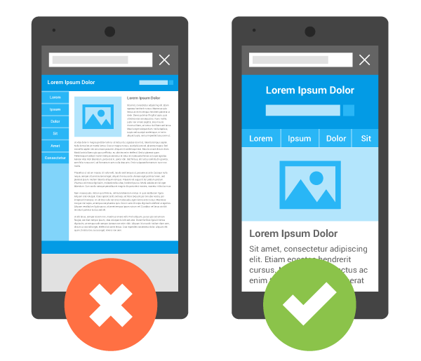
The first and most common option is to embrace responsive web design. It makes the reading and browsing experience as easy and optimized as possible no matter the device and its resolution. The main advantage of responsive web design is that you work with the same piece of HTML and CSS code and it will adapt to any screen size.
To use responsive web design, you’ll have to add the meta name=”viewport” tag to your page. This will tell the browser how to adjust the content to the page.
> Google’s detailed guide on how to setup responsive web design
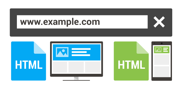
Dynamic serving
Dynamic serving, as its name suggests, is serving the user a page that change depending on the user’s screen size. If the user is browsing your site from a desktop computer, then they will be served with the regular full-size version of your site. But if the server where you site is hosted recognizes the user is browsing from a smartphone or a tablet, it will adapt what the user is seeing to a smarter and adapted arrangement in order to offer the best browsing experience to them.
The dynamic serving setup means, you’ll be using the same URL but won’t be able to keep the same HTML and CSS codes.
> Google’s detailed guide on how to setup dynamic serving
Separate URLs
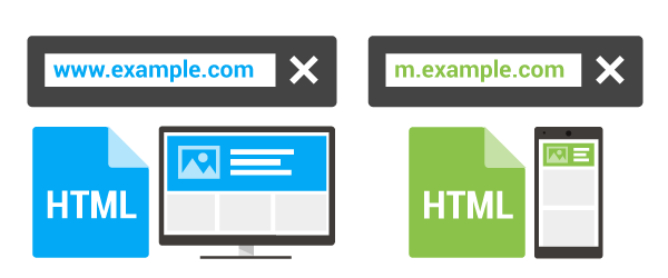
The separate URLs solution is also straight forward: unlike the two previous options, the URL seen by the visitor will simply be different, and so will your HTML.
A classic URL structure for this option is m.example.com. This means neither the URL nor your code will be the same as that which is served to desktop users.
> Google’s detailed guide on how to setup separate URLs
Responsive web design, dynamic serving, separate URLs – whatever you choose, here’s what you need to remember:

38 Comments
Mobile friendly sites are real need and Google is pushing webmasters and site owners to make sites mobile user friendly. I believe that responsive websites are the best in terms of best SEO results with minimum additional overheads like canonical/ alternate tags etc. This approach is the most cost effective and Google is also recommending the RWD. We as a training provider always suggest our learners to make sites according to the Google’s various guidelines.
Pingback: [Infographic] Mother’s Day Marketing in 2016 | DOZ
988355 577289Id forever want to be update on new articles on this site, bookmarked ! . 879558
Hi there friends, how is all, and what you desire to say concerning this piece of writing, in my view its in fact remarkable for
me.
752305 435874Exceptional post however , I was wanting to know should you could write a litte far more on this subject? Id be really thankful if you could elaborate a bit bit more. Thanks! 563643
I am now not sure the place you’re getting
your info, but great topic. I must spend some time learning more or figuring out
more. Thank you for excellent info I was in search of this info for my mission.
I’m amazed, I must say. Rarely do I encounter a blog that’s both equally educative
and amusing, and let me tell you, you have hit the nail on the head.
The issue is something not enough people are speaking intelligently about.
I am very happy I found this in my hunt for something concerning this.
This site was… how do you say it? Relevant!! Finally I’ve found something which helped me.
Many thanks!
Sutter Health
Every weekend i used to pay a quick visit this site, as i wish for enjoyment, since this this
web page conations in fact nice funny stuff too.
Good post! We are linking to this particularly great post on our website.
Keep up the great writing.
I’m truly enjoying the design and layout of your blog. It’s a very easy on the eyes which makes it much more pleasant for me to come here
and visit more often. Did you hire out a developer to create your theme?
Outstanding work!
I have been browsing online more than three hours today, yet I never found
any interesting article like yours. It is pretty worth enough for me.
In my view, if all website owners and bloggers made good content as
you did, the net will be much more useful than ever before.
What’s up to all, how is the whole thing, I think every
one is getting more from this website, and your views
are pleasant designed for new users.
Howdy! Quick question that’s totally off topic. Do you know how
to make your site mobile friendly? My weblog looks weird when viewing from
my iphone 4. I’m trying to find a theme or plugin that might
be able to correct this problem. If you have any recommendations,
please share. Cheers!
Right now it seems like Movable Type is the top blogging platform out there right now.
(from what I’ve read) Is that what you’re using on your blog?
179749 708858Greetings! This is my initial comment here so I just wanted to give a quick shout out and let you know I genuinely enjoy reading by means of your weblog posts. Can you recommend any other blogs/websites/forums that deal with the same topics? Thank you so a lot! 280052
This is my first time pay a quick visit at here and i am really happy to read everthing at one place
Great information shared.. really enjoyed reading this post thank you author for sharing this post .. appreciated
Thank you a lot for sharing this with all people you
really recognise what you’re talking about! Bookmarked.
Kindly also consult with my web site =). We can have a link alternate agreement between us
I like the efforts you have put in this regards for all the great content.
I just like the helpful information you provide in your articles
I’m curious to find out what blog platform you’re working with?
I’m experiencing some small security issues with my latest blog and I’d like to find something
more secure. Do you have any solutions?
bookmarked!!, I like your blog!
Great blog here! Also your site loads up very fast! What host are
you using? Can I get your affiliate link to your host? I wish my web site loaded up
as fast as yours lol
I blog often and I really thank you for your content.
This great article has truly peaked my interest. I am
going to book mark your site and keep checking for new
information about once a week. I opted in for your Feed as well.
Hi all, here every person is sharing such experience,
so it’s fastidious to read this web site, and I used
to pay a visit this weblog everyday.
Hey there! Do you know if they make any plugins to help with SEO?
I’m trying to get my blog to rank for some targeted keywords
but I’m not seeing very good gains. If you know of any please share.
Many thanks!
Hello every one, here every person is sharing these experience, thus it’s fastidious to read this webpage, and I used to go to
see this web site every day.
This post will assist the internet viewers for
building up new webpage or even a blog from start to end.
What i do not realize is in reality how you’re now not really a lot
more well-liked than you might be now. You are very intelligent.
You know thus considerably in terms of this subject, made me personally imagine it from numerous numerous angles.
Its like men and women aren’t interested unless it is one thing to do with Girl gaga!
Your individual stuffs outstanding. All the time care for it up!
My partner and I stumbled over here coming from a different website and thought I might check things out.
I like what I see so i am just following you.
Look forward to going over your web page for a
second time.
Hi there, yeah this article is genuinely fastidious and I have learned lot of things from it
regarding blogging. thanks.
I don’t even know the way I stopped up right here, however I assumed this put up was good.
I don’t realize who you might be however certainly you’re going to a
well-known blogger when you are not already. Cheers!
Hello there! I know this is somewhat off topic but I was wondering if you knew where I could find a captcha plugin for my comment form?
I’m using the same blog platform as yours and I’m having difficulty finding
one? Thanks a lot!
Hello, I enjoy reading all of your article.
I like to write a little comment to support you.
I’m now not sure where you are getting your information, but great topic.
I needs to spend some time studying much more or understanding more.
Thank you for great info I used to be looking for
this info for my mission.
Hey There. I found your blog using msn. This is a very well written article.
I will be sure to bookmark it and come back to read more
of your useful info. Thanks for the post. I’ll definitely
comeback.